[CASE STUDY] How Attention Insight Improved User Activation by 47% with Userpilot’s Interactive Walkthroughs

Despite a really easy-to-use, fully self-serve product, and a generous free trial that takes literally one click to start – Attention Insight – an AI-powered tool offering attention heatmap analysis of websites, ads, and other designs before launch – struggled with activating their free trial users.
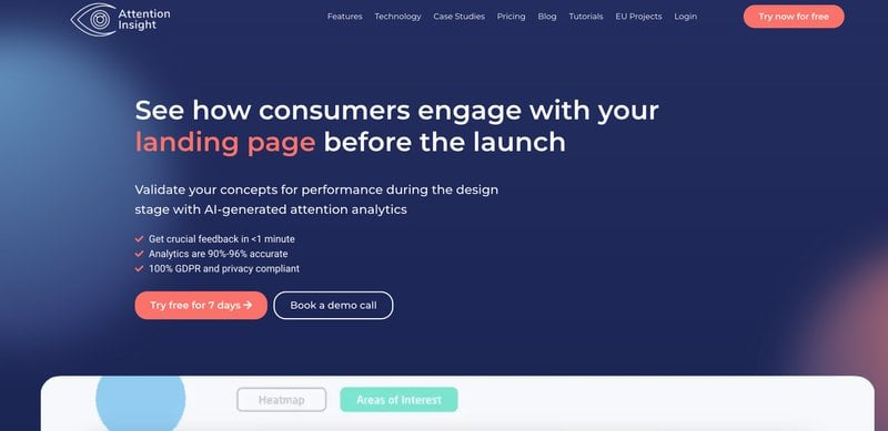
The trial users of Attention Insight have to take two simple actions to activate: upload a screenshot of the website/ad they want to analyze with heatmaps, and “tag” additional “areas of interest” they want to measure.
But the “simple” actions turned out to be not-so-simple:
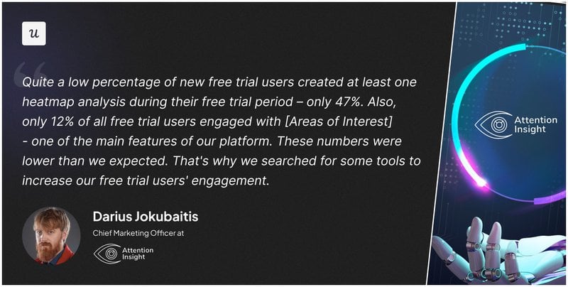
Darius Jokubaitis, the CMO at Attention Insight, noticed that: “Quite a low percentage of new free trial users created at least one heatmap analysis during their free trial period – only 47%. Also, only 12% of all free trial users engaged with [Areas of Interest] – one of the main features of our platform. These numbers were lower than we expected. That’s why we searched for some tools to increase our free trial users’ engagement.”
Low activation rates mean that the users didn’t adopt the critical features that would allow them to experience the value of Attention Insights’ product. And that in turn would mean that they wouldn’t convert to paid users – aka the common ‘leaky trial funnel’ problem.
Attention Insight decided to take action – and plug that ‘leaky funnel’ with better self-serve onboarding. They chose Userpilot as a code-free tool to build it.
After signing up for Userpilot, within 6 months of implementing an onboarding flow for their trial users – Attention Insight was able to improve their new user activation rates by over 47%:
- users who created at least one heatmap analysis growing from 47 to 69% (47% relative increase)
- users who engaged with the Areas of Interest feature went up from 12 to 22% (83% relative increase)!
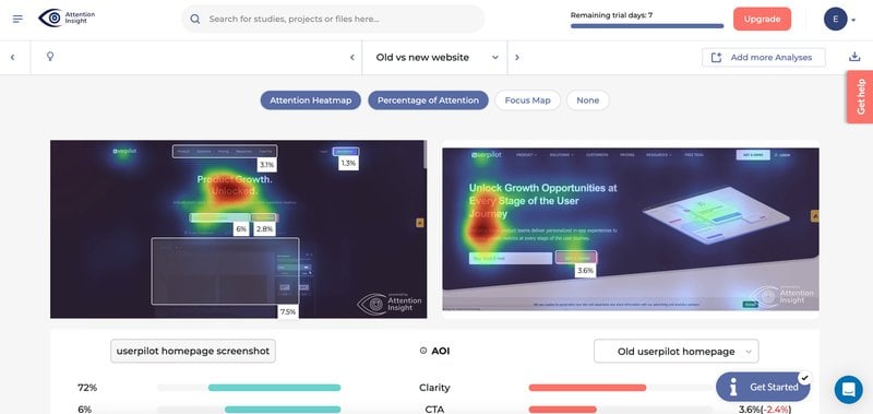
How did Attention Insight manage to achieve that?
In the case study below, we’ll explore exactly what in-app experiences the Attention Insight team built in Userpilot to push their users to a massively higher activation – without code!
TL;DR Summary: Attention Insight’s user activation boost with Userpilot
- Initial challenge: Despite an easy-to-use product and a one-click free trial start, Attention Insight struggled with low user activation rates – only 47% of trial users created a heatmap analysis, and just 12% engaged with the ‘Areas of Interest’ feature.
- Key user actions for activation: Upload a screenshot for heatmap analysis.
Tag ‘Areas of Interest’ in the analysis. - Userpilot’s Role:
- Onboarding strategy: Integrated several in-app experiences to boost user activation.
- Interactive walkthrough: Guided new users through the heatmap analysis creation process.
- Onboarding checklist: Assisted in navigating the heatmap creation and ‘Areas of Interest’ tagging.
- Dedicated flows: Highlighted the ‘Areas of Interest’ feature’s benefits.
- Hotspots and resource center: Drew attention to UI elements and centralized help resources.
- Slideouts: Congratulated users on successful heatmap creation and ‘Areas of Interest’ tagging.
- Contextual education: Provided extra information and guides relevant to the user’s actions.
- User activation results: User activation for creating at least one heatmap analysis increased to 69% – a 47% relative increase.
Engagement with the ‘Areas of Interest’ feature rose to 22% – an 83% relative increase. - Why Userpilot?: Chosen for its user-friendly interface, comprehensive analytics, and cost-effectiveness.
- Overall impact: Significant increase in user activation, crucial for Attention Insight’s growth and user satisfaction.
- Conclusion: Attention Insight’s case demonstrates the effectiveness of targeted user engagement and activation strategies using tools like Userpilot, significantly enhancing user experience and product success.
Quick wins in user activation – onboarding strategy overview
The primary activation point for Attention Insight’s users was creating their first heatmap analysis. Activation Insight combined several in-app experiences in the bid to boost their user activation with Userpilot:
1. An interactive flow (walkthrough) that guided new users through the heatmap analysis creation process with driven actions (a UI pattern consisting of tooltips urging the user to take a specific action inside the product) shortening the time to value and boosting activation.

2. An onboarding checklist helping the users navigate the process of creating a heatmap and tagging their “Areas of Interest” on the dashboard screenshot step by step.
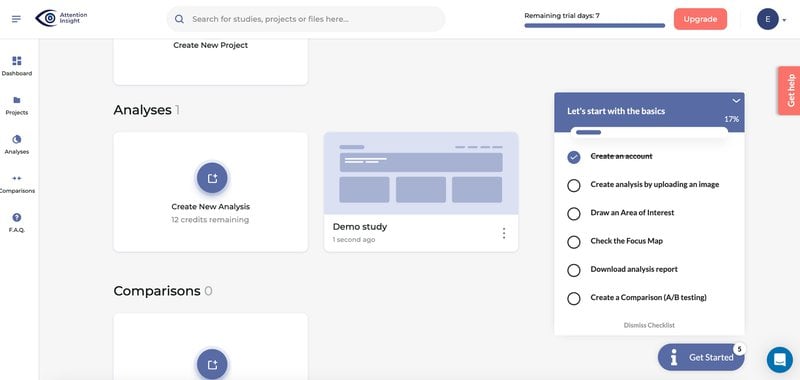
3. A dedicated flow for the ‘Areas of Interest’ feature, highlighting its benefits and encouraging engagement, further supporting the user activation process.

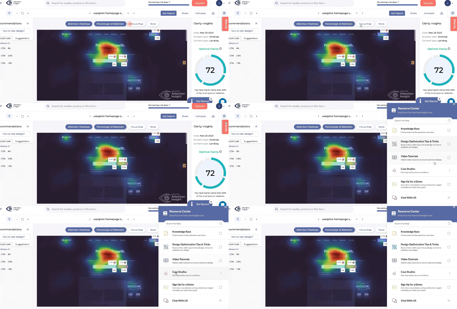
4. Hotspots drawing attention to less obvious UI elements, and a resource center pulling all the help resources and walkthroughs together to reduce support requests:
5. Slideouts congratulating the users on their first successful creation heatmap creation and tagging of an Area of Interest, enhancing the user experience and reinforcing activation:

Interactive walkthrough – getting users to activation faster
Prior to implementing Userpilot’s interactive walkthroughs, when the new trial users first landed on Attention Insights’ dashboards, they were a little confused about where to start. Attention Insight resolved this problem by first implementing a welcome screen.
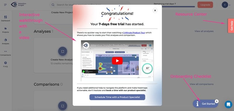
STEP 1: Welcome Screen with a video tutorial and onboarding call booking
Attention Insight first built an in-house welcome screen with a short video tutorial – a starting point for the users to learn more about the product, and start their guided onboarding journey – or book an intro call with the product onboarding specialist:
STEP 2: Interactive walkthrough consisting of driven actions, guiding the user to the first activation point
Clicking out of the welcome screen triggers an interactive walkthrough built in Userpilot, prompting the users to upload the screenshots of the website/ad they wanted to create the heatmap for:
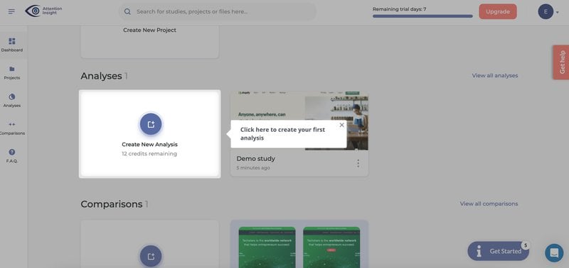
The tiny prompts you see on the screen are Driven Actions – a unique UI pattern promoting the user to take action in real-time, rather than just moving on to the next step of the product tour by clicking the “next” button.
If the user doesn’t have a screenshot at hand, the walkthrough encourages them to download a ‘demo screenshot’:
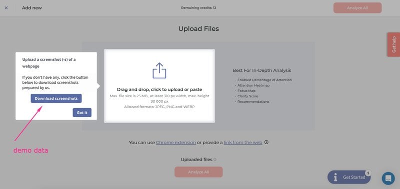
After uploading the screenshot, the walkthrough prompts the user to check its validity:
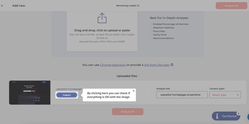
The walkthrough guides the new user through the first heatmap creation process seamlessly, and then congratulates them and prompts them to take the next action – drawing the “Areas of Interest”:
STEP 3: Slideout guiding the user to the 2nd key activation point – drawing “Areas of Interest”
Attention Insight prompted the user to the next key activation point with a slideout explaining how to draw the “Areas of Interest”:
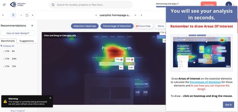
The app explains how to tag Areas of Interest in a handy GIF, with more help resources available at a click of the button:
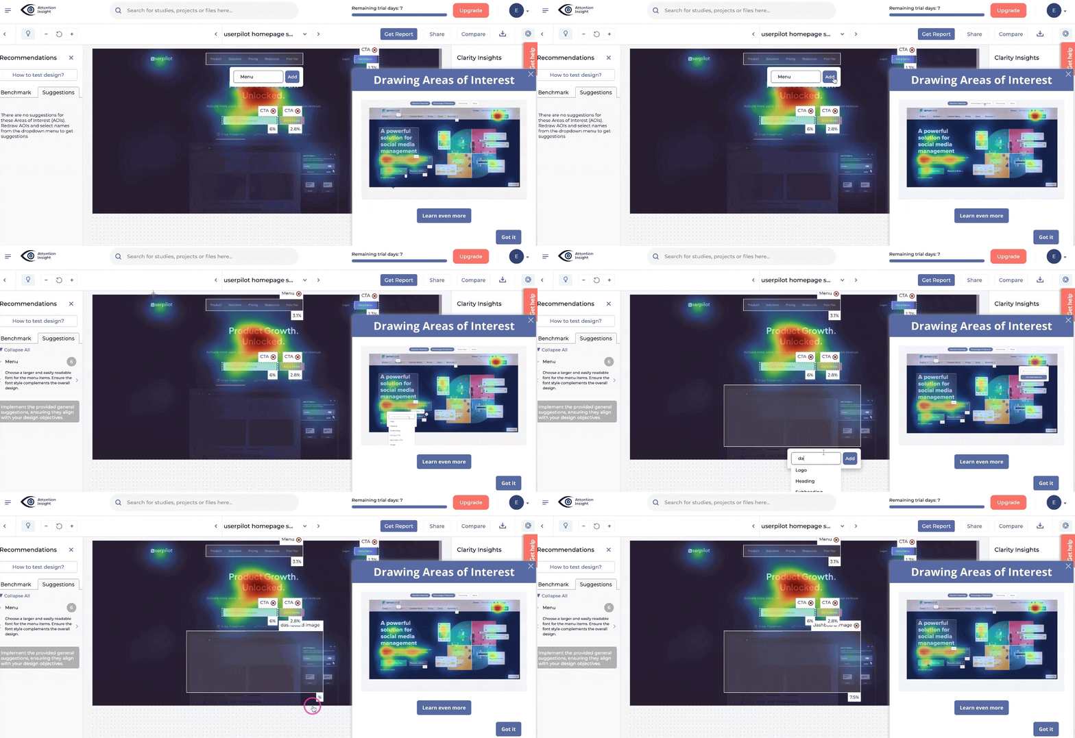
This walkthrough, again, ends with a congratulatory message:
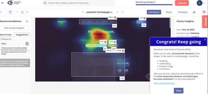
STEP 4: Tying it all together on an onboarding checklist
When the user doesn’t complete the whole onboarding flow and reaches the two key activation points in one go – they may not know how to pick up where they left off.
This is where Userpilot’s onboarding checklist comes to the rescue: it combines all the steps (and the interactive walkthroughs tied to them) on a handy task list available as a widget on the screen:

Clicking on the consecutive steps triggers the relevant interactive walkthrough, and checks the to-do items off the checklist when the user completes the required actions:
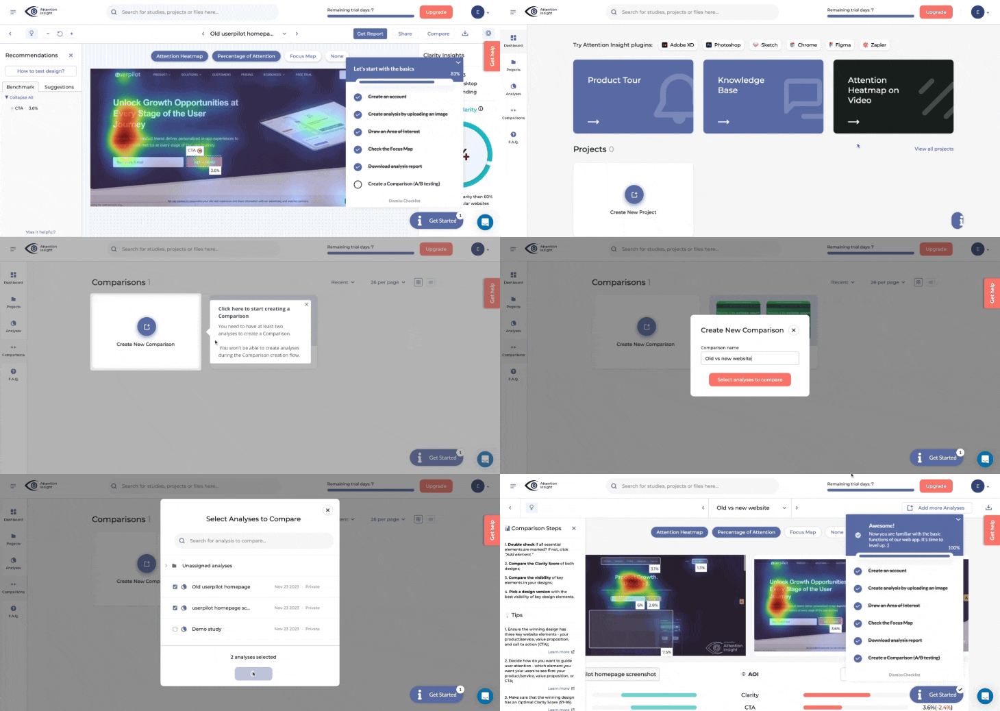
This utilizes the so-called Zeigarnik effect to push the users to complete the onboarding flow and activate: people tend to remember the tasks they haven’t completed better and want to close the ‘open loop’ by completing them.
STEP 5: Slideouts and tooltips providing contextual education resources
Attention Insight peppers the walkthrough with additional contextual education resources, providing extra information and guides on the actions that the users have just taken – hence increasing the chance that the user will actually read the guides:
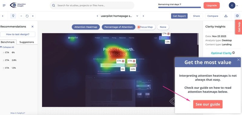
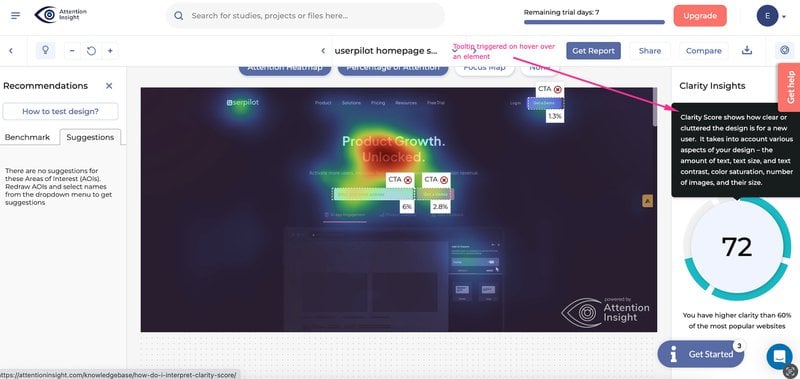
Some of them are very subtle, like this in-house tooltip appearing when the user hovers over the heatmap clarity score:
STEP 6: Providing subtle prompts with hotspots
Finally, Attention Insight also utilized Userpilot’s spotlights feature (the “hotspot”- to be specific) to highlight less obvious elements of the UI and prompt the users to explore more features of the product:

STEP 7: Providing extra guidance with a resource center
Last but not least – Attention Insight pulled all their help resources: from Knowledge Base, through Design Inspiration Gallery, Video Tutorials, Case Studies, Demo signup, and Live Chat – into Userpilot’s Resource Center widget:
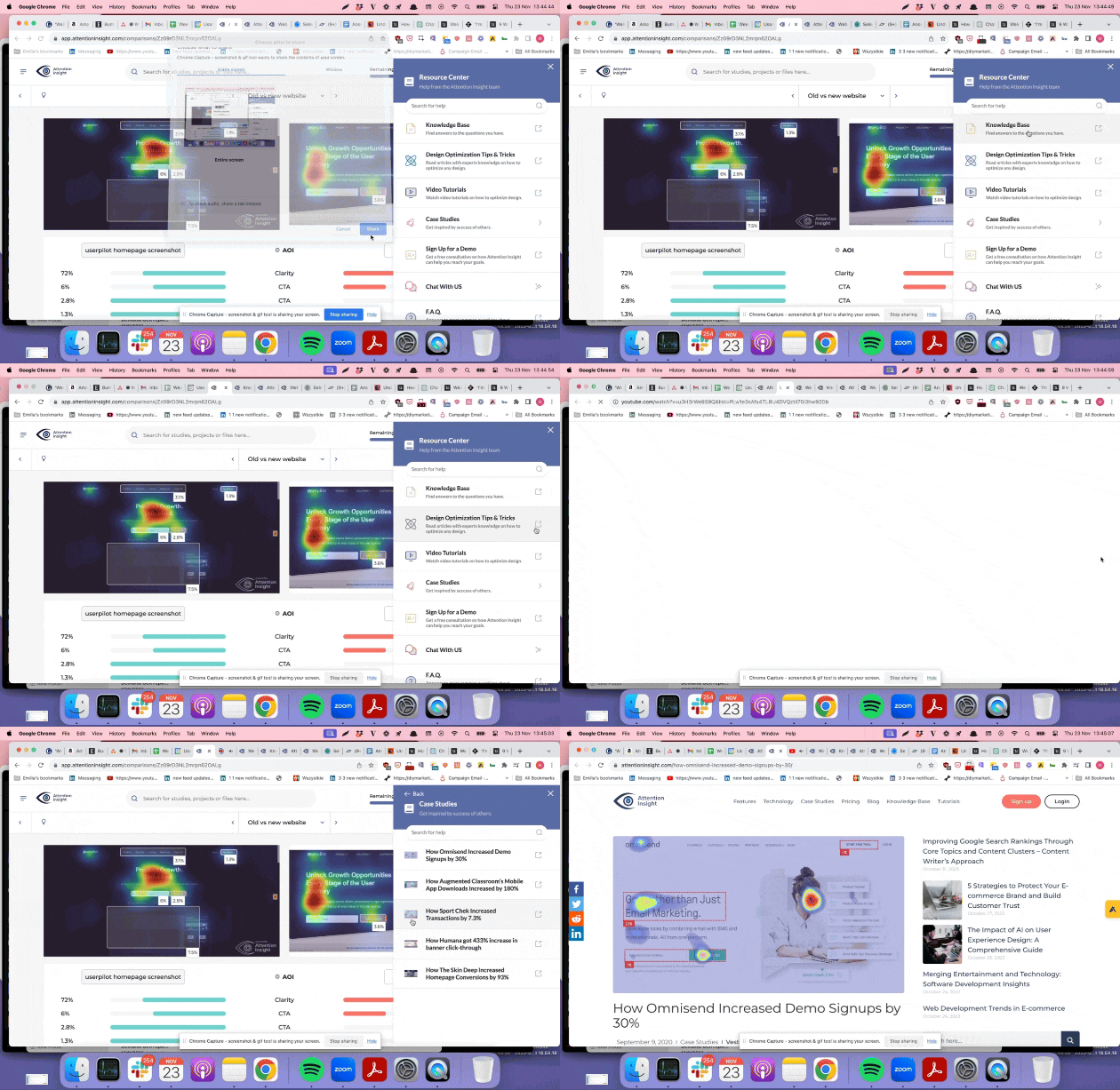
This allows the users to help themselves 24/7 – and reduces support ticket volume (some of our other users saw a whopping 83% drop in support tickets after implementing the resource center!)
Results – 47% increase in Activation Rate
Attention Insight has definitely leveraged all of Userpilot’s engagement features to the fullest – and this focused approach has paid off. It led Attention Insight to some remarkable results:
Over six months, the user activation rate for creating at least one heatmap analysis climbed to 69% – a 47% relative increase.
Engagement with the ‘Areas of Interest’ feature saw an 83% relative increase, reaching 22%.
These improvements were assessed by comparing pre-and post-Userpilot implementation metrics over equivalent six-month periods, highlighting Userpilot’s role in enhancing user activation.
Impact on MRR
While there are a lot of factors at play that affect the revenue of a company, Attention Insight’s team emphasized that the increased trial activation rate will have an impact on their bottom line:
“Increasing the number of users who create heatmap analyses during their free trial is crucial to conversions since they can’t use our platform without doing it. Also, increasing engagement with the second most important feature is essential to the “Aha” moment since, without that feature, there’s a limited value that our customers can get from our platform.”
In other words – without activating, the trial users wouldn’t see any value in the product – so they definitely wouldn’t upgrade to pay. Increasing user activation in the trials translates into higher trial-to-paid conversion – which in turn means more revenue.
Why Userpilot? Easy, effective, affordable & code-free
All’s good that ends well, but there’s a pertinent question: Why did Attention Insight decide to go with Userpilot for its new user onboarding?
As we were told by their CMO: “Userpilot offered us the most content creation possibilities combined with the most extensive analytics for an affordable price.”
Attention Insight selected Userpilot for its user-friendly interface, comprehensive analytics, and affordability.
Userpilot is a tool that offers you full flexibility – you can easily build any onboarding experiences you need, combining all the different UI patterns (flows, spotlights, checklists, slideouts, Resource Center etc.) into an effective onboarding walkthrough. And it also offers comprehensive user behavior analytics and in-app surveys for the same price!
How can Userpilot help you improve the activation rate for your SaaS
If you’re looking for a simple yet effective way to boost user activation, a product growth tool like Userpilot is the right fit. The platform is purpose-built to increase product metrics at each stage of the user journey.
Here’s a look at the features that make it possible:
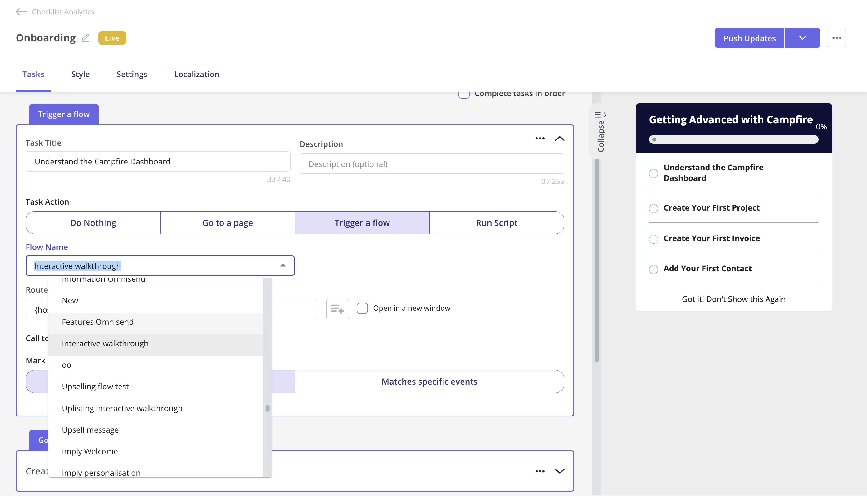
- Onboarding checklist – Design easy-to-follow onboarding checklists to highlight key steps needed to experience value. You can customize the checklist items, pick your preferred colors and fonts, and even add a progress bar to give it a touch of gamification. On top of that, you can track checklist engagement and completion rates.
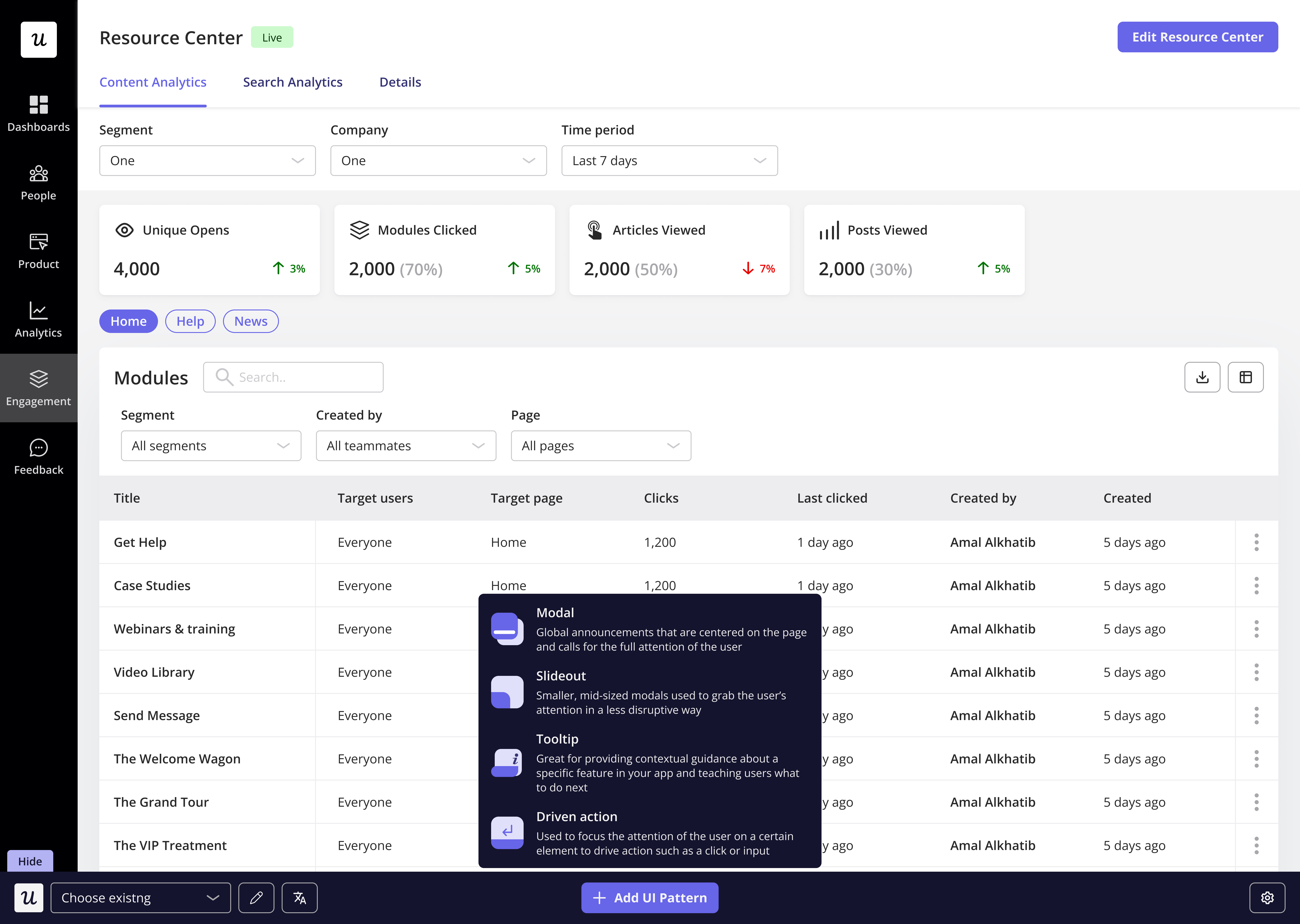
- Interactive guides: Using different UI patterns such as tooltips, modals, slideouts, and hotspots, build interactive walkthroughs that handhold users and help them complete critical workflows step-by-step. They work best when coupled with checklists. In Userpilot, you can trigger these guides when clicking on checklist items.
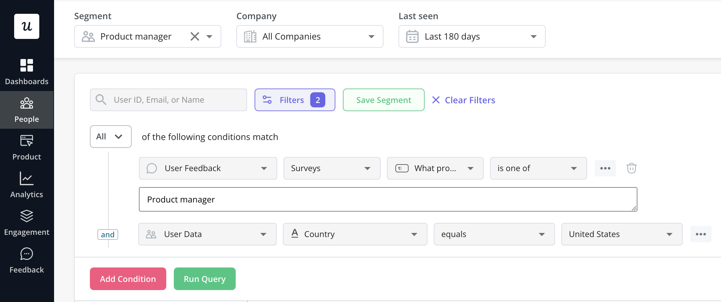
- User segmentation: Group users based on user personas, behavior, location, company, etc., and then target specific user segments with personalized onboarding experiences, making the guidance more relevant and effective.
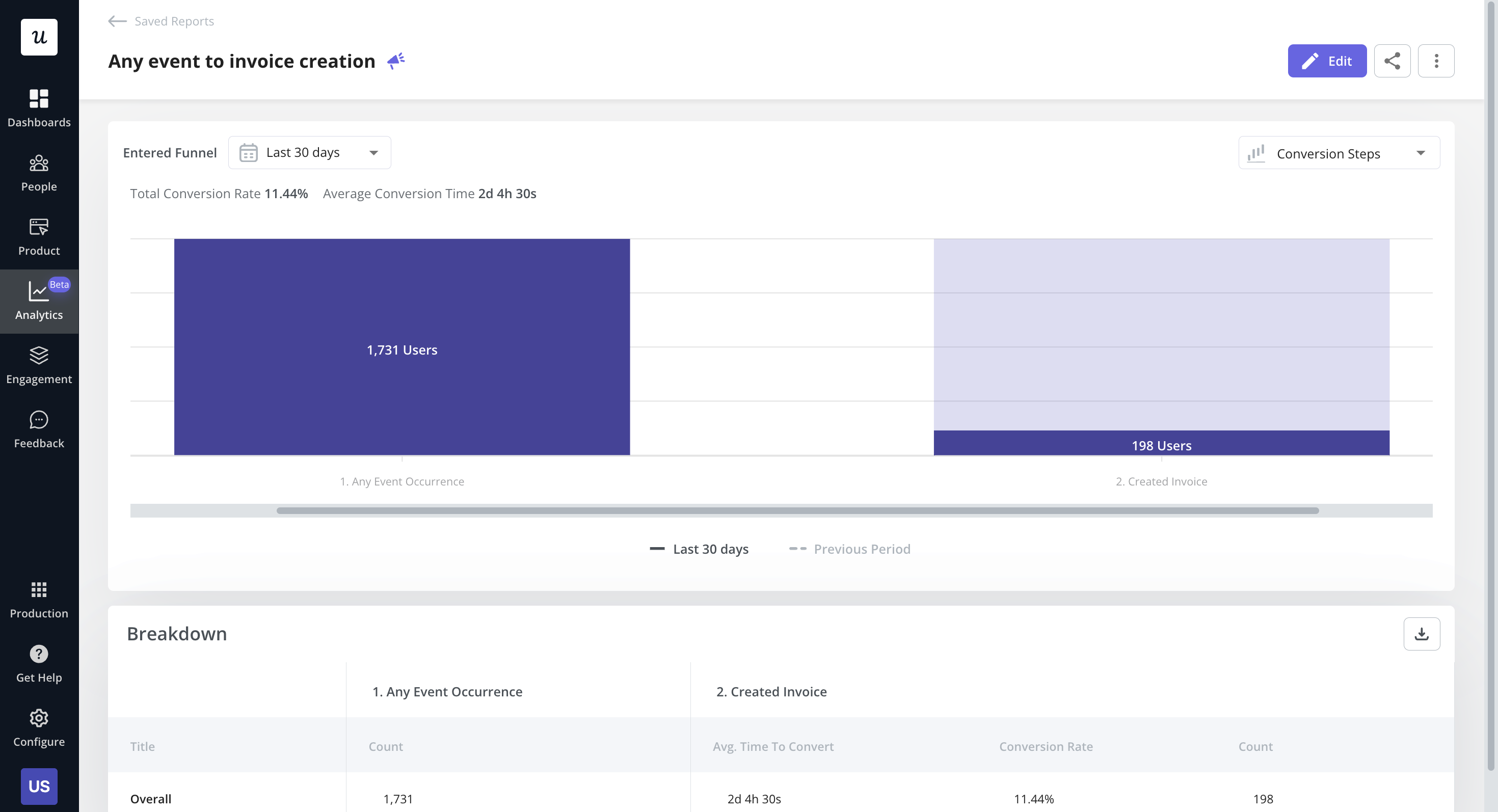
- Funnel analytics: Track the steps users take inside the app to spot friction points in the activation funnel and proactively resolve issues.
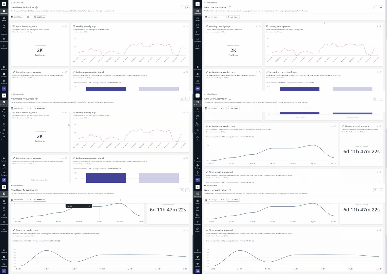
- Analytics dashboard: Monitor metrics such as new weekly signups, activation conversion rates, time to activation, etc on a visual activation dashboard to always be on top of changing trends.
Conclusion
Attention Insight’s example shows the importance of user onboarding experiences for user activation, demonstrating how user adoption tools like Userpilot can profoundly impact user experience and drive product success.
Higher activation means fewer users drop out of the trial-to-paid funnel – which in turn leads to lower average customer acquisition costs and more revenue from free trials.
Book a demo today to see how Userpilot can help your business!

