50+ Best User Onboarding Tools for SaaS [Updated for 2026 & Categorized]

Let’s face it: without the right user onboarding tools, you can’t deliver a great onboarding experience for your new users. And without a great onboarding experience, your users won’t activate and will churn. That’s why we’ve compiled a list of the 50 best free and paid user onboarding tools to help you smash your user activation, product growth, and revenue goals.
And not just that: for your convenience, we grouped the tools into 9 categories by the different goals you can achieve with them, signup flow tools, in-app onboarding software, email onboarding tools, user analytics, user feedback tools, customer support, and success tools, etc., and then proposed a sample tool stack.
What are the best user onboarding tools for SaaS in 2026?
- There are several different categories of user onboarding tools for different purposes, like in-app onboarding, signup flow, emails, in-app chat, etc.
- The best user onboarding tools in each category.
- In-app onboarding tools: Userpilot, Appcues, Userflow, Pendo, Intercom.
- Signup flow tools: Auth0, Kinde.
- “DIY” user onboarding solutions: INTRO.js, Shepherd.js.
- Email-onboarding tools: Mailchimp, ActiveCampaign, GetResponse, Mailer Lite.
- In-app chat tools: Intercom, Zendesk, Livechat, Sendbird.
- Video onboarding tools: Synthesia, Supademo, Walnut, Loom.
- Webinar tools: Sequel.io, Demio, Zoom, E-Webinar.
- Onboarding engagement analytics tools: Userpilot, Amplitude, Posthog.
- Feedback tools: Typeform,
- Customer support tools: Zendesk, Helpscout, Freshdesk.
- To streamline your user onboarding processes and save costs, look for tools that integrate natively with each other. Also, consider tools that cover several use cases, e.g., onboarding users in-app and via emails, analyzing customer data, and customer engagement via live chat.
- Here are a few customer onboarding tools that integrate natively with each other:
Examples of the complete SaaS user onboarding tool stack:
- The “complete” user onboarding tool stack for growth SaaS companies: OAuth (signup) + Userpilot (in-app onboarding + analytics, NPS, session replay) + Intercom (email onboarding, in-app chat) + Wistia (video onboarding) + Sequel (webinars) + Typeform (feedback) + Mixpanel/Amplitude/Heap (user behavior analytics) + Zendesk (Knowledge Base).
- The “MVP” user onboarding tool stack for startups on a budget: Auth0 (signup – freemium) + Intro.js (in-app, free) + MailChimp (email, freemium) + Loom (video, freemium) + Ewebinar (webinars) + Typeform (surveys, freemium) + Mixpanel (analytics, freemium) + Helpdesk (Knowledge Base) + LogRocket (session recording).
1. In-app user onboarding tools
Probably the first tool you should think of when building your onboarding tools tech stack is your in-app onboarding tool. Such tools allow you to build in-app product tours to guide your new users through your product, thus significantly improving the chances they will activate (and reducing day-1 and week-1 churn). In this article, we’ll cover both no-code user onboarding tools and DIY “budget” solutions that require coding.
Let’s start with the no-code tools first:
- Userpilot
- Appcues
- Userflow
- Pendo
- Intercom’s product tours
Find the right user onboarding tools for your SaaS growth
What is your primary goal for implementing user onboarding tools?
From driving activation with product tours to analyzing user behavior, identifying your main objective narrows down the 50+ tools available in 2026.
How much developer bandwidth do you have for setup and maintenance?
Choosing between no-code user onboarding tools and DIY JavaScript libraries like Intro.js depends on your team’s technical resources.
Are you looking for a single-purpose tool or a complete stack?
Streamlining user onboarding processes saves costs. Look for tools that integrate natively for emails, chat, and behavioral data.
Ready to Build a High-Converting Onboarding Stack?
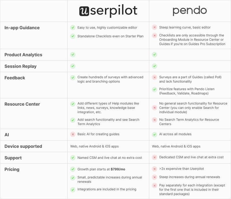
Stop juggling disjointed software. Userpilot is the best all-in-one user onboarding tool, combining no-code interactive walkthroughs with robust analytics and feedback loops. See how we help product teams drive activation and retention from a single platform.
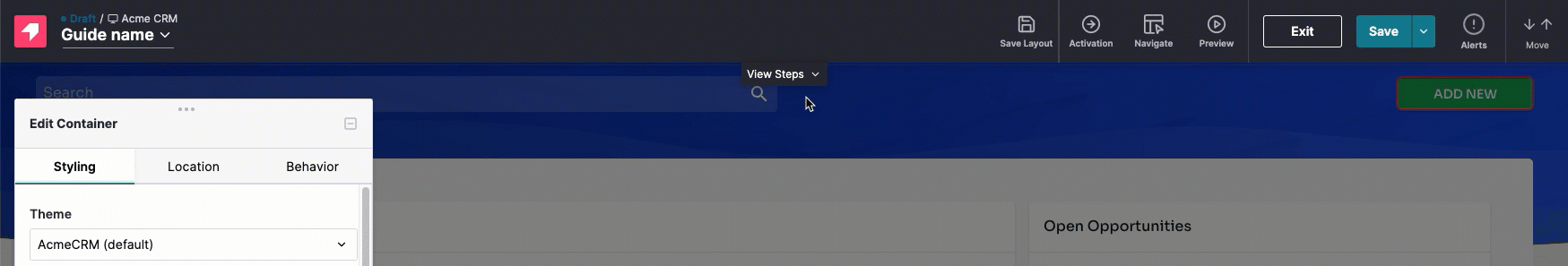
Userpilot: the “all in one” user onboarding tool for web and mobile

Userpilot is a no-code platform that provides an all-in-one solution to product and customer success teams. It features built-in in-app engagement tools that enable you to create personalized onboarding experiences, access robust product analytics, and collect user feedback through in-app surveys.
Key features of Userpilot:
- Chrome Extension for in-app onboarding flows: Offers a visual “what-you-see-is-what-you-get” (WYSIWYG) editor. It enables you to create interactive in-app experiences such as banners, spotlights, tooltips, and modals.
- In-app experiences: Userpilot supports an extensive range of UI patterns for creating in-app experiences, including interactive checklists, tooltips, modals, etc. Additionally, you can set up a resource center, a one-stop hub inside your app where users can access guides, FAQs, and video tutorials.

- Personalization: Flows have a targeting tab where you can set them up to show up based on the user’s in-app behaviors, attributes, paths, survey responses, and more. This allows you to create personalized onboarding experiences for different user segments.
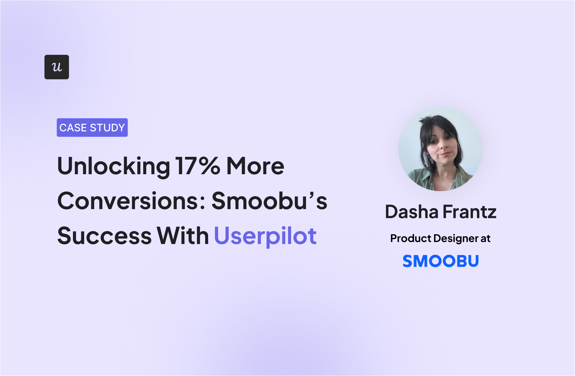
An example of this is how Smoobu used Userpilot to create an onboarding walkthrough to help users navigate their app’s top five most-used features. It triggers right after a user signs up, and if users still haven’t taken action, a persistent banner is displayed on the product UI to nudge them toward connecting to a channel.
“Userpilot allows us the flexibility to move fast, experiment, and really understand what users need. It’s helped us speed up processes and create a smoother user experience.” – Dasha Frantz, Product Designer at Smoobu
- Flow analytics: You can track clicks, form submissions, and other key user actions in real-time. Then, these analytics can help you segment users based on their behaviors, identify bottlenecks, and streamline onboarding.
- Retroactive analytics: The platform automatically gathers data on how users engage with each in-app element, including tooltips, modals, and checklists (without any manual setup). This data can then be visualized through customizable dashboards, where you can monitor key performance indicators, track user progress, and generate reports to share with your team.
- Mobile support: Userpilot allows you to design the onboarding experience of mobile apps via slideouts, carousels, and push notifications. Plus, you can track mobile app events and consolidate them with web analytics.
- Emails: Adding emails to the mix, you can consolidate your whole onboarding process in one place. Besides targeting emails to specific segments, you can trigger specific emails based on in-app activity without workarounds. Then, track the performance of your email onboarding sequences and cross-reference it with in-app events for more realistic insights.

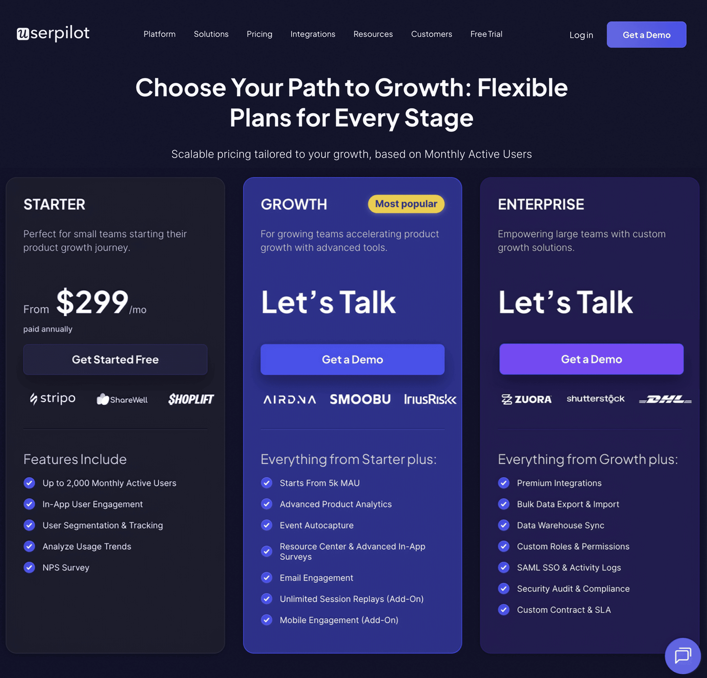
Userpilot pricing
Userpilot’s transparent pricing ranges from $299/month on the entry-level end to an Enterprise tier for larger companies.
Furthermore, Userpilot’s entry-level plan includes access to all UI patterns and should include everything that most mid-market SaaS businesses need to get started.
Userpilot offers three pricing plans based on monthly active users (MAUs):
- Starter: This entry plan begins at $299/month (billed annually) for up to 2,000 MAUs. It includes in-app user engagement features, segmentation, trend analysis, NPS surveys, and essential product analytics. This plan is ideal for small and mid-market SaaS teams getting started.
- Growth: This is a custom plan with advanced analytics, event autocapture, resource centers, in-app surveys, email engagement, and session replay. It’s best for growing teams that need deeper insights and scalability.
- Enterprise: Tailored for large organizations, this plan includes all Growth features along with bulk data handling, premium integrations, SOC 2 Type 2 compliance, custom roles and permissions, and enterprise-level support.
Appcues
Appcues is a no-code platform designed to help non-technical teams create in-app onboarding tours, surveys, and announcements to guide users through their product journey. While it provides a user-friendly interface, its features are limited compared to other solutions with the same pricing.
Key features of Appcues:
- Easy-to-use UI for building in-app flows: It lets you customize onboarding flows such as product tours, tooltips, and banners in real-time.
- Chrome Extension for in-product building: Allows you to build in-app experiences directly on top of your product. This means you can launch and edit product tours, tooltips, and more, without ever leaving your app.
- Onboarding checklists and action prompts: Appcues lets you create onboarding checklists that guide users through complex tasks.
- User segmentation and event-based triggers: Appcues allows you to deliver personalized onboarding experiences based on segmented behaviors, properties, or actions they’ve taken within your app.
- Event Explorer for tracking UI engagement: Sets up custom events and tag elements like buttons or forms.
- Mobile onboarding: Allows you to design an onboarding experience for mobile apps, including slideouts and push notifications.
As I mentioned, Appcues usability is pretty good, but its features are limited. For instance, its product analytics tools only cover the performance of your flows and NPS surveys (rather than the whole user journey), you can’t trigger flows based on server-side events, and localization is manual.
“We switched to Userpilot from Appcues. Apart from being easier to use, Userpilot offers much better product analytics & tracking and a much wider number of features (e.g. resource centre – which was a great bonus!). The one stand-out thing though is their customer support. We have both a dedicated account manager and a dedicated technical support who are always at hand and happy to jump on a call whenever we need to. This is very important to us. We are so far very happy with the switch, and use it from everything to onboarding tours, announcements and surveys.” – Charlotte V. Mid-Market (51-1000 emp.) Wine and Spirits Company
Appcues pricing
Appcues’ pricing starts at $300 per month for the Start plan, which includes basic onboarding features like product tours and tooltips. However, if you need features like resource centers, NPS surveys, and more segments, you’ll need to upgrade to the Growth plan, starting at $750 per month. The Enterprise plan is custom-priced based on the specific needs of larger organizations.
Userflow
If you need a solid solution just for building product tours, Userflow is one of the best no-code, lightweight tools for user engagement in web apps.
The only potential concern would be its canvas experience builder. It may be a bit more difficult to pick up than the common Chrome builders.

It lets you set up logic-based triggers, integrate with multiple tools, segment users, and supports multi-language messaging. You can also personalize flows based on customer behavior and attributes to deliver better customer experiences.
Key features of Userflow:
- No-code flow builder: You can create and customize your onboarding guides and product tours via their Chrome extension.
- In-app experiences: Includes tooltips, banners, announcements, as well as hotspots, icons, or buttons via the Launcher feature.
- Personalization: It can segment your users based on attributes and in-app behavior. Which you can use to trigger personalized flows.
- Onboarding checklists: Can create checklists for new users to achieve activation faster.
Userflow Pricing
At $240/month, Userflow offers most of its features (for up to 3,000 MAUs). However, if you need more than 3 seats, have up to 10,000 MAUs, integration with your CRM, and additional features like localization, then you’d need to upgrade to the Pro plan at $680/month.
Pendo
Pendo is a comprehensive digital adoption platform (DAP) that combines user onboarding features with advanced product analytics, feedback collection, and product adoption tools. It’s primarily targeted at larger enterprises looking for robust analytics and user guidance.
Key features of Pendo:
- Advanced product analytics: Pendo offers in-depth analytics tools, including Paths, Funnels, and Cohorts.
- In-app guides and product tours: Build interactive onboarding flows, such as tooltips and walkthroughs, that guide users through your app.
- Feedback and feature prioritization: With Pendo’s feedback tool, users can submit requests directly in-app. Plus, Pendo Listen allows you to complete the feedback loop faster.
- Cross-platform support: Pendo supports both web and mobile applications, and you can track user behavior and launch onboarding experiences across devices.
Despite being one of the most robust tools in the market, Pendo is more expensive than most tools. You either have to bear with the inconvenience (i.e., no standalone checklists or polls) or pay a great amount to have them.
Pendo Pricing
Pendo’s pricing is available only on request, but Vendr data indicates that the median contract price is about $48,213 per year. Its free plan supports up to 500 monthly active users, while more advanced plans offer additional features like cross-app tracking and enterprise-grade security.
Intercom product tours

Intercom, known for its robust customer messaging platform, also offers Product Tours, an add-on designed to provide basic onboarding experiences. It’s ideal for simpler, linear onboarding flows but may be limited for more complex use cases.
Key features of Intercom Product Tours:
- Basic, linear product tours: Intercom Product Tours guide users through your app with a series of non-interactive information panels. While effective for straightforward, linear onboarding, it lacks interactive elements like modals, checklists, or hotspots that more sophisticated tools provide.
- Seamless integration with Intercom’s messaging: Product Tours integrate seamlessly with Intercom’s chat and messaging tools, allowing teams to combine onboarding with customer support, live chat, and other engagement strategies.
- Frameless video support: You can embed videos in your product tours, giving users additional guidance via visual walkthroughs.
Now, using just Intercom for new user onboarding has certain drawbacks, including:
- Linear tours only, no real interactivity.
- Restricted range of user experiences.
- Styling requires coding. You can always tell if someone’s been using Intercom’s product tour software because the product tours always look the same.
- Entry-point pricing may seem attractive, but it increases sharply with the growing number of users you may have. There’s no transparent pricing on Intercom’s website.
Intercom’s product tours pricing
Product tours are part of the Proactive Support Plus add-on, so you can only get them if you already have a subscription with them (Intercom’s pricing plans are notoriously complicated and tricky to navigate). The base fee is $99/month, but you’ll have to pay additional messages after 500 messages.
2. Signup flow tools – for removing friction from your user onboarding process
If you don’t want to lose users before they have even signed up for your product, your signup flow should be as frictionless as possible. This can be achieved with Single sign-on (SSO), which is a property of access control of multiple related, yet independent, software systems. With this property, a user logs in with a single ID and password to gain access to a connected system.
Filling out long and detailed sign-up and registration forms has always been boring and time-consuming. No one likes that!
While building the in-app experience, you could add SSO so your users will have fewer forms to fill.
You can get such kind of frictionless authorization tools to streamline your user onboarding flow with the following companies:
AuthO (Freemium)
Auth0 is a freemium platform that provides authentication and authorization solutions for both web and mobile applications. It allows you to integrate Single Sign-On (SSO), multi-factor authentication, and social logins into your app, helping users sign up with fewer steps and added security.
Key features of Auth0:
- Single Sign-On (SSO): Allows users to log in with one ID for multiple applications, improving conversion rates and reducing signup abandonment.
- Multi-factor authentication and social login: Has multi-factor authentication (MFA) and the option to sign up with social platforms like Google, Facebook, or Twitter.
- Secure user data and APIs: Auth0 provides high-level security for user data, securing your APIs and preventing unauthorized logins.
Auth0 pricing
It’s based on the freemium model, and it starts with $0 per month for up to 25,000 MAUs. However, you’d need to pay a premium plan ($150/month minimum for 500 MAUs) if you need multi-factor authentication, unlimited organizations, and stream audit logs to AWS, Azure, Splunk, etc.
Kinde

Kinde is a newer platform that offers a simple solution for startups looking to integrate Single Sign-On (SSO) and improve their signup flow. With minimal setup, Kinde provides essential authentication features that make the signup process faster and more secure for users.
Key features of Kinde:
- Developer-friendly SSO integration: Kinde allows you to easily integrate SSO into your product, helping users sign up with fewer barriers and improving activation rates with minimal development effort.
- Customizable signup flows: Tailor your registration forms to suit your product’s specific needs, including user roles and permissions, making account management simpler for growing businesses.
- User roles and permissions: Kinde offers flexible options for managing user roles and permissions, ensuring that the right users have access to the appropriate features.
Kinde pricing
Kinde’s flexible pricing offers affordable options that scale as your business grows. It starts free, but you can upgrade as you need it, starting with a $25/month plan that offers everything you need, up to $250/month for businesses who need to handle Enterprise customers.
3. “DIY” user onboarding solutions (require coding)
We understand not every startup can afford to buy the convenient (but quite expensive) no-code user onboarding software, and may need to code up the guides for their user onboarding process themselves.
INTRO.js (Free)
Intro.js, a JavaScript guide, allows you to harness this principle by allowing you to insert a progress bar into your onboarding flow and get users to actually cross the finish line.
Shepherd.js
The Shepherd.js library is another JavaScript library for creating product tours that is highly customizable and helps you with your user onboarding process.
It basically does everything that Intro.js does, but it’s still being updated and worked on, unlike Intro.js, it seems (it has so many open issues on GitHub that nobody is responding to…).
You should choose an open-source solution for your user onboarding that can offer you support when you need it.
4. Email onboarding tools
Even when you have great in-app onboarding, email onboarding using email automation tools is still essential in user onboarding. Email verifications, sending transactional emails, invoicing, trying to re-engage users who haven’t logged in for a couple of days, or sending a list of links to read, can only be done via email. Just like a lot of a-synch support. So let’s see which email tools are best for improving the user onboarding experience, including:
- Mailchimp
- ActiveCampaign
- GetResponse
- Mailer Lite
MailChimp
Mailchimp is a widely used email marketing platform, especially among small and medium-sized businesses. It has evolved from a simple email tool to a full marketing hub, making it useful for creating onboarding email sequences.

Key features of Mailchimp:
- Customer journeys: Set up automated, trigger-based email sequences to guide users through your onboarding process.
- Easy-to-use interface: Mailchimp’s drag-and-drop email builder makes it easy to create professional-looking onboarding emails.
- Detailed reporting: Track how users engage with your emails through open rates, click-throughs, and other key metrics.
Mailchimp pricing
Mailchimp’s pricing starts with a free plan, with paid plans starting at $13/month for 500 contacts, up to $350/month for 10,000 contacts and advanced features.
ActiveCampaign
ActiveCampaign is a great email marketing platform for mid-level brands looking to scale.
But besides email, it also offers omnichannel marketing tools for SMS, landing pages, WhatsApp messaging, AI agents, and CRMs. Those capabilities make it more suitable for B2C companies.

Key features of ActiveCampaign:
- Email campaigns: Like any email tool, you can schedule, automate, send, and track recurring emails to your contacts, as well as newsletters.
- Multi-step marketing automations: Automate email sequences with multiple actions, waits, and branching options.
- AI assistant: Use prompts to create email drafts, refine copy, and create multiple subject lines to A/B test (only available in the Pro and Enterprise plans).
- Advanced targeting: Segments users based on specific demographics and attributes to target email campaigns. It’s limited in the standard plans and needs the Pro plan to get access to advanced options.
ActiveCampaign pricing
ActiveCampaign’s standard offering begins at $15/month for 1,000 contacts, including the basic email marketing features like A/B testing, sequences, and limited automations.
If you need features like generative AI, predictive sending, or advanced segmentation, the plan can scale up to $145/month (more if you have more contacts).
GetResponse
GetResponse is a household name in SaaS email onboarding. Today, in addition to AI-powered email marketing, landing pages, and ecommerce integrations, it also provides enterprise marketing tools for SMS marketing and mobile push notifications.

Key features of GetResponse:
- AI-powered email: Generate welcome sequences with contextual copywriting assistance.
- Custom workflows: Build onboarding funnels that trigger emails based on behavior (e.g., form completion, inactivity).
- Segmentation: Tailor onboarding messages based on user attributes or engagement behavior.
- Email analytics: Track email performance, conversion metrics, and refine onboarding flows with visual reports.
GetResponse pricing
GetResponse pricing starts at $9/month for the Starter plan at 500 contacts. It can scale based on your contacts and the plan you’re on.
Mailer Lite
Mailer Lite is a user-friendly email marketing platform. And just like other email marketing platforms in the market, it also offers omnichannel marketing tools for creating landing pages, publishing blogs, designing whole websites, and including ecommerce products in your emails.

Key features of Mailer Lite:
- Drag‑and‑drop email and signup pages: Quickly design welcome emails and signup pages without coding.
- Email automation workflows: Create multi‑step onboarding sequences triggered by user signups or behavior.
- Smart send: Uses AI to analyze each subscriber’s past interactions, sign-up dates, and time zones to determine the optimal time to send them your emails.
- AI writing assistant: Generate and refine onboarding email content using AI assistance (Advanced plan only).
- Surveys and quizzes: You can embed interactive quizzes and surveys inside your emails to reduce friction.
Mailer Lite pricing
Mailer Lite has a generous free plan for up to 1,000 contacts that includes most basic email features. If you need A/B testing, website building, and advanced segmentation, there are paid plans that start at $9/month and scale with the number of contacts you have.
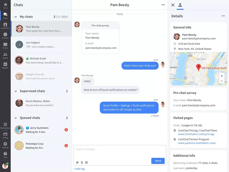
5. In-app chat tools for user onboarding and guidance
In order to provide a seamless user onboarding experience, you should also provide real-time customer support, especially if you have high-ticket customers. A self-serve knowledge base or a resource center may not always be enough to answer all your users’ questions, so in-app chat can be the thing to enhance your user onboarding process.
Let’s look at the best chat tools below, including:
- Intercom
- Zendesk
- LiveChat
- Sendbird
Intercom
Besides Product Tours, Intercom’s main offering revolves around real-time live chat, chatbot automation (via Fin AI agent), help center search, and proactive messaging. Which means it’s best used as a helpdesk for customer support.

Key features of Intercom:
- Fin AI agent: Intercom uses Fin to resolve a higher number of tickets without requiring a human agent.
- Copilot: An AI assistant that helps support reps get the resources they need instantly and respond to user queries faster.
- Help center integration within chat: Users can search articles directly from the messenger for self-service onboarding.
- Multilingual support: Help center and message support in multiple languages.
- Omnichannel support: Can relay conversations from in-app to WhatsApp, email, and even DMs.
Intercom pricing
The most basic intercom plans start at $29/month per seat, with the Expert plan sitting at $135/month per seat. However, it can scale quickly as you get more resolutions via the Fin AI agent.
Zendesk
Zendesk is one of the main user engagement tools for busy customer service teams. It allows you to track every query (whether received through email, chat, social media platforms, or other channels) through a ticketing system.
Key features of Zendesk:
- Smart ticketing system: Which connects the right agent to the right queries depending on expertise.
- Help center: Provides your customer support teams with a 360-degree view of all customer interactions + resources they’ll need to address these queries.
- AI agents: Which can step in for FAQs and provide personalized responses.
- Dashboards with support metrics: Tracks valuable insights on how customer interactions are being handled, and whether customer satisfaction has been achieved or not.
Zendesk pricing
Key features like Zendesk AI and customer ticketing are available with the starter $19/agent/month plan. However, advanced features like multi-channel support, complex gen-AI replies, or routing to the right agent, etc., will only be available with more premium plans (their “Suite Professional” plan is most popular amongst users, and is priced at $115/agent/month).
LiveChat
LiveChat is another popular in-app chatbot tool for communicating with customers and solving their problems in real-time. It supports chatbots, multi-channel messaging (e.g., SMS, social apps), and AI-enhanced responses, ensuring new users get immediate help during key onboarding moments.
Key features of LiveChat:
- Real-time web and mobile chat widget: Embed high-performance chat across web and mobile apps for instant onboarding support. Automatically route users based on behavior, reducing friction during early engagement.
- Copilot: Helps agents auto-rephrase and analyze chat tone to help agents deliver clear, supportive onboarding messaging.
- Customization: Make your chat fit your product’s UI, personalize the profile of your agents, and use the native language of your customers.
- Real-time analytics: You can see where your users experience issues during onboarding (or anywhere else in their journey) and quickly respond to their problems and requests. It can track visitor behavior, chat volume, agent performance, and onboarding success metrics.
LiveChat pricing
LiveChat pricing starts as low as $20/month with an AI assistant included. It can scale up to $59/month per seat if you need to track up to 1,000 visitors and get advanced reporting.
Sendbird
Sendbird is a scalable in-app chat API and messaging SDK. It’s built for real-time one-to-one, group, or public conversations, with support for rich media, moderation, threading, and advanced features like translation.

The platform also includes analytics, delivery receipts, typing indicators, push notifications, and compliance-ready moderation tools .
Key features of Sendbird:
- AI support agents: Sendbird allows your customers to connect with each other or support teams (human, AI, or hybrid) over voice or video calls or via chat.
- Group and supergroup channels: Create community spaces or cohort onboarding experiences.
- Push notifications and offline messaging: Keeps users engaged even when not in-app (via SMS, WhatsApp, mobile push, or in-app messaging).
- Moderation tools: Includes profanity filters, image moderation, domain filters, and user blocking.
- Message translation: Enables multilingual support to onboard global audiences.
- Analytics and data export: Dashboard analytics, webhook support, and integrations for analyzing onboarding interactions.
Sendbird pricing
There’s no official pricing on their website, but according to Vendr pricing data, the median cost per year is about $5,760.
Olark
The Olark chat box matches your branding and enables you to chat with customers if they run into a problem.
Also, you can set up live chat automation rules to automatically ask users for feedback during the onboarding process.
It all happens within the app, so you get their honest reactions as they succeed or fail. In the future, if you uncover patterns or insights from searchable live chat transcripts, you will get bonus points.

Olark’s monthly plans start at $29 per month.
6. Demo video + onboarding video tools
Video tutorials with an actual human behind them make it easier for a user to engage. This could be included in your initial product tours (e.g., in the welcome screen, built in Userpilot) or while showing certain features.
It not only lets you add that extra touch of personalization to your product, but you will also make learning more engaging by breaking down complex processes. Inserting a video in an introductory marketing email increases click-through rates by 96%.
The best tools for this include:
- Synthesia
- Supademo
- Walnut
- Loom
Synthesia
Synthesia is an AI-powered video creation platform that can produce polished demos and onboarding videos without traditional filming. All you need is a script, an avatar, and language selection.

Key features of Synthesia:
- Text-to-video and screen recording: Turn scripts or product walkthroughs into videos in minutes.
- Extensive AI avatar library: Access 6–230+ AI avatars (stock or selfie avatars) across tiers for personalized guides.
- Multilingual support: Produce videos in 120–140+ languages with auto dubbing and subtitles.
- Branded share pages and analytics: Customize shareable pages with CTAs, track engagement, and embed in LMS.
- Collaboration tools: Workspace comments, version control, guest seats, and review workflows enable seamless team cooperation.
- SCORM export & API: Enterprise-grade integrations for LMS and workflow automation.
Synthesia pricing
Although you can create a basic AI video as a test, there’s no free plan. Paid plans start with the Starter plan at $29/month ($18/month if billed annually), giving 10 minutes/month of video, 125+ avatars, workspace collaboration, PowerPoint import, and downloads. The Creator plan expands the limitations plus lets you add dialogue, while the Enterprise plan is unlimited.
Supademo
Supademo is a no-code platform designed for creating interactive demo videos, walkthroughs, and onboarding experiences without coding or traditional video production. It captures user flows via browser, screenshots, or HTML, enhances content with AI, and delivers personalized demos in‑app.

Key features of Supademo:
- Interactive product walkthroughs: Record workflows and turn them into clickable guides with hotspots, text, annotations, and zoom/pan capabilities.
- AI enhancements: Auto-generate voiceovers, text annotations, and translations into 15+ languages.
- Conditional branching: Create multi-path demos tailored per user for personalized onboarding journeys.
- Multi-demo showcases: Group multiple demos into one guided onboarding “starter kit”.
- In‑app embedding and shareable links: Trigger demos inside your product or embed in knowledge bases and emails.
- Collaboration: Team workspaces with commenting/version control and detailed viewer analytics like drop-offs and completion rates.
- Export options: Download demos as video, GIF, or integrate with LMS via SCORM-compatible exports.
Supademo pricing
Supademo offers a free plan at $0 per creator/month, allowing up to 5 demos, unlimited screenshots, a basic editor, exporting capabilities, sharing, and analytics. The paid plans start at $27/month per user and include unlimited demos, team workspace, custom branding, and can scale up to $350/month per user.
Walnut
Walnut is a no-code platform that creates end-to-end interactive demo experiences and personalized onboarding walkthroughs directly in the browser. It captures real product flows, supports self-serve deployment, and provides tools for training new users.

Key features of Walnut:
- HTML-based interactive walkthroughs: Capture live product flows to create clickable, editable demos.
- Embedded in-app and shareable links: Seamlessly launch demos inside your product or via emails, LMS, and knowledge bases.
- Analytics and drop-off tracking: Track user interactions, session time, and steps where users disengage to refine onboarding.
- Conditional branching and personalization: Tailor demos based on user role, industry, or behavior for a contextual onboarding experience.
- Team collaboration & support: Workspaces with commenting, version control, and dedicated success management.
Walnut pricing
Walnut doesn’t offer self-serve or free plans; you’ll need to book a demo and engage in a custom quote process. According to their pricing page, there are plans between $750/month and $1,550/month for most features, but you’ll need custom pricing if you need more than 5 seats or advanced localization.
Loom (freemium)

Loom is a popular tool for creating quick video tutorials by recording your screen. It’s a user-friendly option for SaaS companies that want to create step-by-step videos to enhance their onboarding process.
Key features of Loom:
- Easy-to-use screen recording: Record your screen with audio and video to create clear, concise onboarding tutorials.
- Quick sharing and embedding: Loom allows you to share and embed videos directly in your app or emails.
- Collaboration and feedback: Teams can leave comments or time-stamped feedback on Loom videos.
Loom pricing
It has a free plan, and the paid plans start from $15/month for unlimited features, $20/month to add AI.
7. Onboarding webinar tools
Apart from embedding video tutorials, live user webinars organized by CS to help the new users understand your product are an essential part of user onboarding. Let’s go over some webinar user onboarding tools that will help you improve your user onboarding process, including:
- Sequel.io
- Demio
- Zoom
- E-Webinar
Sequel.io
Sequel.io is a versatile webinar platform that lets you embed live and automated webinars directly onto your website or app. This unique feature gives you full control over the user experience while driving higher engagement
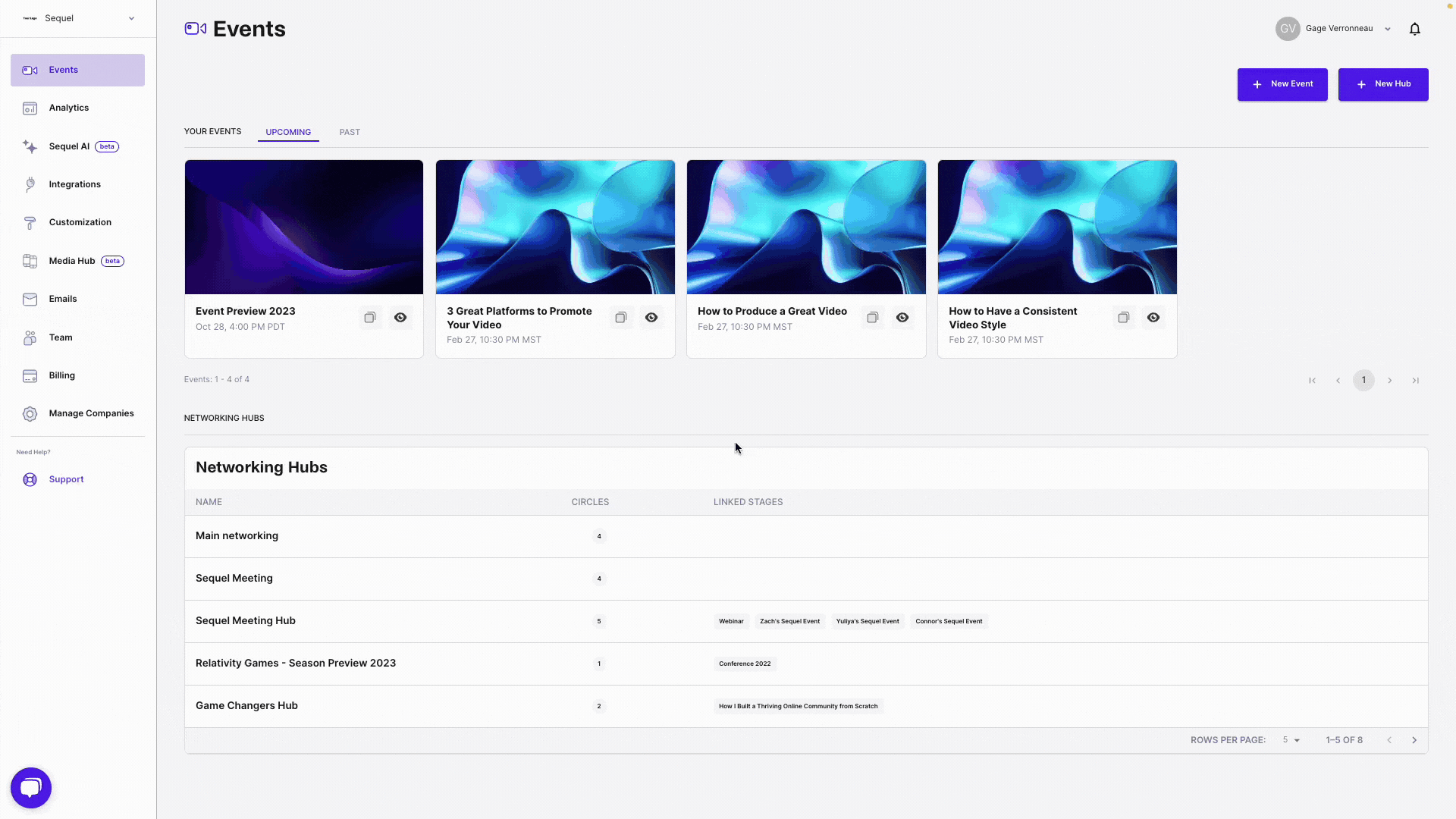
Key features of Sequel.io:
- Embedded webinars: Host webinars directly on your product’s website or app without redirecting users elsewhere.
- Live and automated options: Sequel.io allows you to host live webinars or turn them into evergreen, on-demand sessions to fit different user needs.
- Interactive elements: Add polls, Q&A sessions, and CTAs to engage users during webinars.
Sequel.io pricing
Sequel is not the cheapest webinar tool, with plans starting from $550 per month for up to 500 attendees. If you’re on a tight budget, you may want to check out some of the cheaper solutions below.
Demio
Demio is a user-friendly webinar platform designed for hosting live, scheduled, and automated webinars. Its minimalistic interface and customization options make it a great choice for onboarding users through engaging live sessions.

Key features of Demio:
- Live and automated webinars: Host live webinars or set up automated sessions that can be scheduled to run on demand.
- Customizable branding: Personalize your webinar experience with customizable registration pages, thank-you pages, and interactive elements such as polls, handouts, or CTAs.
- Automated email reminders: Keep users engaged by setting up automated email reminders before and after the webinar.
Demio pricing
Demio starts at $45/month (paid yearly.) But the lowest plan only allows up to 150 webinar participants, so it may not be the cheapest or most scalable choice either.
Zoom
Zoom is a well-known video conferencing tool that also offers a webinar feature. While not as specialized as other onboarding tools, Zoom Webinars is widely recognized and easy to use, making it a familiar choice for onboarding sessions.

Key features of Zoom Webinars:
- Live webinar hosting: Zoom allows you to host live onboarding webinars without participant limits (as long as you pay for it), ideal for businesses with a large user base.
- Recording and on-demand access: Record live webinars and offer them as on-demand videos, allowing users to access onboarding content at their own pace.
- Interactive features: Engage participants with features like polls, Q&A, and chat during live webinars.
Zoom pricing
Zoom Webinars pricing starts at $690 per year for up to 500 attendees. The plan scales up based on the number of attendees and other plans.
eWebinar
eWebinar focuses on automating webinars by turning pre-recorded content into interactive, on-demand sessions. It’s ideal for onboarding users without requiring constant live webinars.

Key features of eWebinar:
- Automated, on-demand webinars: Upload any pre-recorded video and turn it into an interactive webinar that runs on demand.
- Real-time interaction: Even though the webinars are automated, eWebinar allows for real-time chat, polls, and quizzes.
- Scheduling flexibility: Set your webinars to run at specific times or offer “just-in-time” sessions.
eWebinar’s pricing starts at $99 per month for up to 3,000 monthly registrants; the price scales based on the number of participants and the level of customization needed.
8. Onboarding engagement analytics tools
In order to optimize your user onboarding process, you need to be able to analyze your user behavior to see where your users stumble and get stuck.
The tools listed below record all your users’ actions, providing a full-spectrum image of your users’ actions and product analytics. These include:
- Userpilot
- Amplitude
- Posthog
Userpilot
Userpilot has already appeared on this list. But since the platform combines user onboarding tools with analytics, it’s worth mentioning again. It allows you to monitor user behavior and product interactions in real-time, offering granular insights into how users navigate your onboarding flows.
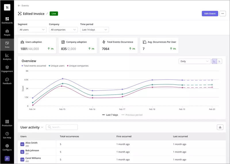
Key features of Userpilot’ analytics:
- Native analytics to track Userpilot content: All analytics tools track every flow, checklist, and resource center content.
- Track everything with autocapture: Userpilot automatically tracks every user interaction in your app, including clicks, hovers, form fills, and more, without the need for manual event setup. The visual labeler allows you to identify and name events without coding.
- Analytics reports: You create reports to analyze how users go through the funnels, the path they follow to achieve success, the user retention rates of different user cohorts, and behavioral trends inside your product.
- Customizable dashboard with drag-and-drop widgets: You can build personalized dashboards for your key onboarding metrics, where you’ll be able to choose from a variety of pre-built templates or create custom dashboards by adding drag-and-drop widgets that track specific data points.
- User and company profiles: Track individual user interactions as well as company-wide engagement. These provide a full history of which onboarding flows users have completed, how they’ve interacted with your app, and what features they’ve engaged with the most.

- Complete analytics: You can track everything you build by default (flows, checklists, resource centers, surveys, etc.). For instance, there are resource center analytics that show term search insights, module clicks, and so on.
- Session replays: Get access to session replays where you can watch how users interact with your product, tag bugs, skip inactivity, and collaborate with your team.
- Mobile analytics: Follow how users behave across multiple devices to understand their activity more deeply.
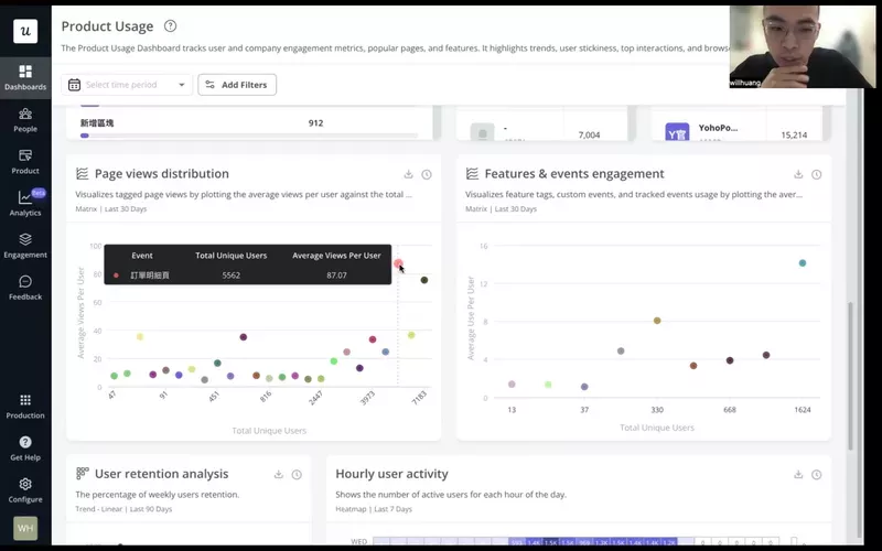
These features make Userpilot a better fit for product teams that need to optimize their products. For example, a Taiwan-based company called CYBERBIZ used Userpilot’s product usage dashboards to prioritize popular pages for their redesign, then monitored session duration to determine if users were able to finish their JTBDs faster.
Amplitude
Amplitude is a powerful analytics platform designed to provide actionable insights into user behavior, user adoption, and retention. It’s particularly suited for SaaS companies looking to optimize their onboarding processes with data-driven decisions.
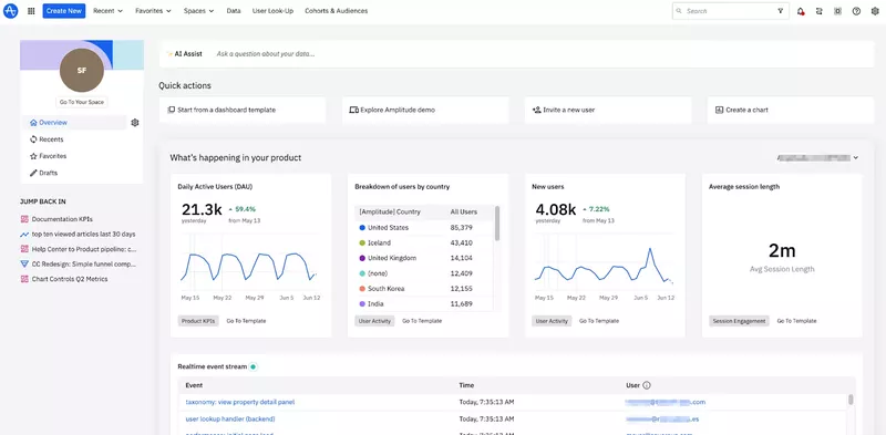
Key features of Amplitude:
- Cross-platform user tracking: Amplitude tracks user behavior across multiple platforms.
- Behavioral cohorts: Segment users into behavioral cohorts to see how different groups engage with your onboarding flow.
- Custom dashboards: Build personalized dashboards to track specific onboarding KPIs, such as completion rates, drop-offs, and time-to-value metrics.
While Amplitude offers powerful analytics, it can be overly complex and costly for startups or smaller teams. Also, it has a steep learning curve that might require dedicated users to manage analytics effectively.
Amplitude pricing
Amplitude has a free plan that allows you to track up to 50k monthly tracked users (MTUs). However, Amplitude’s pricing can increase very rapidly as you start getting more users, rising up to $2,520/month for 300K MTUs.
PostHog
PostHog is a comprehensive, open-source product analytics platform that’s ideal for measuring onboarding engagement. It offers behavior tracking, funnel analysis, session replays, feature flags, and in-app surveys in one integrated suite, making it easy to understand how users move through onboarded flows.

Key features of PostHog:
- Autocapture event tracking: Automatically logs clicks, form submissions, rage clicks, page leaves, and more events that show where users struggle during onboarding.
- Funnel and user path analysis: Build custom funnels and explore paths to find friction points.
- Session replay: Watch real users complete key onboarding steps to identify UX issues and anomalies.
- Surveys: Collect post-onboarding input directly from users to collect qualitative insights.
Despite being highly versatile and open-source, PostHog’s event-based pricing model can become unexpectedly expensive as user interactions scale.
Additionally, its wide array of features can be overwhelming for teams needing straightforward onboarding analytics, potentially resulting in underutilization or complexity in setup.
PostHog pricing
PostHog offers a free plan that includes up to 1 million events per month, 5,000 session replays, feature flags, experiments, error tracking, surveys, and data warehouse integration. Once you exceed free tier limits, you move to usage-based pricing, which can scale very quickly as your user base grows.
9. User feedback tools to measure onboarding success
Collecting user feedback is essential for both usability issues and the onboarding process itself.
You can collect feedback through multiple different ways, from simple surveys sent via email to in-app NPS surveys provided by user onboarding solutions. Let’s review my top choice for the job: Typeform.
Typeform
Use a simple form creation tool like Typeform if you only have a limited budget. Typeform has the advantage of being conversational and interactive. In addition, creating a survey is easy; it’s like typing on a notepad with no coding required.

Key features of Typeform:
- Pre-built templates: Includes specific survey templates to track feedback throughout onboarding.
- Branding: Remove Typeform logo, add custom subdomain/fonts, and create a seamless onboarding experience.
- Analytics: Track completion rates, respondent drop-off, and conversion performance.
- Integration with main platforms: Send responses to HubSpot, Slack, Mailchimp, and Google Sheets via native or Zapier integrations.
Typeform pricing
Typeform has a generous free plan, and paid plans start at $25 per month for 100 responses/month. It can reach up to $291/month if you need 10,000+ responses and more advanced features.
Note: If you use Userpilot, you don’t need another survey tool. The platform lets you send microsurveys and collect Net Promoter Score (NPS) responses, and easily integrate the NPS scores into your analytics and onboarding workflows. For example, you can embed NPS surveys into onboarding flows to measure user satisfaction and track how it changes as users progress through their onboarding journey. Plus, you can segment users based on their NPS scores to personalize future onboarding steps.
10. Knowledge base & resource center tools for product onboarding
All website visitors and later trial and premium customers immediately want access to any particular information. That’s the reason why every company, whether it’s a small startup or a large enterprise, should have an in-depth knowledge base for its customers.
Particularly in user onboarding, the resourceful knowledge base will help us to create better resources for our customers, and later to retain more users by giving them answers, ideas, and information about particular things, that can be everything from “How the tool works” to different use cases.
Not to mention that when your potential customer sees your tool in action or in some use case, you will more easily and quickly unleash the “Aha!” moment.
Hence, here are a few useful Knowledge Base products that can find their purpose in user onboarding, including:
- Zendesk
- Helpscout
- Freshdesk
Zendesk
Zendesk also offers a robust knowledge base feature, making it easy to provide users with self-service support during onboarding. It integrates with live chat and email, allowing seamless transitions between automated help and human support.
Key features of Zendesk:
- Integrated knowledge base: Create a comprehensive knowledge base with articles, guides, and FAQs that users can access directly from your product.
- Live chat and ticketing integration: Zendesk integrates its knowledge base with live chat and ticketing systems, allowing users to escalate issues to support agents if they can’t find the answers they need.
- Other features: Community forums, unified agent workspace, Ticketing system, Automated responses, SLA management, Email to the case, reporting, and analytics.
Zendesk resource center pricing
Help centers are accessible in the customer service suite plans starting at $55/month, up to $115/month to add more languages, more help centers, and a customer portal.
Helpscout
Helpscout is a customer support tool that includes a straightforward knowledge base solution. It’s designed to help small and mid-sized businesses provide quick and easy access to help articles and documentation during the onboarding process.
Key features of Helpscout:
- Customizable knowledge base: Help Scout lets you create a branded knowledge base that users can access for self-service support.
- Live chat integration: Help Scout integrates live chat and email support with its knowledge base. It also supports integrations with various tools like Slack, HubSpot, Salesforce, Jira, MailChimp, and many others.
- Humanized ticketing: You can make your ticket emails look more humanized, personal, and customized for every user.
Helpscout pricing
Helpscout has a free plan for up to 50 contacts, where you can create help docs. It can cost up to $5,000/month if you need 10,000 contacts a month and advanced features like permissions, surveys, and integrations with JIRA.
Freshdesk
Freshdesk is a customer support tool that offers a multi-channel helpdesk solution, including a knowledge base for self-service support. It’s ideal for companies that want to provide a unified support experience across chat, email, and self-service.

Key features of Freshdesk:
- Comprehensive knowledge base: Freshdesk allows you to build a rich knowledge base with FAQs, help articles, and tutorials.
- AI-powered chatbots: Includes AI-driven chatbots that can guide users to the right knowledge base articles based on their queries.
- Ticketing and automation: Integrate your knowledge base with Freshdesk’s ticketing system to ensure that users can escalate issues if they don’t find the answers they need. Freshdesk’s automation rules can also direct users to relevant help articles based on their interactions.
Freshdesk pricing
Freshdesk offers a free plan with basic ticketing and knowledge base features (for up to 2 agents). Paid plans start at $15 per month for advanced features like automation and AI-powered chat.
How to integrate your user onboarding tool stack together?
Connecting your user onboarding tools so they actually “talk” to each other (and don’t cause embarrassing “bloopers” like, e.g., sending the same message to the same person twice, or asking a user that has already completed a specific action to complete it) is essential for your user onboarding success.
So, how can you integrate all your onboarding resources to avoid such situations? Here are a few tips:
Kill two (or three…or four) birds with one stone
Find user onboarding tools that can do more than one thing at a time. It will significantly reduce your implementation costs and overall subscription cost (even if the all-in-one tools might be much more expensive).
Look for tools holistically – choose tools that integrate natively with each other
While choosing your user onboarding tools for the different use cases, look for those that integrate natively with each other. This will save you tons of time zapping things together, and save you from expensive/embarrassing mistakes in your user onboarding.
Here are a few user onboarding tools that integrate natively with each other:
- Userpilot (for in-app user onboarding), Intercom (for email onboarding and in-app chat), and Amplitude, Mixpanel, or Heap (for in-depth product analytics). All have native integration to make your email-in-app user onboarding seamless and more data-driven.
- Hotjar and Zendesk have a native integration that will allow you to cut your response time to customer feedback.
- Userpilot, Loom, and Typeform, so you can easily embed your Loom video tutorials and Typeform surveys into your user onboarding flow.
Examples of the complete SaaS user onboarding tool stack
The “complete” user onboarding tool stack for growth SaaS companies
OAuth (signup) + Userpilot (in-app onboarding, NPS) + Intercom (email onboarding, in-app chat) + Wistia (video onboarding) + Sequel (webinars) + Typeform (feedback) + Mixpanel/Amplitude/Heap (user behavior analytics) + Zendesk (Knowledge base) + Fullstory (session recording).
The “MVP” user onboarding tool stack for startups on a budget
OAuth (signup – freemium) + Intro.js (in-app, free) + MailChimp (email, freemium) + Loom (video, freemium) + Ewebinar (webinars) + Typeform (surveys, freemium) + Mixpanel (analytics, freemium) + Helpdesk (Knowledge Base) + LogRocket (session recording).
Drive product growth with SaaS-ready user onboarding tools!
With these user onboarding tools, you can build your own tech stack based on your company’s needs and resources.
If you need to create a comprehensive, customizable onboarding experience that drives user engagement and accelerates product adoption, Userpilot proved to be the perfect fit for product teams.
So if you want to see how Userpilot can elevate your onboarding process, book a demo to see how you can optimize the whole journey with one platform.
FAQ
What is user onboarding software?
The best user onboarding software helps guide new users through a product, improving feature adoption and reducing churn by offering in-app experiences, tutorials, and support.
What is an onboarding tool?
An onboarding tool is a solution that provides step-by-step guidance, tutorials, or checklists to help users get familiar with a product or service.
What is the user onboarding method?
The user onboarding method refers to the process of introducing new users to a product through guided tours, checklists, and interactive tutorials. This ensures users reach milestones that make them achieve success.
What is a user onboarding checklist?
A user onboarding checklist is a list of tasks or steps that users need to complete to fully set up and understand how to use a product, ensuring a smooth onboarding experience.
About the author