15 Successful Product Tour Examples to Inspire Yours (+Tips)
If you’re looking for real-life product tour examples that drive activation, you’re in the right place.
Below, I’ll walk you through 15 examples from SaaS companies that nailed it. These aren’t just screenshots—they’re flows that helped improve adoption, conversion, and user satisfaction. I’ll explain what worked, why it worked, and how we applied similar ideas in our product.
1. Impala
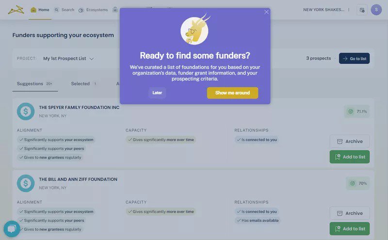
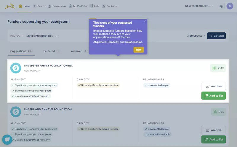
Impala kicks off their onboarding with a friendly welcome modal that clearly states the platform’s purpose: connecting fundraisers with potential donors. It’s clean and goal-oriented.
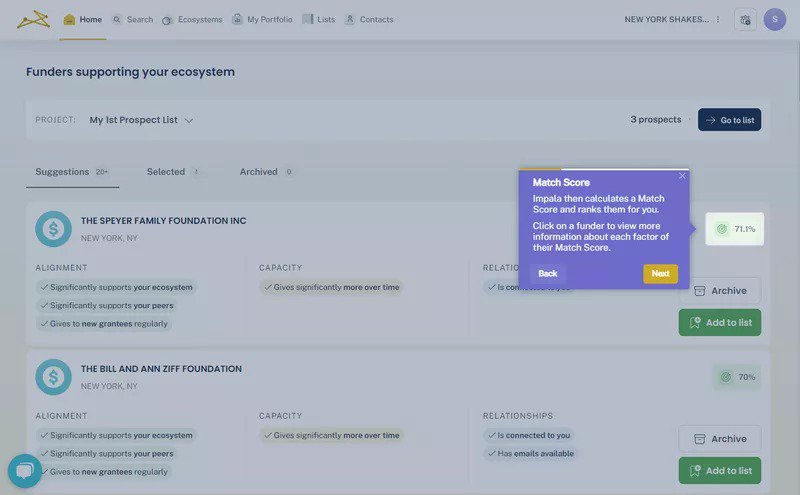
Next, they guide users with contextual tooltips, explaining key features like “Suggested Funder” and “Match Score” without overwhelming new users.
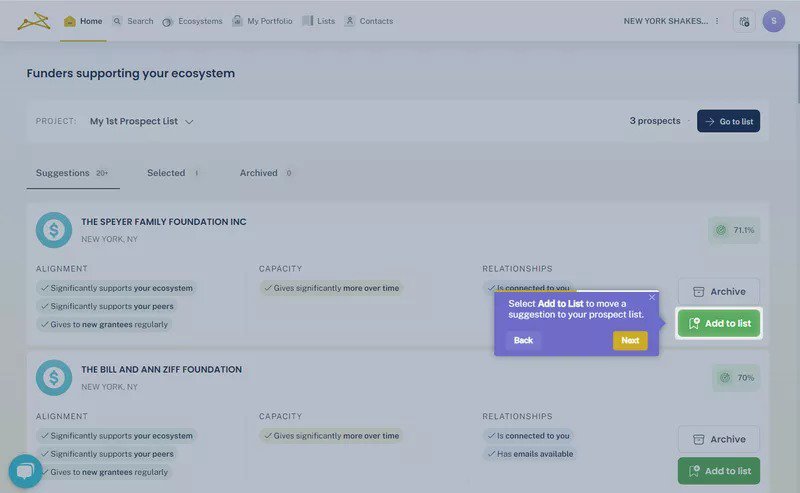
The best part? The tour doesn’t just point things out, it asks users to take action, like adding funders to their prospect list.
What we learned: Structure matters. A mix of modals, tooltips, and action steps can double activation, as it did for Impala with Userpilot.
What’s your biggest challenge with product tour examples right now?
2. Sked Social
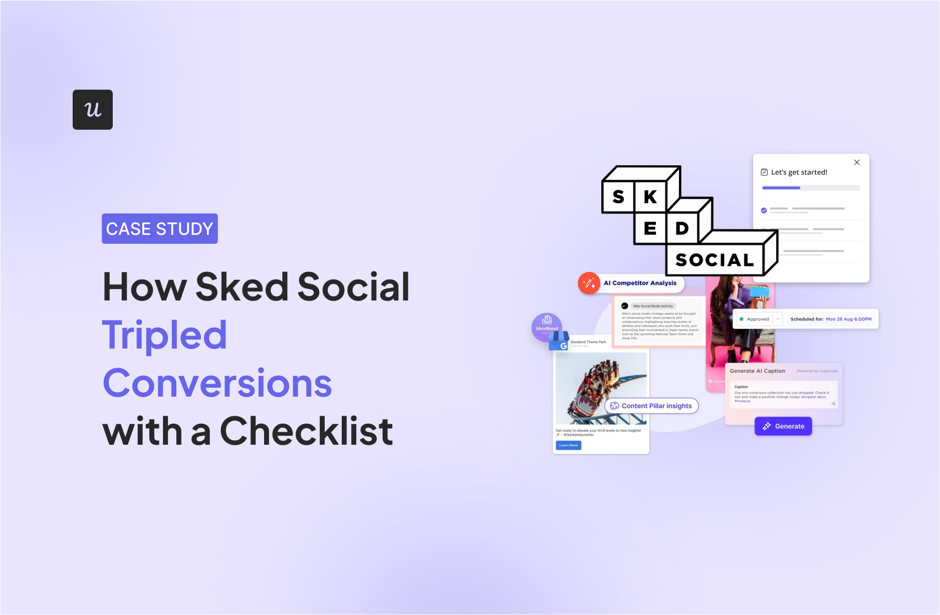
Sked Social is a platform designed to streamline and automate managing social media content.
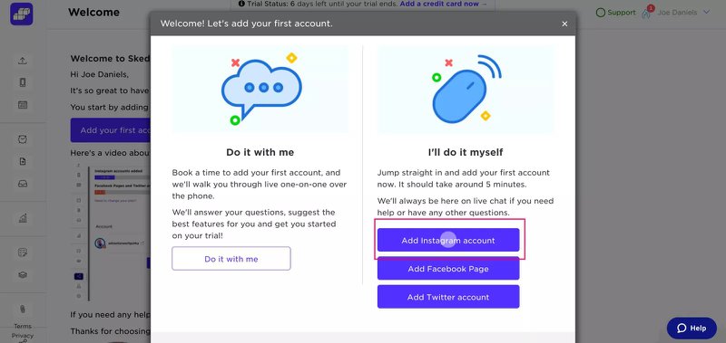
I love how Sked gives users a choice upfront: do it yourself or hop on a call. That kind of flexibility increases completion rates.
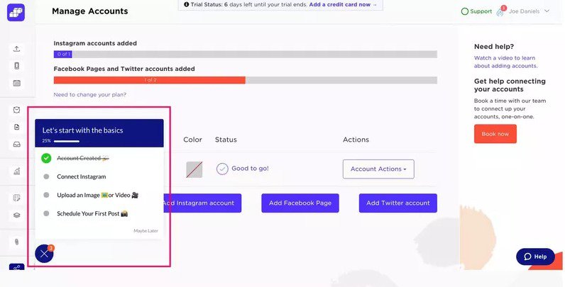
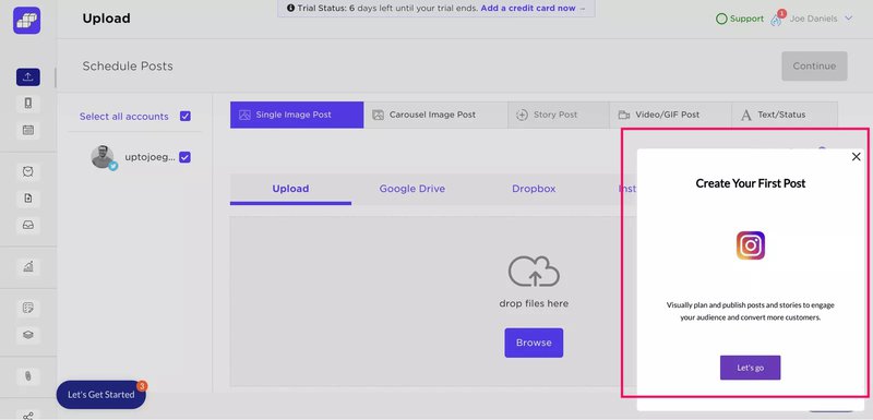
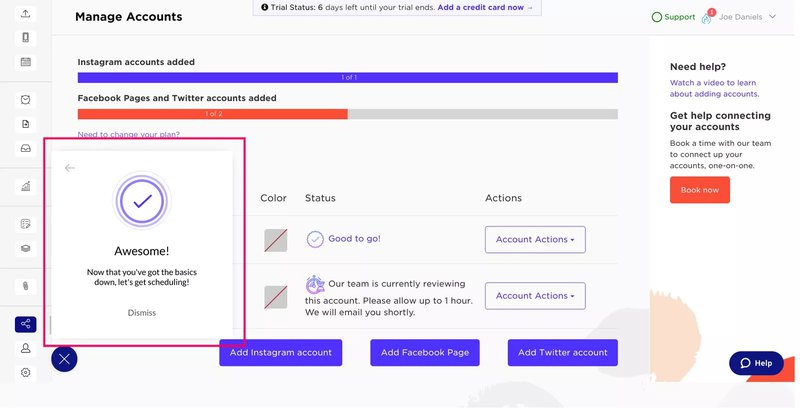
The rest of their tour is a checklist-based flow, with gentle nudges (slideouts) and fun moments of encouragement. When users complete a task, they get a celebratory message. Simple but powerful.
What we learned: Let users go at their own pace, and celebrate milestones to keep them engaged. Sked saw a 3x boost in conversion.
3. Grammarly
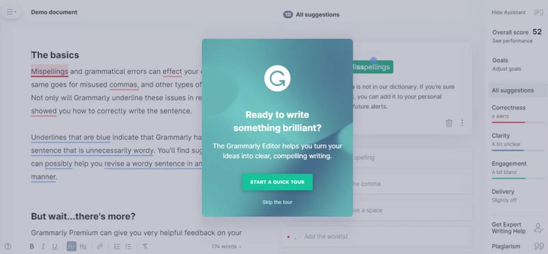
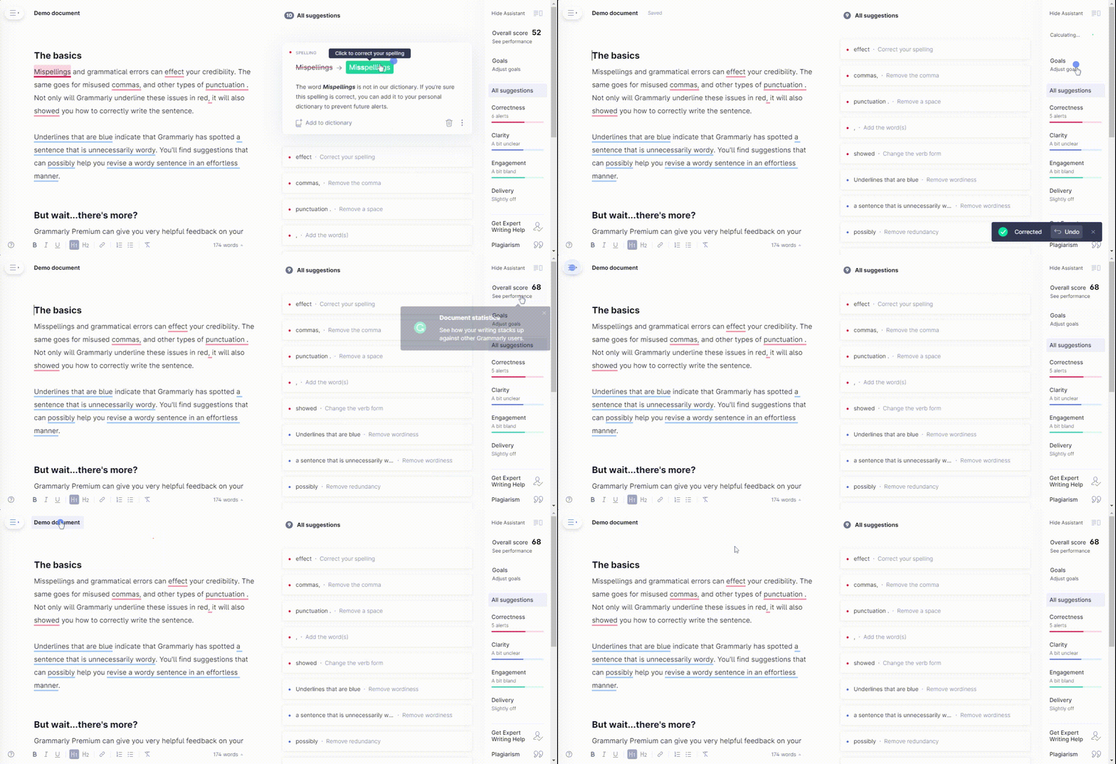
Grammarly’s tour is short, sweet, and to the point. After a quick intro modal, they use tooltips to walk users through setting goals and using shortcuts.
But the kicker? They give you error-filled demo content to play with. It’s onboarding by doing.
What we learned: Hands-on onboarding sticks. Users retain more when they actively use features during the tour.
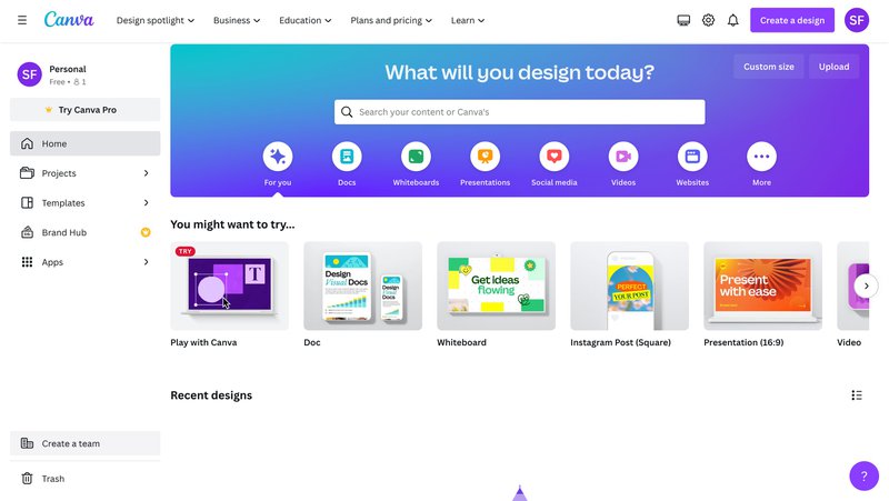
4. Canva
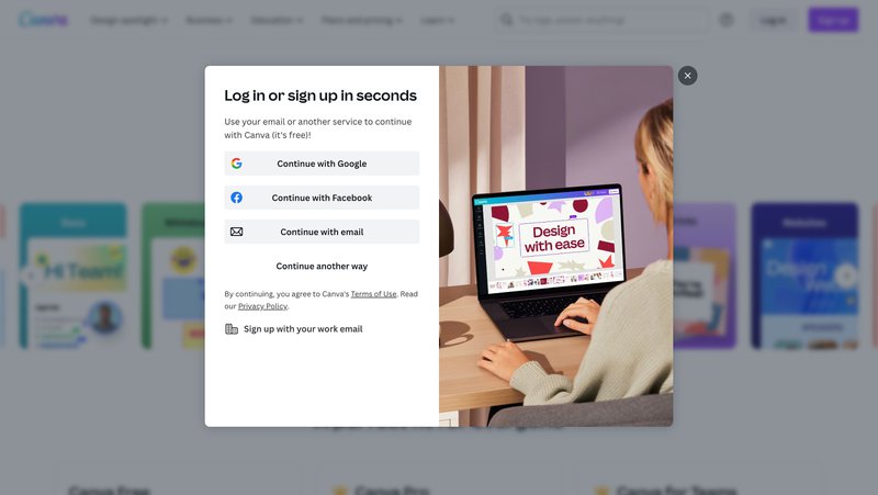
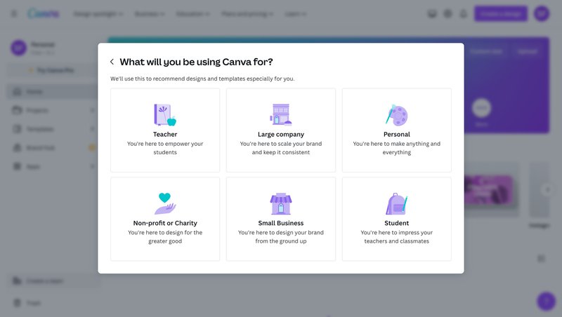
Canva starts with frictionless SSO login, followed by a quick survey that personalizes your dashboard. Smart move.
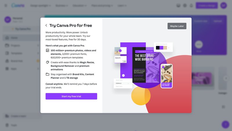
Then comes a reverse trial, letting users test Canva Pro from day one. That’s a great way to nudge upgrades.
What we learned: Personalization and early exposure to premium features increase the likelihood of both engagement and upsell.
5. Attention Insight
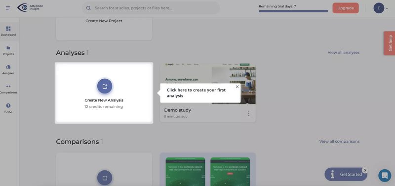
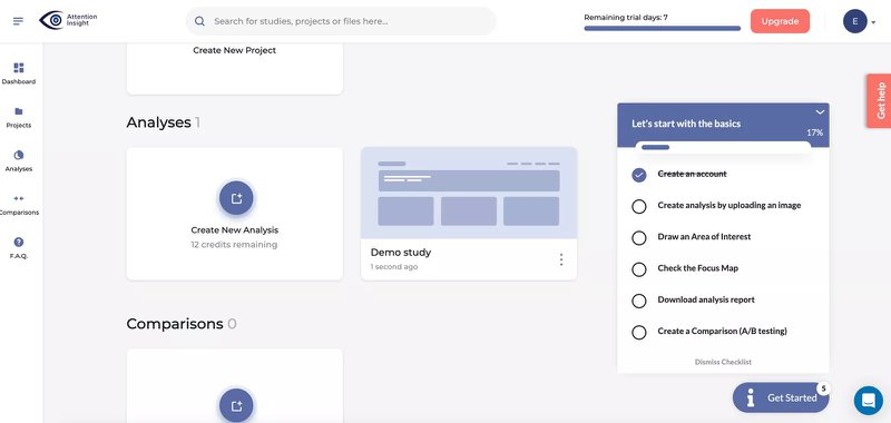
Just like Impala and Sked Social, Attention Insight organizes its product tour around a checklist with essential onboarding tasks. Breaking down the process like this allows users to focus on one task at a time.
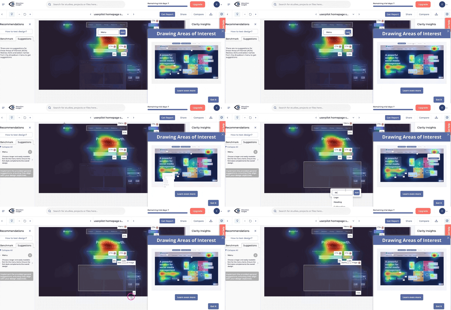
Checklist-driven, video-augmented, and goal-oriented: that’s how I’d describe Attention Insight’s tour.
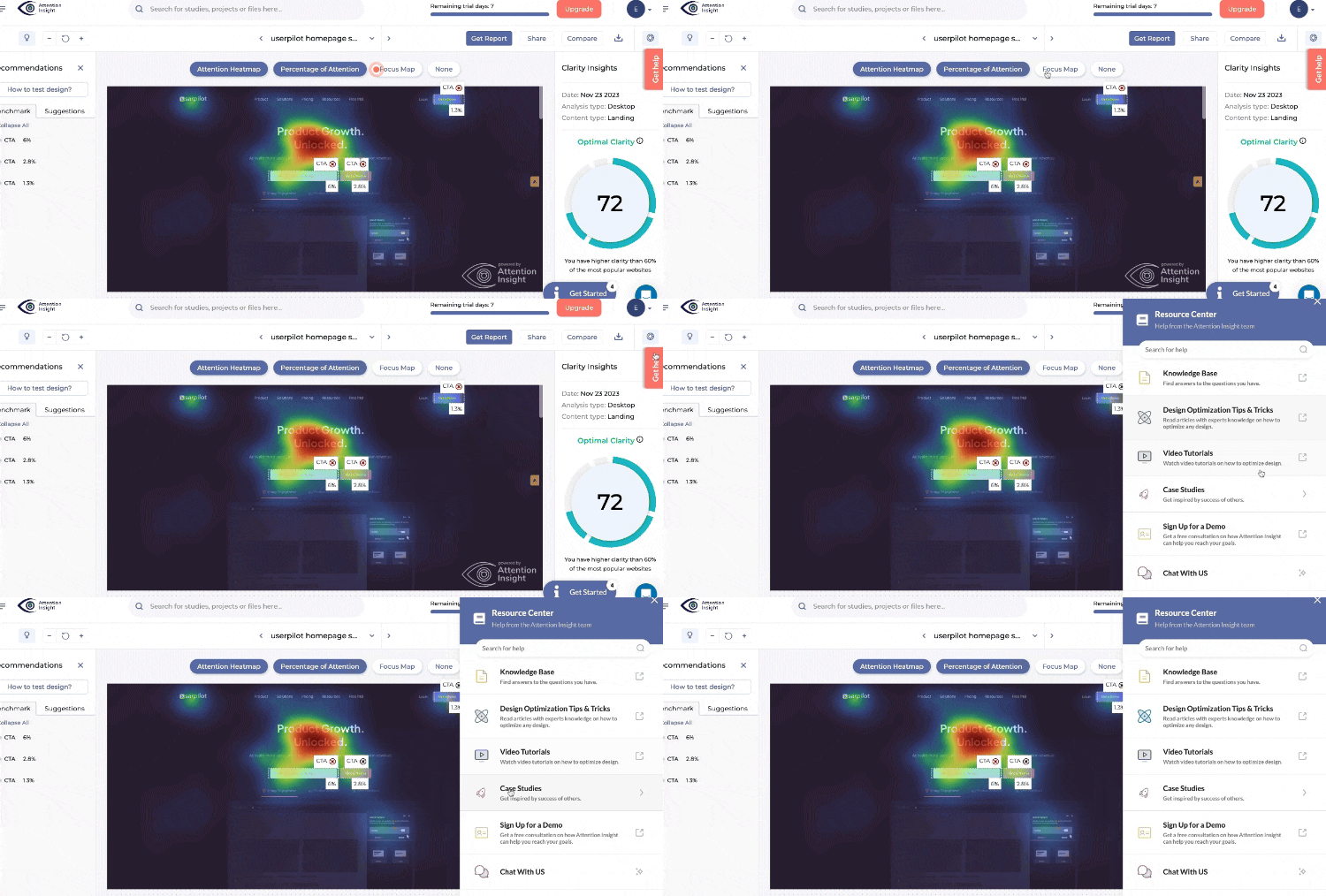
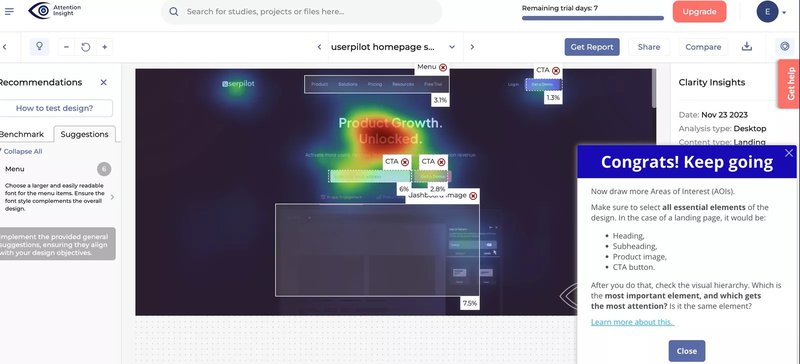
They guide users through creating their first analysis and tagging Areas of Interest, all backed by quick how-to videos. Add a resource center for FAQs, and you’ve got a solid onboarding experience.
What we learned: Combine visual guidance with self-serve support to reduce friction and boost activation. Since implementing the product tour and support resources using Userpilot, Attention Insight increased activation rates for creating analyses by 47%, while user engagement with AOI tagging increased by 83%.
6. HubSpot
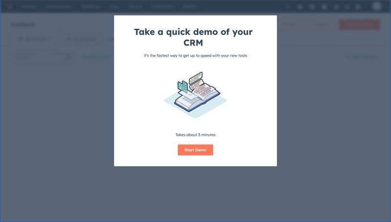
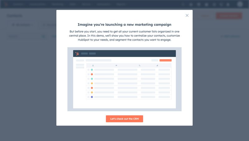
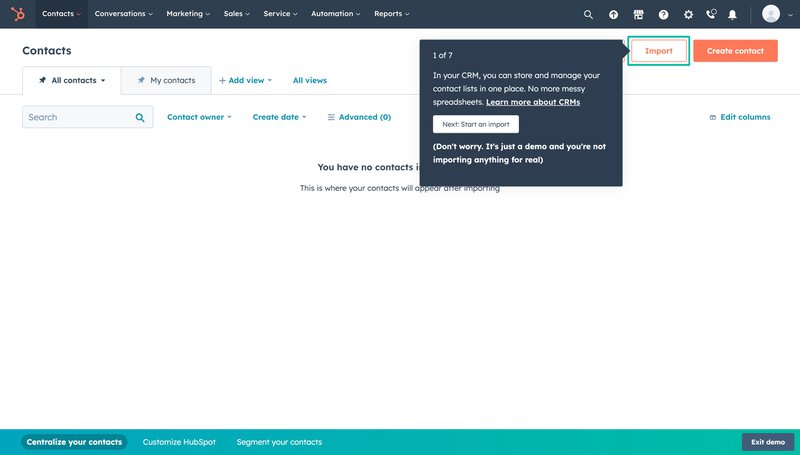
HubSpot onboards new users through a demo account where they can learn how to use the CRM’s key features without worrying about making mistakes: zero risk, just learning.
Their CRM tour walks users through a real-world campaign workflow with tooltips, emphasizing benefits like segmentation and customization.
What we learned: Low-pressure learning environments help users build confidence and explore more features.
7. Loom
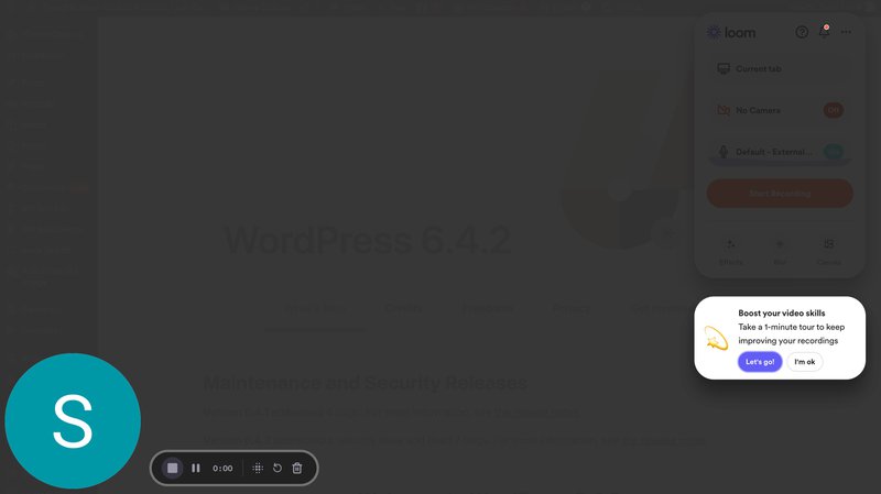
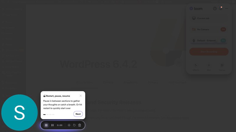
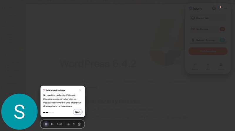
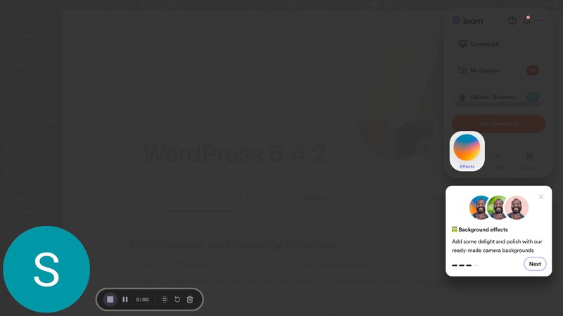
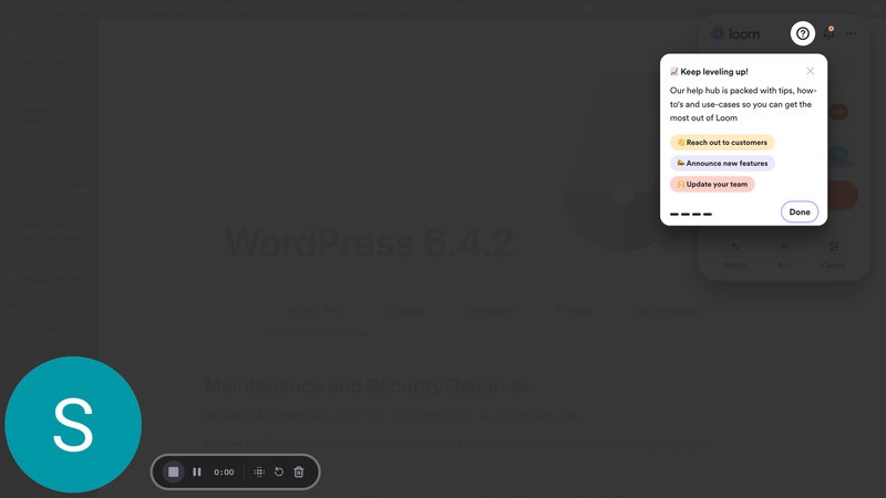
Loom’s 1-minute tour highlights core video recording actions like pause, resume, and edit. Then it directs users to a knowledge base for deeper exploration.
8. Kommunicate
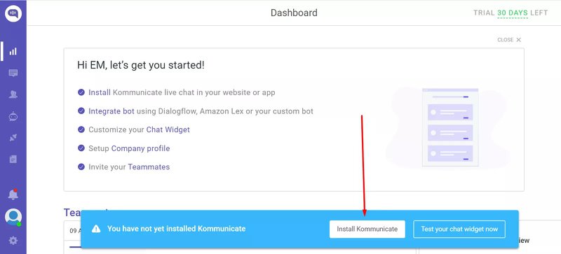
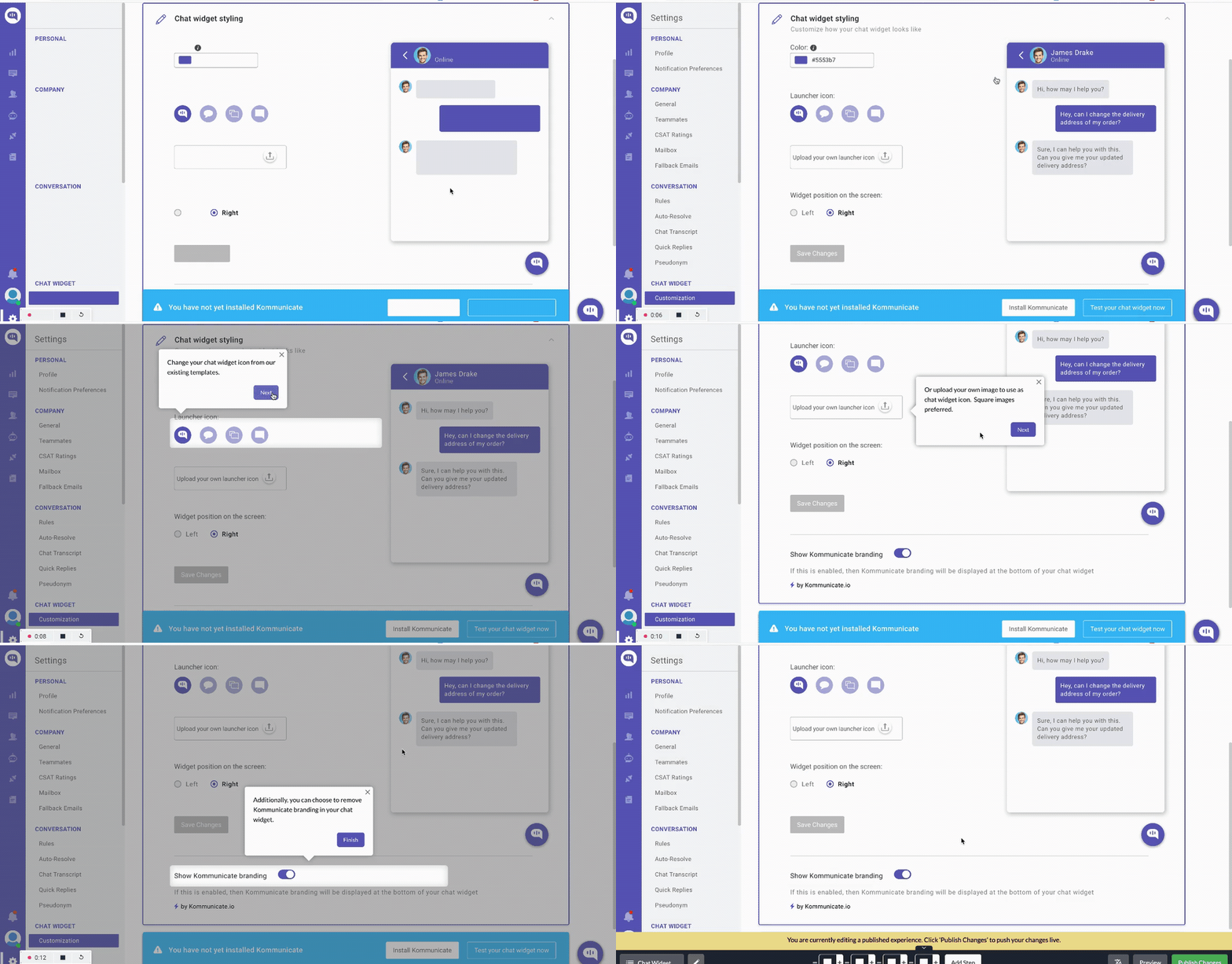
Kommunicate uses banners, checklists, and walkthroughs to drive adoption. The tour starts with a banner encouraging users to install the tool.
Then, an interactive checklist and walkthroughs explain critical steps like bot setup and widget customization.
What we learned: A mix of subtle prompts and deep walkthroughs keeps users progressing without being pushy. The interactive walkthrough (created using Userpilot) increased the feature usage by 3%, while the product adoption rate increased by 4% after the checklist implementation.
9. Groupize
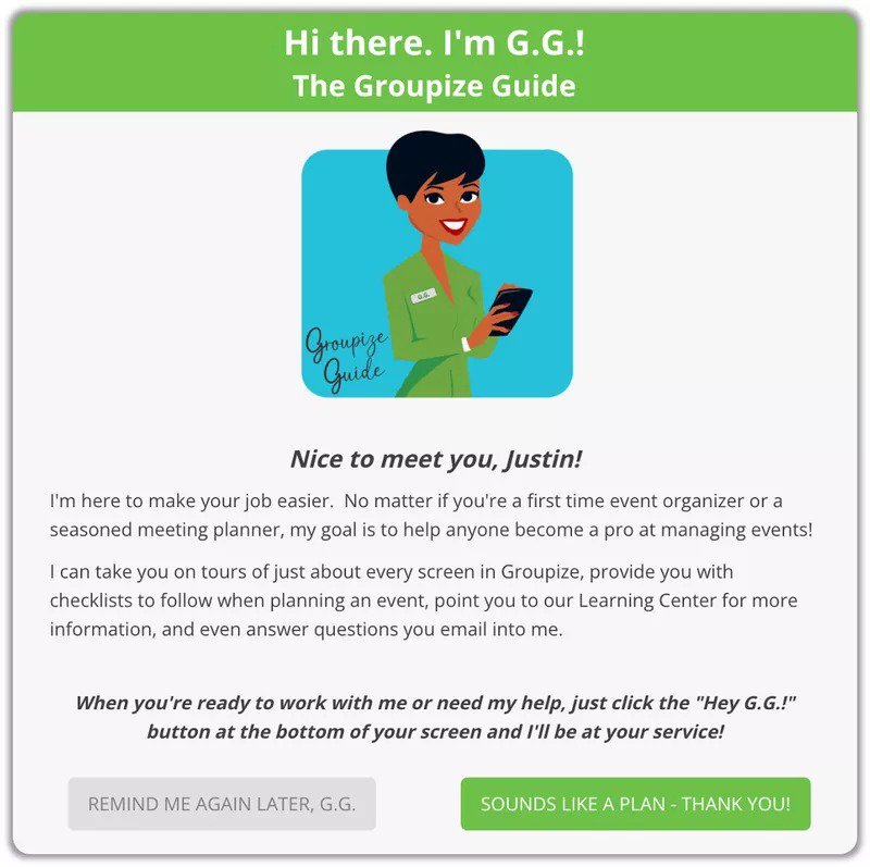
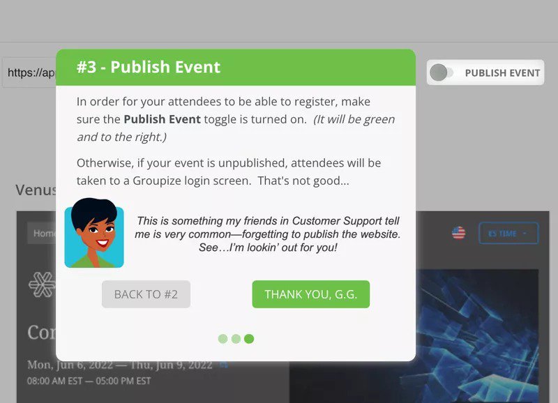
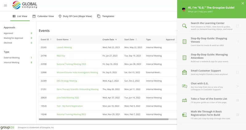
Groupize has an in-app guide (literally called G.G.) that acts like a personal assistant.
G.G. walks users through publishing an event and accessing learning resources, all triggered from the help center.
What we learned: Give users an always-available assistant, and they’re more likely to explore features when they’re ready.
10. Kontentino
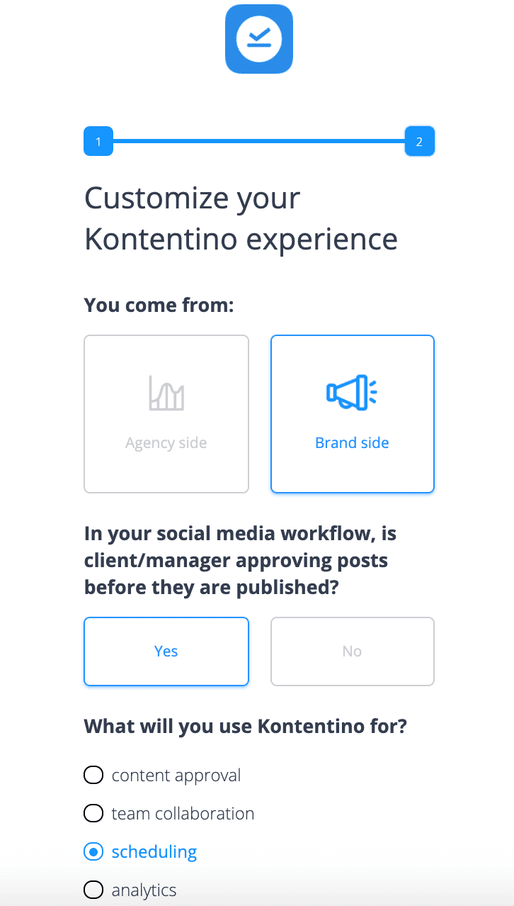
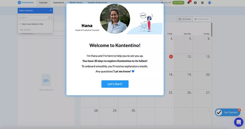
Kontentino kicks off with a welcome survey to segment users, then introduces Hana from Customer Success. It’s a human, personal touch.
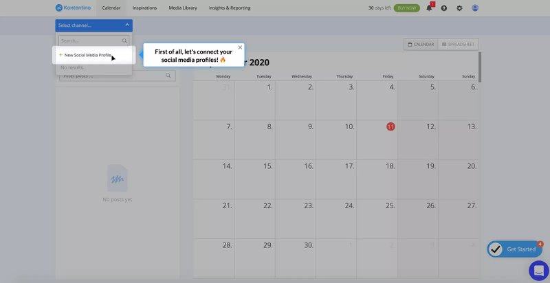
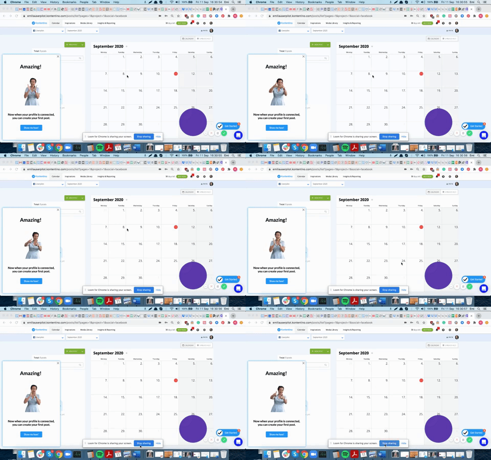
Tooltips walk users through connecting accounts, and every success is celebrated with a fun GIF.
Kontentino observed a 10% increase in activation in the first month after implementing the flow (created using Userpilot).
What we learned: A warm welcome + relevant tips = a 10% activation boost in the first month.
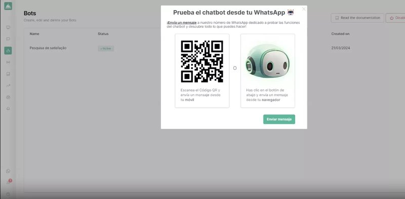
11. Callbell
Callbell is a multi-channel communication platform that uses Userpilot to improve its onboarding process.
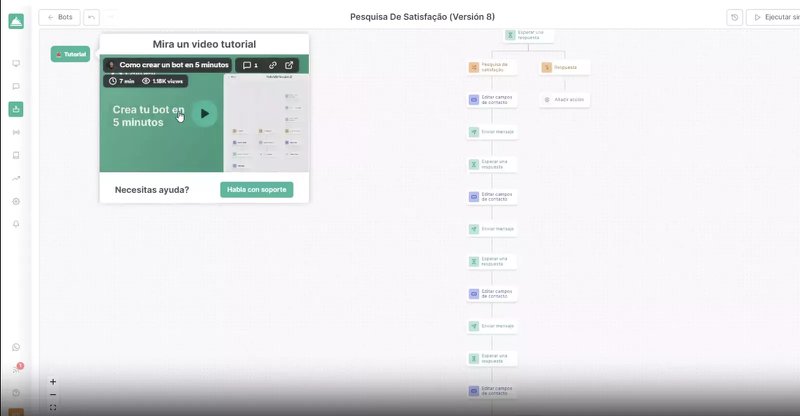
Callbell’s onboarding checklist gets right to the point. It includes short, engaging modals and tooltips that introduce features like chatbot testing via browser or QR scan.
Some steps even include embedded video tutorials.
What we learned: Bite-sized guidance works best when paired with quick wins and visual support.
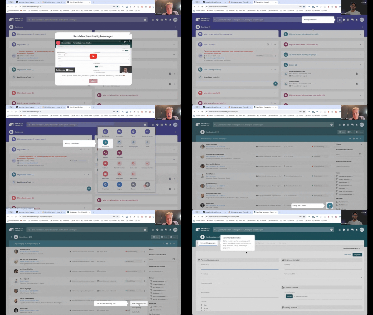
12. RecruitNow
RecruitNow is a candidate tracking system that helps recruiters streamline the screening process.
It uses a mix of video walkthroughs and self-service resources to onboard users.
But what really stands out? Localization. They offer onboarding in multiple languages, crucial for scaling internationally.
13. Rocketbots
Rocketbots, like many other companies, uses an onboarding checklist to organize the onboarding tour and guide its users to the Aha! moment.
Each step is tied to a meaningful task, like creating a workspace.
After implementing this checklist and walkthroughs, Rocketbots saw a significant boost in user engagement and conversion metrics. Activation rates doubled from 15% to 30%, and conversion rates increased from 3% to 5%. This improvement in onboarding led to a remarkable 300% increase in MRR.
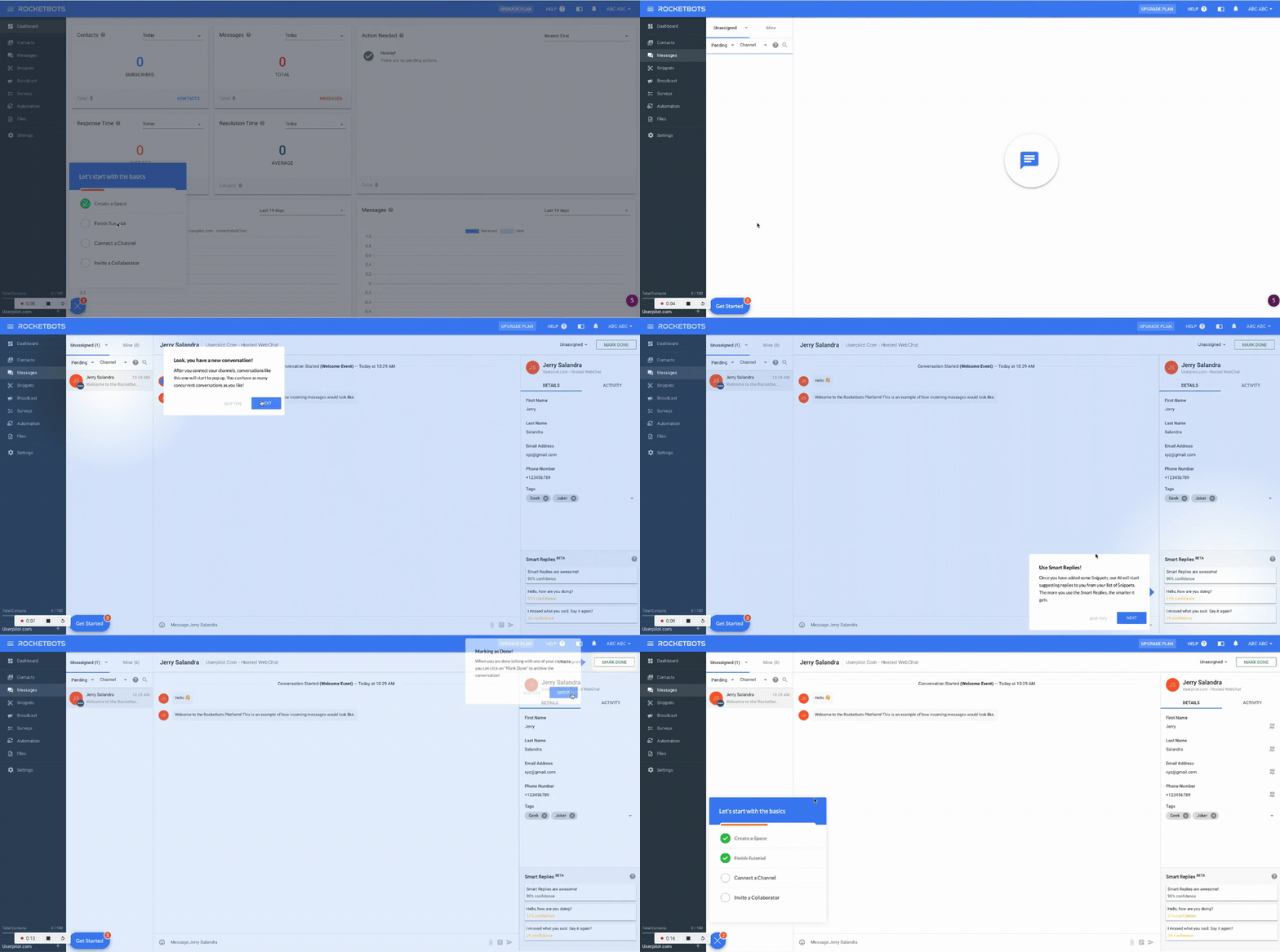
What we learned: Focus on small wins that ladder up to big results. Let users feel progress.
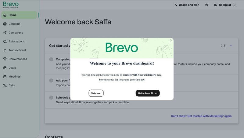
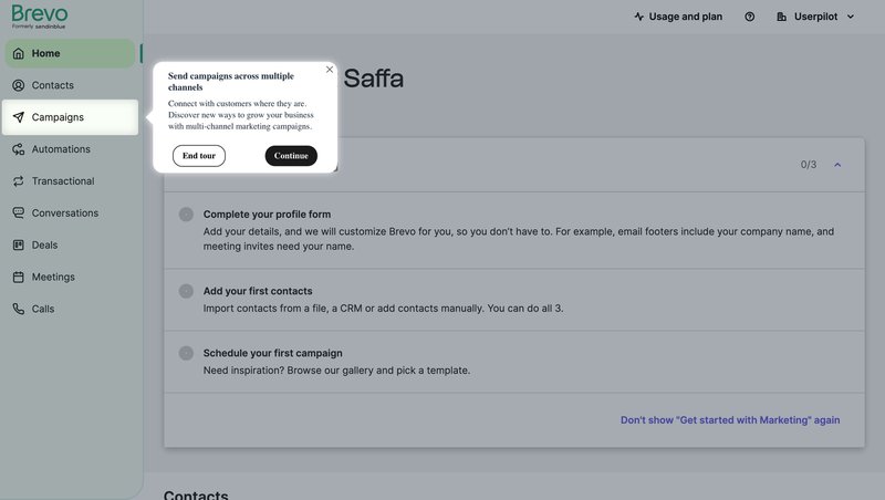
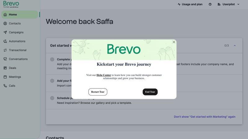
14. Brevo
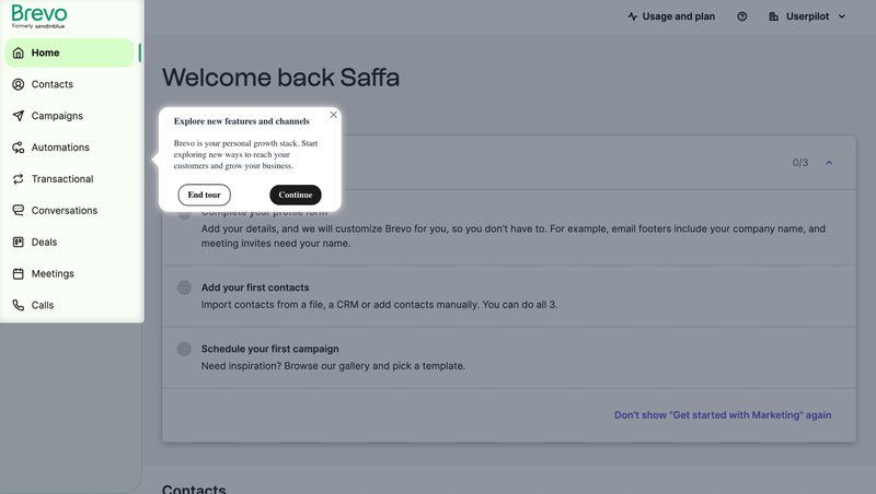
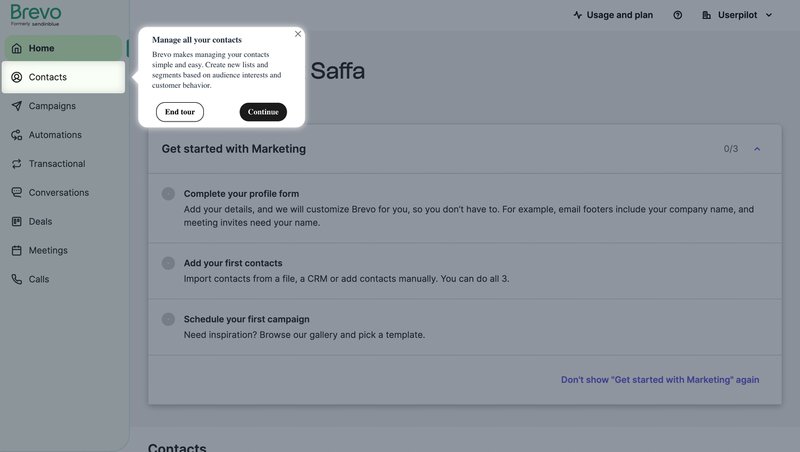
Brevo uses progressive disclosure: one tooltip at a time, gently introducing users to features like multichannel messaging and contact management.
They wrap the tour with a prompt to explore the Help Center.
What we learned: Don’t overload users. Let them explore step by step and know where to get help.
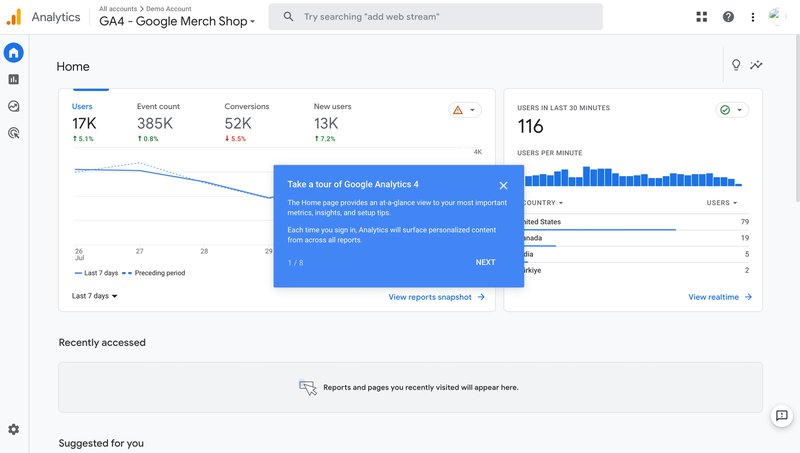
15. Google Analytics 4
When Google launched GA4, marketers had been using its previous version, Universal Analytics, for 15 years. That’s a lot of habits to change.
To flatten the learning curve and smooth the transition to a very different UI, the company created a customer onboarding walkthrough.
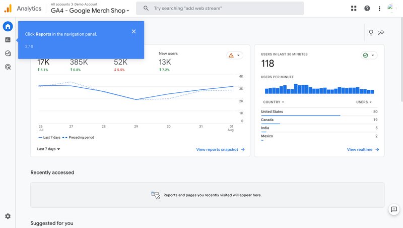
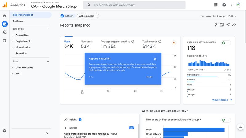
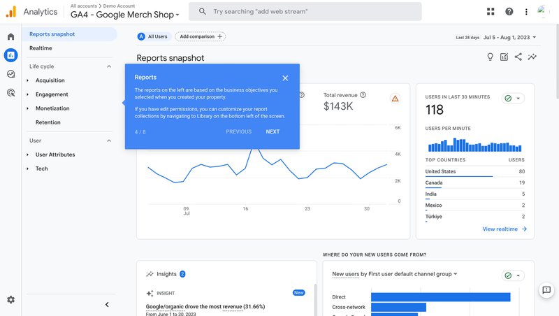
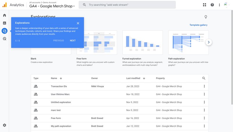
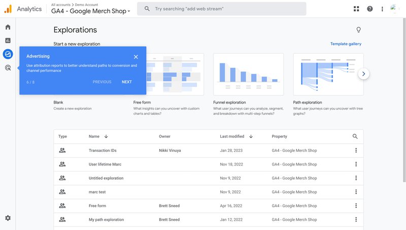
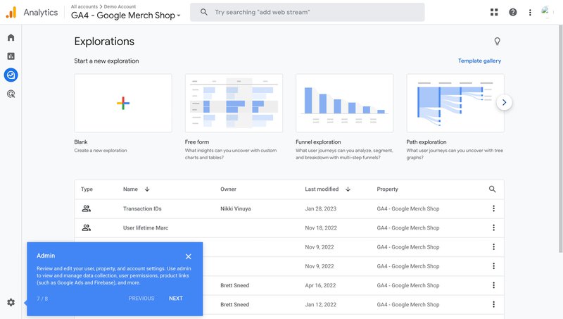
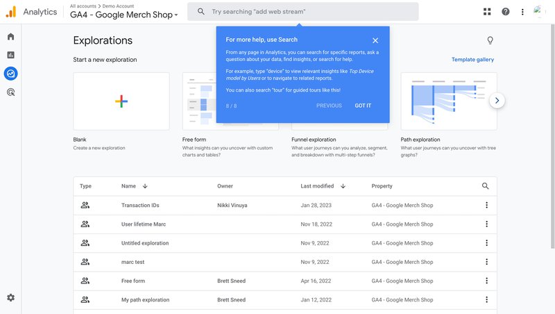
The GA4 tour consists of 8 steps. It starts on the Home page with an introductory message highlighting the page’s quick-access metrics.
Subsequent tooltips guide users through the key sections like Reports, Explorations, or Admin in the navigation panel and explain their application and benefits.
Let’s face it: the tour isn’t enough for users to master such a complex tool. However, it helps them find their way around once they start exploring it on their own.
What we learned: Even the most complex products benefit from a simple orientation flow.
Tips and best practices for creating effective product tours
Having gone over the 15 examples, let’s look at a few best practices that you can learn from them.
Create personalized interactive product tours
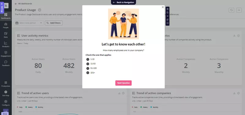
If you have more than one user persona, personalize the onboarding tour.
It’s a no-brainer:
As each user persona has different objectives, they also need different features—or use the same features in a different way. A one-size-fits-all approach won’t work because you will distract and overwhelm them with irrelevant guidance.
Start personalization by segmenting your users. Use welcome surveys to gather data about their roles and use cases.
Next, map the user journey for each persona, focusing on the most optimal path to their goals. Path analysis can help find the most common routes users take. Finally, design a flow that guides users along the happy path.
Gamify the product tour to boost engagement
Gamifying product tours can make onboarding more engaging and enjoyable, encourage users to complete the tour faster, and help them retain the information.
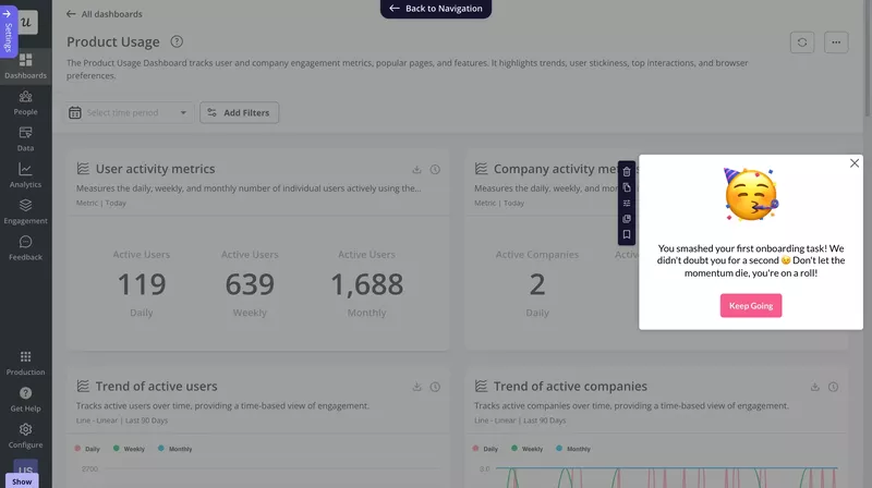
Here’s a simple example: a celebratory modal congratulating the user on completing their first onboarding task. By rewarding them, it motivates the user to carry on.
How else can you gamify product tours?
- Add progress bars to show users how far they’ve gone.
- Incorporate challenges, like completing a task within a limited time.
- Embed a story that ties together each tour step.
Enable users to view the product tour on demand
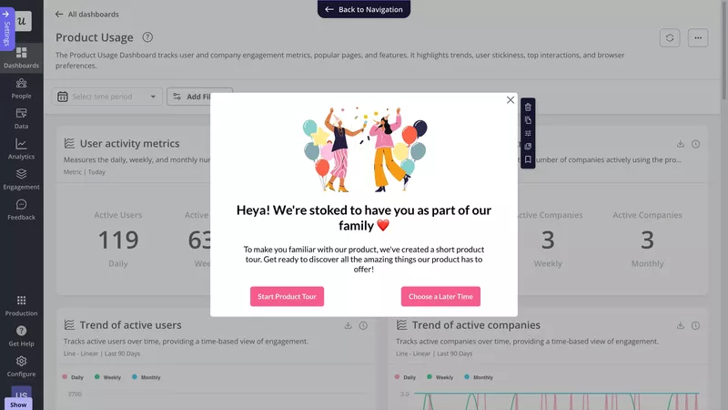
It’s good practice to trigger the product tour as soon as the user logs in.
But here’s the catch:
Many users skip the product tour when they first log in. Or they complete it but don’t pay enough attention and miss important details.
In either case, give your users a chance to view the product tour again whenever they need. For example, by adding it to your resource center.
Include progress indicators to encourage users to complete the tour
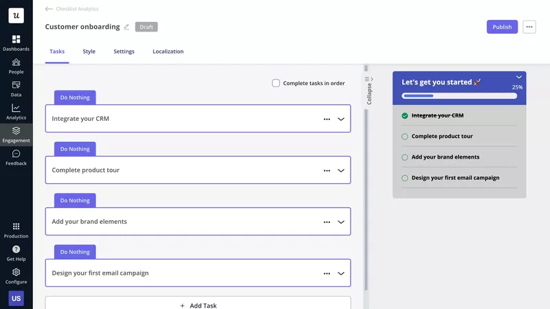
I’ve already mentioned progress bars when talking about gamification, but let’s take a closer look at them.
In a nutshell, they’re brilliant!
They motivate users to complete the tour. That’s because they reinforce the Zagairnik effect, a psychological process that makes people carry on until they complete whatever they’ve started. And the closer they are to the end, the stronger the drive.
Progress bars also set clear expectations as to how long the tour is going to take. When users know what they sign up for, they’re less likely to drop out.
Test different flows to choose the best-performing one
A/B testing is one of the most popular kinds of marketing experimentation. You create two versions of the flow, trigger one for 50% of the test sample, while the other 50% gets to see the other version. And watch which performs better.
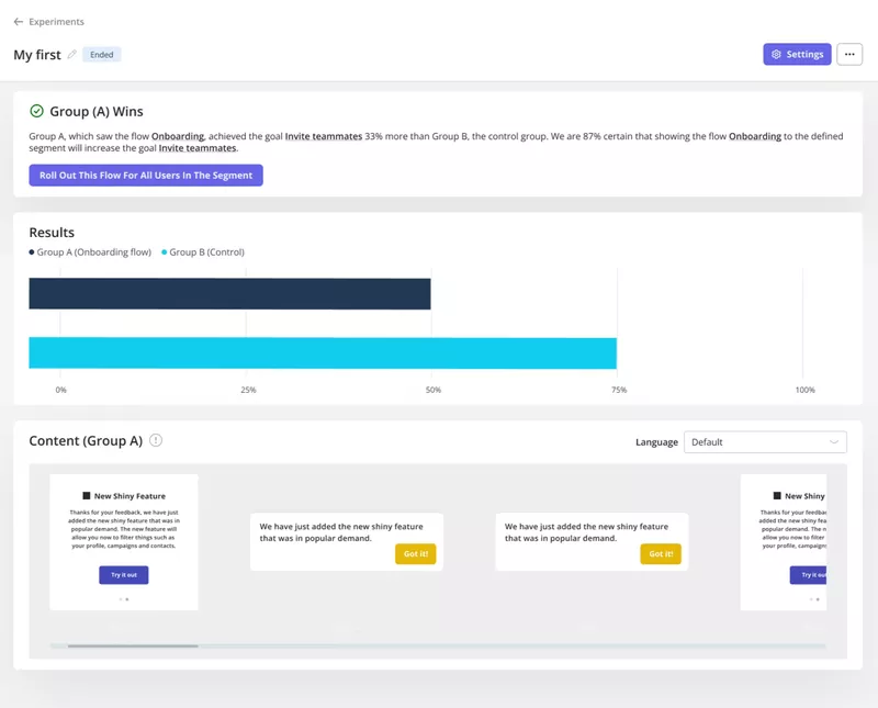
However, this can be time-consuming when you have lots of versions to test.
Solution? Multivariate tests. They’re just like A/B tests, but you can test multiple variables at the same time.
How to create product tours with Userpilot
Userpilot is the best product tour software with powerful onboarding, feedback, and analytics features. So, it has everything that you need to create product tours.
Build product tours without coding
Creating product tours in Userpilot requires no coding.
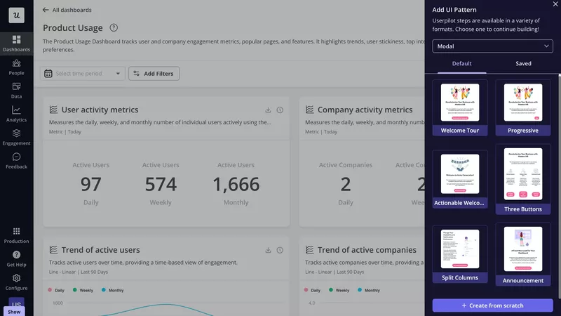
First, you choose what UI pattern you want to create (tooltip, modal, slideout, hotspot, banner, or driven action) and pick a template from the library.
Next, you customize it in the visual editor – tweak the layout, change the color patterns, and all that jazz. Repeat this for all the UI patterns in the tour.
Localize the interactive product tour for different user segments
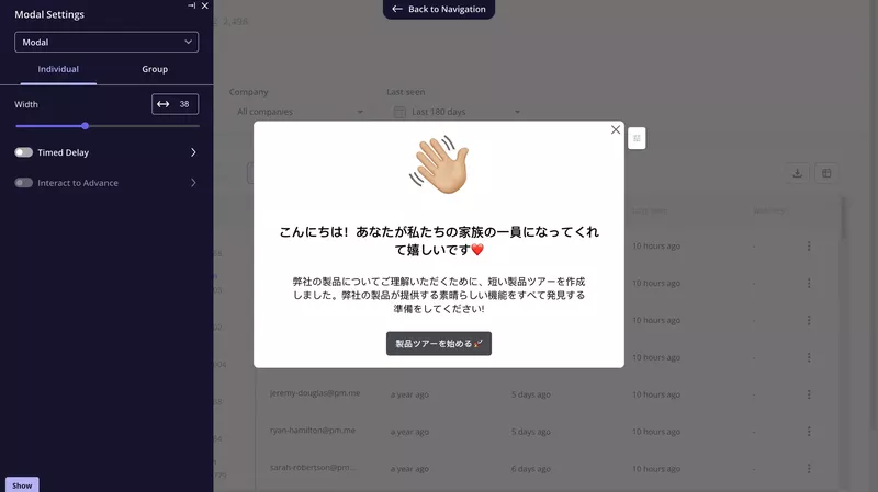
As a SaaS company, you probably have customers from all over the place. If so, why not localize the tour so they can see it in their language? This makes it more engaging.
Once you enable the localization feature in Userpilot, it translates the in-app pattern copy or survey questions automatically based on the language you choose.
Trigger product walkthroughs contextually
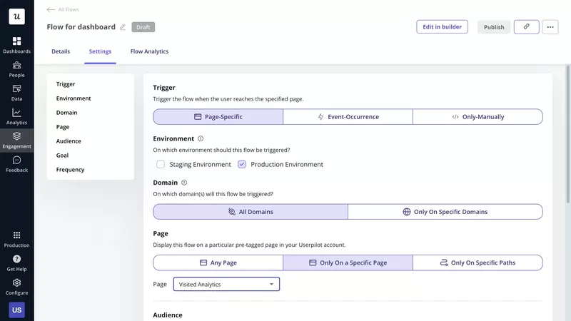
Userpilot allows you to trigger your interactive walkthroughs contextually. This means users see it exactly when they should. For example, when they click or hover over a related feature.
Such triggering makes the guidance more relevant and increases the user’s chances of adopting the feature.
How does it work?
Userpilot offers event-based triggering. You choose an action that the user needs to complete for the tour to start.
Monitor the performance of product tours
Thanks to Userpilot analytics, you can measure the product tour’s performance.
First, you can use Flow analytics to gauge user engagement with your in-app experiences and identify opportunities to improve them. For example, low completion rates may indicate that the tour is irrelevant or confusing.
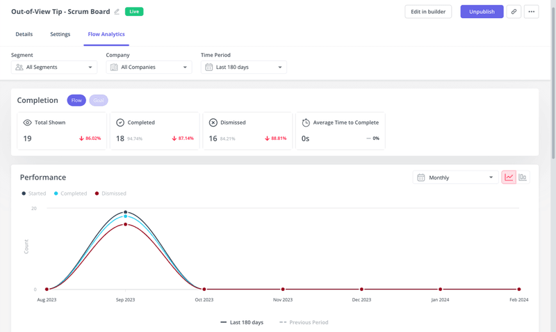
On a higher level, you can measure the impact of the tours on your key metrics, like user activation, product adoption, or account expansion.
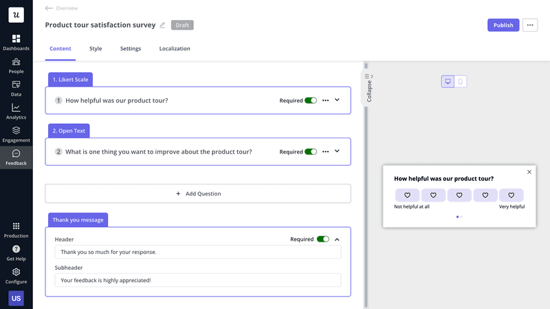
And let’s not forget about the in-app surveys you can use to gather user feedback. For example, you could run them in the middle of the onboarding process to assess how well it meets user needs.
Conclusion
We’ve helped hundreds of SaaS companies design product tours that boost activation, reduce support tickets, and drive expansion.
If you’re ready to build something better, book a demo and we’ll walk you through how we can help.
No fluff. Just results.
FAQ
What is a product tour?
A product tour is an interactive guide that helps new users explore and understand a SaaS product’s key features. Designed to simplify onboarding, it introduces users to the product’s essential functions and helps them to experience its value quickly.
What are the benefits of using product tours in your user onboarding process?
Product tours are crucial for user onboarding as they remove friction and highlight essential features right from the start. By guiding users through the initial steps, product tours reduce the time to value. This improves user engagement, activation, and retention rates.
What are the different types of product tour UI patterns?
Product tours can take various forms, with each UI pattern serving a unique purpose:
- Tooltips: Box-shaped patterns that provide contextual information and highlight specific elements without requiring user action.
- Modals: Pop-up windows used to showcase new features, capture feedback with surveys, or provide guidance on how to complete a task.
- Slideouts: Similar to modals but usually smaller, they slide in from the side or bottom of the screen instead of popping up.
- Driven actions: Users must complete actions before proceeding, which is perfect for task-based guidance.
- Hotspots: Nonintrusive icons used to draw user attention to specific UI features. When clicked, they offer additional information.
How to build a product walkthrough?
Building a product walkthrough involves several key steps.
First, set your goals, for example, increasing product adoption or improving feature discovery.
Next, analyze user behavior in-app to find the most optimal path to conversion. Use the insights to design the UI pattern sequence.
Finally, conduct A/B tests to choose the best-performing tour and track how well it drives your goals.
What are the best product tour tools on the market?
You can build a product tour, but it is usually a mistake. It eats up engineering time that should be spent on your core product. I prefer using dedicated product tour software because it allows marketing and product teams to iterate quickly without writing code.
Here’s a shortlist of the best product tour tools:
1. Userpilot
I use Userpilot because it balances power with ease of use. It is built specifically for SaaS teams who want to drive growth. You can create flows, checklists, and surveys without coding. The Chrome Extension builder lets you click on your live app to place tooltips, which saves massive amounts of time.
What I find most useful is the auto-capture feature. It tracks user interactions automatically, so I can create segments based on behavior (like “users who clicked ‘Export'”) without needing to ask developers to set up custom event tracking beforehand.
2. Appcues
Appcues is the veteran in this space. They have a solid builder and a lot of educational content. Their flows look good out of the box. However, I have found their pricing to be steep for startups, and their analytics capabilities often require integrations with other tools like Amplitude or Mixpanel to get the full picture. If you are looking for alternatives, you can check this comparison of Appcues alternatives.
3. Pendo
Pendo is powerful, especially for enterprise companies that want deep analytics combined with guides. But that power comes with complexity. The learning curve is steep. If you just want to build a tour and get it live today, Pendo might feel like overkill. It often requires significant engineering effort to set up initially.
4. UserGuiding
If budget is your primary concern, UserGuiding is a decent entry-level option. It is cheaper than the others and covers the basics like tooltips and hotspots. However, I found the customization options limited. As you scale, you might find yourself outgrowing it quickly.



![Best User Onboarding Tools for SaaS [Categorized by Use Case]](https://blog-static.userpilot.com/blog/wp-content/uploads/2025/06/Best-User-Onboarding-Tools-for-SaaS-1024x670.png)


