User Onboarding in 2026: Is Yours Ready for PLG in the AI Era?


Most onboarding flows in 2026 already fail before a user opens them. Users sign up, look at the welcome modal, dismiss it, and start clicking around to figure out if the product is worth the next 30 seconds of their attention. That decision happens before any “tour” finishes loading.
Every product-led growth playbook from the last three years told us this would happen. The whole premise of PLG is that the product motivates the signup, then motivates the activation, with no hand-holding from a human in the loop. The catch: most of us kept building onboarding flows as if they were the value-delivery channel themselves, when they were only ever meant to be the bumpers around it.
In 2026, that gap is obvious. AI-native products like Cursor, Lovable, and Notion deliver value in the first few seconds. Their “onboarding” is minimal, and then takes the user straight to the boarding session. The SaaS activation benchmark sits at 37.5% with a median time-to-value of 1 day 12 hours, which means almost two out of three new signups in the average B2B product still never get to first value. Those numbers don’t move with a longer flow. They move when the product itself does more of the work.
The thesis of this article: in 2026, PLG user onboarding should mostly be done by the product itself. Your onboarding flows are bumpers, built to keep users on the straight line to first value, shave time-to-value, and catch the people who wander. Here’s what this post covers:
- The state of user onboarding in 2026
- Eight opinionated best practices that actually move activation.
- Four user onboarding examples worth copying
The state of user onboarding in 2026: the product should do most of the work
The big shift since this article was first written: user onboarding stopped being a process you build for the user and started being a property of the product itself. The product gets the user to value. The flow you build on top is there to handle the wandering, the friction, and the personalisation, not to manufacture the value.
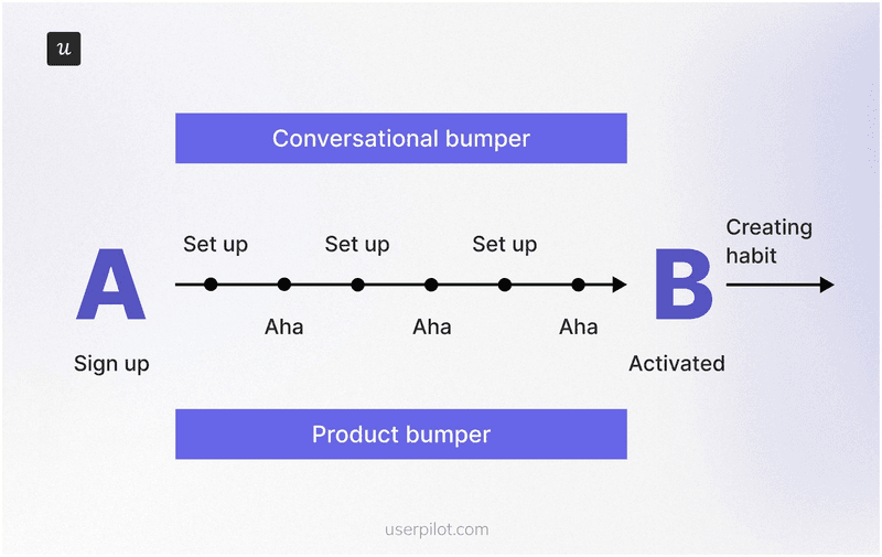
This is Wes Bush’s argument from chapter seven of the ProductLed book on onboarding, the Bowling Alley framework. Picture a bowling lane. The user signs up at one end. The strike at the other end is the moment they experience your product’s core value, what most of us call the “aha”. Everything between those two points is the lane. The product is the ball rolling down it. Your onboarding flow is the bumpers.
In most B2B SaaS products, 30 to 40% of the onboarding steps are unnecessary, another 20% are advanced features that should be delayed to a second pass, and only the remaining green steps belong in the user’s first session. When companies actually apply the Bowling Alley audit, users reach value two to three times faster. Two things to call out from his framework that the rest of this article leans on:
- Product bumpers are the in-product guidance you build (checklists, tooltips, contextual hotspots, hints). Use them only at the steps where users actually wander off the line. Random tooltips on every feature are noise, not guidance.
- Conversational bumpers are the onboarding emails, in-app messages, and nudges that bring sidetracked users back. Same rule: tied to a real wander point, not sent on a calendar.
The second reason the product has to do more of the work in 2026 is the Halving Principle. Wes Bush’s framing in The Evolution of Product-Led Growth: PLG x AI: for any job that can be done digitally, the time from intent to outcome halves every few years. Better tooling halves it gradually. AI halves it rapidly. PLG 2.0 is the version of PLG where the product, often with AI inside it, collapses the workflow and delivers a usable output before the user would have finished configuring the old version of the same tool.
“For any job that can be done digitally, the time from intent to outcome halves every few years. Better tools halve it gradually. AI halves it rapidly.”
If your competitor is shipping an AI-native version of the same workflow, your user onboarding tour has to be shorter than their first response. The prize for getting it right is the activation lift the rest of PLG was promising the whole time. Fairmarkit’s analysis shows a 25% increase in user activation against a 34% MRR lift over 12 months, the highest impact of any “Pirate Metric” on revenue. The stakes go beyond activation, too: research consistently finds that customers with a positive perception of their onboarding experience are far less likely to churn within the first 21 days, the window where most SaaS retention is won or lost.
Another useful framework to look at user onboarding is Kate Syuma’s 6 Steps of Holistic Onboarding, which she lays out in her Growthmates piece and her Product Drive talk. According to Kate, onboarding doesn’t start at the welcome modal. It starts with the Google search the prospective user runs and ends when they form a habit around the core value.
The six steps go as follows:
- Search: the user looks for a solution to a problem.
- Website: the user explores your product’s possibilities before they sign up.
- Sign-up flow: the user goes through the necessary actions to set up the product.
- First session: the user’s first real interaction with the product.
- Path to aha: the user experiences the core value.
- Habit forming: the user builds a habit around the core value.
Two of those six steps (search, website) happen outside the product. The other four happen inside, and that’s where the product itself does most of the work. In Kate’s own case study, an AI-assisted onboarding agent more than doubled activation, not because the AI replaced the product, but because it tightened the bumpers around the steps where users were wandering. That’s the right way to think about AI inside your onboarding: not as a new user class, but as a sharper bumper builder.
One more frame, this one from inside Userpilot. When I asked our Head of Customer Success, James Mitchinson, what good user onboarding looks like from the outside, he described two streams that run in parallel:
“For all users coming onto the platform, having a guided onboarding journey is a good approach. We always think of that in terms of getting a user to the most important first value on the platform. You build onboarding checklists that tell the user we think these things are important, but they can go at their own pace. And then there’s also going to be a subset of users who struggle, because their use case is complex or there are nuances. That’s where the proactive monitoring approach really comes in, so we can see if people are missing milestones or aren’t where they should be on the journey.”
Two streams of user onboarding running side by side: a general guided onboarding for everyone, plus proactive milestone monitoring for the subset who fall behind. Both are bumpers around the product, never the product itself. Hold onto that two-stream model, it shows up again in the best practices.
💡 Read related blog posts: Product-led growth in 2026: what’s changed and what hasn’t
User onboarding best practices for 2026 (opinions, not table-stakes)
Most “best practices” lists for user onboarding in 2026 are the same list you saw in 2022, with the year number bumped and a paragraph about ChatGPT glued to the front. The eight below are the ones I actually believe in for designing onboarding that drives successful activation, taken from my own work at Userpilot and from the conversations I have had with our product, design, and customer success team members. Each one is opinionated. Some contradict the standard advice.
1. Communicate the value proposition of the feature from the first interaction
The most common user onboarding mistake is launching a feature with a huge welcome screen full of paragraph text. Users dismiss it in under a second, and there is no second chance to land the value proposition.
The fix is to make the first thing the user sees demonstrate what the feature does, in a single sentence or a single screen. A different pop-up won’t save you. If your modal needs more than one short paragraph to help users understand the value, the feature itself probably isn’t doing enough work yet, and that’s a product problem dressed up as an onboarding problem (more on that distinction in best practice five). If the text won’t compress, swap it for a 20-second video tutorial that shows the outcome.
2. Keep user onboarding flows short and light
When I look at the flows I have shipped that worked, they have one thing in common: they were short. This observation goes in line with the Bowling Alley argument. Bush’s audit removes 30 to 40% of the steps in a typical onboarding flow because most of those steps are advanced features in disguise. Save the advanced features for secondary onboarding, when the user has already had a strike and is looking for more.
One practical rule that holds up across the best onboarding flows I have seen: cap your onboarding checklist at 5 to 7 items. Cognitive psychology calls this the Zeigarnik effect, the human tendency to remember and want to finish open tasks. A short, scannable checklist builds momentum and lifts task completion rates. A 15-item checklist does the opposite; it makes users feel like they signed up for homework. Anchor each item to an outcome (“Send your first test email”) rather than an action (“Configure SMTP”), and pair the checklist with a progress bar so users can see how close they are to the first value.
Lean on progressive disclosure for everything beyond the green-step list. The user does not need to see your full feature matrix in session one. Surface the next-best action when the previous one is complete, and let the rest of the surface area reveal itself as users earn it.
3. Let users explore on their own terms (and prefer interactive guides over linear tours)
This is the one that contradicts the most popular advice. The standard SaaS onboarding playbook tells you to walk users through a linear tour before they can use the feature. That works for a small subset of users (the ones who came in already convinced) and kills activation for everyone else.
What works better: give the tour as an option, and put a checklist next to it. Users who want to be walked through, take the walk. Users who want to explore click into the product. The checklist sits there as a soft bumper, so the explorers still know which actions matter. We do this inside Userpilot, and I have watched session recordings of users who skipped every interactive walkthrough and still hit activation, because the checklist gave them the roadmap and the product gave them the value. Action-based interactive guides beat static tours every time. Let users learn by doing, not by reading.
4. Personalise heavily to jobs-to-be-done, not just to role
Role-based personalisation (“marketing manager”, “developer”, “founder”) is non-negotiable in 2026, and it needs to go as granular as possible. Two marketing managers can have very different jobs-to-be-done: one is here to track campaign performance, the other is here to publish blog posts faster. The features that matter to each, and the bumpers you want to wrap around them, are different.
The answer is to ask for the JTBD at sign-up, in one survey question, and use the answer to drive the segment. Combine that with behavioral segmentation (what the user actually clicked in the first session, which surfaces they ignored, and how long they stayed), and you get different user segments that hold up under load. Built that way, you can also send the right re-engagement email to the right segment when adoption drifts, rather than blasting the whole user base. The products with the highest activation are the ones whose onboarding meets the user at the exact job they showed up for.
5. Distinguish a product problem from an onboarding problem before you build another flow
Sometimes, even the most optimized flow won’t fix your issues. The core of the problem may be your product.
The diagnostic I run, in order:
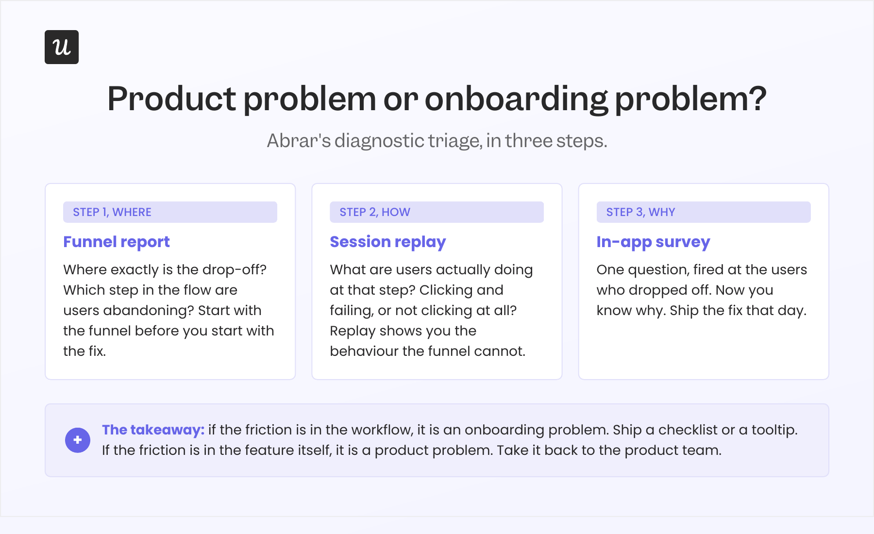
- Funnel report. Where exactly is the drop-off? Which step in the flow are users abandoning?
- Session replay. What are they actually doing at that step? Are they clicking and failing, or are they not clicking at all?
- In-app survey. Once I know where and how, I ask why with a one-question in-app survey targeted at the users who dropped off. Proactive feedback management like this is how you collect user feedback while the friction is still fresh, instead of waiting for a quarterly NPS round.
This is what activation funnel analysis actually looks like in practice: a single workflow that pinpoints where users drop off between signing up and taking their first meaningful action, and tells you whether to fix the bumper or fix the product. Without it, lost users are invisible.
If the answer is “the workflow is confusing”, that’s an onboarding problem. Add a checklist step, a tooltip, an in-app message, and ship it that day. We did this for our email feature six months ago. Domain verification was the drop-off. I built a checklist that highlighted the missing step, added a reminder, and we caught the funnel within hours.
If the answer is “the feature doesn’t do what I expected” or “this isn’t relevant to me”, that’s a product problem. No tour is going to fix it. Take it back to the product team. I once thought we had a mobile-adoption problem because only 10% of all our customers were using the mobile feature. Then I asked one survey question: “Does your company support a mobile application?” Suddenly, the number reframed itself: 25% of the customers who actually had a mobile app were using the feature. The “adoption problem” was a segmentation problem disguised as one.
6. Monitor missed milestones, not just tour completion
Tour completion is a vanity metric. Users can finish your interactive walkthrough and never adopt the feature it was teaching. The metric that matters is the activation milestone the tour was supposed to drive: the first published flow, the first invited team member, the first integration, the first export. Track key actions, not click-throughs.
James from customer success put this best when I talked to him for this piece. He told me about an account that was logging in a lot, but nothing was sticking.
“We had customers off to slow starts. One in particular, it was clear progress wasn’t being made, but there were still a lot of logins. Being able to look at the difference between those two things, lots of activity, but the outcomes aren’t materialising, gave us the opportunity to go and have a more frank conversation with the executive stakeholder, and we got them back on track before they gave up.”
If you can monitor who is missing milestones, you can route the important accounts to a human (or a higher-touch bumper) before they churn. James’s team uses Userpilot signals for this internally. It’s the second of the two streams from section one in action. The same signal works the other direction too: a quiet ticketing system can be a warning sign rather than a green light, because users who have stopped opening tickets have often stopped trying.
7. Build for measurement, not for show
Most onboarding flows ship with a “did the user complete it?” event and nothing else. That number is useful for one thing: pacing the experiment. It does not tell you whether the flow worked.
The flow worked if the milestone it was driving moved. That means every flow needs a paired metric: the flow completion rate (how many users complete the flow) AND the feature adoption rate (or the activation rate, or the milestone rate) for the same user cohort. The only flows worth keeping are the ones where both numbers move together. A flow with high completion and flat adoption is decorative; a flow that users skip while still adopting the feature was always friction.
Treat onboarding the way you would treat any other surface of the user experience. The key metrics are activation rate, time-to-value, drop-off points, product adoption rate, and retention across the time frames that matter to your business model.
Our internal benchmark is harsher than most. The average onboarding checklist completion rate across 188 B2B SaaS companies is 19.2%, with a median of 10.1%. Treat that as a baseline, not a target. The interesting question is what the activation rate looks like for the users who completed the checklist versus those who didn’t. If the gap is small, the checklist is mostly decorative.
Two more measurement habits that compound: run A/B tests on your onboarding flows the way you would on a landing page (test the call-to-action copy, the order of steps, the length of the flow), and fire a post-onboarding NPS survey two weeks after activation. NPS taken right after onboarding is one of the cleanest benchmarks for whether your flow created customer satisfaction or just completion-event noise. The B2B SaaS NPS benchmark sits around 35.7, so you have a number to chase.
8. Use one tool for building, measuring, and personalising your user onboarding
Most teams in 2026 still split their onboarding builder and their analytics into two tools. The builder makes the flows, and a separate analytics tool tracks whether anything worked. That split creates three predictable pain points: segmentation drift (the segments defined in analytics aren’t the segments you can target in the builder, so personalisation falls back to crude role splits), UX-change lag (the product UX changes, the flow anchored to the old selector breaks, you find out via the dashboard, the builder doesn’t auto-correct), and adoption blind spots (you can see that users completed the flow, but stitching that to actual feature adoption is a manual lift every time).
A consolidated tool collapses the loop. The segments are the same segments. The flow analytics live next to the product analytics. The correlation between flow completion and feature adoption is a built-in report. When the diagnostic triage from best practice 5 (funnel report, session replay, in-app survey) all run in the same place, you ship the fix in the same place. AI tightens this further: the IBM Institute for Business Value reports that 47% of customer service leaders have already adopted at least partial automation in onboarding, and Gartner projects 70% of customer service journeys will begin with a conversational AI interface by 2028. Whichever tool you pick, the rule is the same: if it can’t read the behavioural data, it’s building blind.
💡 Read related blog posts: SaaS Product Metrics Benchmark Report (547 companies)
User onboarding examples worth learning from in 2026
Four user onboarding examples worth learning from in 2026. All four are products you have probably used or heard about, picked because each one demonstrates a different way to make the product do more of the work. Each example ends with a short “lessons to learn” block.
1. Notion: ask the JTBD once, let the product do the rest
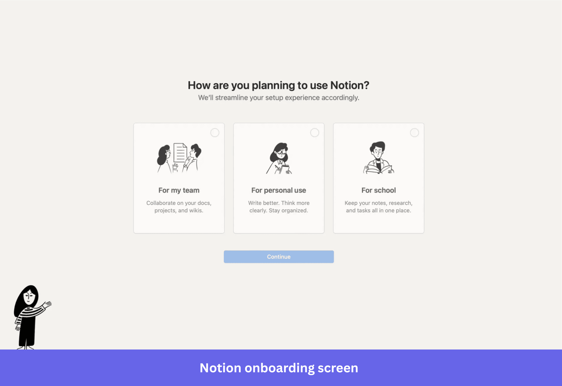
Notion’s sign-up asks one question: “How do you want to use Notion?” The options are Work, Personal, or School. The answer drives which templates show up on the dashboard, which workflows appear in the starter workspace, and what the empty state looks like. By the time the user lands on the workspace, the product already reflects what they said they came for.
What is striking is how few questions Notion doesn’t ask. No long survey, no four-page wizard. The reason Notion can afford to ask only one question is that the AI inside the product picks up the rest of the context from the user’s actual behaviour. The bumpers in their flow are minimal because the product is doing the personalisation work.
Lessons to learn:
- One JTBD question at sign-up beats a five-question wizard. Users tolerate one, they bail on five.
- Let the product’s first session do the rest of the segmentation. If you have behavioural data, you don’t need to interrogate users about preferences they haven’t formed yet.
- Templates are the most underused bumper in B2B SaaS. They give the user a starting point that already looks like success.
2. Lovable: deliver value before the sign-up wall
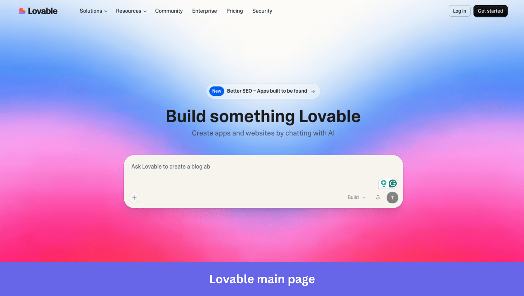
Lovable lets the user do something real before they create an account. Land on the website, and you see a ready-to-use chatbox that lets you start right away (typing into the chatbox prompts singup). There is also a gallery of community-built apps with previews.
The result, by their own reporting, is 85% day-30 retention. The lesson is older than AI: don’t gate first value behind sign-up. Lovable just made the lesson 2026-shaped by putting the work other users did on the front page.
Lessons to learn:
- Push as much of the value experience as possible before the sign-up wall. Sign-ups are friction that users tolerate for the sake of the value behind them; pull that value forward whenever you can.
- Show, don’t tell. A gallery of finished outputs is worth more than any explainer video.
- If you can’t move the value moment in front of sign-up, at least make the first session deliver something the user can keep (a draft, a template, a result) so they have a reason to come back.
3. Cursor: When the product is AI-native, the onboarding almost disappears
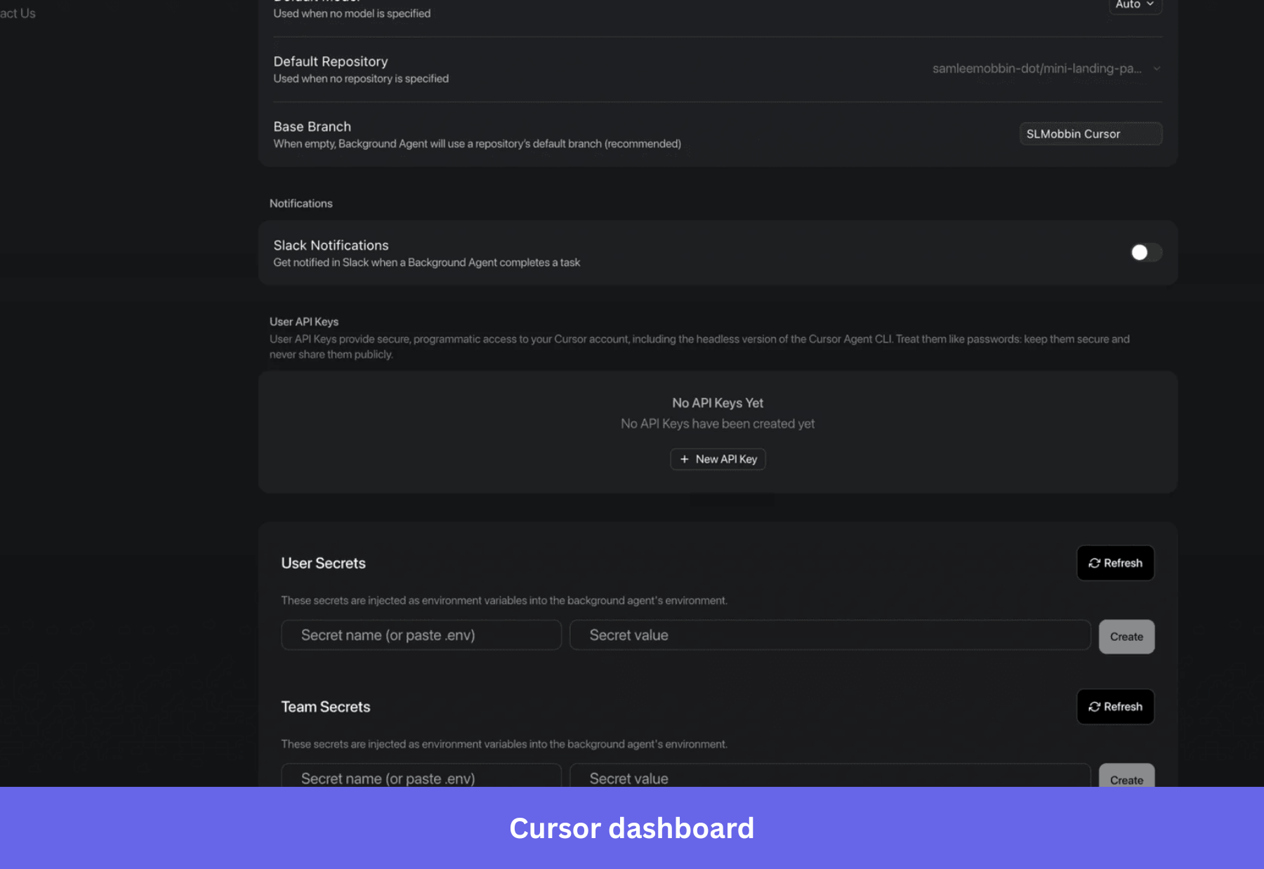
Cursor is the cleanest 2026 example of what happens when AI does the heavy lifting inside the product itself. There is no extended tour. The user opens it, points the agent at a codebase, and asks a question or a task. The product runs the workflow. Onboarding is reduced to “where do I type the prompt” and “what files am I letting the agent touch”.
Cursor operates on a minimal checklist and a masterful “empty state” dashboard that shows the user how to navigate the tool by descriptions under features. Because the tool is a powerful AI-native solution, it trusts the tool’s abilities to speak for themselves.
Lessons to learn:
- When the product is AI-native, onboarding shrinks to a single decision: what do you want done? Match that simplicity at sign-up.
- If your product is not AI-native, copying Cursor’s pattern by simply deleting your tour will backfire. The fix is the longer route: invest in the product so it carries more of the value delivery, and then you can shrink the onboarding without breaking activation.
- Use empty state smartly to prompt the user to start populating their dashboards.
4. Gamma: the deck shows up before the tour starts
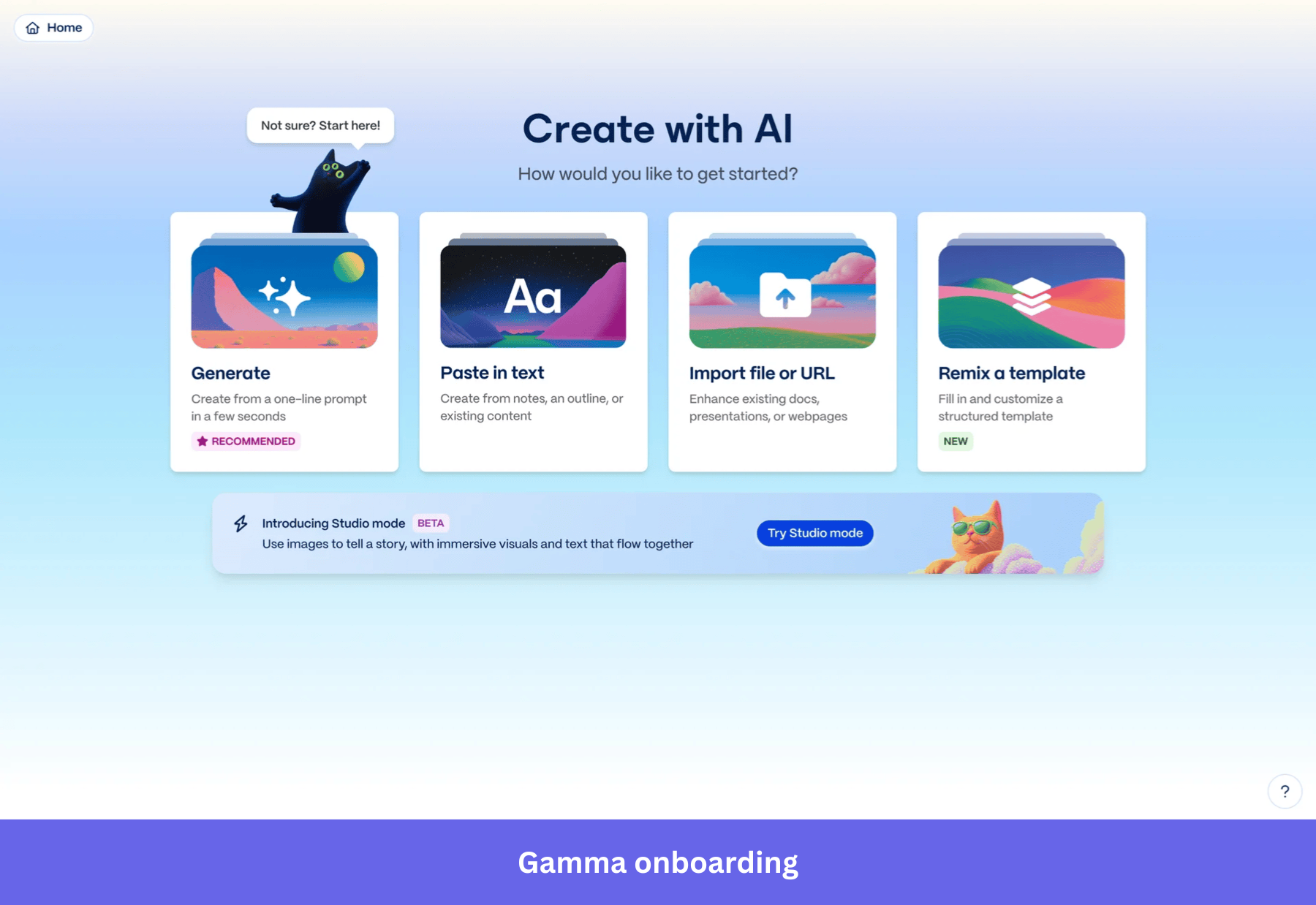
Gamma sells presentations, decks, and one-page sites. Their onboarding is the sharpest commercial example I know of Wes Bush’s Halving Principle in action. You sign up. You type a prompt (“a five-slide pitch for a Series A round, fintech, focus on regulation”). Gamma generates the full deck before you would have finished choosing a template in Google Slides. That generated artifact is the activation event.
Gamma asks one question at sign-up (“what would you like to create?”), and the user picks from a short list of formats (presentation, document, webpage, social post). The user lands in the editor with a usable artifact, and the rest of the experience is just hands-on usage. Still, Gamma allows for self-serve onboarding with the simple “Not sure? Start here!” tooltip.
Lessons to learn:
- If the product can produce a usable artifact in the first session, the artifact is the activation. Stop trying to teach the user; let them edit what the product made.
- One JTBD question at sign-up can drive the entire first-session experience. Don’t add a second question unless the answer to the first one cannot disambiguate the path.
- For any product with an AI surface, ask: can we generate the user’s first output before they have configured anything? If yes, that beats every onboarding tour you could build.
Turn user onboarding into a property of your product (for humans today, and agents tomorrow)
If you take one line from this article into your next planning cycle, take this one: your product is the bowling ball, your onboarding is the bumpers. Move anything your bumpers are doing that the ball should be doing back into the product roadmap, and let your bumpers catch whatever the product still leaves on the table, fast, in-product, without a dev ticket.
The opportunities in 2026 follow from that:
- The products that activate faster almost universally have shorter, more targeted user onboarding. I expect the The 37.5% activation benchmark to continue shrinking for products that apply smart onboarding.
- The 1-day 12-hour TTV benchmark gets halved again in any product where AI is now inside the workflow. Plan your onboarding for the version of your product that will exist 12 months from now.
- The user remains at the centre of your design work. AI agents will increasingly be in the lane, but the activation question is still: did the human (or the human’s agent acting on their behalf) hit a strike fast enough to come back tomorrow?
Treat user onboarding like any other surface of the user experience: instrument it, measure it, iterate on it. Good onboarding doesn’t try to convince users that your product is valuable, it helps them prove the value to themselves, and that’s what makes it effective onboarding rather than a marketing artifact. Done well across primary, secondary, and tertiary stages, it grows your user base by re-engaging users when their behaviour starts to drift, not after they leave.
If you want to benchmark your own activation, TTV, user retention, and checklist completion against 547 SaaS companies, the 2025 SaaS Product Metrics Benchmark Report is free.
💡 Read related blog posts: User onboarding examples · User onboarding flow · User onboarding tools · Onboarding platforms · AI user onboarding · Onboarding screen designs
FAQ
What is user onboarding in 2026?
User onboarding is the process of guiding new users from account creation through account setup to the first value moment of your product as quickly as possible. In 2026, the heavy lifting is done by the product itself, with in-app onboarding flows (welcome screens, checklists, tooltips, progress bars, in-app surveys, video tutorials, resource centers) acting as bumpers that keep users on the straight line to first value and reduce time-to-value across primary, secondary, and tertiary stages.
How do you implement user onboarding in 2026?
To implement user onboarding well in 2026, start by making the product itself deliver value in the first session, then layer flows on top only where users actually wander. Concretely: minimise required fields at sign-up, ask one JTBD question to drive segmentation, give a short checklist (5 to 7 outcome-anchored items) instead of a linear tour, instrument the flow against the feature it teaches, and run a post-onboarding NPS survey to benchmark customer satisfaction.
What are the stages of user onboarding?
Three. Primary onboarding covers everything from sign-up to the first activation milestone, helping new users discover the product’s core features. Secondary onboarding happens after activation and uses contextual tooltips, in-app guides, and prompts to introduce more advanced features. Tertiary onboarding is the ongoing layer that re-engages users with new feature announcements, lifecycle messages, and prompts that drive product adoption over the long run.
What are the key metrics for user onboarding?
- Activation rate: percentage of new users who hit the first value moment. B2B SaaS benchmark: 37.5%.
- Time to value (TTV): how long it takes a new user to hit that moment. B2B SaaS benchmark: 1 day 12 hours.
- Onboarding checklist completion: percentage of users finishing the structured flow. Average 19.2%, median 10.1%.
- Feature adoption: paired with checklist completion, the cohort comparison tells you whether the flow worked.
- Month 1 retention: 46.9% B2B SaaS average. The number that tells you whether activation stuck.
- Post-onboarding NPS: best taken 2 weeks after activation. B2B SaaS benchmark: 35.7. A clean read on customer satisfaction with your onboarding experience.
What's the difference between a product problem and an onboarding problem?
If users are getting confused at a specific step in your flow, that’s an onboarding problem. Ship a checklist update or a tooltip. If users are completing the flow and still not adopting the feature, that’s a product problem. No flow will fix it. Use the diagnostic triage in best practice five: funnel report (where), session replay (how), survey (why), in that order.
About the author