UX Design Examples That Work and Why

Good UX is invisible. You don’t notice it when it works. You only notice it when it doesn’t.
That’s what makes it so hard to learn from. Most “UX design examples” articles show you a pretty screenshot and tell you it’s clean, intuitive, or user-friendly. Which tells you nothing.
So I approached this list differently.
I spent time with the major brands and their product people use every day: tools embedded in how we work, shop, communicate, and unwind. For each one, I looked past the visuals and asked a more useful question: what specific design decision is doing the work here, and why does it change behavior?
The throughline UX designers keep returning to: reducing cognitive load by removing steps, decisions, and friction users never needed in the first place.
Good UX design examples to take inspiration from
The best way to learn about UX design best practices?
Dissecting bad design examples is one. Studying great UX design examples is another way, and that’s what we’re doing in this article.
Here are 25 hand-picked brilliant examples to inspire you. We’ve covered both B2C and B2B products, so whether you’re designing a consumer app or a SaaS tool, you’ll find something useful.
1. Google Maps visual hierarchy guides you without overwhelming you
Open Google Maps mid-navigation, and you’re never confused about what matters right now. The next instruction sits large at the top, with the street name, distance, and turn direction taking up most of the screen. Everything else shrinks down or disappears entirely.
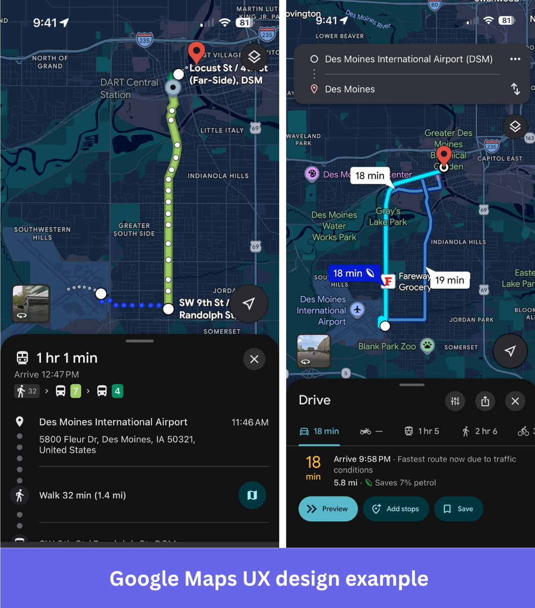
Visual hierarchy is doing the work. By controlling size, contrast, and position across the user interface, the app tells you exactly where to look at any given moment without you having to decide. Lane guidance appears only when you’re approaching a complex junction. Arrival time updates quietly in the corner. The design reduces cognitive load by making sure nothing competes for your attention at the wrong moment.
You can parse the whole screen at a glance, even when you’re doing 60 on a motorway. The same logic applies to how Maps handles travel modes. Whether you’re walking, driving, or on transit, the interface reorganizes itself around what that mode actually requires. You never have to mentally switch contexts.
Why it works: Visual hierarchy is the foundation of good UI design. When the most important information is always the most visible, the interface helps users act faster without thinking harder.
2. iPhone Vehicle Motion Cues’ accessibility design that anyone can use
If you get motion sickness reading your phone in a car, iOS 18 has a fix that’s almost absurdly simple. Small animated dots sit at the edges of your screen and move in sync with the vehicle. When the car brakes, they drift forward. When it turns, they shift sideways. That’s it.
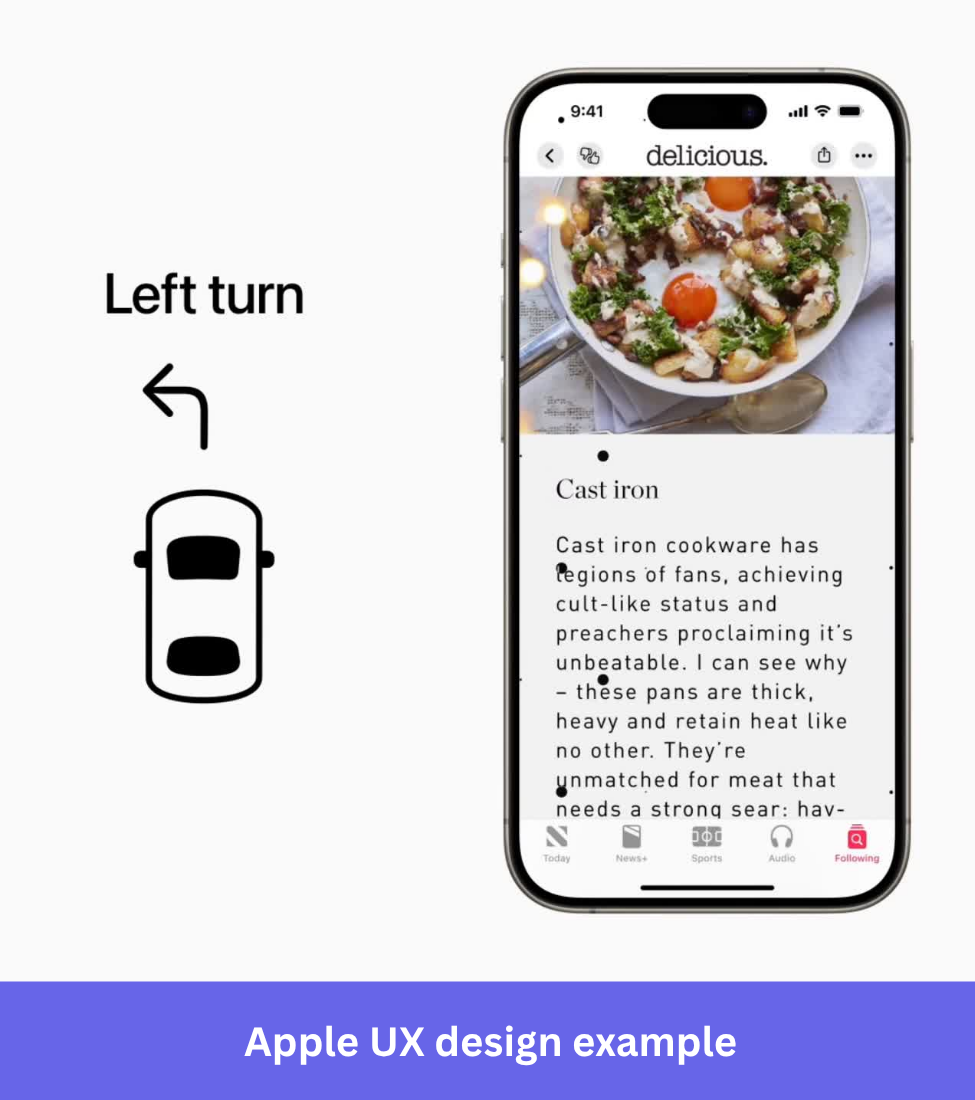
The idea is to resolve the sensory conflict that causes nausea: your inner ear feels the motion, your eyes see a static screen, and your brain doesn’t know what to believe. The dots give your eyes something that matches what your body is already feeling.
It was built as an assistive technology feature. But Marcel, the author at marcel.io, wrote that they hadn’t been able to read in a moving vehicle for 29 years and spent 24 minutes on a bus reading a full chapter without any discomfort. That’s a huge impact from a design thinking perspective.
Why it works: The best accessible design doesn’t just serve the users it was built for. When you solve a real physical problem with genuine care, the solution tends to work for everyone.
3. H&M’s intuitive navigation across thousands of products
H&M sells clothes for men, women, children, and everything in between, across dozens of categories. The navigation has to carry a lot of weight.
On the website, hovering a top-level category opens a side panel that organizes everything into clear groups: what’s trending now, main product categories, brand collections, and store utilities. Each layer has its own section, so you’re never scanning one long list trying to find where something belongs.
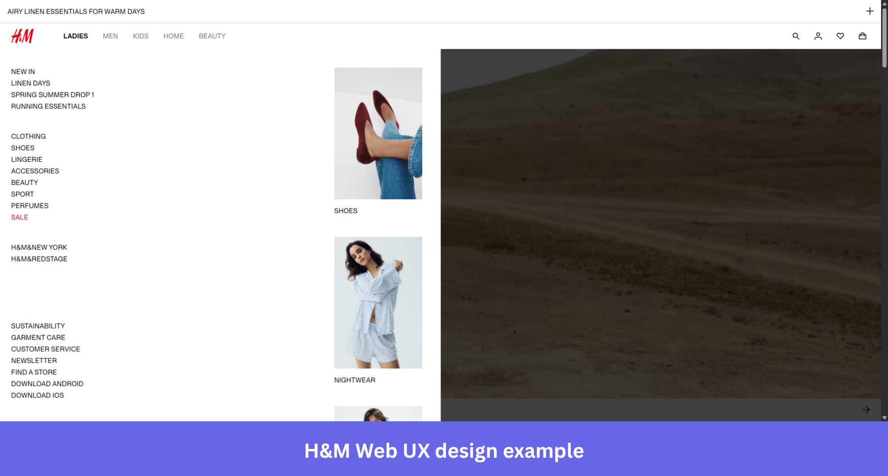
The app carries the same logic. Top-level categories sit in a scrollable tab row at the top, Women, Men, Kids, Home, Beauty, and tapping any of them drops you into a clean vertical list organized the same way: trending edits first, then core categories below. The bottom navigation bar keeps search, wishlist, account, and bag always within thumb reach. You never have to go hunting.
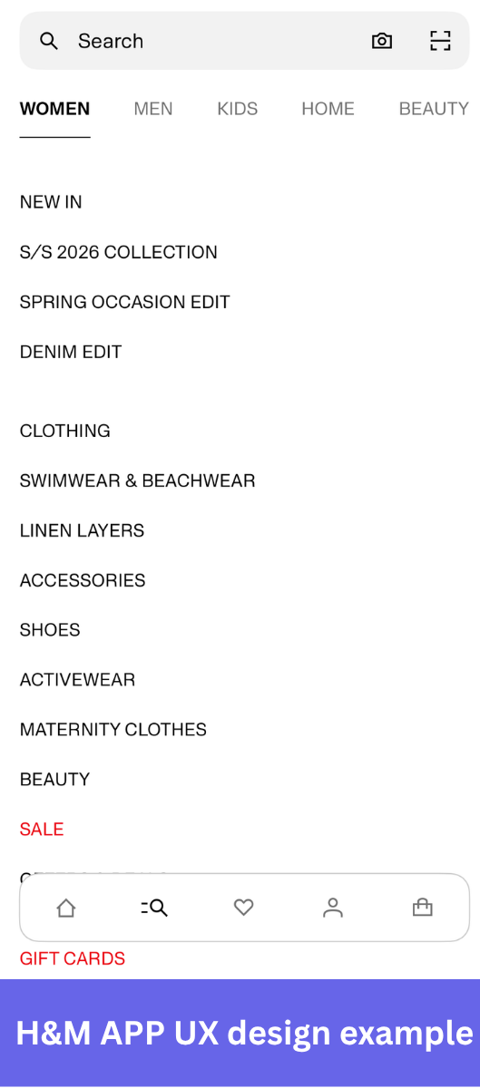
Why it works: When users find what they’re looking for without noticing how they got there, the design has done its job.
4. Trello’s enhanced UX with placeholder text
A placeholder is a visual or textual cue that sits in the interface, showing the context of the action a user should take.
Using a placeholder is a good UX practice because it removes the thinking from the process. The user knows exactly what to do, which reduces the risk of error and the time needed to complete a task.
For example, Trello’s placeholders “add a card” and “add a list” help users manage their Kanban boards and tasks by reducing cognitive load and making drag-and-drop task management feel immediate, even for new users with no learning curve.
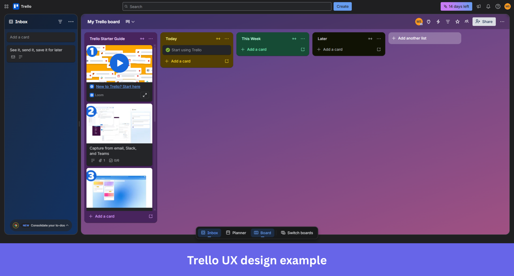
Trello extends the same thinking to permissions and board structure: users can configure both to match how their team actually works, so the tool bends to the workflow rather than the other way around.
Why it works: When the interface removes the question of what to do next, users spend their energy on the task rather than on figuring out how to navigate it.
5. Miro’s user onboarding process
Miro is built for teams who need to think visually, but its shortcuts and gestures take time to learn.
However, to fully realize the tool’s potential and complete tasks efficiently, users need to be familiar with shortcuts and mouse operations or gestures.
The best way to master them? Through practice! That’s why Miro has built an interactive onboarding.
At each step of the process, it not only shows users what they should do but also prompts them to complete the actions. Users not only see what they should do but are prompted to complete the actions.
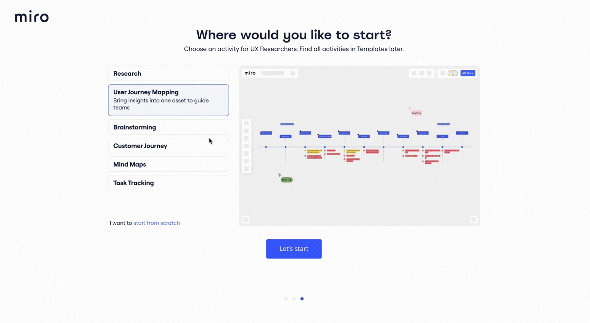
It’s the kind of user onboarding that helps new users build real confidence with the tool, not just a vague sense that they’ve seen it before.
Why it works: Watching a walkthrough and actually completing the action are different experiences. Miro’s onboarding closes that gap. Users arrive at their first real session with muscle memory rather than a vague recollection.
6. Userpilot uses progressive disclosure to avoid overwhelming users
Progressive disclosure is a design pattern that gradually shows users information over multiple screens.
Progressive disclosure reduces cognitive load by showing users only what they need at each step, making the user interface feel manageable rather than overwhelming.
For example, you can break up a multi-step process into multiple screens, just like Userpilot uses when building a checklist.
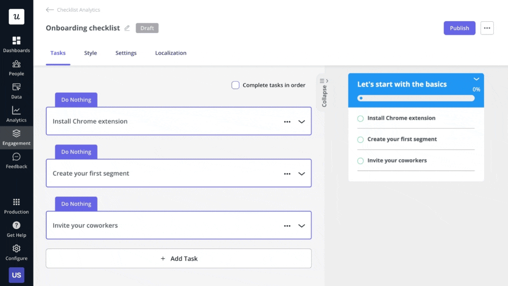
Why it works: When you break a complex process into steps, users focus on one decision at a time instead of abandoning the whole thing because it looks like too much work.
7. Asana’s unicorn that celebrates user achievements
The team behind Asana, the project management platform used across various industries, uses gamification to keep their users engaged and motivated and to inject some fun into the user experience.
This is in the form of celebratory animations of mythical creatures.
When a user completes a task, a unicorn, Yeti, Phoenix, narwhal, or otter flies across the screen. It’s a small moment, but it lands because it feels genuinely celebratory rather than transactional.
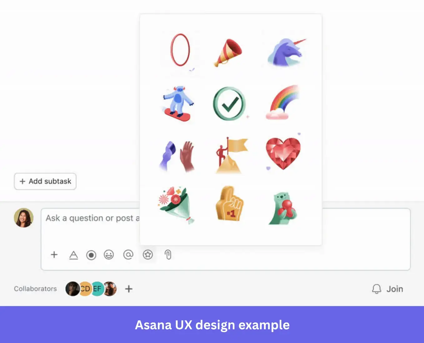
Why it works: Gamification works best when it’s tied to something the user actually did. User motivation spikes at the moment of completion. Asana’s animations fire right there, which is why they land.
8. Zoom’s simplified user-friendly interface
You aspire to have a simplified user interface with as few features and interactions as possible. A simple UI makes it easy for a user to navigate and use your product, especially for those who might not be familiar with it. The easier it is for users to find your product, the less likely they are to abandon it.
So, give users limited options to reduce mental fatigue and make buttons and icons large enough for users to easily find them on the screen.
Just like Zoom, whose simple design is one of the reasons for its success. There are no cluttered menus or interfaces. None of its options makes you think about what to do next.
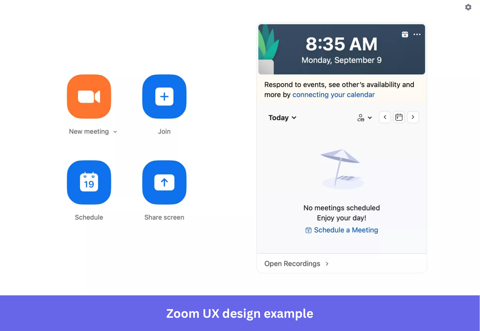
Why it works: A user-friendly interface doesn’t just look clean. It removes the decisions users didn’t need to make in the first place, which is what makes Zoom’s good UX design so easy to overlook.
9. Notion’s empty states that prompt action
Empty states are what way too many users still see when they log into the product for the very first time.
A blank page with no guidance is one of the fastest ways to lose new users before they’ve seen any value. But that’s not the experience of Notion users.
The note-taking and knowledge management app uses the empty screen to kick off its onboarding process. It offers them a checklist with basic commands useful for navigating the tool and video tutorials guiding them through key actions.
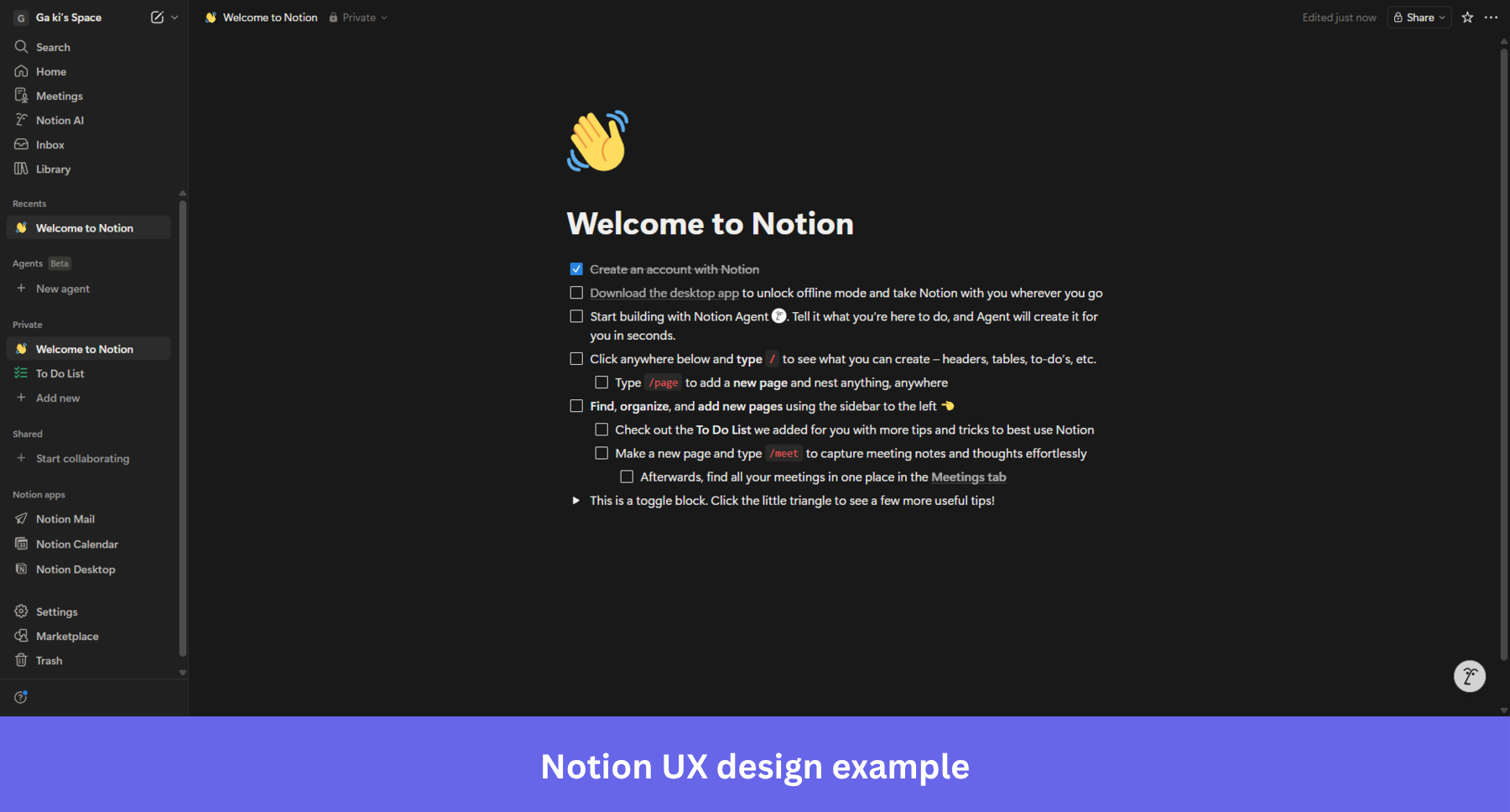
Why it works: Empty states that guide users to their first win reduce churn before it ever becomes a risk. Notion uses that first screen to start the onboarding process, where users arrive with a clear sense of where to start from the moment they sign up, rather than being abandoned.
10. Airtable’s balanced usability
irtable is a web app that asks you a few questions after sign-up, then uses your answers to personalize the onboarding experience and surface templates relevant to your use case. You’re not dropped into a blank interface and left to figure it out.
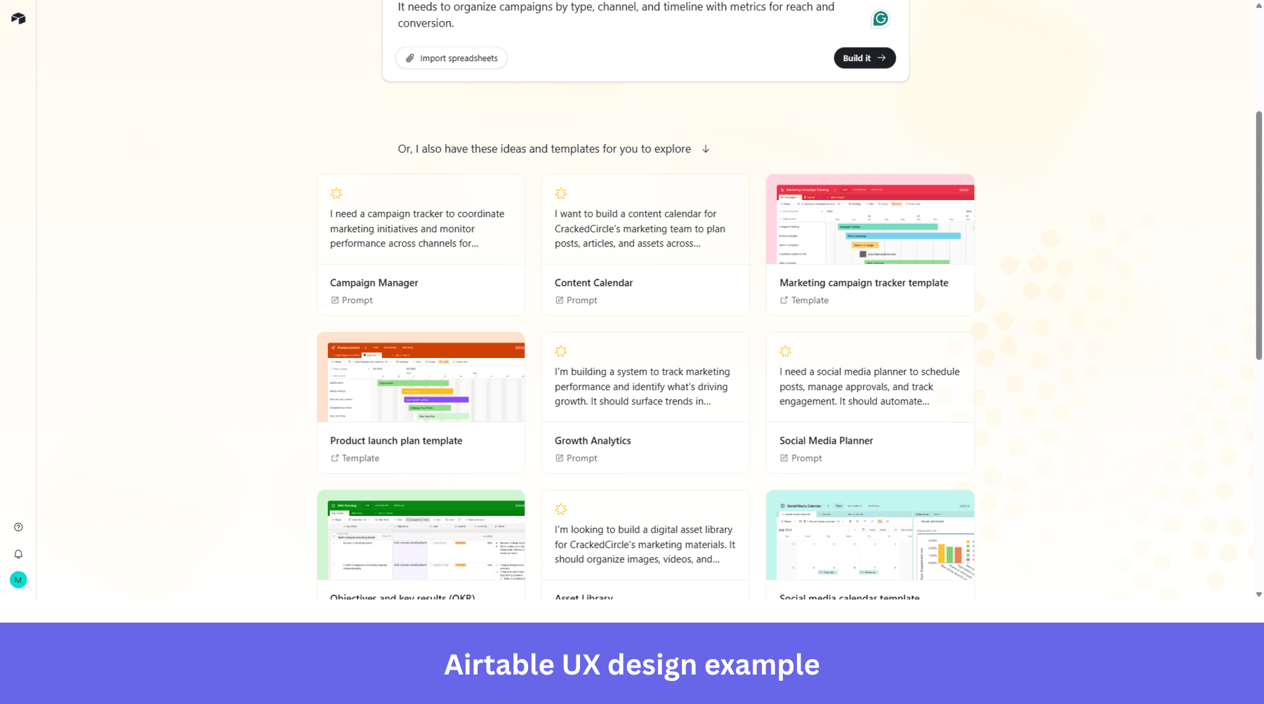
Good UX design means both sides win. The user can get their job done without being overwhelmed, and you get yours done without compromising quality.
Why it works: Sign-up forms are where most products ask for too much or too little. Airtable threads that needle by collecting what it needs without making users feel like they’re filling out paperwork.
11. Grammarly’s demo document
A product tour is an interactive guide showing new users how to use your product. It gives them hands-on experience in how to derive product value.
This is crucial for user retention. If they don’t activate, they aren’t likely to continue using the product, because they don’t see any value in doing so.
Grammarly takes the same UX principle further.
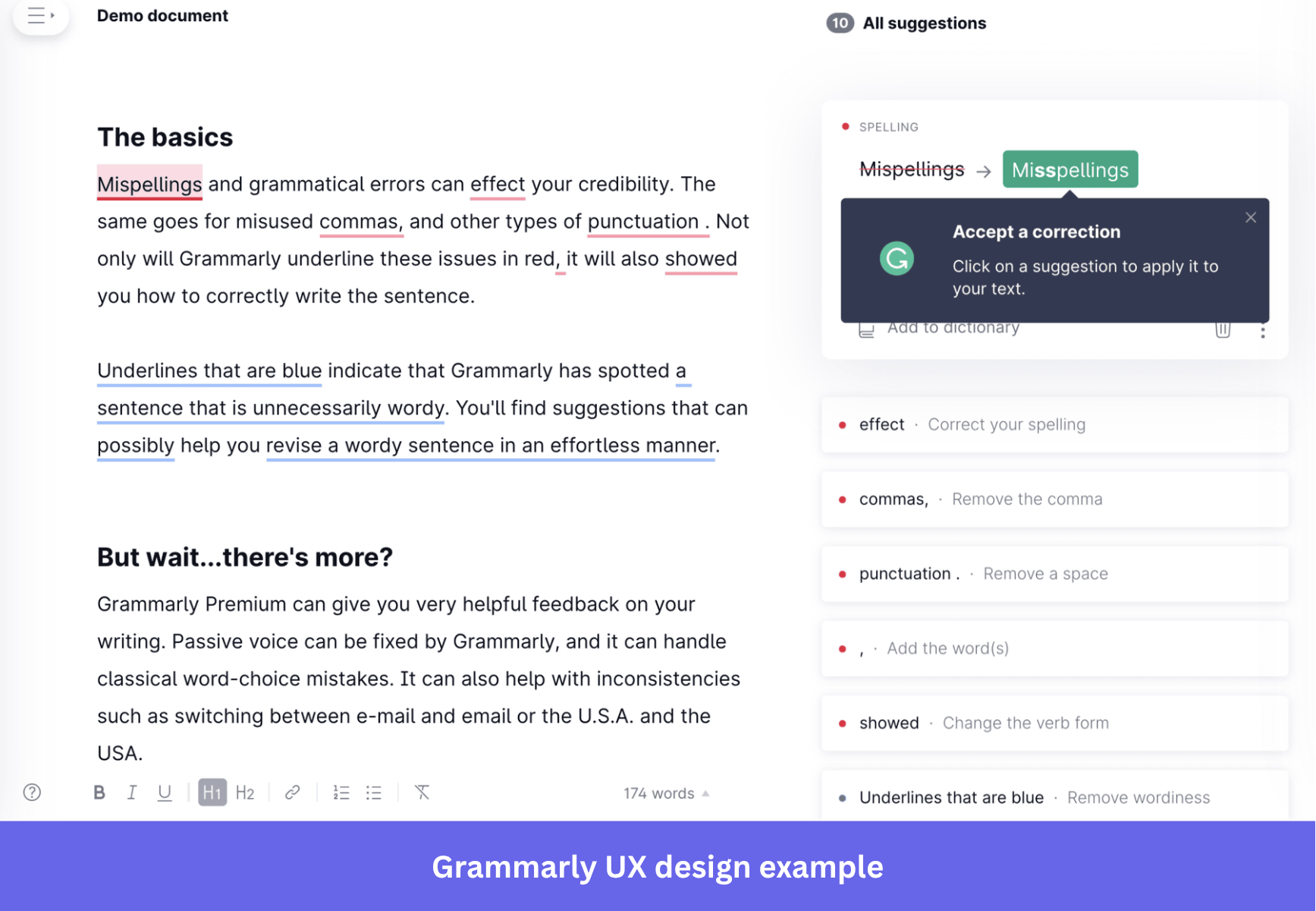
It uses a demo document where users see what each correction code symbol means and have a chance to correct the mistakes themselves. By the time new users open their first real document, they already know what they’re doing.
Why it works: A demo environment removes the anxiety of learning on your own. Users feel confident before they’re doing anything that matters, which is exactly when activation is most likely to stick.
12. Nike’s selling experience
Nike’s product page is designed around one outcome: getting you to buy.
Everything a user needs to make a decision is on one screen, removing the friction that kills conversions.
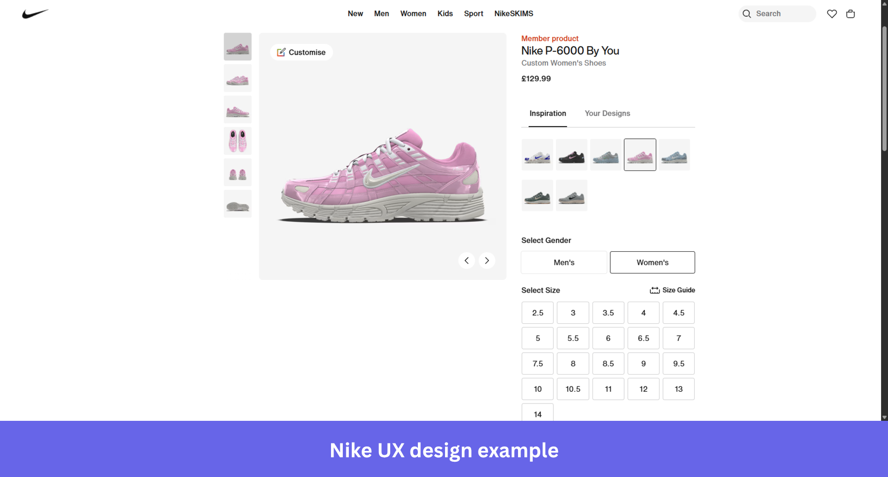
Why it works: When users can see the product, pick their size, and check out without leaving the page, there’s nothing left to interrupt the decision.
13. Airbnb booking experience
The Aha moment is when the user realizes the value your product could offer, which is necessary for activation and adoption.
Airbnb doesn’t beat around the bush when it comes to taking users to the ‘Aha!’ moment.
When people visit the page, they instantly see available rental properties across multiple locations, even before they start searching.
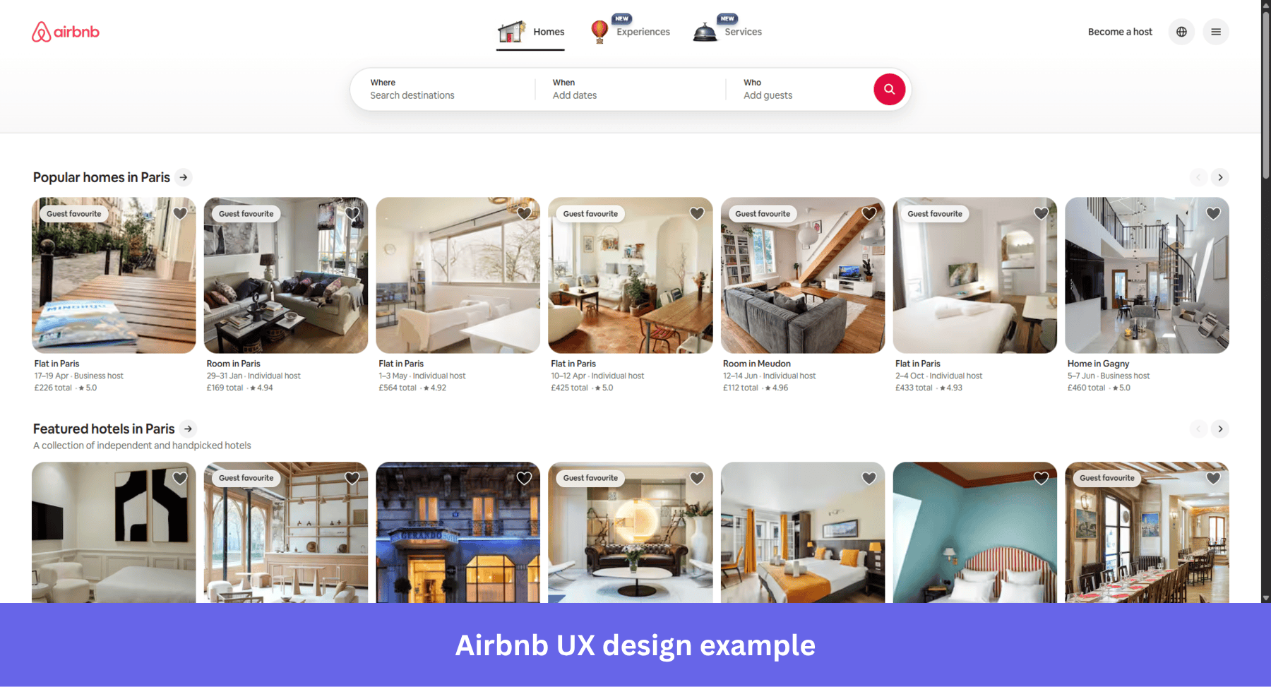
Why it works: Most products make users work before they see value. Airbnb shows you the value before you’ve typed a single character, which is why the homepage converts browsers into searchers so reliably.
14. Netflix’s autoplay feature
Every Netflix binge-watcher is familiar with the autoplay feature: when one episode finishes, the service automatically plays the next one without having to take action.
This creates a frictionless user experience. It keeps users engaged for longer by removing the moment of hesitation where someone might actually stop watching. Netflix’s skip intro button works on the same principle: remove friction at the exact moment impatience kicks in.
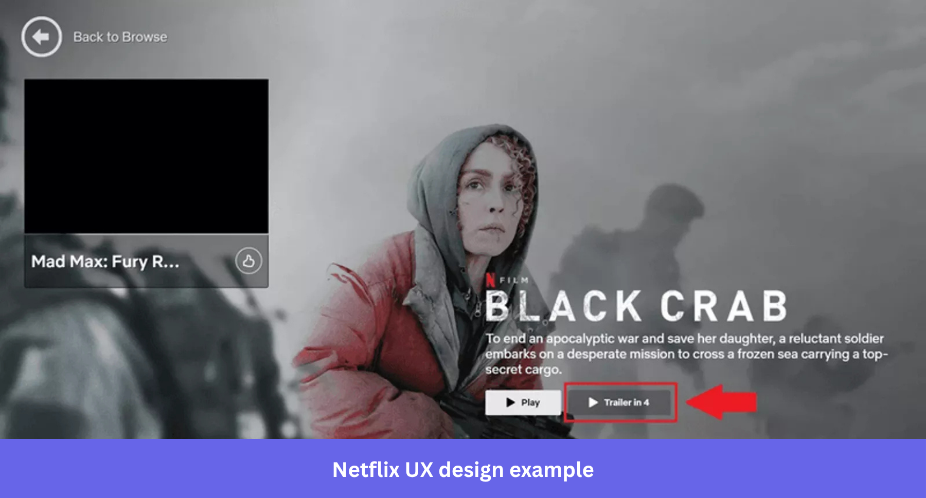
Netflix also uses the feature to hook browsing users with automatically played trailers. It uses autoplay and surfaced trailers because it already knows your viewing habits.
Why it works: The next episode plays before the decision not to watch it. That’s the entire mechanic
15. Canva’s contextual guidance
Contextual guidance is when you present information to users at a relevant and timely point while using your product.
The purpose is to help users act without having to stop and figure things out.
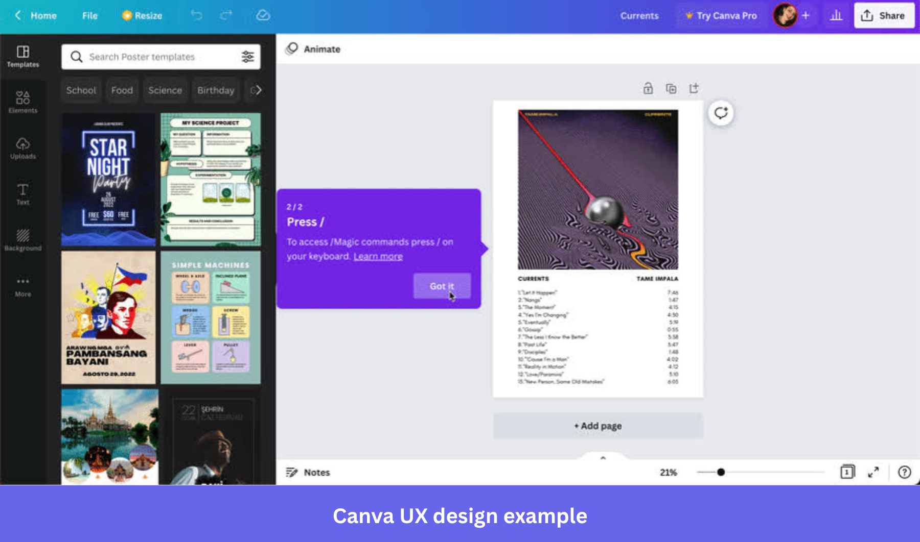
Canva delivers contextual guidance through tooltips that introduce a new feature or surface one that users haven’t tried yet.
Why it works: Contextual guidance lands because it shows up at the moment users actually need it, not buried in a help doc they’ll never open.
16. ASOS’s visually appealing above-the-fold content
Unlike in brick-and-mortar shops, online shoppers can’t touch, smell, taste, or try on the goods they’re buying. All they have is their sense of vision.
Visual design has to do a lot of heavy lifting when the product is clothing.
ASOS, the UK clothing retailer, knows this well, and that’s why its website is all about the images of people wearing their garments. The homepage gives users just two choices: Shop Women or Shop Men, which means nobody lands and wonders where to go.
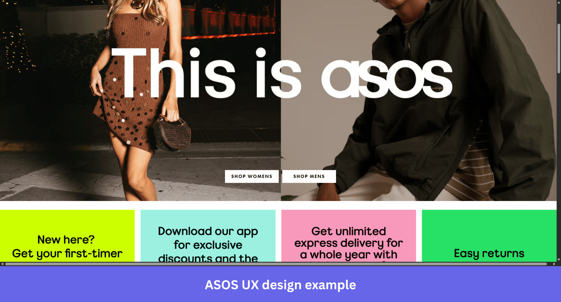
Why it works: Leading with people wearing the clothes rather than the clothes alone is a deliberate visual design decision. It helps users picture themselves in the product, which is what drives the click.
17. Fenty Beauty’s accessible design
Accessible design is where you create user interfaces that are easy to use and understand. It could include simplified navigation, different media formats (video or images), and interactive content.
When done well, accessible design doesn’t just serve users with specific needs; it makes the experience better for everyone.
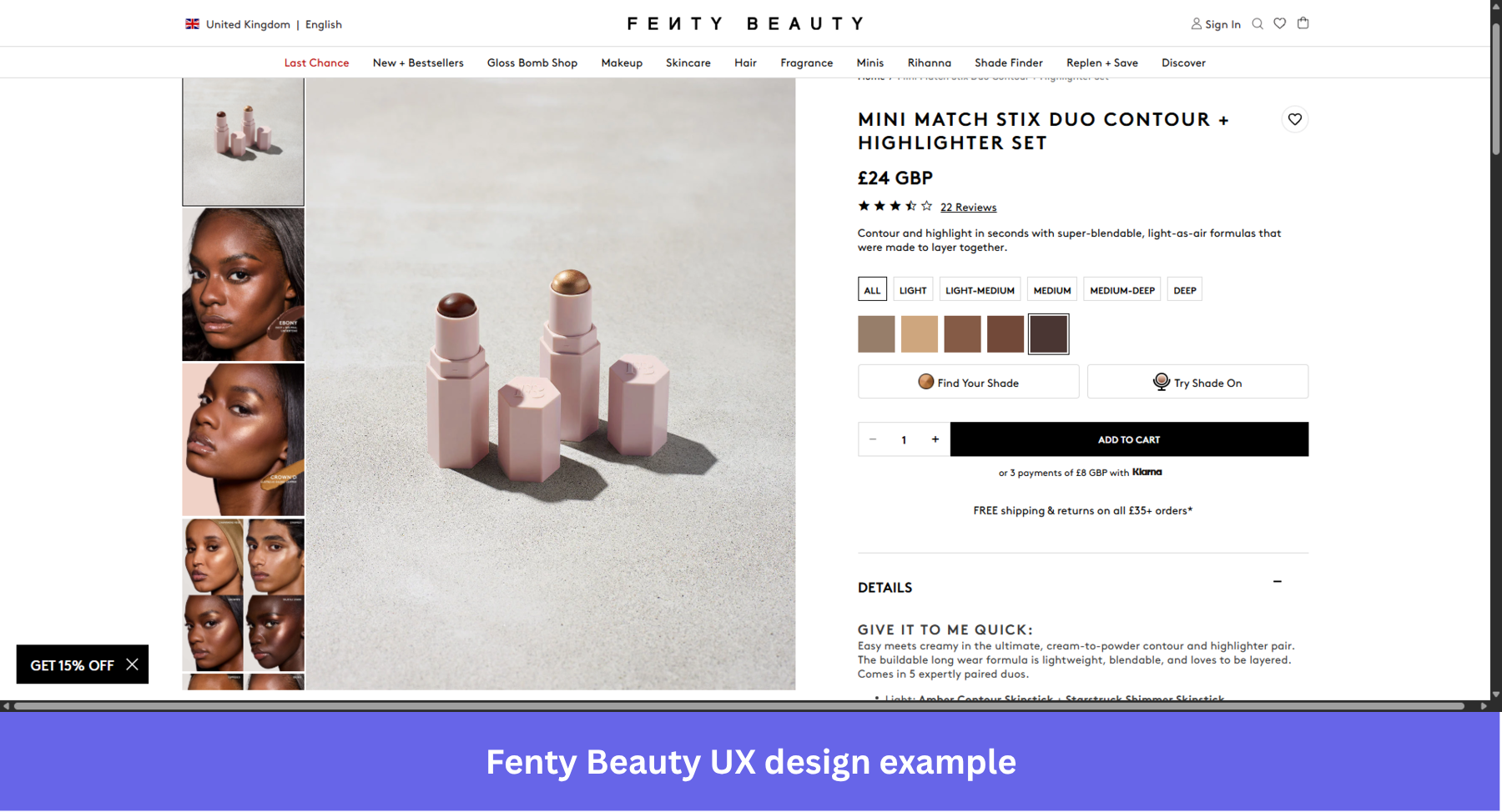
Fenty Beauty has a good, accessible UX design because it:
- Shows price in the user’s currency.
- Enables users to quickly see what colors they can choose for a particular item.
- Has a feature that lets users experience what a product looks like on them.
Why it works: Fenty’s accessible design choices remove the guesswork from buying beauty products online, which is exactly the friction that stops most people from converting.
18. Duolingo’s simplified user flows
When designing the UX for a mobile device, simplicity matters even more.
Smaller screens leave less room for complexity, so every design decision carries more weight.
Moreover, mobile users tend to spend less time on a page or screen, so you don’t want to create any unnecessary friction that could discourage them.
Duolingo’s onboarding and UI reflect this clearly. The onboarding flow is short and sweet: it consists of 5 steps during which users can customize their learning experience.
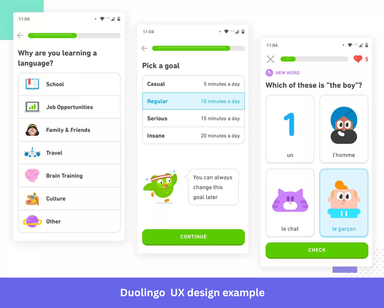
Once inside the app, the UI is clear and intuitive. It features high-contrast color patterns and large buttons, which means mobile users can move through the app without stopping to think about where to tap.
Why it works: Simplified user flows on mobile reduce cognitive load at the exact moment users have the least patience for friction. Getting someone through onboarding in 5 steps rather than 10 meaningfully changes how many of them actually finish it.
20. Calm’s sign-up flow minimizes users’ cognitive load
Cognitive load is the mental effort needed to understand and interact with your product.
The higher the load, the more difficult it is to complete tasks, which pushes users toward abandoning the flow entirely before they’ve seen any value.
Calm achieves this by breaking down its sign-up flow into sections rather than presenting new users with one long form. Users can concentrate on one question at a time, which makes the experience less stressful.
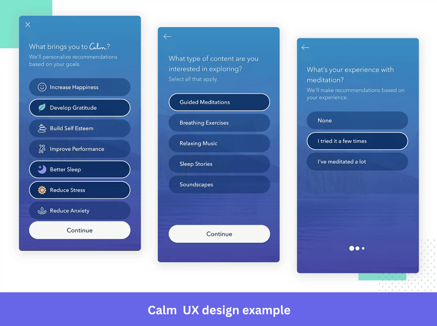
Why it works: A sign-up flow that asks one question at a time respects where new users are mentally. They haven’t committed yet. Making it easy to keep going is the whole job.
21. Spotify’s end-of-year wrapped stories
Spotify Wrapped is one of the most shared pieces of content any product has ever produced, and it costs Spotify nothing to make because users generate all the data themselves.
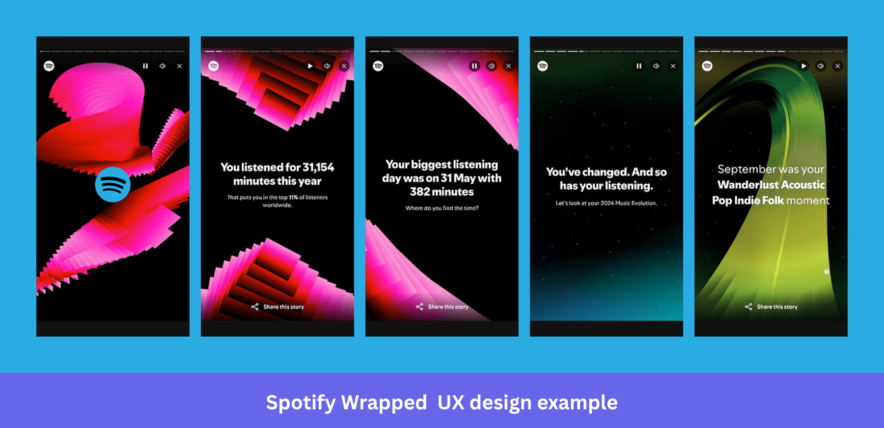
Spotify leverages users’ own data to create content tailored to them. This includes personalized tune recommendations based on their listening history. The end-of-year Wrapped stories pulled 60 million shares in 2021 alone.
Why it works: Personalized user experiences work because they make users feel seen. Wrapped succeeds because every single person gets a unique version, which makes sharing it feel personal rather than promotional.
22. Google’s minimalistic visual design
When it comes to simplicity, not many products beat Google’s Search page.
It has everything that it needs: the logo, a menu with key shortcuts, a search bar, and a couple of buttons.
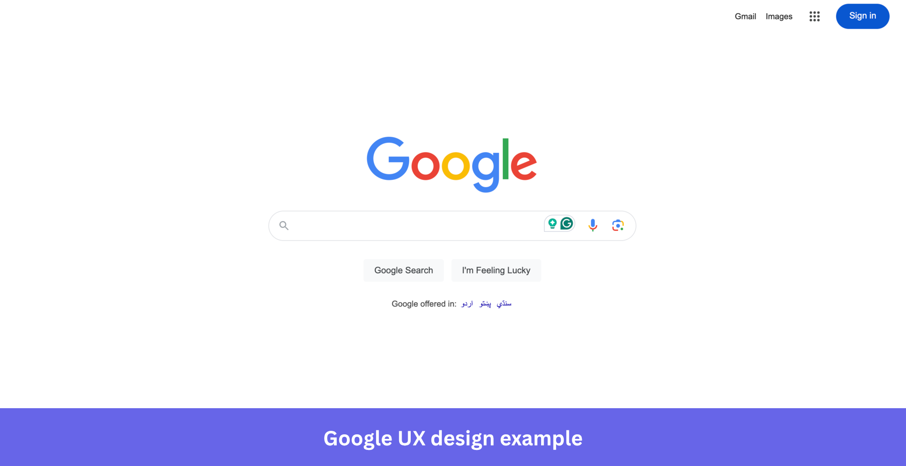
Many users are drawn to the visual design, but what actually matters is that it reduces cognitive load and allows users to complete their tasks in less time.
Why it works: Most products add other features to feel useful. Google’s homepage proves that knowing what to remove is the harder design decision.
23. Revolut offers customization options
Letting users customize a product’s interface or functionality is a good UX design practice.
When users can adjust an interface to match how they actually work, they spend less time navigating and more time getting things done.
Revolut, the online-only bank, does it by allowing users to add different widgets to the home screen. Giving users control over what sits on their home screen means the most relevant information is always front and center.
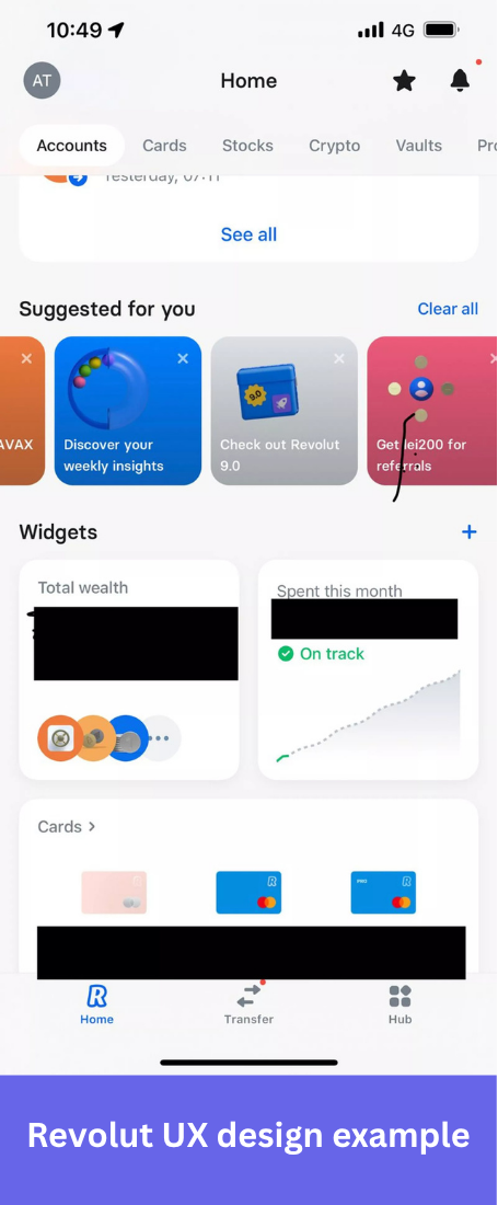
Why it works: Customization turns a generic product into one that feels built for the individual user, which is one of the clearest drivers of long-term engagement.
24. X’s accessibility in product UX
Accessibility in UX design is often treated as a compliance checkbox. Creating a UI for people with various abilities (or disabilities).
Accessibility benefits the product in two ways: inclusive interfaces help more people get value from your product, and it sends them a signal that you recognize their unique needs and care about them, which builds the kind of trust that generic product improvements rarely do.
X gives users access to VoiceOver, contrast settings, and motion controls directly from their settings.
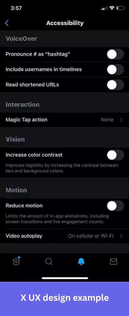
Why it works: Giving users control over how they experience an interface, whether that’s VoiceOver, contrast settings, or motion, means the product works for more people without making anyone else’s experience worse.
25. Glovo’s great navigation
Food delivery mobile apps have one job: get hungry users to their orders as fast as possible.
Glovo, a popular food delivery app, makes its navigation simple and clear to use. Pairing images with text labels means users find what they’re looking for without having to read everything on screen.
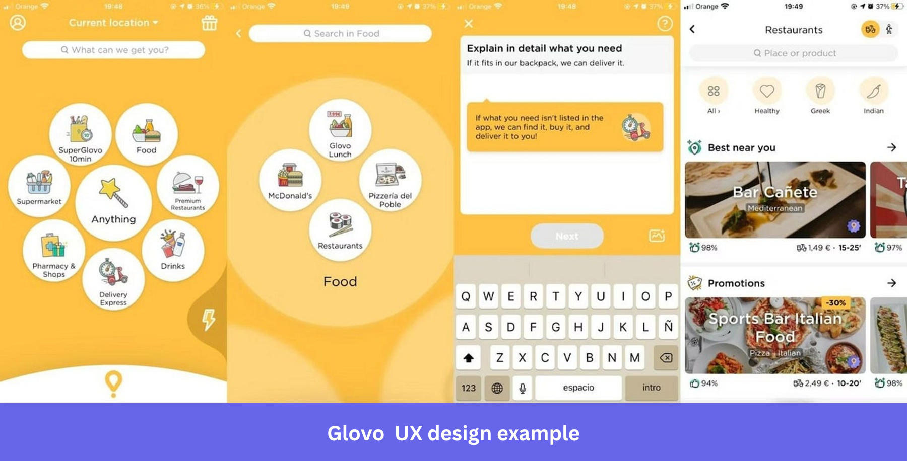
Why it works: Intuitive navigation in a high-intent app like Glovo means fewer taps between opening the app and placing an order, which is the entire point.
Ready to improve your own UX design?
Every example in this list works for the same reason: someone on the design team cared enough to notice a moment of friction and remove it. A mismatched address. A blank first screen. A celebration that fires at exactly the right second.
The best design decisions are the ones users never have to think about.
If you want to build experiences like these for your own product, Userpilot lets you create in-app guidance, onboarding flows, and contextual nudges without writing a line of code. Book a demo today!
FAQ
What is UX design?
UX design, or user experience design, is a process that focuses on how users interact with and feel about a product.
The goal is to ensure a smooth, effective, and meaningful experience for users by improving product usability, accessibility, and visual appeal, thereby increasing user satisfaction.
What is the difference between UX and UI design?
UX design focuses on the overall feel and functionality of a product, ensuring that it meets user needs.
UI (User Interface) design, on the other hand, is concerned with the product’s appearance and layout, including visual elements like buttons, icons, and typography.
While UX is about the journey, UI is about the look and feel.
What is a good UX design?
A good UX design prioritizes user satisfaction by making interactions intuitive, efficient, and enjoyable. It minimizes friction, ensures easy navigation, and anticipates user needs.
This allows them to accomplish their goals with minimal effort and creates a positive user experience.
What do UX designers do?
A UX designer focuses on understanding user behaviors and translating them into design solutions.
They conduct user research, develop wireframes and prototypes, and test designs to improve usability. Their role also involves collaborating with cross-functional teams to ensure the end product is functional and user-friendly.
About the author