Whatfix Alternatives: Finding Your Perfect Digital Adoption Partner


When it comes to digital adoption platforms (DAPs), many teams start looking at product management solutions to guide their users, whether they’re new customers or internal employees navigating complex software.
Whatfix is a name that often comes up in these conversations. However, I’ve learned that even the most recognized tools have their own quirks, and sometimes, the best fit for your specific needs lies elsewhere.
If you’re reading this, you might be feeling some of those quirks yourself. Maybe you’ve heard about slow customer service, a learning curve that feels more like a steep climb, or a general lack of intuitiveness that makes you pull your hair out trying to build simple flows. Or perhaps you’re simply trying to understand the whole market for a digital adoption platform (DAP) before you commit.
My goal here is to help you cut through the noise and figure out which Whatfix alternatives might be your best bet.

Why look for Whatfix alternatives?
Whatfix positions itself as a complete platform for in-app guidance, user support, and deep analytics, focused on internal use cases such as new employee onboarding. It offers onboarding flows, contextual help, and training experiences for complex enterprise software. Many teams choose it because it can support large-scale product adoption initiatives across enterprise environments.
Why companies choose Whatfix:
- Comprehensive analytics: Whatfix provides detailed reporting on user interactions and adoption trends, so teams can understand how employees and customers use enterprise software.
- Developer-focused experimentation: The platform supports testing and controlled rollouts. It can help teams validate changes before full releases.
- Enterprise-focused capabilities: Whatfix is built to support complex software environments and large organizations with strict compliance needs.
- Multiple training formats: Teams can create guided flows, documentation, and contextual help experiences to support different learning styles.
However, from what I’ve gathered and heard from others, it’s not always a smooth ride. Here are a few reasons why you may want to look for Whatfix alternatives, according to concerns echoed in user reviews:
- Slow customer service
Sometimes the customer service can be slow to reach someone. Also it takes some time before the flows actully update from “Draft” stage to “ready” stage. – G2 review
- Unreliability of interactive walkthroughs
Mobile limitations. They user actions cost more. The system outages, bugs and glitches we encounter. – G2 Review
- Steep learning curve and unintuitive UI: Content creation on the platform can feel complex.
It is not easy to apply to complex and non-linear processes – G2 review
- Opaque pricing model: The pricing model isn’t publicly listed, leaving you wondering about the actual cost.
How to pick the right Whatfix alternative?
When I evaluate any tools for user onboarding, especially one as crucial as a digital adoption platform, I don’t just look at the features. I ask myself a few core questions, focusing on the practical impact the tool would have on my SaaS:
Here are a few questions you too should ask before choosing a digital adoption platform:
- How easy is it to use? Can my non-technical teams build and manage content without needing a developer? Does it have a user-friendly interface? A good user experience isn’t just for end-users; it’s for your teammates too.
- How fast can we get it running? Lengthy implementation means delayed user onboarding, user adoption, and value. I look for solutions that let us move quickly.
- Does it have the right features? Whatfix covers a lot, but sometimes less is more if it’s the right less. I need robust capabilities that solve our specific pain points, not just a broad array of options.
- What’s the support like? When things go wrong, or when I have questions, how quickly and effectively can I get help? Good customer service is crucial for a smooth operation.
- Is the pricing transparent? There’s custom pricing, but I want to know what I’m paying for and how much I’ll pay when my user base scales.
These questions guide my thinking, helping me find tools that truly make a difference for my product team and understand user behavior.
Top Whatfix alternatives and competitors
To build this list, I looked at digital adoption platforms that I’ve either used myself or researched extensively. I also cross-checked top competitors frequently mentioned on G2 and other review platforms to understand where Whatfix users tend to switch and why.
Below, I break down each platform’s key features, along with their pros and cons based on feedback from review platforms like G2 and other public user discussions where available.
| Feature | WalkMe | Userlane | UserGuiding | Appcues | Apty | Userpilot | Chameleon | Pendo | Intercom | Product Fruits |
|---|---|---|---|---|---|---|---|---|---|---|
| Pricing (Starting) | On request | Custom pricing | $174/month | $300/month | Custom pricing | $299/month | $279/month | On request | $29/month | $111/month |
| MAUs | On request | On request | 2000 | 1000 | On request | 2000 | Custom | Custom | On request | 1500 |
| Session Replay | ❌ | ❌ | ❌ (Paid add-on) | ❌ | ❌ | ✅ | ❌ | ❌ | ❌ | ❌ |
| A/B Testing | ✅ Basic | ❌ | ❌ | ❌ | ❌ | ✅ (Built-in) | ✅ (Only in Growth plan) | ✅ (Beta) | ❌ | ❌ |
| Auto Event Capture | ❌ (Manual event tracking) | ❌ | ✅ (Only in Growth plan) | ❌ | ❌ | ✅ (Built-in) | ❌ | ❌ (Manual event setup) | ❌ | ✅ |
| Advanced Analytics | ✅ Basic | ✅ Basic | ✅ Basic | ✅ Basic | ✅ Basic | ✅ Advanced analytics tools | ✅ Basic | ✅ Basic | ✅ Basic | ✅ Basic |
| In-app Surveys | ❌ Limited options | ✅ Basic | ✅ Microsurveys | ✅ Forms & Surveys | ❌ Third-party integration | ✅ 30+ Survey templates | ✅ Limited surveys | ❌ Limited options | ❌ Chat-based only | ✅ |
| Resource Center | ✅ | ✅ | ✅ | ✅ | ✅ | ✅ Fully customizable | ✅ Limited | ✅ | ❌ | ✅ |
| Mobile App Messaging | ❌ | ❌ | ❌ | ❌ | ❌ | ✅ | ❌ | ✅ | ✅ Basic | ✅ |
| No-code Implementation | ✅ | ✅ | ✅ | ✅ | ✅ | ✅ | ✅ | ✅ | ✅ | ✅ |
| Operational cost | $78,817/year | $17,529/year | NA | $15,000/year | $44,666/year | $11,000/year | $26,500/year | $48,400/year | $30,456/year | NA |
WalkMe
WalkMe is often seen as the number one Whatfix competitor, especially in the enterprise space. It’s a digital adoption platform used by companies to support both employee and customer onboarding across web and desktop applications.
It is widely adopted by large organizations that need a centralized solution to manage onboarding and software adoption across multiple tools and systems.
Key features:
- Smart Walk-Thrus: Step-by-step interactive walkthroughs that guide users through workflows across multiple applications, directly within their existing tools.
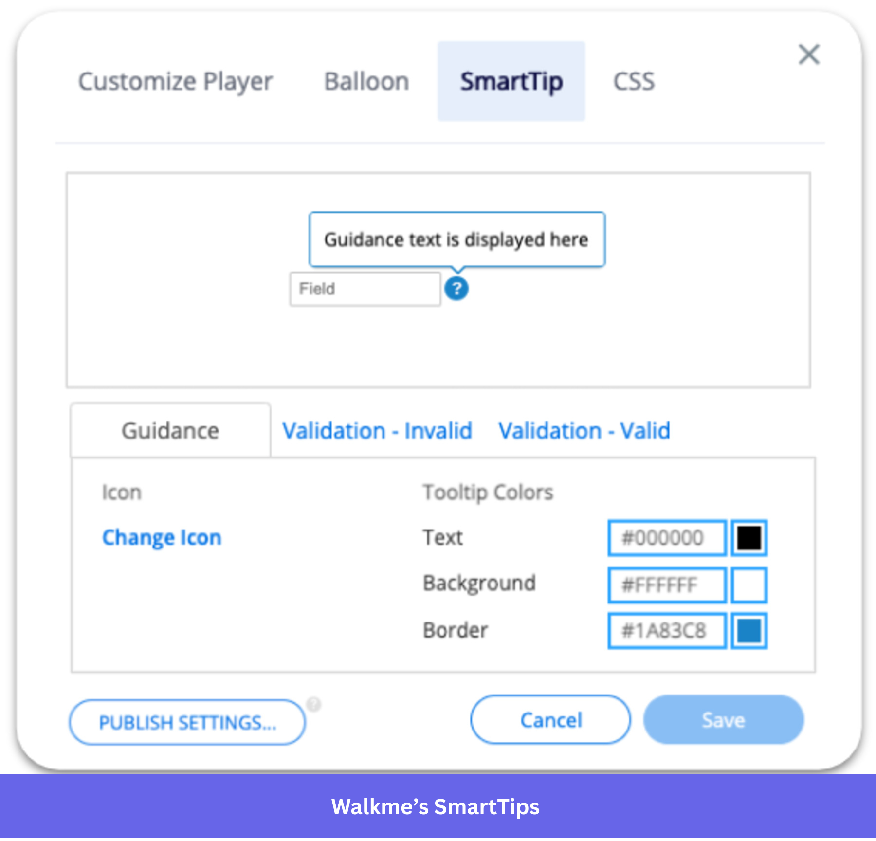
- SmartTips: Contextual tooltips that appear when users interact with specific UI elements to reduce friction.
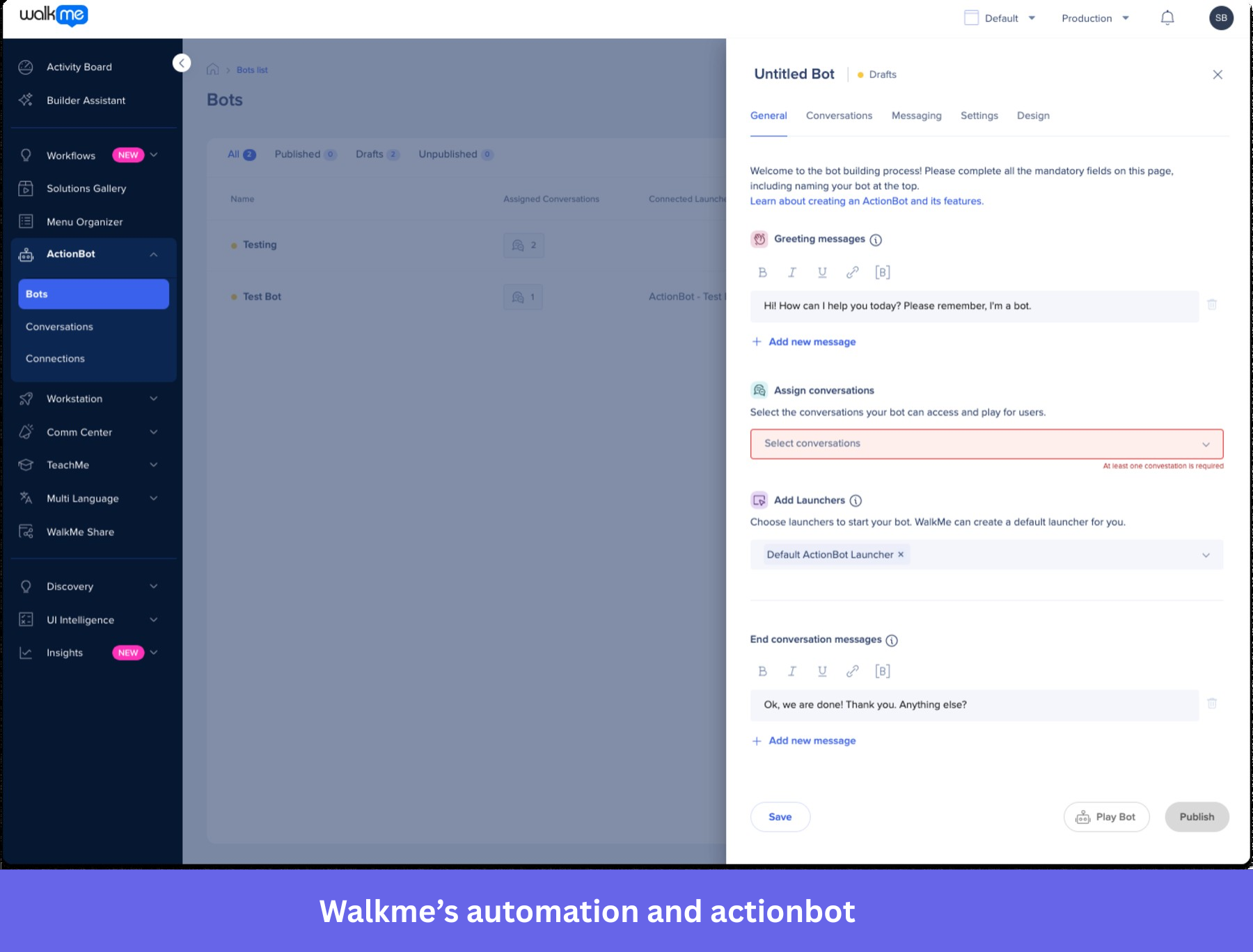
- Automation and ActionBot: Workflow automation and chatbot functionality that help automate repetitive tasks and answer user questions.
- WalkMe insights: Advanced analytics dashboards that track engagement, drop-offs, and workflow completion to identify friction points.
- Segmentation and personalization: Behavioral segmentation to deliver targeted in-app experiences to different user groups.
WalkMe pricing
WalkMe does not publicly disclose its pricing and requires you to contact sales for a custom quote. Pricing typically depends on factors such as the number of users, applications supported, contract length, and selected modules.
According to Vendr data, the median annual contract value is around $43,000, although costs can vary widely depending on deployment size and add-ons.
Some important considerations:
- Pricing is typically seat-based or contract-based.
- Advanced analytics and mobile capabilities may be priced as add-ons.
- Enterprise deployments can exceed six-figure annual contracts.
Why it’s a good Whatfix alternative
If you need a mature enterprise platform capable of supporting complex internal software ecosystems, WalkMe can be a strong alternative. I would consider it especially when employee onboarding and workflow automation across multiple enterprise tools is the main priority.
Pros and cons of WalkMe
| Pros | Cons |
| ✅ Contextual in-app guidance: Users highlight how step-by-step guidance appears exactly when needed, helping them complete complex tasks without leaving the workflow. | ❌ Performance delays with dynamic fields: Some users report slight delays in loading dynamic elements, which can cause guidance to be missed if users move quickly. |
| ✅ Simple setup and intuitive builder: Reviewers mention the platform is easy to set up and allows teams to quickly create in-app prompts that users can access on demand. | ❌ Limited customization and reporting in Workstation: Reviewers highlight restrictions in UI customization and gaps in reporting, such as a lack of detailed user data and flexible date filtering. |
| ✅ Advanced user analytics: Users value features like session playback and analytics that help identify friction points and measure how guidance performs. | ❌ Struggles with dynamic elements: Users mention that handling dynamic fields can be time-consuming, as selector configuration isn’t always smooth or reliable. |
Userlane
Userlane overlays guides on top of apps to walk users and employees through tasks in real time. This reduces mistakes and lets your users get things done without having to stop to ask for help.
Userlane is ideal for companies with a large application portfolio, especially as they go through digital transformation.
Key features:
- Interactive guides: Step-by-step in-app guidance that directs users to the right UI elements and prevents incorrect actions during workflows.
- Userlane assistant: An always-available in-app help widget where users can access guides and track their progress across tasks.
- User segmentation: Behavioral and role-based targeting to show contextual guidance only to relevant users.
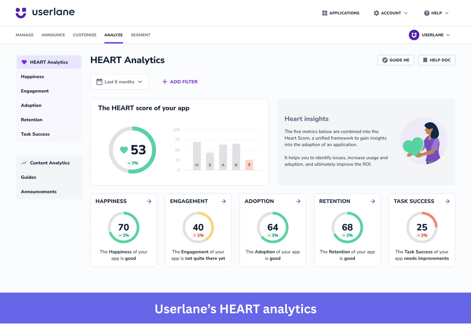
- HEART analytics dashboard: Product usage analytics showing engagement, guide completion, and friction points to improve training effectiveness.
- No-code content editor: Build walkthroughs, announcements, and contextual help without developer involvement.
Userlane pricing
Userlane does not publish fixed pricing and requires contacting sales for a custom quote. Pricing typically depends on the number of users and applications supported.
According to Vendr data referenced in comparisons, operational costs can start around $17,500 annually, which places it in the mid-to-enterprise pricing range for digital adoption platforms.
Key considerations:
- Pricing is contract-based.
- Includes a free trial but no permanent free plan.
- Best suited for internal training use cases rather than product-led growth teams.
Why it’s a good Whatfix alternative
If you need a no-code platform that can be deployed quickly across browser-based applications without complex integrations, Userlane is a strong alternative. I would consider it for teams that want to launch in-app guidance fast and manage onboarding independently, especially when reducing reliance on IT resources is a priority.
Pros and cons of Userlane
| Pros | Cons |
| ✅ Fast deployment and easy integration: Users report fast implementation and smooth integration into existing platforms without heavy dev work. | ❌ Limited design customization for guides: Users mention that they can’t fully customize the look and feel of guides (like fonts or styling), which makes it harder to match their product UI. |
| ✅ Flexible customization with hands-on support: Reviewers appreciate how the team works closely with them to tailor onboarding to their workflows. | ❌ UI navigation between editor and portal can feel clunky: Some users report friction when switching between editing environments. |
| ✅ In-app learning support: Users say the in-app guidance reduces the need for separate training and helps users feel more confident while using the product. | ❌ Limited integrations and slower feature rollout: Users say integrations (like ticketing systems) are missing or take time to be added. |
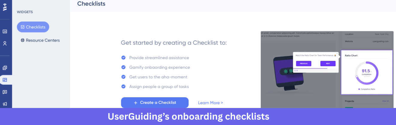
UserGuiding
If you’re a startup or an SMB looking for a more affordable Whatfix alternative, UserGuiding is worth a look.
It offers a decent set of basic onboarding features, like interactive tours, checklists, and in-app surveys, at a lower price point. UserGuiding can be a good starting point for teams that want to get their feet wet without a huge upfront investment.
Key features
- Product tours: Interactive walkthroughs built with a drag-and-drop editor to guide users step-by-step through key workflows.
- Onboarding checklists: In-app task lists that help new users complete activation steps and understand what to do next.
- Resource center: An in-app help hub where you can add documentation, videos, and support links for self-service support.
- In-app surveys and NPS: Built-in feedback tools to collect end-user feedback and measure satisfaction at important touchpoints.
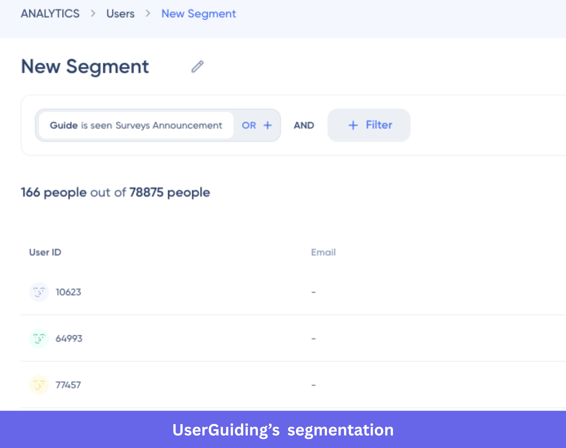
- Segmentation and engagement analytics: Target onboarding flows based on user attributes and track guide engagement metrics.

UserGuiding pricing
UserGuiding uses a monthly active users (MAU)-based pricing model with several tiers depending on usage and feature needs.
Typical plans include:
- Free plan (Support essentials): Includes a knowledge base, product updates page, and resource center but limited onboarding functionality.
- Starter (from $174/month billed annually): Includes product tours, hotspots, checklists, surveys, and basic analytics for around 2,000 MAUs.
- Growth (from $349/month): Adds A/B testing, goal tracking, localization, and premium integrations.
- Enterprise (custom pricing): Includes security features, SSO, and dedicated support.
Important considerations:
- Feature limits exist on lower tiers (number of guides and UI elements).
- Advanced capabilities like A/B testing are only available in higher plans.
- Costs increase as MAUs grow.
Why it’s a good Whatfix alternative
If budget is your main constraint and you only need core onboarding functionality, UserGuiding can be a practical alternative. I would consider it when simple onboarding experiences matter more than advanced analytics or enterprise automation.
Pros and cons of UserGuiding
| Pros | Cons |
| ✅ Easy to use with fast setup: Many users highlight how quickly they can create guides without technical help. This comes up consistently across reviews. | ❌ Limited customization for advanced use cases: A recurring complaint is that styling and customization options are restricted, especially for teams with specific branding needs. |
| ✅ Full control over onboarding content and updates: Users mention they can manage onboarding flows, release notes, and knowledge base content without relying on product releases. | ❌ Testing and troubleshooting can be challenging: Users mention that guides may not always work as expected, and identifying issues can take time, especially when managing multiple domains or setups. |
| ❌ Feature limitations in lower-tier plans: Several users point out that important features (like domains or customization options) are restricted unless you upgrade. |
Appcues
Appcues is another well-known player among Whatfix alternatives, particularly strong in user engagement and A/B testing.
If you’re constantly testing onboarding flows or in-app messages to see what improves product adoption, Appcues offers solid tools for running and measuring those experiments.
If you’re constantly experimenting with different onboarding flows or in-app messages to see what resonates best with your users, Appcues offers solid tools for running and measuring those experiments.
Key features
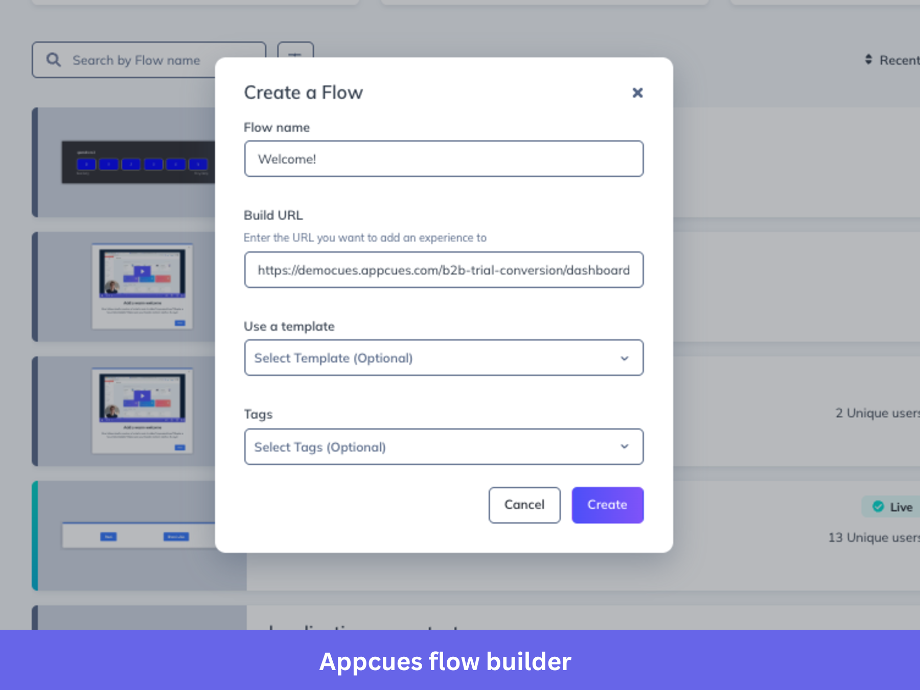
- Flow builder (Chrome extension): A no-code visual editor that lets you build modals, tooltips, and banners directly on top of your product UI.
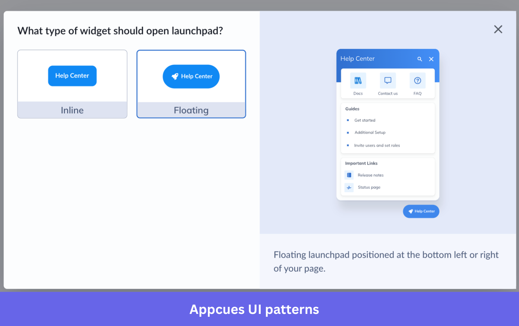
- UI patterns: Components like hotspots, slideouts, checklists, and launchpads (resource hubs) to guide users or provide quick access to help content.
- User segmentation: Target onboarding flows based on user behavior, attributes, lifecycle stage, or account data.
- Event tracking: Track clicks, feature usage, and engagement events to trigger contextual experiences and improve feature adoption tracking.
- In-app surveys and NPS: Collect end-user feedback with microsurveys and NPS prompts without forcing users to leave the product.
Appcues pricing
Appcues uses MAU-based pricing (monthly active users) rather than seat-based pricing.
The main plans include:
- Start plan: Starts at $300/month (billed annually) for early-stage teams and includes flows, checklists, reporting, and email support.
- Grow plan: Starts at $750/month (billed annually) and includes all experience types, integrations, Appcues AI, and implementation support.
- Enterprise plan: Custom pricing with advanced security, compliance controls, SLAs, and priority support.
Key things to consider:
- Pricing scales with MAUs, which can increase costs as your product grows.
- Annual billing is required to access the lowest advertised pricing.
- Advanced security and support features are limited to Enterprise plans.
- Appcues offers a 14-day free trial but no permanent free plan.
Why it’s a good Whatfix alternative
If your priority is improving customer onboarding and engagement rather than employee training, Appcues can be a strong alternative. I would consider it when experimentation, messaging, and improving feature adoption matter more than enterprise workflow automation.
Pros and cons of Appcues
| Pros | Cons |
| ✅ Flexible flow targeting and segmentation: Users highlight the ability to trigger flows based on behavior, events, and lifecycle stages as a major advantage for improving feature adoption. | ❌ Flow management gets messy at scale: Reviewers mention difficulty organizing flows and a lack of structure like folders or governance controls. |
| ✅ Non-intrusive UI patterns like banners and hotspots: Users consider banners as less disruptive than pop-ups while still effective for sharing updates. | ❌ May require technical help despite “no-code” positioning: Some reviewers report needing JavaScript or developer support for setup or advanced use cases. |
| ✅ Reduces support tickets with in-app guidance: Teams use in-app messaging to answer user questions and reduce reliance on support. | ❌ Limited templates: Users mention there aren’t enough pre-built templates to guide flow creation. |
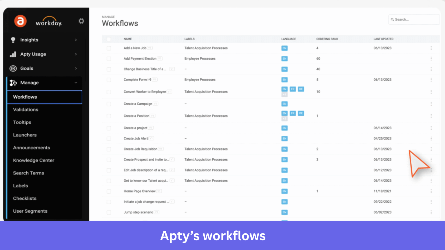
Apty
Apty tracks user actions across applications to identify workflow inefficiencies and errors, then delivers contextual in-app guidance or automation to improve task completion.
The tool is known for its change management features. It pulls data on how users use your software, letting your team fix bottlenecks without constant user training.
This helps avoid switching between tools, keeps workflow steady, and reduces the need for professional services like on-desk calls.
Key features
- Process intelligence (real-time usage tracking): Tracks user behavior across applications to identify friction points and workflow inefficiencies.
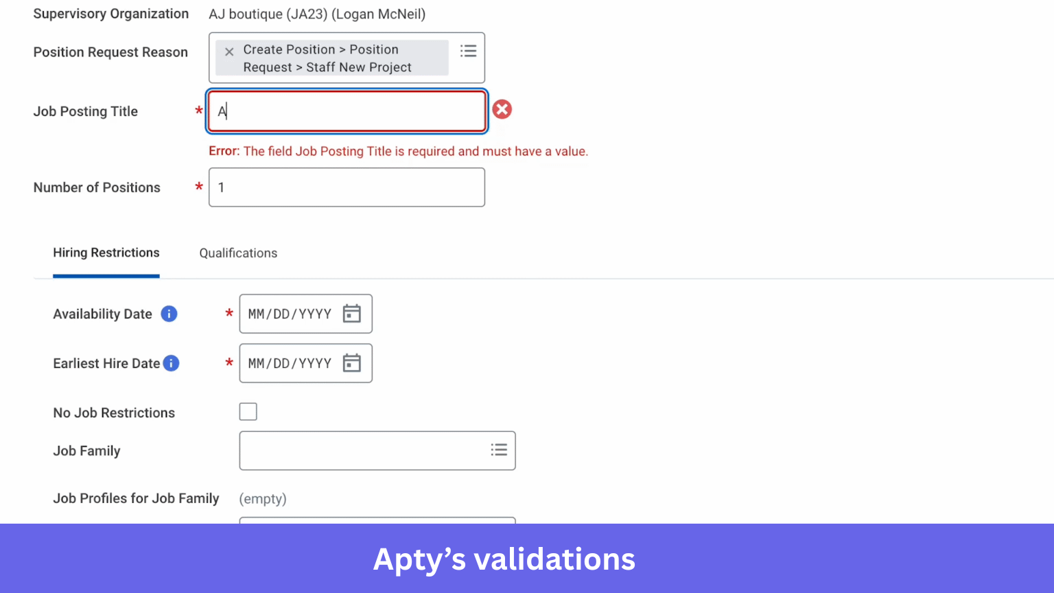
- Contextual in-app guidance: Create tooltips, walkthroughs, and validation rules that appear based on user behavior to prevent errors and improve task completion.
- Workflow automation: Automates repetitive tasks like data entry and navigation between systems to reduce manual work.
- Adoption analytics dashboard: Provides valuable insights into process compliance, task completion rates, and areas where users struggle.
- Multilingual support: Supports 30+ languages to help global teams deliver consistent onboarding and training experiences.
Apty pricing
Apty uses a custom enterprise pricing model based primarily on the number of applications covered, users, and implementation complexity rather than a simple flat subscription.
Available pricing insights suggest:
- Pricing starts at around $9,500 per application annually.
- Typical enterprise deployments range between $26,000 and $78,000 per year.
- Multi-application deployments average around $45,000 annually, depending on scope and integrations.
Things to consider:
- Implementation scope affects cost.
- Advanced analytics and automation are usually part of higher-tier packages.
Why it’s a good Whatfix alternative
If your main goal is improving process compliance and managing digital transformation initiatives rather than just onboarding users, Apty can be a strong alternative. I would consider it when operational efficiency and workflow optimization matter more than basic onboarding experiences.
Pros and cons of Apty
| Pros | Cons |
| ✅ Helps reduce errors and support volume: Apty is often used to guide users through complex processes, which reduces mistakes and repetitive support queries. | ❌ Struggles with complex or custom applications: Apty can have trouble identifying UI elements in highly customized environments. |
| ✅ Reduces training effort with in-app guidance: Teams report fewer support queries as Apty guides users directly inside tools like Workday and ServiceNow. | ❌ Deployment and integration can take time: Some users report that implementation isn’t instant and requires effort during rollout. |
| ✅ Helpful implementation support: Users highlight strong onboarding support that helps with setup and workflow configuration. | ❌ Lacks community or peer support resources: Users mention the absence of a community/forum for sharing best practices. |
Userpilot
Userpilot stands out as a powerful product growth and digital adoption platform that gives you everything you need to create amazing product experiences without asking your engineering team for favors.
It’s an all-in-one solution that covers user onboarding, feedback collection, and product analytics.
Key features
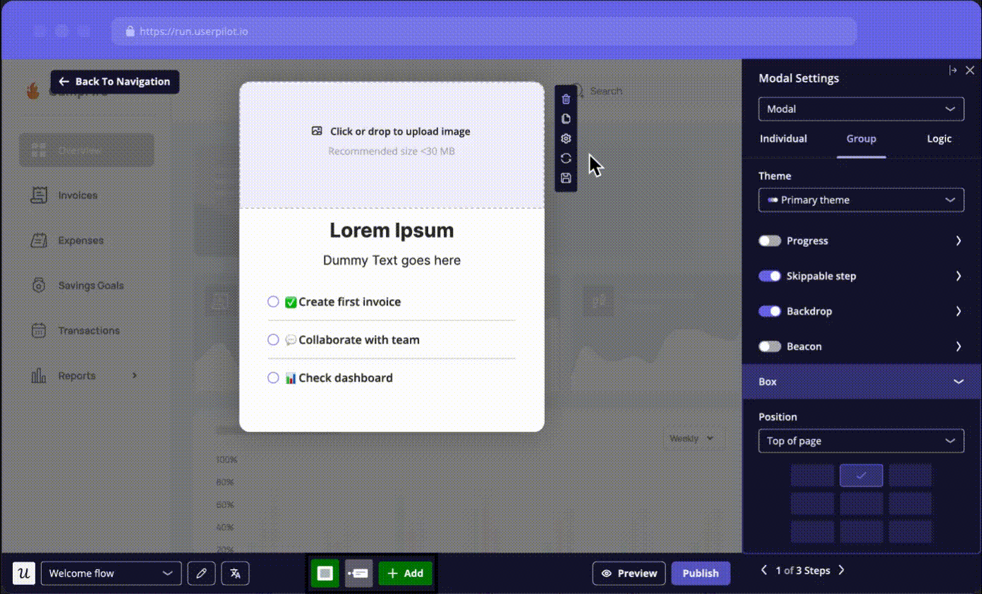
- In-app guides for user onboarding and walkthroughs: Userpilot lets you create interactive user guides, product tours, onboarding checklists, event tracking, and in-app surveys without writing a single line of code. You can build complex interactive walkthroughs and user onboarding flows that span multiple pages, adding tooltips for contextual help and banners for announcements. With embeds, you can easily drop in content from tools like Calendly or Loom directly into your flows.
- Advanced segmentation and personalization: Segment users based on countless criteria, whether it’s their role, plan, or specific user behavior. Then, you can personalize the onboarding experience and in-app messages for each user segmentation. For example, if you want to make the experience feel more inviting, you can use our personalization feature to dynamically display a user’s name within a flow.
- Powerful analytics: You get strong product analytics to understand user behavior. You can track events, analyze funnels to spot drop-off points, map user paths, and monitor user retention. We also offer session replay, which lets you literally watch recordings of user sessions to see exactly where they get stuck or confused. You can also set up custom dashboards to monitor your key metrics.

- Mobile support: A growing number of users interact with products on mobile devices. Mobile capabilities allow you to build native carousels and slideouts, and send push notifications, ensuring a seamless experience across all platforms.
Userpilot pricing
Userpilot uses MAU-based pricing with transparent entry pricing and custom pricing for larger companies.
The main plans include:
- Starter plan ($299/month): Supports up to 2,000 Monthly Active Users (MAUs). Includes in-app engagement tools, NPS surveys, and usage tracking.
- Growth plan (Custom pricing): Ideal for scaling businesses with customizable MAUs. Adds advanced analytics and retroactive event autocapture.
- Enterprise plan (Custom pricing): Tailored for large organizations. Includes premium integrations, advanced security features, and priority support.
Key things to consider:
- Session replay and mobile features may be add-ons depending on the plan.
- There is a free trial, but no permanent free plan.
Why it’s a good Whatfix alternative
Userpilot is a strong Whatfix alternative for product teams focused on improving customer onboarding and product adoption rather than employee training. I would choose it if I wanted an all-in-one platform combining analytics, engagement, and feedback instead of managing multiple tools.
Pros and cons of Userpilot
| Pros | Cons |
| ✅ Fully no-code experience: Userpilot offers a visual builder along with no-code event labeling, so non-technical users can create flows, track user actions, and iterate quickly without developer support. This means my team can deliver value to users much faster. | ❌ Pricing may not fit very early-stage startups: I’d say Userpilot makes more sense for growing SaaS teams, since very small teams might find the pricing a bit high. |
| ✅ Transparent and flexible pricing: Unlike most competitors, our pricing is clear, transparent, and based on monthly active users (MAU), not per application or domain. This means no hidden user license fees. You know what you’re paying for right from the start. In fact, Userpilot has the lowest operational cost among all competitors while having the same features, like comprehensive analytics, onboarding checklists, user insights, and mobile push notifications. | ❌ Not built for employee onboarding use cases: From my perspective, Userpilot works best for customer onboarding and product growth, not internal employee training across enterprise systems. |
| ✅ Responsive customer support and onboarding help: Multiple reviews mention fast support responses and helpful implementation guidance during setup. |
Chameleon
Chameleon tracks user actions within your web app to show where your customers struggle to use your product. You can add product tours and surveys that show at the right moment, only to the right people.
It pulls data on the user paths and clicks, helping teams fix drop-offs quickly. This setup ensures the new features are rolled out smoothly without overwhelming support teams with customer queries.
Key features
- No-code flow builder: Create product tours, tooltips, modals, banners, and launchers without engineering support using a Chrome extension.
- User segmentation: Target experiences based on user behavior, events, account attributes, or lifecycle stage to deliver contextual onboarding instead of generic messaging.
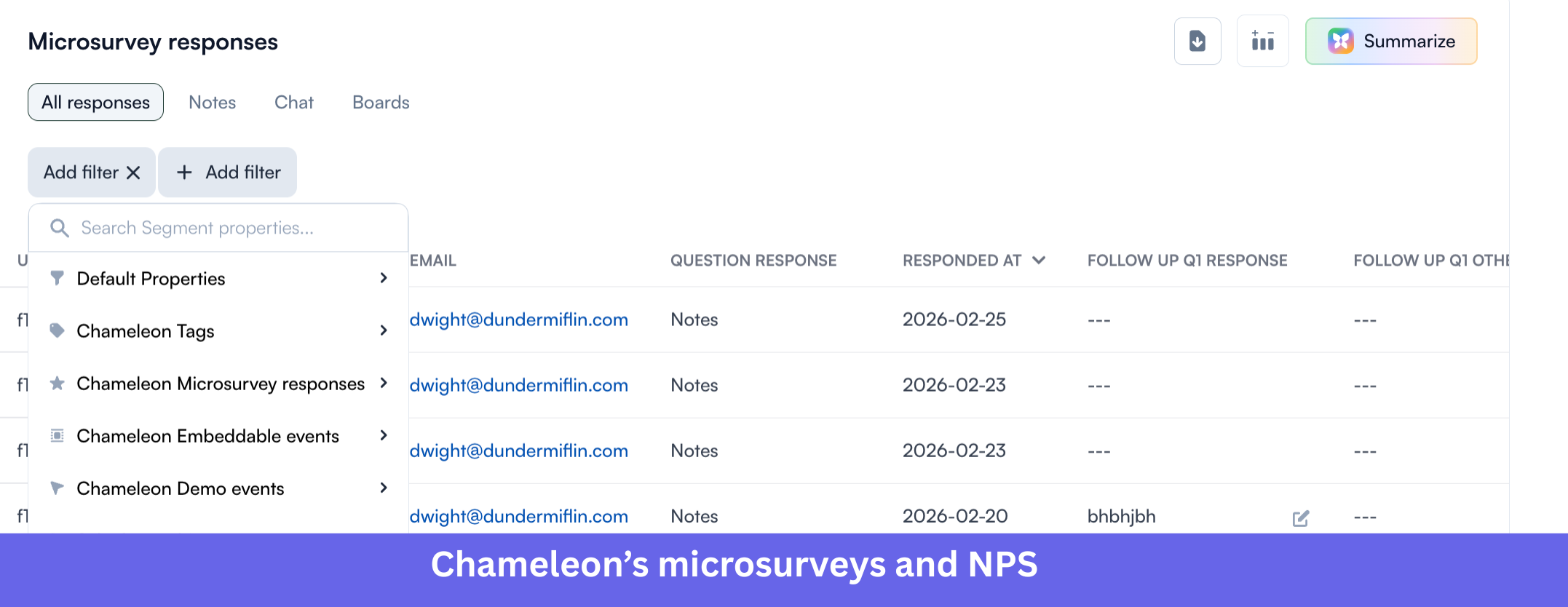
- Microsurveys and NPS: Launch in-app surveys and NPS campaigns to collect end-user feedback directly inside your product.
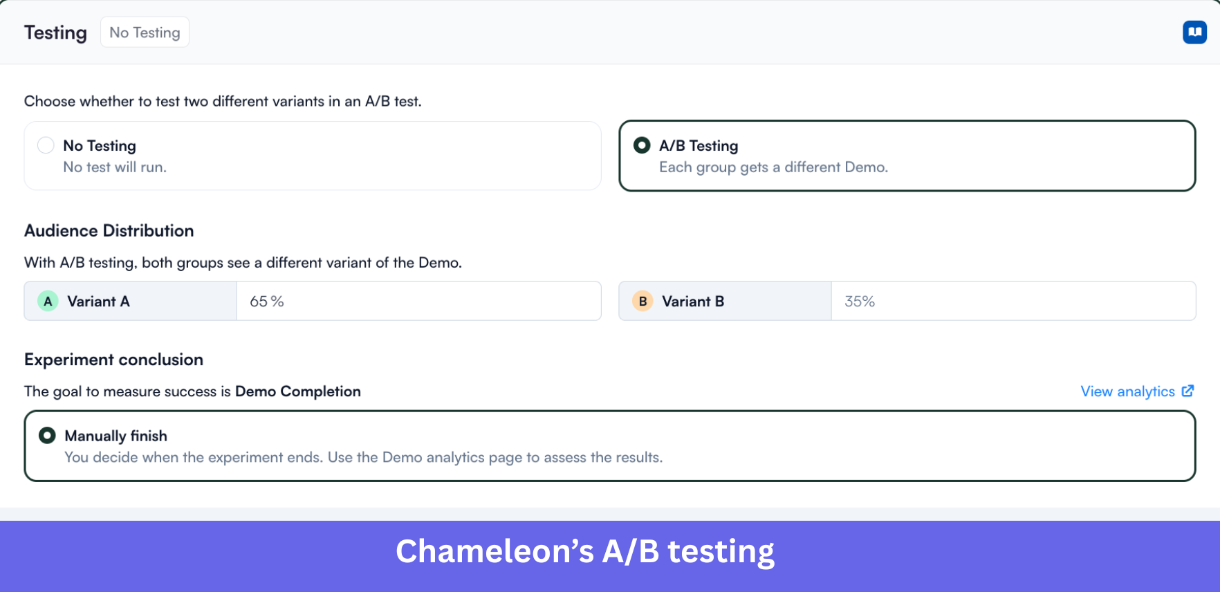
- A/B testing: Test different onboarding flows and UI patterns to understand what improves engagement and feature adoption.
- Integrations: Integrates with tools like Segment, Mixpanel, Amplitude, and Intercom to sync user data and improve targeting.
Chameleon pricing
Chameleon uses a usage-based pricing model that scales with your MTUs and the features you need.
The platform offers four main plans:
- Free plan: Includes access to interactive demos and HelpBar for evaluation.
- Startup plan: Starts at $279/month and includes unlimited tours and tooltips, 5 microsurveys, and one launcher.
- Growth plan: Custom pricing (typically annual contracts) with advanced capabilities like unlimited experiences, A/B testing, and governance features.
- Enterprise plan: Custom pricing for large organizations needing security, localization, and advanced permissions.
Why it’s a good Whatfix alternative
Chameleon is a good Whatfix alternative for SaaS companies focused on customer onboarding and product engagement rather than employee training. I would consider it if my priority was improving feature adoption and in-app communication rather than enterprise process compliance.
Pros and cons of Chameleon
✅ Responsive support and helpful AI assistance: Users highlight Chameleon’s responsive customer support and AI-powered features that help generate templates quickly, reducing manual setup work and making it easier to get started.
✅ Intuitive no-code platform with strong support: Chameleon lets teams build in-app experiences easily, with flexible features and responsive support to improve user onboarding and engagement.
❌ Bugs and glitches affect reliability: Users mention occasional issues like broken segments or UI glitches during setup and usage.
❌ Managing complex flows can get cumbersome: As usage grows, handling multiple guides and advanced use cases becomes harder to maintain.
Pendo
Pendo takes a slightly different angle among Whatfix alternatives by focusing heavily on product analytics as its core strength, then building adoption tools on top. It tracks how people use your app and shares detailed analytics, spotting where they get frustrated or drop off.
Key features
- Automatic event tracking (auto-capture): Pendo automatically captures clicks, page views, and feature interactions without requiring manual tagging, allowing teams to analyze historical trends.
- Feature tagging and product analytics: Teams can tag UI elements to track feature adoption, build funnels, and analyze user journeys to identify drop-offs.
- In-app guides and feedback collection: Pendo includes in-app messaging, NPS surveys, and polls to collect feedback and improve adoption directly inside the product.
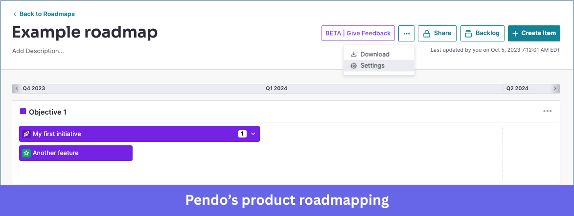
- Product roadmapping (Pendo Listen): Includes feedback management and roadmap planning so product teams can prioritize features based on customer data.
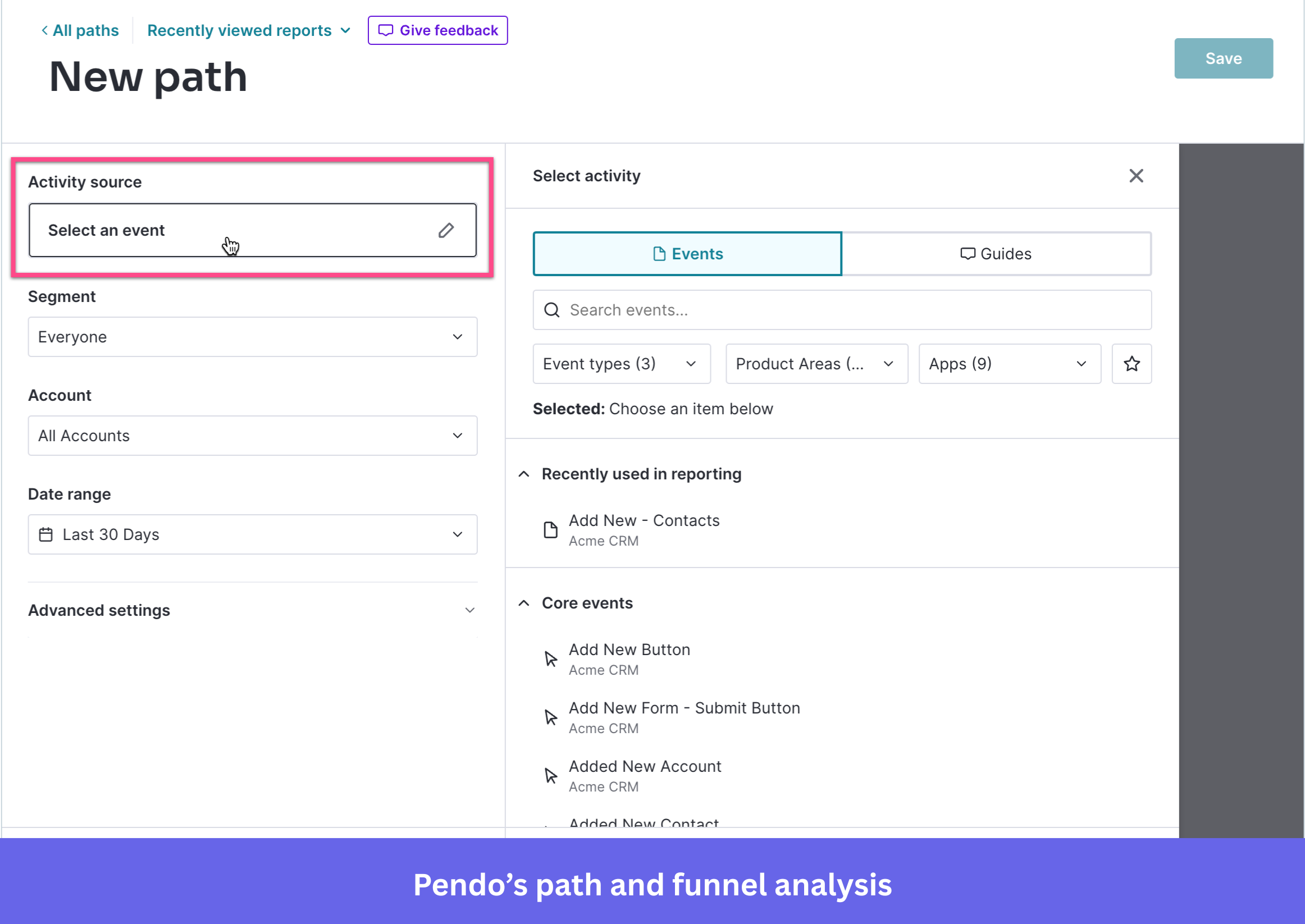
- Path and funnel analysis: Visual journey reports help teams understand how users move through workflows and where they experience friction.
Why it’s a good Whatfix alternative
Pendo is a strong fit for product teams that prioritize deep product analytics and roadmap decisions over employee training or internal process adoption. If your main goal is understanding feature usage and customer behavior at a granular level, Pendo offers stronger analytics depth than many digital adoption tools.
Pendo pricing
Pendo uses a MAU-based pricing model combined with module-based pricing depending on whether you need analytics, guides, or feedback tools.
Pendo offers:
- Free plan: For up to 500 MAUs, including product analytics, in-app guides, NPS, and roadmaps.
- Paid plans (Base, Core, Pulse, Ultimate): Custom pricing depending on user volume and selected products.
- Enterprise contracts: Typically require annual commitments and sales negotiations.
According to Vendr data, the median annual contract value is around $48,500, though actual costs vary widely depending on scale and features. Expect renewal uplifts and add-ons for key features.
Why it’s a good Whatfix alternative
Pendo is a good Whatfix alternative for product teams that prioritize product analytics and roadmap insights over employee training workflows. It is particularly useful when data-driven product decisions matter more than internal process guidance.
Pros and cons of Pendo
| Pros | Cons |
| ✅ Good self-service guides for users: Pendo makes it simple to create self-service guides, so users can navigate new features on their own, which boosts engagement without extra hand-holding. | ❌ Steeper learning curve than expected: Some reviewers mention that getting comfortable with Pendo, especially its advanced features, takes time and effort, which can slow things down initially. |
| ✅ Cost-effective for user research and testing: Users highlight that Pendo makes scheduling interviews and running usability tests straightforward and cost-effective, so teams don’t need separate tools. | ❌ Limited guide metrics and setup issues: Reviewers note that Pendo guides have metric limitations and the initial setup can be tricky. |
| ✅ Clear analytics for tracking adoption: Users love how surveys, funnels, and dashboards make it simple to see who’s using features and how adoption is going, turning data into insights that matter. |
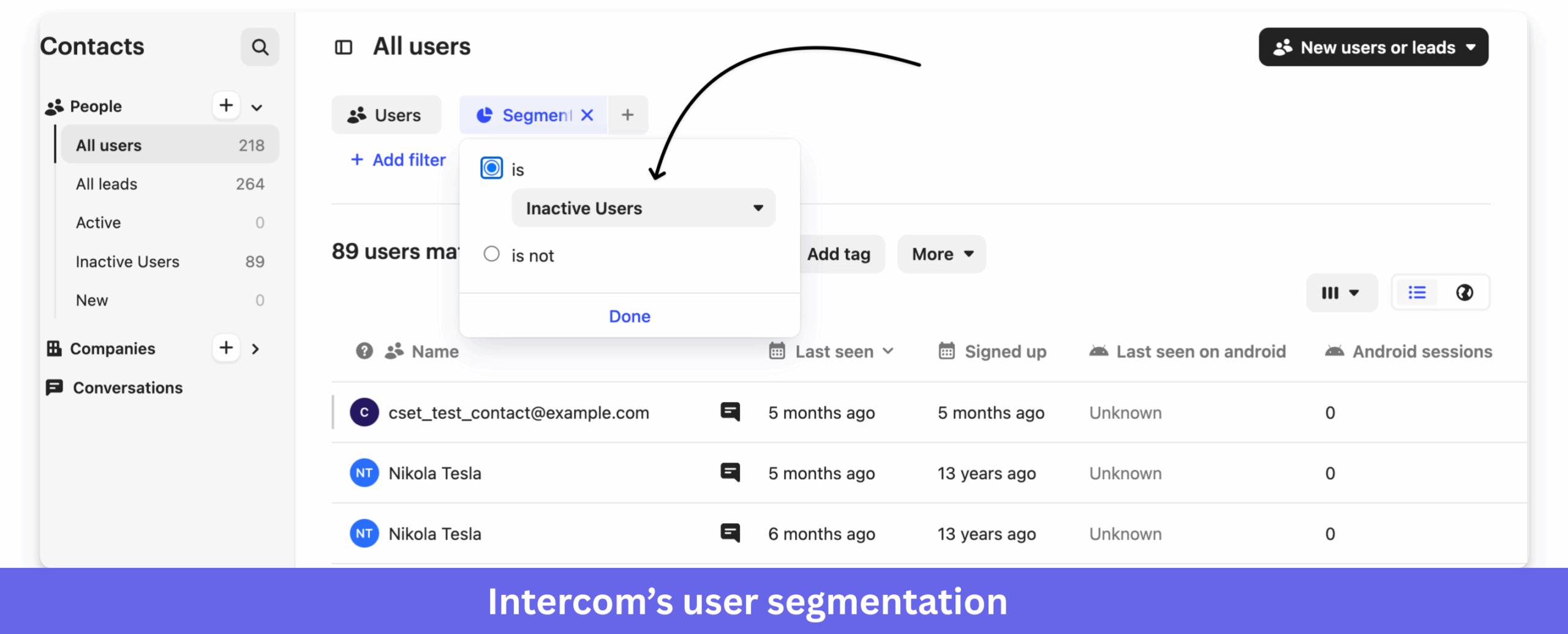
Intercom
Intercom is primarily a customer support platform with a strong focus on customer chats and support tickets in one spot, boosting employee productivity. It also offers some in-app messaging and basic product tour features.
Key features
- Shared inbox (Intercom Inbox): A unified workspace for managing customer chats, emails, and support tickets from one dashboard.
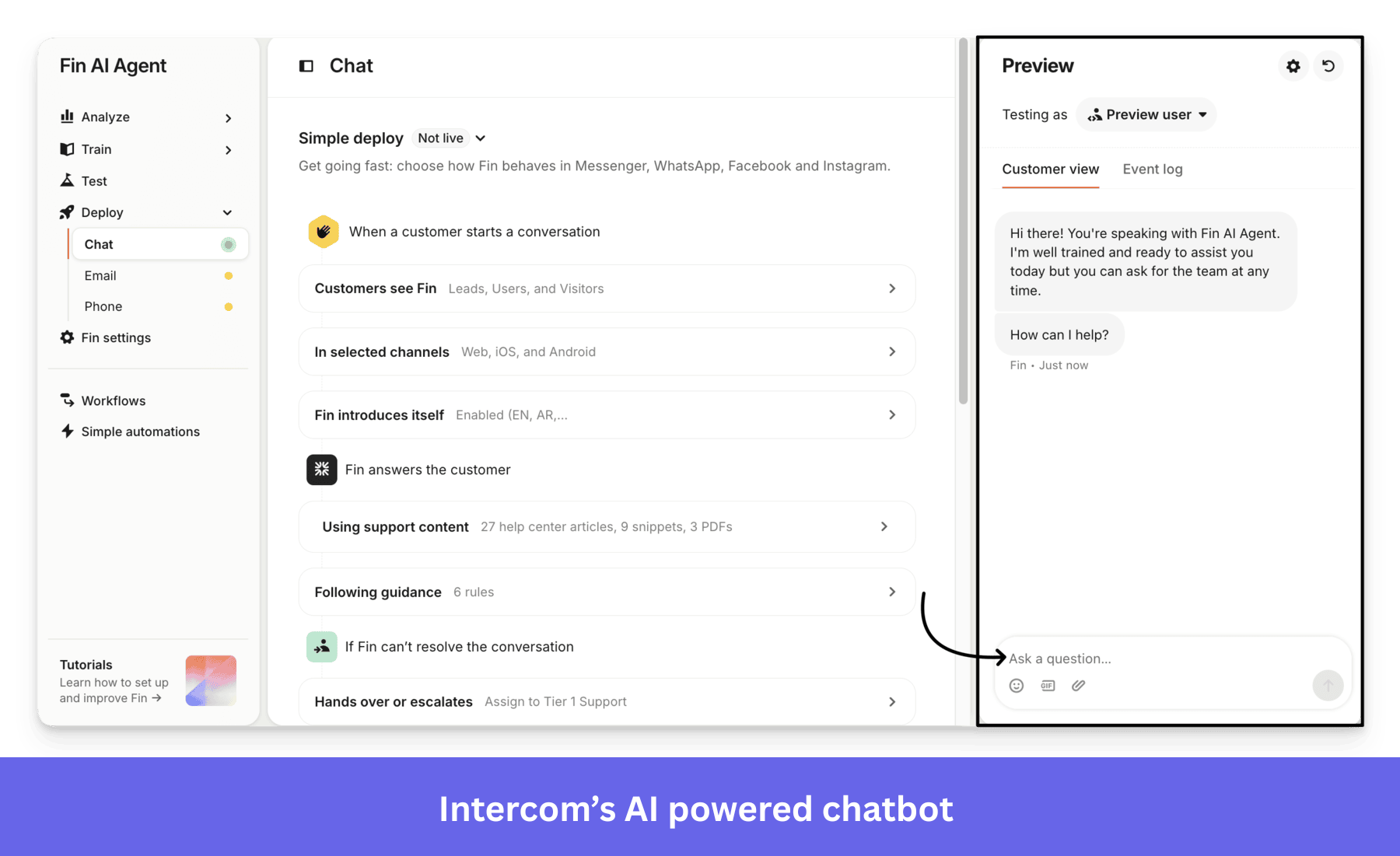
- Fin AI chatbot: Intercom’s AI support agent automatically answers customer questions using your help center content and knowledge base.
- Behavior-based messaging: Create automated messages triggered by user actions, lifecycle stages, or events.
- User segmentation: Segment users based on attributes or behavior to target specific messages and campaigns.
- In-app surveys and feedback: Collect feedback through surveys and simple in-app messages to understand customer sentiment.
Intercom pricing
Intercom uses a seat-based pricing model combined with add-ons for advanced functionality like AI support and automation.
Their pricing structure includes:
- Essential plan: Starts at $29/seat and covers basic support tools.
- Advanced plan: Starts at $85/seat with automation and reporting features.
- Expert plan: Starts at $132/seat with advanced support workflows.
- Fin AI agent: Priced separately based on usage.
Intercom also charges based on the number of support seats and add-ons, which can increase operational costs as support teams grow.
According to Vendr data, Intercom contracts can vary widely depending on seats and add-ons, with mid-market companies often spending significantly more as they scale.
Why it’s a good Whatfix alternative
Intercom is a good Whatfix alternative if your main goal is customer support and engagement rather than employee training or deep product adoption. It works best for support-led organizations that want messaging and automation in one platform.
Pros and cons of Intercom
| Pros | Cons |
| ✅ AI chatbot helps reduce repetitive support work: Reviewers often mention that Intercom’s AI agent helps answer common questions automatically so support teams can focus on complex issues. | ❌ Pricing becomes difficult to justify as you scale: Multiple reviewers mention that Intercom becomes expensive as you add seats, contacts, or AI automation, especially for smaller SaaS teams. |
| ✅ Keeps all customer conversations in one place: Many users say Intercom makes it easy to manage chats, emails, and support tickets from one inbox, which reduces context switching for support teams. | ❌ Steep learning curve when setting up workflows and reports: Some users say Intercom is powerful but takes time to configure properly, especially for automation and reporting features. |
| ✅ Reduces support workload: Filters basic queries so agents can focus on complex issues. |
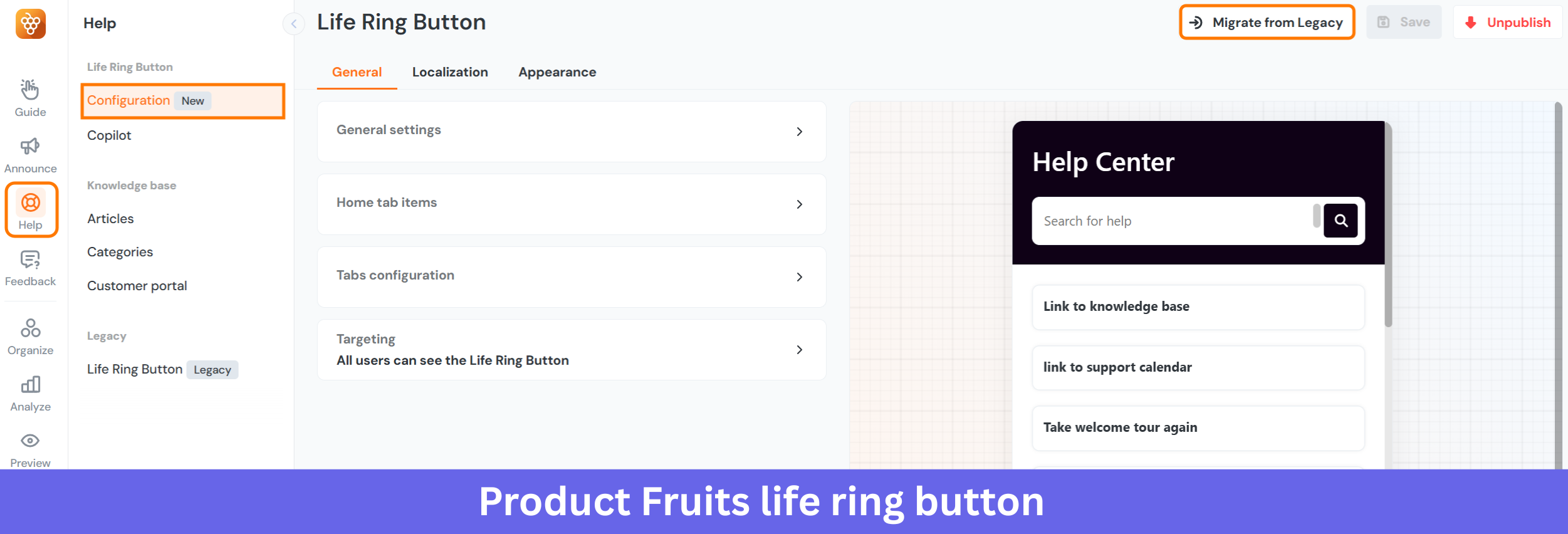
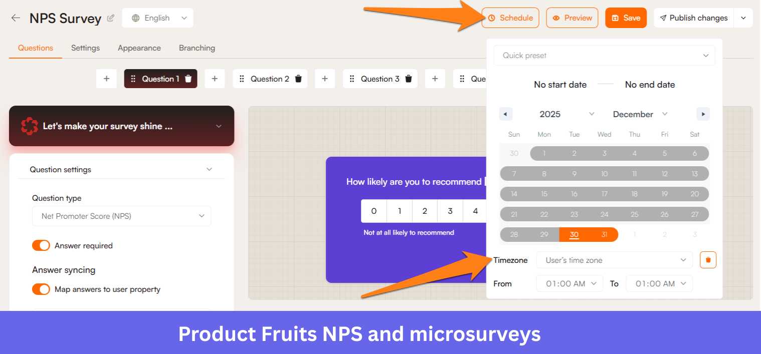
Product Fruits
Product Fruits is a digital adoption platform focused on improving user onboarding for web applications through in-app guidance and feedback tools.
It helps product teams guide users with interactive tours, tooltips, and announcements without requiring development resources.
Key features
- Interactive product tours and walkthroughs: Create step-by-step onboarding tours and contextual hints to guide users toward key features and activation points.
- Life ring button (in-app help center): A built-in help widget that gives users access to guides, knowledge base content, and announcements without leaving the product.
- Checklists and feature announcements: Create onboarding checklists and announce new features directly inside your product instead of relying on emails.
- NPS and microsurveys: Collect user feedback inside the product to measure satisfaction and identify friction points.
- User segmentation and triggers: Target onboarding experiences based on user behavior, attributes, or lifecycle stage.
Product Fruits pricing
Product Fruits follows a monthly active user pricing model with transparent entry pricing.
- Starter: From $111/month (billed annually). Includes product tours, hints, checklists, help center, and basic analytics. Suitable for small SaaS teams starting with onboarding.
- Pro: From $187/month (billed annually). Adds advanced onboarding capabilities, NPS surveys, and deeper product adoption tracking.
- Business: From $374/month (billed annually). Includes premium onboarding features, higher limits, and enterprise-level capabilities.
Why it’s a good Whatfix alternative
Product Fruits can be a strong alternative if you want a simpler and more affordable onboarding solution focused on SaaS product adoption rather than enterprise digital adoption. It’s especially suitable for startups and mid-size SaaS companies that need quick implementation without complex setup.
Pros and cons of Product Fruits
| Pros | Cons |
| ✅ Easy to use with no-code setup: Let teams create onboarding flows without technical skills. | ❌ Limited customization for advanced use cases: Not ideal for highly complex or deeply customized flows. |
| ✅ Improves onboarding and reduces support queries: Guides users with tours, hints, and checklists inside the product. | ❌ Performance issues at scale: Dashboard can feel slow with large data or many tours. |
How to choose the right digital adoption platform for your needs?
Finding the perfect digital adoption platform isn’t about picking the “best” tool in a vacuum; it’s about picking the best tool for you. From my experience, it all boils down to your specific needs and priorities.
- Define your budget: DAPs can range widely in price. Be clear on what you can afford, and look for tools that offer transparent pricing models. Free trials or base packages are a great way to test the waters without commitment.
- Prioritize your features: Do you need to analyze user behavior, or are you primarily focused on interactive guides? Is employee training as critical as customer onboarding? Make a list of your must-have features. For example, if you’re trying to reduce churn, you’ll want strong customer retention management features.
- Consider ease of use vs. power: Some tools are incredibly powerful but come with a steep learning curve. Others are simple but might lack advanced features. Think about your team’s technical skills and how much time you can invest in learning a new platform. As a product manager, I always lean towards tools that empower my non-technical teammates to create and iterate quickly.
- Evaluate customer support: Good support can make all the difference. Look at reviews for customer service quality and how responsive their teams are.
- Test, test, test: Don’t just rely on marketing materials. Sign up for demos, take advantage of free trials, and put the tools through their paces with your actual use cases. Try building a simple product walkthrough or a feedback survey.
Should you go with Whatfix or a Whatfix competitor, then?
In this guide, I walked you through several Whatfix alternatives like WalkMe, Pendo, Intercom, Product Fruits, and others, comparing their strengths across user onboarding, in-app engagement, analytics, and support use cases.
While deciding if you should make the switch, consider whether you prioritize internal or external user guidance. Then, consider if a given platform provides all the top features you need without breaking the bank.
Here’s a simple way to decide:
- Choose Appcues if your priority is building simple onboarding flows quickly with a strong focus on user engagement rather than deep analytics.
- Choose Intercom if your priority is customer support automation with some basic onboarding capabilities layered on top.
- Choose WalkMe if your focus is internal employee training and enterprise digital adoption at scale.
- And if you prioritize strong product adoption capabilities, deep product analytics, minimal engineering dependency, and an all-in-one platform for onboarding, engagement, and feedback, Userpilot is the better fit.
With more companies relying on SaaS tools, the real challenge is getting users past that initial confusion without them dropping off, especially when employee training or digital adoption feels clunky in fast-changing setups.
If you’re dealing with these headaches, I invite you to book a free demo with Userpilot to see how we simplify creating targeted flows that actually help users get productive quicker.
About the author