Website Tour Examples Backed by Data (And What to Avoid in 2026)


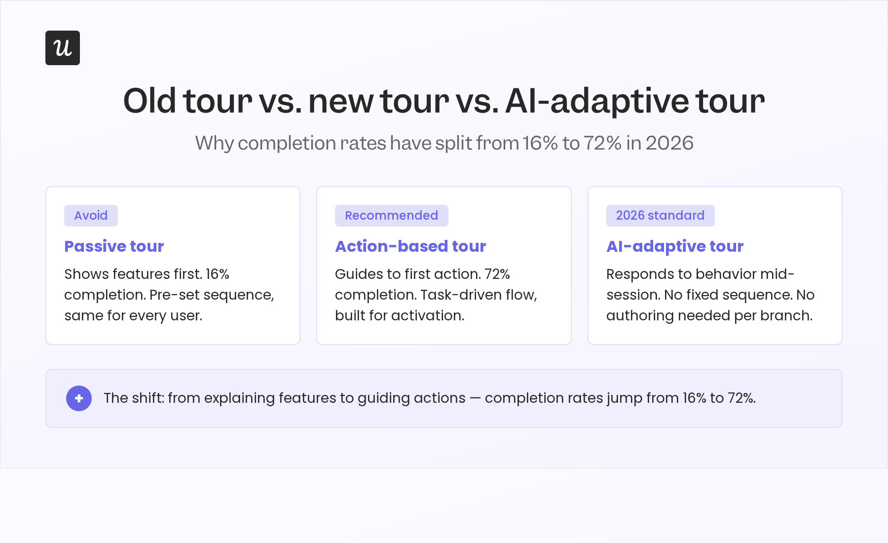
Action-oriented website tours get completed at 72%. Passive, feature-showcase walkthroughs sit at 16%, according to Userpilot’s product benchmarks. That gap comes down to one thing: when the user first gets to act, and whether the tour is built around their actual goals.
This article covers real website tour examples: 8 that show what high-performing tours do in 2026, and best practices on preparing your website tours for the AI era.

8 Website tour examples that drive activation in 2026
Below are examples of good website tours that pass the test in 2026, along with lessons you can learn from them. Spoiler alert: they’re all very specific, to-the-point, and personalized.
1. Wrike: Role-based onboarding
Wrike’s onboarding starts by asking users who they are, before showing them anything. Depending on role (project manager, account lead, compliance officer) the guided tour routes each user to a different entry point. A healthcare compliance manager is taken directly to Wrike Datahub, which links datasets across departments and replaces the spreadsheet consolidation that typically fills their mornings.
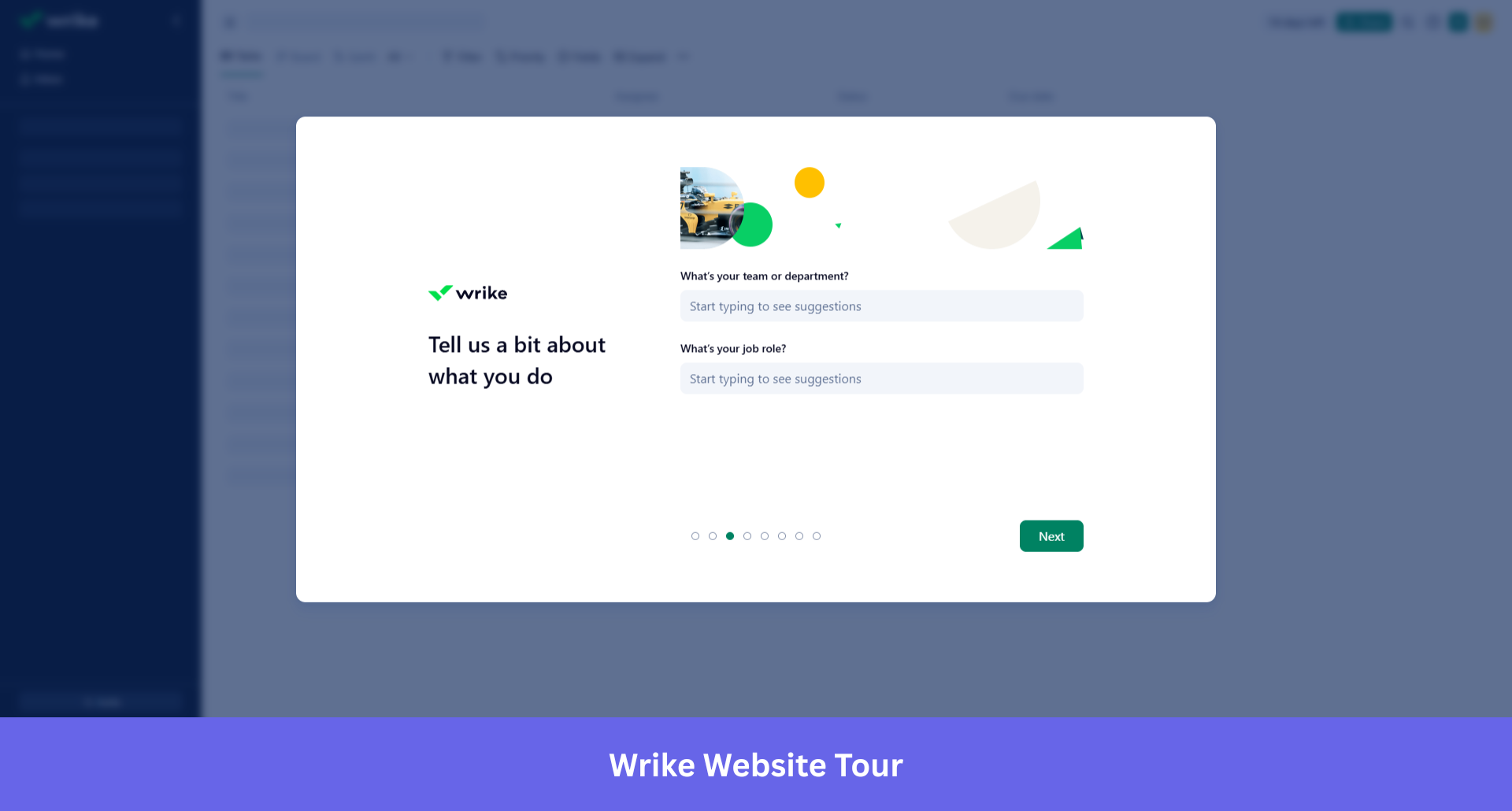
Giving users a choice (continue the guided flow, read more about the feature, or explore on their own) consistently outperforms forcing a single linear path. Flexibility at the right moments is what turns a guided tour into something that actually sticks.
Wrike applies role-based segmentation at the point of first entry, not as a setting buried in account preferences that no one touches.
Lessons learned
- Ask about role before showing the product. Users who see a workspace built for someone else’s job disengage faster than users who see a blank one.
- Map the first tour step to a workflow the user actually does daily, not to a feature the product team wants to showcase.
- Role-based segmentation belongs at entry, not buried in account preferences no one opens.
2. Canva: The reverse product demo
Canva’s onboarding for its AI 2.0 launch flips the standard demo format entirely. Instead of showing users how to use a brush, it asks them to describe a campaign. Canva AI 2.0, built on a foundation model designed for creativity, generates a full multi-channel campaign plan from that description.
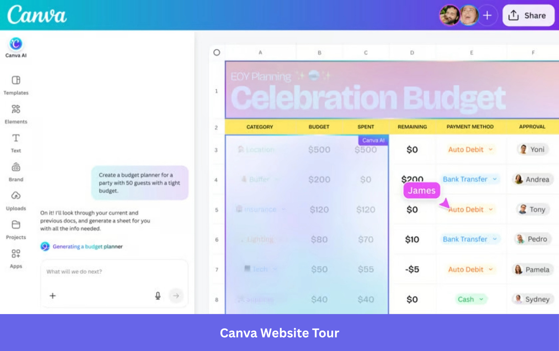
Users onboard by doing the thing they came to do, not by watching someone else demonstrate it. For teams creating product tours, this approach translates into leading with a high-value action (generate, create, publish) rather than a feature explanation (this is your template library).
Lessons learned
- Lead with the output, not the interface. Show users what they can make before you show them how to make it.
- The first action in the tour should be a real goal, not a tutorial task created only for practice.
- If your product uses AI, let it generate a result during onboarding. Value that arrives before the tour ends converts better than value that arrives after.
3. Rocketbots: The activation checklist
Rocketbots built their onboarding around a single question: what is the aha moment for this product, and how fast can we get the user there? The answer was a structured activation checklist that guided new users through the specific actions that correlated with long-term retention.
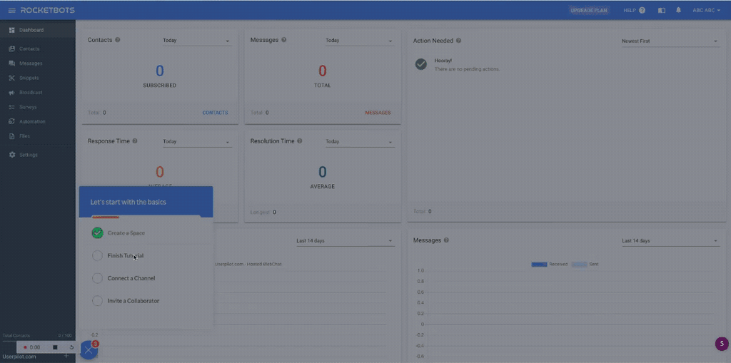
Rocketbots observed a 300% increase in MRR. The checklist did not try to explain every feature. It identified the minimum viable path to activation and made that path impossible to miss.
The Zeigarnik Effect, the cognitive tendency to remember uncompleted tasks more vividly than completed ones, means that a progress indicator showing 3 of 5 steps done pulls users forward. Each completed action releases a small reward signal. Each incomplete item creates mild tension that motivates continuation. Rocketbots’ checklist did not just guide users; it gave them a goal-gradient loop that made quitting feel worse than finishing.
James Mitchinson, our Head of Customer Success, describes the philosophy behind building this kind of onboarding tour:
“We always think of onboarding in terms of getting a user to the most important first value on the platform. You can welcome users and really take them to the most important thing first. Then build onboarding checklists that tell the user these things are important, but they can go at their own pace to take down a chunk through that list.”
Lessons learned
- Define your aha moment first, then build the checklist backward from it. If you cannot name the specific action that predicts retention, a checklist will not help.
- Use progress indicators. A bar showing 3 of 5 steps done pulls users forward more reliably than a prompt asking them to continue.
- Give users pace control. A structured path with flexible timing outperforms a mandatory linear flow.
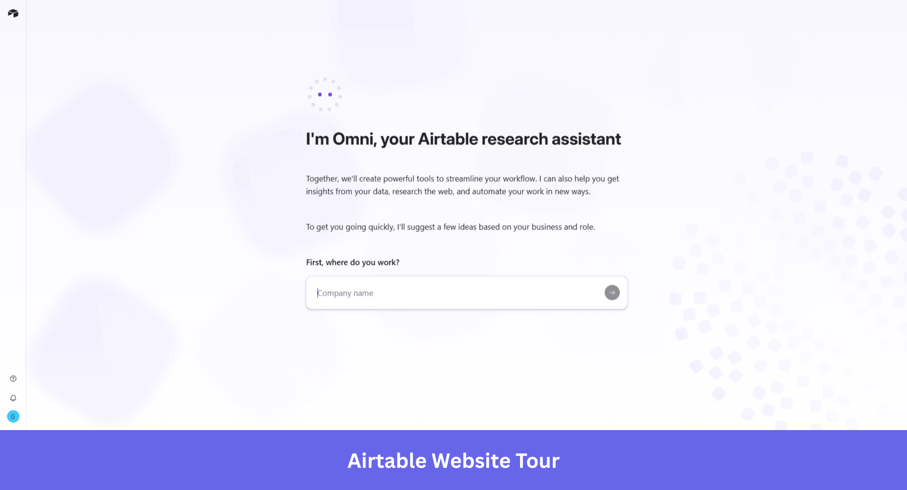
4. Airtable: Contextual tips, not mandatory tours
Airtable’s tour starts with an AI research assistant. “Omni” greets new users with a single question: Where do you work? It uses the company name and inferred role to suggest tools and shape the experience before the user has interacted with a single feature. The contextual tooltip layer still exists, but it now has a smarter front door. The intelligence moves upstream, collecting intent before the product is open, so the guidance that follows is already calibrated to what this specific user is trying to do. That is the same shift described in the AI section below, and it is notable that even a product built on progressive disclosure is now investing in it.
This is the difference between a scheduled tour and a just-in-time one. The scheduled tour assumes every user needs to know the same things in the same order. The contextual model responds to what the user actually does.
For Airtable, whose product has a steep learning curve, this matters more than it would for simpler tools. An upfront tour of all of Airtable’s capabilities would overwhelm most new users before they reach their first base. Contextual guidance surfaces only the information the user needs for what they are doing right now, keeping the interface clean and the learning shallow at first entry.
Progressive disclosure, hiding advanced features behind later interactions rather than front-loading them, is the principle here. Tours should be brief, with 3 to 5 steps often converting better than longer walkthroughs. Airtable operationalizes this by distributing guidance across the user’s first sessions rather than compressing it into a single mandatory flow.
Lessons learned
- For complex products, keep the first session surface-level. Let depth arrive as the user earns it.
- If you add AI intake to personalize the experience, collect context before the first interaction. Guidance calibrated to the user’s role from session one is more useful than guidance that adapts over several sessions.
5. Slack: The red-carpet first session
Slack’s onboarding has been studied for one specific design decision: they never show a new user an empty interface. Before the user has invited a single teammate, Slack pre-populates the workspace with channels, messages from Slackbot, and a guided first interaction.
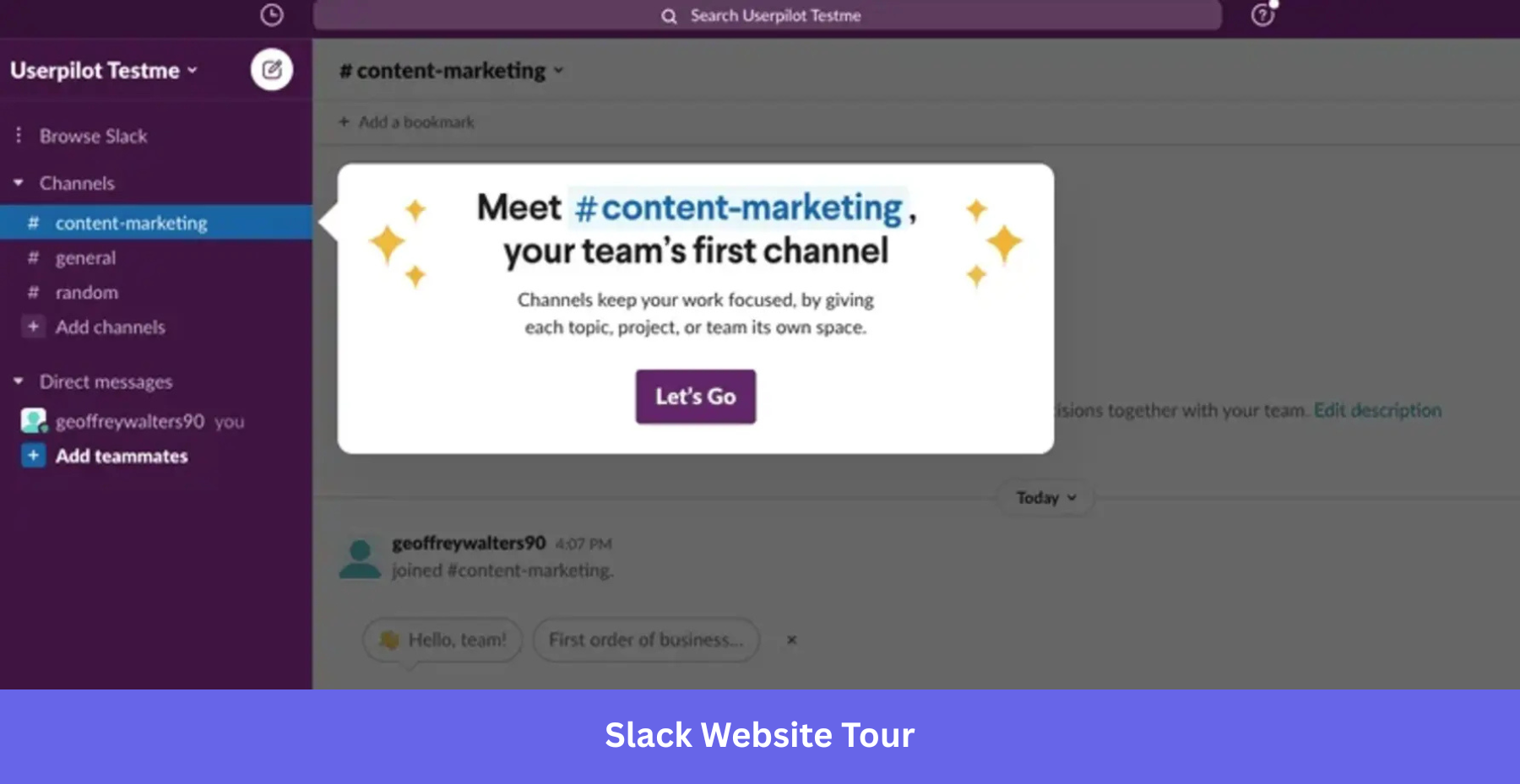
This “red carpet” experience means users feel the product as a working collaboration tool before they have contributed anything to it. The website tour is environmental, baked into the workspace itself, not overlaid on top of it as a tooltip sequence the user has to dismiss.
Communicate value immediately, through action, not through instruction text. A large pop-up explaining what Slack does would get dismissed. An active Slackbot guiding the user through their first channel does the same work without any explanation at all.
Lessons learned
- Never open on an empty state. Pre-populate with content that shows the product working, not a prompt asking the user to start.
- The best website tours are environmental: woven into the product experience, not laid over it as a tooltip layer to dismiss.
- Guidance that shows rather than tells completes at a higher rate. A Slackbot message does the same work as a tooltip saying “this is where messages appear,” without asking the user to read anything.
6. Beehiiv: Demo before signup
Beehiiv made a structural bet: put the demo before the form. Instead of asking users to sign up and then showing them the product, Beehiiv places a 5 to 8 step interactive demo in front of the signup gate entirely. Users experience the product’s core value before they have committed an email address.
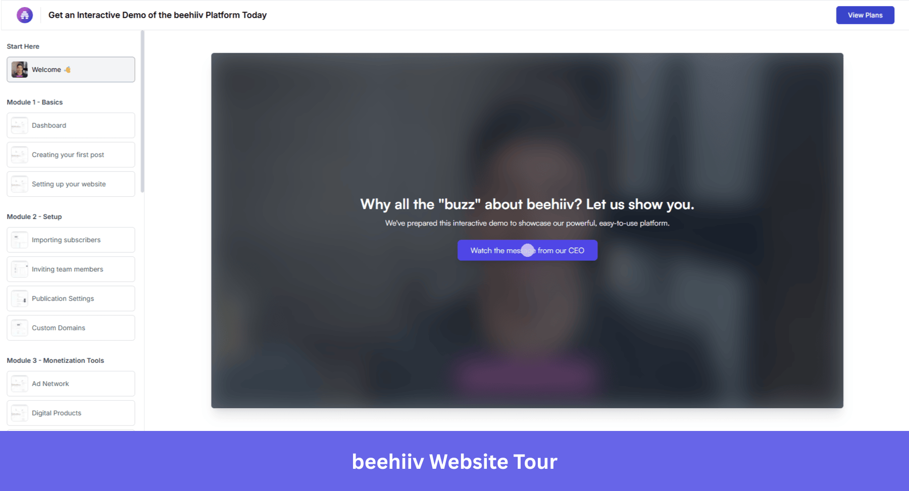
The reported results: 20% demo-to-signup conversion and a 50% free-to-paid lift. The explanation is direct. Users who have already experienced a product’s value are more likely to commit than users who have only read about it. The demo is not a marketing asset. It is the first act of onboarding, and it happens before most products have asked for a name.
This is also how the intent-based routing model works at its most ambitious. Rather than routing different users through different flows after signup, Beehiiv creates the intent before the user has made any commitment at all. The question is not “what path do you want?” The product answers that question by showing rather than asking.
Lessons learned
- Put value delivery before commitment wherever the funnel allows. Users who have experienced a product convert at a higher rate than users who have only read about it.
- Use an interactive demo as the first act of onboarding, before the signup form. The demo answers “is this for me?” so that when the form appears, the user is already convinced.
- Showing a path converts better than asking which path the user wants. Beehiiv does not ask. It demonstrates.
How AI is changing website tours
Rule-based personalization works like this: if a user selects “marketing” at signup, show them the marketing onboarding flow. It is branching logic, better than a one-size-fits-all tour, but still static. The branches were designed in advance. The user fits into one or does not.
AI-powered tours respond to what the user actually does, not what they said they would do at signup. A user who picks “marketing” but immediately navigates to the analytics dashboard gets a different continuation than one who opens the campaign builder. The tour adapts mid-session, based on real behavior.
Most tour sequences are based on assumptions. The product team decides which feature belongs in step 3, based on intuition, user interviews, or what a competitor does. Predictive feature analysis replaces that guesswork with behavioral data. Instead of asking “what should we show first?”, it asks “which feature interactions actually predict whether a user comes back?”
The answer is almost always counterintuitive. The features teams think are central to activation (the ones that go into the tour) are often not the ones that correlate with long-term retention. The features that matter tend to be quieter: a specific export action, a second workspace created, a particular filter applied at the right moment. This kind of analysis surfaces those moments.
AI-assisted guidance and the adaptive knowledge base
Large language models are increasingly being used to handle the part of onboarding where users get stuck on terminology. When a new user encounters a concept they do not recognize (a metric definition, a workflow abbreviation, a product-specific term), an LLM can explain it in the user’s own industry language, right in context, rather than redirecting them to a generic help article.
The model practitioners are building toward is a recursive personal knowledge base: as the user asks questions and reads explanations, the system learns which concepts this specific user needed help with and anticipates the next related set. The guided tour becomes a conversation rather than a script.
At Userpilot, Lia (our AI agent) takes this further. Lia does not just answer questions; it builds onboarding flows autonomously, detects where users are losing momentum, and adapts the experience without requiring a product team to author each branch manually.
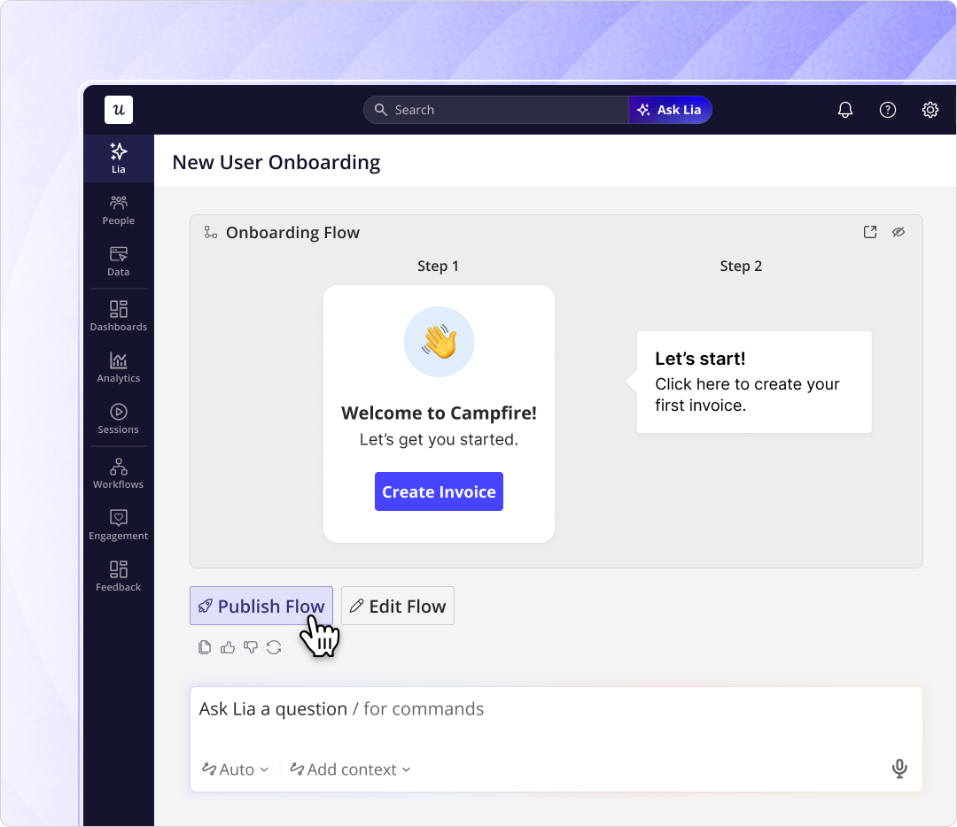
Lia, Userpilot’s AI agent, builds in-app onboarding flows autonomously, detecting friction and shipping the response without a dev ticket.
Lia analyzes product data, identifies where new users lose momentum, and builds the intervention, without the product team having to author every step manually. The team reviews and approves; Lia executes. The same shift you are making for your users (moving from instruction to action), Userpilot is making for the teams who build for them.
Website tour mistakes in 2026 and how to avoid them
The following examples are not here because the products are bad. They are here because each one illustrates a pattern that still shows up in onboarding audits regularly, and each one conflicts with what the data says actually works.
Power-user tips before the user has done anything
Tours shouldn’t overwhelm users with features from the get-go, but present the shortest possible path to activation. Some onboarding flows fall into the trap of wanting to show the full power of their tools upfront, and go crazy on advanced tooltips, keyboard shortcuts, and scheme configuration steps before the user even had her first win. But Salesforce’s State of the Connected Customer report found that 66% of B2B customers stop making new purchases after a poor onboarding experience, specifically when they are dropped into dense dashboards before they are ready.
Leave this for secondary onboarding, and focus on analyzing and surfacing your tool’s happy paths. If your tool is very complex with many different use cases, show an example usage for the user’s job to be done. Notion, for example, shows tooltips showing features not necessary for activation for the first few sessions after first logging in.
Tooltip encyclopedia
Tooltips are still useful for interactive product tours, but not when there are multiple in a row, and if they are purely theoretical. Users don’t feel like reading long sequences of walkthroughs anymore; they’d rather learn by doing.
Research on multi-step tooltip sequences shows completion rates drop sharply after step 5, with retention impact from later steps approaching zero. The shift reflects what most teams discover the same way: users learn a product by using it, not by reading about it.
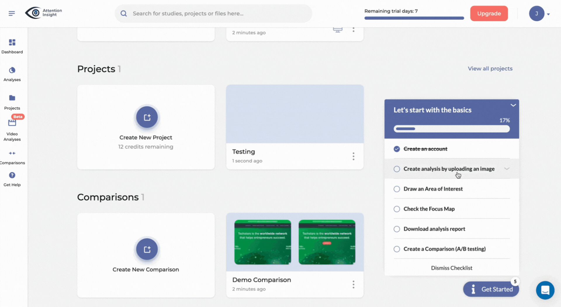
If your product requires tooltips to fully showcase its power, ensure every tooltip triggers action. Take a look at Attention Insight’s onboarding below: the tooltips can be accessed on a self-serve basis from the checklist, and each prompt actually uses the product.
Overly long onboarding wizard
Enterprise SaaS products regularly greet new users with a configuration wizard that must be completed before the product is usable. Assign roles. Define permissions. Configure objects. Set workflows. Each step makes sense from an IT and compliance standpoint. From an activation standpoint, it is asking users to build the plane before they are allowed to fly it.
The cognitive load is front-loaded before the user has any context for what they are configuring or why. Userpilot’s onboarding research consistently shows that completion rates drop with each additional required step beyond three. A wizard that runs 15 or 20 steps produces a starting experience that feels like a compliance audit, not a product.
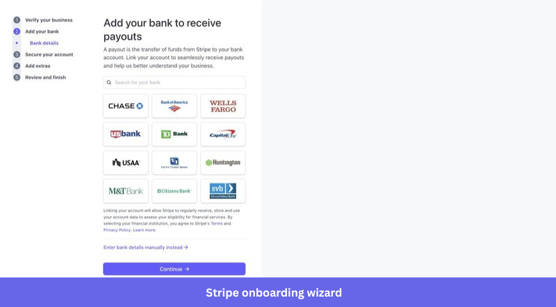
Of course, some products still require a long setup before the user can get started. Those products should focus on clearly communicating the number of steps, reasons why they should be completed, and enable to easily stop and return.
Stripe, for example, does a great job of clearly showing the onboarding path and communicating the reasons why all the steps must be followed.
Build around the job to be done and keep adapting
The examples in this list use different formats: role-based routing, activation checklists, pre-populated workspaces, demos before signup, and AI-generated outputs. What they share is the same starting assumption: the user arrived with a goal, and the tour’s job is to get them to it as directly as possible. Users learn by doing, and they churn when doing takes too long to start.
If you are building or rebuilding a website tour and want to apply these patterns without the engineering overhead, Userpilot’s no-code tour builder is a practical starting point. And if you want Lia to analyze your product’s current activation data and suggest where your tour should focus first, the beta waitlist is open.
About the author