Our 15 Favorite Mobile App Onboarding Examples to Keep Users Motivated


With over 4 million apps competing for attention on the App Store and Google Play combined, your onboarding flow doesn’t really get a second chance. The moment users download your app, they’re already evaluating whether it’s worth keeping or deleting.
In many cases, low retention isn’t about the app itself; it’s the onboarding experience that fails to guide users, clarify the app’s value, or meet expectations.
Many onboarding journeys are bloated, confusing, or overly basic: they either overwhelm users with too much at once or underwhelm them with too little guidance.
If you want to improve user retention, your mobile app onboarding process needs to be both engaging and rewarding from the very start.
In this article, we’ll walk you through 15 of our favorite mobile onboarding examples; apps that nail their first impression.
15 Best mobile app onboarding flow examples
We know this is one of those “show, don’t tell” topics, which is why we compiled a list of apps that boast a well-designed onboarding flow and are overall an engaging and rewarding experience.
Here are 15 great user onboarding examples we believe can inspire you and help you present your app’s features in the best light possible right off the bat:
1. Slack
Category: Team communication and collaboration
Slack uses a personalized setup combined with an interactive tutorial to walk new users through creating a workspace, sending a message, and inviting teammates within minutes of sign-up.
Why is it effective?
Slack guides users with tooltips and modals, showing what actions to take next. The microcopy is short and simple, conversational and uplifting, which reduces friction for new users. The playful, emoji-like design feels warm and friendly, builds excitement, and encourages users to explore the app right away and learn about its key features, without disrupting their daily workflows.

Key takeaway:
Let users do, not just read. The onboarding experience can feel overwhelming if users are expected to remember 30 prompts or options before they even try them out. Trigger core value early by prompting action right after the explanation. For example, prompt users to send a message or tag a teammate immediately after creating a workspace, just like Slack does.
2. Wise
Category: Fintech – personal and business finances
Wise relies on progressive user onboarding and breaking tasks into clear and sequential steps. The entire mobile app onboarding process starts with account creation, followed by identity verification and the first transfer. Once you set up your account, the next steps are clearly laid out.
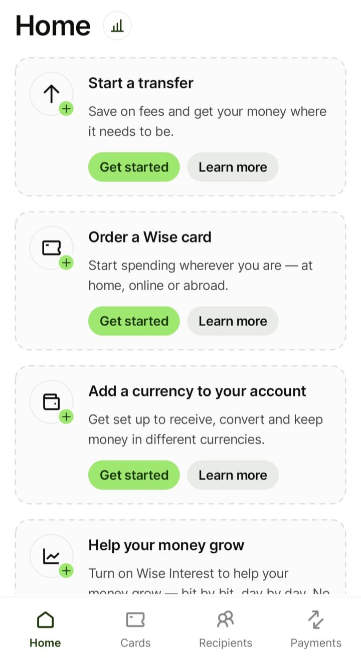
Also, rates and fees are always a pain point when it comes to money transfers. Wise addresses this potential objection by allowing new users to see their rates even before the actual sign-up, delivering value right off the bat.

Why is it effective?
Progress bars and celebratory microcopy after each milestone keep the user onboarding flow engaging and users motivated. Wise reduces anxiety with empathetic, reassuring copy when asking for sensitive data. For B2B users handling cross-border payments, the clear steps and fast setup reduce friction and help improve user retention.
Key takeaway:
Guide users through complex flows using micro-steps and visual cues to build trust and reduce churn.
For example, break identity verification into three smaller steps rather than placing everything on one screen.
3. Asana
Category: Work and project management
Asana uses contextual user onboarding and interactive elements like tooltips and prompts to guide users through creating an account, then setting up projects, adding tasks, and assigning team members. It’s a strong example of an app onboarding flow tailored to the user journey.
Why is it effective?
Instead of overwhelming users with a single product tour, Asana reacts to user behavior in real-time. Tooltips appear when relevant, and subtle guidance supports users as they interact with the app’s functionality, helping them feel productive and organized.
Asana helps users reach their “Aha!” moment, which is creating and managing a live project, quickly and clearly, along with encouraging microcopy.
This user onboarding experience reduces friction for new users and supports deeper adoption across teams. For B2B teams, this solves the common pain point of tool abandonment due to complexity.
Key takeaway:
Trigger actions through contextual prompts that guide users naturally through onboarding screens and feature discovery. For instance, use behavior-based tooltips to nudge users to assign a task right after creating their first project, mirroring Asana’s responsive approach.
4. Canva
Category: Visual design for non-designers
Canva’s mobile app onboarding experience starts with a welcome screen and intent-based personalization. It also asks users what they want to design (like social media or presentations) and adapts the UI and templates accordingly.

Why is it effective?
Introducing users to ready-made templates immediately helps Canva deliver value before account creation is complete. The drag-and-drop editor also offers visual cues that teach users while they interact with the app.
Canva helps users experience instant success by guiding them to create a design early. It’s an excellent example of a benefits-oriented onboarding flow that works across industries, from marketing to HR to internal communications, where speed and simplicity matter.
Key takeaway:
Reduce the learning curve and help users familiarize themselves with the app’s benefits from the start. Let users select what they want to design (such as a presentation or a flyer), then preload templates tied to that intent, like Canva does.
5. Loom
Category: Async video communication
Loom’s mobile app onboarding process eliminates friction with one-tap login (Google, Slack) and dives straight into product functionality with a simple prompt to record a video. The onboarding journey is short, focused, and hands-on.
Why is it effective?
Clear CTAs, progress nudges, and a short tutorial help new users interact with the app right away.

Loom also celebrates small wins, like completing a test recording, which motivates users to keep exploring.
Loom’s onboarding flow gets users to their first output fast: recording and sharing a video. That immediate reward supports user satisfaction and is critical in tools where the “Aha!” moment comes from doing, not reading.
Key takeaway:
Drive activation by guiding users through a fast, functional demo that showcases the app’s core value.
For example, prompt users to record a 30-second video right after login. This can help build confidence and lead to higher activation.
6. Calendly
Category: Meeting scheduling automation
Calendly delivers a streamlined mobile app onboarding process that walks users through a personalized setup flow. It begins with calendar integration, followed by availability preferences, and finishes with sharing a booking link, each as its own step.

Why is it effective?
Calendly uses a clean UI, checklists, and supportive prompts to keep users engaged. The app enables notifications at the right time and provides visual cues that help users familiarize themselves with essential functions without overwhelming users.
This reduces onboarding complexity, which is especially valuable for B2B sales, recruiting, or customer success teams under time pressure.
Key takeaway:
Simplify the onboarding journey with a focused, progressive onboarding checklist that builds momentum toward a clear goal. For example, create a 3-step checklist guiding users to connect their calendar, set availability, and copy their booking link, just like Calendly. Each completed step unlocks the next, with a positive impact on quick activation.
7. Zoom
Category: Video conferencing
Zoom uses a minimal mobile app onboarding flow focused on core functionality. After login, it immediately prompts users to start, join, or schedule a meeting, with no long tutorials.
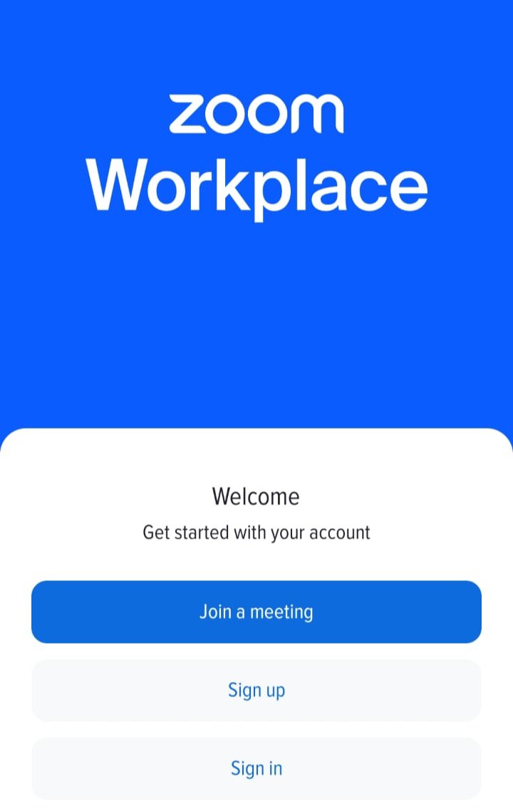
Why is it effective?
Zoom’s user onboarding screens use simple language and large, clear CTAs to reduce friction. The quick path to using the app’s functionality gives users confidence and encourages ongoing use.
Putting action before explanation lets Zoom deliver value to users right away. In B2B scenarios, where speed usually matters (like jumping into client meetings), this approach enhances user satisfaction and improves user retention.
Key takeaway:
Showcase the app’s benefits immediately through action-oriented onboarding that maps directly to user goals. Prompt users to “Start a meeting” as the very first CTA post-login. Avoid tutorial screens; let them experience the core functionality right away, like Zoom does.
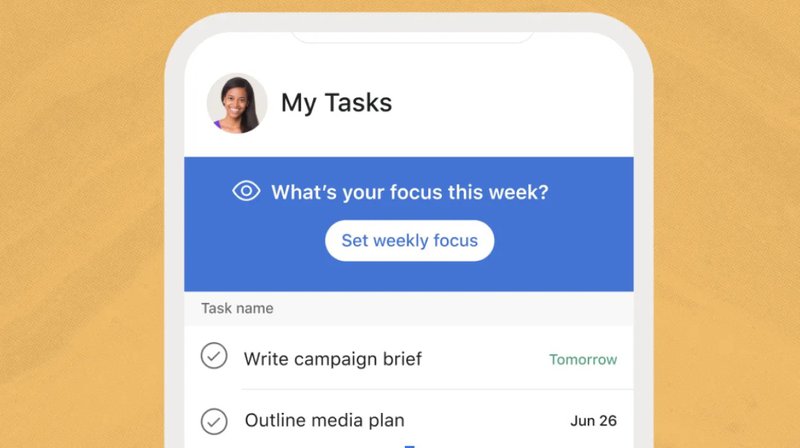
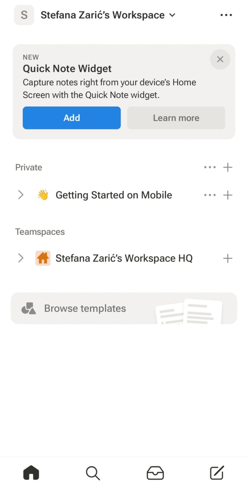
8. Notion
Category: Workspace and knowledge management
Notion uses progressive onboarding via editable templates and unobtrusive tooltips. The mobile onboarding flow emphasizes discovery by letting users explore at their own pace, supported by light guidance and handy checklists.
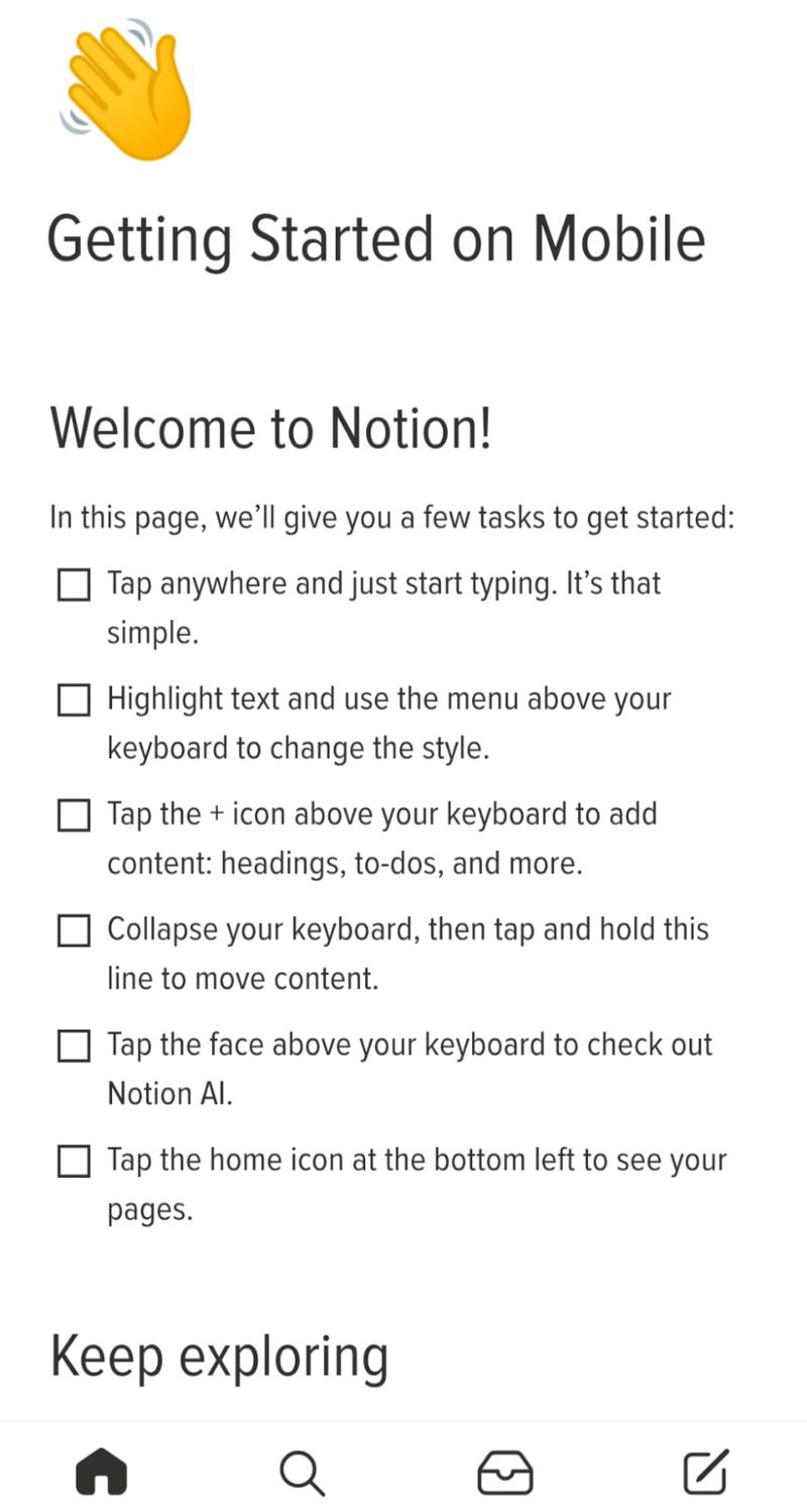
Why is it effective?
Notion’s onboarding experience introduces users to its flexibility and modularity by prompting them to interact with the app through hands-on learning. New users are not forced down a path but are invited to explore based on their preferences.
This approach encourages deeper engagement without overwhelming users. For B2B users, especially knowledge workers, product managers, and content teams, it balances freedom and direction, supporting diverse workflows and advanced users.
Key takeaway:
Give users room to explore while layering in helpful prompts to guide users toward meaningful engagement. For instance, let users edit a blank page freely, but display contextual tooltips based on actions, like suggesting templates when they add a new block, as Notion does.
9. LinkedIn Sales Navigator
Category: B2B sales enablement
LinkedIn Sales Navigator uses a value-driven, personalized onboarding flow. It asks users about their industry, target accounts, and job roles, then adjusts the app experience accordingly, showcasing the benefits of using the app even before the account is activated.

Why is it effective?
The onboarding screens show immediate relevance with smart filters tailored to user goals and offering to set their sales preferences. This helps users interact with the app in a meaningful way early on.

For sales teams, the “Aha!” moment is discovering high-quality leads with minimal setup. LinkedIn’s onboarding process guides users toward that goal quickly, reducing friction and accelerating ROI.
Key takeaway:
Personalization based on user input improves onboarding engagement and helps users progress toward high-value outcomes. You could ask onboarding questions like industry and role, then dynamically customize lead suggestions and feature recommendations.
10. Google Workspace
Category: Productivity suite
Google Workspace uses progressive mobile app onboarding flows tailored to each product (Gmail, Docs, Drive, etc.). Rather than overwhelming users up front, it introduces features gradually by surfacing just-in-time tips during actual usage.
Here’s a part of the onboarding flow for Google Docs, where users are immediately learning about the deeply relatable benefits of using the app:

Why is it effective?
This strategy focuses on showcasing why features matter in context, not just how to use them. For example, when you open Google Docs for the first time, you’re immediately shown how to add comments or collaborate in real time, which highlights the core benefit of fast, async teamwork, critical for today’s global, distributed teams.
Tying guidance to action makes this onboarding experience feel natural and user-driven. There are no lengthy tutorials; just short, contextual tooltips that help users unlock value as they explore. This modular approach prevents information overload and keeps motivation high.
Key takeaway:
Showcase feature benefits at the exact moment users need them. For instance, triggering a tooltip that highlights Docs’ real-time collaboration the first time a user shares a document lets them instantly understand the impact, not just the steps.
11. Basecamp
Category: Project and team management
Basecamp uses a friendly, human-first onboarding flow that relies on warm microcopy, pre-filled content, and motivational nudges to get users oriented quickly.
Why is it effective?
The moment you sign up, Basecamp sets the tone with a welcome note from the CEO, which adds a personal touch that builds trust. A friendly message in your notifications helps you get your bearings, and a pre-filled project dashboard gives you something to explore and modify right away.
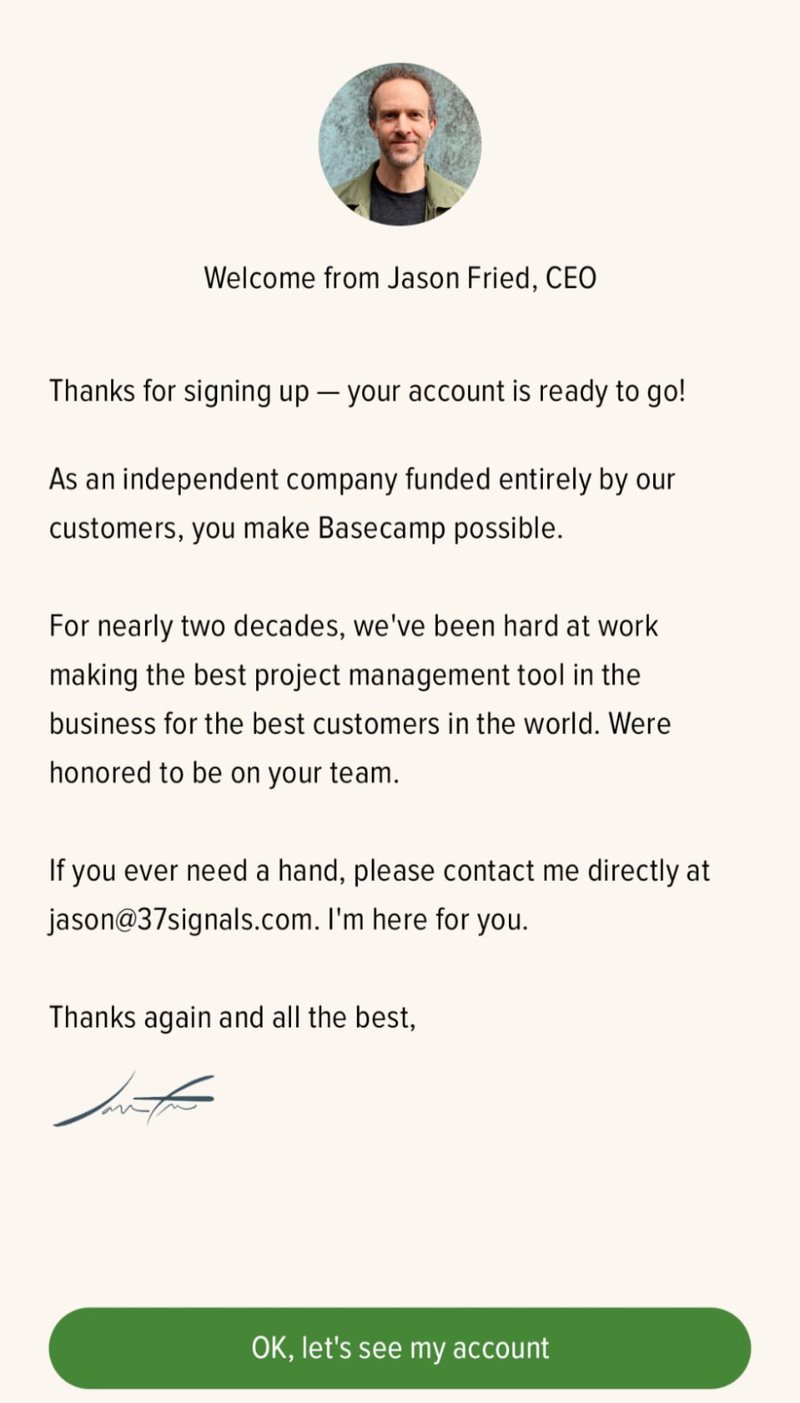
Instead of abstract tutorials, Basecamp uses realistic defaults: to-dos, deadlines, and team assignments you can edit, so new users aren’t staring at a blank screen. With helpful checklists that guide users step-by-step, the experience feels like a gentle hand on the shoulder rather than a rigid walkthrough.

Key takeaway:
Make onboarding feel warm, personal, and purposeful. For example, add a human message (like a welcome note), pre-fill key UI areas, and guide users with checklists tied to real outcomes, just like Basecamp does, to create a sense of momentum right away.
12. Figma
Category: Collaborative design tool
Figma uses a collaborative, action-first onboarding flow with friendly microcopy and built-in collaboration prompts to get users designing within minutes. Its initial screens showcase the benefits of using the app immediately, like the ability to start working with your team right away or mirror your designs on your phone. This is key for teams looking to make their designs responsive on mobile devices!
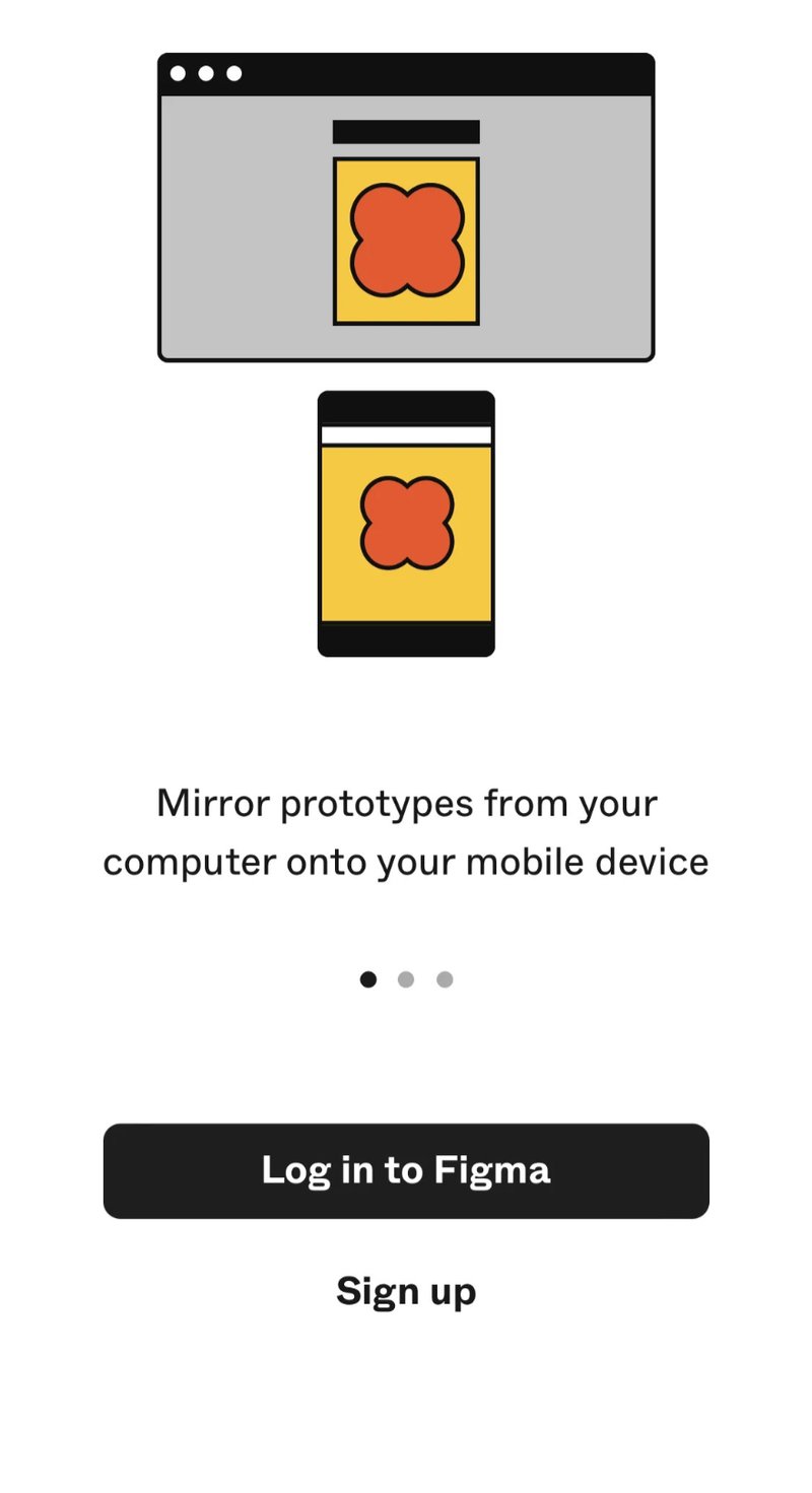
As soon as you create your account, Figma drops you into a pre-made design file with helpful annotations, showing you where to click, drag, and edit. Meanwhile, tooltips guide you through basic actions like drawing shapes, adding text, or inviting collaborators, while subtle prompts encourage you to share the file so you can experience real-time editing with others.
Why is it effective?
There’s no overwhelming setup like with many other design tools, just a clear path to exploring the core functionality right away. This makes the start less intimidating, even if you’re not a designer.
Key takeaway:
Jumpstart engagement by showing users what’s possible in your app right away. Pre-load editable content they can play around with, sprinkle in tooltips for key actions, and prompt collaboration early. Figma does this well and gets users from “Sign up” to “shared design” in minutes.
13. Docusign
Category: Digital signatures and agreements
DocuSign’s mobile app onboarding experience centers on a guided test workflow. Users are prompted to upload a document, set signer fields, and send it in just a few taps. During the entire process, users can choose to tap on “Skip” or “Back” in case they don’t want the guidance or wish to double-check a previous screen.
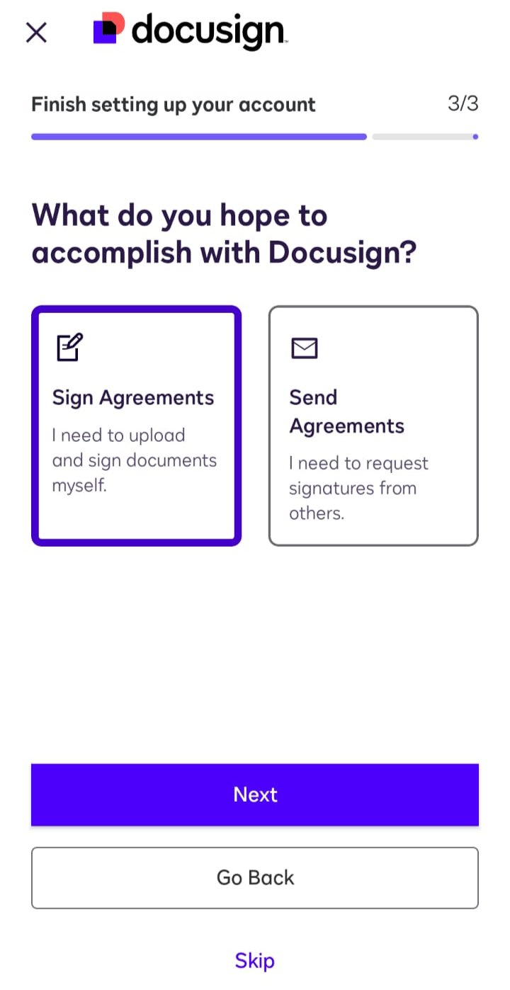
Why is it effective?
Interactive walkthroughs and just-in-time prompts help new users understand each step. The app’s interface is designed to minimize confusion and boost user confidence, especially by giving them control over the onboarding process.
Right after the account setup, the onboarding process is function-oriented: it teaches users by letting them complete a real task. For B2B companies handling contracts or compliance, this builds trust and fast-tracks productivity.
Key takeaway:
Let users complete a real use case early to demonstrate value and encourage continued use. For example, walk users through creating and sending a sample document that mimics their actual workflow, which builds familiarity and trust fast. Let users complete a real use case early to demonstrate value and encourage continued use.
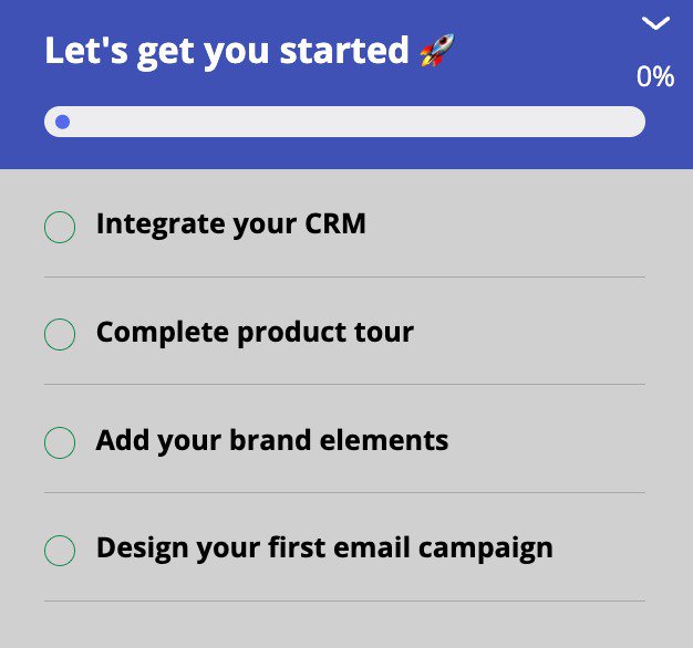
14. Shopify
Category: Ecommerce enablement
Shopify’s mobile app onboarding flow is milestone-based. It walks users through adding a product, selecting a theme, connecting a domain, and launching a store, whether they have an existing product or are launching something new.
Why is it effective?
Checklists, inline tips, and smart defaults help users progress. The onboarding screens avoid overwhelming users by offering bite-sized steps and context-specific prompts. Each screen focuses on one question and offers clarification on why the question is being asked.
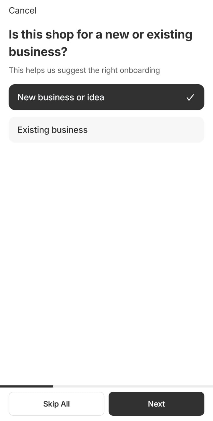
This is especially important in the context of setting up an online store, where there are so many (sensitive) details to pay attention to. For B2B merchants and startups, a clear, gradual, and benefits-oriented onboarding flow keeps users motivated, reduces uncertainty, and supports fast time-to-value.
Key takeaway:
Help users visualize and celebrate progress toward activation milestones. Use onboarding checklists that track completion of key tasks like adding a product or choosing a theme, and provide clarification and encouragement along the way.
15. Coda
Category: Collaborative workspaces
Coda combines interactive templates with in-context tooltips to guide users through building their first doc. The app uses a learn-by-doing approach.
Why is it effective?
Users are prompted to jump right in and explore features like tables, buttons, and automations within the onboarding doc. This encourages experimentation and builds confidence, especially thanks to the small, but mighty note that everything you do in this doc can be undone!
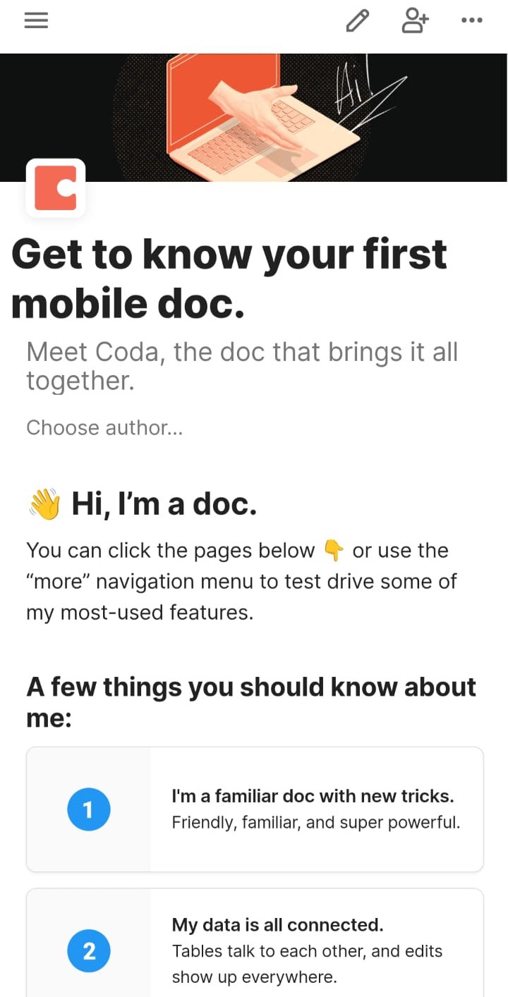
Coda’s mobile app onboarding experience introduces powerful features without overwhelming users. For product and operations teams, this reduces resistance and accelerates adoption of advanced functionality.
Key takeaway:
Teach users through embedded experiences that mirror real workflows. For example, embed editable onboarding templates into your app where users can modify content or trigger automations as part of their actual learning journey.
Best practices for designing effective app onboarding flows
There are many great ideas to pick up from the examples we shared in this article. Now, let’s be even more practical: below, we compiled some best practices to help you start revamping your user onboarding process right away.
1. Immediately show “What’s in it for me?”
Don’t make users wait to understand the value of your app. The best mobile app onboarding experiences showcase the app’s functionality right away, sometimes before users sign up or finish a tutorial.
For instance, Slack’s onboarding flow doesn’t just walk users through setup; it lets them send a message, invite teammates, and preview a workspace almost instantly. New users can immediately understand how Slack simplifies communication.
Why it works: This onboarding experience shortens the time-to-value. Early exposure to core functionality keeps users motivated and improves the user activation rate.
Key takeaway: Let users interact with the app, complete a small task, or see how the product solves a problem right away.
📖 Read more: 12 Modal UI Examples from the Best SaaS Apps
2. Implement “micro-commitment laddering”
Break down the onboarding journey into small, manageable steps. Each one should reinforce progress, reducing drop-off. This approach keeps users engaged and helps them progress without resistance.
Wise gradually walks users through the app onboarding flow with clear visuals, short steps, and progress indicators. Each step feels like a quick win and a more manageable hurdle, from verifying identity to choosing a currency to send.
3. Empower user choice and control
Let users skip, pause, or return to onboarding later in case they want to refresh their memory. Empowering choice gives users a sense of control, especially advanced users who want to explore on their own.
Calendly lets users skip the product tour entirely and go straight to setting availability. A clear “Don’t show again” button on onboarding screens respects user behavior and preferences.
Respect different user types by offering flexible onboarding flows.

4. Reduce friction for entry
Make the signup process as frictionless as possible. That means fewer form fields, fewer steps, and fast login options. Prioritize social login options for one-tap registration, and if entering traditional credentials is necessary, only ask for the bare minimum, like email and password. Users can add profile details later.
For instance, Loom offers Google and Slack sign-in options on the very first screen, skipping traditional account creation steps. Users are recording videos in seconds.
Key takeaway: Eliminating friction during account creation reduces early drop-off and increases the chances that users start engaging with the app’s features right away.

5. Prompt users with effective microcopy
Microcopy should anticipate user questions, reduce anxiety, and reinforce progress, especially when asking for data, permissions, or deeper engagement.
Asana uses warm, encouraging microcopy in setup emails and in-app, like “You’re almost there!” or “Let’s get your first task in” to ease users through creating the account and their first task.
Tiny bits of helpful (and encouraging!) copy go a long way in reducing churn and improving user retention.
Motivate users from day one
You’ve seen what great mobile app onboarding looks like, and now it’s time to put it into action.
Whether you want to guide new users through core features, create progressive onboarding journeys, or keep existing users engaged through contextual nudges, Userpilot gives you the power to do it all:
- No-code onboarding flows.
- In-app experiences tailored to user behavior.
- Built-in analytics to improve user retention.
FAQ
What is an example of digital onboarding?
A great example of digital onboarding is Duolingo’s mobile app onboarding flow that guides new users through account setup, prompts users to select goals, and uses visual cues to teach users how the app works, all while keeping users engaged with playful UI and progress tracking.
What is mobile onboarding?
Mobile onboarding is the onboarding process that helps new users get started with a mobile app. It introduces the app’s features, sets up user expectations, and guides them through essential functions to improve user activation rate and overall user satisfaction.
Which app has the best onboarding?
Apps like Canva, Headspace, and Slack are often mentioned as examples of some of the best app onboarding experiences. They combine clear UI, progressive onboarding, and benefits-oriented messaging to keep users interested and engaged with the app from day one.
About the author