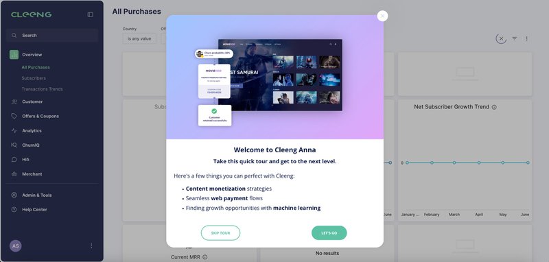
How Cleeng Used Userpilot to Spot a UI Issue and Save Feature Adoption After a 92% Drop


Cleeng is a D2C subscription management platform that unifies the entire subscriber experience across web and mobile apps. Its Subscriber Retention Management (SRM®) suite simplifies subscription management and helps maximize customer lifetime value with features like flexible payments, in-app subscriptions, churn prediction, and AI-powered customer support.
For any product design team, feature-rich dashboards and a fast development pace can pose quite a challenge. They need to design and update a UI that’s as intuitive and frictionless as possible. And when friction does happen, they need to react quickly.
Recently, what seemed like a small UI improvement led to a 92% drop in feature usage. In our conversation, Anna Sobiak, Product Designer at Cleeng, walked us through how Userpilot’s analytics and in-app guidance tools helped them avert this crisis. Her team managed to recover usage by 75% in just a few days, and then identified the source of the problem and found a solution that boosted usage even further.
I’ll show you how they did it!
Struggling with a 92% feature usage drop after UI redesign
Cleeng helps businesses manage digital subscriptions, handling everything from web payments to preventing customer churn. But due to the complexity, their product design team faces the challenge of keeping the dashboard easy to use as new features are added.
To maintain a user-focused design, the team uses Userpilot’s in-app tools to guide users through tasks and announce new features. They also track how users interact with the platform by collecting user behavior data and monitoring page analytics. We see that this approach helps them know if a UI change worked and quickly fix any problems that come up.
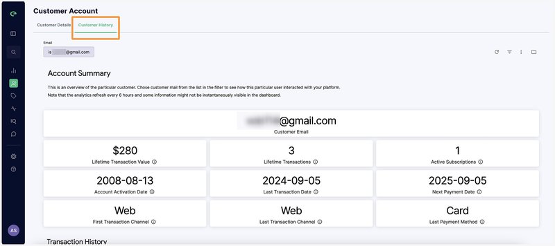
Recently, Cleeng followed the same process with their newly launched “Customer History” page. This feature gives clients detailed information about their subscribers, including transaction history, subscription details, refunds, and customer support history.
Initially, the feature could be accessed through a link inside the “Customer details” bar. Userpilot’s data quickly showed the move was a good decision, as the page became one of their top 10 most-visited pages.
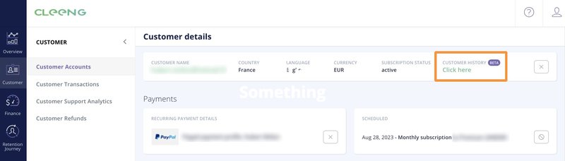
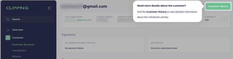
However, during a recent larger UI redesign, the team decided to move the “Customer History” tab. They moved it higher up the page hierarchy with a goal to increase accessibility.
But Userpilot’s analytics immediately revealed a problem. After the redesign, monthly visits to the “Customer History” page decreased sharply, which was a massive 92% drop.
“Pages analytics is the feature we’re using the most. It’s amazing what you can see there.” – Anna Sobiak, Product Designer
The team noticed the drop on Userpilot’s page analytics dashboard and began working to contain the damage and identify its cause.
Solving the feature navigation issues with Userpilot’s tooltips and page analytics
The page visit data indicated that something went wrong. But Cleeng’s product design team still needed to understand why the usage dropped. Was it a bug? Or was it a UI issue?
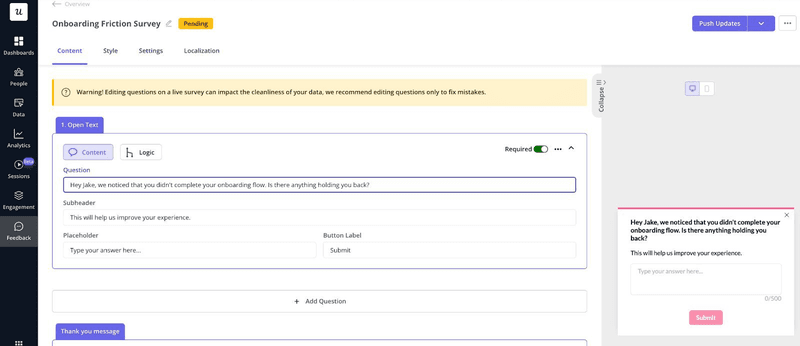
The team suspected the new tab placement had confused users, but they needed to test this theory. Therefore, they added a tooltip highlighting the page’s new location.
“We decided to draw more attention to the feature tab with a tooltip. And we noticed that even with many users dismissing the tooltip, the page visits still increased. That proved to us the page is not visible enough to our clients.” – Anna Sobiak, Product Designer
Right away, the number of visits to the page increased. Though the growth was still below the original margin, it was clear proof that the change in button placement was the issue.
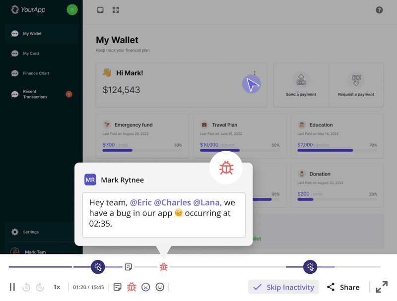
Session replays provided further confirmation.
“Session replays were super useful when we changed the navigation. We could see what exactly the users were clicking and if they were visiting the pages we want them to visit.” – Anna Sobiak, Product Designer
With the replays allowing the team to track the customers’ in-app behavior, the team noticed that many users who had previously used the Customer History feature consistently missed the new tab placement.
The combination of product analytics and session replays clarified that the design change had made a valuable feature invisible to users. Based on these insights, the team decided to redesign again.
Results: 75% increase in page visits and data-driven UI redesign
The tooltip intervention delivered a 75% increase in page visits compared to the post-redesign low, even before any UI changes.
Additionally, the data gave Cleeng’s team the confidence to make another design change. They turned the hyperlink into a green button and moved it back to a more prominent location.
And to guide users through the redesign, the team implemented a tooltip.
With these two actions, page visits jumped up even higher.
The team follows this research pattern for every product update. They monitor the performance of new features with Userpilot’s analytics dashboards, spot friction points, and investigate how to fix them. This systematic approach places user behavior data at the center of product design.
Anna and the team go a step further with their user data analysis. Apart from setting reports inside Userpilot, they also import data points such as unique users, total page views, and average views per user to leverage them in deeper research. They feed the data into spreadsheets to calculate their internal product performance score, complementing the qualitative insights from user acceptance testing.
This workflow empowers them not only to create a high-quality, user-friendly product but also to adopt a truly user-centric mindset in their product design work.
“Userpilot set me on the path to becoming a very good product designer. The platform helps me learn how to use data and make product decisions.” – Anna Sobiak, Product Designer
The 92% feature usage drop could have been a disaster without the right data. But because Cleeng had the right product analytics platform in place, they managed to quickly prevent further drops and gather enough insights to smartly redesign the product, improving it in the long run.
Bonus: Streamlining the onboarding process with modals, tooltips, and a resource center
Feature performance tracking wasn’t Cleeng’s original use case for Userpilot.
The platform had first caught the product team’s attention three years ago because of another fundamental challenge: creating a user onboarding flow that would lead to fast user activation.
Anna and the team chose Userpilot for its no-code approach, which let them implement tracking and iterate quickly without relying on the engineering team. They were also pleased with the diversity of UI elements for building effective onboarding flows.
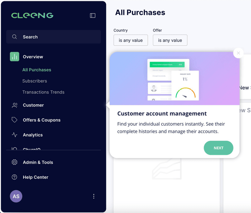
“The main problem we were facing was that our dashboard is very rich in features. Newly registered users were a bit lost and didn’t know where to go at first. So, we made a Userpilot onboarding flow to welcome and orient users.” – Anna Sobiak, Product Designer
The product design team combined multiple UI elements in a careful sequence. The new users first see a welcome modal.
Then, the customer sees tooltips that explain the key features one by one. Clicking “Next” moves the user to the next tooltip.
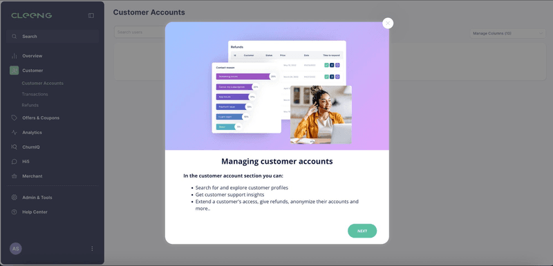
Clicking any feature triggers a follow-up flow starting with a modal that explains the functionality in detail.
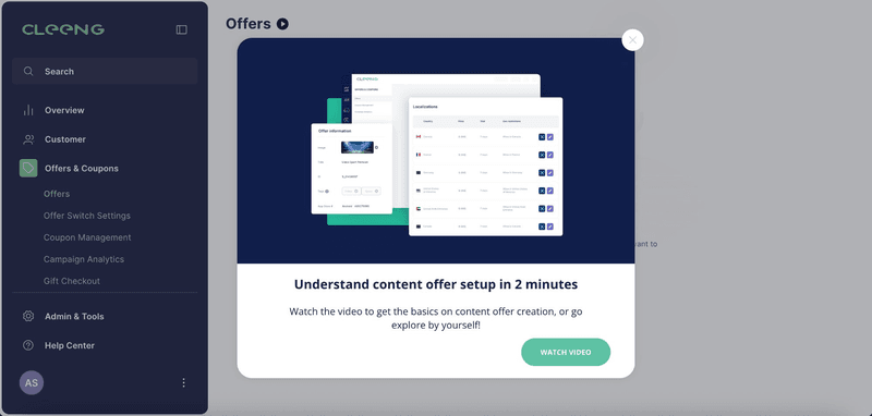
The exact design of the walkthrough varies depending on the feature. For example, for more complex solutions, the team added CTAs to onboarding videos.
On their quest for the perfect onboarding flow, the product design team also revised their help center. Previously, clicking the hyperlink opened an external page in a new window, which pulled users away from the app experience.
The team implemented Userpilot’s resource center, which could now reside inside the app. It combines all the resources needed for a self-serve onboarding, plus a feedback form.
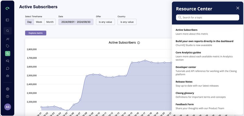
“Userpilot’s resource center is a game-changer. With the old navigation, the help center button was sending users outside of the app, which we didn’t really want. Now, when they click the button, they can see the Userpilot Resource Center.” – Anna Sobiak, Product Designer
With Userpilot’s help, new customers onboard faster and become independent quicker. The team’s also observed an influx of submitted feedback, which was a sign that users feel more engaged.
Design better products and improve in-app experience with Userpilot
Cleeng’s story is a blueprint for how UX teams can leverage data to make better design decisions. Let’s see how Userpilot can help your team as well.
Track product usage with analytics
UX analytics are the foundation for data-driven design decisions.
You can use Userpilot’s “Pages” view or create custom reports to understand how users interact with your app by tracking page views, analyzing funnels, mapping user paths, and much more.
As you can see from Cleeng’s example, it’s important to set up tracking as soon as the feature goes live. Otherwise, the product design team wouldn’t have noticed the drop.
This is possible thanks to the no-code page and event tagging. With Userpilot’s visual labeler, you can start tracking data right away without the need for hard-coded solutions.
Watch session replays
Data can uncover friction points. But you would still have to make guesses on why certain users performed specific actions.
Session replays help you replace that guesswork.
Product UX teams can use Userpilot’s session replay feature to watch real user sessions and get detailed insights into behavior patterns.
Send surveys and collect feedback
Direct user feedback can complement behavioral data, giving you even more specific information about user behavior.
Your product design teams can collect these insights on onboarding, new features, or UX redesigns using contextual surveys. Our key takeaway is to show surveys to selected user segments at the right time rather than broadcasting to everyone.
Guide users through new features
Feature release communication becomes more effective when you can guide users directly within the product.
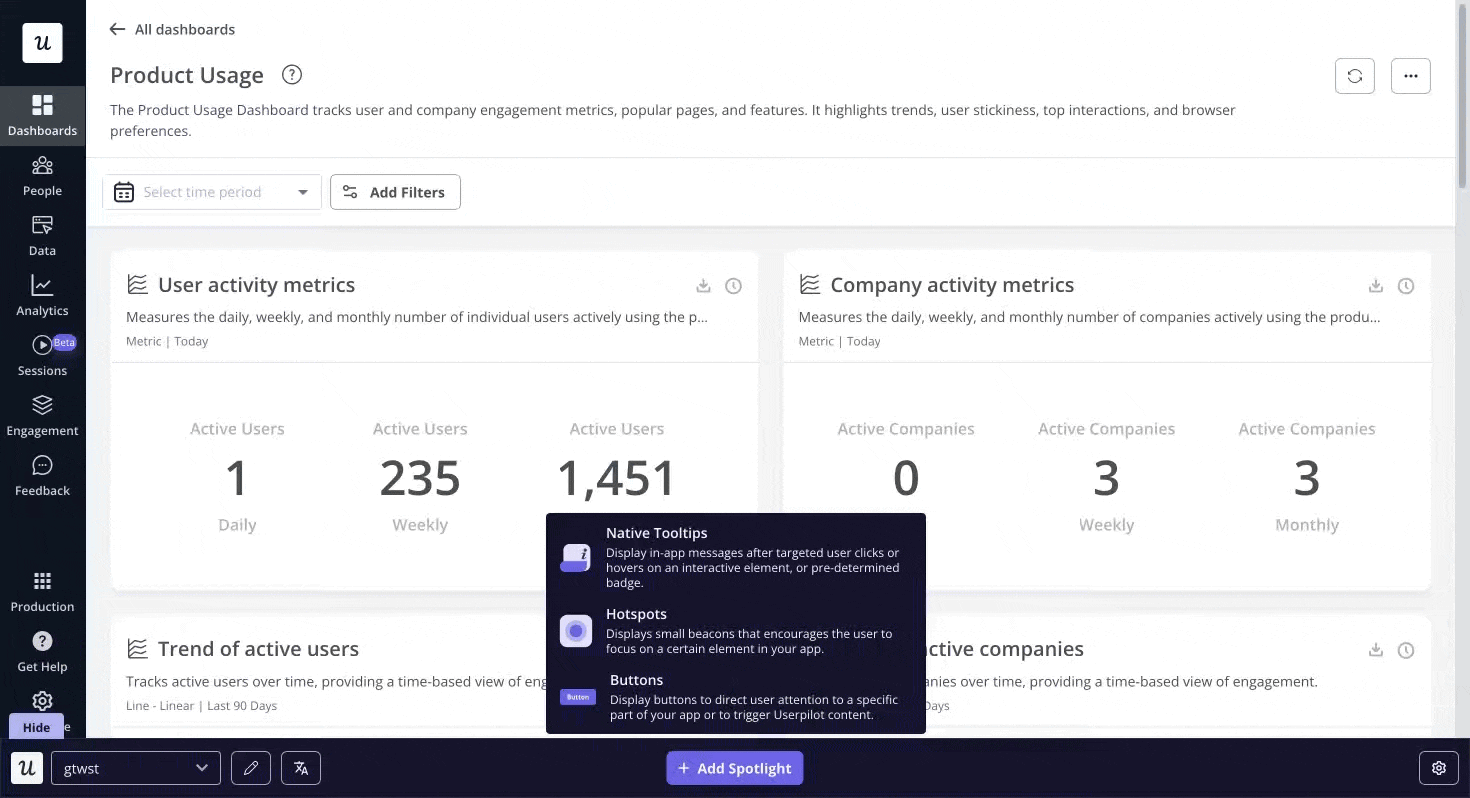
You can implement interactive walkthroughs that showcase newly released features with announcement modals, hotspots, and educational tooltips to improve feature discoverability and adoption.
Would you like to build product experiences that adapt and improve based on real user behavior? Get a Userpilot demo and see how data-driven design can transform your approach to product development.
About the author

![What are Release Notes? Definition, Best Practices & Examples [+ Release Note Template] cover](https://blog-static.userpilot.com/blog/wp-content/uploads/2026/02/what-are-release-notes-definition-best-practices-examples-release-note-template_1b727da8d60969c39acdb09f617eb616_2000-1024x670.png)