How to Create a Winning Customer Onboarding Strategy
A well-defined customer onboarding strategy sets the foundation for successful adoption, retention, and long-term customer satisfaction.
Without a clear objective, whether that’s improving activation, reducing early churn, or increasing trial conversions, it’s difficult for onboarding efforts to drive consistent results at scale.
We’ll stay at the strategy level in this guide. If you’re looking to get more tactical with onboarding flows, patterns, and examples, we’ve covered that in more detail in our onboarding fundamentals and best practices guides.
Step 1: Define the goal of your onboarding process
Having a well-defined onboarding goal is essential to the success of any customer onboarding strategy.
Without a clear objective — whether it’s to boost user adoption, improve retention rates, or enhance overall user satisfaction — it would be hard for your onboarding strategy to succeed.
Here are some examples of onboarding goals to consider for your strategy:
- Reduce the time from sign-up to the first key action by 30%.
- Set a target to improve retention rates, such as aiming for a 45% increase over six months.
- Increase trial-to-paid conversion rate by 45 % in 30 days.
Step 2: Design an onboarding strategy using proven elements and frameworks
There’s no need to reinvent the wheel when building a customer onboarding process.
Use proven onboarding elements and frameworks to create a more streamlined experience for users.
How would you describe your current customer onboarding strategy?
How do you measure the success of your new user onboarding?
How do you currently collect feedback to improve the onboarding experience?
How personalized is your onboarding for different user segments?
It’s time for a more effective customer onboarding strategy.
Stop losing users to generic tours and a lack of insights. A data-driven, personalized onboarding experience is key to increasing activation, adoption, and retention.
Userpilot allows you to build, test, and measure contextual onboarding experiences without writing any code. See how you can turn more users into advocates.
Essential elements of a successful customer onboarding process
A successful onboarding process relies on specific elements and frameworks that welcome users, provide guidance, and build confidence as they learn to navigate your product.
Before diving into specific frameworks, let’s look at these core elements that shape a strong onboarding experience:
Welcome Screens
The first thing users see is typically a welcome screen. Use it to greet new customers and make a positive first impression.
Include information about your product to reassure users that they made the right choice.
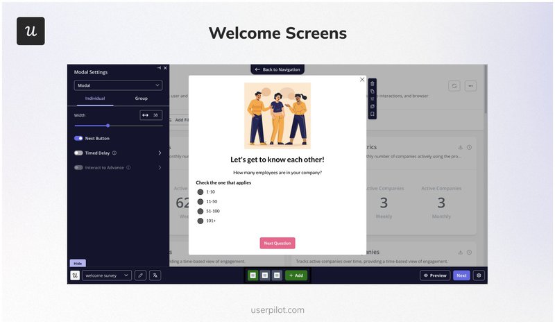
Welcome screens.
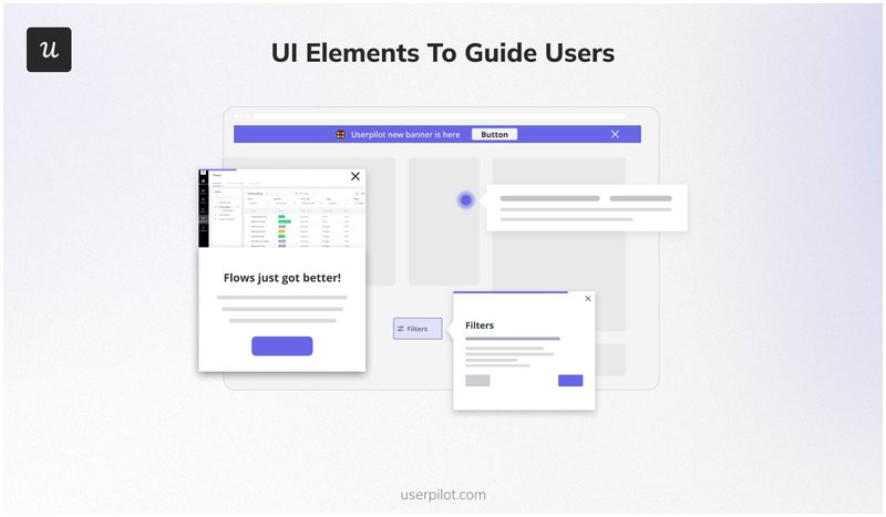
UI elements to guide users
Incorporating the right UI elements makes onboarding smoother and more intuitive.
Use these elements to provide timely guidance and keep users engaged as they navigate your product:
- Tooltips: Tooltips are generally used to guide users through specific features of your product. For instance, you can use tooltips during onboarding to help users get familiar with the interface and encourage feature adoption.
- Modals: Modals are attention-grabbing pop-ups ideal for important announcements or welcoming new customers. Consider using modals to share critical information at key moments, pairing them with a clear call to action.
- Slideouts: Slideouts appear from the side of the screen, making them a less intrusive option for catching users’ attention. You can use slideouts to send invitations to events like webinars or share additional resources without disrupting the user experience.
- Banners: Banners are floating notifications positioned at the top or bottom of your interface. Use banners for minor announcements, such as maintenance updates, so users are informed without interrupting their workflow.
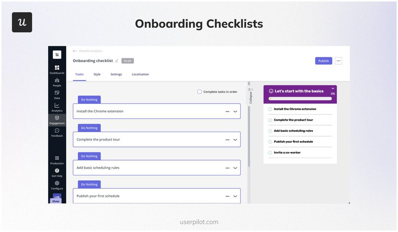
Onboarding checklists
Guide users through the initial stages of your product. They also serve two major purposes:
- Accelerating task completion: For example, Sked Social’s onboarding checklist includes four tasks to help users get started quickly. Adding checklists was worth it because conversions increased 3x when users completed it.
- Increasing activation rates: Checklists consist of 3-5 key action lists that help users experience the value of the product and reach the activation point.
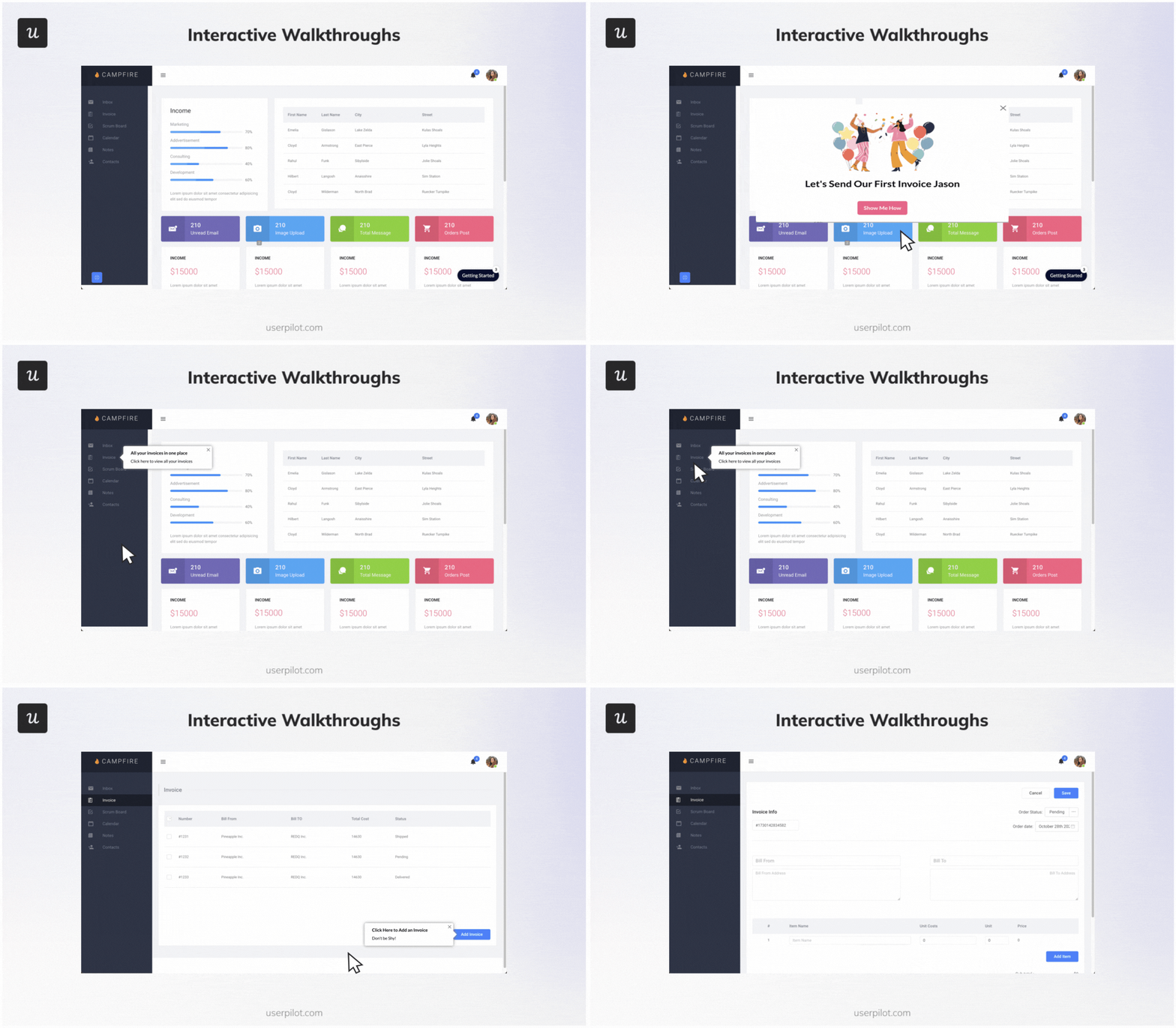
Interactive walkthroughs
Interactive walkthroughs engage users actively, unlike passive product tours, which can be unnecessarily long and impractical.
Our customer onboarding survey revealed that 47% of companies use interactive walkthroughs to guide users. For example, Attention Insight, an AI tool for heat map analysis, improved activation rates by 47% with interactive walkthroughs.
Self-service options
Many customers prefer solving issues on their own and will only reach out for support for more complex problems.
With self-service options, you empower users to find answers independently. This enhances their experience and also helps to reduce the load on your support team as your customer base grows.
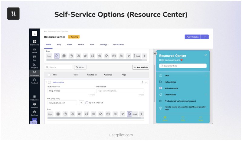
To make self-service effective, create a resource center with educational content and address common questions in various formats like:
- Videos.
- Knowledge base articles.
- Case studies.
- Documentation.
Gamification examples
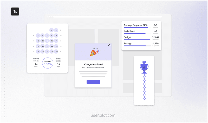
By integrating gamified elements, you help users feel a sense of progress and accomplishment, which further encourages them to explore and adopt features. In short, gamification can make onboarding more engaging and enjoyable.
Some examples of effective gamification elements include:
- Progress bars: Use progress bars to show the completion status of a task or process.
- Badges: Award badges as users achieve milestones. This method is ideal for building a sense of accomplishment.
- Points and streaks: Incorporate points or streaks early in the onboarding process to promote daily interaction. This approach can help users build a habit around using your app, enhancing long-term engagement.
Customer onboarding frameworks to implement
With the essential elements in place, you’ll want to select frameworks to guide the overall onboarding journey.
A customer onboarding framework provides a structured approach to guide new users through your product and ensure they reach key milestones and experience value early on.
The frameworks below help you structure onboarding at a strategic level; the specific UI patterns and flows are covered in our onboarding best practices guide.
Here are some onboarding frameworks you can use for your strategy:
The AIDA Framework (Attention, Interest, Desire, Action)
- Attention: Capture the user’s attention by highlighting your product’s benefits.
- Interest: Build interest by providing valuable information, such as how the product solves specific problems.
- Desire: Create a desire for the product by showcasing relevant features and case studies.
- Action: Guide users toward specific actions, like setting up their accounts or completing onboarding tasks.
The EUREKA Framework (Ease, Understanding, Relevance, Engagement, Knowledge, Action)
- Ease: Ensure that important features and resources are easily accessible.
- Understanding: Recognize the user’s needs and goals.
- Relevance: Make sure the content and features presented during onboarding connect directly to what users care about.
- Engagement: Keep users actively involved through gamification and interactive elements.
- Knowledge: Provide the information users need to use the product effectively.
- Action: Encourage users to take practical steps that demonstrate the product’s value.
The 5E Framework (Engage, Educate, Execute, Expand, Evaluate)
- Engage: Hook users from the start with a welcome message highlighting your product’s value.
- Educate: Provide clear and concise information on how to use the product. Use tutorials, tooltips, or guided walkthroughs to simplify complex features and demonstrate their benefits.
- Execute: Encourage users to take specific actions within the product with clear calls-to-action (CTAs).
- Expand: Motivate users to explore additional features and functionalities by showcasing advanced tools that align with their goals.
- Evaluate: Assess your customer onboarding process by collecting user feedback and analyzing engagement metrics.
The HEARD Framework (Hear, Empathize, Apologize, Resolve, Diagnose)
- Hear: Listen actively to the customer’s complaint.
- Empathize: Acknowledge the issue.
- Apologize: Express apologies for the problem the customer encountered, regardless of fault.
- Resolve: Address the issue promptly with a solution or escalate it if necessary.
- Diagnose: Analyze the root cause of the issue after resolution to prevent future occurrences.
The RAMP Framework (Recognition, Achievement, Mastery, Purpose)
- Recognition: Acknowledge the user’s efforts and successes.
- Achievement: Set attainable goals for users with tangible markers of their progress.
- Mastery: Offer opportunities for users to practice and refine their skills.
- Purpose: Help users understand the significance of their efforts and how their contributions impact the bigger picture.
Customer onboarding templates to use
Consider using customer onboarding templates that align with your goals and adjust them to create the best experience for your customers.
Here are three customer onboarding templates you can customize:
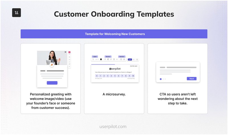
- Template for welcoming new customers
Welcome messages should go beyond simply greeting new customers.
Key elements include a personal welcome, a brief survey to learn about new users, and a clear call to action to guide them through their first steps with your product.
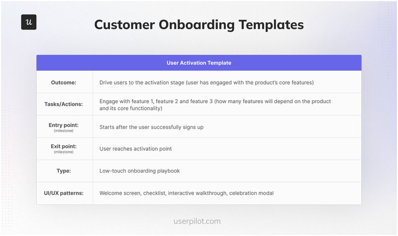
- User activation template
Designed to motivate new users to utilize key features, this activation template entails defining goals, pinpointing specific stages of the user journey to focus on, and outlining tactics to help users reach important engagement milestones.
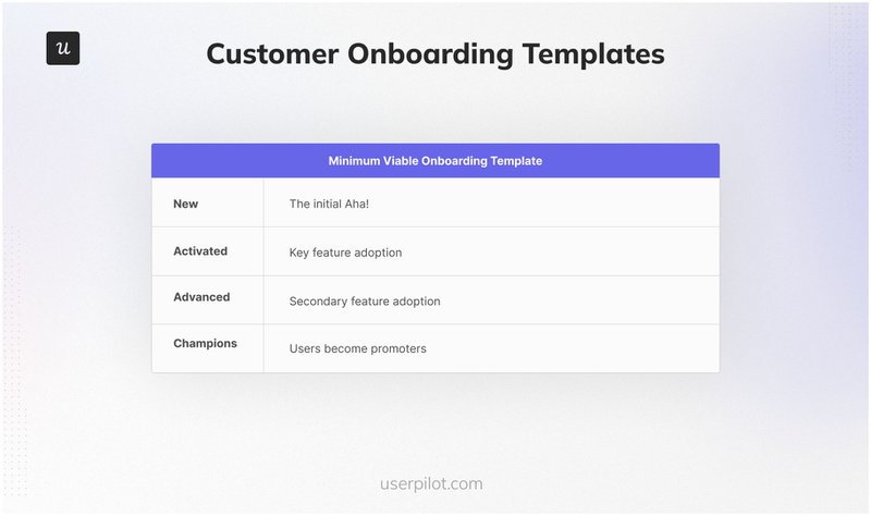
- Minimum viable onboarding template
This minimum viable onboarding template focuses on essential onboarding by highlighting only the core features users need to understand at the start.
Use it to guide users toward successful adoption by outlining the critical steps necessary to begin using the product effectively without overwhelming them.
Step 3: Use the right customer onboarding software to track the onboarding experience
Selecting the right onboarding software can be the secret sauce to your success. A good onboarding platform will help you streamline the process and make the right adjustments.
Here are essential tools to help you optimize your customer onboarding strategy for better engagement, satisfaction, and long-term success:
- User feedback tools are needed for the customer onboarding experience to highlight exactly where users face friction. Additionally, they offer insight into user goals.
- Analytics tools allow you to measure the success of your onboarding flows. Tracking onboarding metrics helps you identify friction points, optimize the user experience, and increase engagement.
- CRM system integrations connect onboarding data with customer profiles to create a unified view of each user’s journey.
- Customer onboarding platforms allow you to create different code-free experiences, A/B test various onboarding flows, and have a centralized view of your customer journeys. Different onboarding tools are available based on your specific goals.
For a seamless experience, use an all-in-one solution like Userpilot to build:
- Interactive walkthroughs: Step-by-step guidance through product features.
- Onboarding checklists: Essential tasks for users to track progress.
- Personalized onboarding flows: Tailored based on user behavior.
- Resource hubs: Central location for tutorials, FAQs, and documentation.
- In-app surveys: Collect feedback directly from users.
- Analytics: Track user behavior across different onboarding touchpoints.
Userpilot also integrates with popular CRMs like HubSpot and Salesforce, as well as analytics tools like Mixpanel and Amplitude.
Step 4: Set onboarding performance metrics
To gauge the success of your onboarding performance, you need to define what metrics you’ll track.
Some important onboarding metrics to track include:
- New user activation rate: Measures the percentage of new users who complete key actions that indicate successful engagement with a product. It is essential for assessing the effectiveness of the onboarding process.
- Product adoption rate: Indicates the percentage of users who start using a newly launched product or feature
- User retention rate: Tracks the percentage of users who continue to engage with a product over time.
Step 5: Implement analytics to refine your existing onboarding strategy based on insights
Analyzing user interactions within your onboarding flow helps identify what’s working and where users face challenges.
With the right analytics tools, you can make data-driven adjustments to your onboarding flow and provide better support to users at each stage.
Let’s go over some key analytics tools:
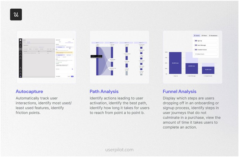
- Autocapture: Records all user interactions automatically, including clicks, text input changes, and form submissions, eliminating the need for manual event tracking.
- Path Analysis: Tracks the sequence of user actions within a product to identify behavior patterns and potential obstacles in the onboarding flow. This analysis helps pinpoint key actions leading to user activation and highlights drop-off points where users may disengage.
- Funnel Analysis: Visualizes user journeys to identify where users drop off, enabling teams to optimize conversion rates. It offers insights into user progress and completion times during onboarding, aiding in measuring the impact of various onboarding elements on overall conversion.
10 Onboarding best practices for a good customer onboarding strategy.
When done right, onboarding doesn’t just introduce users to the basics but also lays the groundwork for a long-lasting, positive relationship.
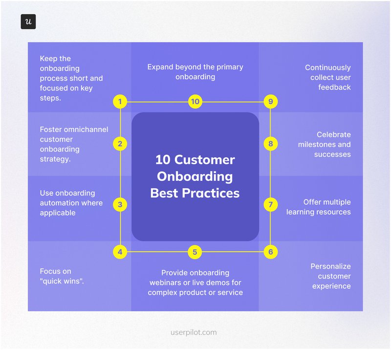
Here are ten best practices to make your customer onboarding strategy effective:
1. Keep the onboarding process short and focused on key steps: Prioritize the essentials and save advanced features for later to avoid overwhelming users.
2. Foster omnichannel customer onboarding strategy: Use in-app guidance and emails to deliver a complete experience.
3. Use onboarding automation where applicable.
4. Focus on “quick wins”: Guide users toward small victories early in their customer journey to build confidence.
5. Provide onboarding webinars or live demos for complex products.
6. Personalize customer experience: Tailor welcome messages, tutorials, and content recommendations based on user JTBDs.
7. Offer multiple learning resources: Cater to different learning styles with videos, articles, and guides available in a centralized knowledge base.
8. Celebrate milestones and successes: Use onboarding gamification to acknowledge customer progress.
9. Continuously collect user feedback: Use surveys, interviews, and analytics to capture user insights and refine the onboarding process accordingly.
10. Expand beyond the primary onboarding: Plan for ongoing support and education.
Conclusion
An effective customer onboarding strategy transforms new users into confident product champions.
From building the foundation of your customer onboarding plan to implementing these best practices, setting up your strategy won’t be a hassle if you follow the steps and explore the resources listed here.
FAQ
What is a customer onboarding strategy?
Customer onboarding strategy is the process that gets new users and customers familiarized and comfortable with your product.
What is a good client onboarding process?
A good client onboarding process is streamlined, personalized, and value-focused on customer success.
What is a customer onboarding strategist?
A customer onboarding strategist designs and optimizes the customer onboarding process from initial signup to product mastery for customer success.

