Empty State in SaaS Applications – How to Design Better User Experiences

If most UX designers noticed an empty state in a SaaS product they were working on, they would view it as an example of poor UX.
And this is partially correct: it’s unlikely that your customer will deem a blank screen a particularly meaningful part of their product experience.
But if every problem contains the seeds of opportunity, then empty states also present UX designers with a chance to educate customers on how best to use your product, or just show off your brand’s personality.
How, you might ask? Well, you’ve come to the right place.
Summary of empty state in SaaS
- An empty state is the technical design term for a screen inside your product that is almost completely blank.
- Empty states occur most commonly when users have just signed up to a new platform, or when there is some kind of error message.
- If left as a boring, blank screen, empty states are problematic because they increase Time to Value.
- UX designers should fill empty states with user onboarding hints, demo data, or attractive branding.
- Monday, Jetadmin, and Notion have all found ways to make the most out of their empty states.
- Userpilot is a great tool for building tooltips and modals to replace empty states in your SaaS, without requiring code. Sign up for a Userpilot demo today!
What is an empty state?
An empty state is a moment in a user’s product experience where there is nothing to display.
Sometimes, this is due to a temporary lack of user data; other times, the user encounters an error.
Whatever the reason, what the user sees is an empty screen, like this one:
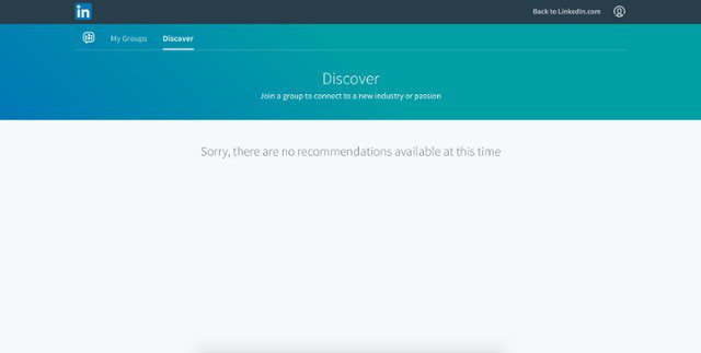
The word “empty” is slightly misleading, because the empty state screen is almost never completely “empty,” per se.
It might have a brief error message on it that explains why the customer is seeing this particular page.
But from the user’s perspective, an empty state is often confusing and annoying.
When might you encounter an empty state?
Here are some examples of when your user could see an empty state screen:
- users sign into an app for the first time and haven’t had the chance to input any of their data yet (they are still new and haven’t completed the app onboarding experience)
- when running a search on your platform that returns no results
- if the user experiences an error ( e.g. clicking on a button and nothing is loading on the screen)
- user cleared their data ( e.g. deleting all tasks in a project management tool)
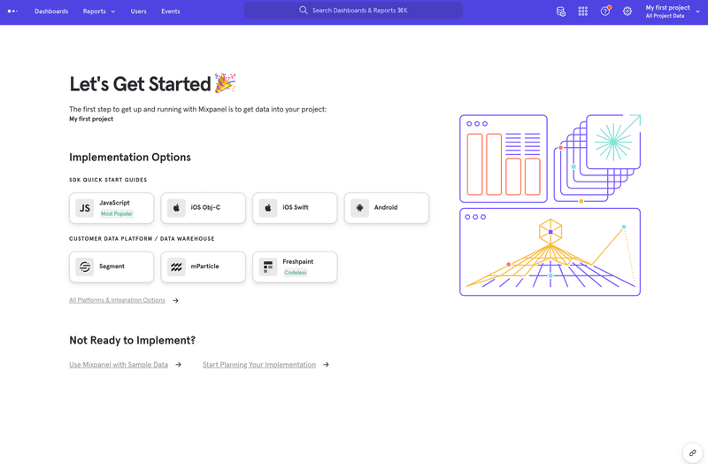
Imagine Mixpanel greeting their users with a white screen when they first sign up instead of this guiding starter content.
What do all these situations have in common?
In each case, the user is “between states.” Put another way, they performed a group of key tasks inside the app but got stuck.
The worse part?
If all they see is an empty screen that doesn’t at least display an error message or an action that must be taken, users end up being confused and might even not return to using your app.
You should at least provide guidance to your users instead of letting them stare at an empty state screen.
Even Slack does it and their tool is supposedly easy to use.
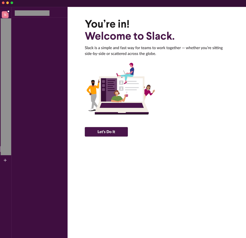
From a UX designer’s point of view, it’s tempting to think that there’s little economical or practical use in spending time designing an empty state like this, simply because instances like these affect a minority of users.
That’s why the empty state pages that are designed are often rather boring and devoid of educational content. Designers have other priorities.
I’m here to tell you that this is a faulty design mindset — and here’s why.
What’s the problem with empty states in SaaS businesses?
Do you remember the art exam in school where you were asked to draw something on a blank sheet of paper?
I bet that you didn’t find it much fun. Right?
From a psychological perspective, tasks like these are stressful because they require a lot of activation energy just to get started.
It’s the same reason that we procrastinate on filing our taxes and large work tasks. There’s no obvious way to begin, so we put it off.
So how does this relate to empty states and their effect on user onboarding?
Empty states slow down your onboarding and increase Time to Value
Just as you didn’t want to engage with the blank piece of paper in your school art exam, your customer is put off from engaging with your product when they see an empty state.
They don’t know where to click, or who to turn to for guidance.
So the best-case scenario is that they are slower to understand your product, thereby reducing your Time to Value. Here’s a reminder of what that metric means:
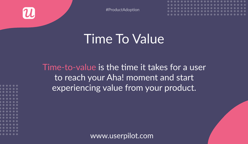
Other times, they might just churn entirely, with unpleasant financial consequences for your business.
So what can you do about this problem as a UX designer?
Best practices for designing empty states
Good UX designers seek opportunities to enhance the user experience whenever they can — even when a user is “between states,” in the sense we described earlier.
This could mean educating your customers about your product, leading them directly to a new page, or even just injecting a bit of brand personality into the interaction.
Here are three concrete ways that you can transform an otherwise dull, blank page into a meaningful experience for your customer.
1. Use your empty state to gently guide your user towards value
Consider that customers freeze when they see empty states because it’s not clear to them what to do next.
So one way that you can “break the spell,” so to speak, is by encouraging users to take action.
Welcome screen modals
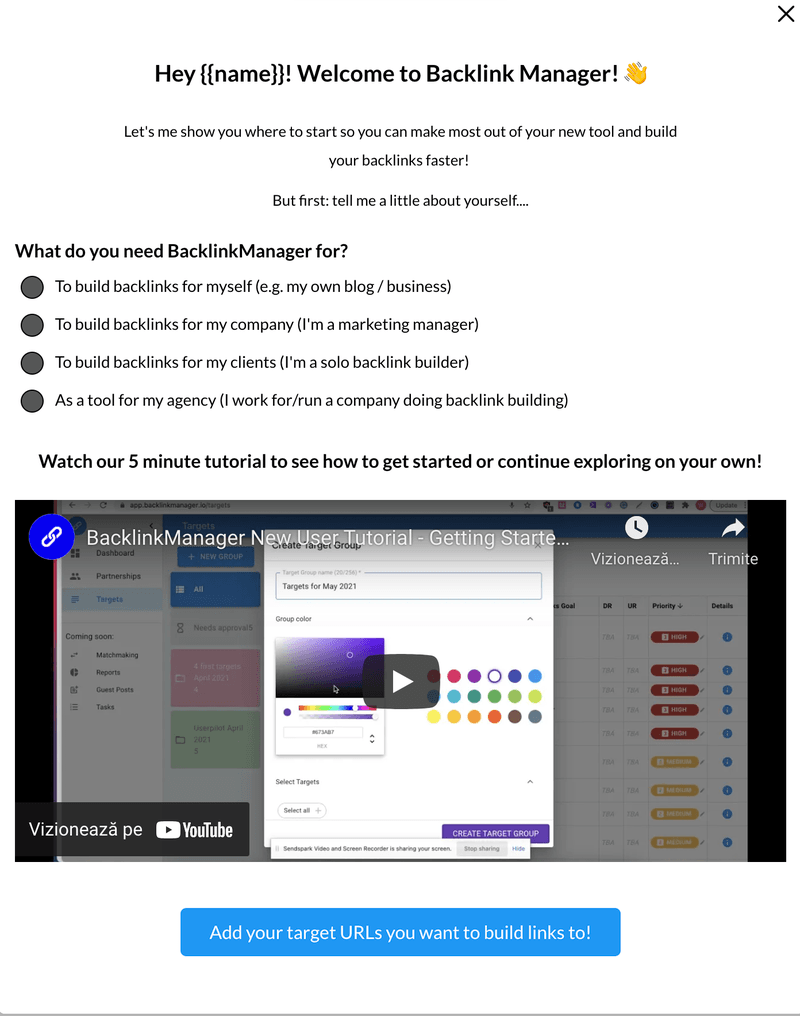
For example, you might create a modal, which is large enough to catch the customer’s attention, and then guide them towards clicking on a call to action (CTA) which will take them to the core of your product.
Welcome screens work great in this case.
They are the first thing the users see when they sign up for your app and you can use them to guide them on what key tasks they should perform first so that they get the most out of your app.
Check out this example from Backlinkmanager. Not only the user is not greeted and confused by a blank screen, but there are also multiple benefits this welcome screen brings:
- collect more data about your users through a simple micro survey ( data that you can use to personalize their onboarding path based on their needs)
- delight users and build an engaging first experience by welcoming them and guiding them to take action
- add a more personal touch with a short video of a human welcoming users or simply add a short intro video on your modal to help the user get started
Tooltips
Alternatively, if there’s an important UI element on your top navigation that you’d like to highlight, you could use a product adoption tool to create a tooltip that helps users understand that feature and help them get started.
The best part, using a no-code product tours software to build tooltips and modals will speed up the UX design process since you don’t have to custom code these and can also test multiple designs and copies to see which works best.
You can now also explore how to improve retention in your mobile app with Userpilot’s brand new mobile features.
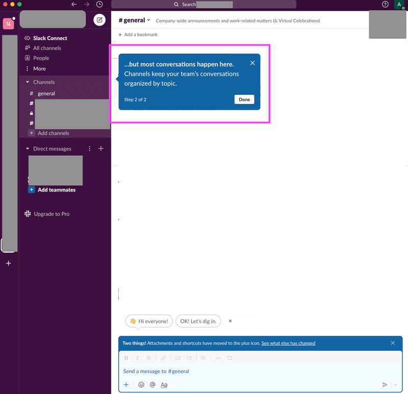
Slack uses tooltips to draw the user’s attention to the main UI elements inside the app when a user first joins a Slack Group.
One tooltip to showcase where direct messages are.
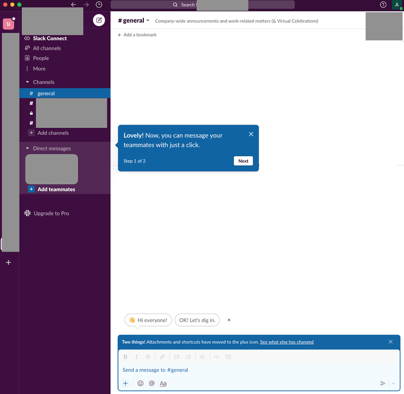
.. and another tooltip to explain the channels section.
Product tours
Tooltips are exceptionally good for explaining one feature at a time, just because they are so small and subtle as to naturally blend in with your native UI.
But when you combine multiple tooltips into a short product tour ( also known as interactive walkthroughs) the results are exponentially better.
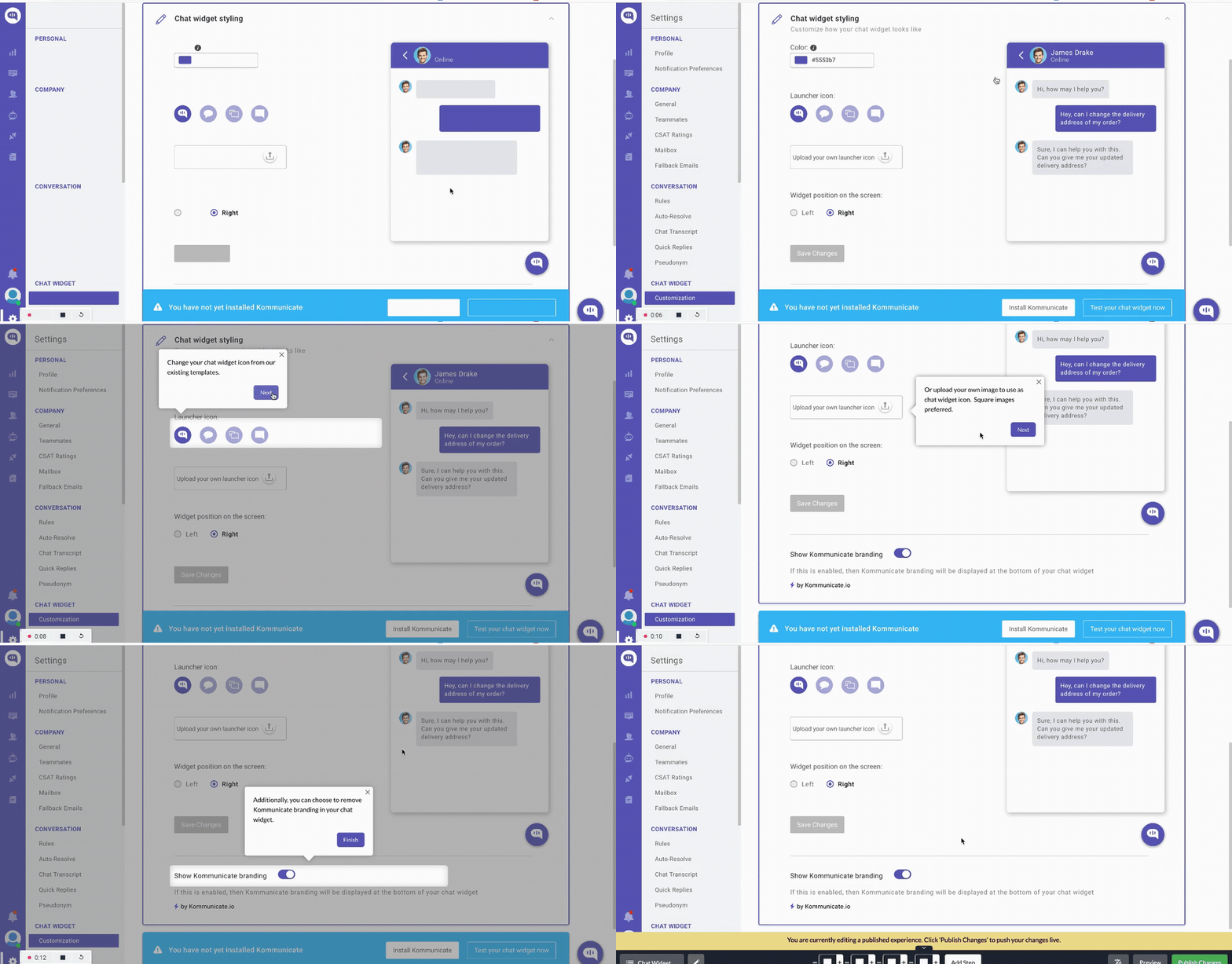
One tooltip can drive the user’s attention towards a UI element but can also trigger a short product tour, which is a bunch of tooltips that trigger sequentially once the user engages with each, guiding users step by step.
Here’s an example of how Kommunicate guides their user to perform one key task- customizing their chatbot.
If you want to replace your empty states with tooltips or modals, sign up for a Userpilot demo today!
2. Replace your empty states with meaningful demo content
Picture the scene: new users sign up to your platform, are excited to try it out, and then they see this empty state:
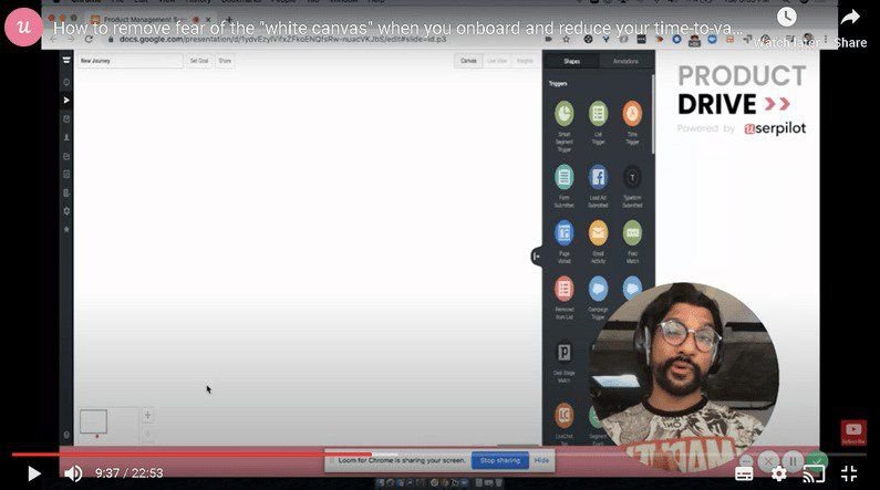
If your platform seems like a ghost town, it’s unlikely that your customers will stick around for long.
That was the issue faced by Shiv Patel, founder of the marketing automation tool Autopilot.
As many as 50% of Autopilot’s users churned after completing the free trial.
Shiv solved this problem by creating customer journey templates. He used the templates to store content from fake users, presented in a way that would be of interest to his real customers.
Autopilot also segmented the templates by use case and showed customers the templates immediately after they had finished the signup process.
Users loved that they could play around with fake journey templates before becoming a paying customer, and Autopilot’s trial to paid conversion rate skyrocketed, as you can see in this video:
This is an example of using demo content to fill an empty state.
By demo content, I mean fake, placeholder data that shows customers how they could hypothetically use your product in the future.
How do you generate demo content?
Any type of starter content like this is more appealing to your user base than an empty state would be.
There are numerous databases online that will let you create templated content inexpensively, such as Mostly.ai and Syntho.ai.
Your dataset should be large enough so that your users can play around with it and find conclusions that are meaningful for their particular use case. So 5 test users probably won’t be enough.
Just make sure that your dummy content is actually fake data, so as to avoid privacy-related lawsuits.
3. Inject some brand personality into your user interface design
But what if this is an empty state that has been generated by a power user who has already understood the value of your product?
As a point of principle, I would point out that customer education never fully ends, even for a customer like this, so there’s always value in a well-placed helpful message.
But if all else fails, you’ve got nothing to lose by adding a bit of extra personality to your empty state design.
Adding images, custom graphics, or even gifs can be great for this purpose. Depending on your particular brand, the imagery can have a neutral or humorous tone.
For example, here’s a screenshot from a gamified 404 page:
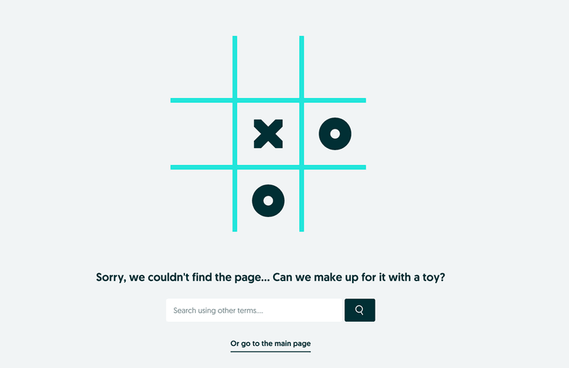
It’s unusual and playful and bound to elicit a smile from users.
At Userpilot, we practice what we preach, so here’s the graphic that we present our customers with while our product is loading:
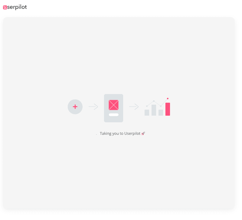
The imagery is simple, slightly technical, easy to understand, and slightly playful. All in all, nicely on-brand
Inspiring examples of empty states from other SaaS products
Now that you know what empty states are and how to make the most of the design opportunity that they present, let’s look at some examples of empty state design from leading SaaS brands.
Empty state example #1: Notion
Notion provides a simple way to create internal company documentation and share it with your team.
When you first sign in to Notion, this is what you encounter:
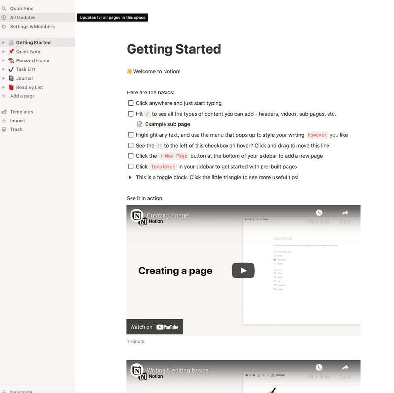
Consider that if you only saw the left-hand menu, this would be a great example of an empty state. It would be extremely unclear to the user how to proceed from here.
Instead, Notion has filled its empty state with some educational content that doubles as both demo content and a type of onboarding checklist.
If this is your first time using Notion, you can proceed down the checklist, taking the items one by one, and get to know how the core functionality works.
Since this is demo content, there’s no downside if the user interacts with it in a way that they shouldn’t, change the formatting, or moves the bullet points around.
All in all, this is a customer experience that is likely to reduce Time to Value.
Empty state example #2: Monday
Monday are well known for their intuitive project management software.
But when you first start putting all of your task management through one platform, it can be a bit overwhelming to know where to begin.
For this reason, rather than serve you with a blank slate when you sign up, Monday provides the following templates:
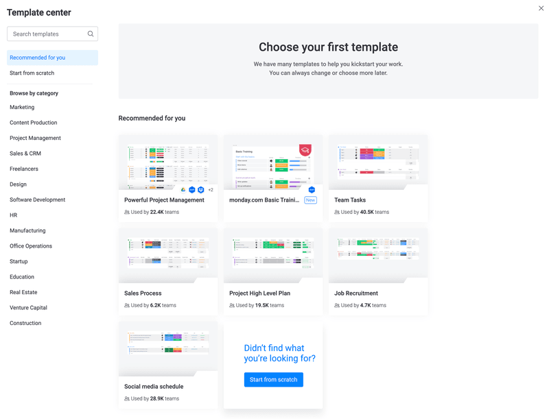
The copywriting here is a work of art.
The templates have a personalized feel to them since they are “recommended for you.”
Monday also stresses that this is only your “first template” and that you can always change your choice later, which reduces any user anxiety of making the wrong decision initially.
My favorite bit of copy is the usage statistics on each template option. From a customer’s perspective, it feels reassuring to know that you have a direct link to a tool that is being used by other teams.
There’s an implicit sense of social proof here which is intelligently communicated by Monday.
Empty state example #3: Jetadmin
Jetadmin lets you build internal tools for your business without having to use code.
Here’s what you see as a new user when you sign up:
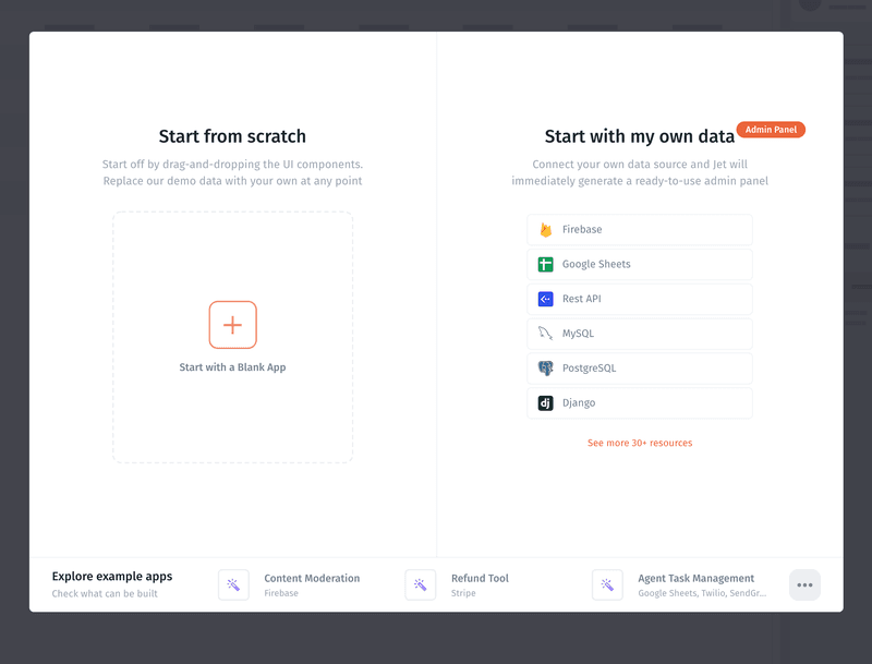
Jetadmin has combined 3 approaches into one screen here:
At the bottom of the screen, there is some demo data, allowing customers to look at example apps that have been built with the software.
On the right-hand side, there is the possibility to connect your own data source. This is easier and less intimidating than a screen that gives you no direction whatsoever.
If you want to jump right in and start building an app, the left-hand window gives you the option of doing that. Note that more demo data and a drag-and-drop interface are used to reduce the onboarding friction to an absolute minimum.
Conclusion
And that’s a wrap! We hope that you’ve learned something from this article on empty states.
Please promise me that you won’t leave your customers hanging! Empty states are such a great opportunity for UX designers to go the extra mile with onboarding. Just as Userpilot helps you build these engaging experiences for web applications, explore how you can improve the retention in your mobile app with Userpilot’s brand-new mobile features.
If you want to build modals and tooltips for your empty states without using code, consider giving Userpilot a try. Sign up for a demo today!

