Heatmap Alternatives in 2026: The AI Agent-Ready Tool Stack


The heatmap alternatives worth considering in 2026 don’t just visualize behavior more precisely. They predict friction before it surfaces, synthesize behavioral signals automatically, and stay legible when the user generating events is an AI agent rather than a person. That’s the stack this post covers.
Why traditional heatmaps break in 2026
Calling these “limitations” understates the problem. Each one is a structural failure rooted in an assumption the tool was built on. Here’s what broke, and why.
AI agents don’t click, scroll, or hover
Standard user behavior analytics was built around human interaction patterns: mouse movement, click events, scroll depth, session duration. When a human user navigates your product, they leave a trail of behavioral signals that heatmaps, session recorders, and event trackers were designed to read.
AI agents accessing your product through APIs and MCP servers generate none of those signals, or generate them artificially at machine speed in ways that look nothing like a human session. A heatmap of your dashboard is now a map of human-only behavior. In products where agents are a real user class, you’re analyzing an increasingly unrepresentative sample.
The deeper problem is that most teams don’t know what share of their traffic is agents. Until you can separate those streams, any behavioral data you read is a blend of two fundamentally different interaction patterns with no label on which is which.
SPAs and component-shifting UIs break static snapshots
Single-page applications re-render component trees without a full page reload. A user can move from a blank dashboard to a populated one, trigger a modal, dismiss it, and navigate to a settings panel, all on the same URL. All of that lands in one static heatmap overlay.
Any click group you’re analyzing may not correspond to a UI element. If you’ve updated a component layout since the recording session, the visual context for the data is gone. You’re reading heat on a ghost map.
This isn’t a minor edge case. Most modern SaaS products are built on React, Vue, or Angular, all of which handle navigation this way. If your product has any SPA architecture, your heatmaps are giving you confident numbers about ambiguous data.
Privacy law has closed the mouse-movement window
GDPR and CCPA enforcement has grown significantly stricter since most heatmap tools were designed. Mouse-movement recording in sensitive workflows, specifically financial dashboards, healthcare interfaces, and multi-tenant B2B platforms, increasingly falls into restricted categories under both regulations.
Enterprise customers with legal teams are now explicitly excluding behavioral tracking tools from vendor contracts, or requiring strict data-masking configurations that degrade recording quality. The power users you most want to study are often the ones you can no longer record.
What you’re left with is a heatmap based on free trial users and low-engagement accounts, precisely the population whose behavior is least predictive of what drives retention.

Why product teams still fail to act (even with better data)
Session recordings, funnel analysis, and event tracking gave product teams more signal than heatmaps alone ever could. The workflow became richer: instead of one overlay per page, teams could watch sessions, build funnels, and track specific interactions across the full customer journey.
But the workflow still looked like this: collect data, build a dashboard, schedule a review, have someone manually dig, surface a finding, and maybe ship a fix two sprints later. LogRocket’s Galileo AI, FullStory, and Quantum Metric all pushed on this latency problem by auto-surfacing friction signals like dead clicks, rage clicks, and anomalous session patterns. That was a meaningful step forward, and it moved behavioral analytics from a purely retrospective tool toward something more active.
The ceiling they hit was that these tools could flag that something was wrong, but acting on it still required a human to pull the thread, form a hypothesis, and route the finding to whoever could ship a fix. Flagging friction and fixing it remained two disconnected workflows.
James Mitchinson, Userpilot’s Head of Customer Success, calls this the “high logins, zero outcomes” problem: accounts showing strong activity signals but no downstream retention. The behavioral data existed; the path from data to action didn’t.
That’s the gap the 2026 stack is designed to close. Not just better signal, but a shorter path from signal to response.
The 2026 heatmap alternatives stack
These categories aren’t one-for-one replacements for heatmaps the way a newer model of the same tool would be. They represent a different model for what behavioral analytics is supposed to do: move from visualizing what happened to predicting, synthesizing, and responding to it.
1. Predictive UX and attention simulation
Before a single user loads your redesigned onboarding flow, you can generate a fixation map predicting where they’ll look. Predictive UX tools use AI-trained gaze prediction models, built on eye-tracking datasets from thousands of controlled sessions, to simulate visual attention from design inputs alone.
EyeQuant and Attention Insight are the two established platforms in this category. Both take a screenshot or design mockup as input and return predicted attention maps showing fixation density, saccade paths, and areas of visual competition. Unlike a heatmap, these require no live traffic and can be run in minutes on a design file you haven’t shipped yet.
Design teams can validate layout decisions pre-launch rather than diagnosing problems post-incident. Testing five layout variants in a day costs nothing in live traffic. For high-friction flows you’re about to rebuild, this eliminates the feedback loop latency entirely.
2. Automated funnel and path analysis
Traditional funnel tools required you to decide in advance which steps to measure. You named the events, defined the sequence, and the tool confirmed or denied drop-off at those predetermined checkpoints. The problem: users rarely follow the path you designed, and the steps you didn’t instrument are the ones where the interesting behavior lives.
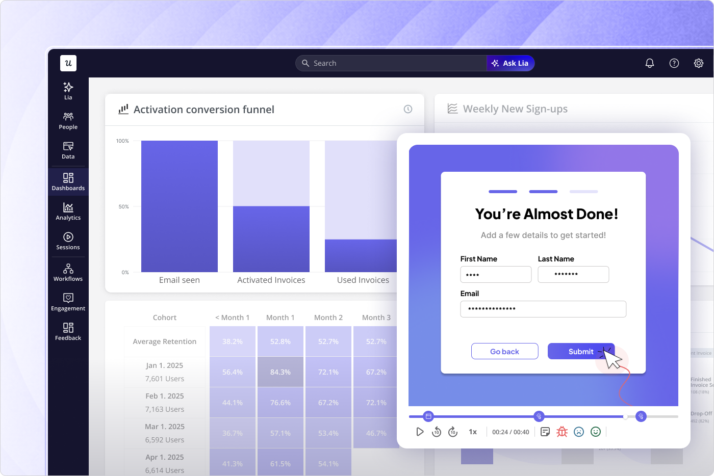
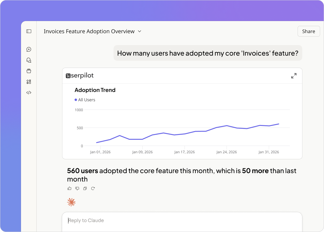
Automated funnel and path analysis inverts this. Userpilot’s funnel analysis generates behavioral flows from actual event sequences, showing which paths users take rather than validating the paths you assumed existed. If a significant cohort is taking a route you never instrumented, it appears.
The shift from “we track what we thought to instrument” to “the product tells us which paths actually exist” is what makes this category structurally different from legacy funnel tools. It also means you catch drop-off patterns at steps you didn’t know to care about, which is usually where the real adoption problems are hiding.
3. AI-synthesized session replays
The original session replay workflow had a human throughput ceiling. Even with filtering and playlist curation, someone had to watch the recordings. LLM-powered session summarization changed that: instead of watching hours of footage, you read structured friction reports generated automatically from session data.
Amplitude and Contentsquare (which absorbed both Hotjar and Heap into one platform) now offer AI summarization layers that tag rage clicks, dead clicks, hesitation patterns, and navigation anomalies at scale. The friction report is auto-generated; the manual review meeting becomes optional. This matters for any team where user engagement analysis was previously bottlenecked by analyst bandwidth.
The next evolution beyond summarization is synthesis across data types. Userpilot’s session recording feeds into a product analytics layer that connects replay events to funnel position, NPS scores, and in-product survey responses in one platform.
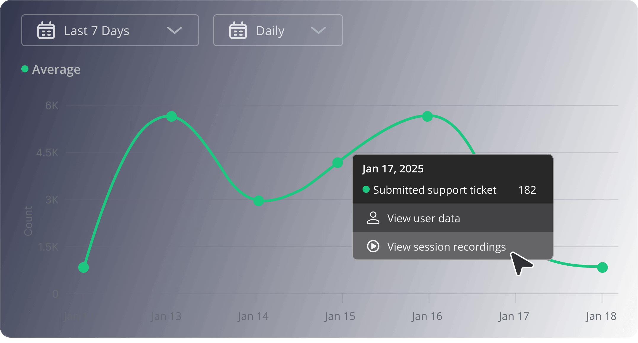
My thinking on why MCP changes the game for product and marketing teams comes down to workflow. If you want to cross-reference session replay data with NPS responses, survey feedback, and feature usage trends, the old path was four separate tool logins, four exports, and a reconciliation step. With the Userpilot’s MCP Server and AI agent Lia, you query across all of those streams in whatever environment you’re already working in and get the answer directly, collapsing the barrier between behavioral data and action.
4. Micro-interaction and friction triggers
Rage clicks and dead clicks were measurable before 2024, but they lived in debugging dashboards, not product analytics workflows. The shift happened when LogRocket’s Galileo AI, FullStory, and Quantum Metric moved friction detection from a niche QA tool into the core analytics layer, bringing together anomalous interactions by feature, user segment, and journey stage automatically.
Rage clicks are a symptom. The insight is which feature they gather around, which user segments generate them most frequently, and at which point in the onboarding or activation journey they spike. Modern friction tools surface that grouping without requiring a manual tagging workflow.
There’s a second benefit that’s easy to overlook: micro-interaction data separates genuine engagement from false-positive heatmap signals. A bunch of clicks on a UI element that looks engaged in a heatmap may be rage clicks on a broken component. Without micro-interaction data, you optimize toward the wrong element.
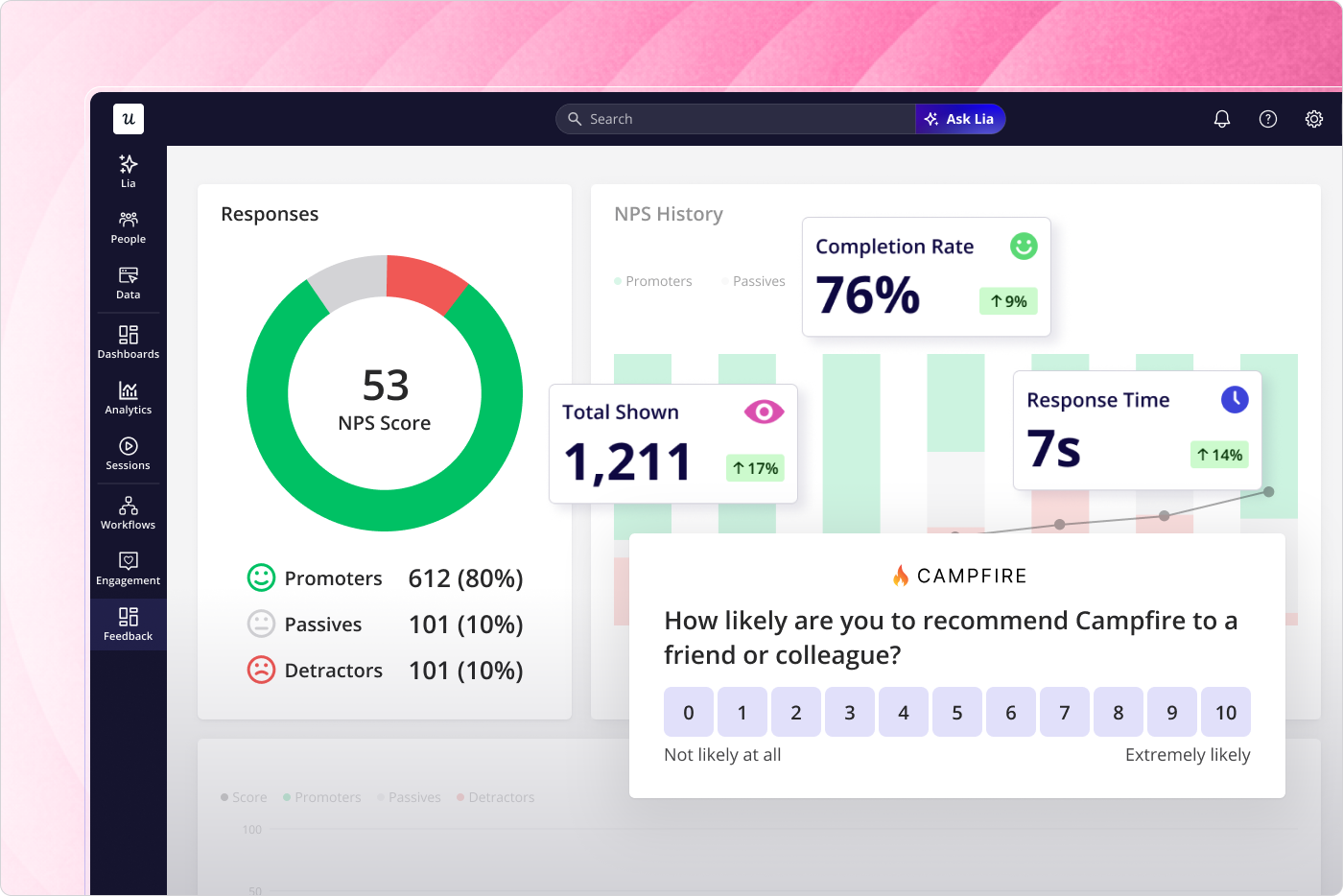
5. Event-driven contextual in-app feedback
Email NPS surveys capture what users remember. In-app surveys triggered by behavioral events capture what they’re experiencing right now. The delta between those two signals is significant in complex B2B workflows, where friction is highly context-dependent and degrades quickly in memory.
Userpilot’s in-app feedback tools let you trigger micro-surveys based on specific behavioral events: after a user abandons a workflow step, after they encounter an error state, after they use a feature for the third time. You get qualitative data tied to the exact moment of friction rather than a recollection retrieved 30 minutes later from an email.
Segmentation is where this gets precise. Rather than sending the same NPS survey to all users, you can target accounts showing high logins but low feature adoption, or users who completed onboarding in the last seven days. The signal-to-noise ratio on the responses is dramatically higher than any time-based survey approach.
From diagnostic charts to product engineering instruments
Heatmaps were retrospective, passive, and human-only. They told you where users had clicked after the fact, on a static rendering of a page that may have already changed. The 2026 stack is predictive (attention simulation before launch), automated (AI-synthesized session summaries and friction grouping), and agent-aware (data models that stay legible when the user is software rather than a person).
Underneath those tool changes, behavioral analytics has a different job in the product development workflow. A diagnostic chart surfaces a problem for someone to investigate. A product engineering instrument routes behavioral signals directly into the mechanism for response: a targeted in-app intervention, an updated onboarding flow, a triggered survey at the exact moment of friction.
Teams treating analytics as a passive reporting layer are now operating with a structural disadvantage. Their behavioral data is incomplete (human-only), latent (reviewed on a schedule), and disconnected from the product experience itself. The teams building a 2026-ready stack have turned analytics into an active function, one where the insight and the response live in the same system.
Userpilot covers categories 2, 3, and 5 in a single platform: automated funnel and path analysis, AI-synthesized session replay with MCP integration, and event-driven contextual in-app feedback. Get a demo to see the full stack in action.
About the author