15 Best Help Center Designs for SaaS + How to Build Yours


Good help center designs promote self-service, allowing users to find answers independently without waiting for support. Which is exactly how users prefer it. In fact, research shows that 81% of customers try resolving issues on their own before contacting a support agent.
So users provided with a well-structured help center end up happier, because they get help fast without any lengthy disruptions.
And for SaaS companies, this means fewer support costs and a lighter workload for the support team. The research backs this up, with companies that implement self‑service support centers reducing support call volume by 25–30%.
In this article, we’ll explore 15 standout SaaS help centers, highlighting what works best, and walk you through how to build yours.
What makes a help center design the “best”?
I went through a lot of help centers and support pages as research for this article. Some looked visually appealing but lacked useful content, while others provided effortless searchability but unclear instructions. In short, there was a lot of inconsistency.
So when it came to putting this list together, I focused on three questions to narrow down truly effective help center designs:
- Intuitive navigation: Can users quickly find clear, helpful information that makes sense?
- Easy to follow instructions: Does the help center content actually solve problems, so users don’t have to contact customer support?
- Easy access: Do users have to hunt for the support page, or is help embedded into the navigation, including contacting support?
With that lens, I present this list to you:
15 Help center design examples for SaaS inspiration
I’ve hand-picked 15 help center examples from familiar services that get it right by using user-driven language, intuitive categories, prominent search bars, helpful media, and more.
Help center design example: Slack
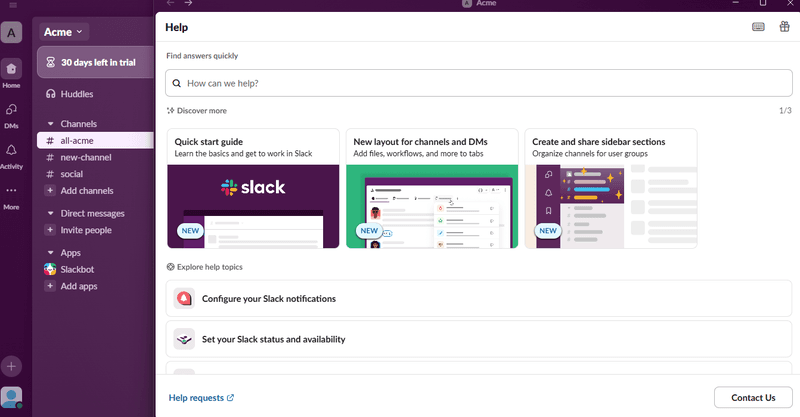
I like that the search bar is right at the top of the help panel. As I type, it even suggests popular queries, which is handy when I’m not sure what to search for.
Then there’s a content carousel widget right below, useful for highlighting quick-start guides and new features, with clean visuals that instantly catch my eye. Other common help topics are grouped in bite-sized blocks with clear icons, things like “Set a reminder” or “Slack video tutorials.”
And if I’m still stuck, there’s a clear “Contact Us” button so I can escalate my issue.
Tips for your help center design
- Offer smart suggestions: Help users get started by showing common troubleshooting topics as they type.
- Make escalation easy: Always offer a visible button for contacting support in case self-service isn’t enough.
- Keep the search bar visible throughout: Once I click on a help article, Slack’s search bar disappears, making me go back if I need to search for something again. If this happens enough times, it can get frustrating.
Help center design example: Spotify
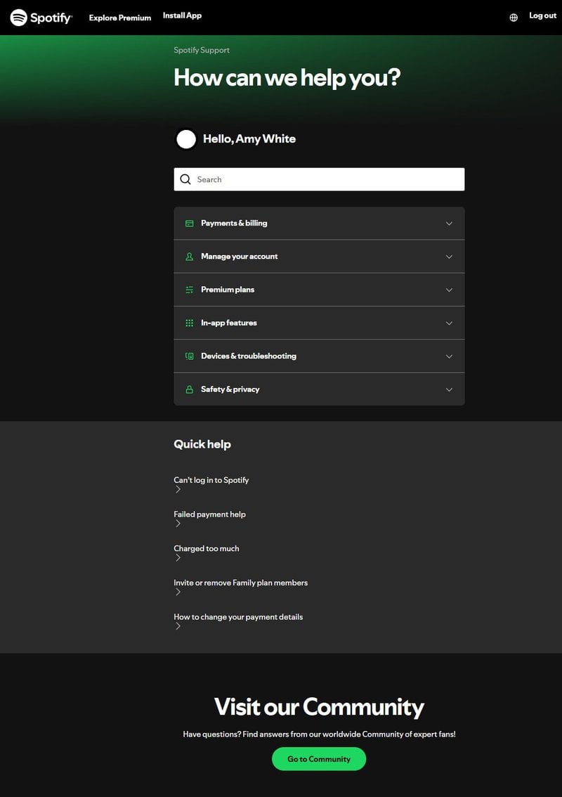
Spotify’s support page starts with a friendly greeting with a name, which makes the experience feel personal. Then there’s the search bar right up top, which provides search suggestions as I type.
Next, the topics are neatly grouped into collapsible sections, so I can expand only what I need without endless scrolling.
Below that, there’s a “Quick help” list for the common problems, such as login issues (exactly what I was looking for) or payment failures. And on the off chance I don’t find an answer? There’s a way I can reach out to other users who might have gone through a similar issue via the community forums button.
Tips for your help center design
- Personalize the experience: A simple greeting with the user’s name makes it feel more engaging.
- Use collapsible categories: Keep information tidy and easy to scan without overwhelming the page.
- Offer community support: Add links to an active community for extra peer-to-peer help.
Help center design example: Loom
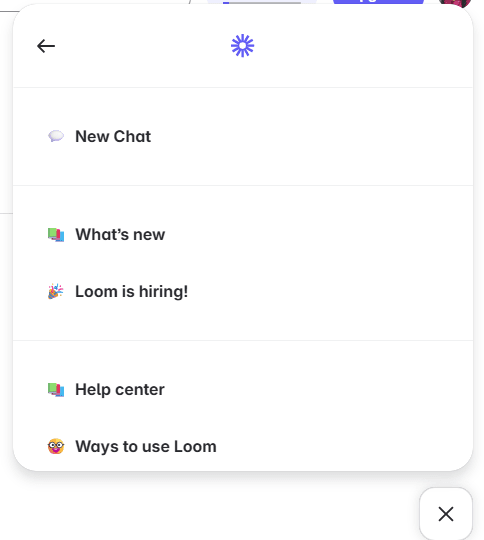
Loom keeps its in-app help super minimal. There’s a simple help widget with a few quick links: “What’s New,” “Ways to use Loom,” and a direct link to the full help center hosted on their main website.
There’s also a clear “New Chat” option to reach their AI-powered chatbot. I liked using this because it gave me answers right inside the app and pointed me to the exact pages I needed, saving me time.
Tips for your help center design
- Keep it lightweight: If your product is straightforward, similar to Loom, a few focused links might be all you need.
- Highlight new updates: A “What’s New” link keeps users in the loop and excited about improvements.
- Consider an AI chatbot: Offer solutions to simpler questions, plus links to greater help resources, without making users leave the app.
Help center design example: Figma
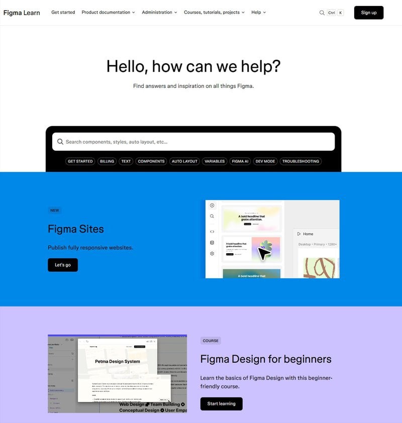
As is customary, the search bar is at the top, where it’s easy to spot. But what I appreciate more are the suggested search terms right below that help users quickly find answers to common questions.
Overall, there’s a lot of content covered on the support page. But Figma does a good job at visually organizing it all using color blocks, which neatly separate key sections like beginner guides, video tutorials, and product updates. This color-coding makes it easy to differentiate between content at a glance, so navigation feels effortless.
I also enjoy the use of icons and GIFs throughout these sections. Such visuals make the support page more engaging and add context, such as showing what a section covers, which is great for visual learners like me.
Another notable mention is how Figma promotes its courses and community forums within the help center, offering alternative learning paths beyond troubleshooting.
Tips for your help center design
- Use color to guide navigation: Color blocks make sections easy to spot and reduce visual clutter.
- Add GIFs and video content: Visual media makes concepts clearer and keeps users engaged for longer.
- Offer learning paths beyond featured articles: Link to courses and community spaces so users can discover deeper product insights.
Help center design example: Whatagraph
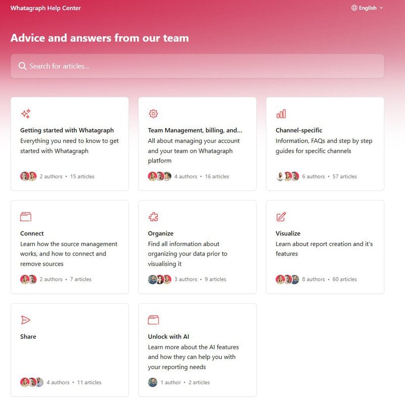
Whatagraph’s help center page feels clean and to the point, starting with a simple search bar for exploring the knowledge base.
The page is neatly divided into clear, task-based categories, such as Connect, Organize, and Visualize. These groups follow the same steps any user would naturally take while using Whatagraph, making it easy to find the right guidance at the right moment.
It’s especially worth noting that each section shows which team members wrote the articles. This taps into basic human psychology: seeing real names and faces builds user trust and makes the support feel more credible.
Lastly, I thought the dedicated “Unlock with AI” section was a clever way to guide users toward newer, AI-powered features without burying them under generic topics.
Tips for your help center design
- Organize by user workflow: Match categories to the exact steps users follow inside your product.
- Highlight the people behind the help: Adding author names and photos helps users feel more connected to your team.
- Spotlight new advancements: Dedicate a section for new or advanced tools (like AI) to boost feature discovery and adoption.
Help center design example: Coinbase
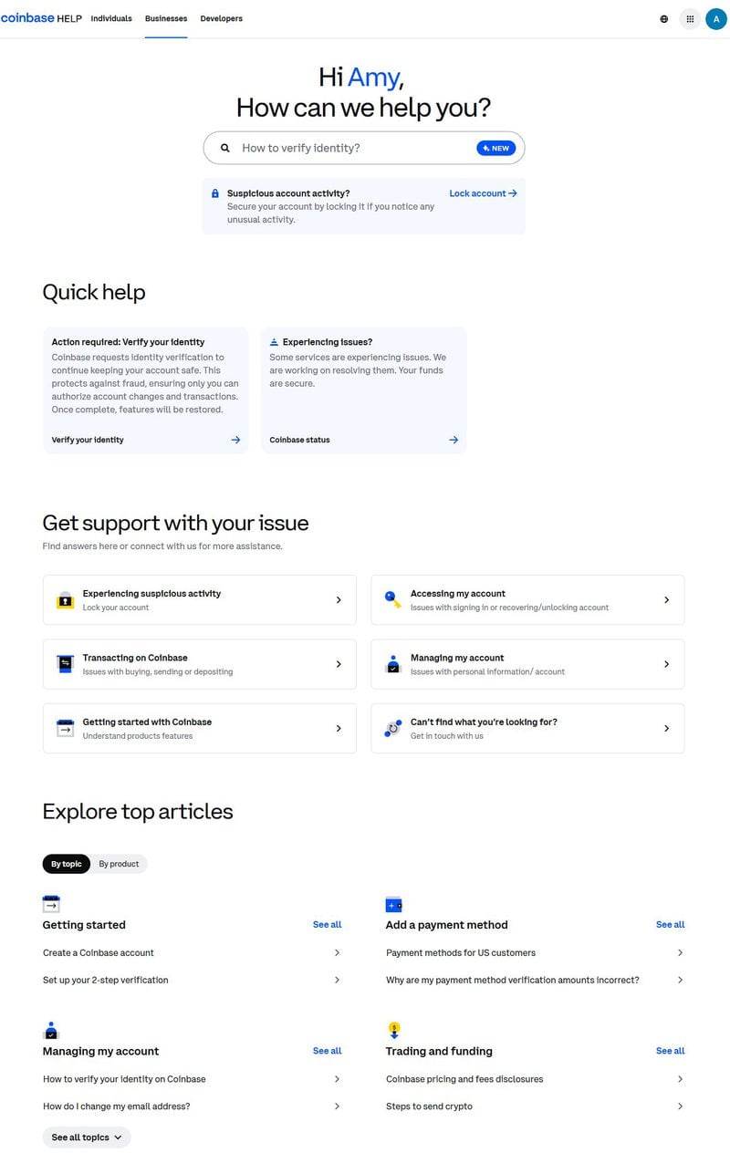
Coinbase’s help center page starts with a friendly, personalized greeting and a prominent search bar featuring a suggested query to help users get started quickly.
Right below that is a high-visibility banner for suspicious account activity. This lets me lock my account immediately if I notice anything unusual, a critical feature for a finance platform, and likely the first thing distressed users look for.
Further down, the “Explore top articles” section provides two ways to browse: by topic or by product. This dual structure is a smart way to organize a large amount of content without overwhelming users.
Tips for your help center design
- Show urgent tasks first: Display time-sensitive actions, like locking an account, at the top, so worried users don’t have to dig for them.
- Use whitespace and a simple color palette: The primarily white layout, accompanied by Coinbase’s signature blue color, creates a cohesive design and an uncluttered page.
- Offer multiple browsing paths: Some users think in terms of what they’re doing, others by what tool they’re using. So, give them the option to explore by topic and product.
Help center design example: Zendesk
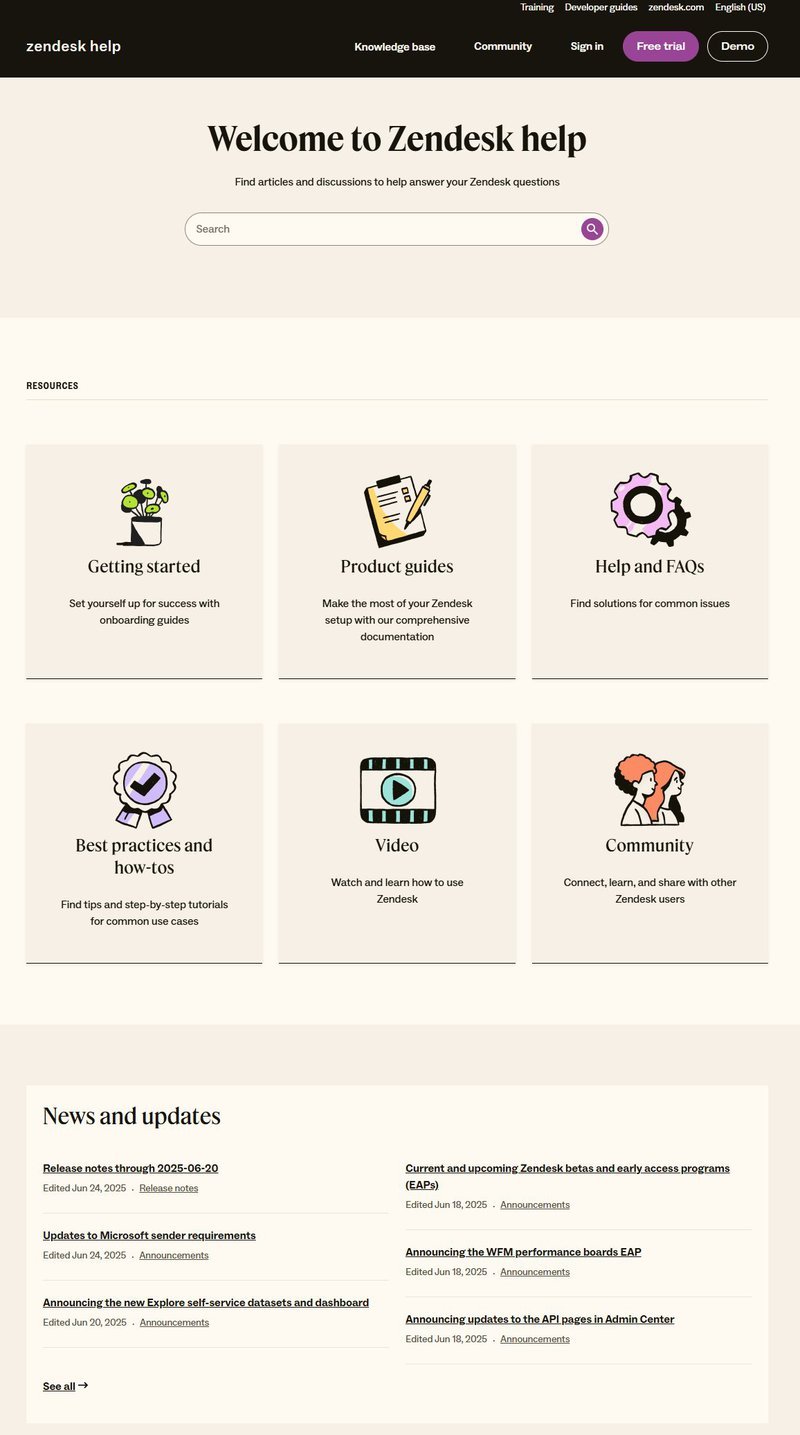
Zendesk’s help center is minimal. The layout is clean, with neutral tones, lots of whitespace, a simple search bar, and fun illustrations that make the page more engaging.
I like how the content is split into separate categories. “Product documentation” covers in-depth technical guidance, while “Help and FAQs” provides bite-sized answers to popular questions. It’s a smart separation, so users looking for fast answers don’t have to wade through long setup guides.
There’s also video content and community posts available. These offer alternative ways to learn, perfect for users like me who prefer watching or asking questions over reading guides.
Tips for your help center design
- Separate quick answers from deep dives: Pair in-depth product documentation with a clear FAQs section to serve both power users and newcomers.
- Use icons to break up text: Illustrations next to each category add clarity and help users visually scan the page faster.
Help center design example: Google
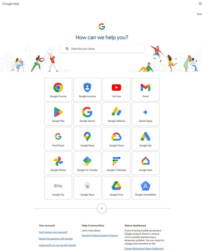
Google’s support page is designed for clarity and action. It has the fastest and most accurate search bar I’ve seen, powered by Google’s search capabilities. And what’s even better is that it stays visible on top no matter how deep into the help center I go, so I’m never stuck on a dead-end page.
Help content is grouped by product, e.g., Gmail, YouTube, Pixel Phone, each with recognizable icons in their signature colors. So it’s easy to spot what I’m looking for without even reading the label.
A notable feature is the small feedback widget at the bottom of every page. It’s always there, making it easy for users to report confusing content or missing information, showing that their input is valued.
Tips for your help center design
- Always show the search bar: Keep it sticky across all help pages so users never feel lost.
- Offer a visible feedback option: A simple widget on each support page invites user feedback and signals that you care about their experience.
Help center design example: Wise
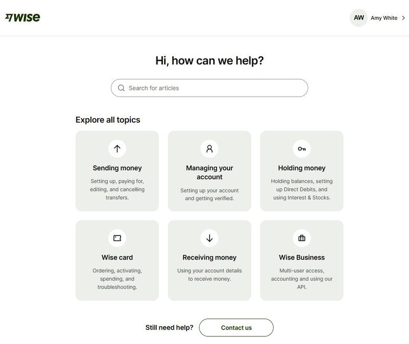
The search bar is the first thing I see, making it easy to find answers without scrolling further.
Overall, the support page is simple. There are only six cards that all help topics are categorized into, with straightforward labels like “Sending money” and “Wise card.” Each card has a short description underneath, so I know exactly what to expect.
Clicking on a topic opens up a well-organized list of related articles, saving me from opening irrelevant pages and wasting my time. And if I still need additional help, there’s a “Contact us” button at the bottom that puts me in touch with the support team directly.
Tips for your help center design
- Group support topics into focused blocks: Limit categories to a few broad options so users find their path faster.
- Choose user-friendly language: Labels like “Receiving money” are clear and understandable. Something like “Inbound transfers” might mean the same thing, but it feels confusing and overly technical.
Help center design example: Buffer
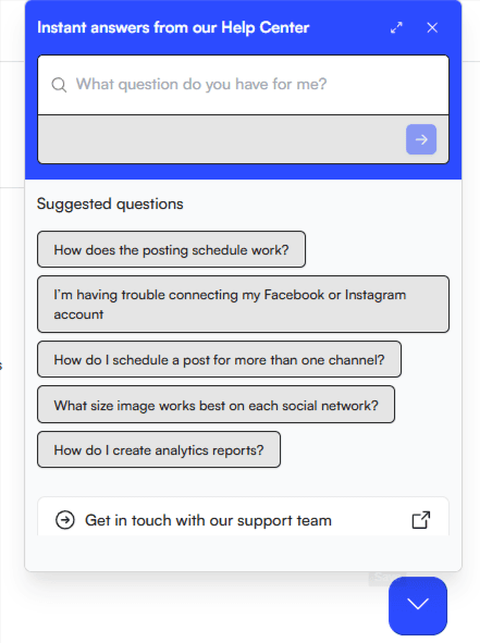
I like that Buffer’s help center is fully in-app. This way, I don’t have to leave the platform every time I have a problem, saving me from unnecessary friction.
Though seemingly limited, the help center has all the necessary elements. A search bar up top, common questions suggested down below, and a way to contact customer support if I need to escalate an issue or can’t find what I’m looking for.
Tips for your help center design
- Keep help inside the app: Reducing tab-switching keeps users focused and less likely to abandon what they’re doing.
- Use button-style links for clarity: Wrapping suggested questions in pill-shaped buttons makes them easy to read and tap, especially on mobile.
Help center design example: Dropbox
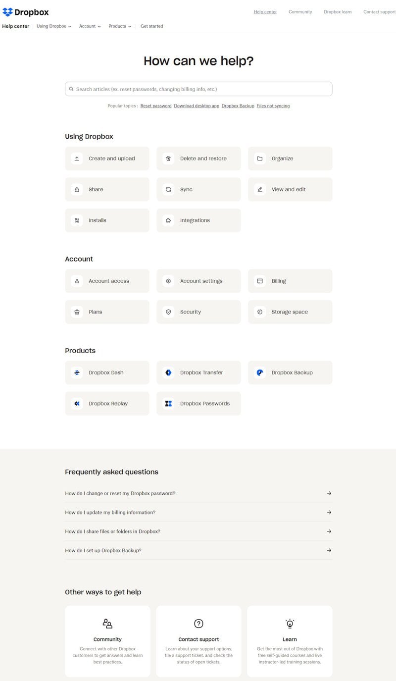
The help center page starts with a search bar on top, followed by popular topics suggested underneath for quick access, without even having to type.
The page is a bit plain and dull without any illustrations or color. But it’s still easy to follow. Everything is well-structured, with relevant articles organized under clearly labeled, clickable categories, making it easy to find the right topic fast.
There’s also an FAQ section: helpful for quickly finding answers to common user problems without needing to dig through support articles.
Tips for your help center design
- Show popular links before search: Preempt common questions by listing top queries right below the search bar.
- Design with consistency: Use the same block style and icons for each category to create a sense of visual order and ease of scanning.
Help center design example: Square
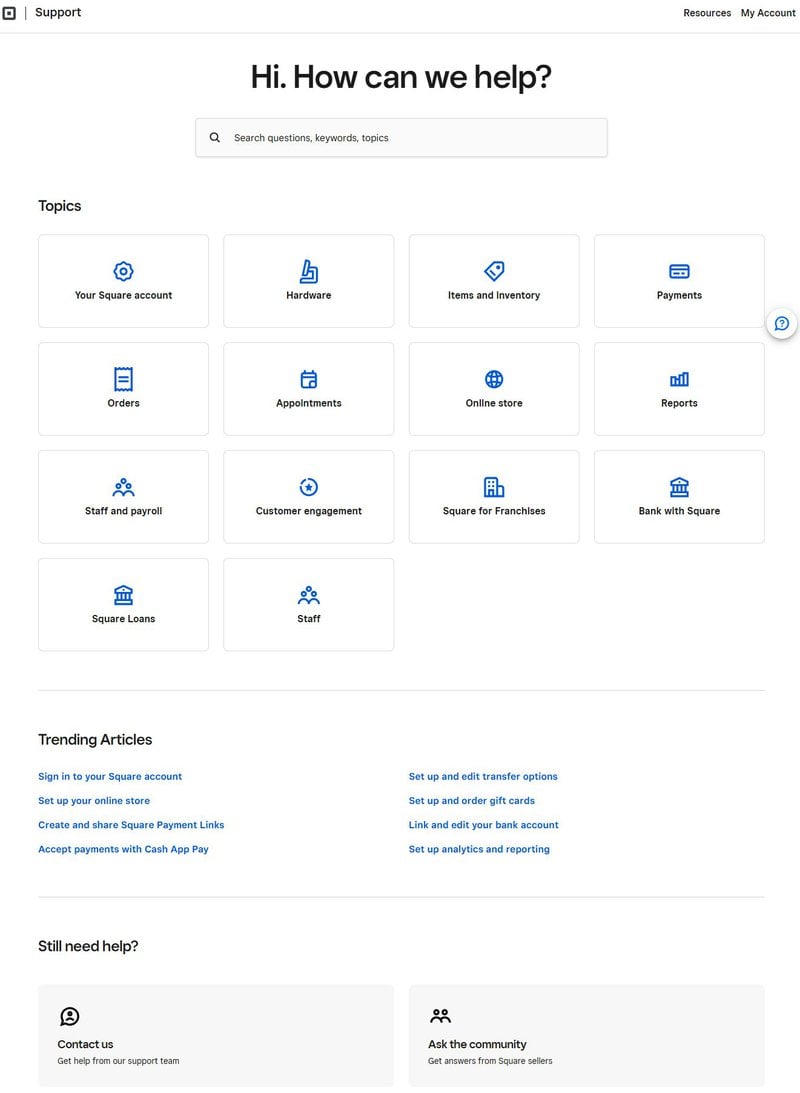
The search bar is front and center, with placeholder text prompting me to search by question, keyword, or topic. Helpful when I’m not exactly sure how to phrase what I need.
The section for trending articles has been great for me. These are short, linked phrases covering common actions, so I can jump straight into popular tasks without even using the search bar.
Lastly, at the bottom, Square gives me the option to contact support or ask the community. It’s always a plus having these options because sometimes users want direct help, and other times they’d rather see what other users are doing.
Tips for your help center design
- Highlight trending tasks: Link to popular articles mid-page so users can solve common issues faster without searching or running into friction.
Help center design example: Stripe
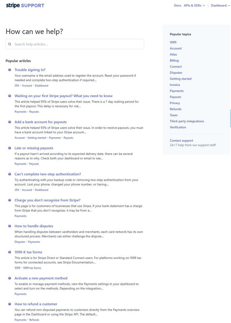
Stripe’s help center UX feels a bit cluttered, with a lot of dense text packed into one long list of articles.
But despite this, some positives include the search bar at the top and related articles showing up as I start typing. On the right, the “Popular topics” section is also helpful when I want to explore help by category instead of typing or sifting through full documentation.
Tips for your help center design
- Balance text with visual breaks: Learning from Stripe’s mistakes, use headers, spacing, bolded keywords, or images to improve scannability and reduce fatigue.
Help center design example: Shopify
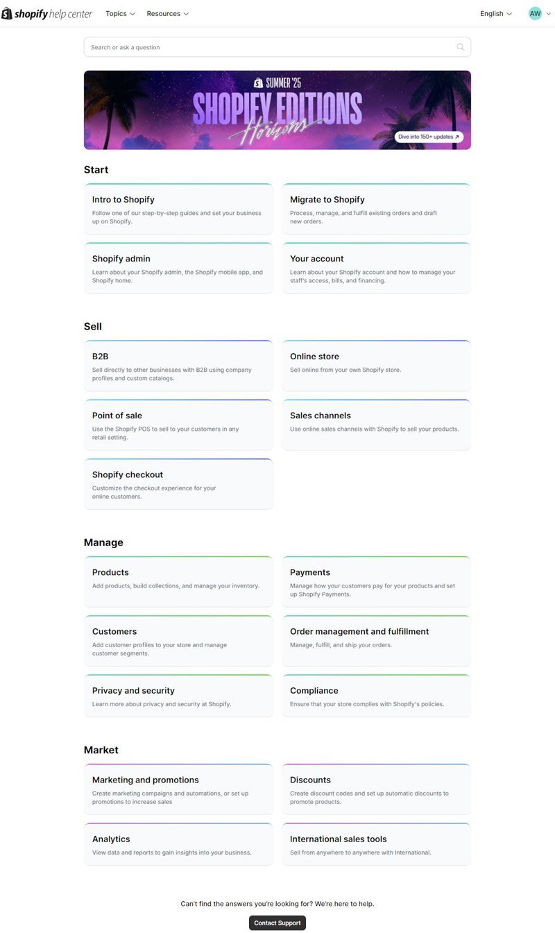
As is good practice, the help center page starts with a search bar. Below that, the page is neatly organized into sections like “Start,” “Sell,” and “Manage,” so I can quickly access resources related to what stage I’m in with the product.
The clickable cards within each section are lightly color-coded, which breaks up the visual monotony and makes scanning the page easier.
I also appreciate how, overall, Shopify uses user-focused language. The tone is clear and practical, avoiding jargon and keeping explanations short. For example, “View data and reports to gain insights” is much easier to understand than something like “Access analytical dashboards for performance monitoring.”
Tips for your help center design
- Use color to break up content: Soft borders or light hues can create visual separation between sections without making the page feel busy.
- Stick to a strict grid layout: Every tile is the same size, aligned cleanly in rows. That kind of visual order makes it easier to take in a lot of information at once without getting lost.
Build a help center worth mentioning
A well-designed SaaS help center removes friction, builds user trust, and scales support without increasing costs. But to create such effective help center designs, you’ll need to keep these tips in mind.
Some non-negotiables include adding a search bar for quick answers, using intuitive categories and labels for easy navigation, and writing content that users actually search for. Play around with visuals and colors to draw attention. And make it all accessible in-app for a more seamless experience.
FAQ
How to create a help center?
- Goal setting: Set actionable goals for what your help center should achieve.
- Data-driven decisions: Use metrics and search data to improve content.
- Smart organization: Structure content by key tasks or product workflows.
- Adopt no-code tools: Try tools like Userpilot to build personalized in-app resource centers with search, video tutorials, walkthroughs, and live support.
- Helpful visuals: Add videos, GIFs, and screenshots to simplify complex topics.
- Accessibility: Support voice search and inclusive design for a wider range of users.
What is the purpose of a help center?
A help center’s main purpose is to provide users with quick self-service resources so they can find answers independently, without contacting support. Good help center designs reduce support tickets and boost customer satisfaction by centralizing resources like FAQs, tutorials, and guides in one easy-to-navigate place.
How to write help center articles?
- Focus on solving a clear user problem.
- Use simple, friendly language and active voice.
- Structure content with headings, bullets, and visuals.
- Include keywords users actually search for.
- Keep articles short, scannable, and empathetic.
- Update regularly based on user feedback and support trends.
About the author