Pendo vs Userlane: Which is Better for Interactive User Guides?19 min read
Get The Insights!
The fastest way to learn about Product Growth, Management & Trends.
Pendo vs Userlane: Which one is a good choice for interactive user guides?
- Let’s explore how Pendo, and Userlane compare when it comes to creating interactive user guides.
- Pendo is a product adoption platform that lets teams monitor product usage, analyze user behavior, and publish in-app guides. The no-code solution focuses on increasing user engagement and driving feature discovery.
- Userlane is a no-code digital adoption platform used to measure how employees use applications, identify areas for improvement, and offer real-time guidance directly within any application.
- If you’re looking for a better option for creating interactive user guides, Userpilot exceeds both functionality and value for money compared to other tools on the list.
- Userpilot is a product growth platform that drives user activation, feature adoption, and expansion revenue. It also helps product teams collect user feedback, streamline onboarding, and gather actionable insights from analytics.
- Get a Userpilot demo and drive your product growth code-free.
Must have features for interactive user guide tools
Not all tools are built the same. Some offer different advantages over others while some will simply get you basic functionality but at a low price. It depends on your budget and needs which will be the best tool to build interactive user guides.
Here’s what to look for as the main functionalities when picking a tool to build in-app guides:
- Good range of UI patterns to use for building your guides.
- Ability to customize each interactive guide to fit your brand and style.
- Segmentation so you could trigger the guides to the right audience at the right time. A one-size-fits-all approach won’t bring you the desired results.
- The ability to trigger the user guides when specific in-app events happen is nice to have and will help you build more contextual in-app experiences.
- Minimum product usage analytics, to be able to track how users engage with the product, and where they get stuck so you can build relevant user guides to help them.
The above list is not exhaustive, but it’s a starting point. Depending on your product, you might also need automated localization, A/B testing capabilities, advanced analytics or security, and more.
Pendo for creating interactive user guides
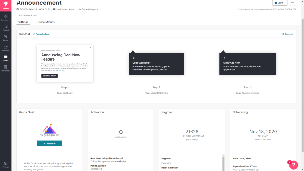
Product tours, walkthroughs, and tooltip sequences all count as interactive user guides. Pendo lets you build interactive user guides that drive feature adoption for both web and mobile apps while writing little to no code.
Here are the benefits of using Pendo to create interactive user guides:
- Intuitive Analytics: Pendo divides its analytics into Paths, Retention, and Funnels to avoid overwhelming new users. This makes it easy to find the exact metrics you’re looking for while ignoring other data that would otherwise serve as background noise.
- No-Code Guides: Whether you’re creating a full-blown product tour or a short guide sequence, Pendo lets you build and edit these flows without the need for extensive coding. This speeds up the build process and reduces the amount of engineering resources needed to iterate.
- Segmented Guides: Pendo lets you limit visibility for certain guides to specific segments — meaning users only see in-app guides that are relevant to their use case and where they are in the user journey.
- Mobile Guides: Unlike most of its competitors, Pendo lets you create interactive user guides for your mobile apps. This is invaluable to mobile product adoption as data from Adjust showed that the majority of mobile apps get deleted within a week of inactivity.
No-code product tours in Pendo
Product tours help new users reach product activation, increase retention rates in the long run, and drive feature adoption through secondary onboarding flows. Pendo has plenty of features that you can use to create streamlined product tours for new and existing users.
Here are a few product tour features that you can utilize with Pendo:
- Welcome Screens: Pendo lets you create a full-screen welcome modal that welcomes new users and tells them what the next step of their onboarding process is. You can also let them select which product tour they’d like to proceed to or link to more resources for them to explore.
- Segmented Guides: When creating in-app guides with Pendo, you’ll be given the option to limit certain flows to a specific segment. This means you’ll be able to create separate product tours for each use case to make the onboarding process as contextual as possible.
- Feature Adoption: Pendo’s feature adoption analytics will show you which features have the highest or lowest adoption rates. These insights can help you make a data-informed decision on which features to promote within product tours.
In-app messaging in Pendo
In-app messaging is one of the most effective ways to engage with active users with the goal of educating, retaining, or upselling them. Most in-app messaging flows are comprised of tooltips, modals, or a combination of the two.
Here are Pendo in-app messaging features you can use to connect with your users:
- Lightboxes: Lightboxes are Pendo’s take on modals. Certain lightboxes can prevent users from interacting with the product until the in-app message has been dismissed, so these intrusive popups should be reserved for important notifications.
- Tooltips: Instead of taking up large swathes of the screen, tooltips are small text snippets that show up next to a button or feature to provide additional context. These can help users discover new features or figure out where to go next after completing a product tour.
- Banners: While not as commonly used as lightboxes and tooltips, Pendo banners are another in-app messaging option that you can use. These show up at the top of the screen and can be used as a less-intrusive alternative to lightboxes as they don’t restrict product interaction.
Userlane for creating interactive user guides
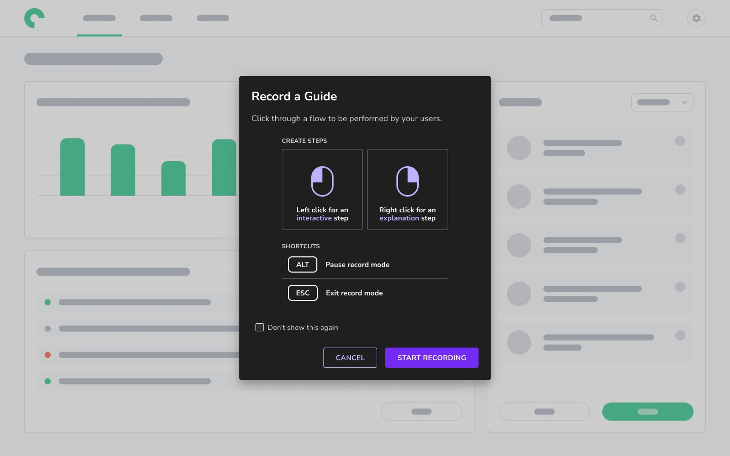
With the Userlane Editor, you can create powerful interactive guides within applications, enhancing user experiences and facilitating content creation and editing.
You can create guides within the application or tooltips to add explanations to an element within the application for your users. Let’s take a look at how Userlane can help you create interactive user guides:
- Real-time assistance: Userlane’s interactive guides are more than just pop-up hints. They provide context-aware help right when and where a user needs it. If a user seems stuck or unsure of the next step, Userlane’s guides can nudge them in the right direction, ensuring they’re not frustrated or overwhelmed.
- Sleek learning path: Userlane allows the creation of adaptive learning paths. This means the guides can adjust in complexity and depth based on the user’s previous interactions, ensuring a customized and efficient learning experience. The platform’s no-code functionality allows these adaptive paths to be set up without needing to delve into complex coding or scripting.
- Seamless integration: Userlane understands that users have different learning preferences. Some prefer text, while others benefit from visuals or videos. The platform seamlessly integrates multimedia elements into the guides, ensuring a comprehensive and engaging learning experience.
No-code product tours in Userlane
Userlane is primarily designed to create interactive product walkthroughs with simplicity. For companies looking to integrate a basic onboarding experience without coding complexities, Userlane’s no-code platform is an ideal choice.
It provides a seamless solution for businesses to create in-app interactive content. Rather than requiring extensive coding and development effort, Userlane enables organizations to craft intuitive product tours rapidly.
Here’s a breakdown of the features of Userlane for no-code product tours:
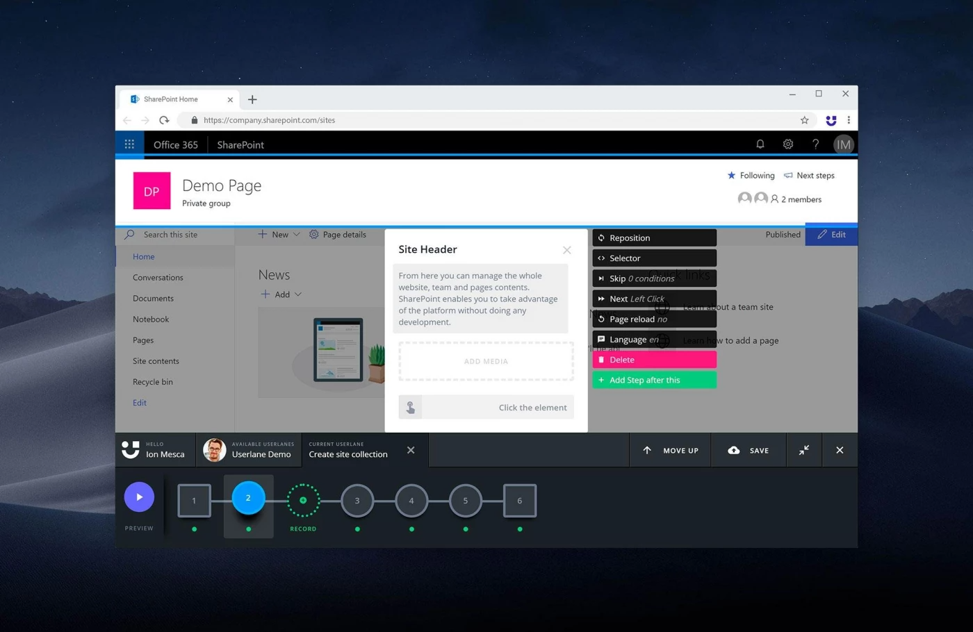
- Interactive Step-by-Step Guidance: Userlane offers a visual editor that allows creators to design step-by-step instructions directly within the application interface. These guides provide users with a hands-on approach to learning, leading them through real-time processes. This ensures that users aren’t just reading instructions but are actively engaged in performing tasks.
- Analytics and Performance Insights Without Code: Beyond just crafting the tours, Userlane’s no-code platform provides businesses with valuable insights into user engagement. Organizations can monitor the effectiveness of their onboarding content, pinpoint areas of improvement, and optimize their guides—all through a user-friendly, code-free dashboard.
- Personalized User Segmentation with No-Code Customization: Userlane’s no-code capabilities enable businesses to tailor tours based on user roles, preferences, or behaviors without diving into complex programming.
In-app messaging in Userlane
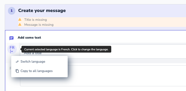
With Userlane, you can deliver in-app messages to your users through the Userlane Assistant. This way, you can communicate with your users without the hassle of using a Google translator to translate to their preferred language.
- Contextual Communication: Delivers tailored messages to users based on their actions, position within the app, or specific milestones, ensuring timely and relevant engagement.
- Role-Based Message Management: Grants specific permissions to administrators, moderators, and contributors in your product team, allowing for streamlined creation, editing, and publishing of in-app messages.
- Content-Rich Announcements: Supports the inclusion of various media types, like images, and offers capabilities to link messages directly to detailed guides, enhancing the depth and versatility of the messaging experience.
Pros and cons of Pendo
There are a few obvious instances where you’ll likely need an alternative solution to Pendo — such as these use cases:
- Over 500 MAUs: If your product has more than 500 MAUs then you’ll need to subscribe to a premium Pendo plan (which tends to be significantly more expensive than other competitors on the market).
- Real-Time Analytics Needs: Companies that operate in fast-paced work sprints will likely opt for product adoption solutions with real-time analytics since Pendo’s one-hour data lag can data-driven decision-making difficult.
- Expensive Pricing Model: Pendo is more expensive than most solutions on the market and the subscription cost rises rapidly as your MAUs grow. Even if you’re on the Starter plan, you could be paying $35,000 annually once you reach 10,000 MAUs — which makes it harder to scale.
Pros of Pendo
Let’s take a look at some of the benefits of using Pendo:
- No-Code: Pendo lets you create surveys, in-app guides, and track metrics without needing to write your own code, which saves a lot of time (while making product experiments or split-testing a lot easier).
- Custom Themes: Pendo’s themes let you create multiple palettes and ensure that any in-app materials published align with your existing brand palette (however, you can only create/customize themes after you’ve installed the Pendo snippet).
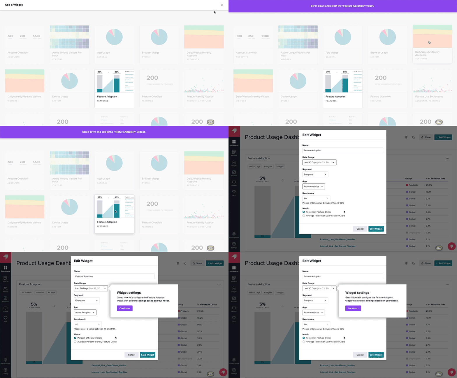
- Flexible Dashboards: Pendo has plenty of widgets that you can add to your dashboard, including feature adoption, net promoter score, poll results, guide engagement, product stickiness, and MAUs — so you always have your most important metrics within reach.
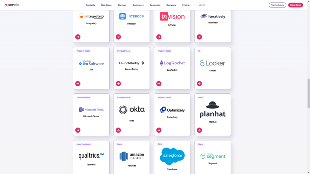
- Integrations: Pendo has 50 different integrations to choose from including popular tools like Intercom, Jira, Okta, and HubSpot. Unfortunately, only four of these — Salesforce, Segment, Workato, and Zendesk — are two-way integrations that can share data both ways.
- Multi-Platform Analytics: Because Pendo is compatible with mobile applications, you’ll be able to track product analytics for both web apps and mobile apps. This gives you a more holistic view of how users (or specific segments) use your product on different platforms. Note: You’ll need to upgrade to Pendo Portfolio to add more than one product to your account.
Cons of Pendo
While Pendo certainly has quite a few benefits that make it an appealing solution, there are also a few notable drawbacks that you should be aware of before you choose the platform as your product adoption tool:
- Pricing Jumps: While Pendo does offer a free version, it has a limit of 500 MAUs. Upon reaching the MAU limit, you’ll need to upgrade to continue using most of Pendo’s features (and paid plans tend to cost thousands of dollars per month).
- Locked Features: Key features like the data explorer, resource center, and product engagement score are locked behind the Growth or Portfolio plan.
- Data Lag: Pendo’s analytics dashboards only update once per hour. In some cases, this data lag could lead product teams to make the wrong decisions or draw false conclusions from outdated insights.
Pros and cons of Userlane
While Userlane is undoubtedly powerful, certain scenarios might necessitate exploring alternatives.
- Extensive Third-party Integrations: While Userlane offers some key integrations if your business heavily relies on a diverse range of third-party tools and you need a seamless, in-depth integration for all of them, you might want to explore platforms like Pendo or Mixpanel that offer broader integration ecosystems.
- Budget Constraints: While Userlane offers a plethora of features suitable for established enterprises or growing companies, it might be beyond the reach of early-stage startups with limited funds. If you’re on a strict budget and looking for a more affordable solution, platforms like UserGuiding, Intercom, or Intro.js might be more aligned with your financial constraints.
- Complex Customization Needs: If your platform requires highly specialized or intricate onboarding experiences that go beyond standard walkthroughs and tooltips, you might find Userlane’s customization options a bit restrictive. In such cases, tools like WalkMe or Appcues, known for their deep customization capabilities, might be a better fit.
Pros of Userlane
Higher productivity, less support effort, and happier users are what Userlane is created for. From a vast spectrum of capabilities to elegantly crafted UI elements that cater to any walkthrough, regardless of its level of customization, Userlane stands out as a robust platform to bolster user engagement and product familiarization.
Let’s dive into the pros of using Userlane:
- Streamlined no-code interface: Userlane boasts a user-friendly dashboard, enabling even those with no coding background to easily design and implement onboarding flows.
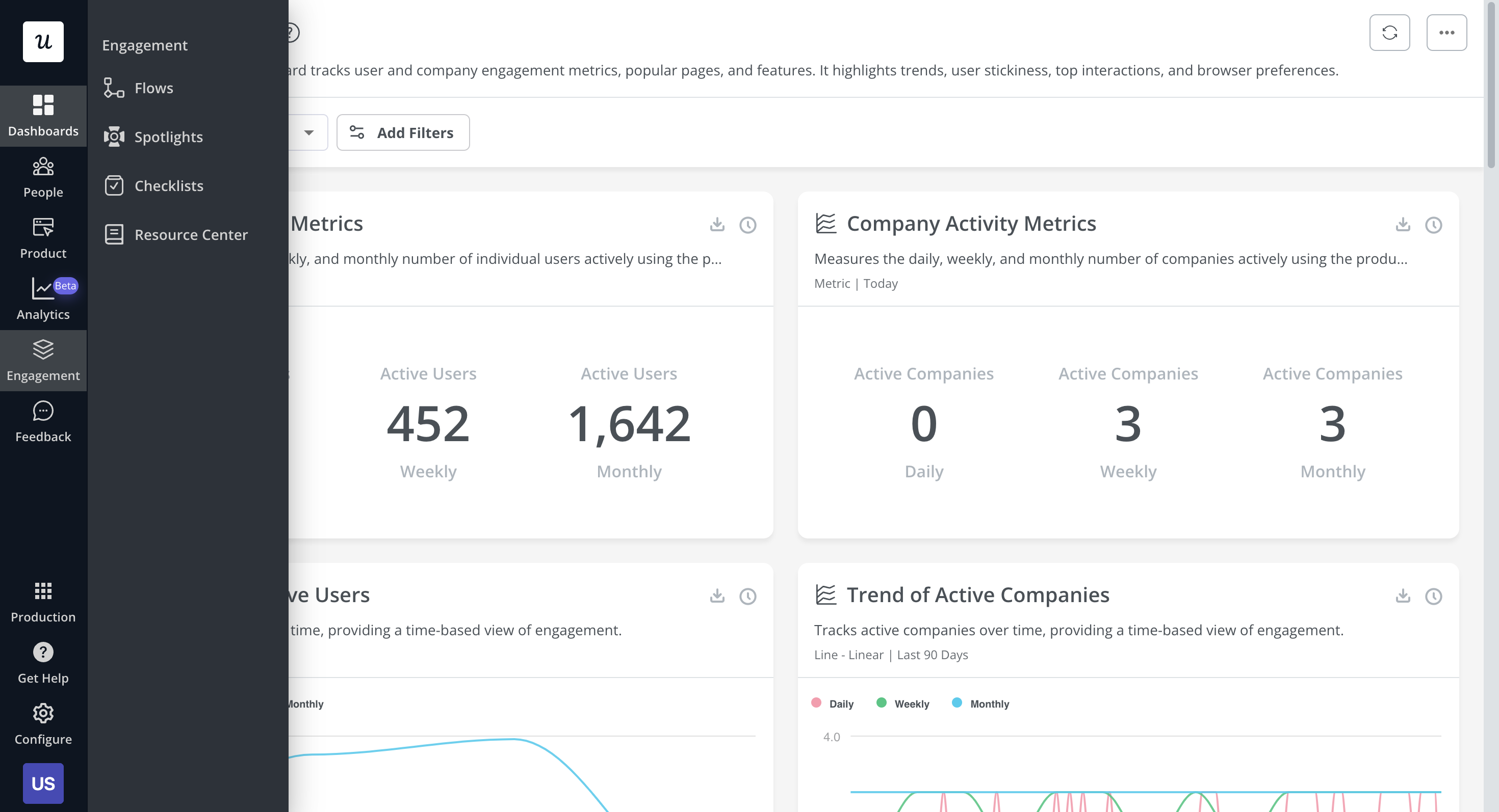
- Product adoption analytics: Get a real-time view of digital transformation progress in your organization. Delve deeper into user behaviors across different applications and analyze engagement levels so you can optimize user experiences.
- Dynamic user walkthroughs: Craft compelling and interactive walkthroughs that intuitively guide users through your software, ensuring they grasp every essential feature.
- Versatile in-app communication tools: Whether tooltips, banners, or pop-up modals, Userlane offers many tools to engage users directly within your platform. With Userlane’s customer onboarding solution, you can tailor communications for different user segments, guiding them through the tasks and processes they will most likely need help with.
- Seamless third-party integrations: Integrate Userlane with various analytics tools, CRM platforms, and other essential software to ensure a harmonious workflow and data sharing.
- Granular audience segmentation: Understand your users and their needs better by segmenting them based on behavior, user type, or other customizable metrics. This ensures that your messaging and tours are always relevant and timely.
- Optimized A/B testing capabilities: Refine your onboarding and in-app messaging by A/B testing different approaches, enabling you to continually enhance user experience based on concrete data.
- Thoughtful pacing with walkthrough rate limiting: Ensure users aren’t too quickly bombarded with too much information. With Userlane’s rate limiting, you can pace the introduction of new features or tasks, striking a balance between informing and overwhelming.
Cons of Userlane
As with any tool, weighing its strengths and weaknesses is essential. Here are the notable drawbacks of adopting Userlane:
- Visual Customization Restrictions: One of Userlane’s apparent setbacks lies in its restricted visual customization capabilities. If you have an eye for aesthetic and unique branding elements might find the platform limiting. The lack of diverse templates and somewhat rigid design elements could impede brands from truly reflecting their identity.
- Analytical Ambiguities: In the age of data-driven decision-making, Userlane’s analytical powers — or the lack thereof — stand out. While it offers basic insights, those looking for a deep dive into granular user behavior, funnel analysis, heatmaps, and more might need to bridge the gap with external integrations.
- Integration Quandaries: Speaking of integrations, Userlane might not be the Swiss Army knife of connectivity that some businesses might be hoping for. While essentials like Zendesk, Google Analytics, Hubspot, and Salesforce are on the list, those yearning for a wider array of integration options might need to strategize around these limitations.
- Cost Considerations: Userlane’s pricing structure could be a roadblock, especially for startups and SMEs keen on budget constraints. The initial investment for Userlane might seem daunting, especially considering the added costs of potential integrations and the learning curve associated with maximizing the platform’s potential.
Pendo vs Userlane: Which one fits your budget?
Understanding the cost implications is paramount when selecting the right solution for creating interactive user guides, so here’s a detailed pricing comparison of Pendo and Userlane.
Pricing of Pendo
Pricing for paid Pendo plans is only provided on a quote basis and there are no listed price ranges on the solution’s website. That said, certain reviews have stated that prices start at upwards of $20,000 per year for a single product and more than twice that for higher plans.
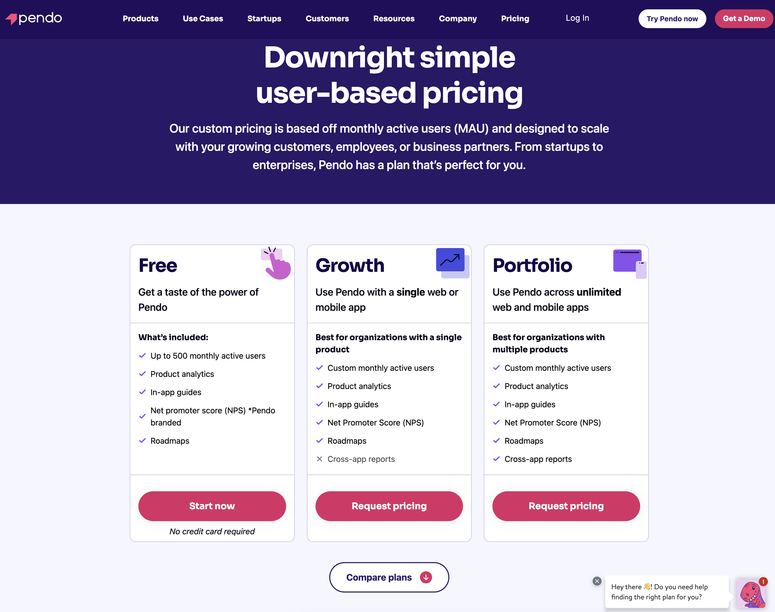
Pendo has two paid plans and one free version that is limited to 500 MAUs which makes it accessible to startups but difficult to scale in the long run.
Here are the differences between each Pendo plan:
- Pendo Free: The free version of Pendo can accommodate 500 MAUs and has features like native analytics dashboards, feature tagging, event tracking, segmentation, NPS surveys (with Pendo branding), analytics reports, and in-app guides.
- Growth: Pendo’s Growth plan is designed to be used for a single web or mobile app but can accommodate a custom number of MAUs. It includes features like native analytics dashboards, in-app guides, NPS surveys and response tracking, and customer support.
- Portfolio: Pendo’s Portfolio plan is targeted towards customers who want to use the tool for multiple web and/or mobile apps. Features include guide experiment capabilities, cross-app executive dashboards, cross-app journey reporting, and access to product engagement scores.
Pricing of Userlane
Userlane’s pricing plan is structured in a customizable pattern. This means you need to get a custom quote to know the plan that fits your brand’s purpose based on the level of your SaaS and the number of acquired customers.
Userpilot – A better alternative for building interactive user guides
Userpilot is a product growth platform that drives user activation, feature adoption, and expansion revenue. It also helps product teams collect user feedback, streamline onboarding, and gather actionable insights from analytics.
With Userpilot, you’ll be able to track both product usage and user behavior to get a holistic view of how customers use your product — which will guide future development, improve the user experience, and inform your growth efforts.
No-code product tours in Userpilot
Product tours are an effective way to show new users what a product can do and reduce the time-to-value (TTV) for them. Userpilot lets you build advanced product tours, set contextual triggers, and target specific audiences, all without writing a single line of code.
Here are the Userpilot features that you can use to build a product tour for your users:
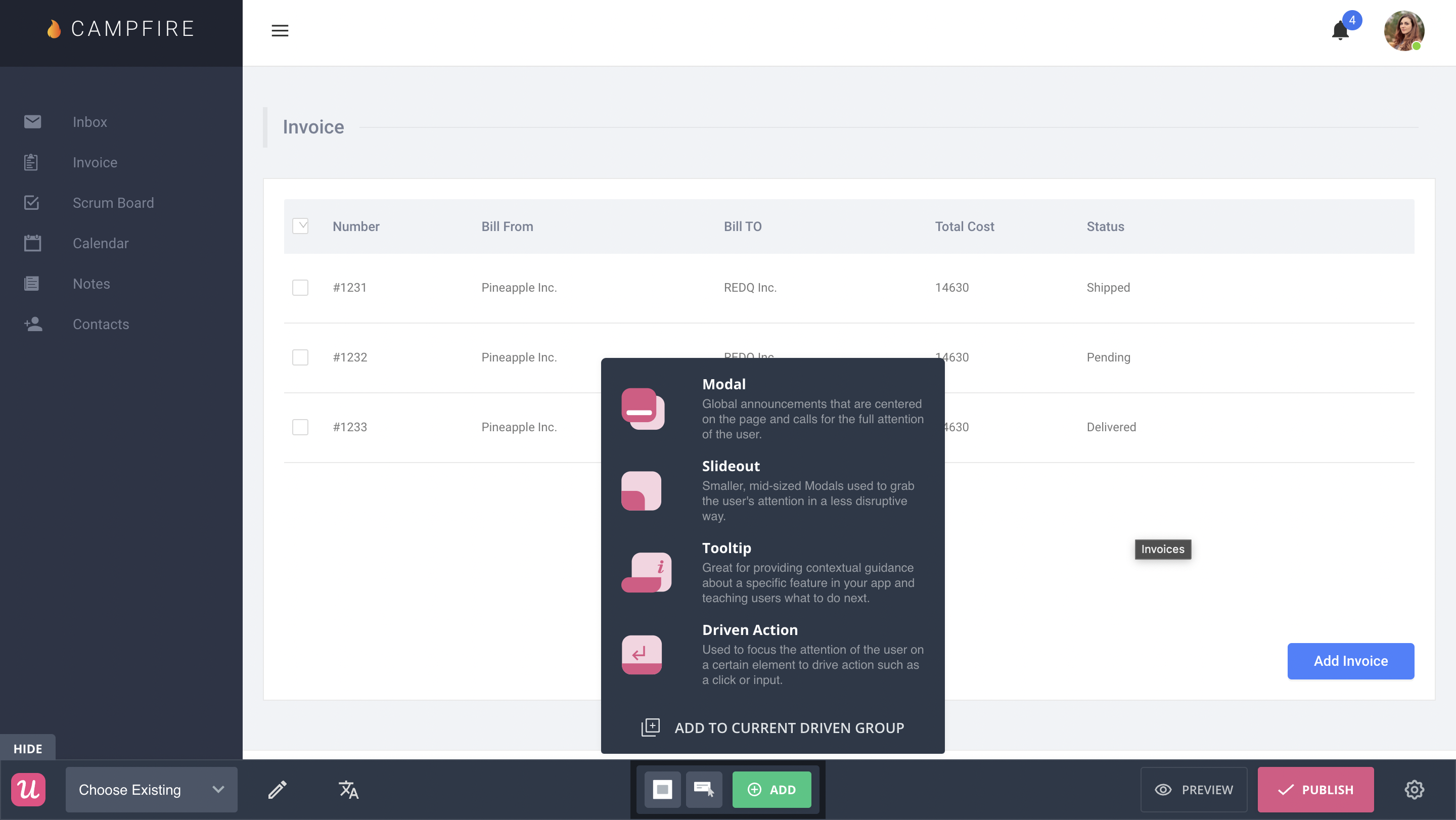
- Flow builder: Userpilot’s no-code flow builder has a variety of UI patterns to choose from, such as modals, slideouts, tooltips, and driven actions. All UI patterns are available for use regardless of which Userpilot plan you’re on. All you need to do is install the Chrome extension.
- Contextual triggers: Userpilot lets you set triggers for your flows to ensure that they appear at the most contextual moments. Flows could be triggered when users land on a specific page or when a tracked event occurs. There are also manual triggering options that you can tinker with.
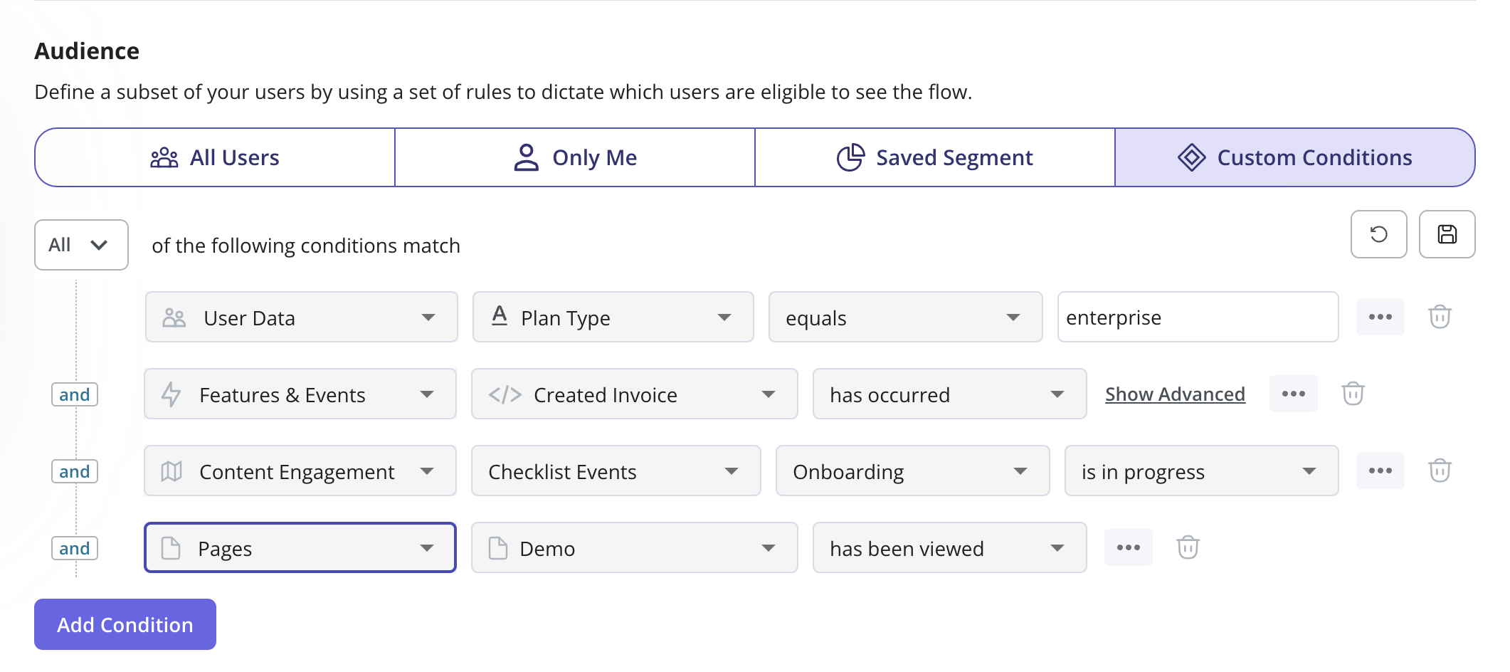
- Audience targeting: Userpilot’s audience targeting setting lets you set the conditions needed for a flow to show up for a specific user. You can use these settings to create flows that target a specific segment or exclude certain users from seeing a flow if certain conditions are met.
In-app messaging in Userpilot
In-app messaging enables communication within your product to onboard new users or drive feature adoption among existing customers.
Here are a few ways you can send in-app messages using Userpilot:
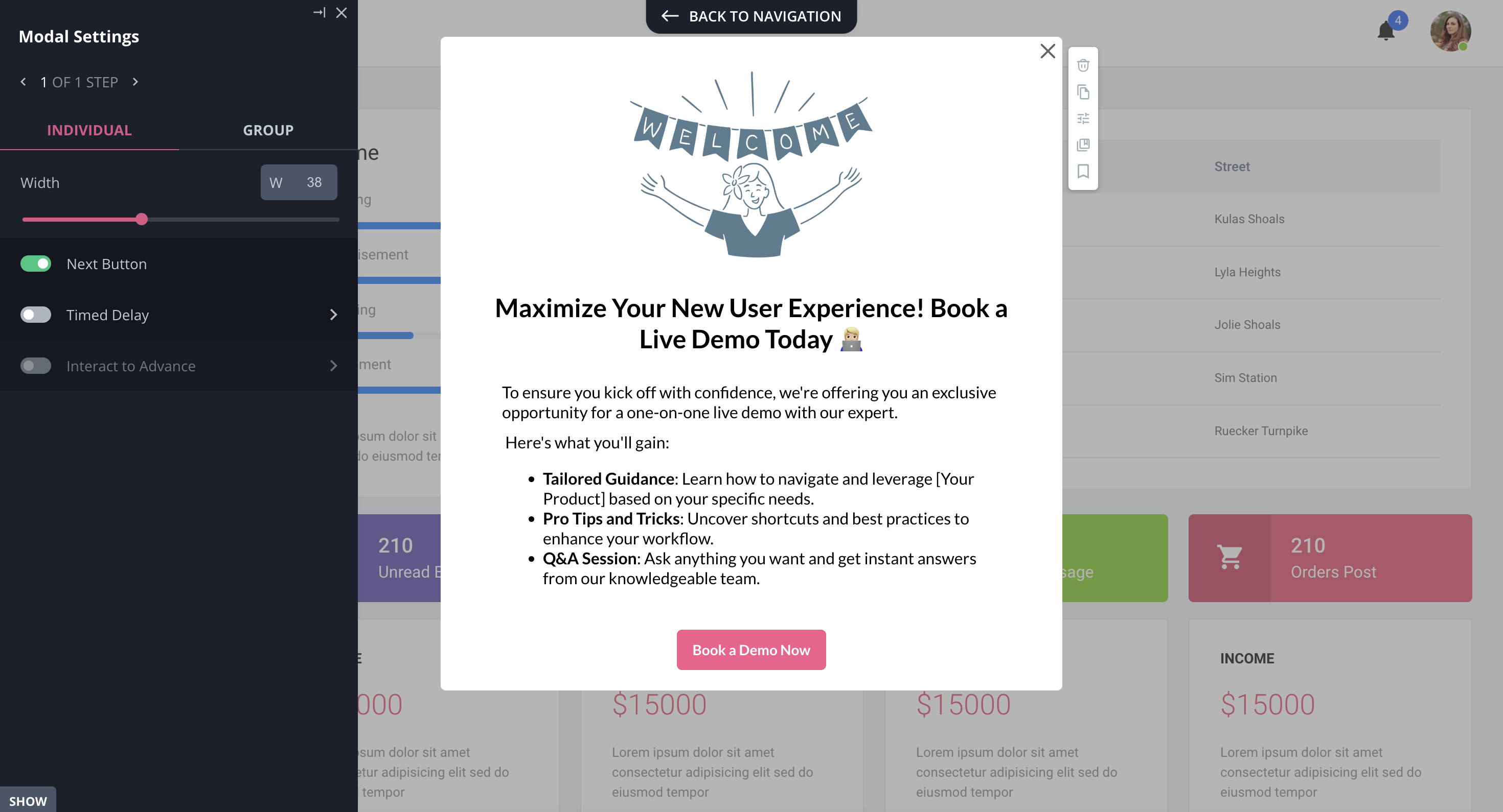
- Modals: Userpilot lets you use modals to send unmissable in-app messages to your users. Simply choose from one of the six templates or create a new modal from scratch. You’ll be able to use text, emojis, images, and videos to help your modals get the message across to users.
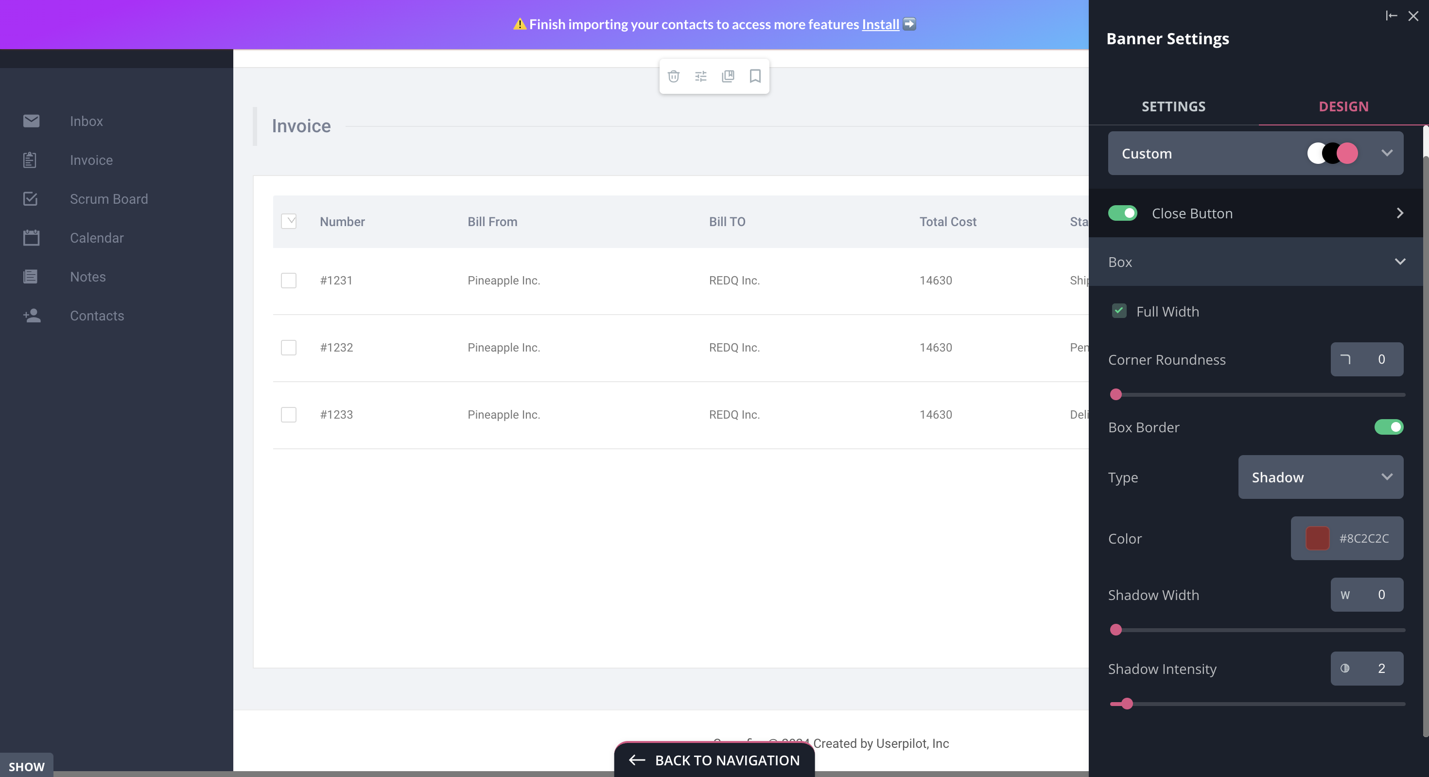
- Banners: Userpilot banners can be used to send in-app messages that are urgent but don’t need to take up the entire screen. You can also add blocks with text, emojis, images, videos, forms, custom JavaScript functions, and more to style banners to your liking.
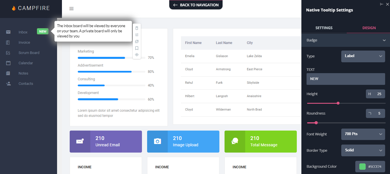
- Tooltips: They are the least intrusive form of in-app messaging as they only show up when users hover over an element or click on an info icon. You’ll be able to adjust the height, shape, color, and placement of tooltips to make them native-like.
Pricing of Userpilot
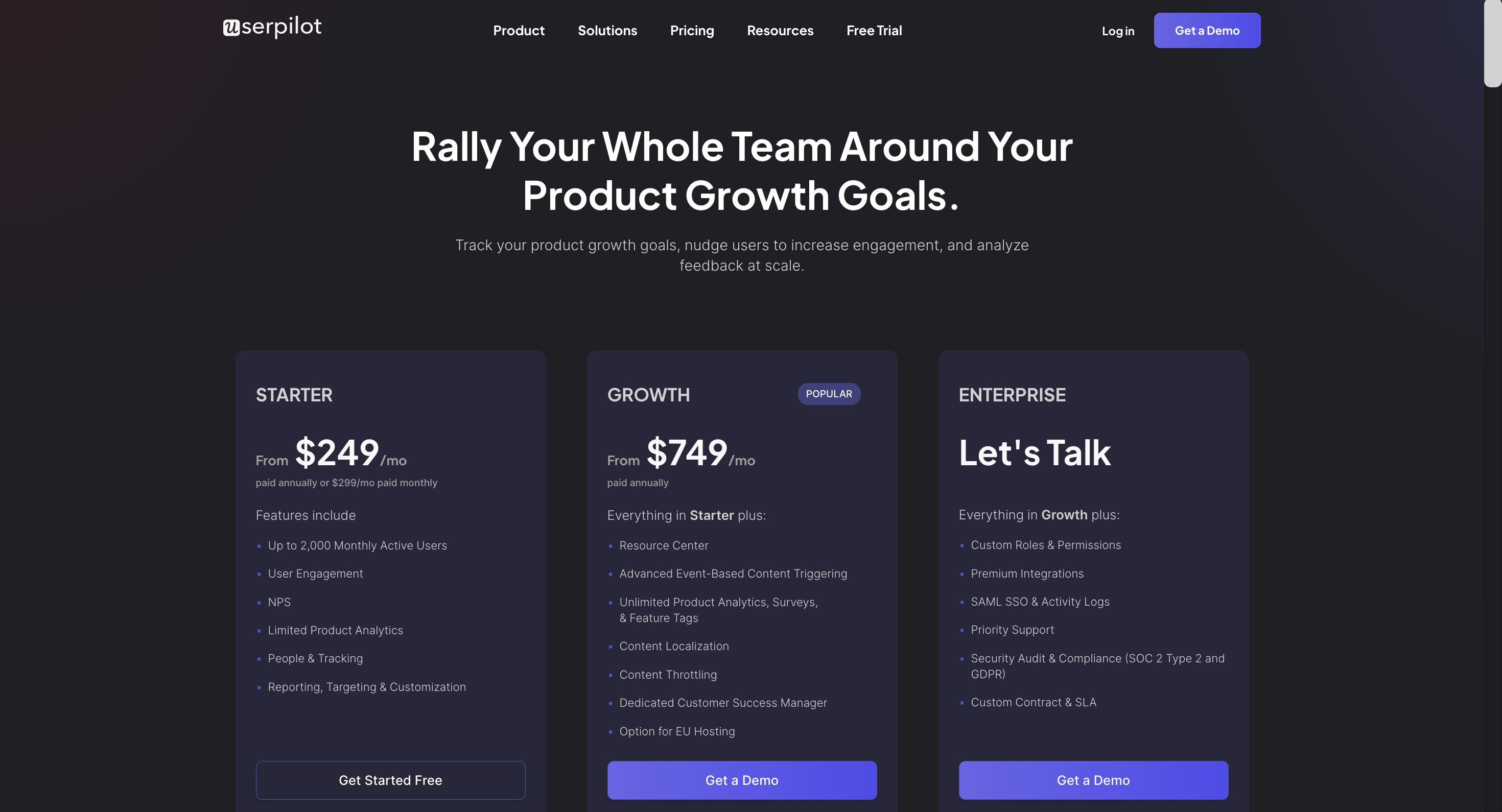
Userpilot’s transparent pricing ranges from $249/month on the entry-level end to an Enterprise tier for larger companies.
Furthermore, Userpilot’s entry-level plan includes access to all UI patterns and should include everything that most mid-market SaaS businesses need to get started.
Userpilot has three paid plans to choose from:
- Starter: The entry-level Starter plan starts at $249/month and includes features like segmentation, product analytics, reporting, user engagement, NPS feedback, and customization.
- Growth: The Growth plan starts at $749/month and includes features like resource centers, advanced event-based triggers, unlimited feature tagging, AI-powered content localization, EU hosting options, and a dedicated customer success manager.
- Enterprise: The Enterprise plan uses custom pricing and includes all the features from Starter + Growth plus custom roles/permissions, access to premium integrations, priority support, custom contract, SLA, SAML SSO, activity logs, security audit, and compliance (SOC 2/GDPR).
What do users say about Userpilot?
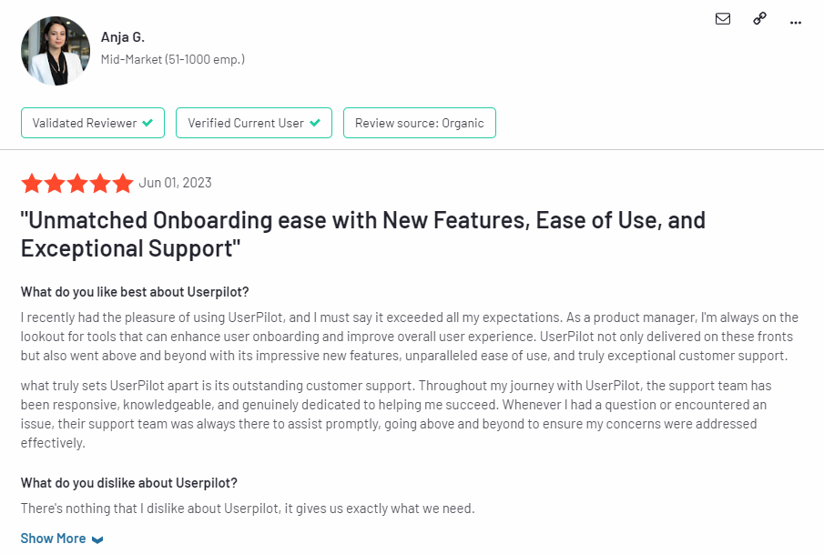
Most users laud Userpilot for its versatile feature set, ease of use, and responsive support team:
I recently had the pleasure of using Userpilot, and I must say it exceeded all my expectations. As a product manager, I’m always on the lookout for tools that can enhance user onboarding and improve overall user experience. Userpilot not only delivered on these fronts but also went above and beyond with its impressive new features, unparalleled ease of use, and truly exceptional customer support.
What truly sets Userpilot apart is its outstanding customer support. Throughout my journey with Userpilot, the support team has been responsive, knowledgeable, and genuinely dedicated to helping me succeed. Whenever I had a question or encountered an issue, their support team was always there to assist promptly, going above and beyond to ensure my concerns were addressed effectively.
Source: G2.
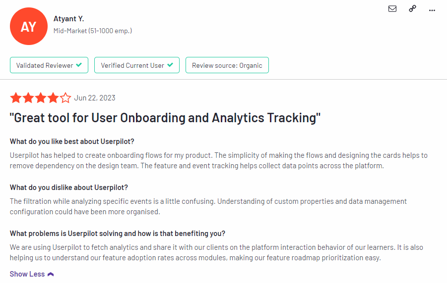
Of course, other users are also kind enough to share constructive criticism regarding specific features like event tracking filters:
“The filtration while analyzing specific events is a little confusing. Understanding of custom properties and data management configuration could have been more organised.”
Source: G2.
Conclusion
This is the end of our thorough comparison between Pendo and Userlane. You should be able to make a confident decision by now. If you’re looking for a solid tool for building interactive user guides that promises great value for money, give Userpilot a go. Book a demo today.

