Salesforce In-App Guidance: An In-Depth Review of + A Better Alternative
What is Salesforce in-app guidance?
Salesforce in-app guidance is a functionality designed to provide contextual guidance to platform users and help them perform various tasks efficiently.
You can use this tool to onboard new Salesforce users, communicate new feature updates, and enhance user adoption.
Pros of Salesforce in-app guidance builder
Designed to aid the onboarding of new users and employees, the in-app guidance system from Salesforce boasts two main advantages:
- No-code builder: The in-app guidance builder doesn’t require any coding knowledge. This means non-technical team members can build interactive product experiences without further installing any scripts or waiting for developer help.
- Personalization: Salesforce allows you to segment users based on profiles and permissions before triggering flows, allowing for some basic personalization.
Cons of Salesforce in-app guidance builder
The in-app guidance system is not without its disadvantages. Most of these stem from limitations to the…
- Limited UI patterns: Salesforce lacks in-app message types present in other tools such as banners, modals, and hotspots.
- Lack of advanced segmentation: Although we mentioned Salesforce allows basic segmentation, you still can’t create sophisticated segments based on the user’s role, location, or in-app behavior.
- Walkthrough limitations: Walkthroughs can have a maximum of ten steps. While this may be great for most occasions, you can’t add extra prompts if needed.
Types of Salesforce in-app guidance prompts
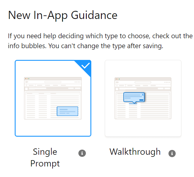
Salesforce allows you to create two types of in-app guidance – a single prompt or a walkthrough.
Whichever one you choose, though, you’ll have to select from 3 types of prompts: floating, docked, or targeted.
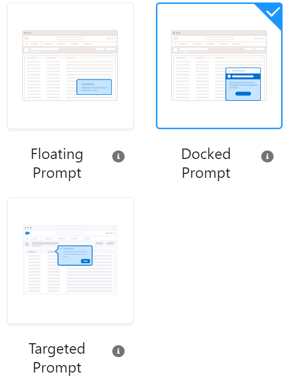
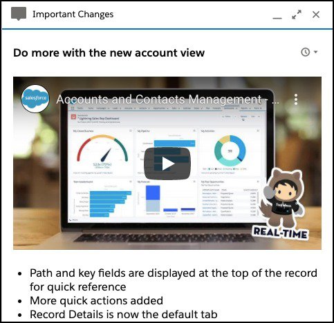
- Floating prompt: A floating prompt appears as a small pop-up window that can be positioned as an informative box anywhere on the screen. It floats over the app’s UI and is ideal for providing quick tips, reminders, or notifications without interrupting the user’s workflow.
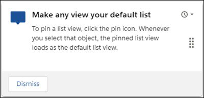
- Targeted prompt: A targeted prompt also floats over the screen but is tied to a specific element and is positioned relative to that element. This makes it an excellent choice for context-sensitive information, such as a prompt explaining how a button/feature works.
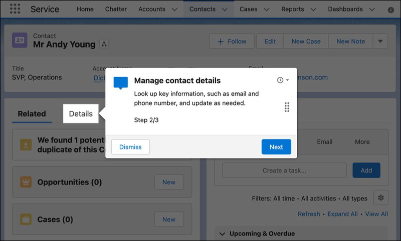
- Docked prompt: The docked prompt is a larger-sized prompt that typically appears at the bottom corner of the page. It allows you to embed images and videos, and to provide longer step-by-step directions to guide users through more complicated tasks.
How to create in-app guidance with Salesforce? A closer look at its in-app guidance settings
To enable in-app guidance in Salesforce, navigate to Setup > User Engagement > In-App Guidance Settings and toggle it on.
To create a prompt or walkthrough, go to the App Manager tab, select the app where you want to add the prompt, then click Add. Alternatively, you can select in-app guidance from the Settings page and click “New” to add a prompt.
After clicking the Create Prompt button, you’ll be able to select one of the different prompt types, choose a specific page where it appears, and adjust its position, size, color, and font on the setup page on the right sidebar.
Click Next to edit the contents of the prompt, including the title and body. You’ll also be able to add or embed images and videos for the prompt on this page.
For a walkthrough, you’ll need to add more prompts to form steps. If you selected walkthrough instead of prompt, you’ll be able to add prompts as steps. After adding each prompt, select Add Step to add a new one. You’ll also be able to re-order the steps on the left sidebar.
Note that the first prompt in your walkthrough is your branding and customization environment. Choose from various colors, fonts, and other design elements to create a walkthrough that matches your brand.
Finally, once you’re done, click Save at the top right corner and customize the profiles, permissions, triggers, and call to action for your new prompt.
Salesforce in-app guidance pricing
With a standard Salesforce subscription, you’ll be able to create and view up to three custom walkthroughs at a time.
In addition to the standard Salesforce license cost, you’ll have to pay an additional $25 per user per month for every user who you want to see or create a walkthrough.
Userpilot in-app guidance: A better alternative to the Salesforce platform
While Salesforce offers a valuable starting point, its limited customization and targeting features can present a problem. It is also limited to use within the Salesforce platform.
In that regard, Userpilot offers a more rounded experience. It is a no-code tool for use in any web app. By simply installing a JS code snippet, Userpilot enables you to streamline your onboarding process and drive user adoption on your own apps.
Pros of Userpilot in-app guidance feature
Userpilot is a full-sized digital adoption platform with all the features you need for user onboarding and targeting. Some of its pros include:
- Extensive UI patterns: Userpilot provides a wide range of UI patterns for you to choose from, including hotspots, modals, tooltips, banners, slideouts, and more!
- Extensive customizations: Customize the colors, font, and overall feel of your in-app messages to match your brand style. You can also add your company’s logo and name, and embed images, videos, and GIFs.
- Advanced segmentation: Hyper-segmentation lets you select who sees a flow or prompt based on their browser, profile, in-app activities (such as hovers, clicks, or other in-app events), NPS score, and more.
Cons of Userpilot in-app guidance feature
Of course, there’s no perfect tool and Userpilot has a few drawbacks of its own, including:
- No mobile app support: Userpilot is designed to work with web apps only. This means it won’t work on your mobile or desktop apps.
- Pricing: Userpilot is a powerful tool with an extensive feature set (in-app guidance, event tracking, etc.). With it’s cheapest plan $249/month, it may not be suitable for small startups on a shoestring budget.
Types of in-app guidance in Userpilot
The in-app guidance provided in Userpilot can be differentiated based on its size, position, and purpose. It is broadly divided into six (6) main categories:
- Tooltip: This is a prompt that is linked to a particular UI feature and is used to explain what the feature does or how it’s used. It can be triggered when users interact with a specific product page.
- Banner: Banners are static and unobtrusive in-app notifications. They take up very little screen space, attracting attention without covering the main user interface or obstructing user activity.
- Modal: Modals are pop-up messages that command the user’s attention and carry a clear call to action. You can use them to share critical information or announce major product updates.
- Slideout: Slideouts are smaller-sized modals that “slide out” from a corner of the screen. You can use them to announce updates, encourage plan upgrades, and more.
- Resource Center: Userpilot’s in-app resource center helps users receive help and find answers without leaving your product. It can hold articles, videos, and other forms of helpful guides.
- Checklists: This is a type of in-app messaging that list of tasks a user must complete for user activation. The list is automatically ticked off as the user completes each step.
Steps to creating in-app guidance with Userpilot
Creating in-app guidance flows with Userpilot is a fairly straightforward affair. If this is your first time, using Userpilot, you’ll need to download the Userpilot Chrome Extension Builder.
Once that’s done, you can create a prompt or flow in a few short steps:
- Navigate to your web app and click on the Userpilot builder icon in your browser extension bar.
- Select “Create New Content” and navigate to the page you want to create the flow for.
- Click “Start here” > “Create new content”
- Choose your preferred UI pattern and customize the look and feel (colors, fonts, etc.) of the pattern.
- Use our AI writing assistant to fine-tune your product copy. You can rephrase, shorten, and rewrite to improve the readability of your text and the overall quality of the guide.
Userpilot in-app guidance pricing
We use transparent pricing while offering plans for mid-market and enterprise SaaS companies.
Here’s an overview of the three Userpilot plans you can choose from:
- Starter: The entry-level Starter plan starts at $249/month and includes features like segmentation, product analytics, reporting, user engagement, NPS feedback, and customization.
- Growth: The Growth plan starts at $749/month and includes features like resource centers, advanced event-based triggers, unlimited feature tagging, AI-powered content localization, EU hosting options, and a dedicated customer success manager.
- Enterprise: The Enterprise plan uses custom pricing and includes all the features from Starter + Growth plus custom roles/permissions, access to premium integrations, priority support, custom contract, SLA, SAML SSO, activity logs, security audit, and compliance (SOC 2/GDPR).
Conclusion
Whether it’s new user onboarding, employee onboarding, or secondary education and support, in-app guidance is a powerful addition to your toolkit, and the Salesforce in-app guidance builder is great for Salesforce users.
If you want to build product experiences and create in-app guidance for your product, though, Userpilot is an excellent, more powerful choice. Book a demo call with our team today to get started!