Sign-Up Page Examples That Convert


There are hundreds of sign-up page examples on the internet. Some blogs list fifty. A few push past a hundred. But volume isn’t the problem. The real question is: which ones actually convert, and more importantly, which ones are worth learning from?
Not every example you find will apply to your product. A fintech app asking for KYC details has completely different constraints than a no-code SaaS tool trying to get someone into a free trial in under 60 seconds. Distinct audiences have different needs, and what works for one will kill conversions for another.
That’s why I put this list together differently.
I studied sign-up pages we interact with every day: tools that have become genuinely embedded in how we work, communicate, and manage our businesses. Pages where every design decision pulls its weight on conversion. For each example, I looked at the signup page design, the compelling copy, and the specific conversion logic behind it, and what type of product or audience it maps to best.
Whether you’re building email sign-up forms for a newsletter or a full free trial flow for a SaaS product, you’ll find something here worth borrowing.
What is a sign-up page?
A sign-up page is a dedicated landing page with one job: turn a visitor into a user. Its only purpose is getting someone across the finish line.
For SaaS products, it’s typically the entry point to a free trial or freemium account. For e-commerce brands, it’s where shoppers create an account or join a list. How it looks depends on the product. What it needs to do never changes.
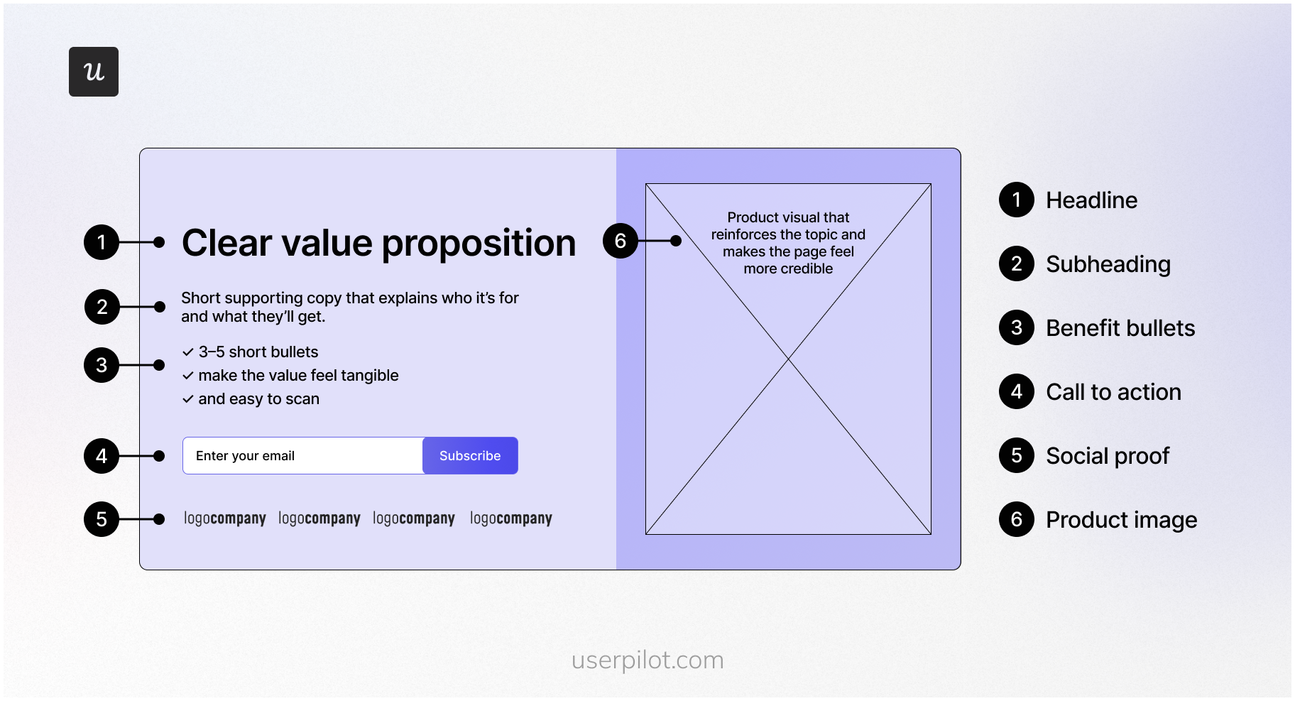
What separates a well-built sign-up page from a form dropped randomly on your site is focus. The right key elements, a clear call to action, solid visual appeal, and smart form design all work together to move someone from visitor to user. Done right, it removes every reason to hesitate and makes the signup process smooth.
25 Best sign-up form examples for inspiration
Best way to learn how to create a great signup form for your SaaS product?
Study excellent sign-up page examples!
Here are my top 25 design examples for you.
1. Google: For seamless ecosystem entry
Best for: Products where signup unlocks a broader suite rather than a single tool.
Creating a Gmail account is the first step towards using Google’s suite of tools, like Docs, Sheets, and the cloud-storage platform, Drive. Since Gmail account creation is the gateway to the entire Google Workspace ecosystem, it’s no surprise that its sign-up page has been perfected.
The sign-up form for Gmail abides by Hick’s law with its minimal design, plenty of white space, and absence of potentially distracting elements. This is especially advantageous for entrepreneurs in a rush to set up their Google Workspace business accounts.
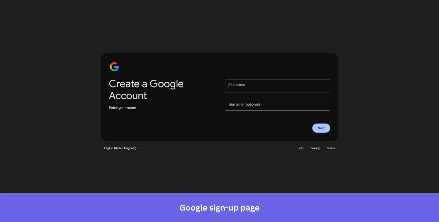
Why it works: Fewer choices mean faster decisions. Reducing visual noise directly reduces drop-off.
2. OpenAI: For frictionless AI sign-up
Best for: AI and tech products targeting users who want to get in and start immediately, with zero commitment signals upfront.
ChatGPT has one of the simplest online sign-up forms since you can create your free account by just entering your email address.
Users can also take shortcuts during signup by logging in with their Google, Apple or Microsoft accounts instead. Single Sign-on (SSO) can improve the conversion rate amongst new users by 20-40%.
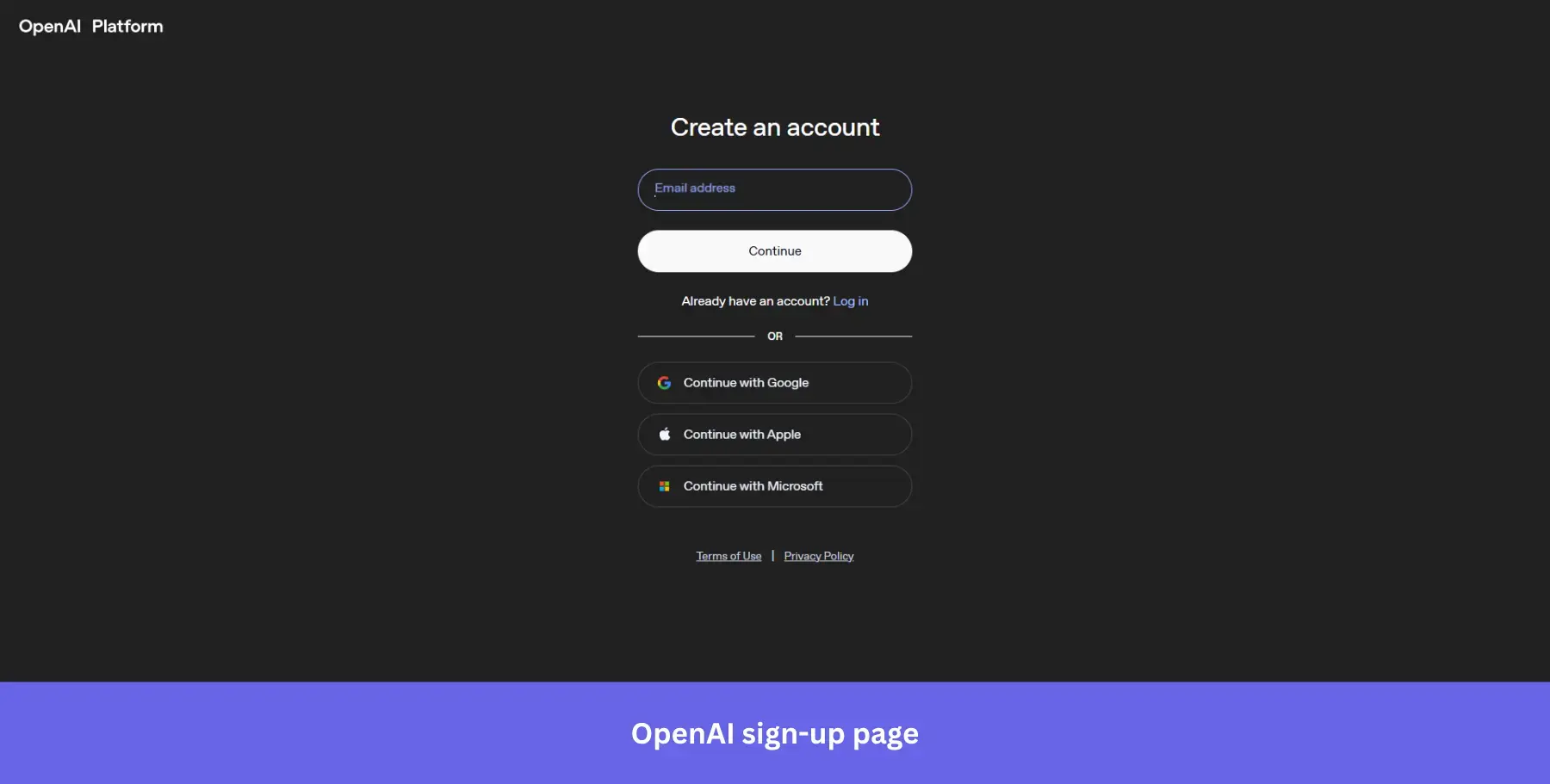
Why it works: The dark background strips away every distraction and puts the form front and center. One field, one button, three SSO options. There is nothing to overthink.
3. Leadinfo: For trust-led B2B sign-ups
Best for: B2B tools where buyers need social validation before committing, even to a free trial.
Leadinfo uses very simple signup forms to onboard new users. The company’s signup forms also display clear error messages whenever a form field is overlooked or incorrectly filled out. The heading mentions the 14-day free trial to assure visitors they won’t be charged.
The entire page uses simple copy to ensure it makes sense to visitors who land on it.
To keep anything that could confuse visitors to a bare minimum, Leadinfo has their social proof on the left side of the page, while the signup form is on the right.
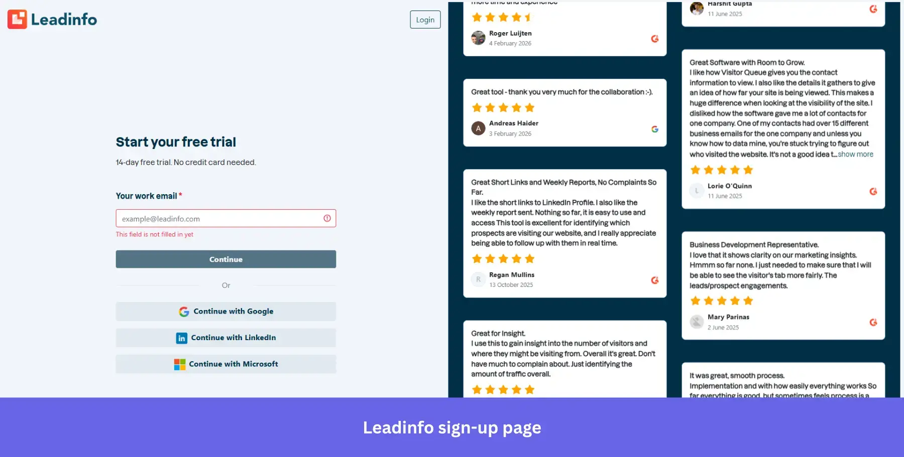
Why it works: Real G2 reviews next to the form do the selling while the form stays clean. Using social proof in sign-up forms can meaningfully improve credibility, and Leadinfo puts that principle front and center.
4. Asana: For benefit-first frictionless sign-ups
Best for: Productivity and project management tools where seeing the interface upfront reduces signup hesitation.
The project management software Asana uses very simple signup forms to ensure that the entire onboarding journey is as frictionless as possible for new users (they conduct additional steps in the onboarding flow through email sequences later on).
Their signup page has a lot of white space to keep the main focus on the benefit-oriented headline and CTA button, with a sneak peek into the dashboard to set clear expectations.
The headline “You’re one click away from less busywork” leads with the outcome, not the feature, keeping the copy concise and value-driven.
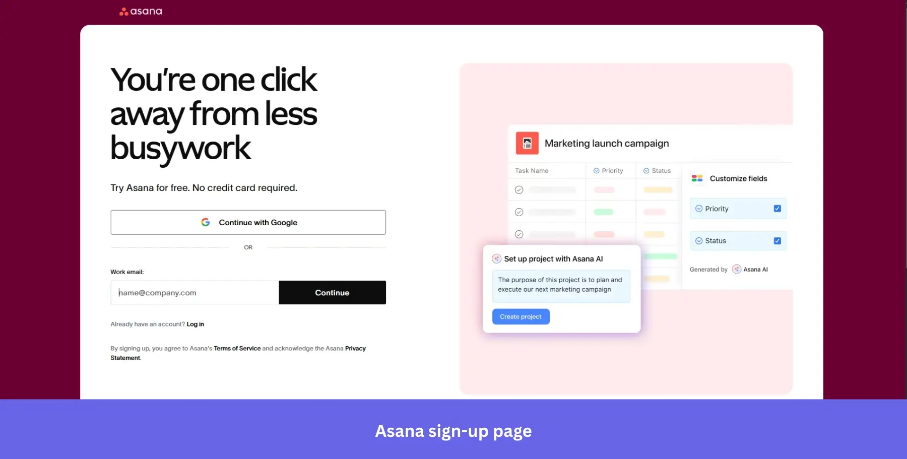
Why it works: Showing the actual product interface next to the form answers the unspoken question every visitor has: “What am I signing up for?”
5. Typeform: For social-proof-driven sign-ups
Best for: Form and survey tools where demonstrating response quality upfront directly influences signup confidence.
The Typeform sign-up form is designed to be as intuitive as possible. It starts by giving users the option to log in with their Google or Microsoft account.
This is a no-brainer since most people already have one of the accounts. The signup form also offers an email option for those who don’t want to link other accounts.
Typeform splits the page into two distinct halves: a rotating product carousel on the left showcasing real results, and a clean, minimal form on the right. The “Trusted by over 150,000 brands” callout alongside logos like HubSpot and Airbnb does the trust-building before a single field is filled.
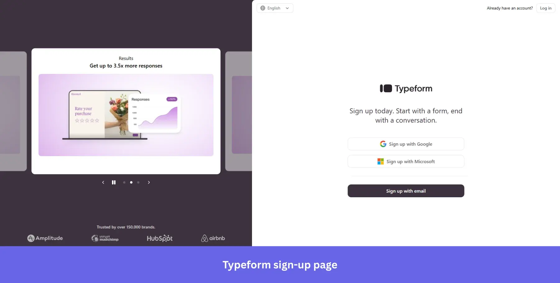
Why it works: Proof and form on the same screen mean visitors never have to go looking for reassurance.
6. Salesforce: For multi-step sign-ups
Best for: Complex enterprise products where qualifying information is necessary but needs to feel gradual rather than demanding.
At first glance, Salesforce’s signup form appears more complex than the other examples on this list. It has more form fields, but that’s to be expected since the Salesforce platform itself is more complex than other software solutions.
Still, its heavier-handed user interface is a great example of how helpful content can incorporate customer education into a free-trial sign-up flow. The benefit bullet points give new customers a quick recap of what they’ll gain, and the “No credit card required, no software to install” copy removes the two biggest objections upfront.
Unlike single-step forms, multi-step forms like Salesforce’s break the process into a step-by-step process across three digestible screens. And with a progress bar at the bottom, keeping users oriented throughout.
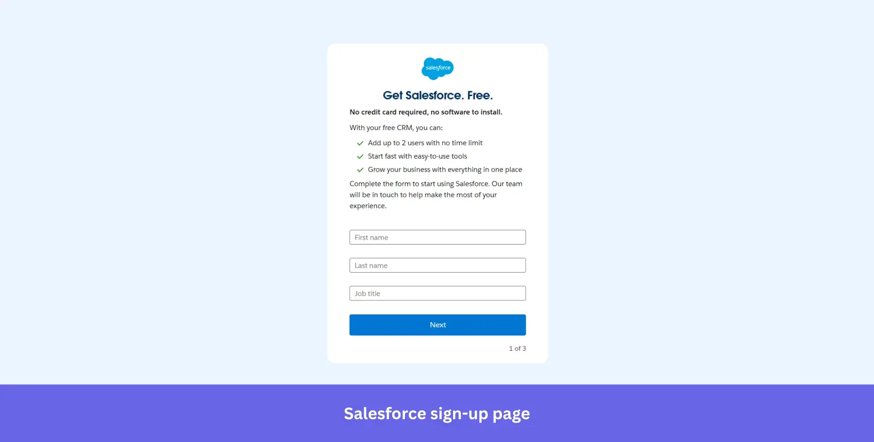
Why it works: Collecting the job title at step one lets Salesforce route users into the right onboarding experience immediately.
7. Monday.com: For zero-friction, no-commitment sign-ups
Best for: Collaboration tools targeting teams who need a fast, low-commitment entry point before looping in colleagues.
Monday.com’s sign-up page design is quite straightforward, with minimal text, a single form field, not a single pop-up, and alternative sign-up options like logging in through a Google account. The signup form also reminds visitors that it’s free and doesn’t require a credit card.
You won’t find any additional steps on Monday’s signup page. All illustrations are on the right side of the page to ensure that users aren’t distracted from their account creation.
The bold illustrated visual on the right reinforces the product’s collaborative, colorful nature without adding cognitive load to the signup process.
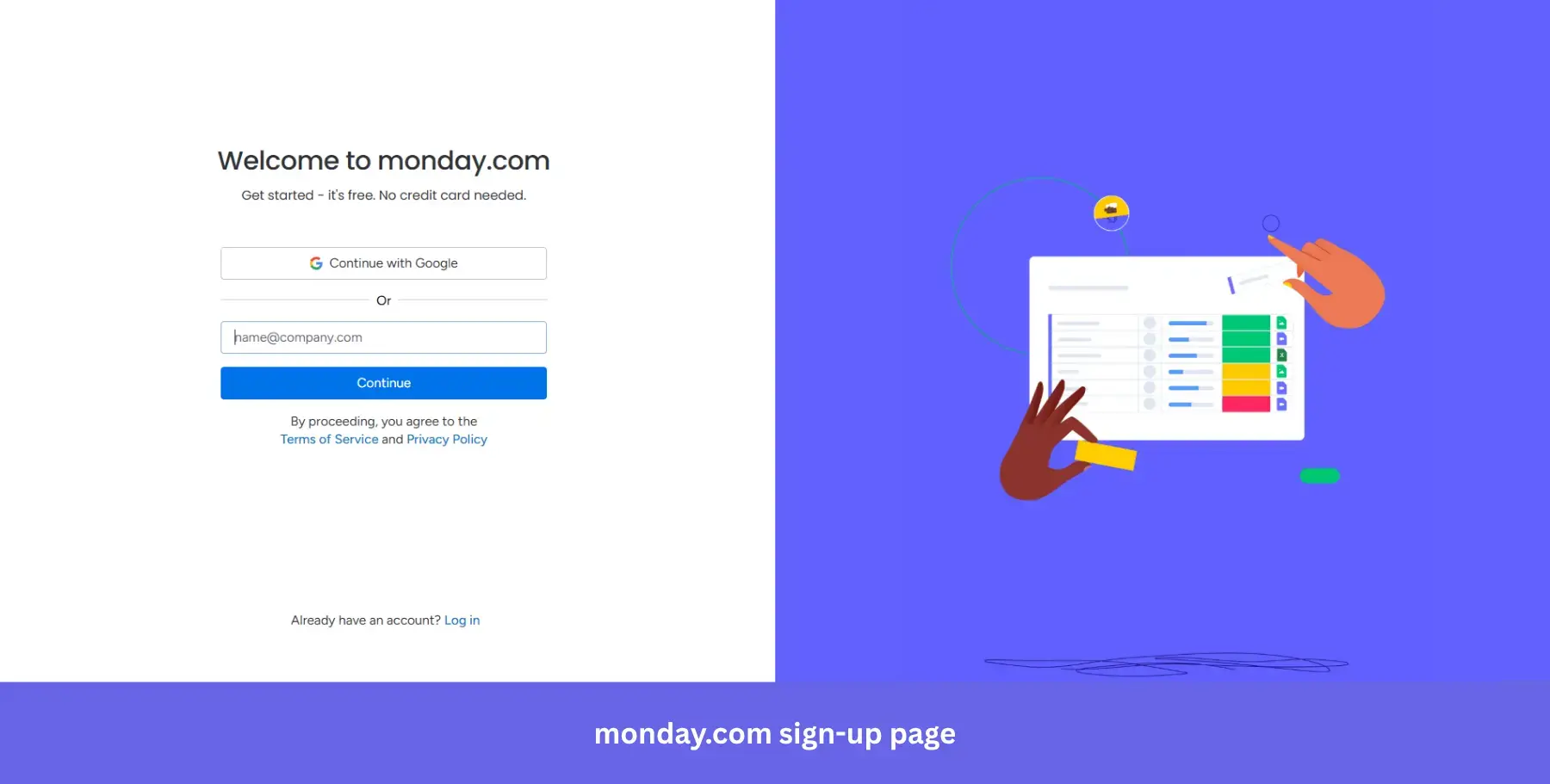
Why it works: “Get started, it’s free. No credit card needed” in the subheading handles the two most common objections before the visitor even reaches the form field.
8. Claude: For utility-first AI sign-ups
Best for: AI productivity tools targeting builders and professionals who want to see workflow context before committing.
Claude’s sign-up page leads with a sharp, outcome-driven headline: “Think fast, build faster.” There’s no lengthy explanation of what Claude is. The subheading “Brainstorm in Claude, build in Cowork” does the positioning in six words.
The form itself is minimal: Google SSO or email, nothing else competing for attention. What makes this page stand out is the product preview on the right, showing a live task workflow with real integrations like Notion, Linear, and Google Calendar. It’s not a marketing illustration. It looks like an actual working environment.
The “Download desktop app” option below the form is a subtle but smart addition, offering a different entry point for users who prefer native apps over browser tools.
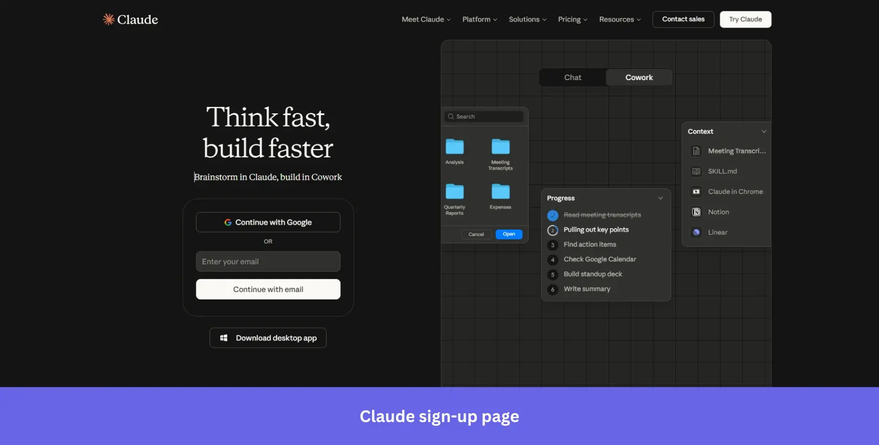
Why it works: The product preview signals immediate utility rather than abstract capability, which is exactly what a skeptical AI user needs to see before signing up.
9. PayPal: For high-trust & security-first sign-ups
Best for: Financial and payments products where collecting thorough information upfront is non-negotiable, and user trust needs to be established immediately.
PayPal has a multi-step signup form, but every screen focuses on a single action to avoid overwhelming website visitors. The form fields also focus on security-related information like email and mobile verification.
Seeing as PayPal is a financial app, it’s expected that its signup form would require more essential information than software that deals with less sensitive subjects like email or AI writing tools.
The subheading “Whether you’re a business, nonprofit, or a casual seller, you’re in the right place” does something most sign-up pages skip entirely: it acknowledges distinct audiences upfront and reassures each one before a single field is filled.
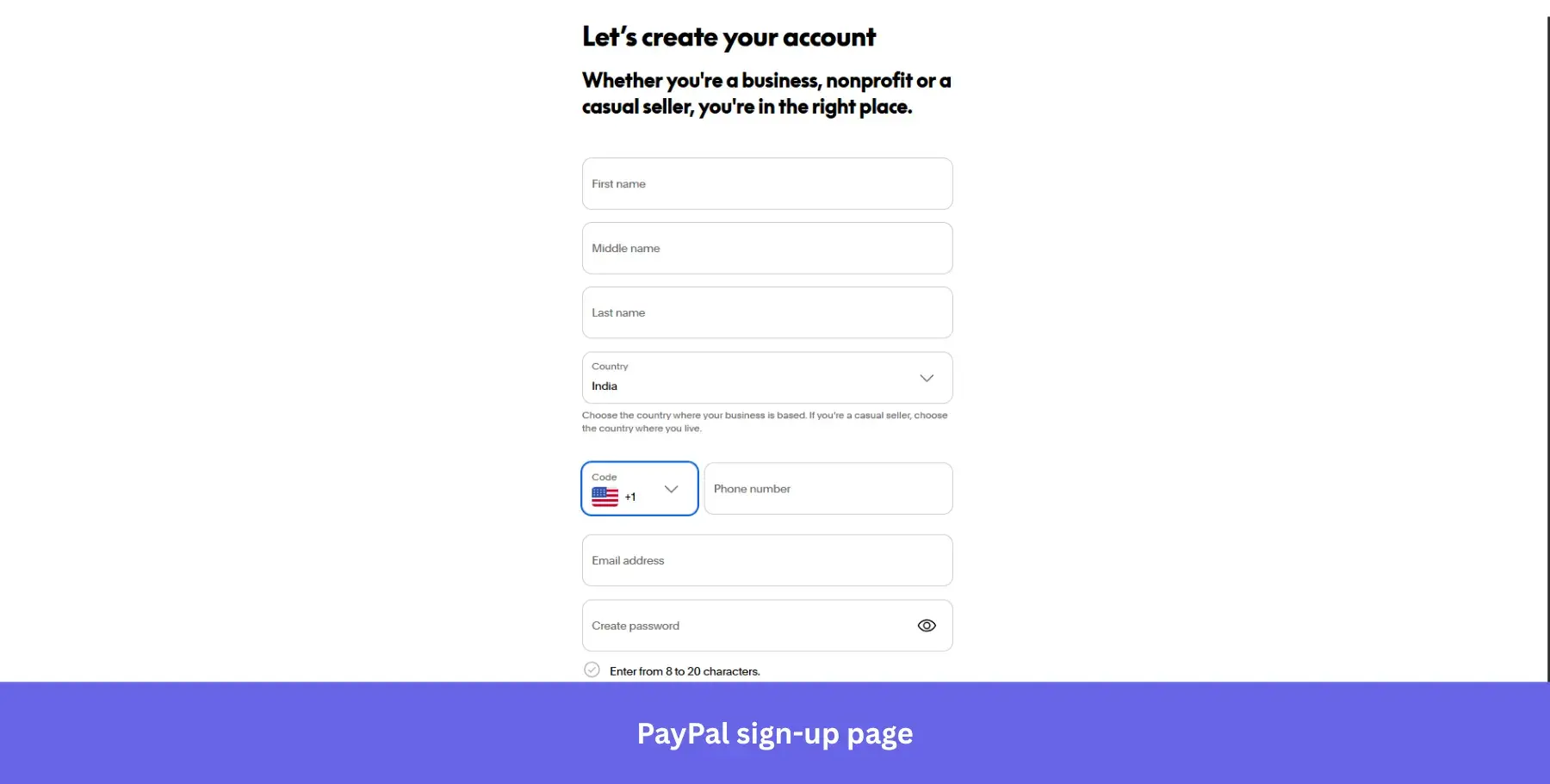
Why it works: The inline password field that shows character rules, including uppercase letters and symbols, reduces form abandonment by telling users exactly what’s needed as they type.
10. Quora: For combined sign-up and login on one screen
Best for: Community and knowledge platforms where both new and returning users arrive at the same entry point regularly.
As you need an account to post on Quora, respond to threads, or view more than one question on your browser, it makes sense that the signup page is the first place that most users will be directed toward.
Both the signup form and login form sit side by side within the same modal, so users don’t have to navigate between different screens. You don’t even need to enter your email to sign up since you can log in through a Google or Facebook account.
The vibrant illustrated background is a deliberate contrast to the dark modal, making the form feel less like a gate and more like an invitation into a larger community.
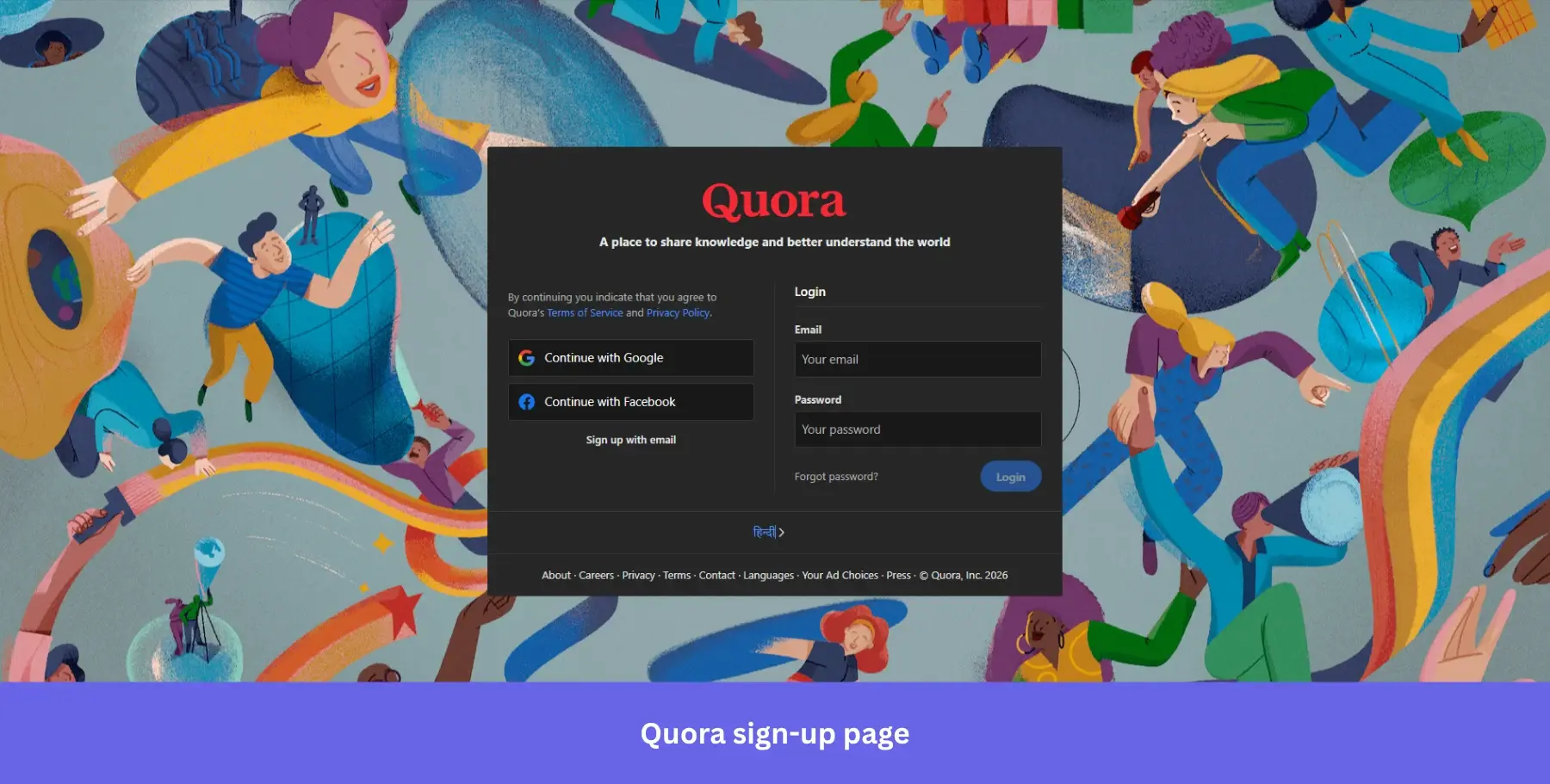
Why it works: Putting signup and login on the same screen eliminates the friction of users landing on the wrong page and having to find their way back.
11. Wise: For minimal-entry financial sign-ups
Best for: Fintech and financial products that need significant user information but want to avoid scaring users off at the first screen.
Wise is similar to PayPal in terms of the product it offers, but takes a noticeably different approach to its sign-up form. Since lengthy KYC procedures are one of the biggest annoyances of the financial services industry, Wise front-loads the process with the simplest possible first step: just your email address.
Sign-up options include Google, Apple, and Facebook, with clean icon-only buttons that keep the page visually uncluttered. The additional verification and compliance steps come later, once the user is already committed.
The micro-copy “First, enter your email address” is a small but deliberate choice, framing the form as a sequence rather than a commitment.
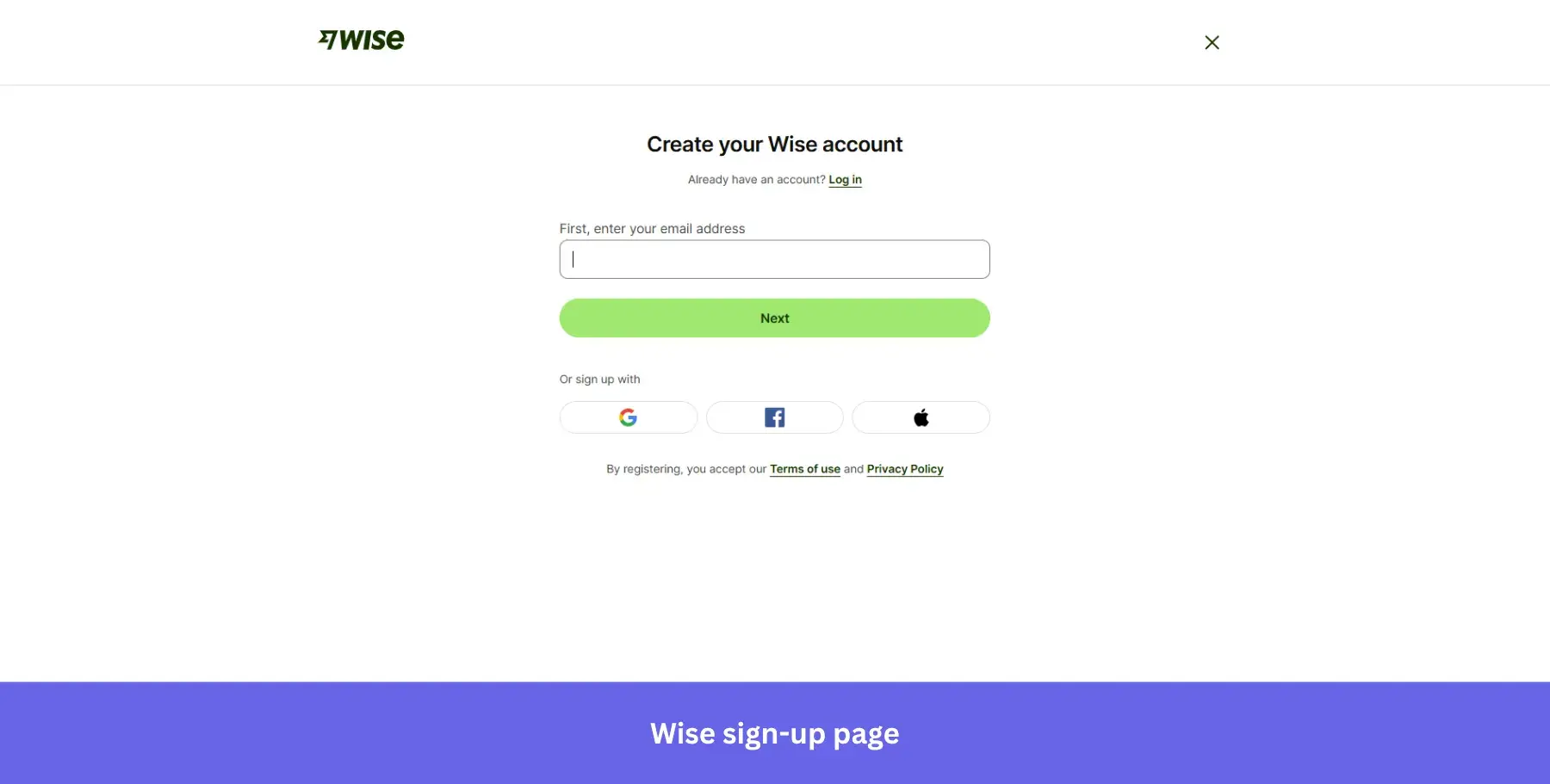
Why it works: Starting with a single low-friction field gets users past the first psychological barrier before the heavier KYC requirements kick in.
If you want a larger library of categorized sign-up page layouts, see my full collection of sign-up page design inspiration.
12. Crazy Egg: For feature-forward sign-ups
Best for: Analytics and CRO tools where the feature set itself is the selling point, and users are already comparison shopping.
Crazy Egg keeps the signup form clean and direct, giving users two options to create their account: email or Google. The two CTA buttons use different colors, blue for email and white for Google, so users can immediately identify their preferred path without reading carefully.
The page splits into two distinct sections: a minimal white form on the left and a soft gradient panel on the right listing exactly what you get access to: heatmaps, recordings, A/B testing, web analytics, and surveys.
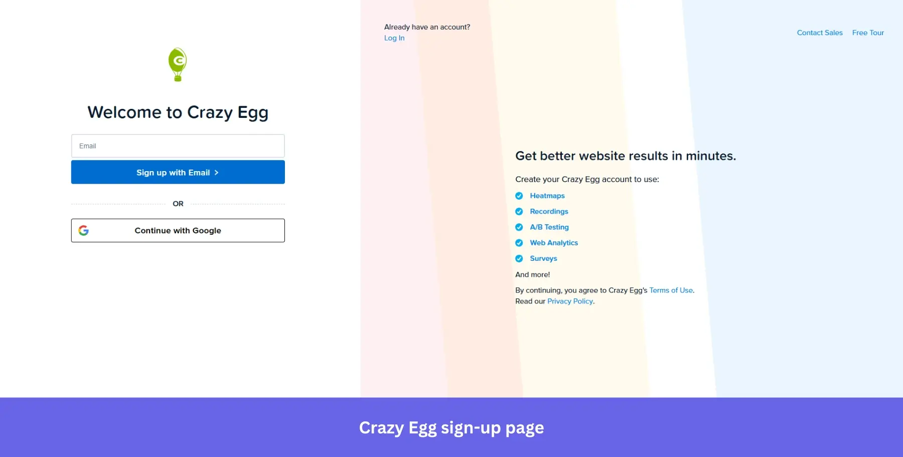
Why it works: Listing specific features rather than generic benefits on the same page as the form removes the need for visitors to go digging elsewhere before deciding.
13. Microsoft Clarity: For SSO-only sign-ups
Best for: Free analytics and CRO tools targeting website owners who are already skeptical about adding another tool and need zero-friction entry to get started.
Microsoft Clarity makes a bold statement before you even reach the form: “Free forever. 2M+ sites and apps globally.” Both claims land on the landing page behind the signup modal, doing the heavy lifting before a single button is clicked.
The signup modal itself offers only three options: Microsoft, Facebook, and Google. No email field, no password to create. The entire account creation process is SSO-only, which means the signup process takes seconds rather than minutes.
The product dashboard visible in the background shows real analytics data, session recordings, and an AI Copilot answering actual questions, giving visitors a preview of exactly what they are signing up for.
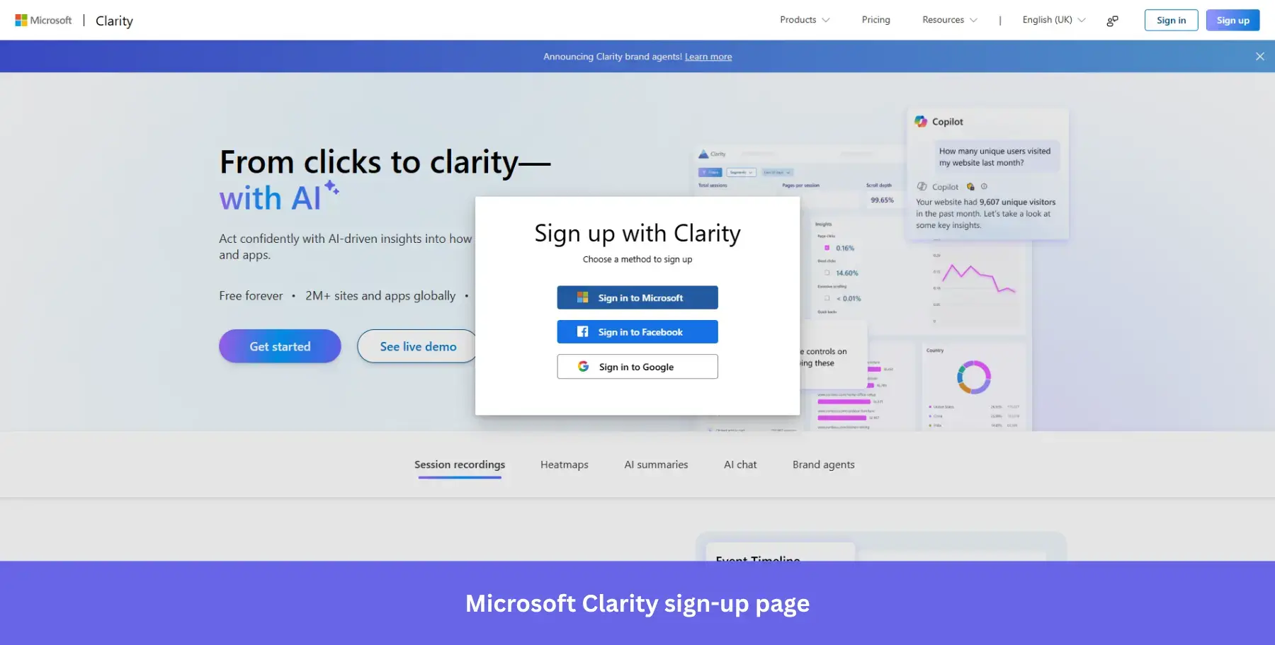
Why it works: SSO-only signup eliminates the single biggest source of form abandonment, password creation, entirely.
14. ElevenLabs: For product-confident sign-ups
Best for: AI and developer tools with an established reputation, where the audience arrives already convinced and just needs a fast path in.
ElevenLabs takes a deliberate gamble with its signup page: there is no headline, no value proposition, no feature list, and no social proof. Just a logo, a form, and two ways to get in.
That confidence is intentional. ElevenLabs has enough brand recognition in the AI audio space that it doesn’t need to sell itself at the signup stage. The page trusts that the visitor already knows why they’re there.
The form is straightforward: Google SSO or email and password with a visible password toggle. Nothing competes for visitors’ attention, and nothing slows the entire process down.
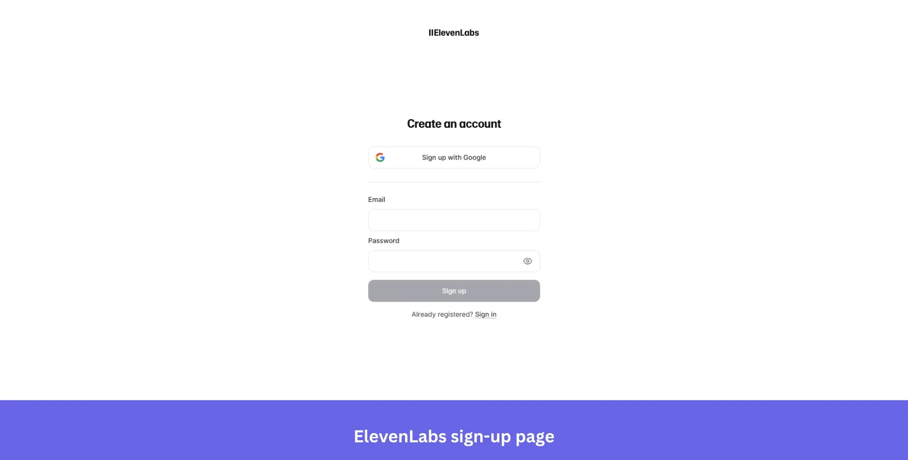
Why it works: Removing all persuasion elements from the signup page signals product confidence and works particularly well for tools with strong word-of-mouth or developer audiences who dislike marketing noise.
15. Grammarly: For transparent sign-ups
Best for: Writing and productivity tools where users are handing over sensitive content access and need reassurance before committing.
Grammarly’s sign-up modal is clean, professional, and to the point, reflecting the brand’s focus on clarity and precision.
Unlike a standard pop-up form, Grammarly’s modal sits over a blurred product dashboard, giving visitors context while keeping the signup action front and center.
The main CTA “Agree and Sign Up” stands out in Grammarly’s signature green, and the copy beneath it is unusually thorough: terms, privacy policy, reCAPTCHA notice, and marketing email disclosure all spelled out clearly before account creation is complete.
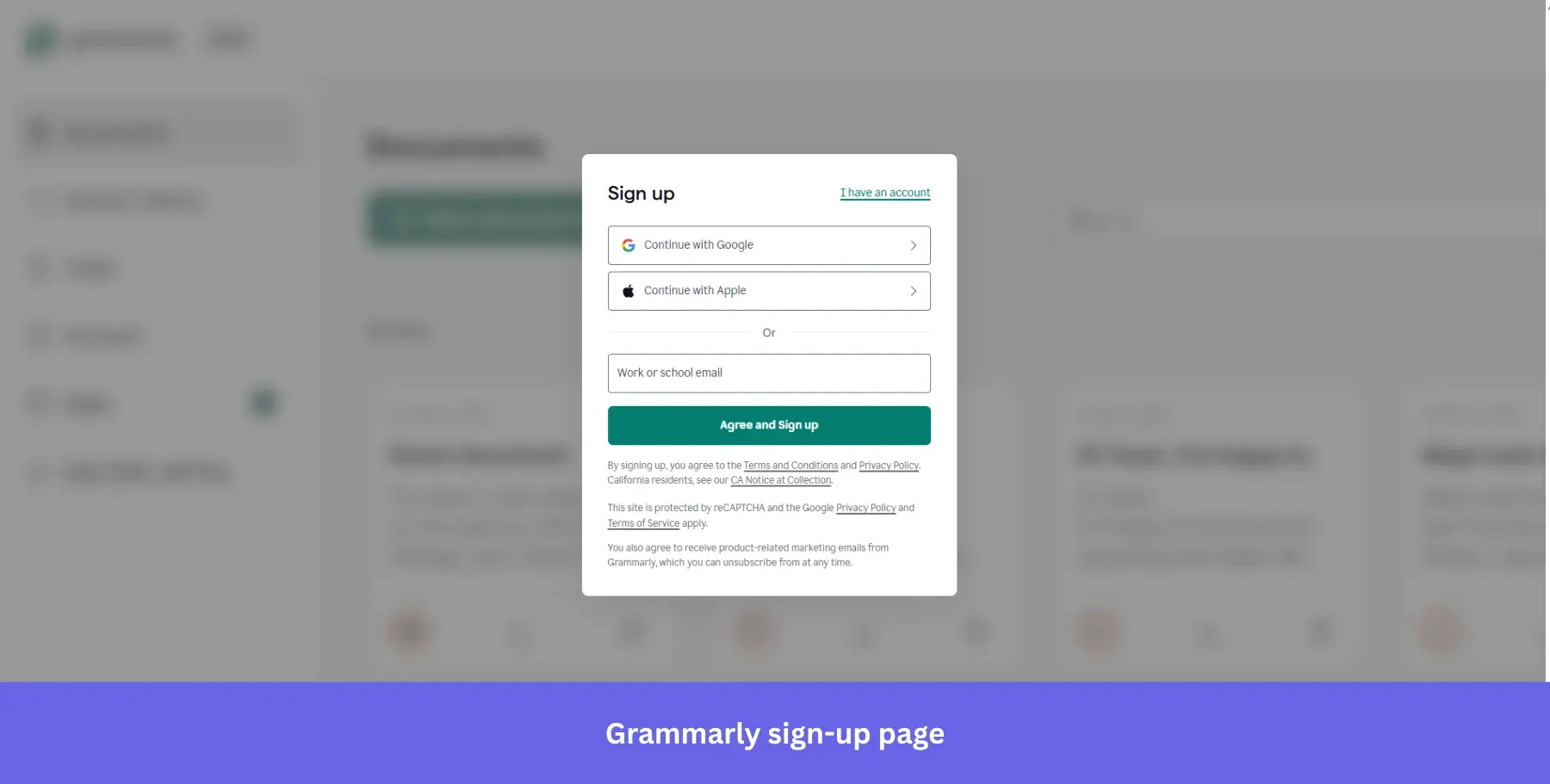
Why it works: Full legal transparency at signup builds trust with an audience that is about to give a writing tool access to their documents and browser activity.
16. Canva: For product-as-background sign-ups
Best for: Visual and creative tools where showing the output upfront is more persuasive than describing the features.
Canva’s sign-up page is as visually appealing as you’d expect from a design tool. The modal sits centered over a full-screen mosaic of real user-created designs, from hiring plans and pitch decks to campaign strategies and brand guidelines, which reinforces the product’s value proposition before a single field is filled.
The form offers mobile phone number, Google, email, and a “Continue another way” option, covering every possible entry preference. The headline “Log in or sign up in seconds” sets a speed expectation that the minimal form then delivers on.
A small but smart addition sits at the bottom: “Signing up for a business” as a separate path, quietly segmenting personal and business users right at the door.
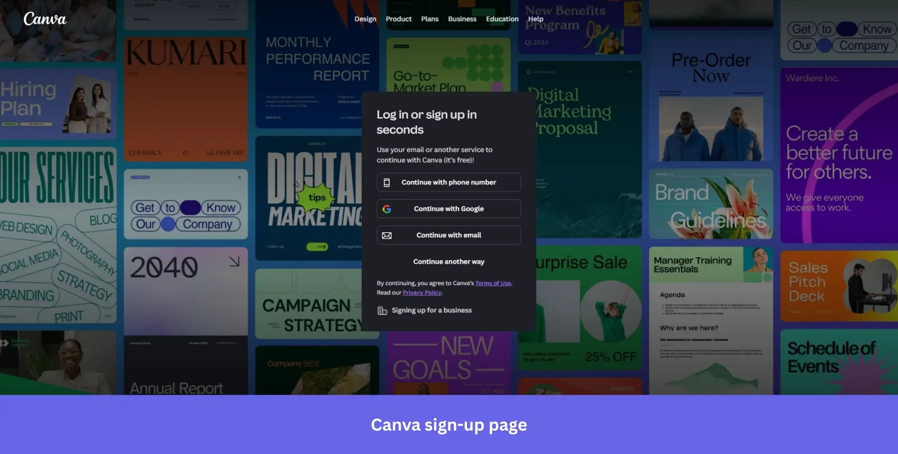
Why it works: Using actual user-created content as the background is the most honest product demo possible. It shows capability without a single marketing claim.
17. Attention Insight: For enterprise-signaling sign-ups
Best for: Niche B2B tools targeting agencies and mid-market teams where name-dropping familiar clients carries more weight than feature lists.
Attention: Insight‘s sign-up page has a sleek, modern design that cleanly splits its persuasion work across two halves.
The left side leads with “Delivering critical pre-launch insights for” followed by logos from McCann, Dell, Wunderman Thompson, and Dentsu, instantly signaling enterprise credibility. Below the logos sits a client testimonial like this one from Lienke de Wolf, Founder of Eikonikos, with a specific outcome: “I just closed a $3K deal using this.”
The right side keeps the form itself simple: Google, Microsoft, Facebook, or email, all clearly color-coded so each option is instantly recognizable.
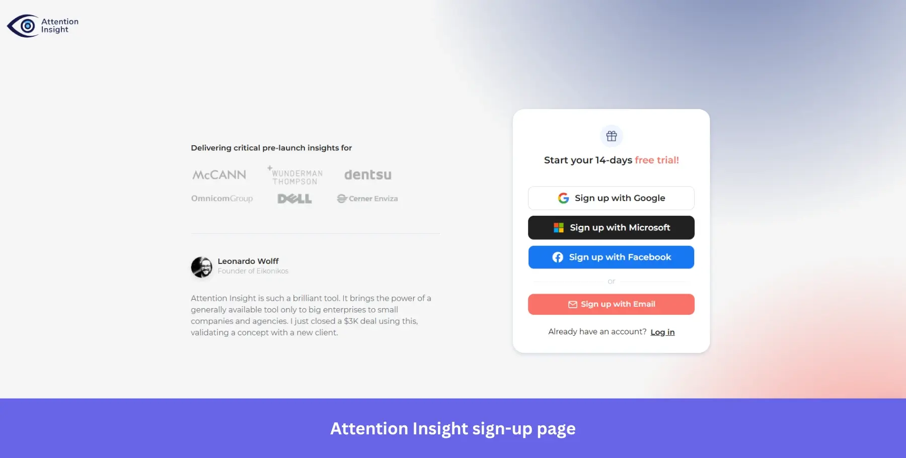
Why it works: Pairing a specific revenue outcome in the testimonial with recognizable enterprise logos addresses both the “does this work?” and “does this work for companies like mine?” questions simultaneously.
18. HubSpot: For expectation-setting, objection-clearing sign-ups
Best for: CRM and marketing platforms where lead qualification matters as much as signup volume.
HubSpot’s sign-up page shares many of the features of other pages: SSO options for Google, Microsoft, and Apple, and a minimalist form asking for just an email address.
Users do need to verify their email address, which might seem like unnecessary friction. However, that’s when HubSpot collects additional information about the user, breaking the signup process into smaller, more digestible steps rather than front-loading a long form.
The headline “Create your free account” paired with “100% free. No credit card required” directly beneath it is one of the cleaner objection-clearing combinations on this list. Two lines, two major hesitations handled, before a single field is touched.
The placeholder text “[email protected]” is also a quiet but deliberate nudge toward using a work email, which helps HubSpot qualify leads from the very first interaction.
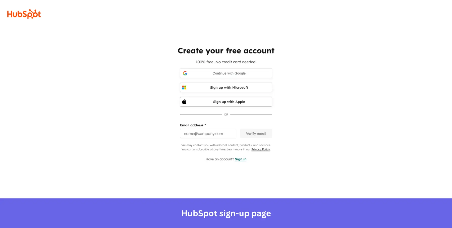
Why it works: Splitting information collection across steps keeps the initial form frictionless while still gathering the data HubSpot needs for personalization and lead scoring.
19. Webflow: For metric-backed sign-ups
Best for: No-code and web development tools targeting professional teams who need business justification before signing up.
Webflow’s sign-up page is as clean and functional as its design platform.
The form offers two options: Google SSO or a work email address, with a bold blue “Continue” button making the next step unmissable. The design is free of distractions, with simple, concise text pointing to the Privacy Policy and Terms of Service, reinforcing user trust.
What makes this page stand out is the left panel. Rather than illustrations or generic marketing copy, Webflow shows real customer case studies with hard numbers: “$1.4M savings from site speed optimization” and “3x faster time” alongside recognizable brand logos. The social proof does the selling while the form stays clean.
The “Building an Enterprise site? Contact sales” prompt at the bottom quietly routes high-value prospects down a different path without cluttering the main signup flow.
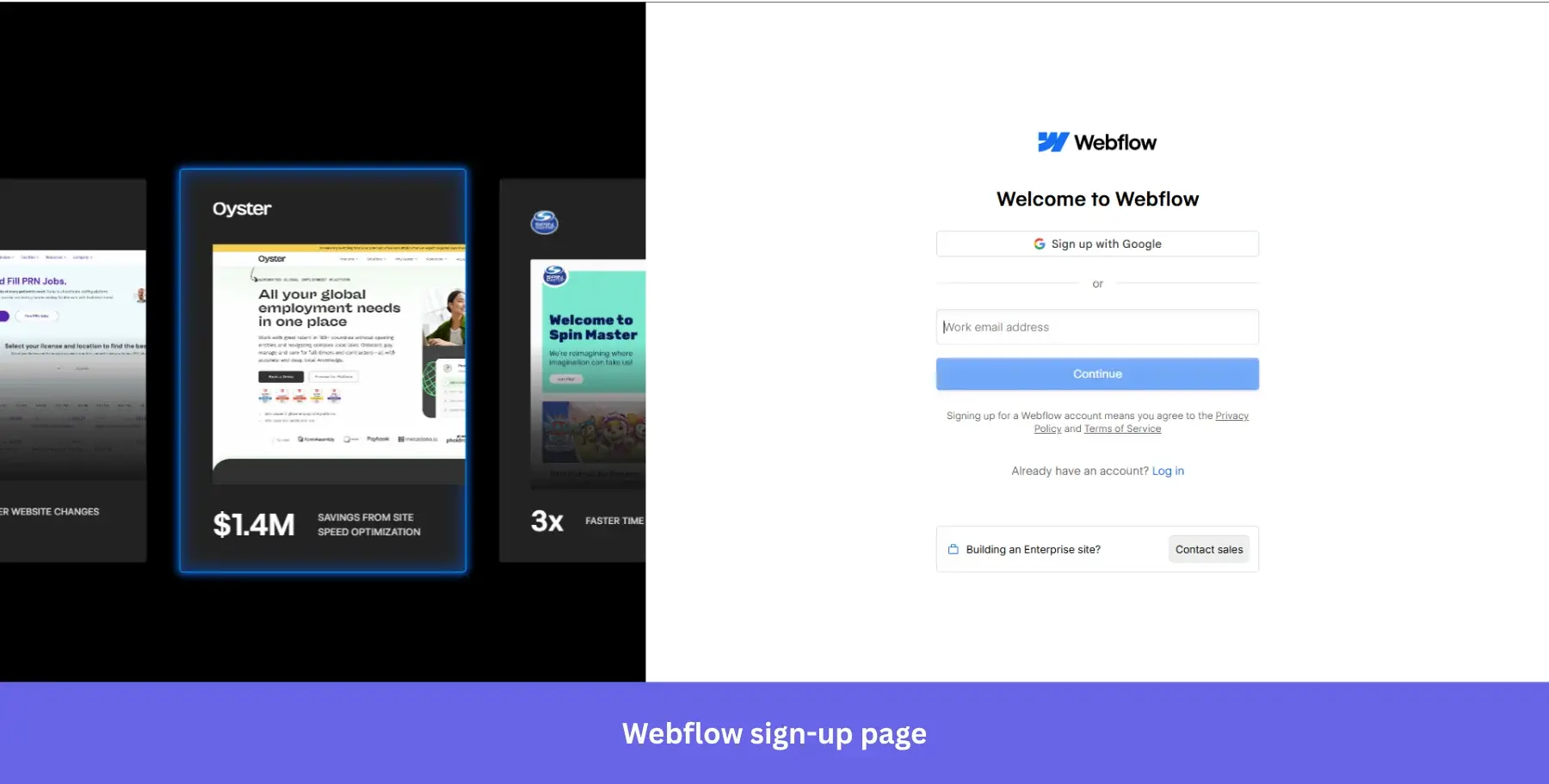
Why it works: Specific dollar and time metrics in the social proof panel answer the ROI question before any sales conversation is needed.
20. Kontentino: For testimonial-led sign-ups
Best for: Social media and content management tools targeting agency teams who need to justify a new tool to clients before committing.
Kontentino‘s sign-up page greets users with a generous “14 days for free” offer, including access to all features.
The signup form is short and requires only an email and account name for a quick and smooth registration process. The account name field appends “.kontentino.com” automatically, a small detail that makes users feel like they are setting up something real and permanent rather than just filling in another form.
The “no credit card required” and “no obligation” checkmarks below the form reduce hesitation, while the named testimonial from Lienke de Wolf on the right does the emotional heavy lifting: “Kontentino saves us a lot of time and the clients we work with are very enthusiastic about it.”
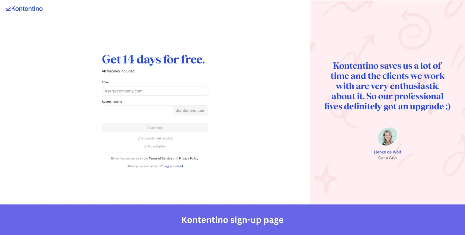
Why it works: A named, face-matched testimonial with a conversational tone feels far more credible than a polished marketing quote, especially for a mid-market social media tool.
21. Dropbox: For professional-targeting sign-ups
Best for: File storage tools targeting business users where speed of access matters more than personalization at signup.
Dropbox’s sign-up page is minimalistic and direct, offering users a choice between using their Google or Apple accounts to log in quickly or entering their email addresses manually.
And what about the recommendation to use a “work email address”? This is a subtle hint that Dropbox targets professionals looking to store and share files within business settings.
The design follows a clean and clutter-free layout with a bold blue “Continue” CTA button that stands out against the white background, guiding users to the next step. This simplified form makes the sign-up process effortless, focusing on speed and ease.
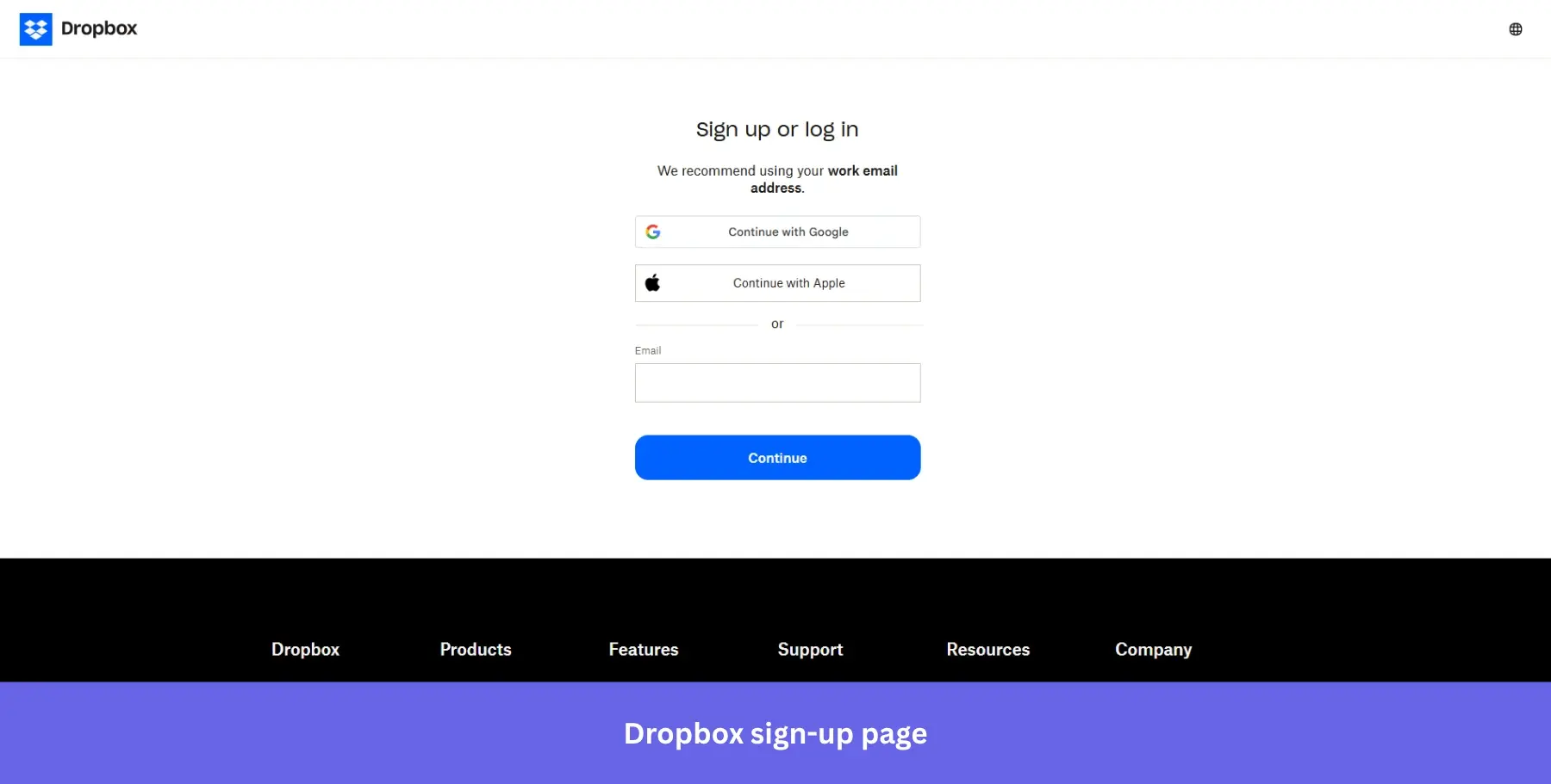
Why it works: Merging sign-up and login into one screen means no user ever ends up in the wrong place, quietly eliminating a common source of drop-off.
22. Shopify: For trial-first sign-ups
Best for: E-commerce platforms where transparent trial-to-paid pricing builds more trust than hiding costs until after signup.
Shopify’s sign-up page is all about making it as easy as possible for potential users to get started.
The headline “Start your free trial” is straightforward, and the subheading “3 days free, then 3 months for $1/month” does something most signup pages avoid entirely: it shows pricing upfront.
The single email field minimizes friction, and four signup options, email, Google, Apple, and Facebook, cover every preference. The dark background gives the white form card a clean, focused feel that draws the eye immediately to the signup action.
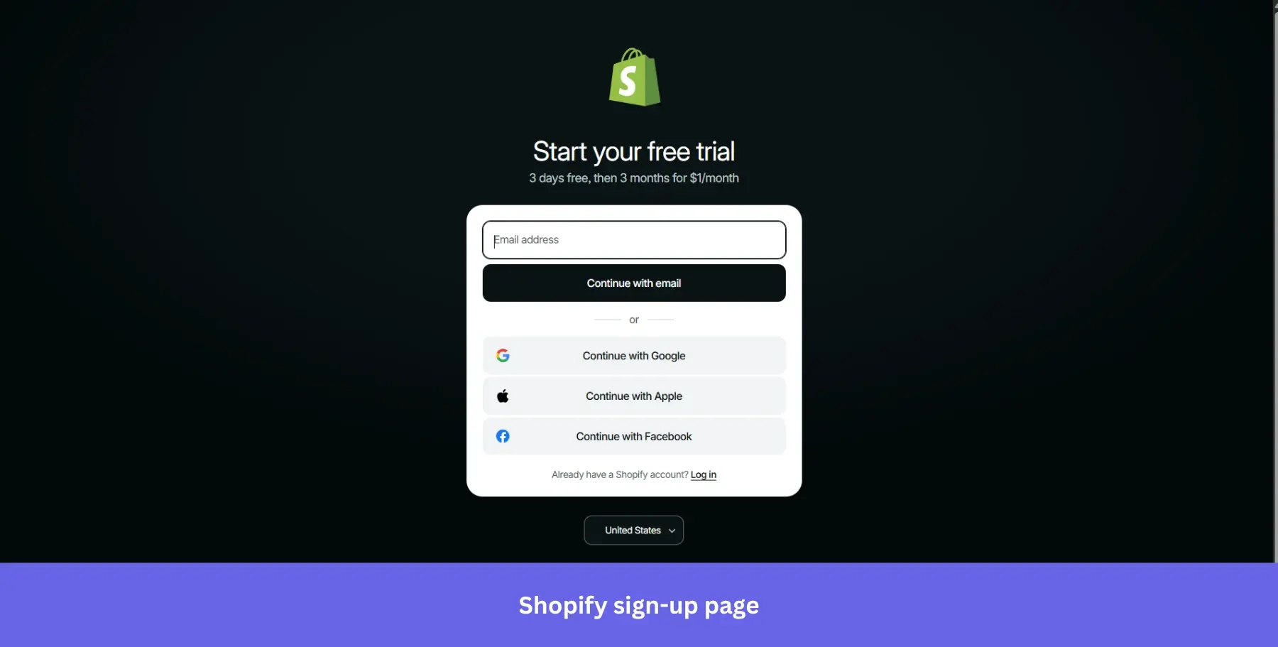
Why it works: Showing post-trial pricing upfront attracts higher-quality signups who are already comfortable with the cost, reducing churn after the trial ends.
23. Semrush: For brand-confident & distraction-free sign-ups
Best for: Established SaaS tools with strong category awareness, where the signup page is a formality rather than a persuasion moment.
The Semrush sign-up page keeps things simple with a clean, minimalist design.
At the top, you’ll find the option to continue with Google, allowing users to bypass the standard sign-up process in favor of a faster, single-click entry. For those opting to sign up with email, the form asks for an email address only, keeping the initial commitment as light as possible.
The page is almost entirely white with no imagery, feature list, or social proof. For a tool as well-known as Semrush in the SEO space, this level of restraint signals confidence: the brand doesn’t need to sell itself at the door.
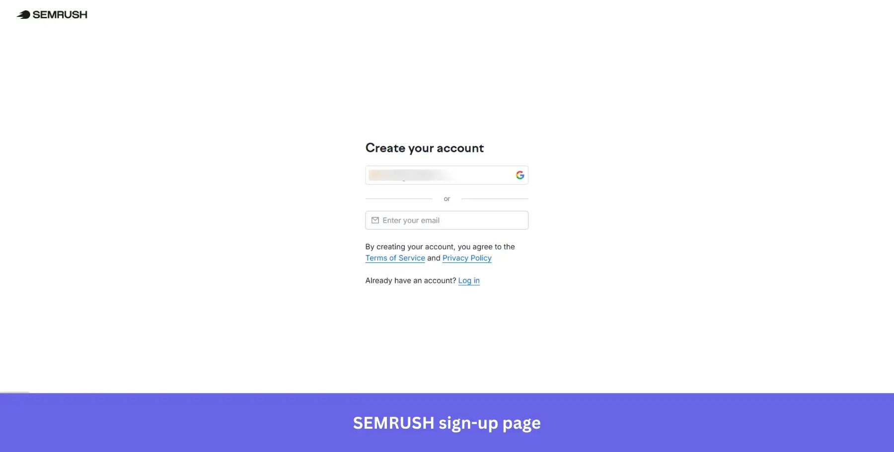
Why it works: A tool with Semrush’s brand recognition can afford to strip the signup page back completely. Visitors already know what they’re signing up for.
24. Miro: For team-workspace sign-ups
Best for: Collaboration and whiteboarding tools targeting teams already embedded in Google or Microsoft ecosystems who need frictionless access across multiple devices.
Miro’s sign-up page offers a straightforward, no-fuss design with a clear headline: “Sign up for free.”
The form encourages users to provide their work email, with a helpful hint that using a work email helps keep work and life separate. This subtle yet effective nudge is perfect for their target audience of professionals and teams.
The page features multiple sign-up options through Google, Office 365, and Slack, covering every entry point across a typical customer journey from solo user to full team workspace. And the line directly beneath the email field: “No password required. You’ll receive a sign-in link” removes one of the most common points of signup abandonment entirely.
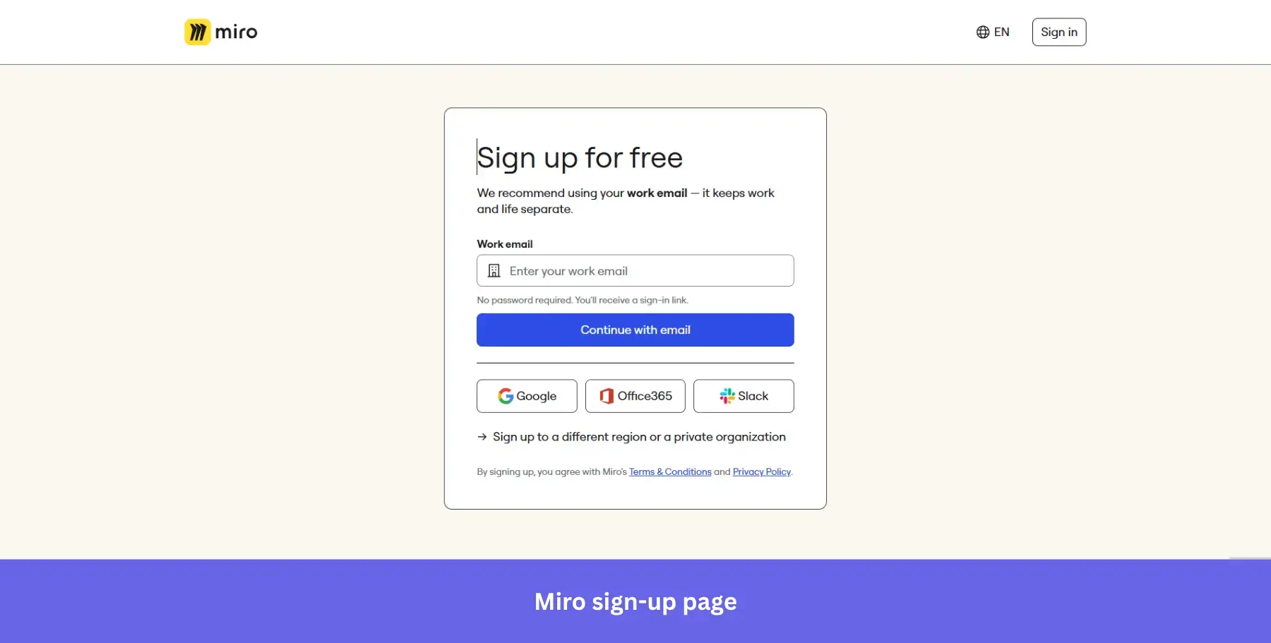
Why it works: Passwordless login via magic link eliminates the “forgot my password” drop-off before it ever happens, making account creation feel instant.
25. AirOps: For enterprise-signaling, full-form sign-ups
Best for: B2B marketing and AI tools targeting mid-market and enterprise teams where name recognition among peers drives signup confidence.
AirOps takes a different approach from most tools on this list. Rather than stripping the form down to a single field, it asks for first name, last name, work email, password, and password confirmation upfront.
The longer form is justified by what sits on the right: a grid of 12 recognizable enterprise logos including Monday.com, Webflow, Gong, Klaviyo, and Hard Rock, under the header “The Best Marketing Teams Trust AirOps.” The social proof does the patience work while the form asks for more information than usual.
The subheading “Increase your brand’s visibility in AI search with the only platform that takes you from insights to action” positions the product clearly before a single field is touched.
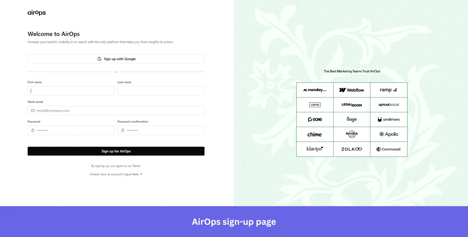
Why it works: Enterprise logo grids signal that serious companies have already made this decision, making a slightly longer form feel worth the effort.
Now comes the harder part
Twenty-five examples, twenty-five different approaches to the same problem: getting a visitor to take that first step.
What stands out after going through all of them is that the best sign-up pages don’t try to do everything at once. They pick one conversion principle and execute it well, whether that’s radical simplicity, strategic social proof, or transparent pricing.
But here’s what I want to leave you with: a great sign-up page gets users in the door. What happens next determines whether they stay. The real work of activation, feature adoption, and converting free users into paying customers starts the moment someone creates an account. The sign-up page sets the tone for the rest of the onboarding flow. What you do with that first session determines whether they stick around.
If you want to see how Userpilot helps you nail that post-signup experience, from personalized onboarding flows to in-app guidance and user feedback, book a demo and we’ll walk you through it.
About the author