What Is a User Flow? Guide + Examples for SaaS UX Design


How to ensure users won’t get lost navigating new features? Always start with a user flow.
User flow maps the steps from an entry point to completion, including what happens when users hesitate, choose the wrong path, or hit an error.
If you work in SaaS UX Design, this is where good ideas turn into buildable logic.
In this guide, you’ll learn how to create user flows step by step, use proven user flow examples as templates, and measure flow performance with analytics.
What is a user flow?
A user flow is a visual representation of the specific path a user takes to complete a task within your product. It tracks movement from an entry point, through a set of steps and decisions, to a successful outcome.
Think of it like a GPS route. The map is your product. The user flow is the blue line telling the user exactly where to turn to reach their destination. It includes every interaction: clicking a button, filling out a form, handling an error, or closing a modal.
User flows vs user journeys vs wireframes
A common pushback from product managers is: “We already have wireframes and a user journey map. Why add another artifact?”
However, I’ve learned the hard way that this is where UX gaps start. You can ship a clean screen and still lose users because the path between screens feels unclear.
I treat the three artifacts as tools for three different questions in the design process:
| Tool | Best for | What it deliberately leaves out | Where to find information to create and refine it |
|---|---|---|---|
| User journey maps | Understanding the ‘who’ and the why.’ Outlining motivation, context, and expectations across the whole customer journey |
Click-by-click logic inside the specific interface | Interviews, user research, and usability testing |
| User flow diagrams | Understanding the ‘how.’ Outlining specific interface interactions and decision points for one task inside the product | Long-term emotion and off-product touchpoints | Event data, funnels, and completion rates |
| Wireframes | Screen-level hierarchy and basic visual representation of interface screen layouts | The full path across screens, actions and decisions | Design review and quick user testing |
Why is it important to design a user flow?
I never let a designer open a prototyping tool until they have mapped the flow. It might seem like extra work, but it saves us weeks of development headaches later. Here is why.
1. It exposes logic gaps
A good user flow surfaces the moments where the product must choose a path: validation, edge cases, and failure scenarios. When you map the unhappy paths, you can design clear system responses, so first-time users don’t hit dead ends.
Take a SaaS signup that ends with task completion: “Create first project.”
A quick sketch of the user flow diagrams often reveals potential friction points like these:
- Email already exists: Route to login with pre-filled email.
- Password too weak: Show requirements and an example.
- Verification link expired: Provide a one-click resend.
- New workspace has no data: Show a guided blank slate with one next action.
As a result, those branches look obvious once you draw them. They stay hidden when you only review “happy path” screens.
2. It aligns product and engineering
Designers think in screens. Engineers think in states, rules, and edge cases. A user flow fills that gap because it turns “pretty screens” into a buildable sequence of logic and outcomes. It cuts down on the back-and-forth questions and helps us ship faster. It’s a vital part of our product development process.
3. It focuses on the goal
A mapped user flow makes every step earn its place. You can point to a screen and ask: Does this move users closer to the outcome, or does it add friction? If the answer is no, cut it.
The pruning improves the entire user experience and supports business goals because more people reach the moment that matters. It also keeps the team anchored to one clear business objective for the flow: activation, adoption, upgrade, or retention.
How to create a user flow?
I treat the UX design process like a sequence: clarify intent, map the path, then tighten the logic. Good flow design is less about drawing boxes and more about making one outcome easy for real users, even in complex processes.
The goal? Define the outcome, map the entry point, and remove anything that slows task completion.
Step 1: Define user persona and goals
Design starts by knowing who is walking the user’s path. Start with your product personas, then write down the job they are trying to finish, the goals they care about, and the user needs they expect you to handle.
To reduce guesswork, I do a quick round of user research: talk to a few lead users, scan support tickets, and gather feedback from sales calls. This helps you separate “nice-to-have” requests from what actually blocks progress.
Next, translate the goal into a measurable “done” state using Jobs to Be Done. “User exports Q3 report as a PDF” is specific. “User views the dashboard” is vague.
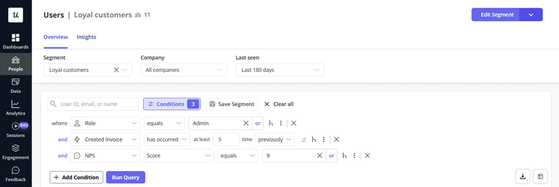
In Userpilot, you can map these audiences into segments. You can later use them to show the right content to the right audience or to filter reports.
Step 2: Establish the entry point
Where does this story begin?
A user arriving via a new feature announcement email has different expectations than one stumbling upon a setting in the dashboard. Map their state of mind (Confused? In a rush?) to determine what context is needed on the first screen.
Step 3: Sketch the minimum viable path
Now, map the shortest route from the first screen to success in a user flow map. I start with rough flow charts, then turn the clean version into user flow diagrams once the steps hold up.
For a SaaS signup user flow, the happy path might be:
- Landing page → click Sign up
- Create account
- Verify email
- Welcome screen
- Dashboard
Keep the first pass simple enough that multiple team members can review it quickly and move the project forward. If the flow feels heavy, the optional setup is probably showing up too early.
Step 4: Identify potential friction points and design for errors
At this stage, the user flow diagram helps the most: it forces you to write down the “unhappy paths.”
Go through each step and mark the key decision points and one or two potential friction points, like:
- Input mistakes: What does the user see if the email is invalid?
- System issues: Which system responses appear if the server times out?
- Empty states: What happens when there’s no data yet?
At major branches, include a clear next step, like retry, edit input, or contact support, so users can move forward after an error.
Step 5: Optimize for time-to-value
Finally, cut anything that delays value. Can you remove a field, merge two screens, or defer advanced setup until later?
This is where you sanity-check behavior: do users follow the path you designed, or do they take different user paths? Capture the key user interactions you care about, then tighten the steps until reaching value feels obvious.
If you want to scale this work, break bigger experiences into smaller task flows you can ship and improve one at a time.
User flow examples
These are five typical SaaS user flow examples, with matching user flow diagrams you can treat as templates. Copy the structure, swap in your steps, and adjust the branches to fit your product.
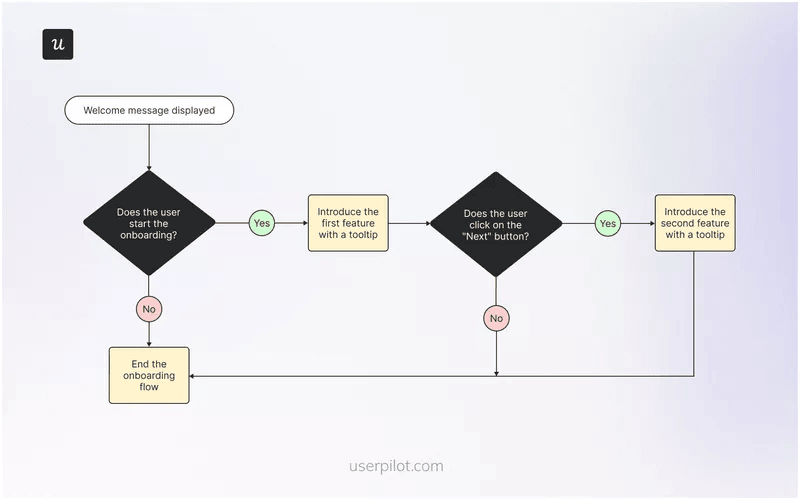
1. The onboarding flow
This is the most critical user flow in your product. If it fails, your customer acquisition cost is wasted money. A strong onboarding user flow is not a tour. It is the shortest path to value.
I start by asking one question on a welcome screen, usually as a microsurvey: “What are you here to do first?” That answer lets you tailor the next steps for different users.
Someone who wants to collaborate can get an invite checklist. Someone working solo can get a “create your first project” checklist. Keep the guidance focused on the one action that proves value, then end the flow.
If you want to see this in action, look at our onboarding user flow examples.
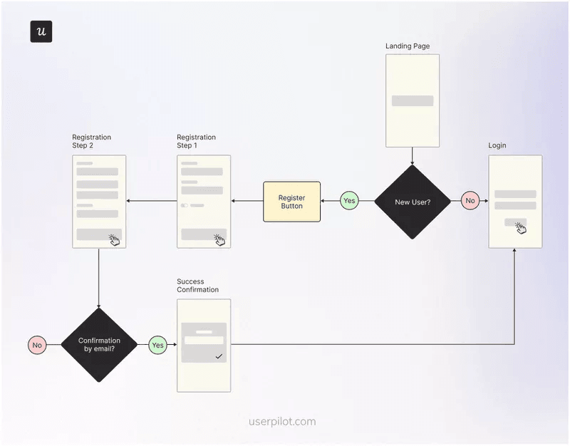
2. User flow chart for logging in
Login looks simple, which is why teams forget to design the flow around failure. A shaky login user flow creates friction before users experience value.
Good practice is to make the first step easy: offer multiple sign-in options, keep the form minimal, and remove anything that distracts from task completion. Then plan recovery like it is part of the product: clear “Forgot password,” predictable error messages, and fast confirmation.
The diagram below shows a common split between new accounts and returning users. Treat that split as intentional, with a clear next step after registration and a clean loop back to login.
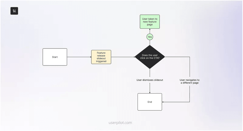
3. New feature release user flow
This flow is about adoption, not announcements. Start with a visible in-app message that explains the benefit in one line.
Then make the next step opt-in: if users click the CTA, route them into a guided tutorial that ends with one meaningful action, not five screens of explanation.
The dismissal branch matters just as much, because timing is often the real blocker. If someone dismisses the message, do not treat that as a failure. Add a hotspot next to the new feature so users have a quiet way to return when they are ready. I like this approach because it keeps the session uninterrupted while still allowing gradual product discovery.
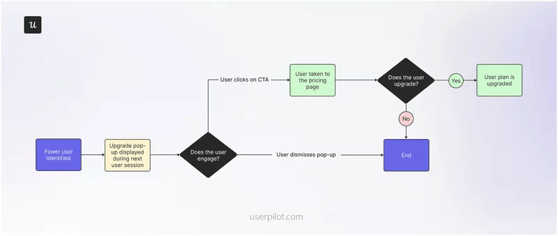
4. Plan upgrade user flow
This flow aims to encourage power users to upgrade their current plan based on their usage patterns. Trigger the upgrade prompt right after a valuable action, like exporting a report, hitting a limit, or inviting a teammate. That timing makes the message feel like the next logical step.
The key is restraint. Use a pop-up that is easy to dismiss, explain the upgrade in plain language, and send the person to pricing with the relevant plan already in view.
If users close the message, the flow should end cleanly, without blocking the product. Overly aggressive prompts may lift short-term conversions, but they damage the long-term user experience.
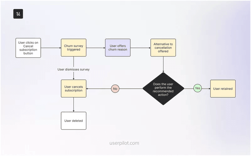
5. The churn prevention user flow
This is the flow someone enters when they click “Cancel Account.” Many companies make it painful on purpose; however, that is a short-sighted approach. A good cancellation flow tries to save the relationship, but it still lets users leave with dignity.
Start with a short cancellation survey to understand the reason, then branch the response.
If the answer is “too expensive,” offer a downgrade, pause, or time-boxed discount. If the answer is “I don’t know how to use it,” offer a call with support or a guided restart. Either way, you gather feedback you can use to fix onboarding and retention.
Best practices for effective user flows
A great user flow should be constrained, consistent, and measurable. These best practices keep the work practical for product managers, designers, and engineers, especially when you are shipping fast and iterating in a live website or app.
One goal per flow
If you try to onboard, upsell, and ask for feedback in one user flow, you usually get none of the outcomes. Pick one job and define what “done” looks like, tied to user goals and your own business goals.
When the experience is big, I break it into smaller task flows. One flow gets the first win. Another flow introduces a secondary feature. This is how you protect the user experience while still moving users forward.
Standardize your symbols
I treat consistent notation as an essential tool for collaboration. When your user flow diagrams follow the same “visual grammar,” the whole team can review them quickly and spot problems without needing a live walkthrough.
Use standard shapes across your flow charts:
- Circles: Start and end points.
- Rectangles: Screens, actions, and outcomes.
- Diamonds: Choices and branches.
- Notes: Rules, assumptions, or dependencies.
That consistency also makes it easier to reuse and compare user flow diagrams across onboarding, upgrades, and retention work.
Use conditional logic
Static flows age fast because not all users need the same help. Instead, decide what should happen for each user group based on user behavior.
For example, if someone already completed a key action, skip the intro flow and show the next step. If someone has not reached a value yet, keep the guidance tight and focused on the next win.
This approach protects the user experience and reduces noise for returning users.
Iterate based on data
So, a user flow is a hypothesis. The only way to improve it is to measure whether users actually complete the steps you designed, and where they hesitate.
Below are four practical ways to validate flows with analytics, using a complete platform that combines onboarding, engagement, feedback, and measurement.
1. Track events without code
You do not always need developers to instrument every step in a user flow. With Userpilot’s Visual Labeler, you can tag the UI elements that represent progress, especially the action that signals task completion.
For example, if your onboarding user flow is meant to get users to “Create first project,” tag (1) the “Create project” click, (2) the submit action, and (3) the success state. Then check whether the sequence happens in the first session, or only after multiple logins.
If it is delayed, the flow does not guide people to value fast enough.
Keep event names consistent so multiple team members can interpret reports without a decoding session.
2. Use funnels to find friction
Funnels tell you where the flow breaks, not where you “think” it breaks. If you mapped a five-step onboarding user flow, build the funnel using those exact steps, then look for the sharpest drop.
If users abandon step one, the issue is usually clarity: the next action isn’t obvious. If they abandon step three, it’s often effort: too many fields, too much setup, or a decision is asked too early. Fix the step, not the whole flow. You can start with one change at a time so that you can connect cause and effect.
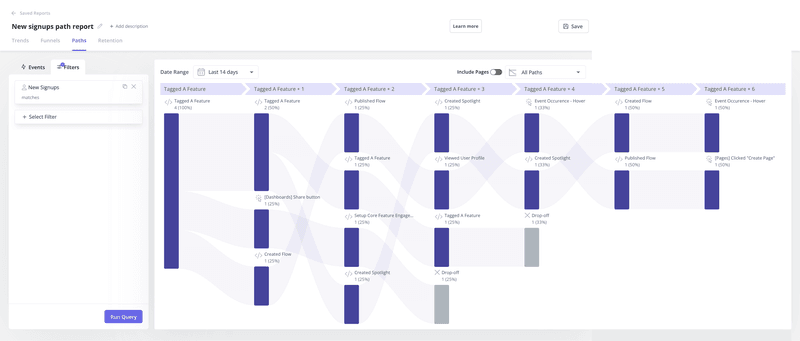
3. Use paths to see how users navigate the product
Even strong diagrams are still hypotheses. Path analysis shows the routes users actually take, which is useful when users interact with the product in a non-linear way.
For instance, if users jump from “Settings” to “Help,” it’s a strong signal that the screen lacks clarity. That is a great place to add contextual guidance, simplify labels, or reorder information. You can use paths to decide whether to improve navigation or improve clarity at the moment of confusion.
4. Watch session replays
Data tells you what happened. Watching users tells you why.
If you see a user rage-clicking on an element that isn’t clickable, you have a design flaw. Use Session Replay to watch real users navigate your flows. It is often painful to watch, but it is the fastest way to find usability issues.
Optimize your user flows with Userpilot
A clean user flow on a whiteboard is a good start. The real work is what happens after launch: confirming the user flow matches real user behavior, fixing the step where users hesitate, and iterating until the path feels obvious.
That is where Userpilot earns its keep as a complete product growth platform.
You can build in-app guidance, collect feedback, and measure outcomes in one place. That way, user flow diagrams don’t remain static documentation. You turn them into living experiences you can test, refine, and scale across onboarding, feature adoption, upgrades, and retention, without waiting on long engineering cycles.
Book a demo to see how you can build, measure, and refine user flows in a live product.
FAQ
What are the best tools for creating user flow diagrams?
Use different tools depending on how far along you are:
- Brainstorming and mapping: FigJam or Miro (quick to drag boxes, sketch branches, and align with teammates).
- High-fidelity design: Figma (best when you want user flow diagrams to match real screens and states).
If you want to implement flows inside your live product, target the right segments, and improve them without waiting on engineering sprints, use a product engagement and analytics platform like Userpilot.
The Userpilot Chrome extension helps you build in-app flows and tooltips on top of your site, and analytics helps you track completion and spot drop-offs.
At what point in the design process should you build user flows?
Build user flows after you define the goal and entry point, and before you move into high-fidelity screens. This is early enough to change the logic cheaply, but concrete enough to prevent gaps between screens. Revisit the user flow after release using usage data to refine friction steps.
Who creates user flows?
Product designers typically draft user flows, with input from product managers, engineers, and ux researchers. This cross-functional review helps validate steps, edge cases, and decision points, and creates shared alignment on what gets built.
About the author