Product Analytics Tools I’ve Shortlisted to Help You Decide


For me, choosing the right product analytics tool is all about finding what works best for your team, your product, and your stage of growth.
To build this shortlist, I have combined multiple perspectives: aggregated insights from G2 reviews, conversations with our own customers as they evaluated different tools, and my firsthand experience working in the SaaS industry. This gives me a more grounded view of how these platforms work within the context of their marketing claims.
That said, every tool comes with trade-offs. What excels for a data-heavy growth team might be overkill for an early-stage startup, and what’s intuitive for product managers might frustrate engineers.
I’ve made a conscious effort to stay as objective as possible, so you can make a decision based on your specific needs.

How we shortlist product analytics software
I selected these product analytics tools across three main categories of analytics needs, evaluating their “best-fit” use case, core features, and pricing. They include:
- All-in-one product growth platforms that combine product analytics with in-app guides to take action on insights (e.g., triggering personalized in-app tutorials).
- Product analytics suites that track user events and behaviors at scale for deeper reports. I also included Datadog’s RUM (Real User Monitoring) for a developer-focused product usage analytics.
- Visual and qualitative analytics that focus on session replay, heatmaps, and user experience analytics.
Now, let’s dive into each tool, covering what each is best at, key features, pros, cons, and pricing structure.
Best all-in-one product analytics tools
These are the tools that pair analytics with a wider set of engagement features, like in-app surveys, messaging, etc., so you’re not relying on separate tools for each job. They’re a better fit if you’re looking for one platform that can support both analysis and action.
1. Amplitude: AI analytics platform for modern product teams
Amplitude works best for teams that need visibility into user behavior across the full journey. It’s a strong fit for mid-to-large SaaS teams with some data maturity and budget.
Like many analytics-first tools, Amplitude has started expanding into in-app engagement. Its guides and surveys let you act on insights directly, but this layer is still relatively new.
Amplitude offers a free Starter plan with core analytics (typically capped at around tens of thousands of monthly tracked users). Paid plans start with Plus (from ~$49/month) and scale based on monthly tracked users (MTUs).
According to Vendr, this usage-based model can scale significantly in practice, with a median contract value around $64,000/year, depending on volume and feature needs.
Main Amplitude features for product analytics
- Behavioral analytics: Amplitude tracks user behavior/actions as events (clicks, feature usage, page views) and turns them into funnels, retention curves, and cohorts. This way, you see behaviors that drive activation or friction.
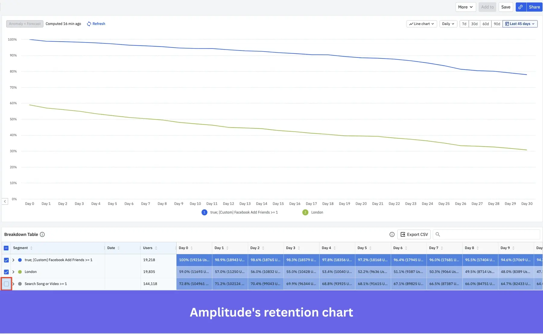
- Journey analysis: With tools like Pathfinder, Amplitude maps the actual paths users take through your product. You can use that to identify what caused drop-offs or failed conversions.
- Experimentation: It runs (and measures the impact of) A/B tests on features or experiences on key metrics like retention or revenue.
- AI-powered insights: It includes anomaly detection and predictive models that surface unusual trends or forecast user behavior. For example, it can flag sudden drops in user engagement or identify customer churn.
- Data infrastructure: Amplitude integrates with data warehouses and CDPs to unify product data, so you can trust and act on their analytics across tools.
The trade-offs show up in how teams actually use it day-to-day. It’s often described as “incredibly powerful… but brings a steep learning curve,” and can feel “very complex for some people,” especially without a clear tracking plan in place. There are also mentions of data not always matching internal databases, and that it can get expensive as usage grows.
Overall, Amplitude is one of the strongest options if your priority is serious product analytics, just expect to invest time (and budget) to get the most out of it.
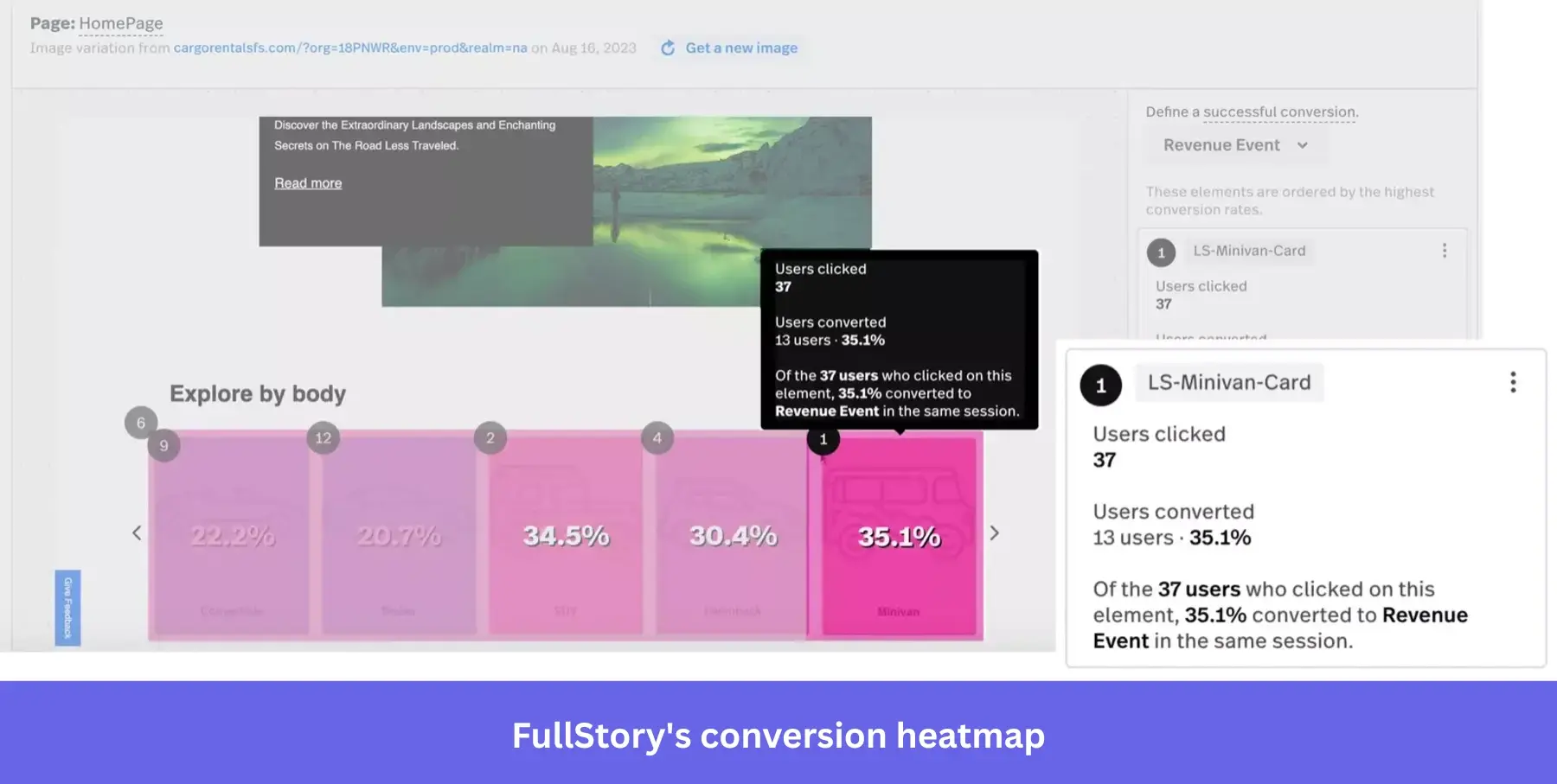
2. FullStory: Customer behavioral analytics platform
FullStory helps reveal why users drop off or struggle with your product. So, if you focus on UX optimization and are a mid-to-large SaaS company (e-commerce, particularly), it’s a good fit.
While Amplitude is analytics-first, FullStory leans on visual insights. Its session replays, heatmaps, and frustration signals will help you spot issues and understand user behavior in context.
Often positioned at the higher end, FullStory uses a quote-based pricing model. According to Vendr data (415 purchases), its median contract value is around $27,000/year. However, the ACV can move past $100K/year, depending on your usage and plan.
Main FullStory features for product analytics
- Visual tools: FullStory provides heatmaps and session replays, which you can filter by user segments or timeframe.
- Tagless autocapture: FullStory captures all user interactions (clicks, form inputs, page visits, etc.) without manual event tagging. For example, if you forgot to track “PDF Download clicks,” FullStory likely has recorded them as generic clicks, and you can label those clicks on the “Download PDF” button retroactively.
- Frustration and friction signals: FullStory automatically detects “frustration signals” like “rage clicks,” “dead clicks,” “error clicks,” and excessive scrolling or back-and-forth navigation.
- Behavioral analytics: FullStory can produce journey maps that illustrate common paths users take, drop-offs, sequences, and branching of user flows through your product. You can also create funnels for event sequences, analyze conversions, and track trends over time.
Users say it is “great when it comes to building funnels…but you have to manually find the page,” and that there is a learning curve for creating custom events.

The other major letdown I’ve seen is “how difficult it is to share data from within the tool to someone outside the tool.”
Nonetheless, Fullstory is a good choice for visual debugging. But factor in the higher costs and the upfront effort to organize and interpret data.
3. Userpilot: Product growth platform with analytics capabilities for both web and mobile applications
For teams that want to analyze user behavior and act on it, Userpilot is the go-to product analytics tool. Originally known for user onboarding, we have expanded our analytics capabilities since 2024 to include: autocapture, event-tracking for mobile, reports and dashboards for analyzing different engagement metrics, session replays (and very soon AI analytics).
And fast-moving companies are seeing results. Amplemarket, for example, improved adoption by 10x, thanks to Userpilot’s behavioral insights and targeted in-app guidance. The Staff Product Manager, Awni Shamah, said:
The no-code event tracking was a huge “aha! moment” for the whole product team. It was almost unbelievable how we could have a new event live in 5-10 minutes without a single line of code.
Regarding pricing, we offer tiered plans based on MAUs, starting at $299/month for smaller teams. And there is custom pricing for advanced analytics and enterprise features.
Main Userpilot features for product analytics
- Autocapture: Automatically collects all product interaction events from day one without manual tagging. This helps you access event data for actionable dashboards and reports instantly.
- Multi-channel analytics: You can track events on your web, mobile apps, and email campaigns in one unified platform (no need to force-integrate email with product data).
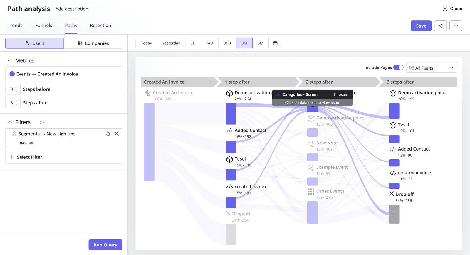
- Behavioral analytics: Userpilot creates reports like funnels, trends, paths, and retention cohorts. This means you can add granular filters to compare behaviors across different segments, spot drop-off points, and sources of friction.
- Custom dashboards: The platform provides both templates and the ability to customize dashboards. These include key metrics for product growth like new user activation, conversion, retention, product usage, etc.
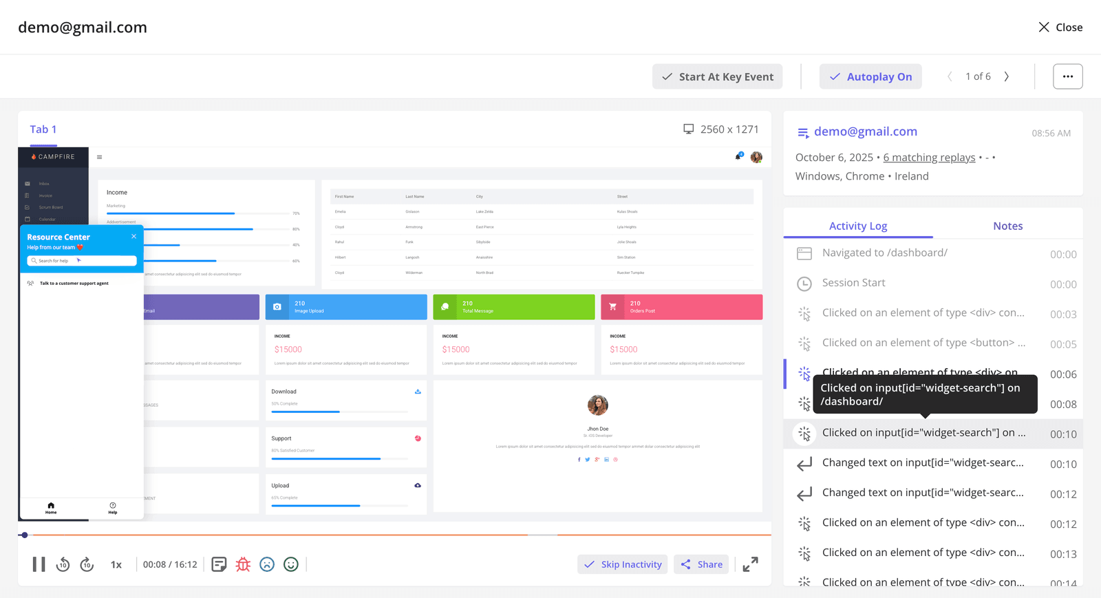
- Session replays: Like any other analytics feature, we design session replays to help you quickly move from observation to insight. You can filter sessions by specific users, segments, or key events to instantly surface the journeys that matter most. From there, you can jump to key moments, skip inactivity, mark bug, leave notes etc. Even better, sessions can be organized into playlists and shared with your team so product, UX, and support can align on issues.
- User and company profiles: Besides advanced segmentation, Userpilot also creates profiles of individual users and companies. This lets me, for example, focus on high-value accounts to prevent high revenue churn or follow account-based marketing strategies.
- In-app surveys: The platforms can design any type of survey (such as NPS, CSAT, CES).
And we’re taking it a step further with Lia, our upcoming AI product growth agent. Instead of manually digging through dashboards or replays, Lia helps surface the insights that actually matter so you can quickly understand what’s happening and why.
It connects the dots across your data and points you toward the next best action, so your team can move faster without second-guessing.
👉 We’re rolling out Lia in beta soon, join us today!

4. PostHog: Startup-friendly product analytics software
PostHog is the platform for teams that want deep product analytics with full control over their data. As an open-source or low-cost solution, it’s ideal for startups and engineering-led companies.
Unlike most analytics tools, PostHog combines multiple capabilities, including analytics, session replay, A/B testing, feature flags, data warehouse, and experimentation. While limited in in-app guides, the analytics depth is commendable.
PostHog offers a limited free tier and a generous cloud, making it easy to get started with minimal cost. But to unlock more projects or advanced features, pricing can scale up to $54,443/year.
Main PostHog features for product analytics
- Event tracking: PostHog allows tracking of user events across web and mobile, either via their snippets/ SDKs or by receiving events from other sources. The platform also automatically captures some events (needs some setup) and supports custom events.
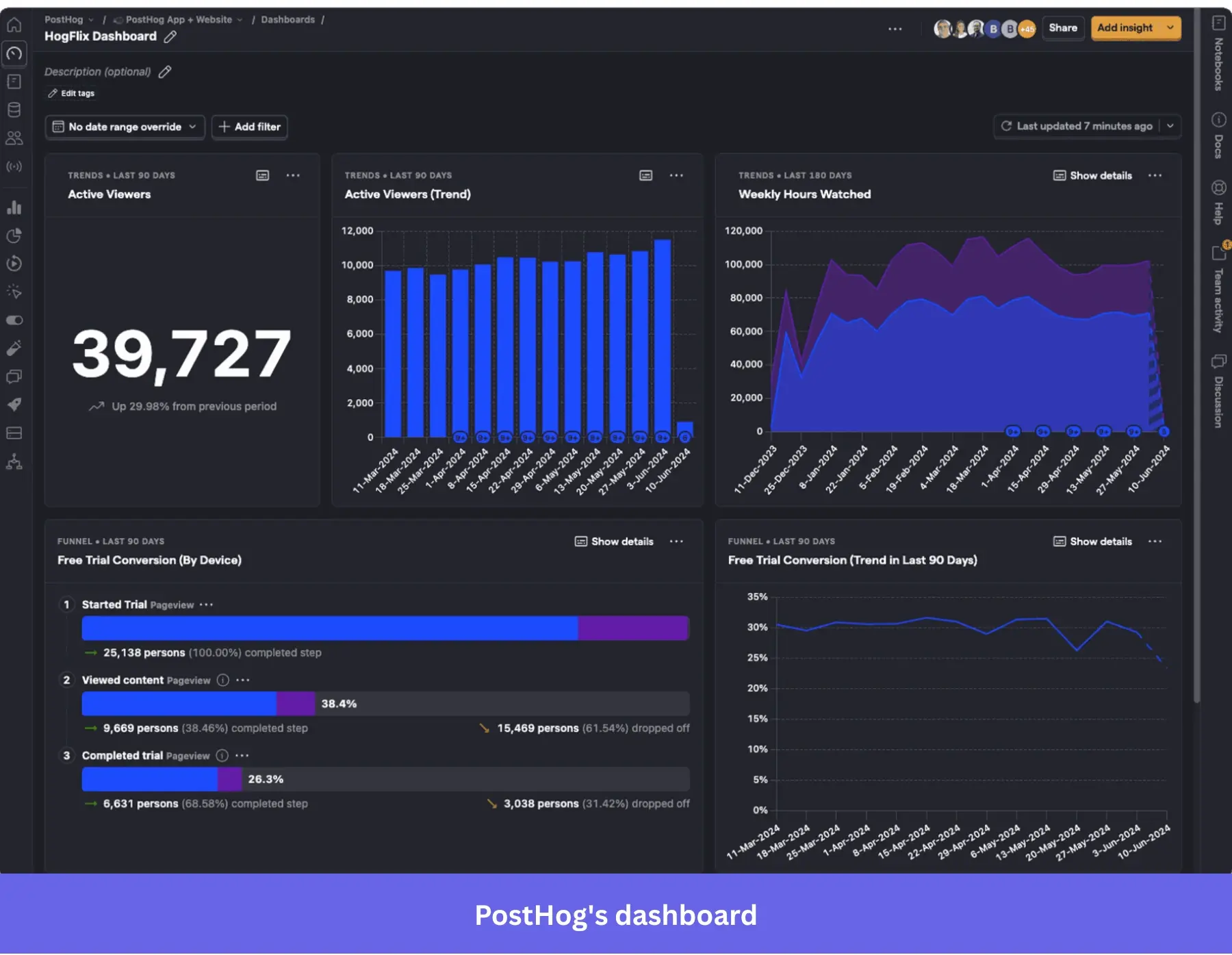
- Behavioral reports: PostHog includes funnel analysis, trend analytics, user path analysis, and user retention charts. And finally, correlation analysis to find which actions are correlated with a chosen outcome.
- Custom dashboards: PostHog lets you pin funnels, graphs, retention tables, etc., to build a shared view for your team. These dashboards update as data comes in and can be used to monitor experiments or core company metrics.
- Session replay: PostHog has added a session recording feature as well, meaning you can watch what users did in your app (similar to LogRocket/Hotjar).
Users love PostHog for being affordable and easy to use… but complain about not getting deeper insights from session replays. Some say “support is good…but UI can be clunky,” but the recurrent theme is that it can be overwhelming for non-tech users.
In short, PostHog is a blend of flexibility, control, and cost efficiency. You’d have to trade ease of use (and higher costs if you’re an enterprise) for all that power.
Best product analytics tools for advanced analytics use cases
These tools provide deep, flexible analysis of user/customer behavior at scale. While they require more technical know-how, you’ll get advanced event tracking, segmentation, data exploration, and querying. These make them ideal for answering complex product questions.
5. Heap: Digital analytics platform with auto-capture
Heap works best for teams that want full visibility into user behavior without manual event tracking. Hence, it is a fit for product marketing and data teams.
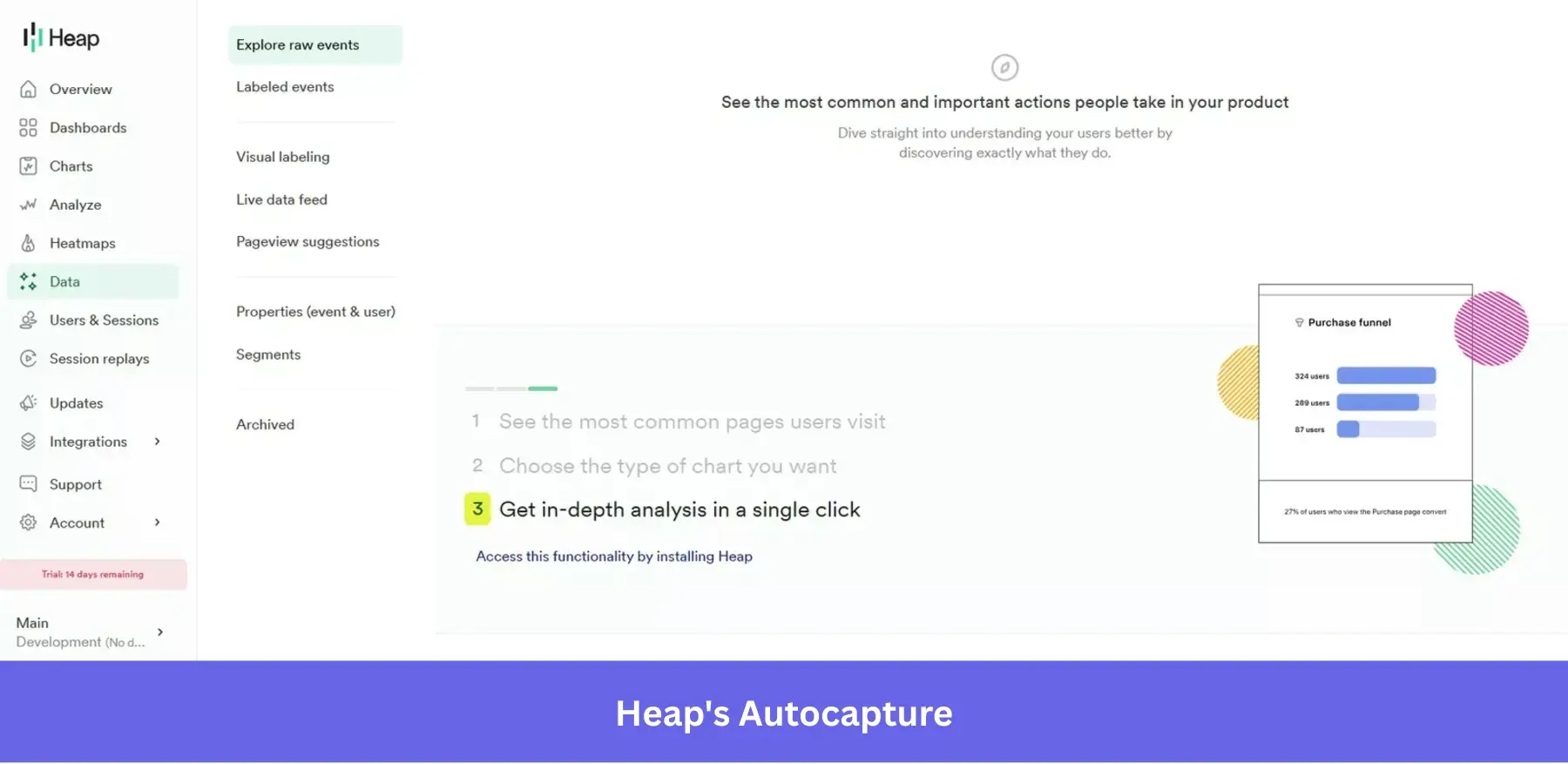
Its core differentiator is the auto-capture model. Once installed, it tracks all user interactions across web and mobile. This way, you can analyze behavior retroactively without planning events in advance.
Heap uses MTU-based pricing, but does not disclose it publicly. But according to Vendr (173 purchases), the median contract value is around $39,000/year, and even that can scale up to $124K based on session volume and usage.
Main Heap features for product analytics
- Automatic capture of all interactions: Heap logs every user action (click, tap, swipe, page view, etc.) once you install it on your site or app. This means you can always analyze them retroactively.
- User segmentation: It includes robust segmentation tools that group data by user properties or behaviors. This lets you filter analyses to specific user segments to understand their differences.
- Behavioral analytics: Heap includes funnel analysis, journey analysis, and retention charts. It also offers the “Engagement Matrix”, which correlates frequency of certain actions with retention.
- Heatmaps and session replays: In addition to quantitative data, Heap includes built-in heatmaps to visualize where users have more activity. As well as session replays, which let you watch actual user sessions to see their real behaviors.
Users say “the autocapture saves time…but collects a huge amount of data, and it can be tricky to sift through.” Also, the UI is simple and easy to use. But it tends to be slow, especially the sessions feature.
Overall, Heap is a good choice if your priority is flexible, retroactive analysis. But prepare a process to manage the large volumes of data as you scale.
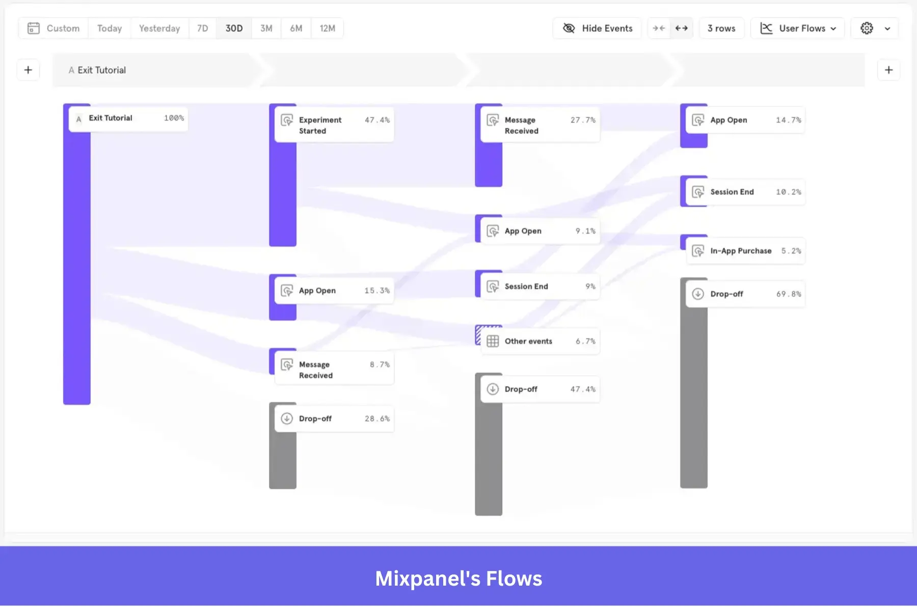
6. Mixpanel: Advanced event analytics platform
Mixpanel extracts quick, self-serve, actionable insights from user behavior. This makes it a go-to for product-led SaaS, B2C companies, and startups that need to analyze user journeys in real time.
Compared to enterprise tools, it’s easier to get started with, while still offering enough depth for growing teams. The pricing is fair, too.
Mixpanel offers a free plan with core analytics (up to 1M events/month). Paid plans scale based on event volume, with the median contract value around $38,334/year, according to Vendr.
Main Mixpanel features for product analytics
- Complete event tracking: Mixpanel allows you to instrument custom events to capture virtually any user interaction (e.g., button clicks, form submissions, purchases).
- Behavioral reports: Mixpanel provides funnel reports to visualize how users progress through multi-step processes, the “Flows” feature to show the common paths users take through your product, and a retention analysis graphic that tracks how often users come back to your product after a certain action.
- Interactive dashboards: The Insights reports allow ad-hoc querying on events, and Boards are customizable dashboards where you can pin multiple reports and KPIs.
- Session replays: It records anonymized user sessions and links them to your analytics data. This lets you pair quantitative data with qualitative insights to validate hypotheses and spot issues.
Mixpanel is often praised for speed and real-time insights. But the trade-off is management and scaling. Users say “more advanced A/B test setups can be difficult to implement” and raise concerns about strict event naming.
In all, it is one of the best options for an event-based analytics tool. But you must manage event taxonomy carefully. Otherwise, your data becomes messy.
7. Usermaven: Privacy-focused website analytics tool
If you seek a simple, privacy-friendly analytics tool, Usermaven fits the bill. It’s a good choice for SaaS companies and SMBs looking for a no-code alternative to Google Analytics that still covers both acquisition and product usage. Its privacy-first approach (cookieless tracking) also makes it appealing for teams operating under GDPR or CCPA constraints.
On pricing, Usermaven uses straightforward, event-based pricing. It starts at $71/month (billed annually) for 250K events, making it accessible for smaller teams.
Main Usermaven features for product analytics
- Privacy-focused tracking: It’s cookieless by default (uses localStorage or fingerprinting in a privacy-compliant way) and doesn’t collect personal data unless you provide it, helping with GDPR/CCPA compliance. This means you can often run Usermaven without cookie consent banners.
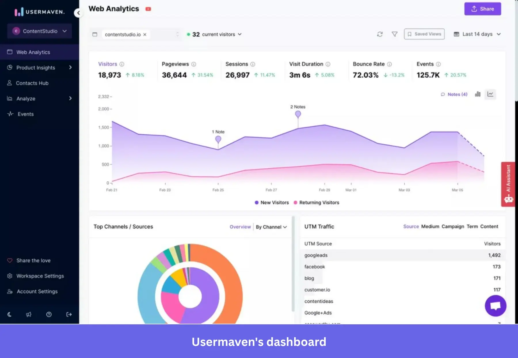
- Auto event tracking: Usermaven automatically tracks common events (page views, clicks on buttons, etc.) via a lightweight JS snippet. It also captures UTM parameters and referral info for attribution.
- Product analytics: It offers feature usage tracking, funnels, and retention analysis. You can see which features are most used, build funnels for onboarding flows, and cohort retention charts to see how user engagement changes over time.
- AI-powered insights (Maven AI): Usermaven has an AI assistant that tries to surface trends and anomalies (for example, a sudden drop in conversion, or a user segment that’s highly engaged) to reduce manual analysis.
Usermaven gets several thumbs up for being easy to use. One user called it “snappy and smooth.” However, that comes with trade-offs, such as customization gaps and integration issues. In other words, it can be limiting for advanced use cases, like building complex, custom cohorts.
Regardless, Usermaven remains a top choice for privacy-compliant analytics with minimal setup. Just remember, it’s best for lightweight analysis.
Best product analytics tools for behavior and performance
These tools offer beyond standard analytics. They help you see how users behave and where drop-off happens. They do that by combining behavioral insights (like session replays and heatmaps) with performance monitoring. Hence, they are ideal for debugging friction and improving UX.
8. Hotjar: Visual analytics platform for product and marketing teams
Unlike traditional analytics tools, Hotjar emphasizes what users actually do on the page through heatmaps and session recordings. This makes it ideal for product teams and designers, especially in small to mid-sized companies, focused on improving conversion rates and onboarding flows.
Since the acquisition by Contentsquare, Hotjar uses the former’s pricing structure. Meaning that it offers a free plan with limited usage, and paid plans scale based on session volume. According to Vendr, average contracts can reach around $20,000/year, depending on usage.
Main Hotjar features for product analytics
- Heatmaps: Hotjar automatically generates heatmaps for clicks, taps, and scrolls on your web pages.
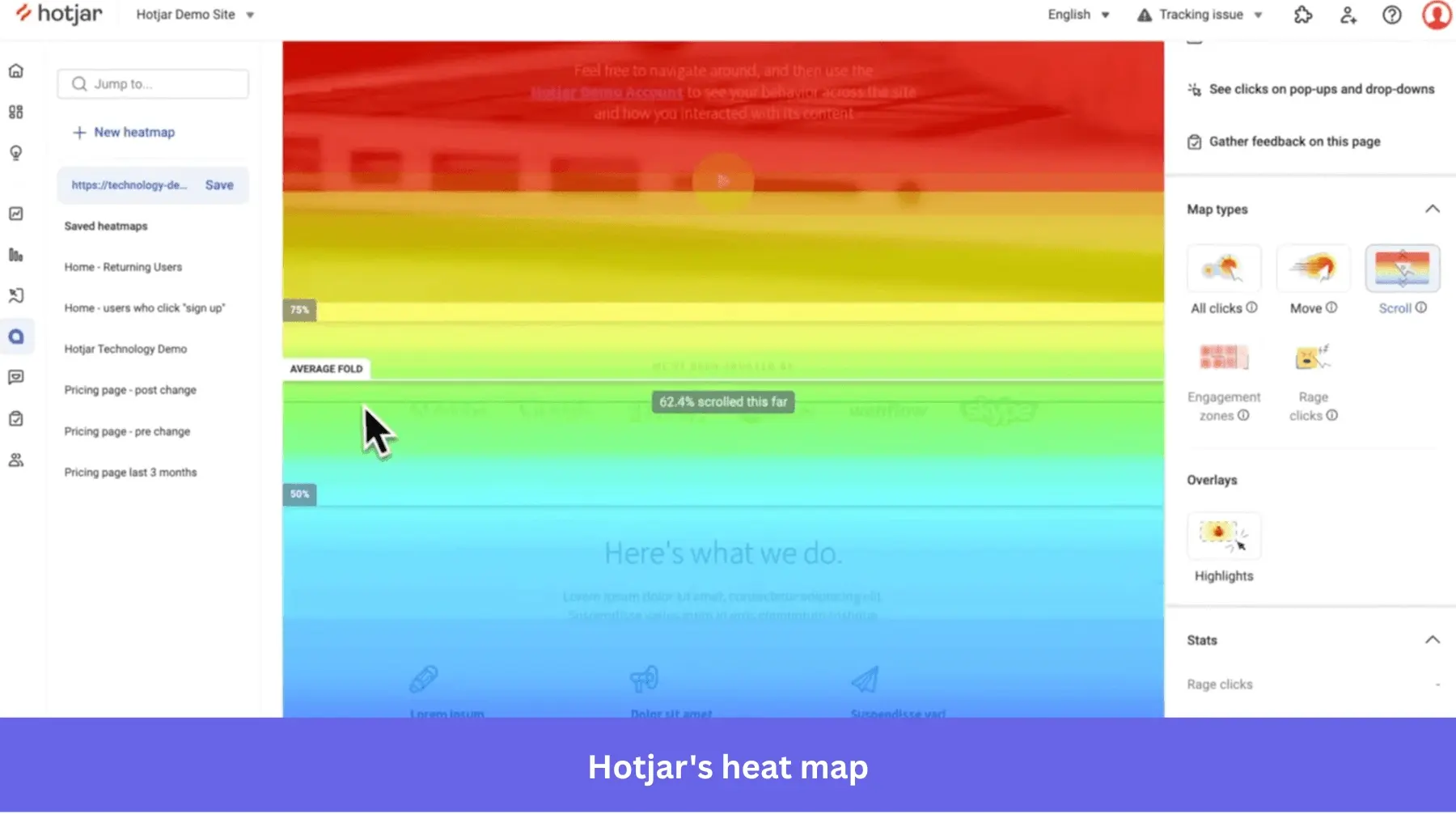
- Session recordings: It also records user sessions, allowing you to play back individual user visits (mouse movements, clicks, scrolling) on your site.
- Conversion funnels: Hotjar has a feature to set up funnels and then tie them to session recordings. You can click on a funnel step drop-off, and Hotjar will show you recordings of users who dropped off at that step.
- Trends and behavior scores: Hotjar provides some trend tracking (e.g., daily/weekly trends in visits) and has introduced “frustration and engagement scores” that use algorithmic detection to rank recordings. For example, it might detect “rage clicks” or “u-turns” to identify frustrated sessions, and conversely identify highly engaged sessions.
Users often single out Hotjar’s heatmap effectiveness. One says, “It gives me a clear heatmap, whether mobile or desktop…but there are navigation issues.” Others have also raised concerns around performance, particularly the lag when analyzing large datasets.
Despite that, Hotjar remains a good option for quick, visual insight into user behavior. However, note that you’ll require an extra tool for more advanced analysis.
9. UXCam: Qualitative and quantitative data analytics platform for mobile apps
UXCam reveals how users interact in mobile apps at a granular level. Hence, it is a fit for mobile product teams and UX designers who want to reduce churn and fix usability issues.
Unlike general analytics tools, UXCam is mobile-first. And it uses session replays and touch heatmaps to show where users struggle on specific screens.
While UXCam offers a free plan for smaller apps, its paid plans are quote-based. According to Vendr, median contracts typically range between $20K–$21K/year, depending on usage and features.
Main UXCam features for product analytics
- Screen analytics: UXCam offers detailed screen analytics, which show key metrics for each screen in your app (views, average time spent, drop-off rate, etc.). This helps identify which screens might be problematic.
- Session replay: The platform records users’ screen interactions and gestures so you can watch taps, swipes, and see where a user might have gotten frustrated.
- Heatmaps and touch visualizations: UXCam automatically generates heatmaps for mobile screens. It shows where users commonly tap, pinch, or perform gestures.
- Behavioral analytics: The platform includes funnel analysis to measure conversion through multi-step processes, as well as user journey flows (path analysis). It also provides retention analysis to track how well you retain users after certain events (like app install or feature use).
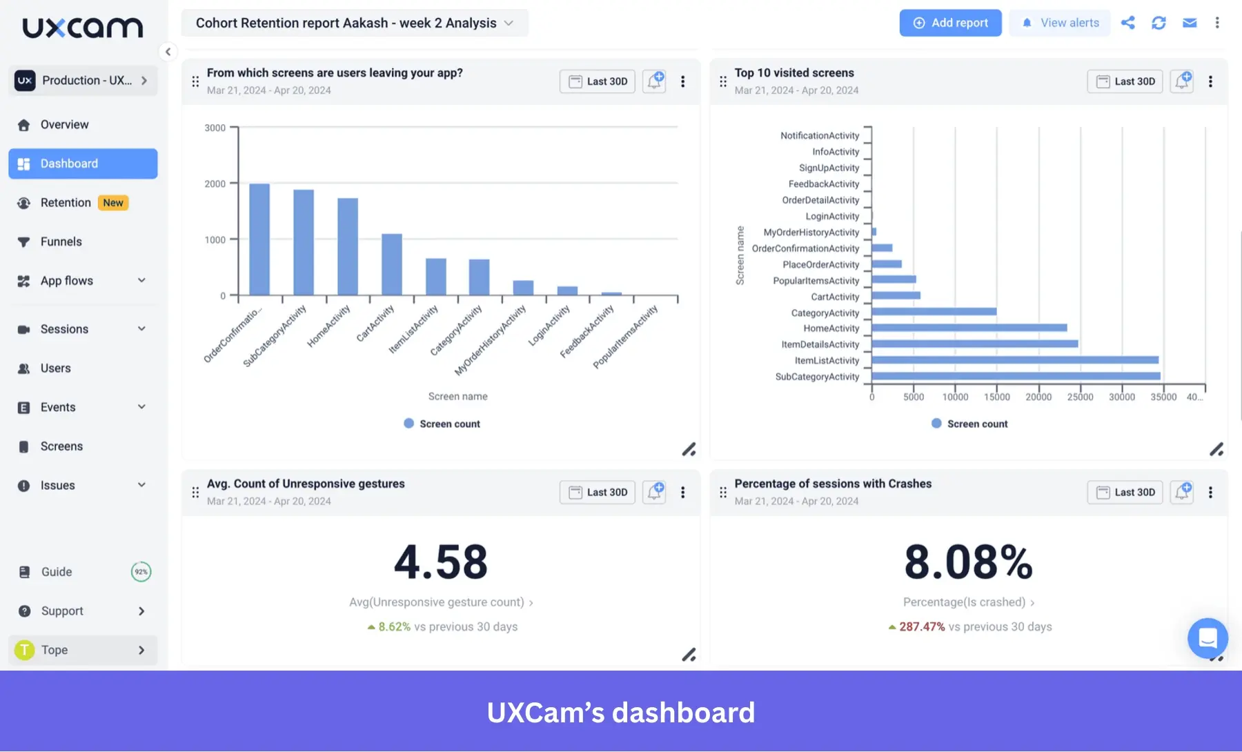
UXCam often gets praised for its mobile-specific insights and ease of setup. However, users have also complained about its cluttered dashboard.
My verdict is UXCam is a nice-to-have tool for mobile-specific user insights. For now (at least), it is only a part of a broader analytics stack if you need full web and product analytics coverage.
10. Glassbox: Digital customer experience analytics platform
Glassbox provides complete visibility into every user interaction with strong compliance controls. This makes it ideal for mid-to-large, compliance-heavy enterprises in industries like finance, insurance, retail, and travel.
Its main strength lies in recording everything automatically and making that data usable for debugging and compliance. And its price reflects this enterprise’s positioning.
Glassbox uses custom enterprise pricing that is based on traffic, platforms, and deployment needs. According to Vendr, contracts range between $211K and $287K per year.
Main Glassbox features for product analytics
- “Tagless” data capture: Glassbox records 100% of interactions automatically (clicks, taps, scrolls, errors, API calls) with no manual tagging needed.
- Session replays: It generates high-fidelity replays of user sessions on websites or mobile apps (including rage clicks, struggles).
- Customer journey mapping: Glassbox visualizes aggregate journey maps to show common paths, drop-off points, and where users struggle in funnels. It can highlight points where customers abandon a process (e.g., a loan application or checkout) so you can investigate why.
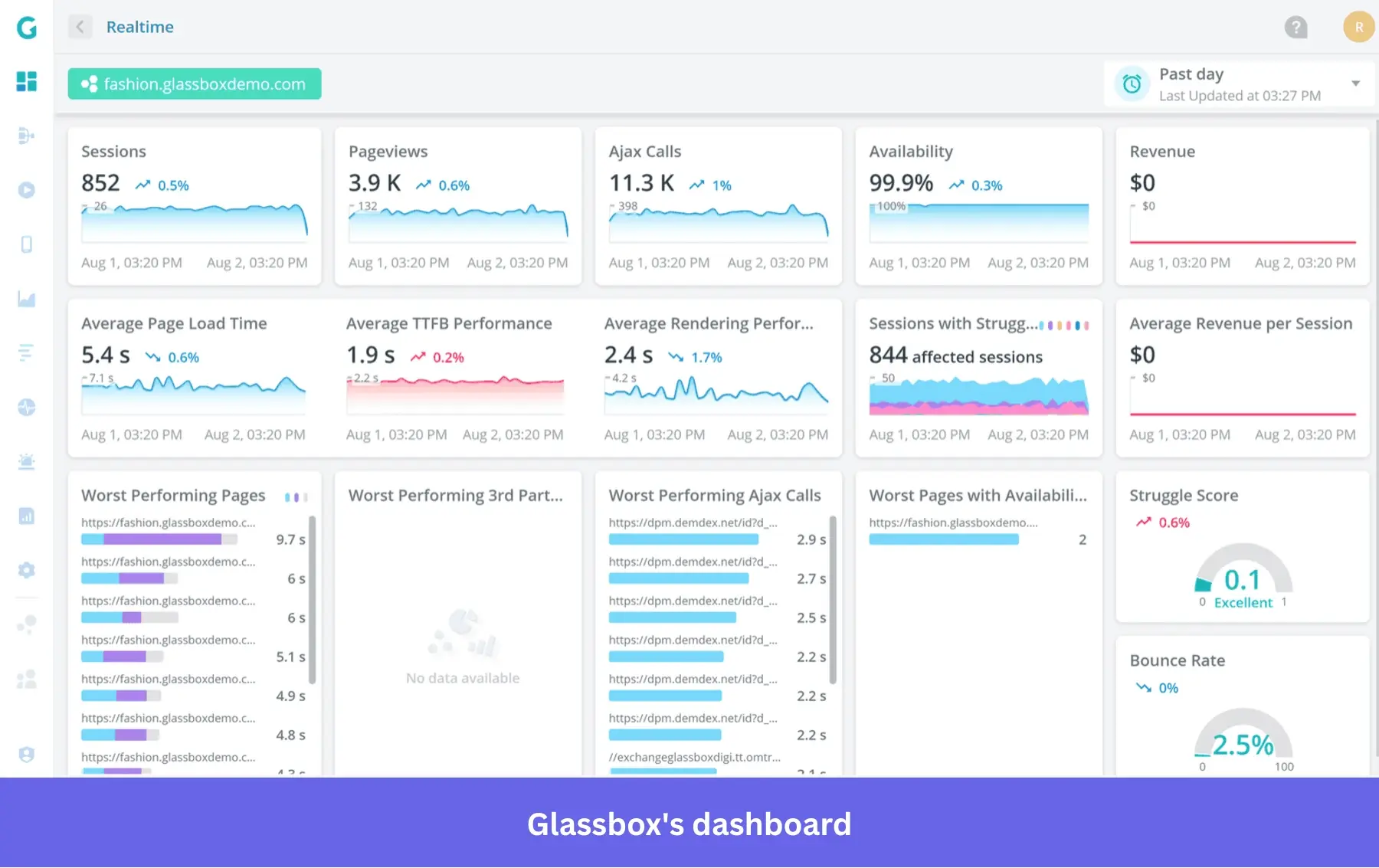
- Mobile analytics: It has robust SDKs for native mobile (like for React Native, Flutter, etc.), capturing screen recordings and UX metrics in mobile apps. It tracks things like app crashes, UI responsiveness, and network calls to help optimize mobile experiences.
- AI-powered insights: The platform includes automated anomaly detection, struggle detection like rage clicks, and even fraud detection.
Users praise Glassbox for its depth, particularly for its customer journey analysis. But like any feature-heavy tool, it has performance issues. One user experiences “occasional performance slowdowns on large datasets.”
Overall, Glassbox offers unparalleled, full-session visibility, compliance, and enterprise-scale analytics. The tradeoff is the higher costs and the operational effort needed to get the most out of it.
11. Datadog: User behavior and product performance monitoring platform
Datadog connects user behavior with system performance in real time. Hence, it’s ideal for DevOps, engineering, and IT teams or anyone operating complex, high-scale applications.
At the core, Datadog is an observability platform. But with its Real User Monitoring (RUM) module, it extends into user behavior tracking and analyzes sessions alongside backend metrics infrastructure performance.
Regarding pricing, Datadog uses usage-based pricing across multiple modules. According to Vendr, the median contract value is around $152,340/year, and can scale to $662K, depending on usage. RUM itself is priced per session, with add-ons like session replay increasing costs.
Main Datadog features for product analytics
- User flow monitoring: Datadog RUM tracks user journeys through an application in real-time. It captures events like page loads, route changes, clicks, etc., and can visualize sessions to show the sequence of user actions.
- Session replay: Datadog includes session replay for web apps, with technical info like infrastructure logs and errors. It’s mainly used for debugging issues.
- Frontend event capture: It automatically captures frontend events like button clicks, link clicks, form submissions, errors, and even long tasks or network calls in the browser. It also collects these with context (browser info, user ID if provided, etc.).
- Endpoint and performance monitoring: You can tie in endpoint (API) monitoring and synthetic tests into user analytics. For example, Datadog can run synthetic user flows (like a scripted journey) to test that it works and alert on problems.
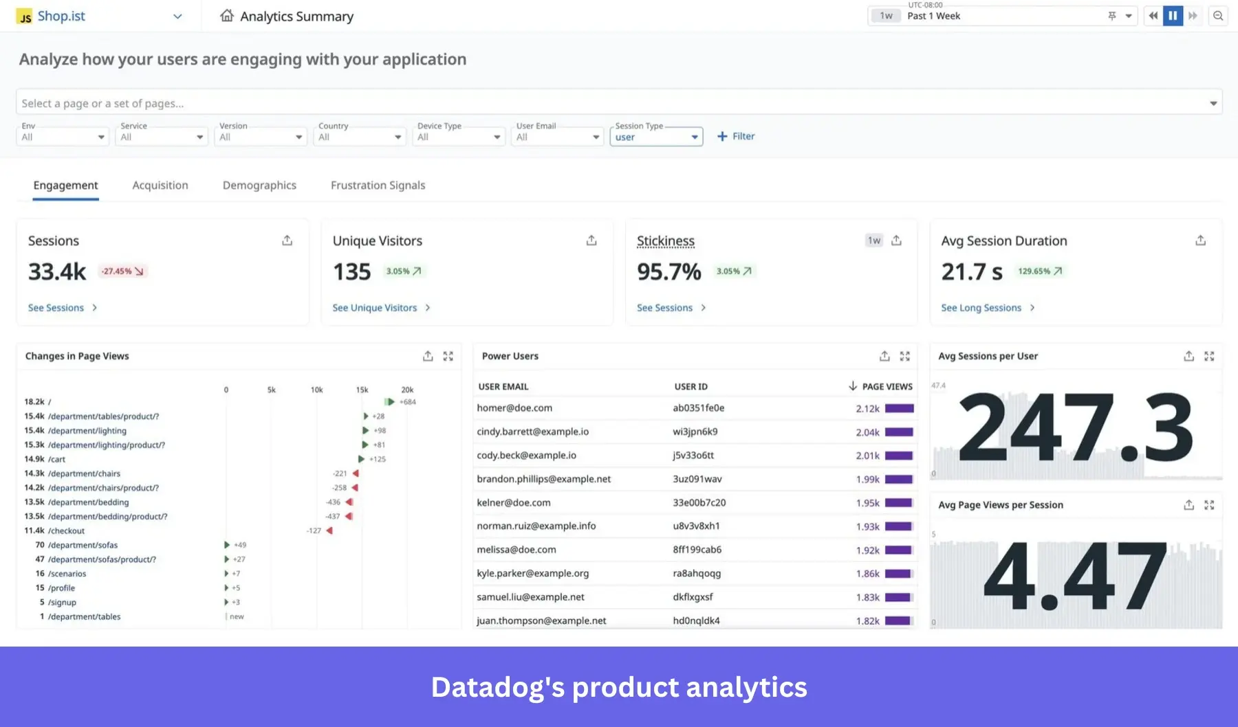
Users speak highly of Datadog. One says it is “a single source of truth for our entire stack…but has an overwhelming UI.” Others say it has a steep learning curve, often needing users to understand agents.
Overall, I’ll say Datadog is the right tool if you need real-time monitoring and debugging across user experience and infrastructure. The tradeoff is that it’s better suited for engineering teams than product teams focused on growth analytics.
How did we evaluate these tools?
Too many teams end up buying product analytics software that is either overkill for their maturity or too limited to drive real decisions. To avoid that trap, I evaluated each tool using a consistent set of criteria focused on real-world usability and ROI, not just feature checklists.
Using the following criteria, I shortlisted tools across different categories, from all-in-one product growth platforms to deep analytics suites and visual UX tools, so you can choose based on your goals, your team, and your stage, not hype.
Here’s what I looked at:
- Ease of implementation: How quickly can a team get value after signing up? I considered setup effort, such as manual event tracking versus autocapture, engineering dependency, documentation quality, and how usable the product is for non-technical users like product managers, designers, and customer success teams.
- Data depth and analytical power: Does the tool go beyond surface-level metrics? I evaluated how well each platform supports funnels, retention, paths, cohorts, and segmentation, as well as its ability to connect user behavior to outcomes like activation, churn, or conversion. Tools that combine quantitative data with qualitative context, such as session replays, scored higher.
- Ability to act on insights: Insights are useless if they live only in dashboards. I looked at whether teams can act on the data by launching in-app guides, surveys, experiments, or alerts without stitching together multiple tools.
- Price-to-value ratio: Instead of just listing prices, I evaluated what you actually get for the money. Many tools appear affordable at low usage but become expensive as event or session volume grows, especially when essential features like session replay or data exports are locked behind add-ons.
- Best-fit use case: No tool is best for everyone. Each platform was assessed based on who it is truly built for, such as early-stage startups, product-led SaaS teams, mobile-first apps, or enterprise engineering organizations, so you can match the tool to your team’s reality.
Typical cost of product analytics tools
Expect to pay $300–$1,000/month for most product analytics tools, or $10k–$100k+/year at enterprise scale.
Most tools use event-based pricing (you pay per user interaction), which gets expensive fast. What looks cheap at 1M events can hit $10k/year at 10M events. The real killer is hidden fees. I’ve seen tools advertise low prices but lock session replays and advanced features behind expensive add-ons.
This is why I like Userpilot’s approach. Everything like analytics, session replays, and engagement tools is bundled into transparent pricing plans starting at $299/month.
How to select the right product analytics platform?
Choosing the right tool is a strategic decision that impacts everything from product roadmaps to customer satisfaction.
When my team evaluates tools, we follow a clear thought process:
What problem are we trying to solve?
We start by identifying the specific gap in our understanding or our workflow. Are we struggling with low activation rates, poor feature adoption, or high churn?
Each problem points to different analytical needs. For example, if we’re seeing high churn, we’d focus on tools with strong churn analytics and user paths to uncover root causes.
This will let us shortlist the products based on our primary use case. And once we have a list of candidates, then we can start evaluating and discarding tools in the following steps until we’re left with one option.
Who needs to use it?
Now, consider whether it’s just product managers who’ll use the tool, or if marketing, customer success, and even engineering teams also need access. This impacts the required ease of use and the number of licenses.
What I recommend is to think about the least technical person who’ll get access to the platform. If it’s just for a technical product manager and engineers, then you can get away with a deeper tool that requires SQL skills and coding.
But if, for example, you need an analytics tool that will be used by product managers, UX designers, and engineers, then a no-code platform like Userpilot will allow the designers to engage with data to improve usability.
What other tools does it need to work with?
Integration is key. We look at our existing stack (CRM, marketing automation, and data warehouses) and determine what seamless data flow looks like. Will the new tool integrate with our HubSpot analytics or push data to our Segment for broader use?
For this, I recommend looking into how specific your use case is. Do you only need a product analytics tool for session replays or heatmaps? Or do you want to centralize all data in an all-in-one platform to perform all analyses?
If the former, then sourcing the data from your warehouse could be enough. If the latter, then you’d probably need two-way integrations with your data warehouse, CRM, Google Analytics, and BI tools so you can transfer product data seamlessly between platforms.
What outcomes are important?
Focus on results, not just features. We think about what product KPI we want to improve, is it reducing time-to-value for new users? Or increasing engagement with a core feature? Defining these outcomes upfront helps us measure success accurately.
That said, you should evaluate each tool based on its capacity to:
- Follow your metric deeply (e.g., not just measuring retention, but creating user cohorts where you can correlate what actions lead to less churn).
- Improve your metric directly (e.g., implementing a checklist that leads users to activate a feature).
For example, if your goal is to improve product adoption, make sure to pick a platform that can both track product usage metrics (yes, like Userpilot) and give you tools to improve it, such as adding walkthroughs for onboarding.
How will it fit our organization?
Every company has unique workflows and methodologies. We assess how a new tool fits into our daily operations.
My advice is to leverage free trials and demos to see if:
- The tool performs well in your specific environment and doesn’t break.
- Your team can easily adopt its marketing analytics.
- There’s a clear path from analyzing user behavior to positive ROI (e.g., if the tool helps you increase free-to-paid conversion rates).
- Integrations work as intended.
- The tool is going to be useful 2 years from now as the business grows.
This way, even if you shortlist two identical products, you’ll be able to make a purchase decision based on experience rather than promises.
Your next step in choosing a product analytics tool!
As you evaluate your options, focus on how quickly you can go from insight to impact, and whether the tool fits your team’s workflow and technical comfort.
If you’re looking for a platform that combines analytics with built-in engagement so you can act on insights immediately, Userpilot is worth exploring.
👉 Book a demo to see how you can analyze user behavior, uncover opportunities, and drive product growth, all in one place.
About the author