How to Measure & Improve Mobile App Performance


If I could go back and tell my past self one thing about measuring mobile app performance, it would be this: clarity beats complexity. Early on, I thought being thorough meant tracking everything. In reality, it led to decision paralysis and wasted time.
Now, I follow a more intentional method. I focus on performance through the lens of user experience, then layer in just the right tools to surface insights that drive real change. In this guide, I’ll walk you through the exact process I use to measure what matters and share actionable ways to improve your app’s performance to drive engagement, retention, and long-term growth.
How I measure mobile app performance as a product designer
Measuring mobile app performance isn’t a one-size-fits-all process. The metrics you track and how you interpret them will differ if you’re a designer, product manager, or engineer. This process serves as your baseline for determining which performance indicators to track. So, you can prioritize changes that drive user engagement.
1. Start with user base research
Researching your user base helps you understand who is using your app and why they are using it. This approach enables you to establish a baseline for enhancing their mobile experience.
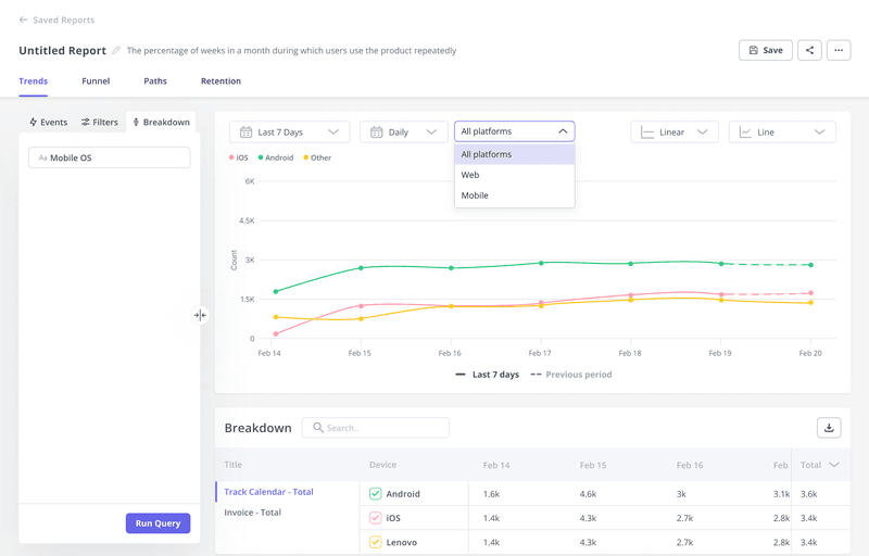
I review my analytics dashboard to determine the number of daily active users (DAUs), weekly active users (WAUs), and monthly active users (MAUs) who use my app. Then, I’d create segments to have a better understanding of the different personas in the user base.
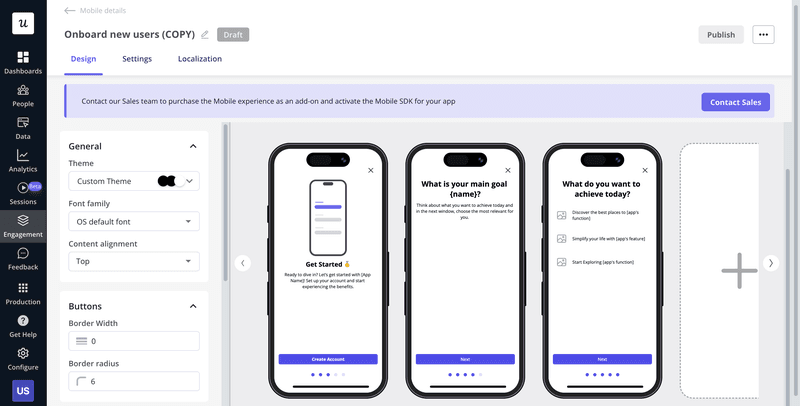
With Userpilot’s segmentation feature, you can build custom segments on properties like user events, account attributes, and survey responses to uncover which personas engage with your core features.
2. Zone in on to understand the core value proposition of the app
Nailing down your app’s core value proposition ensures you focus on the features that deliver real user value. To do this, I identify which parts of our app solve a problem or delight users.
I revisit my user base and ask: What single feature (or set of features) is driving those numbers?
Depending on your personas, that Aha moment might differ. For example, it can be accessing an advanced reporting screen for power users and completing an onboarding checklist for new users.
Use Userpilot’s trend analysis to compare feature usage across segments and periods, spotting which features resonate with each persona.
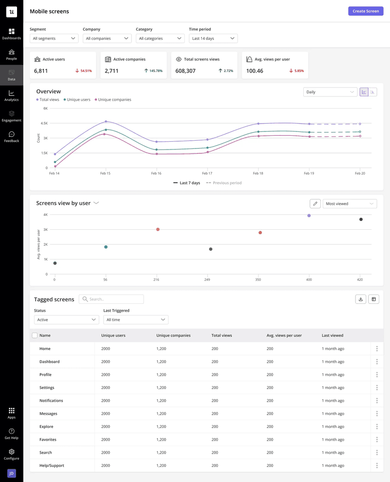
3. Track the key events and mobile screens that make up core features
Tracking the discrete actions and screens that lead to your app’s value moment uncovers exactly where users succeed or fail.
Map the entire user journey to the value moment and break it into individual events. Include the core actions that deliver value and the supporting steps that guide users through the process.
For example, if your value moment is “completed onboarding,” you’d track:
- Core events: “Created a project,” “Uploaded a file,” “Completed onboarding.”
- Supporting events: “Clicked ‘Next’ on tutorial screen,” “Enabled notifications.”
With Userpilot’s event tracking, which logs which screens users land on, how long they stay, and where they exit, you can identify:
- Drop-offs.
- Key decision points.
- Popular vs. underused features.
4. Collaborate with the engineering team to set up the tracking plan
Joining hands with the engineering team to design and implement your tracking plan lets you capture reliable performance data. This approach is essential because there are metrics (such as app load time) that affect user experience but that you (as a designer) can’t improve. For such metrics, you need to request that the engineering team address the issue.
Here are some examples of mobile app performance metrics that product designers should consider keeping tabs on:
App startup time
A slow app launch kills first impressions. Your app’s startup time measures how long it takes from tapping your icon to the first usable screen. I calculate it by logging a timestamp when it launches and another when it renders the initial UI, then subtracting the latter from the former.
Monitoring this metric helps you determine if users are waiting too long before they can interact with your app. Long startup times can lead to higher abandonment rates, so try to keep startup times under 2-3 seconds to align with user expectations.
App crash rate
Keeping your crash rate low is crucial for building and maintaining user trust. This metric measures the frequency of app failures during a session. You can calculate it by dividing the total number of crashes by the total number of sessions, then multiplying by 100.
I always track this metric because every crash erodes user confidence and drives users to uninstall the app. Conversely, users may also leave negative app store reviews, which can deter more people from installing your app. A sudden spike in crashes signals instability in the mobile app development or bugs in the code. As a benchmark, aim for a crash rate of less than 1% per session.
App load time
This metric is incredibly similar to app startup time. However, the app load time measures how long it takes for your app’s content to display completely after a user has interacted with it.
The startup time counts from when a user taps your app’s icon until the first usable screen appears. On the other hand, the load time begins when the user taps a screen or button and continues until the page is fully rendered.
You can calculate the app load time by subtracting the time it takes for the content to finish rendering from when the user taps on it.
Tracking load time is essential because slow content rendering frustrates users and leads to increased abandonment. If your average load time exceeds 2 seconds, you’ll often see user retention and engagement suffer; therefore, try to keep this as a benchmark.
Session duration
Session duration is my go-to metric for gauging user engagement. It tells you how long, on average, users spend on your app each time they open it. To calculate it, divide the total time spent across all sessions by the number of sessions in a given period.
Tracking session duration helps you spot friction points or features users love. Longer sessions often indicate that users are finding value, while unusually short sessions can suggest confusing screens or performance bottlenecks.
As for benchmarks, session lengths vary widely by industry. However, Adjust’s 2024 research shows a typical range of 18.6 minutes per session across different verticals and rejoins.
Feature adoption rate
This metric measures the percentage of users who engage with a specific feature at least once during a given period. You calculate it by dividing the number of that feature’s MAUs by the total user logins over the same period, then multiplying by 100.
Adopting core features is crucial for users to gain value and for the likelihood of them being retained, and even expanding their app usage. A high feature adoption rate signals that users find the feature useful. In contrast, a low rate can reveal friction, lack of awareness, or misalignment with user needs.
Benchmarks vary by industry, but aim for a 20-30% feature adoption rate, especially if you have a SaaS product. To increase the percentage of users who utilize a feature, I recommend using nudges such as slideouts or direct engagement through carousels. These features can keep users on track and help them see the value in the feature.
DAU/MAU ratio
This ratio is also known as user stickiness, which measures the percentage of your MAUs who engage with your app daily.
Tracking user stickiness indicates whether users consistently return every day. A low ratio can indicate that people are trying your app once or twice and never returning. However, a healthy ratio means you’re delivering value that keeps users engaged.
For the benchmark to shoot for, 37% is the average stickiness across industries. As a designer, you can influence user stickiness through thoughtful UX patterns. For example, I take inspiration from Duolingo’s gamification. They add hooks like streaks, leaderboards, and points that nudge users back to the app.
You can use Userpilot to implement gamification. Set up in-app messages and carousels that appear at the right time to remind users of their progress and motivate them to keep using the app.
Retention rate
This metric indicates the percentage of users who stick around over a specified period. You calculate it by subtracting the number of new users acquired during a specific time from the total number of users remaining at the end. Divide that by the users at the beginning of the period and multiply the result by 100.
So, if you start the month with 1,000 active users, add 200 new users, and end with 950 total users, your retention rate is ((950 − 200) ÷ 1,000) × 100 = 75%.
A low rate indicates that users are churning and that more people might leave your app if you don’t make changes. On the other hand, a rising retention rate indicates that more users prefer a newly added feature or redesign.
Like other metrics, retention rate benchmarks vary by industry. However, aim for a retention rate above 25–30% after 30 days. Preventing users from leaving and improving your retention rate requires employing tactics that encourage them to continue using your app.
When I notice users who are at risk of churn, I use push notifications that offer a reward or remind them of new features or recent updates. I can also embed a contextual survey to determine what’s holding them back and use that feedback to improve the app’s user experience.
In-app purchase rate
This metric shows the percentage of your active users who complete at least one purchase within the app. You calculate it by dividing the number of users who made an in-app purchase by the total active users. Then, multiply by 100.
Tracking your in-app purchase tells you how effectively your app turns engagement into revenue. For example, if power users convert at a rate of 6% but casual users only at 1.5%, you know how to implement your upsell techniques such that they’ll have the most impact.
The average in-app purchase rate is 2.6% to 5.5%. To increase your rate, I recommend using behavior-based triggers, such as slideouts and carousels. They’ll enable you to prompt upsells at high-intent moments when the user is most likely to make a purchase.
5. Combine quantitative data with qualitative insights to get a holistic view of performance
Combining numbers with user feedback uncovers the real story behind your mobile app metrics. And tracking only one can mislead you. Quantitative data (like crash rates, session duration, and feature usage) highlights trends and patterns. On the other hand, qualitative data (such as feedback from surveys and user interviews) helps explain the motivations and frustrations that drive user behavior.
For example, after rolling out a new dashboard design, you see a high average session duration and assume it’s a good sign. However, a survey found that users find the screen confusing. The next move would be to simplify the UI or provide in-app guidance and measure its impact.
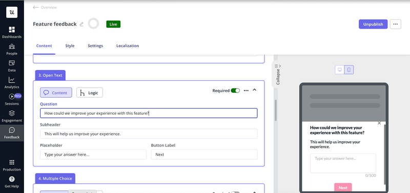
With Userpilot, you can set up contextual feedback surveys on any screen to get a better understanding of user interactions.
3 Tools to help you measure and improve app performance
Here are three essential tools to track your mobile app’s performance, analyze user behavior, and implement changes that matter.
Userpilot for optimizing in-app experiences
Userpilot unifies user analytics and in-app engagements in a single platform, allowing you to see how people use your app and deliver personalized experiences without requiring coding experience.
Its key features include:
- Unified user tracking: Captures every click, tap, and event across devices to build a complete user profile.
- Localization: Helps you create guides and tooltips in multiple languages for various regions, ensuring every user segment feels at home in your app.
- Reports (funnels, paths, trends): Let you set up funnels to spot drop-off points, use path reports to trace user flows, and monitor trends to see how feature adoption changes over time.
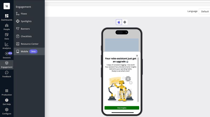
- Slideouts: In-app prompts to nudge users toward key actions, like completing onboarding or trying a new feature, without interrupting their workflow.
- Carousels: Let you group related messages into lightweight panels that showcase multiple tips or updates at once, keeping users informed and engaged.
- Surveys: Embed contextual, in-app surveys to gather feedback at the right moment so you understand the “why” behind the data, and assess user satisfaction.
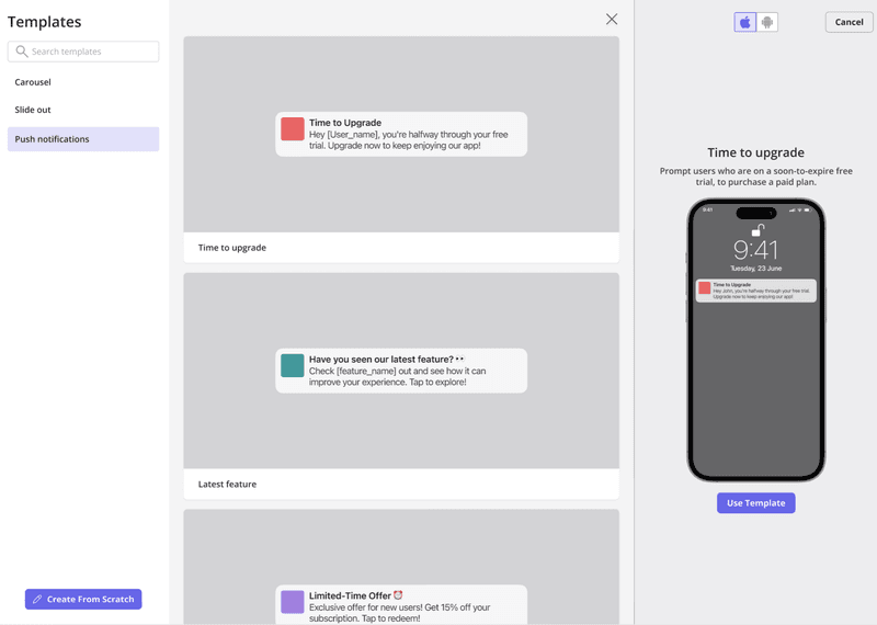
- Push notifications: Send timely messages to re-engage users who might be about to churn, announce new features, or encourage users to return to your app.
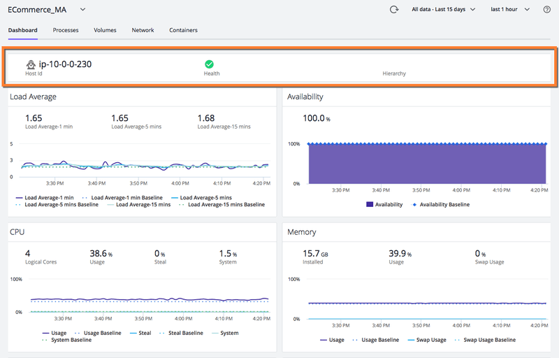
AppDynamics for infrastructure monitoring
AppDynamics delivers real-time visibility into the server, OS, and network components that affect mobile app performance so you can catch and resolve infrastructure issues before they chase users away.
Its key features include:
- End-to-end infrastructure visibility: View CPU, memory, disk I/O, and network request alongside your business transactions to understand how underlying resources affect app functionality.
- Preconfigured health rules: Define thresholds on key metrics (e.g., response time, CPU) and trigger automated alerts or remediation when they’re breached.
- Machine Agent & custom metrics: Deploy the Java-based Machine Agent to collect out-of-the-box hardware metrics and extend with your custom metrics via extensions.
- Correlation & scalability analysis: Use scatter diagram charts to correlate any two metrics and analyze how performance scales under load.
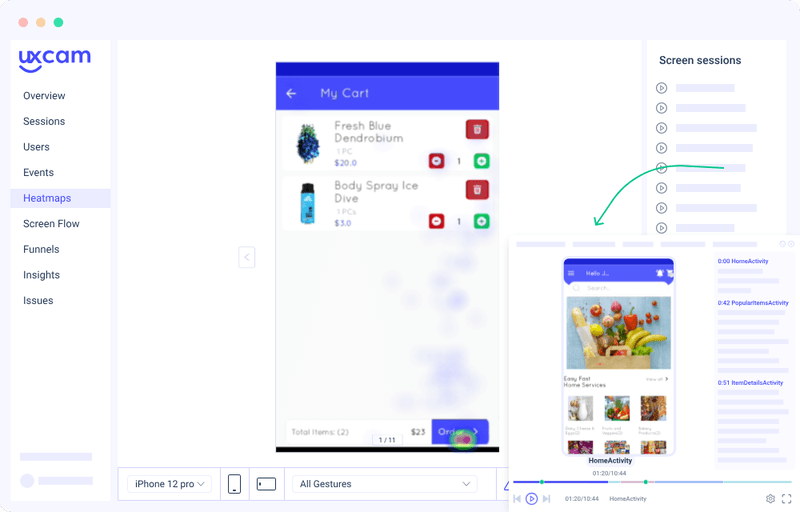
UXCam for visual analytics
UXCam provides intuitive visual analytics that let you see exactly how users interact with your app, uncover friction points, and optimize experiences without needing to review raw logs.
Its key features include:
- Session replays: Video recordings of real user sessions capture every interaction, allowing you to pinpoint where users struggle and iterate your design quickly.
- Heatmap analysis: Aggregated touch and scroll overlays highlight hotspots and dead zones on each screen, guiding you to simplify layouts and reduce confusion.
- Conversion funnel analysis: Track and visualize each step of a user flow to identify drop-off points and optimize funnels.
- Crash & error reporting: Monitor crashes and errors in real-time with detailed logs and stack traces, allowing you to collaborate with engineering to resolve stability issues before they affect more users.
Optimize mobile app performance with Userpilot!
With Userpilot, you can channel your performance data into strategic changes so you stop guessing and start improving the right things.
You’ll access carousels that guide users through valuable moments, as well as push notifications that re-engage them. These features will help you bridge the gap between insight and impact, enabling you to boost engagement, retention, and conversions.
Book a demo now to see how Userpilot helps you transform your metrics into growth-driving experiences.
FAQ
How do I test the responsiveness of my mobile app?
To ensure your app adapts smoothly across devices and conditions, follow these steps in mobile app performance testing:
- Test on mobile devices and run Google Play’s pre-launch report to catch layout issues on multiple app versions and hardware.
- Use emulators and simulators such as those in Android Studio, to verify UI scaling, font rendering, and orientation changes on common screen sizes.
- Simulate various network conditions such as 3G, LTE, and even offline, using tools like Network Link Conditioner to confirm stable loading and data sync.
- Measure UI render times and frame rates using profiling tools such as Android Systrace to identify slow-rendering animations.
- Validate interactive elements manually or via automation, check touch-target sizes, button responsiveness, and layout breaks to ensure real-world usability.
How to measure the success of an app?
You can measure an app’s success based on a combination of user, performance, and business metrics:
- User engagement: DAUs, MAUs, session duration, and feature adoption rate reveal how often and how deeply users interact with your app.
- Retention & churn: Track retention at multiple intervals, and calculate churn to understand loyalty and identify friction points.
- Performance metrics: Monitor crash rates, load times, and API latencies to ensure a smooth and reliable experience.
- Business KPIs: Measure conversion rate, in-app purchase rate, customer acquisition cost, and customer lifetime value to tie performance to revenue.
- Customer feedback: Use NPS scores and in-app surveys to collect qualitative insights and correlate them with your quantitative data.
About the author