
While most SaaS onboarding occurs within the app, new customers’ first point of contact with your company is typically an onboarding email.
Because of that, onboarding emails should be a vital part of your omnichannel onboarding strategy. If done right, they’ll quickly guide users to success and boost feature engagement. Emails can also help re-engage those users who forgot to log in and are missing your tried-and-tested, optimized onboarding flow.
In this article, I’ve analyzed 12 real-life emails from successful SaaS companies. I’ll share what works, the types of emails you should include in your onboarding sequence, and the best practices we always follow.
12 Onboarding email examples (with pros and cons)
A great customer onboarding email should follow these rules:
- Reinforce the value of signing up.
- Have a personalized message.
- Include a clear call-to-action (CTA) that helps users take the next step.
- Introduce the product in a way that it fits the learning curve, business model, and user persona.
Based on these criteria, I’ll break down 12 onboarding emails from top SaaS products, including:
1. ClickUp
ClickUp’s onboarding email introduces different product capabilities, resources, and ways to explore the platform.
It includes different sections for learning about ClickUp, inviting team members, importing data from other platforms, and more, serving as a complete resource center.

What’s good about it?
- Comprehensiveness: It presents a complete picture of ClickUp’s offering, including product overviews, demo content, and visual guides.
- Embedded UI preview: The annotated screenshots give a preview of what the interface looks like, making it feel more familiar.
- Education-first approach: With ClickUp University, product demo links, help docs, and a Facebook community, I felt incentivized to learn the product before using it.
What can be improved?
- The cognitive load: This email has too much content for a new user. A more guided sequence (e.g., one email for setup and another for integrations) would reduce friction.
- More personalization: Different roles can benefit from different onboarding paths. Personalizing the resources based on their needs would make the email more helpful.
- No single CTA focus: This email lacks a main CTA. Is the goal to complete the setup, book a demo, or join ClickUp University? A clear primary CTA would lead me to the activation stage faster.
2. Airtable
Airtable’s email focuses more on “motivating” rather than educating. The copy is short, and it only has one CTA that asks me to keep using the app.

What’s good about it?
- Simple and focused: The copy is short and doesn’t overwhelm me with many tasks, minimizing friction.
- Added value: The email offers two free weeks of the Pro plan, allowing me to experience the value of a paid plan.
What can be improved?
- More context or guidance: Adding a simple checklist or proposing a task to complete would incentivize me better to continue exploring than “keep going.”
- Product features: Sample visuals of Airtable’s features would boost familiarity with the product.
- Personalization: This email also lacks personalization. It doesn’t even address the receiver by name.
3. Monday
Monday’s onboarding email is all about momentum. Its format is simple and makes the first steps easier: creating a task.

What’s good about it?
- Clear CTA: “Create my first task” is direct, action-oriented, and focused. There’s zero ambiguity about what I should do next, making it easier for me to reach activation.
- Visual reinforcement: The zoomed-in UI screenshot shows exactly where I needed to click, reducing guesswork.
- Extra support links: The bottom section offered more help (tutorials, blog, knowledge base) without distracting me from the main CTA.
What can be improved?
- Personalization: The email could prompt me to add a task relevant to my JTBD (job-to-be-done) (e.g., set project timeline).
- Explaining product value: There’s no goal behind creating my first task or a vision of what’s coming next. Adding a checklist for next steps or setting an ultimate goal (e.g., planning your first project) would make it more motivating.
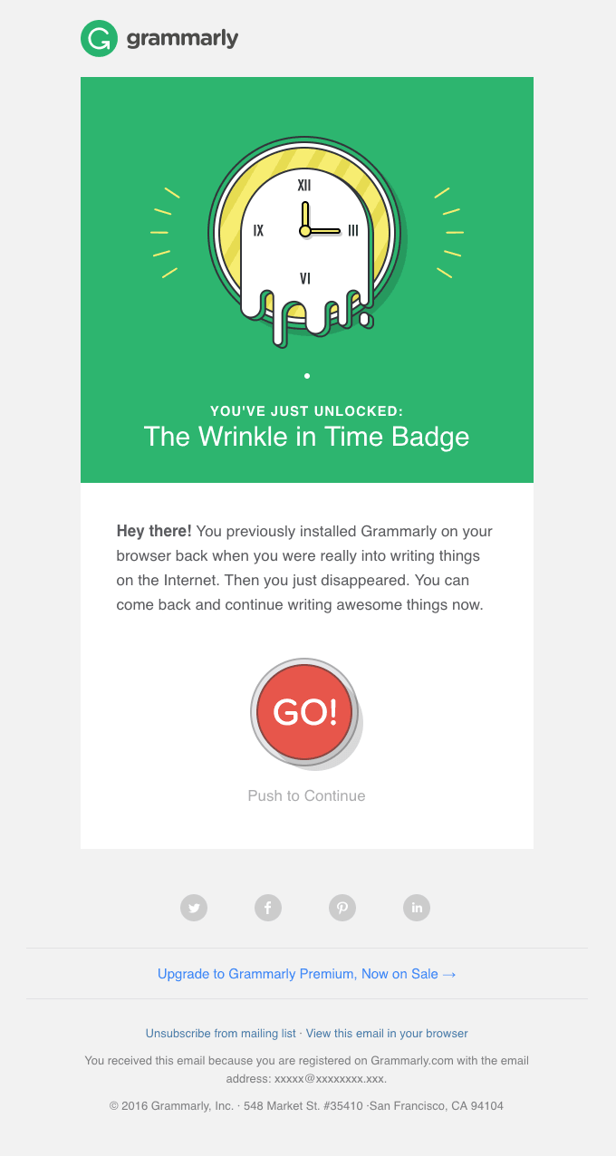
4. Grammarly
Grammarly’s email fulfills multiple goals at once in a clear, spaced-out way. It introduces the core product value, highlights Pro features, and communicates about privacy options.

What’s good about it?
- Expectation setting: The email does a good job of framing the product as more than just a grammar checker, highlighting features such as AI assistance and customization.
- Value reinforcement: It communicates clear benefits such as improved writing quality and saved time.
What can be improved?
- CTA hierarchy: The multiple buttons made it harder for me to know where to start. It’s best to highlight a primary CTA (e.g., “Go to Editor”) and then leave the privacy-related content as tertiary.
- More personalization: Grammarly missed the opportunity to personalize this email based on the information I provided during the signup flow.
- More visual onboarding: It could add a short GIF or annotated screenshot showing the Grammarly editor in action.
- The upsell: The email is pushing Grammarly Pro before I can experience the value of the free product.
5. UXPressia
This email comes from Nina, Head of Customer Success, and it’s a short, personal message with a few helpful links.
It’s a simple email that introduces the platform without being pushy.

What’s good about it?
- Personal touch: The sender is a real person with a name, title, and profile image. That kind of human touch builds trust and makes me feel welcomed.
- Tone and clarity: The message is casual and friendly without being distracting. Its use of emojis, short paragraphs, and a clear structure made it easy to scan.
- Personalized resources: Since I signed up to create customer journey maps, the email offered help resources just for that.
What can be improved?
- The upsell: The nudge toward a paid plan isn’t pushy, but it’s still too early as a new user.
- More product context: There’s no visual preview or mention of how the platform works. Even a basic UI screenshot or an onboarding checklist could help me orient myself.
- Fewer links: The email would be clearer if it led to one single action, such as mapping the first customer journey.
6. Loom
Loom’s onboarding email includes a video message from the Loom team and encourages me to start recording immediately, leveraging the trial period to drive activation and increase upgrades.

What’s good about it?
- Video-first experience: The embedded welcome video serves as a demo, showing me how to interact with the app.
- Clear value: The email explains features available during trial (e.g., unlimited recording length, custom branding, CTA buttons), helping me understand the difference from the free plan.
- Next action: The “Try a few quick recordings” CTA is direct and well-placed in the email’s context.
What can be improved?
- Clearer CTA hierarchy: The main CTA could be on a button to stand out from other links.
- Too much link scattering: While informative, the number of blue hyperlinks distracted me from the main CTA.
7. Miro
Miro’s onboarding email shows a board interface resembling Miro’s actual UI.
It introduces multiple ways to engage with the product without relying on dense copy or abstract instructions.

What’s good about it?
- Interface-driven design: The email looks like a Miro board, giving me the actual product experience before logging in.
- Clear primary CTA: The “Start creating in Miro” CTA stands out and is actionable.
- Good CTA hierarchy: The email also provides links to different resources without distracting me from the main goal.
What can be improved?
- More personalized resources: Suggesting resources based on the role (e.g., “designer” vs. “project manager”) would make it more helpful for new users.
8. Mixpanel
This email is clean and does a great job introducing Mixpanel’s product vision. It inspires and reassures without overwhelming with features.

What’s good about it?
- Clear product promise: The email explains exactly what Mixpanel does and how teams can use it.
- Low-friction CTA: “Get Started” is well-placed, with no competing buttons to distract you.
- Non-intrusive resources: The bottom section provided links to helpful content like customer stories, onboarding guides, and support without crowding the main message.
What can be improved?
- Specific resources: Considering that Mixpanel is a complex product, adding more specific and personalized resources would reduce friction in the learning process.
- Visual onboarding cues: There are no product screenshots, videos, or annotated UI. Adding them would make the product feel more familiar before logging in.
- More personalization: The copy is generic and doesn’t address my use case, industry, or in-app behavior.
9. Baremetrics
Baremetrics email sets the stage for a white glove onboarding experience. So, besides introducing the onboarding guide, Baremetrics connects me with an account manager and informs me about mid-trial check-ins.

What’s good about it?
- Clear onboarding flow: The email outlines what’s happening now and what’s coming next, including a personal onboarding guide and a mid-trial check.
- Focused CTA: The button catches my attention and makes it easy to get started.
- The expectations: The mention of a scheduled meeting and trial check-in prepares me for the next stages of the onboarding.
What can be improved?
- Fewer buzzwords: Fluffy, unspecific terms such as “supercharge your business” are distracting and delay the value.
- A product walkthrough: Adding previews of the product would make me more familiar with it before meeting the account manager.
- More opportunities to try the product first: Even though the onboarding guide is a great next step, I’d rather try the platform before jumping on calls with an account manager.
10. Qualtrics
This email is clean, visual, and instructional, which is perfect to introduce me to a robust platform like Qualtrics.
The email guides me through three key actions: create, distribute, and analyze a survey, and invites me to log in.

What’s good about it?
- Step-by-step guidance: Breaking onboarding into three digestible steps helps me understand the product faster.
- Actionable copy: Each sentence in the email is valuable. It either communicates new information or leads you to perform a meaningful action.
- Good visual hierarchy: The icons and layout make it easy to scan.
- Personalized greeting: Including my first name in the headline adds a human touch.
What can be improved?
- More product screenshots: Instead of the generic icons, the email should include GIFs or screenshots of the tasks inside the product.
11. Zapier
Zapier’s onboarding email is built like a mini-course. It introduces me to Zapier through the fictional story of Zoey, a taco truck owner, and her 14-day course challenge to automate her company’s internal systems.
The course uses real-world scenarios and daily micro-lessons to help new users get immediate value out of the product.

What’s good about it?
- Narrative-driven learning: Introducing Zoey as a relatable character helps simplify the concept of automation and makes abstract ideas feel tangible.
- Drip-based onboarding: Framing it as a “14-day course” gives the onboarding a clear structure, sets expectations, and incentivizes me to learn the product by using it.
- The shared Zap: The email shares a ready-to-try Zap, which is a fast lane to activation.
What can be improved?
- The personalization: Apart from my name, the email should recommend role-specific automations.
- More focus: Although the resources follow a logical hierarchy, the many links compete for attention. The email could focus only on the course and only share the zap after watching the first lesson.
12. Calendly
Calendly starts the trial with an email that encourages me to schedule my first meeting using the app.
It does a great job contextualizing the product’s benefit with an attention-grabbing statistic and a three-step flow to get started.

What’s good about it?
- Strong value framing: Leading with the time-saving statistic positions Calendly as an indispensable tool for users with tight schedules.
- Trial orientation: The email reminds me how many days of trial I have left, creating a subtle sense of urgency to activate and upgrade.
- Step-by-step onboarding: The numbered list is actionable and written in clear language.
- Single, clear CTA: “Start scheduling” is visually strong and aligns with the email’s goal.
What can be improved?
- More visual aid: The email would benefit from screenshots, videos, or a preview of what the scheduling process looks like.
What does an effective onboarding email look like?
After analyzing 12 onboarding emails, you should now have a clearer outlook on the anatomy of a good onboarding email.
To start working on your own onboarding email sequence and for additional inspiration, take a look at one of the templates we use at Userpilot:
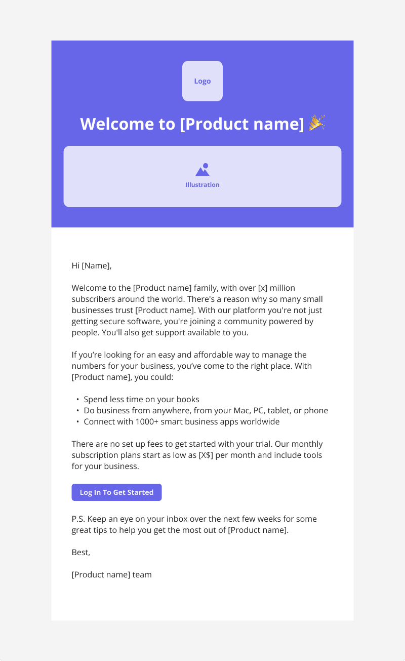
As you can see, this template includes:
- Personalized welcome message with the user’s name.
- Dedicated space to add illustrations such as product screenshots, GIFs, or videos.
- A brief yet detailed explanation of the product and its value proposition.
- A quick bullet list showing the benefits of the product.
- One primary CTA: “Log in to get started.”
- A heads-up that the user will receive more guidance via email over the coming days.
Remember: The best onboarding emails are tailored to your product’s learning curve, your user persona, and the actions they’ve (or haven’t) already taken in-app.
Email types in an onboarding email sequence
The first onboarding email isn’t the only one you should send to new users. A good onboarding email sequence can re-engage inactive users, further educate and hook the active ones, share additional resources, and collect feedback.
Let’s go through a few typical email types from an onboarding email sequence:
1. Warm welcome email
This is the first email users receive after signing up. It reassures users they made the right decision, sets expectations, and offers one simple action to start working with the product.
A good welcome email should include:
- A welcoming message.
- One benefit-oriented CTA.
- Access to customer support, a help center, or onboarding tutorials.
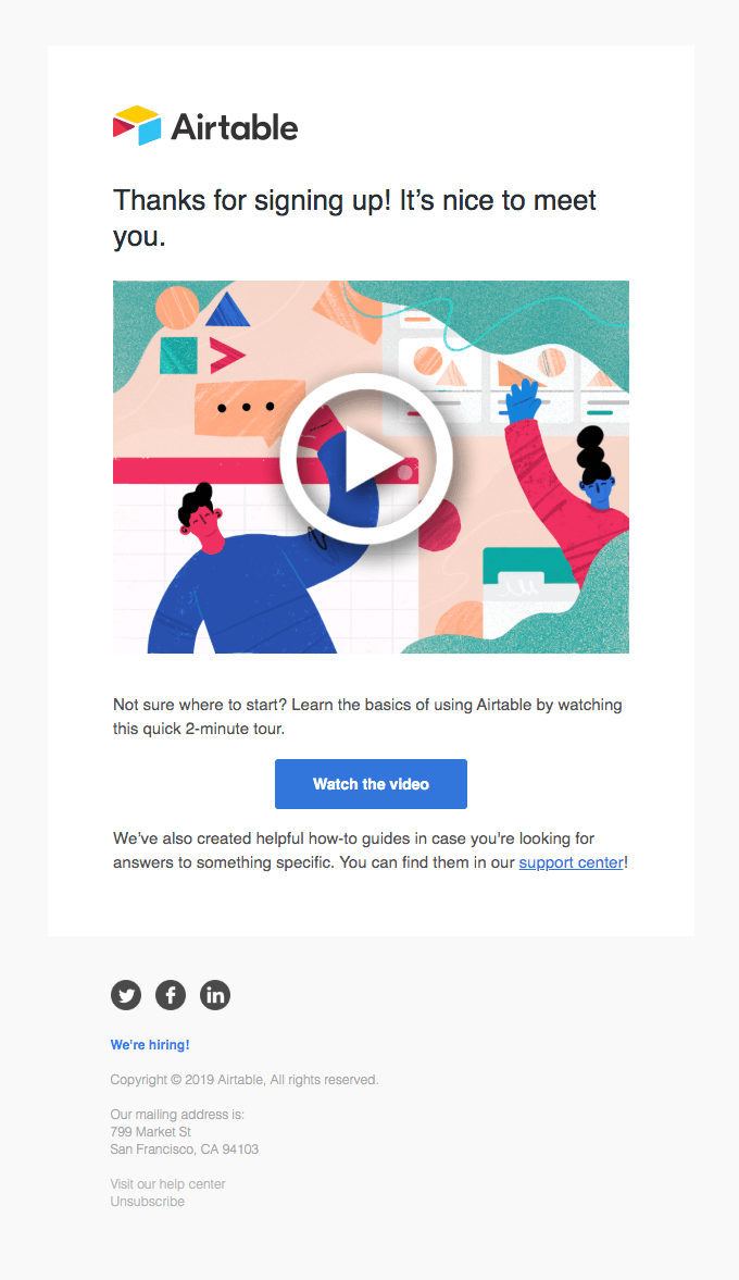
An example of this is this simple Airtable welcome email. It thanks users for signing up, prompts them to watch a two-minute video tour, and shows a CTA to watch the video.
💡 Pro tip: Make sure the welcome email fits your onboarding flow and your customer lifecycle strategy. Don’t repeat what the users just saw in your welcome modal. Instead, expand on it and add value through another channel.
2. “Next steps” product email (with helpful resources)
After welcoming new users, send an email to guide them toward their next meaningful action. The goal is to drive momentum, activate users as quickly as possible, and provide enough resources to start using the product.
A “next steps” email should include:
- A clear next action based on the user’s stage in the journey.
- Links to relevant tutorials, FAQs, or templates.
- Context around why this step matters for the user.
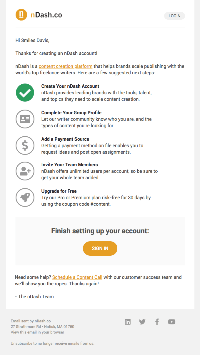
A great example is this nDash email, which thanks users for signing up and shows an onboarding checklist to follow.
The copy is clear, the CTA prompts users to perform the next action, and it includes a link to set up a call with a CSM if they need support.
💡 Pro tip: This type of email also works well as an automated follow-up based on in-app behavior (e.g., in case a user signed up but didn’t take any other action).
3. Social proof email
A social proof email shows how other users are achieving goals and solving problems with the product. Its purpose is to reinforce trust with testimonials, pique the user’s curiosity, and validate that the product works for a similar type of user.
This is what a social proof email should include:
- A clear success story (either from a testimonial, customer story, or user-generated content from your social media management tool).
- Links to community spaces or shared resources.
- Optional CTA to join the community, participate in events, or replicate other people’s success.
For example, this email from Visual Electric invites users to their Discord community. It lists the main benefits, such as early access to features, personalized help, and contests.

4. Re-engagement/check-in email
No matter how strong your onboarding flow is, some users will inevitably drop off.
Since in-app messaging won’t reach users who don’t log in, email is the only line of communication with inactive users.
Re-engagement emails bring the opportunity to reframe the product’s value, reactivate disengaged users, and bring them back to your product.
Here’s what re-engagement emails should focus on:
- Persuading users to come back without guilt-tripping or pressure.
- Reminding users about the original value or goal they had when signing up.
- Keeping the reader up-to-date with new features to spark interest.
- Having a single CTA (e.g., resume setup, log in, revisit dashboard).
Grammarly’s re-engagement emails are a great example of this. They add gamification and humor to make the email feel less transactional, their copy is not pushy, and there’s only one CTA button that stands out.
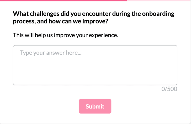
5. Onboarding feedback email
Onboarding feedback emails include surveys asking users to rate their experience. They help us gather insights, spot friction points, and improve the onboarding experience over time.
A successful feedback email should include:
- A brief, conversational intro that frames the question.
- A survey or rating scale question.
- Space for open-ended feedback.
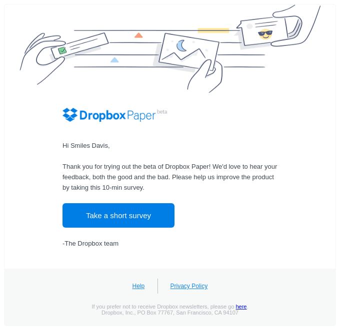
Always consider whether you want to send an onboarding feedback survey through email or in-app. If most of your onboarding happens via email or is asynchronous (i.e., when users explore on their own), then email is the better channel. Take this short email from Dropbox as an example:
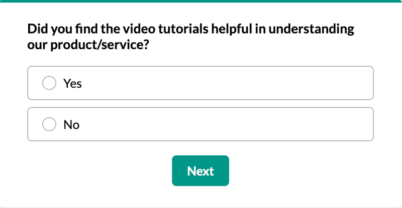
But if your onboarding is happening mainly in-app, consider collecting feedback where your users are. You can use one of our templates, like this one:
Onboarding email best practices
An onboarding email is only one point in the onboarding process. Let’s go over the best practices we follow when creating onboarding flows:
1. Personalize the onboarding email experience and automate sequences based on behavioral triggers
I’ve already mentioned that personalization is what makes a great onboarding email. But what does this mean in practice?
A personalized onboarding should accomplish the following:
- Increase activation by showing users the features most relevant to their use case.
- Reduce friction by meeting users at their current stage.
- Build trust by showing that you understand the users’ needs.
To do this, we segment users based on JTBDs, in-app behavior, and custom events. Then we use these conditions to create a personalized email. For example:
- If a part of your audience is marketing experts, include a tutorial on how to use your product with marketing templates.
- Send a targeted “invite your team” email if the user has installed an integration but hasn’t added collaborators.
- Trigger a reminder email if a user starts onboarding but doesn’t complete their first task within 24 hours.
2. Make emails part of an omnichannel onboarding strategy
The email strategy should align and expand on in-app touchpoints, rather than acting as a separate onboarding flow.
In our case, if a Userpilot user dismisses our welcome modal without installing the Chrome extension, we send a follow-up email that reminds them to install the extension and create the first flow.

You can also send follow-up onboarding emails to:
- Nudge the users to revisit a core feature they didn’t activate and trigger an interactive walkthrough when they click through.
- Share a video tutorial for a key feature to explain more advanced use cases.
- Explain secondary features if the user ignores the corresponding in-app hotspots.
3. Ensure your onboarding email sequence fits your product
There’s no one-size-fits-all template for onboarding emails.
The length, frequency, tone, and content of an onboarding sequence should match the product’s complexity, the users’ goals, and the path that leads to an ‘Aha!’ moment. In other words, your onboarding email campaign should fit the shape of your product’s learning curve.
Let’s take the Baremetrics’ onboarding email as an example.

Even though it offered an onboarding guide to get started, Baremetrics is aware that self-serve onboarding is not enough for their robust product. Thus, they also provided a dedicated account manager to personally walk me through the product and show me the best way to use it in my role.
Thankfully, you don’t have to know what kind of onboarding is best for your business before starting. Test different sequences and measure results until you figure out what works.
4. Monitor, test, and tweak
No matter how well-thought-out our onboarding emails are, we can’t know what works until we measure and iterate.
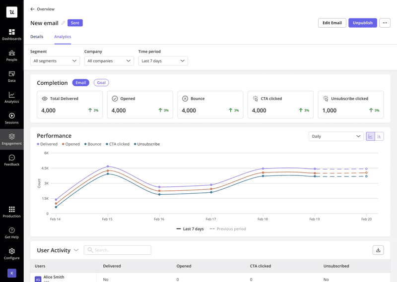
To do this, we use email analytics dashboard to track engagement metrics such as:
- Delivery and open rates per email.
- Bounce rates.
- Clicks on individual CTAs.
- Unsubscribes.
- Performance across different user segments.
We also ask for feedback at the end of onboarding, either through in-app surveys after the checklist is completed or via one of the final emails in the email sequence.
FAQ
What is a user onboarding email?
A user onboarding email is a message sent to new customers to help them get started with your product. It’s designed to guide them through their first steps, highlight product value, and encourage activation.
What are the benefits of user onboarding emails?
The most impactful benefits of an onboarding email include:
- Better user activation. Onboarding emails can clearly outline the value of your product.
- Increased customer retention. Activated users are more likely to stay with your product.
- Long-term engagement. Emails help introduce more use cases of the product than just the most typical user path, encouraging customers to take advantage of more features and turning them into habitual users.
- Positive branding. A good onboarding experience builds a strong brand image and increases customer loyalty.
What is the difference between a welcome email and an onboarding email?
A welcome email is a type of onboarding email. It’s the first message users receive after signing up, and its primary goal is to greet the user and set expectations.
An onboarding email, on the other hand, is any email in the sequence that helps guide users through learning and using the product.
About the author