What is Pendo? A Detailed Overview of Pendo Features, Use Cases, and Pricing

The information in this article has been reviewed and is accurate as of July 2025.
If you work on a product team and improving engagement or retention metrics is part of your role, chances are you’ve come across Pendo, one of the biggest names in the digital adoption space. But what is Pendo, exactly? Beyond the marketing buzzwords, what does it actually do, and more importantly, does it deserve a place in your tech stack?
In this post, I’ll provide a detailed review of Pendo, including its core features, pricing, pros, and cons, so you can determine whether it’s the right fit for your team.
What is Pendo.io?
Pendo is a software experience management platform that enables companies to understand and optimize how users interact with their software products.
It combines product analytics, feedback collection, and in-app guidance into a single, no-code platform, empowering non-technical teams to take complete control over user experiences.
Pendo serves three main markets:
- High-growth SaaS and software vendors (50 – 500 employees) pursuing product-led expansion.
- Enterprise and large mid-market (500 – 5,000+ employees) with complex product portfolios and multiple business units.
- Digital transformation leaders in industries like financial services, healthcare, and government services want to drive internal adoption and team innovation.
What is Pendo used for? A look into its main personas and use cases
Pendo is used by cross-functional teams of product managers, marketers, UX designers, customer success managers, and digital transformation leaders to analyze and improve user experience.
If you are curious how exactly each team is using Pendo, check out this detailed comparison table I made:
| User persona | How they use Pendo |
|---|---|
| Product managers | – Track feature adoption and identify what’s working (or not) – Prioritize the roadmap using real usage data and user feedback – Analyze the impact of product changes on retention |
| Product marketers | – Target specific user segments with tailored in-app marketing campaigns (e.g., webinars, special discounts, etc.) – Sync usage data with CRM for better lead scoring – Nudge users towards contextual upsells or cross-sells |
| UX designers | – Analyze user paths and drop-offs to optimize user flows – Measure how users interact with new design changes – Recruit participants for usability tests |
| Customer success managers | – Automate personalized onboarding for different user types – Monitor usage to identify at-risk accounts and re-engage them – Offer in-app help to reduce support tickets |
| IT and HR teams | – Segment employees by role, department, or experience level to deliver customized training – Gather employee feedback to improve internal systems – Ensure compliance by tracking usage of mandatory tools or resources |
Pendo platform is organized into three core modules: Analyze, Assess, and Act. These modules group features that help teams listen to users, learn from data, and take targeted actions to drive product success.
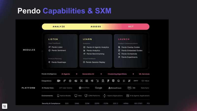
Pendo features for product analytics
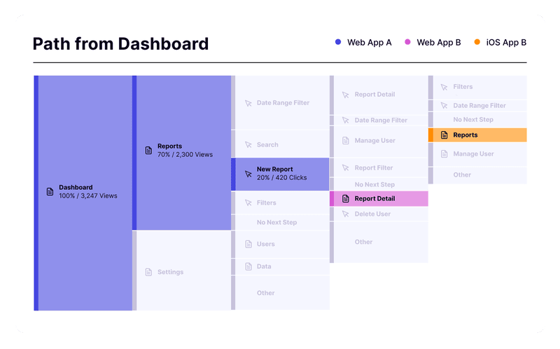
Pendo was built with analytics at its core. I have to confess, Pendo Analytics has been a gold standard in the digital adoption space.With Pendo’s comprehensive analytics features, you can uncover behaviors, patterns, and context behind every user action and make data-driven decisions with confidence.
Now let’s go over its key features in more detail:
- Event tracking: Automatically captures user interactions like clicks, pageviews, and text inputs, eliminating the need for manual event tagging and enabling retroactive analysis.
- Pendo user paths analysis, funnels, and retention cohort reports: Pinpoint where users drop off, understand their actual navigation patterns, and track what drives long-term engagement, allowing you to remove bottlenecks, uncover hidden user journeys, and focus on what truly boosts retention.
- Custom analytics dashboards: Get real-time visibility into key metrics like monthly active users, feature adoption rates, and user retention. You can fully customize them with drag-and-drop widgets to focus on what matters to your team.
- Product engagement score (PES): This is Pendo’s own metric that combines adoption, stickiness, and growth into one score that gives you a quick read on overall product health without digging through multiple reports.
- Pendo session replays: Observe exactly how users navigate your app with video-like recordings to understand the “why” behind user behavior.
- Heatmaps and clickmaps: See where users click, scroll, and spend time on your interface, highlighting usage patterns you might miss in raw data.
- Data export and integrations: Stream raw data into Snowflake, Redshift, BigQuery, or BI tools and create real-time data pipelines for advanced analytics workflows.
Pendo features for user engagement
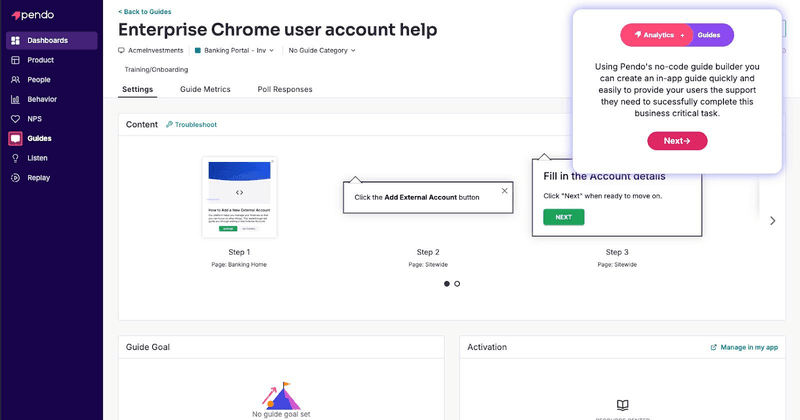
Pendo Guides equips product teams with powerful tools to deliver contextual omnichannel user engagement flows across web, mobile, and email.
Here’s a breakdown of its key features and how they help:
- UI patterns: Choose from a variety of in-app messages like modals, tooltips, banners, and onboarding checklists to drive feature adoption and provide helpful tips throughout the user journey.
- Visual design studio: Use a drag‑and‑drop editor that makes creating, styling, and launching in-app experiences super easy; no developer required.
- AI assistant: Use Google’s Vertex LLM to instantly generate multi-step in-app guides from a simple prompt, starting URL, and tone preferences.
- Multi-step logic and personalization: Set up dynamic, step‑by‑step flows that change based on user behavior to keep guidance relevant.
- In-app resource center: Create a self-serve hub within your product where users can easily access documentation, video tutorials, trigger interactive walkthroughs, or contact chat support.
- Pendo mobile: Deliver consistent, helpful in-app guides to mobile users with fully native SDKs for iOS and Android.
- Email creation: Build and send behavior‑triggered emails, keeping users engaged even when they’re away from the app.
Pendo features for feedback collection and sentiment analysis
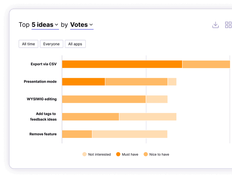
Pendo combines surveys, user sentiment analysis, and roadmap planning to help teams gather user insights and prioritize what matters most to them. But these features are split across separate modules or sold individually, making it challenging to take advantage of this unified feedback system.
Let’s have a closer look at it:
- Pendo polls and surveys: Launch targeted surveys directly within your product to gather user feedback. Although I should warn you that polls are embedded into guides, so they may lack advanced survey features found in dedicated survey platforms, like question branching logic or customization. (Part of the Pendo Guides module).
- Pendo NPS: Collect and analyze NPS scores to understand what drives customer loyalty or dissatisfaction. (Part of Pendo Feedback).
- AI-powered sentiment analysis: Use AI-powered tagging and trend detection to group qualitative feedback into themes to spot recurring issues, surface emerging needs, and streamline decision-making. (Part of Pendo Feedback).
- Pendo roadmaps: Centralize feature requests and let users submit ideas directly from your app. Users can vote on requests, helping your team surface high-impact items. You can then link customer feedback directly to product initiatives and share your data-driven roadmap with internal stakeholders. (Part of Pendo Listen).
Pendo features for employee productivity
You can also use Pendo on top of internal applications to see how employees are interacting with your company tools.
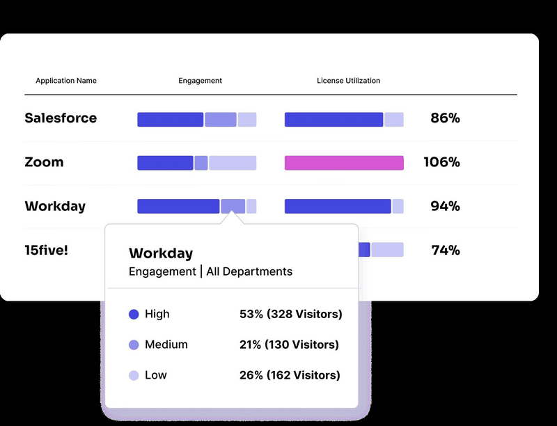
- Step-by-step in-app walkthroughs: For training employees on tools like Salesforce or Workday.
- SaaS portfolio insights: Gain visibility into app usage data and license activity to reduce software waste and ensure tool adoption.
- Process analytics tools: Track how employees navigate workflows across apps to uncover bottlenecks and improve operational efficiency.
How much does the Pendo app cost?
Pendo’s pricing can be quite confusing. The company doesn’t disclose pricing publicly; you’ll need to contact sales for a quote. Your cost depends on a few core variables: how many MAUs you have and the features you want to include.
But to give you a ballpark figure, according to Vendr, a SaaS negotiating company, Pendo pricing ranges $15,000 to $142,476 annually, with the median being $48,300.
Let’s now explore its pricing plans in more detail.
Pendo has a free version for up to 500 MAUs that includes basic analytics and in-app guidance features. But this plan serves primarily as a trial mechanism rather than a long-term solution.
Other than that, Pendo offers four paid plans: Base, Core, Pulse, and Ultimate. You can check out the summary of these plans in the image below:
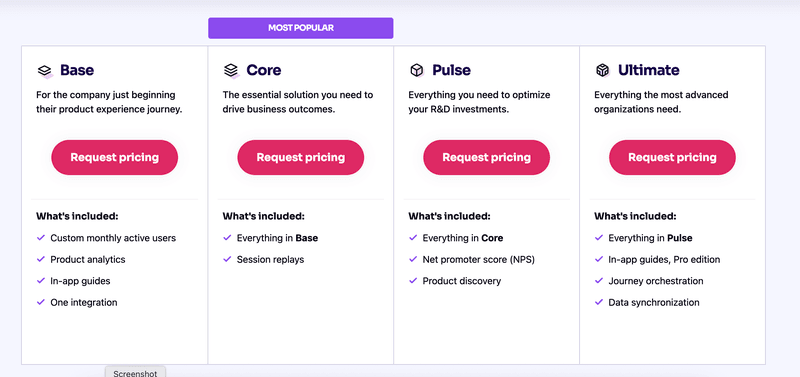
Except for the free plan, all pricing tiers come with one free integration. Additional integrations are available as add-ons.
All Pendo plans come with limited functionality by default, with many juicy features locked and sold as add-ons on top of the plan. For example, key features like AI-powered localization and sentiment analysis (via Pendo Listen) are only included in its highest-paid Ultimate plan. If you buy lower-tier plans, these features need to be purchased separately.
As you can tell, Pendo’s pricing model can be challenging to navigate and can become expensive quickly. So that raises the question: Is Pendo worth it, or do I need a Pendo alternative?
Is Pendo software worth the investment? Weighing pros and cons
I went through dozens of real user reviews and put together this quick list of pros and cons to help you decide if Pendo is the right fit for you.
| ✅ Advantages of Pendo | ❌ Disadvantages of Pendo |
| Unified SXM Platform: Combines product analytics, in-app guidance, feedback, roadmap and employee onboarding in one platform | High Complexity and Steep Learning Curve: Complex setup (metadata, tagging, segments) and complex UI that can be overwhelming for new users (users often mentioning that they just “don’t know how to do it”). Extensive feature set may lead to underutilization of the product’s capabilities. |
| Comprehensive Analytics: Provides deep analytics capabilities, capturing historical data without pre-implementation | Fragmented Analytics UI: Reporting split across Data Explorer, Guides, Listen and Dashboards, can slow time to insight. Also, Surveys and NPS live in different modules. |
| Enterprise-Grade Ecosystem: 70 + native integrations across CRM, BI, ITSM and analytics tools: ideal for complex stacks. | In-app Guides Limitations: A lot of basic features are missing (Spotlights, Mobile Push Notifications) or are locked in Guides Pro add-on. AI features like automatic translation, copy writing requires another add-on. + doesn’t support RTL languages translation completely |
| AI-Driven Insights: Proactively surfaces friction points and growth opportunities without manual analysis. | Expensive and Non-Transparent Pricing: Gets very pricey, very fast. Opaque MAU-based pricing with undisclosed add-on fees and typical 5–10% (and sometimes up to 20%) uplifts at renewal, making total costs unpredictable and often substantially higher than initial quotes. Requires multi-year commitments to lock in pricing caps. |
And here are some reviews backing up my research:
Because the tool is so robust, it is a full-time job for someone. It requires a lot of time and effort to take advantage of all the pages and features per product, and we found that we needed to leverage their professional services team for assistance in this regard. The pricing model could be cost prohibitive for some organizations, especially if their products receive lots of visitors or they require many application keys. — Chris P., G2 review
“Editing guide templates can be frustrating due to the lengthy steps it takes to edit one. I’m also worried that they may be releasing too many AI features that will potentially lead to feature bloat and a declining user experience (also to mention increased pricing as a consideration here.. “more features” (even bad ones)! = “we can raise our pricing!”).” — Brittany N., G2 review
The UI can be overwhelming at times, especially for new users. It takes a bit of time to get comfortable with all the features. Also, the pricing can be steep for smaller teams or early-stage products, and some reporting options could be more flexible. — Ranjan M, G2 review
We’ve been using Pendo for the last 6 years and I just love the overall product. It does everything it claims to do, and more. My favorite is the retroactive analytics. Forget to tag something? Tag it now and Pendo will go back to when the snippet was first added to the page. — Verified user in computer science, G2 review
Userpilot: A flexible Pendo alternative for product teams
If you want the power of Pendo without the complexity, steep learning curve, or high price tag, Userpilot is an excellent alternative.
Like Pendo, it is an all-in-one platform combining omnichannel engagement, advanced analytics, and user feedback. (While employee engagement features aren’t available yet, they’re on our roadmap.) The main difference is, we’ve focused obsessively on making our intuitive and scalable, allowing you to get more value for your money.
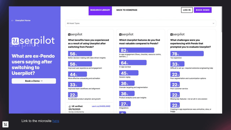
We have dozens of former Pendo users who can back up our words. Here are some interesting insights we’ve extracted from our conversations with them:
- 82% told us they found better in-app engagement features with Userpilot (more on this later!).
- 78% said cost was their primary challenge with Pendo.
- 64% found more value with our in-app survey feature than with Pendo’s.
Take Shelterluv, an animal shelter software company, for example. While they initially invested in Pendo to drive adoption, its complexity became a bottleneck and slowed their team down.
Matthew, the Senior Customer Solutions Manager at Shelterluv, put it bluntly:
“One of the biggest feedback the team had about Pendo was like, we just don’t know how to use it. And it’s hard to figure out.”
So, they decided to transition to Userpilot. The migration was quick and seamless. Right away, they were able to streamline customer communication and significantly reduce support tickets.
Cuvama had a similar struggle with Pendo’s difficult configuration and clunky interface. Since the tool was complex, it felt like they weren’t getting good value for money. But that changed once they transitioned to Userpilot.
Here’s how Leyre Iniguez, Customer Experience Lead at Cuvama, described their experience to us:
“Pendo was complicated to setup and maintain. With Pendo, I could not do, or at least I didn’t know how to easily do, specific flows for specific companies. Because Userpilot is easier to configure and to work with, I’m getting much more value than with Pendo.”
How much does Userpilot cost?
At Userpilot, we believe pricing should be transparent and straightforward. Our tiered system makes it easy to understand what exactly you are getting, with no hidden costs and locked features. Not to mention Userpiot is scalable and seamlessly grows with your product.
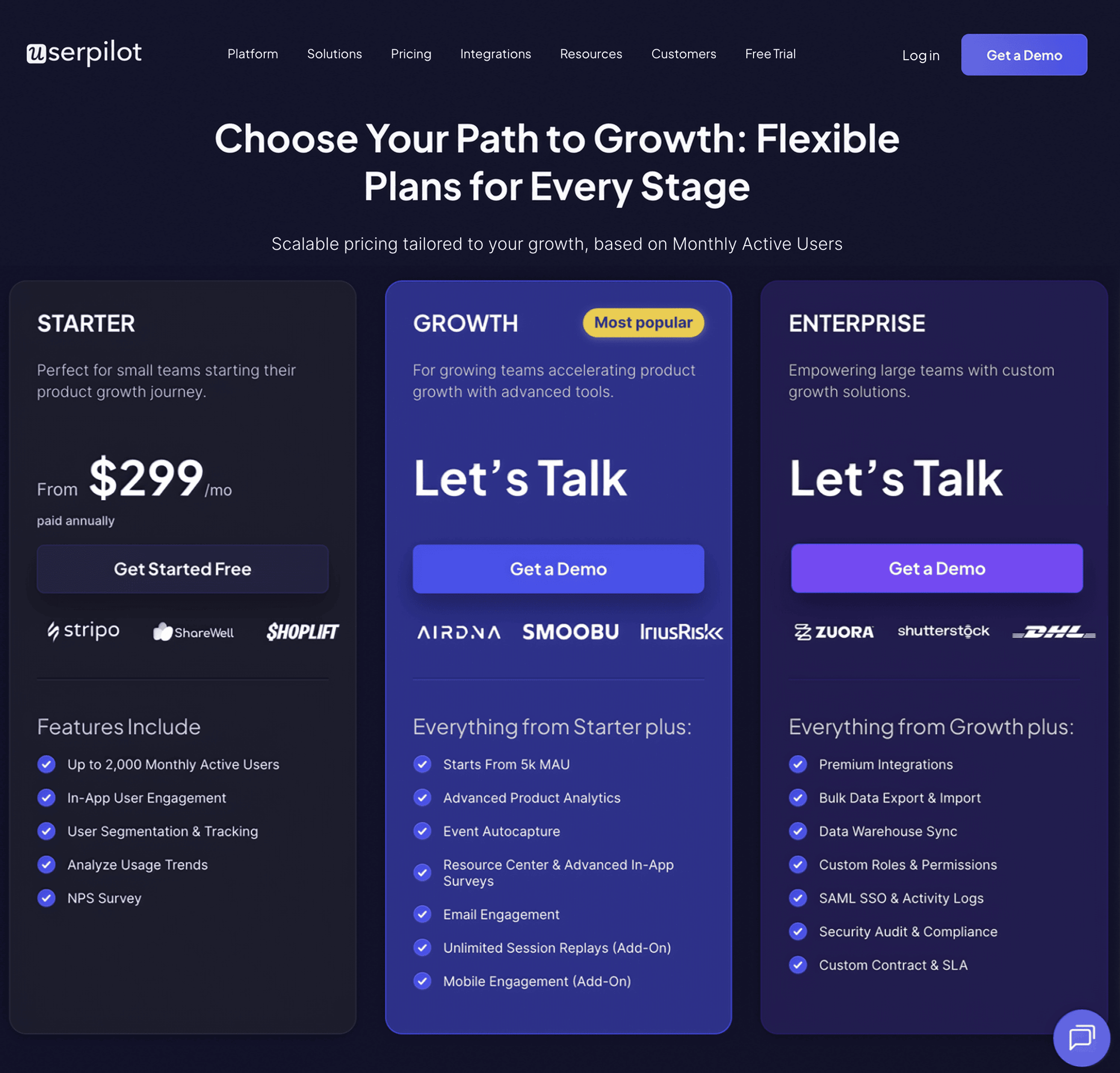
Userpilot offers three pricing plans based on monthly active users (MAUs):
- Starter: This entry plan begins at $299/month (billed annually) for up to 2,000 MAUs. It includes in-app user engagement features, segmentation, trend analysis, NPS surveys, and essential product analytics. This plan is ideal for small and mid-market SaaS teams getting started.
- Growth: This is a custom plan with advanced analytics, event autocapture, resource centers, in-app surveys, email engagement, and session replay. It’s best for growing teams that need deeper insights and scalability.
- Enterprise: Tailored for large organizations, this plan includes all Growth features along with bulk data handling, premium integrations, SOC 2 Type 2 compliance, custom roles and permissions, and enterprise-level support.
How does Userpilot compare to Pendo in terms of product analytics?
Both platforms offer strong foundational product analytics features like autocapture, funnels, paths, custom dashboards, and session replays, but differ in complexity and flexibility.
While Pendo has a wider feature set, it’s also harder to implement and maintain. For example, it offers extra features like AI-powered insights, heatmaps, and a native Product Engagement Score dashboard, but you’ll pay for that with complexity. Segmentation requires manual tagging and extra setup, and data refreshes hourly.
Userpilot is built for speed and simplicity: it gives you real-time dashboards, instant access to all your custom properties for filtering, and a no-code setup that anyone can use. You don’t need to touch a snippet or tag anything manually to start segmenting.
| Feature | Pendo | Userpilot |
| Trends, Funnels, Paths, Retention reports | ✅ | ✅ |
| Event tracking | ✅ Autocapture + manual event instrumentation with Suggested Features auto-tagging. | ✅ Autocapture of clicks, hovers & form submissions; manual Visual Labeler for naming events. |
| Segmentation and Filtering | ❌ Requires sending custom metadata via visitor/account objects in your snippet, manual tagging of features/pages, then applying segments or Data Explorer filters. | ✅ All your custom properties (plan tier, sign-up date, any event) are instantly available as filters in every dashboard—no snippet changes, no manual tagging, and no separate segment setup required |
| Heatmaps and Clickmaps | ✅ | ❌ |
| AI-Powered Insights | ✅ | ❌ |
| Product Engagement Score | ✅ Composite metric measuring adoption, stickiness & feature growth. | ❌ |
| Data Latency | ❌ Hourly UI data refresh (bulk calculations processed ~15 min after each hour) | ✅ Real-time analytics dashboards update immediately upon event capture. |
| Complexity | ❌ Steep learning curve and advanced configurations across multiple modules (Data Explorer, Listen) can require technical expertise. | ✅ Straightforward, no-code drag-and-drop dashboards and inline event labeling; minimal training required. |
| Session replays | ✅ Notes, comments, tagging ✅ Flag issues directly to Jira ❌ Steep setup: Admin setup (agent upgrade, CSP changes, snippet config) | ✅ Notes, comments, tagging ❌ No Jira integration ✅ Intuitive UI with built-in filtering & playlists; minimal configuration & training |
| Core Integrations | ✅ Salesforce, Hubspot, Segment 2-way ❌ No direct connectors with Amplitude/ Heap/ Mixpanel ✅ Okta, Jira | ✅ Salesforce, Hubspot, Segment 2-way ✅ Direct integration with Amplitude/ Heap/ Mixpanel ❌ Okta, Jira |
How does Userpilot compare to Pendo in terms of user feedback?
Userpilot and Pendo take very different approaches to user feedback. Userpilot offers integrated survey tools with over 30 pre-built templates, logic branching, and survey analytics dashboards. You can see exactly what a user did in your app before filling out a survey without any additional costs.
In contrast, Pendo’s feedback features are fragmented and often locked behind costly add-ons. It doesn’t support bespoke surveys; instead, polls are embedded within in-app Guides, limited to just a couple of templates and a less intuitive creation process. However, Pendo does provide extra product discovery features and roadmapping tools that help centralize and act on feedback, though these come with premium pricing and complexity.
| Feature | Pendo | Userpilot |
| NPS | ❌ Only included in Pulse & Ultimate plans or as an add-on, Free plan has NPS but are Pendo-branded ✅ AI Insights | ✅ Unlimited NPS included in Starter plan ❌ no AI |
| Polls and Surveys | ❌ Part of Guides (surveys & polls embedded in in-app Guides) ❌ Only 2 templates and the polls creation is less intuitive | ✅ Dedicated survey modal/page for all feedback ✅ 30+ pre-built templates and easy customization |
| Sentiment, Validation and Product Roadmap | ✅ Automated theme detection & trend alerts ✅ Idea validation = Only with Listen (Pulse & Ultimate; $-add-on for Base & Core ✅ Product roadmap | ❌ Promoter/passive grouping only ❌ Idea validation ❌ Product roadmap |
| Survey analytics | ❌ Advanced analytics and AI Listen hub only in Pulse & Ultimate; $-add-on for Base & Core ❌ Dashboards that link survey answers to user actions require purchasing Listen; otherwise you must export data and join manually. | ✅ Built-in analysis without extra add-ons or integrations ✅ Survey responses automatically linked to clicks, hovers, and form submissions in the dashboard. No extra modules or manual exports needed. |
How does Userpilot compare to Pendo in terms of user engagement?
This is where I can confidently say Userpilot wins.
Userpilot and Pendo both support a range of in-app experiences like modals, banners, interactive walkthroughs, and slideouts.
But Userpilot offers greater flexibility out of the box, with features like hotspots, unlimited customizable checklists, and branched flows. Also, Userpilot’s resource center is far more robust: it supports inline video playback, full search across both in-app content and external knowledge bases, and provides analytics on search terms. In contrast, Pendo restricts many of these capabilities to its highest-tier plans, and checklists are only available within its Resource Center or Task Lists, with limited customization. Also, only Userpilot mobile out of the two includes push notifications.
Localization is also stronger in Userpilot, which supports automatic translation for right-to-left (RTL) languages like Arabic and Hebrew, something Pendo’s auto-translation skips.
Pendo does edge ahead with more advanced AI features, including AI-generated guides and writing assistance, while Userpilot only offers an AI writer.
| Feature | Pendo | Userpilot |
| Guide types | ✅ Modals, Banners, Polls, Interactive Walkthroughs, Slideouts, Badges ❌ Hotspots ❌ Standalone checklists – only part of Resource Centre or as a Task list in Guides with Guides pro (Ultimate plan) | ✅ Modals, Banners, Polls, Interactive Walkthroughs, Slideouts, Badges ✅ Hotspots ✅ Unlimited and highly customizable checklists |
| Resource Centre | ❌ Limited video support ❌ No general search functionality for Resource Center (you can only enable Search for individual module) ❌ No Search Term Analytics ❌ Only 1 RC per plan included (unless on Ultimate plan) | ✅ Linked videos play directly inside app ✅ Searches both the Resource Center content and other external knowledge bases ✅ Search Term Analytics ✅ Unlimited RC from Growth plan |
| Advanced targeting, Event-based triggering, Branching and Throttling | ❌ Conditional branching (skip-ineligible steps, metadata-based flows) via Guide Logic in Guides Pro (in Ultimate plan or as an add-on) | ✅ Native branched flows (linear & “choose-your-own-adventure”) with if-then logic in the builder, without add-on |
| Customization | ❌ Basic templates – most guides built from scratch ❌ Designer Custom Code (CSS & JS) only with Guides Pro | ✅ Rich library of pre-built, industry-specific flow templates ✅ Full customization availability, intuitive settings |
| Localization | ❌ Auto-translation omits RTL languages like Arabic and Hebrew | ✅ Automatic translation of RTL languages |
| AI | ✅ AI Guides creation ✅ AI writing assistant | ❌ Basic AI writing assistant only |
| Complexity | ❌ Navigation spreads across several consoles (Design Studio, Segments, Analytics). Steep learning curve. | ✅ Unified, in-context editor with live preview and inline help, all in a single “Flows” interface. Very intuitive. |
| Mobile support | ✅ iOS, Android, Xamarin, MAUI, React Native, Expo, Flutter, and Swift UI ✅ Carousels and slideouts ❌ Push Notifications | ✅ iOs and Android, React Native, Flutter, Ionic, Capacitor (coming soon) ✅ Carousels and slideouts ✅ Push Notifications |
DISCLAIMER: Userpilot strives to provide accurate information to help businesses determine the best solution for their particular needs. Due to the dynamic nature of the industry, the features offered by Userpilot and others often change over time. The statements made in this article are accurate to the best of Userpilot’s knowledge as of its publication/most recent update on July 17, 2025.
FAQ
What does Pendo do?
Pendo is a product experience platform that helps companies understand how users interact with their software, collect customer feedback, and guide users with in-app messaging. It enables teams to drive business outcomes, improve user onboarding, engagement, and product adoption without relying heavily on engineering resources.
Is Pendo like Google Analytics?
Pendo is similar to Google Analytics in that both track user behavior, but they serve different purposes and audiences.
Google Analytics focuses on website traffic, marketing metrics, and user acquisition across web properties. In contrast, Pendo tracks user behaviour across web and mobile apps. Also, Pendo goes beyond analytics by offering in-app guides and product feedback tools, making it more of a product management tool than a pure product analytics platform.
Do I need a developer to use Pendo?
While Pendo is designed to be low-code after setup, some developer support is typically needed. You need a developer to install Pendo’s JavaScript snippet (for web apps) or SDK (for mobile apps) into your product. This is a one-time setup that enables Pendo to start tracking user behavior and displaying in-app content.
After installation, most day-to-day tasks, like creating in-app guides, can be done without a developer. However, you may still need a developer for custom event tagging or identifying users and passing metadata (e.g., user role, subscription level) to Pendo for segmentation.




![What are Release Notes? Definition, Best Practices & Examples [+ Release Note Template] cover](https://blog-static.userpilot.com/blog/wp-content/uploads/2026/02/what-are-release-notes-definition-best-practices-examples-release-note-template_1b727da8d60969c39acdb09f617eb616_2000-1024x670.png)