Pendo vs Appcues vs Product Fruits for Customer Satisfaction21 min read
Get The Insights!
The fastest way to learn about Product Growth, Management & Trends.
Pendo vs Appcues vs Product Fruits – quick summary
- Customer satisfaction is a measurement that shows how well your product meets your user’s expectations. It hints whether they’ll stay around as loyal customers and recommend your product to others.
Let’s explore how Pendo, Appcues, and Product Fruits compare when it comes to customer satisfaction.
- Pendo is a product adoption platform that lets teams monitor product usage, analyze user behavior, and publish in-app guides. The no-code solution focuses on increasing user engagement and driving feature discovery.
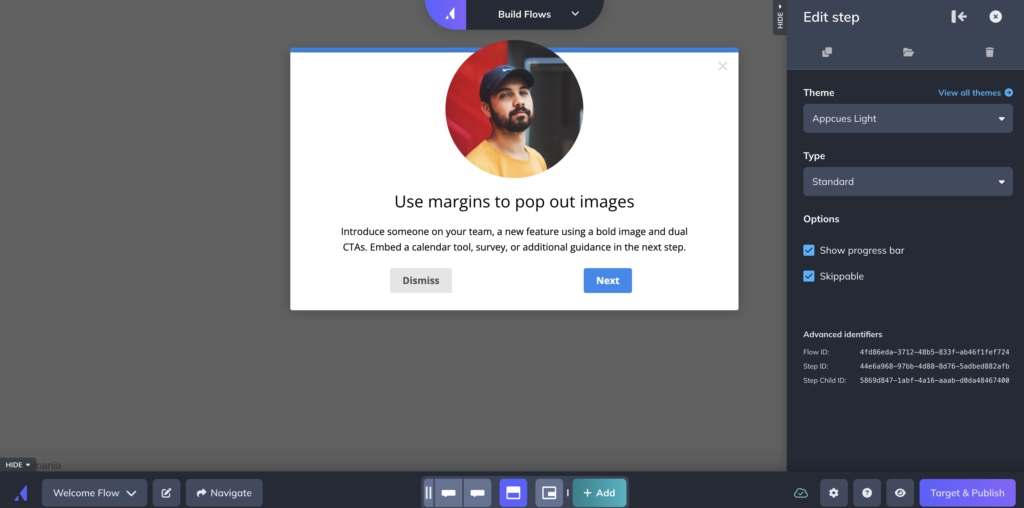
- Appcues is a robust product adoption and user onboarding platform for web and mobile apps. It enables product teams to create, implement, and test personalized in-app onboarding experiences. The platform also helps you announce new product features and collect customer feedback.
- Product Fruits is a platform designed to help you tackle issues related to software adoption. With a focus on seamless customer onboarding, this tool allows companies to create engaging in-app journeys.
- Userpilot is a product growth platform that drives user activation, feature adoption, and expansion revenue. It also helps product teams collect user feedback, streamline onboarding, and gather actionable insights from analytics.
- If you’re looking for a better option for customer satisfaction, Userpilot exceeds both functionality and value for money compared to other tools on the list. Get a Userpilot demo for customer satisfaction and drive your product growth code-free.
What is customer satisfaction
Customer satisfaction is a measurement that shows how well your product meets your user’s expectations. It hints whether they’ll stay around as loyal customers and recommend your product to others.
Pendo for customer satisfaction
Customer experience is the sum of touchpoints across your customer support, customer success, marketing, and sales teams but the product experience also plays a key role. Pendo lets you survey, poll, and collect feedback from users on the customer experience through multiple features.
Here are the Pendo features that can be used to gather customer experience insights:
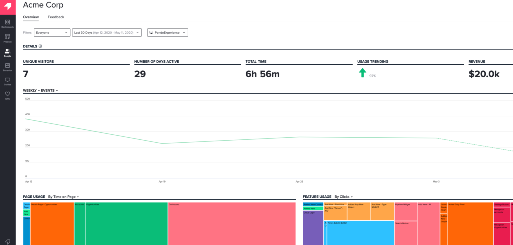
- Polling Features: Using Pendo to poll specific segments can guide your customer experience optimization (CXO) efforts. You’ll also be able to add polling widgets to your home dashboard so you can view responses, response rates, and other poll-related data points.
- NPS Surveys: Pendo NPS surveys can collect both quantitative and qualitative data by combining rating scales with follow-up (open-ended) questions. You can view all NPS survey analytics from the NPS section on your sidebar or the NPS widget on your home dashboard. Note: All NPS surveys have Pendo branding on them unless you upgrade to the Starter plan, which costs $7,000/year.
- Segmentation: Pendo segmentation settings like you create different flows, guides, and onboarding journeys for each user. You can segment users based on the type of device they’re on, what operating system it’s running on, which browser they’re using, or when they joined.
- Path Analytics: Pendo’s path analytics dashboard shows you the paths users take to get to a specific page or when coming from a specific page. These insights help you identify the areas where you need to reduce friction and add contextual UI patterns.
- Feedback Module: You can add a feedback module to your in-app resource center in two clicks to get direct insights from users on how to improve the customer experience.
Pendo pros
Let’s take a look at some of the benefits of using Pendo:
- No-Code: Pendo lets you create surveys, in-app guides, and track metrics without needing to write your own code, which saves a lot of time (while making product experiments or split-testing a lot easier).
- Custom Themes: Pendo’s themes let you create multiple palettes and ensure that any in-app materials published align with your existing brand palette (however, you can only create/customize themes after you’ve installed the Pendo snippet).
- Flexible Dashboards: Pendo has plenty of widgets that you can add to your dashboard, including feature adoption, net promoter score, poll results, guide engagement, product stickiness, and MAUs — so you always have your most important metrics within reach.
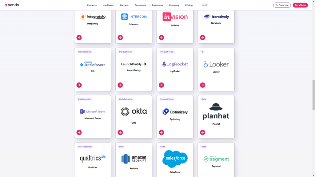
- Integrations: Pendo has 50 different integrations to choose from including popular tools like Intercom, Jira, Okta, and HubSpot. Unfortunately, only four of these — Salesforce, Segment, Workato, and Zendesk — are two-way integrations that can share data both ways.
- Multi-Platform Analytics: Because Pendo is compatible with mobile applications, you’ll be able to track product analytics for both web apps and mobile apps. This gives you a more holistic view of how users (or specific segments) use your product on different platforms. Note: You’ll need to upgrade to Pendo Portfolio to add more than one product to your account.
Pendo cons
While Pendo certainly has quite a few benefits that make it an appealing solution, there are also a few notable drawbacks that you should be aware of before you choose the platform as your product adoption tool:
- Pricing Jumps: While Pendo does offer a free version, it has a limit of 500 MAUs. Upon reaching the MAU limit, you’ll need to upgrade to continue using most of Pendo’s features (and paid plans tend to cost thousands of dollars per month).
- Locked Features: Key features like the data explorer, resource center, and product engagement score are locked behind the Growth or Portfolio plan.
- Data Lag: Pendo’s analytics dashboards only update once per hour. In some cases, this data lag could lead product teams to make the wrong decisions or draw false conclusions from outdated insights.
Pendo pricing
Pricing for most paid Pendo plans (except Starter) is only provided on a quote basis and there are no listed price ranges on the solution’s website. That said, certain reviews have stated that prices start at upwards of $20,000 per year for a single product and more than twice that for higher plans.
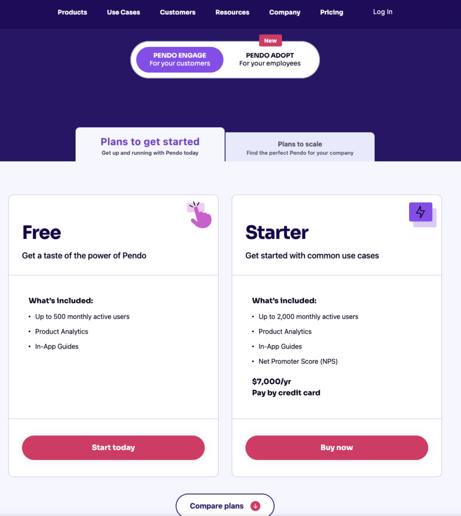
Pendo has three paid plans and one free version that is limited to 500 MAUs which makes it accessible to startups but difficult to scale in the long run.
Here are the differences between each Pendo plan:
- Pendo Free: The free version of Pendo can accommodate 500 MAUs and has features like native analytics dashboards, feature tagging, event tracking, segmentation, NPS surveys (with Pendo branding), analytics reports, and in-app guides.
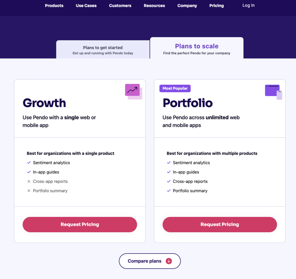
- Growth: Pendo’s Growth plan is designed to be used for a single web or mobile app but can accommodate a custom number of MAUs. It includes features like native analytics dashboards, in-app guides, NPS surveys and response tracking, and customer support.
- Starter: The Starter plan starts at $7,000 per year (or $2,000 per quarter) for 2,000 MAUs and is the cheapest upgrade option available for freemium users. Starter includes features like Product Areas, NPS surveys without Pendo branding, and (limited) NPS analytics. Note: You’ll need to upgrade to the Growth or Portfolio plan to get full NPS analytics.
- Portfolio: Pendo’s Portfolio plan is targeted towards customers who want to use the tool for multiple web and/or mobile apps. Features include guide experiment capabilities, cross-app executive dashboards, cross-app journey reporting, and access to product engagement scores.
Appcues for customer satisfaction
Appcues plays a key role in taking your product’s customer experience (CX) up a notch.
It helps enhance CX in the following ways:
- UI patterns like checklists, hotspots, modals, and tooltips let you create guided in-app tours and tutorials and simplify customer onboarding.
- A Launchpad lets users access Appcues onboarding flows from a notification dropdown within your product.
- NPS surveys help you collect customer feedback and improve your product. However, unlike Userpilot, Appcues only offers NPS surveys.
- Other features like user segmentation (for personalization) and event tracking also come in handy.
That said, Appcues alone can’t guarantee a flawless customer experience. It only covers the onboarding aspect of CX. You’ll need to focus on other aspects like customer support and relationship-building to improve the overall UX, and for those you need multiple types of user surveys, on-demand support (using a resource center) and proper analytics, which Appcues lack.
Appcues pros
As a first-comer in the no-code product adoption landscape, Appcues offers several valuable features. It’s suitable for mid-market SaaS businesses looking for a simple, easy-to-use tool that enhances user onboarding, retention, and the overall customer experience.
Let’s take a closer look at the benefits of Appcues:
- Intuitive UI and UX: Appcues offers a straightforward interface that’s easy to navigate and use. Users with non-technical backgrounds can design captivating in-app flows and onboarding journeys with its simple drag-and-drop builder. You can tailor user journeys with various UI patterns, from modals and hotspots to tooltips, slideouts, and banners.
- Simple setup: You can get started with Appcues in minutes by adding the SDK to your app’s source code or integrating Appcues with Segment or Google Tag Manager. Then, add a Chrome extension to launch the Appcues Builder in a few quick clicks and start creating in-app flows.
- Feedback options: Create Net Promoter Score (NPS) surveys to collect actionable user feedback. You can even check and analyze NPS analytics on your Appcues dashboard.
- Mobile onboarding: Besides web apps, you can use Appcues to create end-to-end experiences for mobile apps. It supports various mobile environments, including Native Android, Native iOS, React Native, Flutter, and Iconic.
- Extensive integrations: Appcues integrates with 20+ email automation, CRM, and analytics tools, including Heap, Zapier, HubSpot, Google Analytics, and Google Tag Manager. Many of these include two-way integrations.
Appcues cons
Appcues comes with a ton of useful features you’d expect from a leading product adoption platform, but it does have a few shortcomings.
Let’s look at a few drawbacks of Appcues:
- Poor element detection: The Appcues algorithm occasionally struggles to detect in-app elements, unlike some of its competitors like Userpilot. It’s particularly limiting when you want to add tooltips to individual options in a dropdown menu.
- Limited customization capabilities: While Appcues lets you customize pre-designed templates, you’re limited to basic options like font style, size, color, and padding. Advanced customization requires working with CSS code, which can be challenging for non-technical teams.
- Basic analytics: Appcues provides insights into product usage and customer behavior. However, you can’t access in-depth analytics without connecting to a third-party tool like Amplitude or Google Analytics.
- Limited survey options: Appcues lacks variety in feedback collection and survey options and doesn’t offer integrations with other platforms like Google Forms and Typeform. You can only build NPS surveys. This is in contrast to some of its competitors, like Userpilot, which offers an extensive library of customizable survey templates.
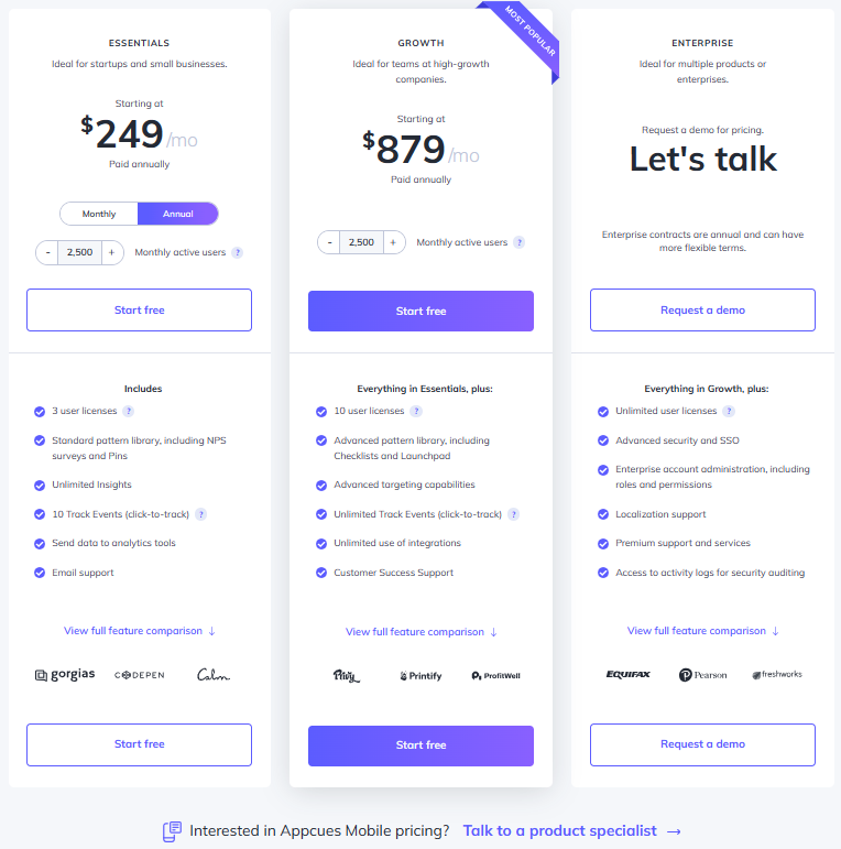
- Higher pricing: Starting at $249 per month, the Appcues Essential tier has several constraints, such as limited UI patterns and no custom CSS support. Moreover, localization support is only available in the Enterprise tier. If your app is multilingual, you’ll have to shell out a ton of money to make the most of Appcues.
- No live chat: While Appcues offers educational resources and a help center (Help Docs), customer support is limited to email and phone.
Appcues pricing
Pricing for Appcues starts at $249 per month, with the platform offering three distinct tiers – Essentials, Growth, and Enterprise.
The total cost can vary depending on the number of monthly active users (MAU). For instance, the Essential plan starts at $249 per month for 2500 MAU but jumps to $299 for 5000 MAU.
Here’s a detailed glimpse of the different pricing tiers:
- Essentials: It’s the basic tier that starts at $249 per month. It includes 3 user licenses and lets you add up to 5 audience segments. Some UI patterns, such as checklists, launchpads, and custom CSS support, aren’t available. Customer support is only available through email.
- Growth: This tier starts at $879 per month (for 2500 monthly active users) and includes 10 user licenses. You can target unlimited audience segments and use the full spectrum of UI patterns. Additionally, you can access the Premium Integrations package, which includes integrations with Slack, Salesforce, Marketo, and Zendesk.
- Enterprise: This is the most feature-packed tier and includes robust security controls like role-based access and activity logs. It’s also the only tier that comes with multi-account and localization support. Besides email and phone support, you also get a dedicated Customer Success Manager and Technical Implementation Manager. Pricing is available on request.
All three plans come with a 14-day free trial, where you can test unlimited flows and track up to 5 events. You can extend the trial by another 14 days by installing the Appcues SDK in your app. Additionally, you don’t need a credit card to sign up for the free trial.
Keep in mind that the above pricing plans are applicable to web apps. Pricing for Appcues Mobile is available on request.
It’s also worth noting that Appcues is pricier than some of the other product adoption tools available in the market, including Userpilot. For instance, Userpilot’s basic tier (Starter) lets you add up to 10 audience segments and includes the complete set of UI patterns.
Product Fruits for customer satisfaction
Customer experience is all about ensuring a smooth and hassle-free interaction when using the product or service.
Now, how exactly can Product Fruits ramp up your customer experience?
- Dashboard: This feature enables you to monitor user onboarding progress and critically evaluate your onboarding strategies’ effectiveness.
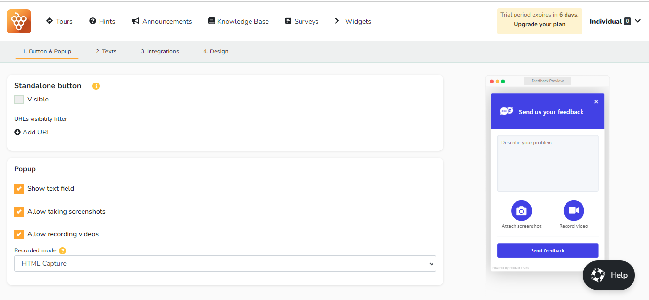
- Feedback Management: This is a systematic process that involves collecting, tracking, and analyzing customer feedback. Product Fruits does this by offering useful tools like the Adoption Meter and the Feedback Widget to gauge customer sentiments and identify potential issues. You can submit these issues in the form of images or videos. The platform also provides NPS Surveys to assess customer loyalty over time. These insights drive continuous improvements in products and services and enhance the overall customer experience.
- Knowledge Base: This is a collection of helpful information that users can access whenever they need help. You can quickly get to your knowledge base articles through the Life Ring Button or a Hint icon. Moreover, Product Fruits offers an easy-to-use WYSIWYG editor that makes creating content easy.
Product Fruits pros
Product Fruits offers many benefits with its easy-to-use, no-code platform. It is one of the good solutions for companies looking for affordable user onboarding, product adoption, and product analytics.
So, what does Product Fruits bring to the table? Let’s explore its promising pros:
- Guided Product Tours: It guides users to learn about your app through step-by-step tours for new features.
- Newsfeed: Enhance your users’ connectivity by sharing updates about your product. Additionally, you can set specific newsfeed items which will be displayed in the knowledge base.
- Feedback Through Screenshots and Videos: This feature allows users to send screenshots or videos directly within the app to provide feedback.
- Tooltips: These are brief hints added to different parts of the application to guide users and prevent confusion
- Life Ring Button: A comprehensive support hub that combines all guidance and support resources in one location. This allows users to conveniently access onboarding flows, support documents, and tutorials, no matter what page they’re on.
- Custom Events: Trigger actions based on what users do in your app for more personal interaction.
- Segmentation: Create unique experiences for different types of users and show tailored content to separate user groups.
- Analytics: Gain valuable insights into user behavior, identify improvement areas, and address pain points effectively.
- AI Writer: This feature instantly generates your onboarding copy. However, it is only available in higher-tier plans.
Product Fruits cons
While Product Fruits does have its merits, it’s not without its share of issues. Let’s see some potential drawbacks that might have you considering alternatives.
- Absence of A/B Testing: Product Fruits lacks A/B testing, a vital feature for refining your product tours based on user responses and data-backed insights.
- Basic Analytics: Product Fruits does not offer in-depth analytics as its competitors like Userpilot. This makes it difficult to evaluate user interaction and the success of your onboarding
- Insufficient Segmentation Options: The segmentation options here are only based on user attributes. This means you can’t highlight particular app functions or experiences based on a user’s past actions in your app, which can limit the customization of their experience.
- Missing Event-Based Triggering: The absence of real-time triggers may limit timely content delivery. This could affect the success of all in-app flows, such as product tours, tooltips, walkthroughs, modals, etc.
- Complex Tour Configuration: Configuring tours with specific conditions, especially when tuning CSS selectors, can be challenging and time-consuming.
- Limited Integrations: This tool links up with analytic tools, which is great. However, it doesn’t go beyond that. You won’t be able to bring in your resource center materials or link up your CRM unless you’re a Hubspot user.
Product Fruits pricing
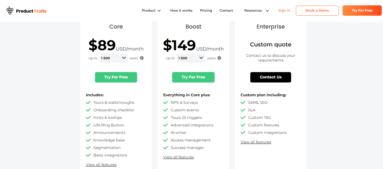
The platform offers two distinct plans. Each of these plans is tailored to accommodate the number of users you have. Here’s a detailed breakdown of each plan:
- Core: $89/month for 1,500 users. This package includes features like tours & walkthroughs, a knowledge base, and basic integrations. Notably, the onboarding checklist is limited to three items, and there’s also a Life Ring Button for support and announcements feature.
- Boost: $149/month for 1,500 users. This package contains everything in the Core plan, with added benefits such as custom event triggers, advanced integrations, and an AI writer. It also includes features like NPS & Surveys, and access management, ensuring a smoother user experience.
- Enterprise: This plan is custom-priced according to your needs. It’s meant for larger organizations requiring features like SAML SSO, custom terms & conditions, SLA, and bespoke features and integrations.
Core plan is reasonably priced but may not provide the depth of features that a growing company might require. Hence, the Boost plan offers more comprehensive user onboarding and engagement tools. The customizable Enterprise plan is a more appropriate choice for organizations with specific requirements.
You can easily subscribe to any pricing plan without a credit card. Plus, there’s a 14-day free trial on offer. Opting for the yearly plan can be cost-effective, saving $20 on any plan.
Better alternative to Pendo, Appcues, and Product Fruits
We have discussed Pendo, Appcues, and Product Fruits for customer satisfaction with their pros, cons, and pricing. Let’s take a look at a better alternative – Userpilot.
Userpilot for customer satisfaction
Userpilot gives you an eagle-eye view of the customer experience through user analytics, trend/funnel reports, and feedback collection through different types of surveys.
Here’s how you can use Userpilot to track and analyze customer experience insights:
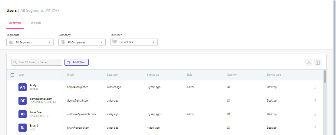
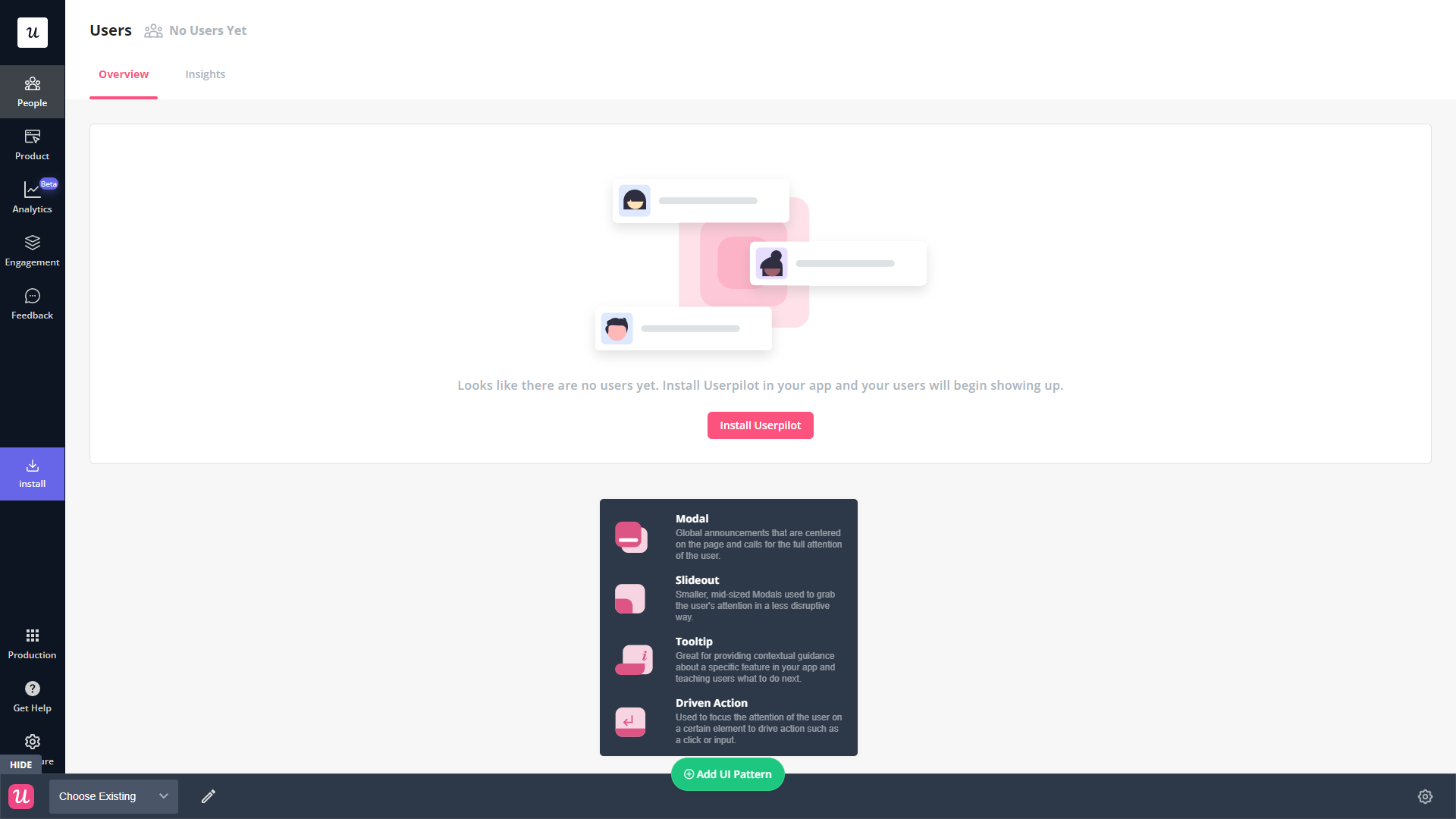
- User analytics: The users dashboard gives you an overview of all your users while letting you sort by segment, company, or when they were last seen. You can also export user data in bulk as a CSV or click on the Insights tab to see segment-specific insights for a given time period.
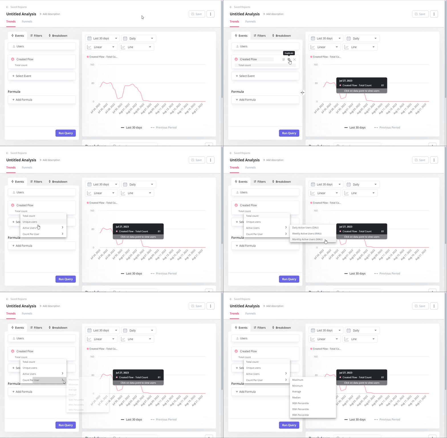
- Trends and funnels: Userpilot’s trends and funnels reports let you track certain events like a specific feature’s usage, add filters to narrow down the data, and then create a breakdown based on segmentation data or user attributes — offering quick and actionable CX reports.
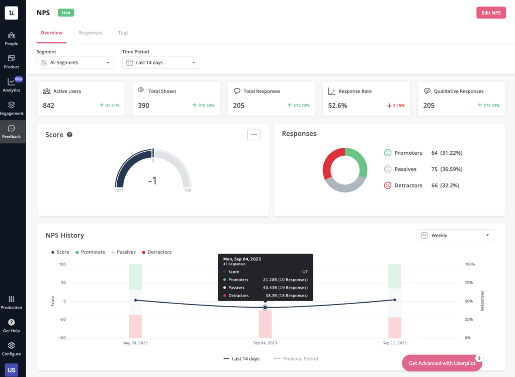
- Satisfaction benchmarking: Userpilot has a built-in NPS dashboard that tracks customer loyalty over time. In addition to the NPS dashboard, you can also use Userpilot’s survey templates to run CSAT or CES surveys and gather additional quantitative and qualitative insights on the customer experience.
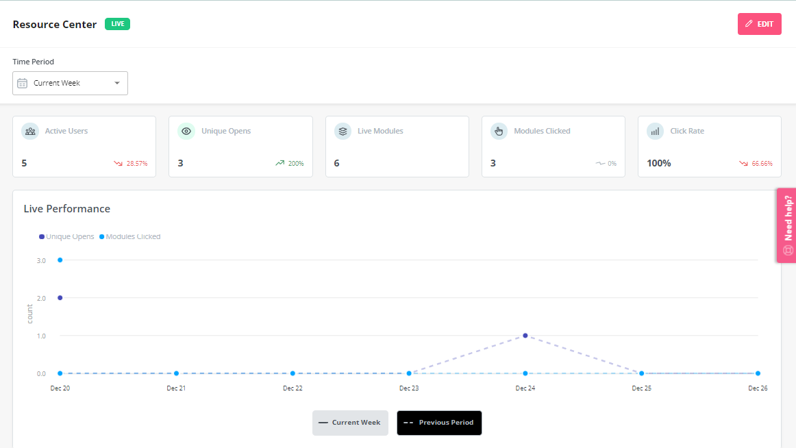
- Self-service support: Userpilot lets you build in-app resource centers, which can include feedback widgets to collect feedback passively, checklists to walk users through specific processes, or integrations with knowledge bases to leverage existing documentation.
- In-app flows: Userpilot’s no-code flow builder helps you create product experiences that can help you optimize the customer experience by educating customers and reducing their time-to-value (TTV). All UI patterns are available on every Userpilot plan from Starter to Enterprise.
Userpilot pros
As a full-suite digital adoption platform, Userpilot has all the features you need to onboard users, track analytics, and gather feedback from customers without writing a single line of code. Here are a few pros of using Userpilot as your product growth solution:
- No-code builder: Userpilot’s Chrome extension lets you build flows, add UI elements, and tag features without writing a single line of code.
- UI patterns: There are plenty of UI patterns to choose from when using Userpilot, such as hotspots, tooltips, banners, slideouts, modals, and more!
- Startup-friendly: Userpilot’s entry-level plan gives you access to all available UI patterns so you can hit the ground running.
- Walkthroughs and flows: Build engaging interactive walkthroughs and personalized onboarding flows that target specific segments of your user base.
- Self-service support: Build an in-app resource center to help users solve problems, customize its appearance to align it with your brand, and insert various types of content (videos, flows, or chatbots) to keep your customers satisfied.
- A/B testing: Userpilot’s built-in A/B testing capabilities will help you split-test flows, iterate on the best-performing variants, and continually optimize based on user behavior.
- Feedback collection: Userpilot has built-in NPS surveys with its own unified analytics dashboard and response tagging to help you retarget users. There are other survey types to choose from and you can even create your own custom survey.
- Survey templates: There are 14 survey templates to choose from so you can gather feedback on specific features or run customer satisfaction benchmarking surveys like CSAT and CES.
- Advanced analytics: Userpilot lets you analyze product usage data, monitor engagement on all in-app flows, and use the data to create user segments that are based on behaviors instead of demographics.
- Event tracking: Userpilot’s no-code event tracking lets you tag UI interactions (hovers, clicks, or form fills) and group them into a custom event that reflects feature usage.
- Third-party integrations: Userpilot has built-in integrations with tools like Amplitude, Mixpanel, Kissmetrics, Segment, Heap, HubSpot, Intercom, Google Analytics, and Google Tag Manager so you can share data between all the solutions in your tech stack.
Userpilot cons
Of course, no tool is perfect and there are a few cons to consider before choosing Userpilot as your user onboarding or product growth solution:
- Employee onboarding: Currently, Userpilot only supports in-app customer onboarding.
- Mobile apps: Userpilot doesn’t have any mobile compatibility which could make it difficult for developers with cross-platform applications to create a consistent user experience for both versions of their product.
- Freemium plan: There’s no freemium Userpilot plan so those bootstrapping their startup and need sub-$100 solutions should consider more affordable onboarding platforms like UserGuiding or Product Fruits.
Userpilot pricing
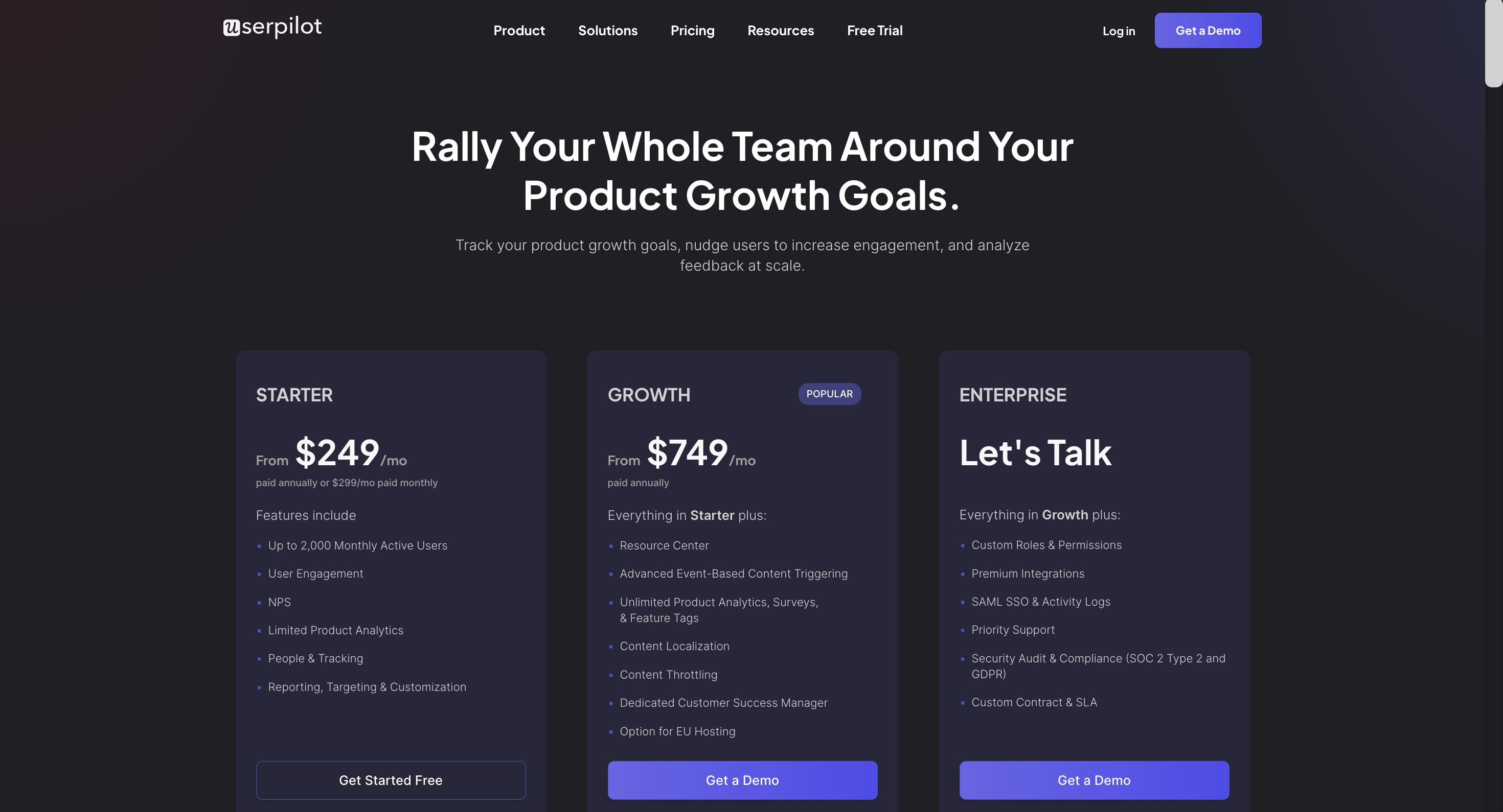
Userpilot’s transparent pricing ranges from $249/month on the entry-level end to an Enterprise tier for larger companies.
Furthermore, Userpilot’s entry-level plan includes access to all UI patterns and should include everything that most mid-market SaaS businesses need to get started.
Userpilot has three paid plans to choose from:
- Starter: The entry-level Starter plan starts at $249/month and includes features like segmentation, product analytics, reporting, user engagement, NPS feedback, and customization.
- Growth: The Growth plan starts at $749/month and includes features like resource centers, advanced event-based triggers, unlimited feature tagging, AI-powered content localization, EU hosting options, and a dedicated customer success manager.
- Enterprise: The Enterprise plan uses custom pricing and includes all the features from Starter + Growth plus custom roles/permissions, access to premium integrations, priority support, custom contract, SLA, SAML SSO, activity logs, security audit, and compliance (SOC 2/GDPR).
Conclusion
In conclusion, as we’ve explored Pendo, Appcues, and Product Fruits for customer satisfaction, it becomes evident that there is a diverse landscape of solutions available to cater to your specific needs. Each of these tools brings its own set of features, advantages, and unique capabilities to the table. Whether you’re seeking enhanced functionality, cost-effectiveness, or a different approach to tackling your tasks, our guide has showcased a range of options.
Ultimately, the choice of the best alternative depends on your individual requirements and preferences. We hope that our exploration of these tools has provided you with valuable insights to help you make an informed decision.
There is a better tool for your SaaS than Pendo!


