14 Product Personalization Examples PMs Should Learn From
It’s well-known in the product world that personalization is key to building experiences that delight your users. So, what better topic to cover than exploring several personalization examples in-depth?
We’ll unpack exactly how different SaaS products personalize their onboarding experiences and more and why they’re effective.
Let’s get into it!
What is product personalization?
Product personalization is a broad term describing the range of activities it takes to create a personalized experience within your product or service. It encompasses the entire user experience, from initial discovery to advanced feature usage.
Personalization can manifest itself in many ways, from customizing sign-up landing pages to target new and returning customers differently – we’ll be discussing them in detail below.
What are the different types of personalization?
You can personalize different elements within your product to create memorable experiences. Some of the areas product managers might spend personalizing include:
- Sign-up process. How users actually sign up for an account and get into your product in the first place is important for customer engagement as you want to get off to a good start. You could opt for a simple SSO option, or go for a more detailed flow (to gather data points on demographics, usage, and more).
- Customer onboarding. Onboarding is the process of showing new visitors (and existing customers) how to get value from your product. There are various different stages to consider, and as it’s such a pivotal step to get right, the personalized approach is usually best. Onboard and engage mobile app users by creating personalized messaging, push notifications, and surveys.
- User interface. The UI refers to the visual aesthetics of your product or app. It’ll heavily dictate your customers’ browsing behavior which explains why UX designers play such a pivotal role in the success of any SaaS. You can tweak and customize elements of the UI to ensure different segments get the best experience.
- In-app messaging. You have multiple communication channels to reach your customers. In-app messaging is the best way to convey information as it reaches users directly inside the product. You can tweak the content and how the message itself is delivered.
- Surveys. Surveys are an excellent tool to gather insight directly from your users. PMs can customize them as appropriate to align with their product goals and generate valuable customer data needed to personalize their experience even further. Mobile surveys are a quick way to measure customer satisfaction, gather real-time feedback, and boost engagement.
14 Best personalization examples from SaaS companies
In this section of the article, we’ll explore a whopping 15 personalization examples from the SaaS world. That should help you realize the huge range of personalization options out there, and give you some product inspiration.
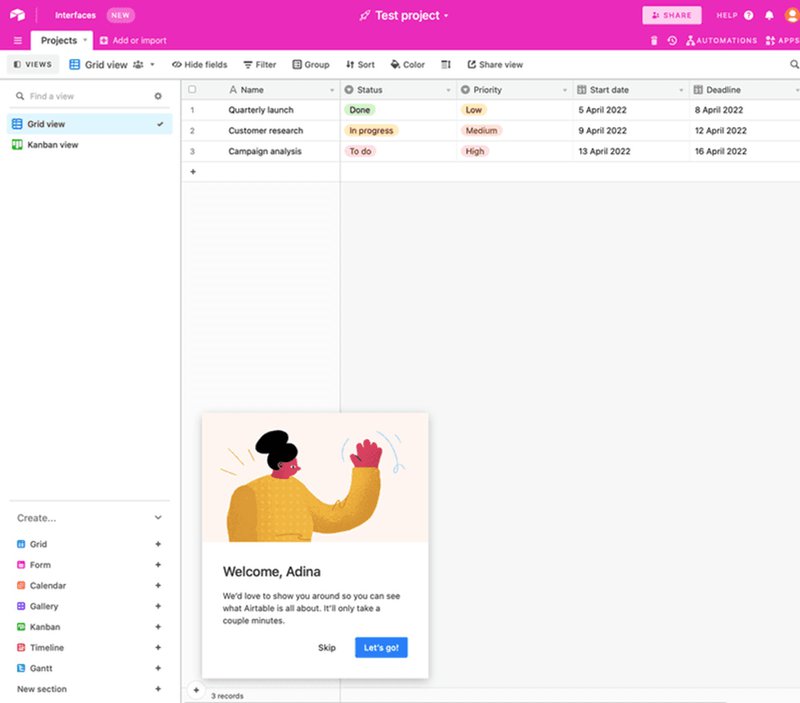
#1 – Airtable greets new users with a personalized message
What are they doing? Airtable welcomes new users to their product by greeting them with their first names.
How does it help? By introducing a sense of familiarity and creating a warm welcome in their product tour, Airtable transforms passing visitors into repeat customers. It’s the kind of personal touch you remember.
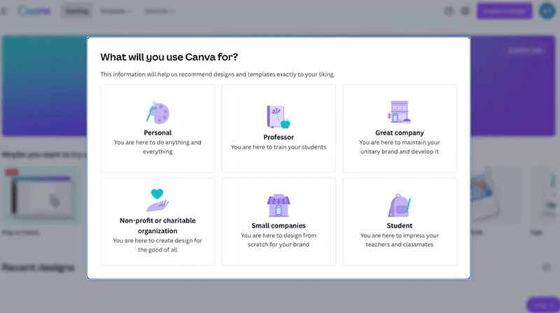
#3 – Canva personalizes the onboarding experience
What are they doing? Canva kicks off the product experience with an onboarding survey that collects data regarding distinct use cases.
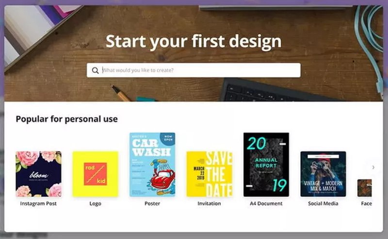
How does it help? Users selecting what they’re trying to achieve by using the product will help form them into clear categories. That makes it far simpler to build personalized onboarding experiences for customers based on the segment they land in (i.e., are they a student, small organization, non-profit, etc.).
Canva then shows relevant recommendations based on what users have chosen.
#4 – Notion personalizes the empty state
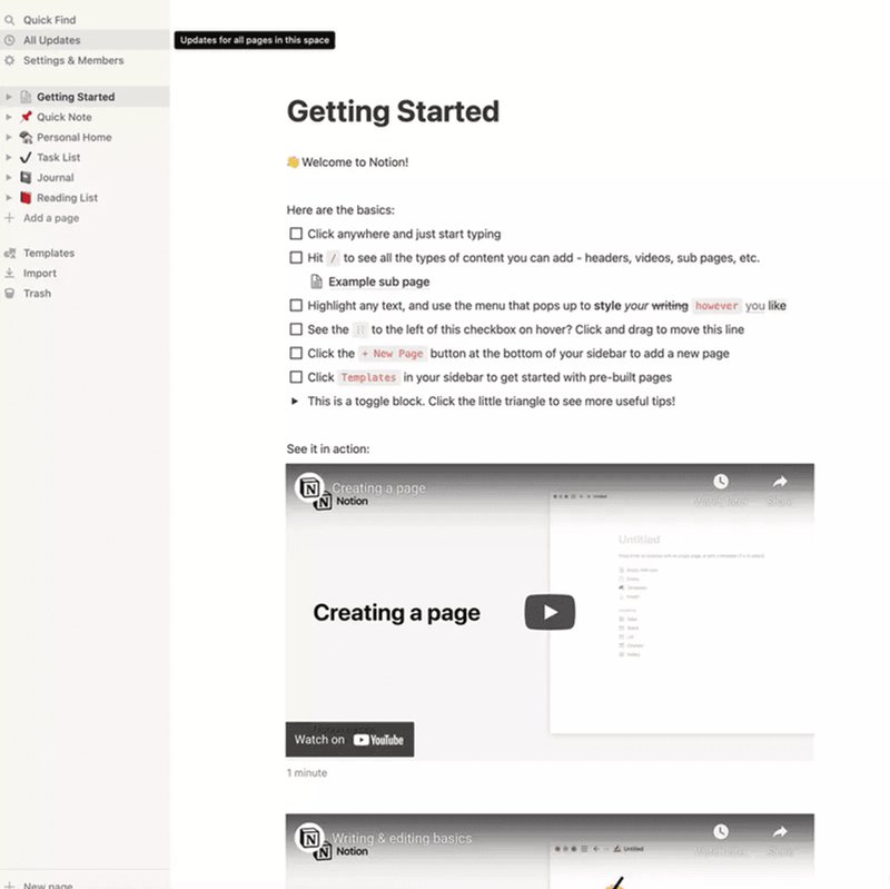
What are they doing? Instead of leaving the ’empty state’ blank, Notion asks how users plan to make use of the tool. They then build a personalized empty state based on their responses.
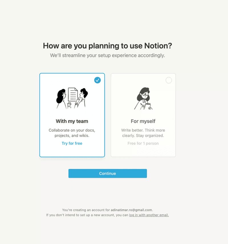
How does it help? This bit of personalization hits two birds with a single stone. Not only does it demonstrate how the product works with a real-life application, but it also drastically reduces the time to value – a user can quickly blast through their initial, personalized tasks.
#5 – ClickUp enables users to customize their UI
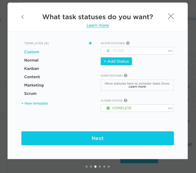
What are they doing? ClickUp offers users the chance to customize their dashboard, rather than giving them a standard option.
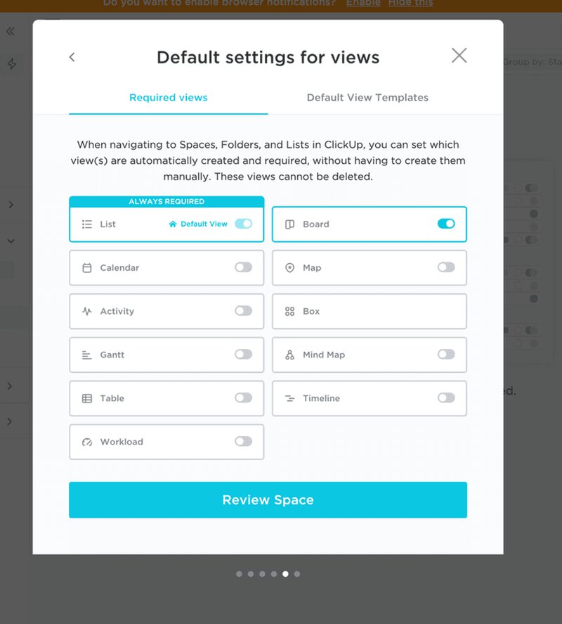
How does it help? First and foremost, it means users only see what’s relevant to them. This level of personalization makes a massive difference to overall usability (and means the UI is significantly less cluttered).
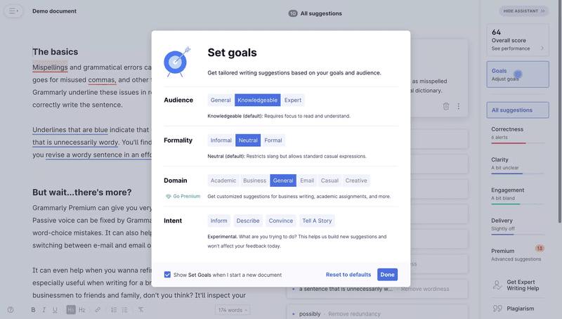
#6 – Grammarly enables users to set their personal preferences
What are they doing? Before a user can start to use Grammarly, they have to set their personal preferences and goals (i.e., audience, formality, domain, and intent).
How does it help? It helps Grammarly show relevant suggestions personalized to exactly what the user is trying to achieve (i.e., a marketer trying to demonstrate social proof will want a less formal tone than an academic researcher submitting a paper).
This will help users gain greater benefits from the product, which will keep them retained and increase customer loyalty.
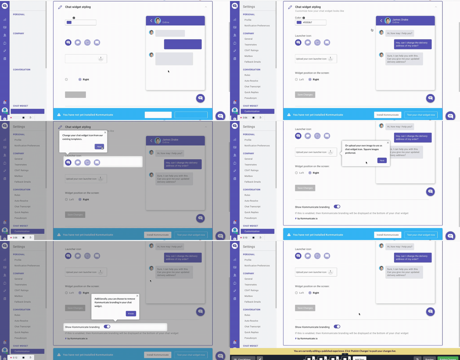
#7 – Kommunicate shows an interactive walkthrough to first-time users
What are they doing? Kommunicate uses an interactive walkthrough that gives users a step-by-step rundown of how the product operates.
How does it help? Rather than forcing all users down a common path, Kommunicate offers a personalized flow that is far more relevant to the goals of new customers.
This flow created through Userpilot, has resulted in a 3% increase in the feature’s usage for Kommunicate.
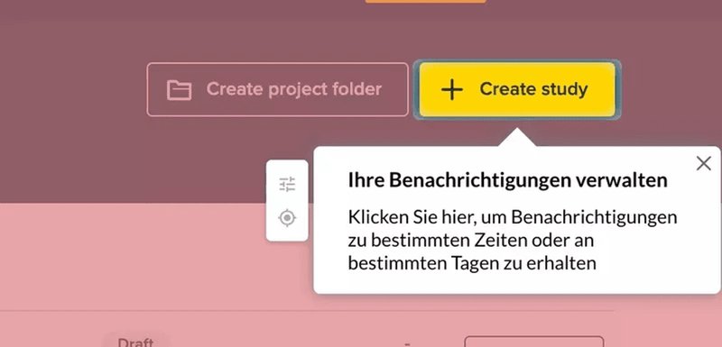
#8 – Userpilot localizes a tooltip’s content
What are they doing? Userpilot uses location data to ensure tooltip content is shown in the user’s native language – like in the example below, that’s German.
How does it help? Language is one of the most personal things to a user: it’s how we communicate with one another. A surefire way to make users feel important is to offer in-app communication in whatever language they feel comfortable with. It’ll help increase conversion rates and boost sales, too.
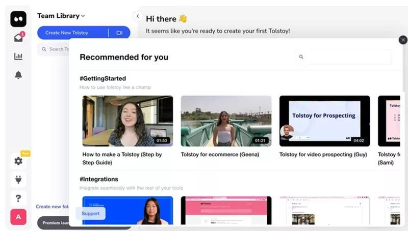
#9 – Tolstoy shows personalized recommendations
What are they doing? Tolstoy shares personalized recommendations so that users receive relevant information based on their position in the customer journey.
How does it help? This personalization example demonstrates that sometimes, ‘less is more.’ Rather than bombarding users with unnecessary information, a targeted approach can improve the overall experience.
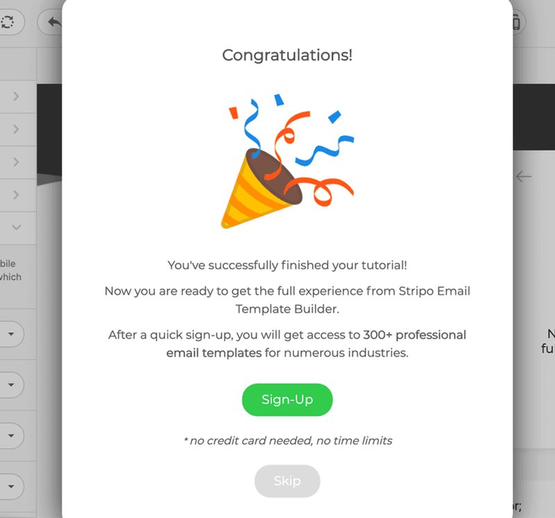
#10 – Stripo uses gamification to celebrate milestones
What are they doing? Stripo celebrates distinct product milestones with elements of gamification – in this case, a ‘congratulations’ modal that gives users a pat on the back once they’ve finished a tutorial.
How does it help? Users need regular encouragement, help, and support to keep going. Gamification is proven to boost engagement and personalized examples only deepen the effect.
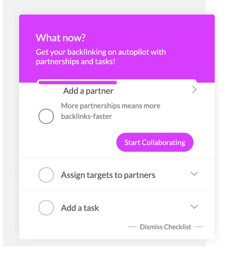
#11 – Backlink Manager uses a checklist to personalize secondary onboarding
What are they doing? Backlink Manager encourages customers to use secondary features (in this example, adding a partner to boost collaboration) using a punchy checklist.
How does it help? Secondary onboarding is crucial for improved customer loyalty. The better your secondary onboarding, the more value users are getting from advanced features – and the more expansion revenue your customers will drive.
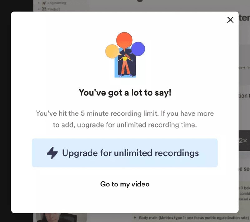
#12 – Loom prompts contextual upsell messages
What are they doing? Loom triggers contextual upselling messages to customers at relevant points in the journey. In this example, once a user hits the 5-minute recording limit.
How does it help? This personalization example is a fantastic way of convincing your users to upgrade. If they’re getting value from your product, and based on their usage patterns, you think a different plan would work for them, why not give them a nudge?
#13 – Userpilot sends relevant messages in response to survey results
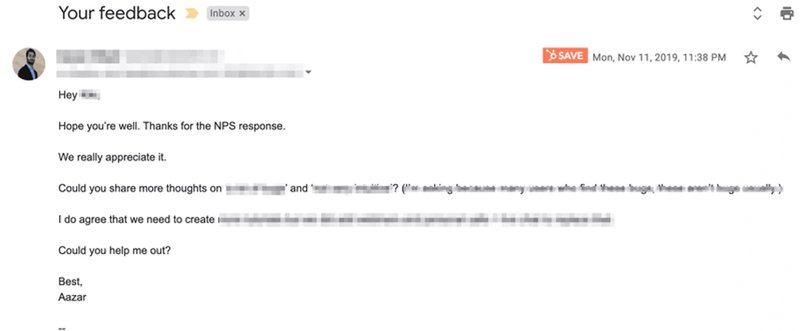
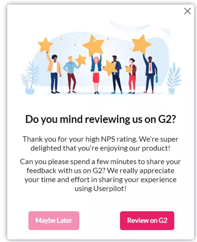
What are they doing? Userpilot fires a personalized (and automated) response to users based on how they’ve rated them on their NPS survey.
How does it help? This helps Userpilot gain valuable insights regarding why users rated them a specific NPS score and guide the next step onwards.
For detractors, a personalized email is sent to learn about any issues or challenges being faced. If you don’t understand a problem, how can you hope to resolve it?
Alternatively, a modal is also triggered to promoters asking them to leave a review on the G2 platform (spreading positive word of mouth).
#14 – Userpilot personalizes the resource center for different pages/segments
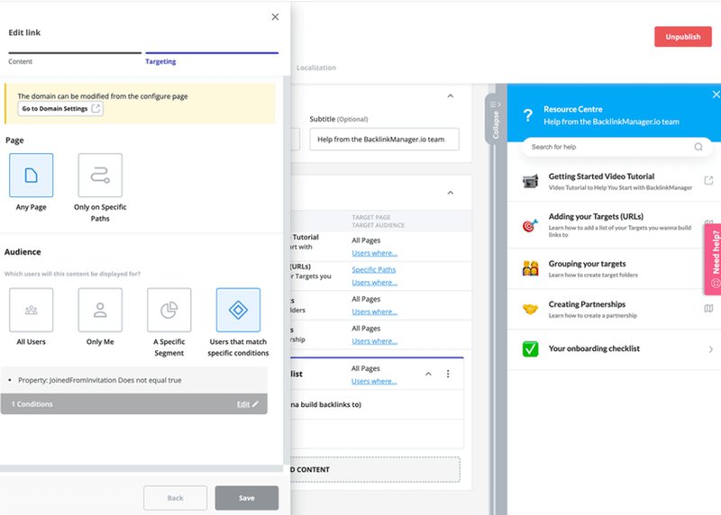
What are they doing? Userpilot shows different modules in the resource center depending on the specific user segment.
How does it help? This is an excellent personalization example: rather than overwhelming the user with excessive information, they can quickly and easily get the help they need.
#15 – Asana offers personalized recommendations to avoid churn
What are they doing? When a user decides to leave Asana, they launch a churn survey. It’s designed to help understand why they want to move on. Based on their response, Asana then shows them a targeted message.
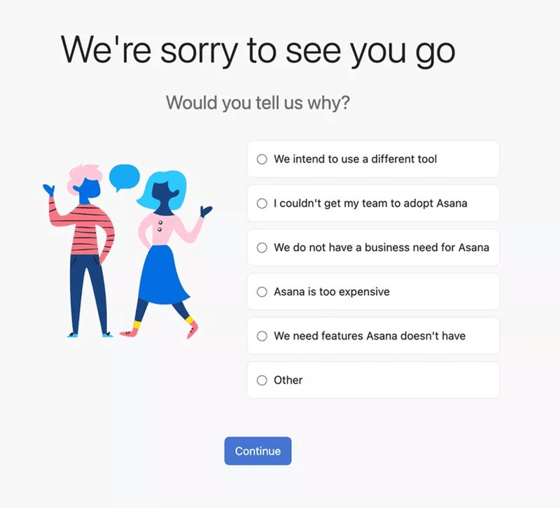
Once a user selects an option, Asana shares a relevant message in hopes to retain them. For instance, if someone clicked on ‘Asana is too expensive,’ they offer the user a cheaper alternative.
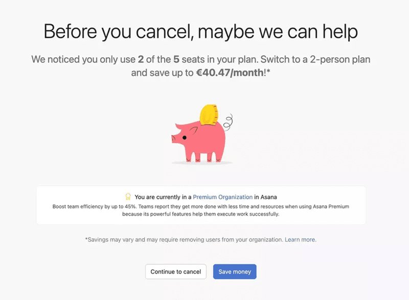
How does it help? Not only does this help understand the common reasons why customers want to churn, but it also helps reduce potential churn by offering users another alternative.
How can PMs drive maximum results from their personalization efforts?
Hopefully, you’d have learned something from every personalization example above. But the question is: how will you create personalized experiences for your customers?
Here are some tips for PMs:
- Build a personalization strategy in line with your goals. If your overarching product goal is customer retention for example, then your personalization should be geared toward that objective. You can personalize secondary onboarding for different user segments in an effort to retain them.
- Understand your audience. Collect data from a range of sources to build your understanding of user behavior: surveys, product usage analytics, and interviews can help you with this.
- Analyze the customer journey. Identify where personalized content can be introduced to drive the biggest outcome.
- Continuously test, learn, and iterate. See which personalization ideas work the best by A/B testing them.
Conclusion
We’ve covered a lot of ground! Hopefully, you now have a whole host of personalization examples that have inspired you to draw from.
If you want to get started with building your own personalized experiences, get a Userpilot Demo and see how you can start delighting your customers with bespoke flows today.

