Quantitative Data Analysis: Everything You Need to Know


Does the thought of quantitative data analysis bring back the horrors of math classes? We get it.
But conducting quantitative data analysis doesn’t have to be hard with the right tools. Want to learn how to turn raw numbers into actionable insights on how to improve your product?
In this article, we explore what quantitative data analysis is, the difference between quantitative and qualitative data analysis, and statistical methods you can apply to your data. We also walk you through the steps you can follow to analyze quantitative information, and how Userpilot can help you streamline the product analytics process. Let’s get started.
What is quantitative data analysis?
Quantitative data analysis is about applying statistical analysis methods to define, summarize, and contextualize numerical data. In short, it’s about turning raw numbers and data into actionable insights.
The analysis will vary depending on the research questions and the collected data (more on this below).
Quantitative vs qualitative data analysis
The main difference between these forms of analysis lies in the collected data. Quantitative data is numerical or easily quantifiable. For example, the answers to a customer satisfaction score (CSAT) survey are quantitative since you can count the number of people who answered “very satisfied”.
Qualitative feedback, on the other hand, analyzes information that requires interpretation. For instance, evaluating graphics, videos, text-based answers, or impressions.
Another difference between quantitative and qualitative analysis is the questions each seeks to answer. For instance, quantitative data analysis primarily answers what happened, when it happened, and where it happened. However, qualitative data analysis answers why and how an event occurred.
Quantitative data analysis also looks into identifying patterns, drivers, and metrics for different groups. However, qualitative analysis digs deeper into the sample dataset to understand underlying motivations and thinking processes.
Pros of quantitative data analysis
Quantitative or data-driven analysis has advantages such as:
- Objectivity and reliability. Since quantitative analysis is based on numerical data, this reduces biases and allows for more objective conclusions. Also, by relying on statistics, this method ensures the results are consistent and can be replicated by others, making the findings more reliable.
- Easy comparison. Quantitative data is easily comparable because you can identify trends, patterns, correlations, and differences within the same group and KPIs over time. But also, you can compare metrics in different scales by normalizing the data, e.g., bringing ratios and percentages into the same scale for comparison.
- Scalability. Quantitative analysis can handle large volumes of data efficiently, making it suitable for studies involving large populations or datasets. This makes this data analysis method scalable. Plus, researchers can use quantitative analysis to generalize their findings to broader populations.
Cons of quantitative data analysis
These are common disadvantages of data-driven analytics:
- Limited context. Since quantitative data looks at the numbers, it often strips away the data from the context, which can show the underlying reasons behind certain trends. This limitation can lead to a superficial understanding of complex issues, as you often miss the nuances and user motivations behind the data points.
- Inflexibility. When conducting quantitative research, you don’t have room to improvise based on the findings. You need to have predefined hypotheses, follow scientific methods, and select data collection instruments. This makes the process less adaptable to new or unexpected findings.
- Large sample sizes necessary. You need to use large sample sizes to achieve statistical significance and reliable results when doing quantitative analysis. Depending on the type of study you’re conducting, gathering such extensive data can be resource-intensive, time-consuming, and costly.
Quantitative data analysis methods
There are two statistical methods for reviewing quantitative data and user analytics. However, before exploring these in-depth, let’s refresh these key concepts:
- Population. This is the entire group of individuals or entities that are relevant to the research.
- Sample. The sample is a subset of the population that is actually selected for the research since it is often impractical or impossible to study the entire population.
- Statistical significance. The chances that the results gathered after your analysis are realistic and not due to random chance.
Here are methods for analyzing quantitative data:
Descriptive statistics
Descriptive statistics, as the name implies, describe your data and help you understand your sample in more depth. It doesn’t make inferences about the entire population but only focuses on the details of your specific sample.
Descriptive statistics usually include measures like the mean, median, percentage, frequency, skewness, and mode.
Inferential statistics
Inferential statistics aim to make predictions and test hypotheses about the real-world population based on your sample data.
Here, you can use methods such as a T-test, ANOVA, regression analysis, and correlation analysis.
Let’s take a look at this example. Through descriptive statistics, you identify that users under the age of 25 are more likely to skip your onboarding. You’ll need to apply inferential statistics to determine if the result is statistically significant and applicable to your entire ’25 or younger’ population.
How to choose the right method for your quantitative data analysis
The type of data that you collect and the research questions that you want to answer will impact which quantitative data analysis method you choose. Here’s how to choose the right method:
Determine your data type
Before choosing the quantitative data analysis method, you need to identify which group your data belongs to:
- Nominal—categories with no specific order, e.g., gender, age, or preferred device.
- Ordinal—categories with a specific order, but the intervals between them aren’t equal, e.g., customer satisfaction ratings.
- Interval—categories with an order and equal intervals, but no true zero point, e.g., temperature (where zero doesn’t mean “no temperature”).
- Ratio—categories with a specific order, equal intervals, and a true zero point, e.g., number of sessions per user.
Applying any statistical method to all data types can lead to meaningless results. Instead, identify which statistical analysis method supports your collected data types.
Consider your research questions
The specific research questions you want to answer, and your hypothesis (if you have one) impact the analysis method you choose. This is because they define the type of data you’ll collect and the relationships you’re investigating.
For instance, if you want to understand sample specifics, descriptive statistics—such as tracking NPS—will work. However, if you want to determine if other variables affect the NPS, you’ll need to conduct an inferential analysis.
The overarching questions vary in both of the previous examples. For calculating the NPS, your internal research question might be, “Where do we stand in customer loyalty?” However, if you’re doing inferential analysis, you may ask, “How do various factors, such as demographics, affect NPS?”
6 Steps to do quantitative data analysis and extract meaningful insights
Here’s how to conduct quantitative analysis and extract customer insights:
1. Set goals for your analysis
Before diving into data collection, you need to define clear goals for your analysis as these will guide the process. This is because your objectives determine what to look for and where to find data. These goals should also come with key performance indicators (KPIs) to determine how you’ll measure success.
For example, imagine your goal is to increase user engagement. So, relevant KPIs include product engagement score, feature usage rate, user retention rate, or other relevant product engagement metrics.
2. Collect quantitative data
Once you’ve defined your goals, you need to gather the data you’ll analyze. Quantitative data can come from multiple sources, including user surveys such as NPS, CSAT, and CES, website and application analytics, transaction records, and studies or whitepapers.
Remember: This data should help you reach your goals. So, if you want to increase user engagement, you may need to gather data from a mix of sources.
For instance, product analytics tools can provide insights into how users interact with your tool, click on buttons, or change text. Surveys, on the other hand, can capture user satisfaction levels. Collecting a broad range of data makes your analysis more robust and comprehensive.
3. Clean and visualize your data
Raw data is often messy and contains duplicates, outliers, or missing values that can skew your analysis. Before making any calculations, clean the data by removing these anomalies or outliers to ensure accurate results.
Once cleaned, turn it into visual data by using different types of charts and graphs. Visualizations and data analytics charts make it easier to spot trends, patterns, and anomalies. If you’re using Userpilot, you can choose your preferred visualizations and organize your dashboard to your liking.
4. Identify patterns and trends
When looking at your dashboards, identify recurring themes, unusual spikes, or consistent declines that might indicate data analytics trends or potential issues.
Picture this: You notice a consistent increase in feature usage whenever you run seasonal marketing campaigns. So, you segment the data based on different promotional strategies. There, you discover that users exposed to email marketing campaigns have a 30% higher engagement rate than those reached through social media ads.
In this example, the pattern suggests that email promotions are more effective in driving feature usage.
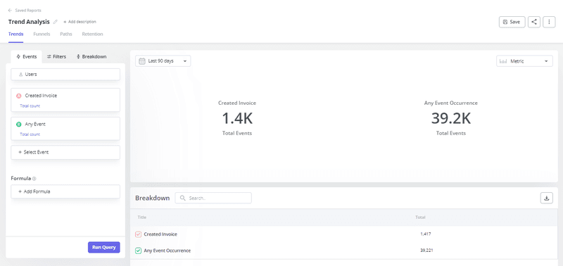
If you’re a Userpilot user, you can conduct a trend analysis by tracking how your users perform certain events.
5. Share valuable insights with key stakeholders
Once you’ve discovered meaningful insights, you have to communicate them to your organization’s key stakeholders. Do this by turning your data into a shareable analysis report, one-pager, presentation, or email with clear and actionable next steps.
Your goal at this stage is for others to view and understand the data easily so they can use the insights to make data-led decisions.
Following the previous example, let’s say you’ve found that email campaigns significantly boost feature usage. Your email to other stakeholders should strongly recommend increasing the frequency of these campaigns and adding the supporting data points.
Take a look at how easy it is to share custom dashboards you built in Userpilot with others via email:
6. Act on the insights
Data analysis is only valuable if it leads to actionable steps that improve your product or service. So, make sure to act upon insights by assigning tasks to the right persons.
For example, after analyzing user onboarding data, you may find that users who completed the onboarding checklist were 3x more likely to become paying customers (like Sked Social did!).
Now that you have actual data on the checklist’s impact on conversions, you can work on improving it, such as simplifying its steps, adding interactive features, and launching an A/B test to experiment with different versions.
How can Userpilot help with analyzing quantitative data
As you’ve seen throughout this article, using a product analytics tool can simplify your data analysis and help you get insights faster. Here are different ways in which Userpilot can help:
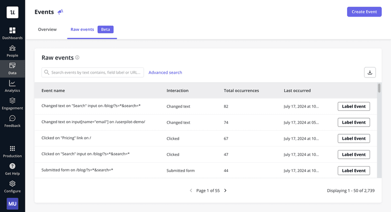
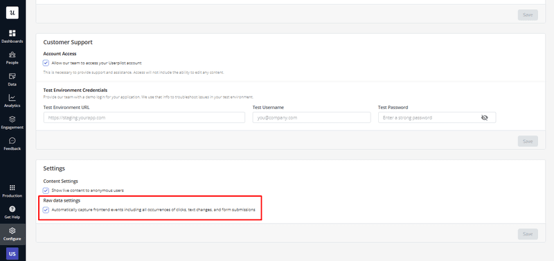
Automatically capture quantitative data
Thanks to Userpilot’s new auto-capture feature, you can automatically track every time your users click, write a text, or fill out a form in your app—no engineers or manual tagging required!
Our customer analytics platform lets you use this data to build segments, trigger personalized in-app events and experiences, or launch surveys.
If you don’t want to auto-capture raw data, you can turn this functionality off in your settings, as seen below:
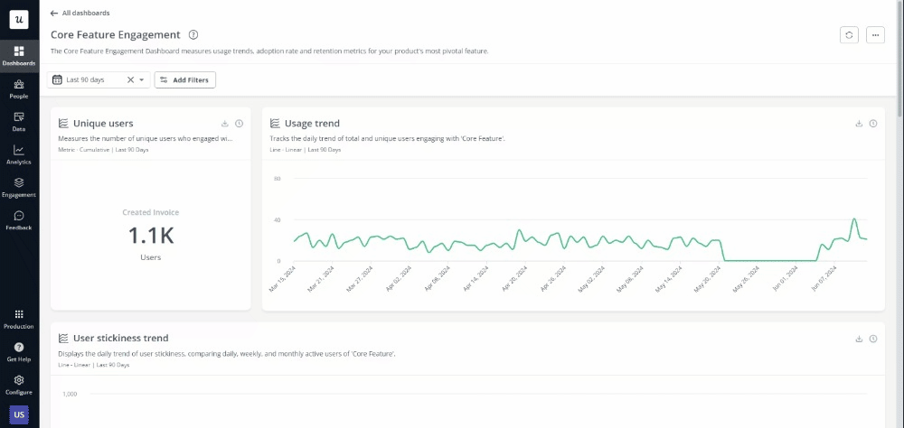
Monitor key metrics with customizable dashboards for real-time insights
Userpilot comes with template analytics dashboards, such as new user activation dashboards or customer engagement dashboards. However, you can create custom dashboards and reports to keep track of metrics that are relevant to your business in real time.
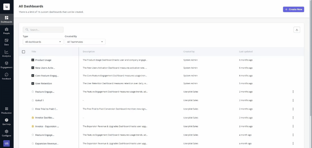
For instance, you could build a customer retention analytics dashboard and include all metrics that you find relevant, such as customer stickiness, NPS, or last accessed date.
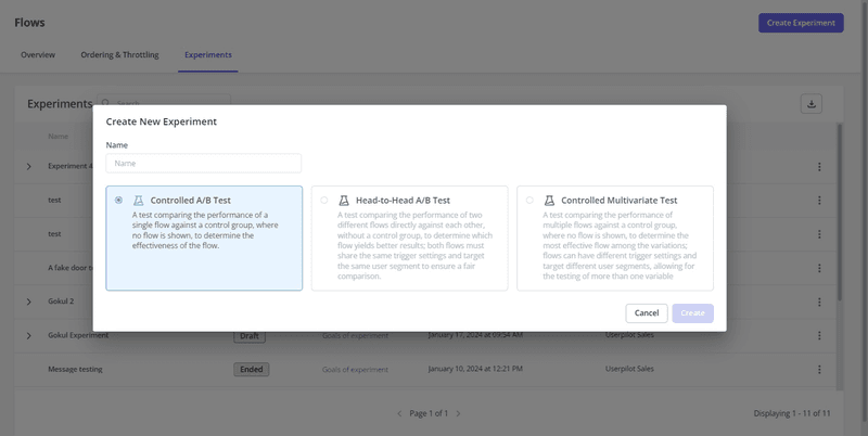
Analyze experiment data with A/B and multivariate tests
Userpilot lets you conduct A/B and multivariate tests, either by following a controlled or a head-to-head approach. You can track the results on a dashboard.
For example, let’s say you want to test a variation of your onboarding flow to determine which leads to higher user activation.
You can go to Userpilot’s Flows tab and click on Experiments. There, you’ll be able to select the type of test you want to run, for instance, a controlled A/B test, build a new flow, test it, and get the results.
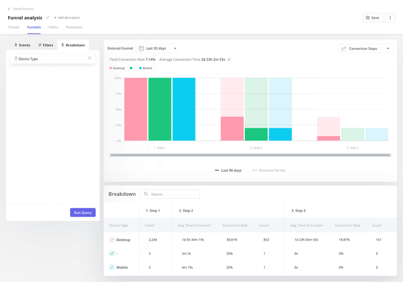
Use quantitative funnel analysis to increase conversion rates
With Userpilot, you can track your customers’ journey as they complete actions and move through the funnel. Funnel analytics give you insights into your conversion rates and conversion times between two events, helping you identify areas for improvement.
Imagine you want to analyze your free-to-paid conversions and the differences between devices. Just by looking at the graphic, you can draw some insights:
- There’s a significant drop-off between steps one and two, and two and three, indicating potential user friction.
- Users on desktops convert at higher rates than those on mobile or unspecified devices.
- Your average freemium conversion time is almost three days.
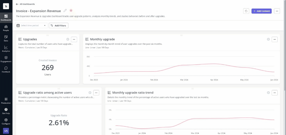
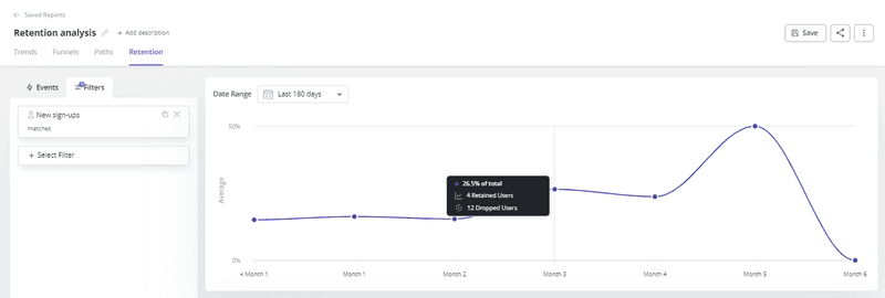
Leverage cohort analysis to optimize retention
Another Userpilot functionality that can help you analyze quantitative data is cohort analysis. This powerful tool lets you group users based on shared characteristics or experiences, allowing you to analyze their behavior over time and identify trends, patterns, and the long-term impact of changes on user behavior.
For example, let’s say you recently released a feature and want to measure its impact on user retention. Via a cohort analysis, you can group users who started using your product after the update and compare their retention rates to previous cohorts.
You can do this in Userpilot by creating segments and then tracking user segments’ retention rates over time.
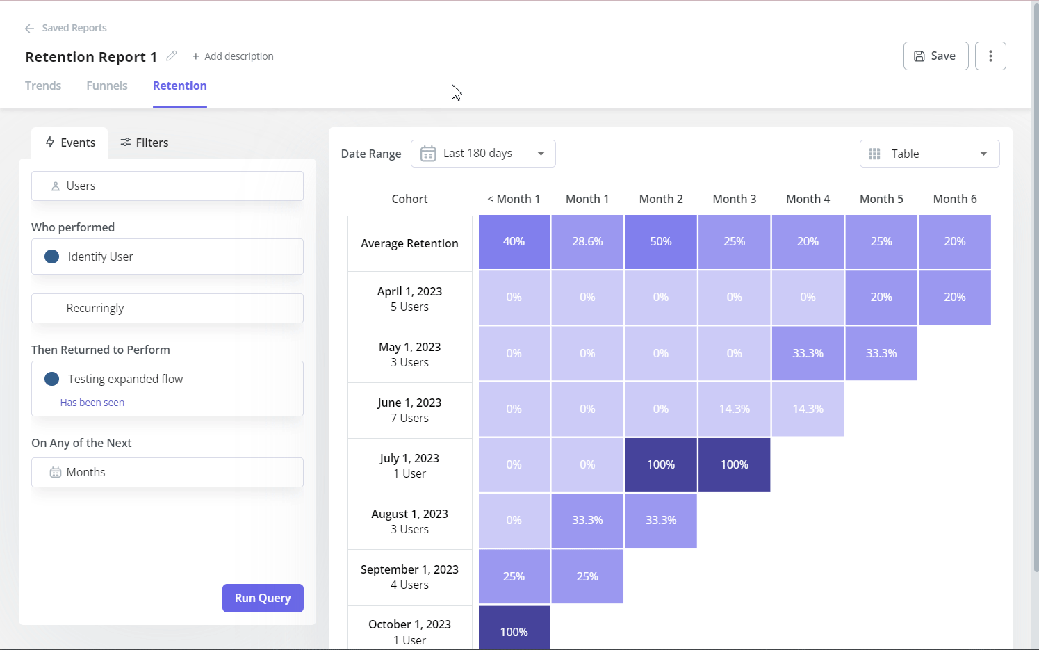
Check how many users adopted a feature with a retention table
In Userpilot, you can use retention tables to stay on top of feature adoption. This means you can track how many users continue to use a feature over time and which features are most valuable to your users. The video below shows how to choose the features or events you want to analyze in Userpilot.
Conclusion
As you’ve seen, to conduct quantitative analysis, you first need to identify your business and research goals. Then, collect, clean, and visualize the data to spot trends and patterns. Lastly, analyze the data, share it with stakeholders, and act upon insights to build better products and drive customer satisfaction.
To stay on top of your KPIs, you need a product analytics tool. With Userpilot, you can automate data capture, analyze product analytics, and view results in shareable dashboards. Want to try it for yourself? Get a demo.
About the author