10 Best User Onboarding Examples That Keep Users Coming Back
Who would know more about what effective onboarding looks like than a user onboarding tool like ours?
Having analyzed over 100 onboarding flows and helped countless customers improve their activation and retention rates, we know what works, and we’re here to share it with you.
In this article, you’ll discover 10 user onboarding examples that welcome users successfully, introduce core features effectively, and prompt action at every step of the journey.
What do the best user onboarding examples have in common?
Every company customizes its onboarding process, but the best user onboarding examples focus on driving user activation, offering personalized experiences, and making data-driven improvements.
Here’s a closer look at what makes these user onboarding experiences stand out:
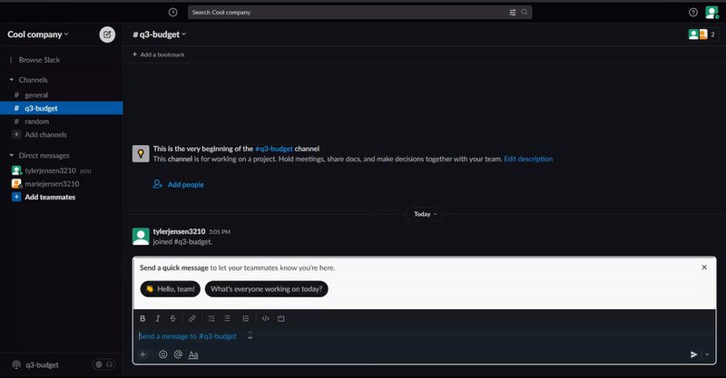
- Drive users to activation. This is where new users first experience your product’s core value, often called the “Aha!” Moment. For example, Slack encourages new users to send a message early on to showcase its collaborative functionality.
- Personalize experiences based on user JTBD. Customers don’t want a cookie-cutter walkthrough, but rather a personalized one. The JTBD framework can transform onboarding by tailoring experiences to the outcomes users seek. Instead of a one-size-fits-all approach, offer branched onboarding paths based on the tasks users aim to accomplish.
- Combine different onboarding elements. Good onboarding flows use tooltips, modals, and onboarding checklists together. These elements work well together to guide customers through each step of the user journey.
- Demonstrate continuous improvement in onboarding flows. The best user onboarding flows aren’t static. They evolve with user feedback, A/B test experiments, and behavior analysis to optimize the experience continually.
Here’s what Userpilot’s Director of Customer Success, Matt O’ Boyle, has to say about effective onboarding:
The best onboarding will set up your customers for long-term success. Many companies will view onboarding as a race to get customers to activation, which is a fair thought! Getting customers to activate quickly is always good, but we need to keep in mind that they will be your customers after onboarding.
Do you truly understand their goals, and why they purchased your product? Does your onboarding address their desired use cases and show value? Are you getting them actively using the elements of your product that make you stickiest?
Think: How can a digestible onboarding also get them addicted to your product? They need to see and feel value, and want more of it.
— Matt O’ Boyle, Director of Customer Success at Userpilot
10 User onboarding examples from well-known brands
Now that we know what makes great user onboarding experiences work, let’s look at 10 examples from top brands.
1. Asana puts users right in the workflow with streamlined onboarding
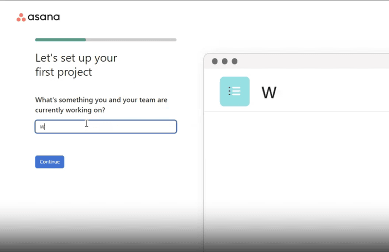
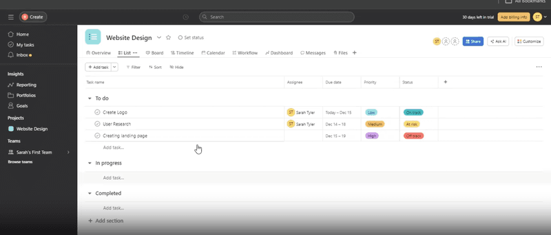
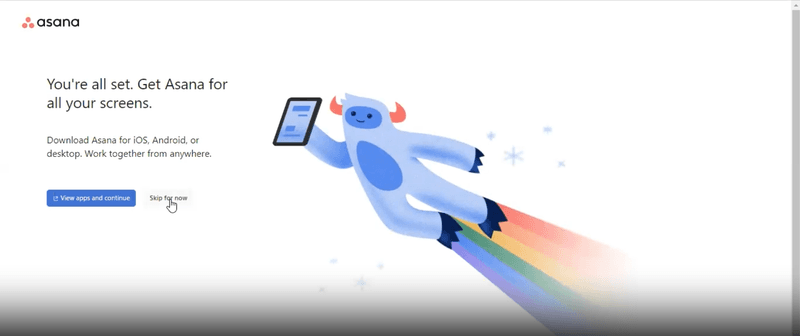
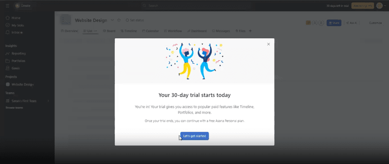
Asana, a leading work management platform, helps teams organize, track, and manage their work. Their onboarding flow is designed to immerse users directly into their workflow for a seamless transition.
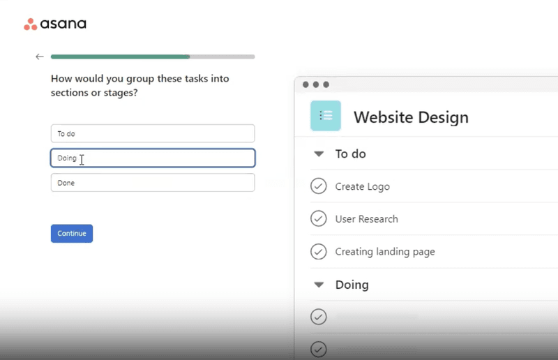
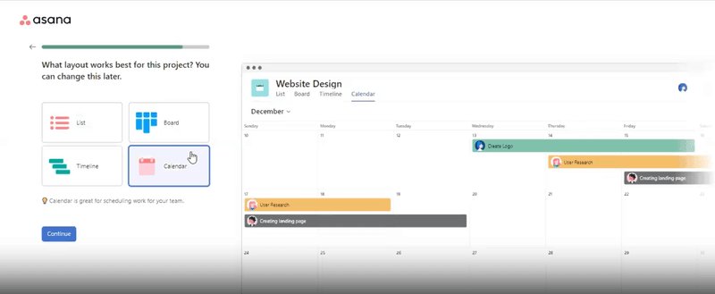
Upon signing up, users are guided through Asana’s core features, like creating projects, adding tasks, and setting due dates. Interactive tooltips and prompts offer contextual help, ensuring effective use of key functionalities.
How Asana creates a good onboarding process
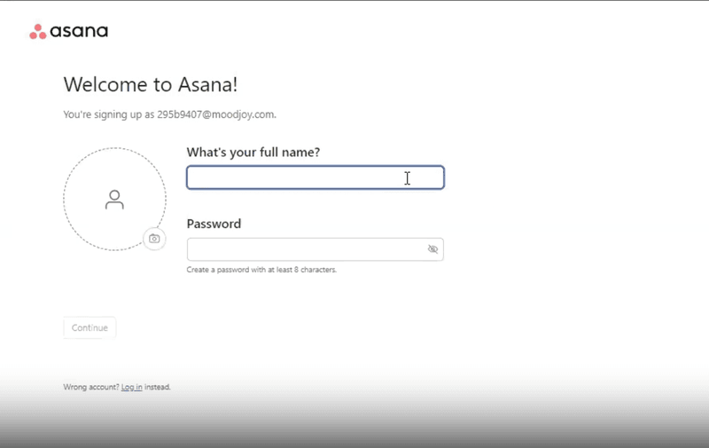
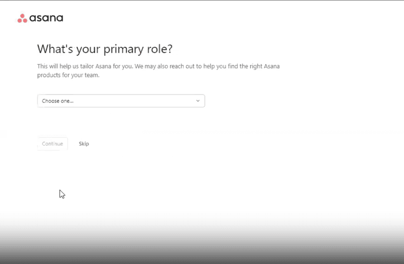
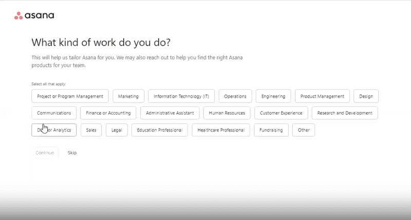
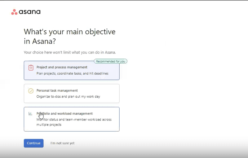
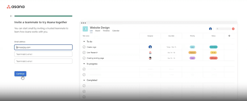
- Prompts for early user segmentation with a sign-up questionnaire. Asana’s onboarding flow starts with a quick questionnaire on roles, team size, and goals to tailor the experience to meet users’ specific needs.
- Gives users a personalized feeling by greeting them by name and showcasing their personal board during sign-up. Asana personalizes user onboarding flow by greeting users by name and displaying a pre-loaded board with sample tasks, providing a quick intro to workflow organization.
- Promote essential features right off the bat. Asana highlights key product features early, like task creation, due dates, and collaboration tools, to help users quickly plunge into productive work and see its value for project management.
2. Sked Social improves conversion with an onboarding checklist
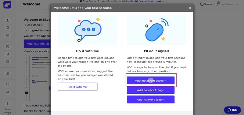
Sked Social is a social media management tool that enables users to plan, schedule, and analyze their social media content across various platforms. As a comprehensive tool, it’s easy for new users to feel overwhelmed, which can lower engagement and conversion rates.
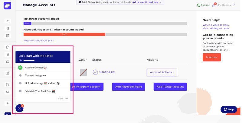
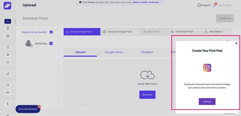
Sked Social solves both issues with a simple onboarding checklist that guides users through key tasks to quickly understand core features and see the tool’s value. Some elements used include a pop-up modal to introduce the first task and a slideout to prompt users to create their first post.
How Sked Social creates a good customer onboarding process
- Uses a simple checklist with 4 key actions. Sked Social simplifies onboarding tasks with a four-step onboarding checklist: Create an Account, Connect Instagram, Upload an image or video, and Schedule a Post, to keep users focused and ensure quick progress.
- Connects checklist items with walkthroughs to better educate users. Each onboarding checklist item links to an interactive walkthrough, offering hands-on learning and helpful tips to guide users through Sked Social’s features step-by-step.
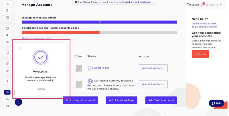
- Celebrates user success. Sked Social celebrates each completed task with small, celebratory moments, which keeps users engaged while making onboarding a rewarding experience.
3. Notion personalizes onboarding by use case
Notion is a flexible productivity/project management tool that unifies note-taking, task management, and collaboration to enable users to build custom workflows, databases, and documents for personal and professional use.
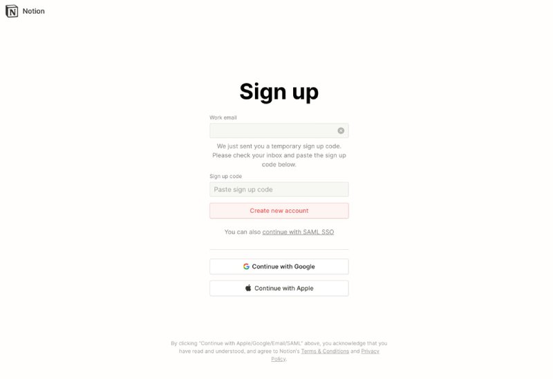
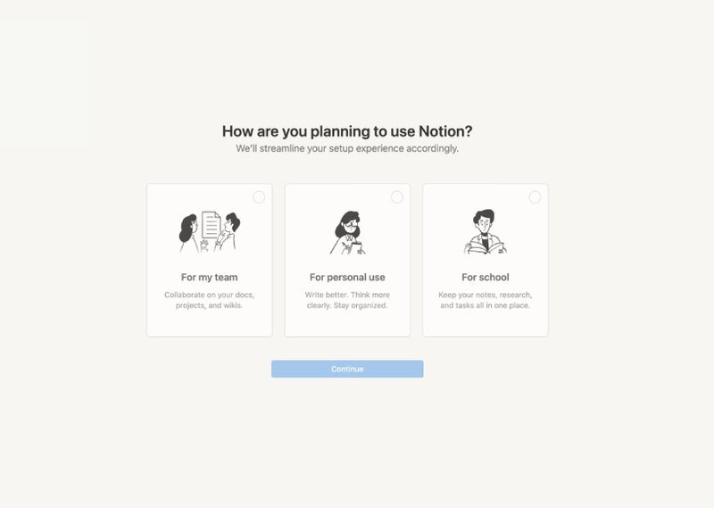
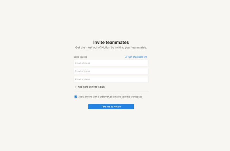
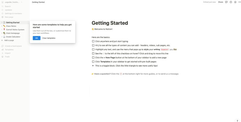
Here is a step-by-step overview of Notion’s personalized onboarding flow tailored to individual user needs:
- Account creation. Users begin by signing up with their email, sharing a sign-up code, setting a password, and providing their name and photo.
- Use case selection. Notion prompts users to specify their intended use — personal, educational, or team-based, which influences the subsequent onboarding steps.
- Workspace customization. For team accounts, users are guided to name their workspace, choose an icon, and invite team members.
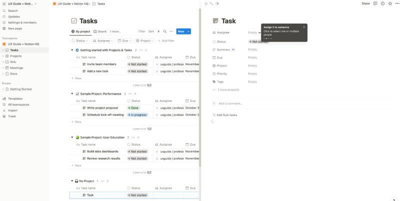
- Guided introduction. Upon entering the platform, users encounter a “Getting Started” page, which introduces Notion’s core features (e.g., adding blocks, creating pages, and utilizing templates).
- Task creation wizard. For team users, Notion provides a step-by-step wizard to assist in creating the first task, which helps users understand task management and database functionalities.
How Notion creates a good onboarding process
- Uses the tool itself to guide users through the first steps. Notion’s onboarding immerses users in the interface to showcase features through a hands-on approach that makes the process practical and intuitive.
- Guides users through creating the first task with tooltips. Notion provides step-by-step guidance for users as they create their first task by using tooltips to point out essential elements and features.
- Sends personalized nurturing emails. After onboarding, Notion engages users with tailored emails based on their use case, which may be personal, educational, or team-based. These emails provide tips, resources, and best practices aligned with users’ goals to help them unlock more value over time.
4. Attention Insight addresses “leaky trial funnel” problem with self-serve onboarding
Attention Insight is an AI-powered platform that provides predictive heatmap analysis for websites, advertisements, and various designs to enable users to assess visual attention before launch.
Despite having a user-friendly interface and a free trial, Attention Insight struggled with a “leaky trial funnel,” as users skipped core features, which limited engagement, conversions, and product use.
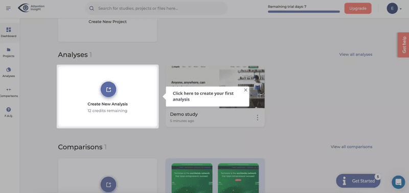
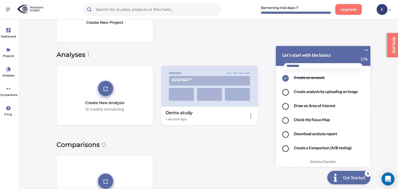
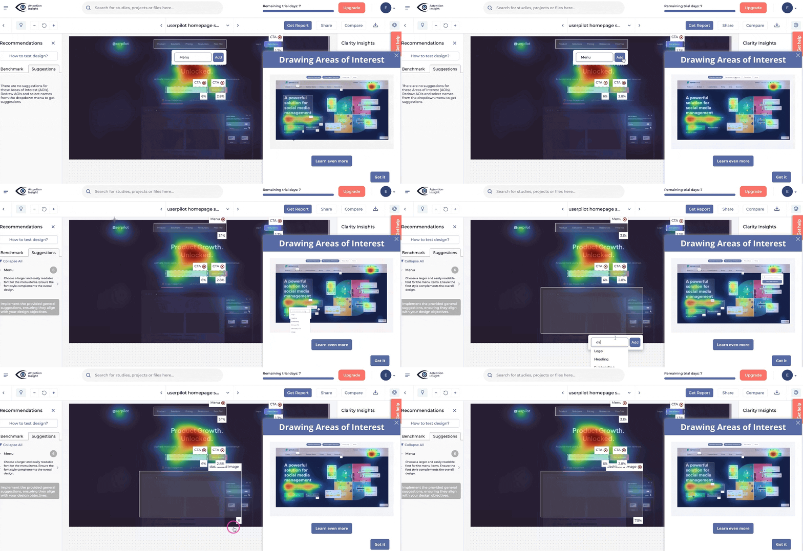
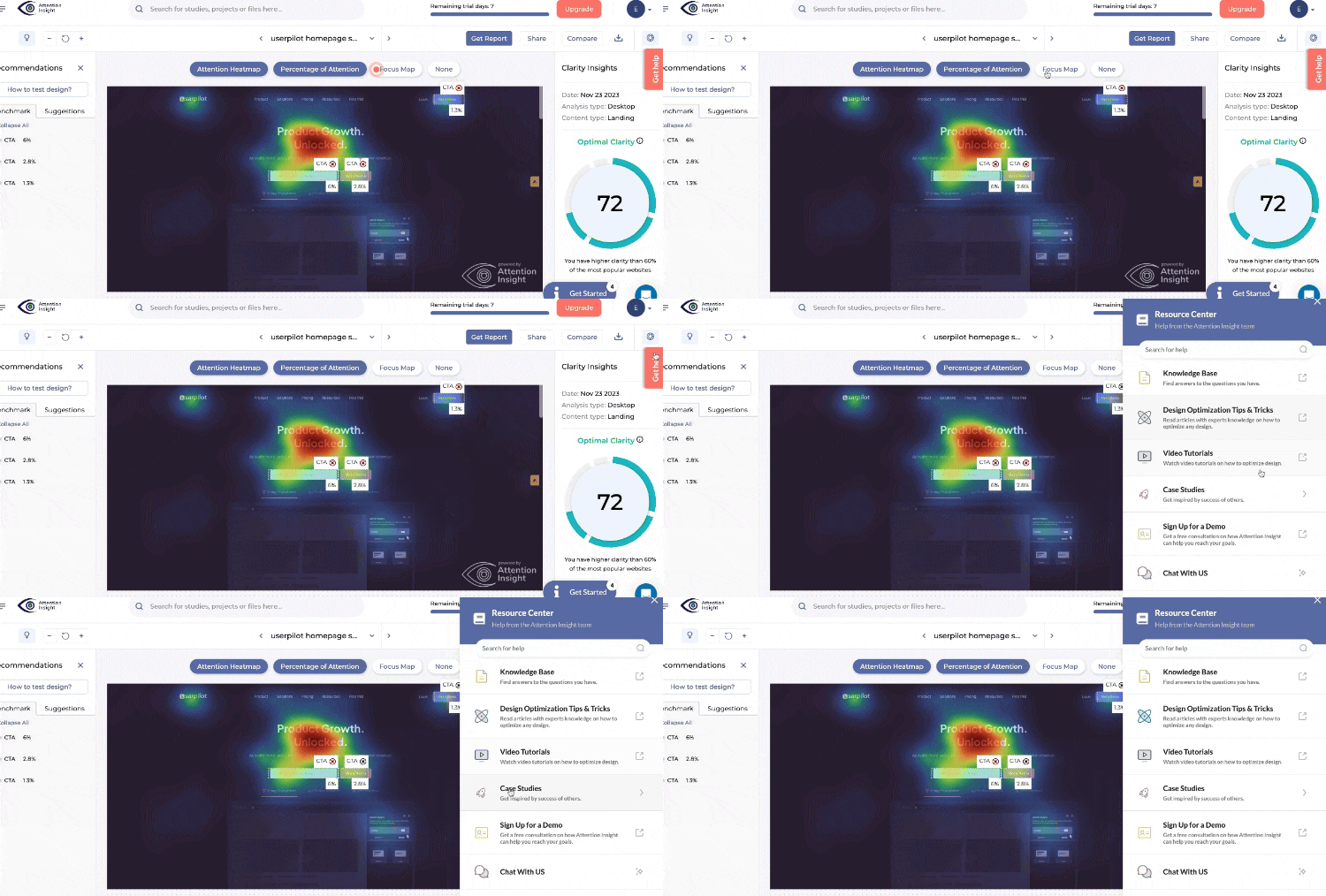
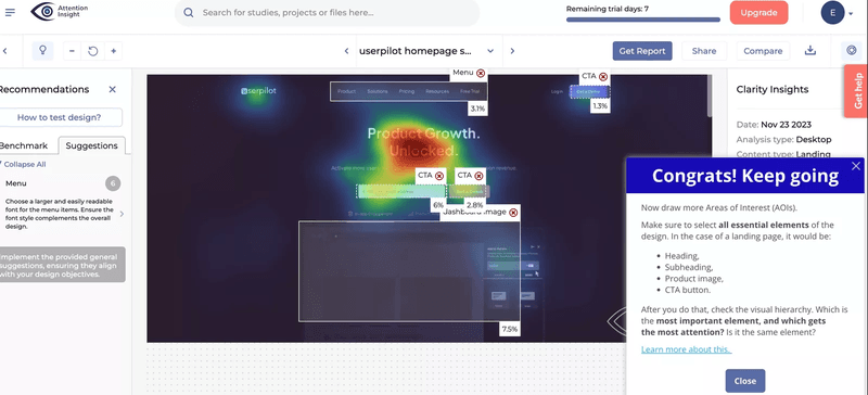
To address this, they introduced a self-serve onboarding process with an interactive walkthrough to guide users step-by-step through their first heatmap analysis.
Why Attention Insight creates a good customer onboarding process
- Combines several in-app experiences to boost user activation. Attention Insight boosts early engagement with interactive walkthroughs, onboarding checklists, and tooltips, increasing user activation by 47% by simplifying access to important features.
- Encourages engagement with necessary features. Attention Insight’s onboarding highlights key tools, like the heatmap generator and tagging, to ensure users engage with its core value and quickly experience its benefits.
- Reduces support requests with self-serve options. Attention Insight’s self-serve onboarding empowers users to navigate independently by using tooltips and checklists to answer common questions and reduce support needs.
5. Baremetrics leverages social proof to build user trust
Baremetrics helps subscription businesses track their numbers. It shows important data like monthly income, lost customers, and customer value.
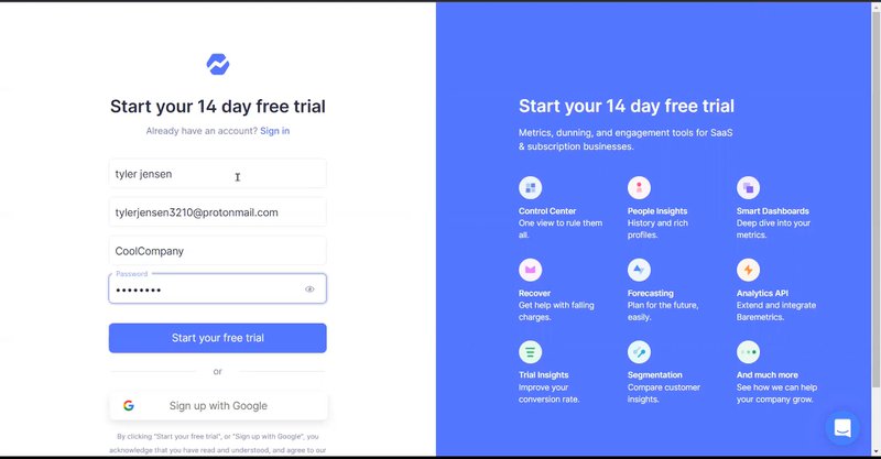
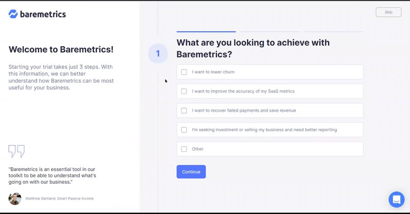
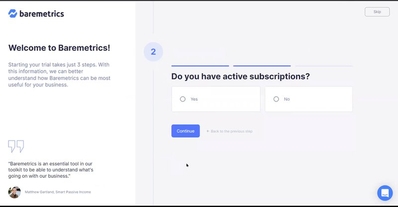
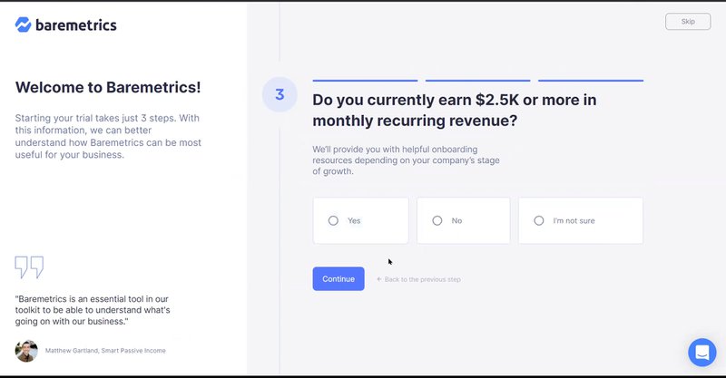
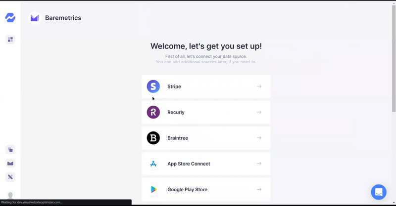
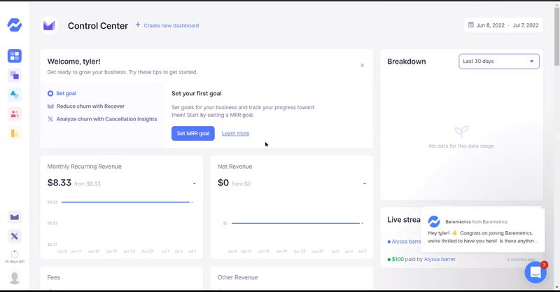
Their onboarding is simple to follow. Users start at a sign-up page. They answer three quick questions. Then they go to the main page where they can add their data and explore features.
How Baremetrics creates a good customer onboarding
- Incorporates testimonials. They show what current customers say about the platform. This helps new users feel confident about their final choice.
- Breaks down the survey into digestible chunks. The first survey is quick and easy. Users can finish it fast without feeling bored.
- Shares what users will get during the trial. Users see exactly what features they’ll get to try. This clear info helps them explore more and leads to more conversions.
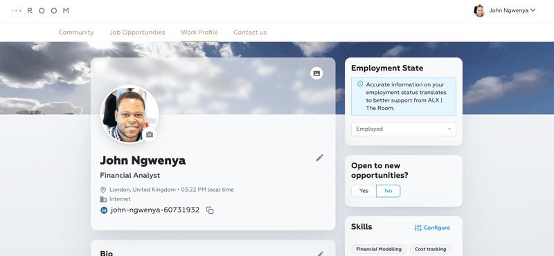
6. The Room addresses friction with targeted onboarding to boost CV upload rates
The Room, a Talent-as-a-Service platform, connects elite African professionals with global employers. With a goal of creating 3 million job placements over the next decade, The Room faced a significant challenge: low CV upload rates among new users.
This friction not only hindered candidates’ job prospects but also limited the platform’s ability to deliver on its mission.
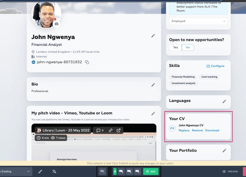
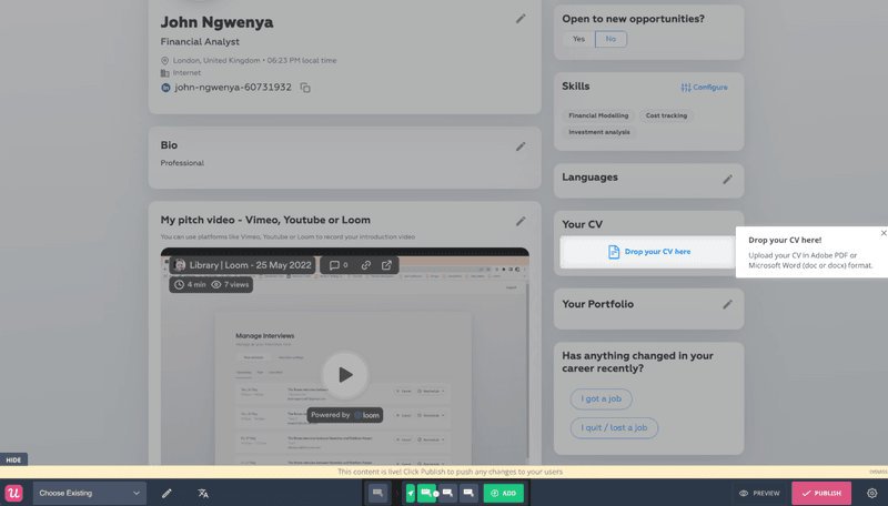
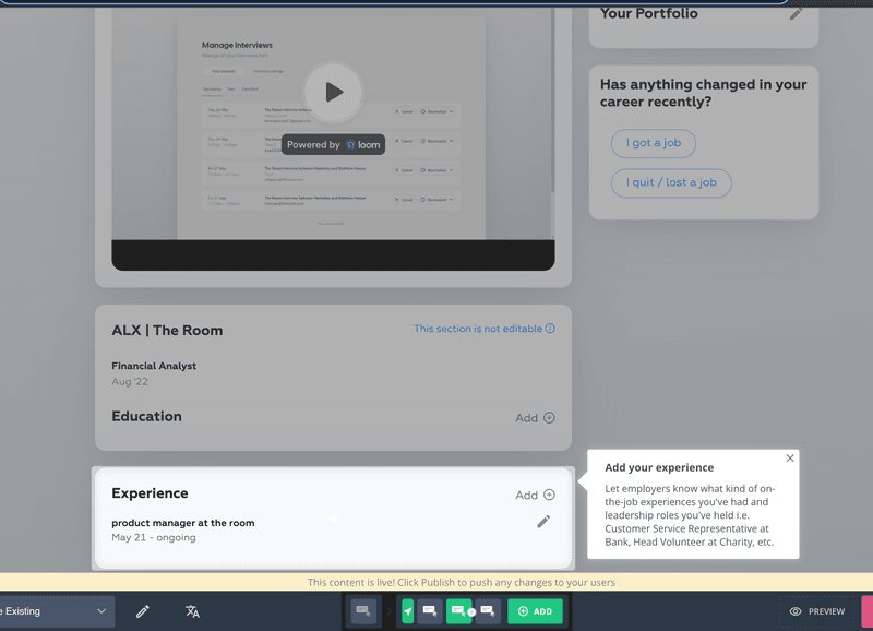
To address this, The Room implemented a targeted onboarding flow using a driven action UI pattern to guide users toward uploading their CVs. This process provided step-by-step guidance for completing critical sections like “experience.” These measures ensured users could seamlessly reach the platform’s key activation point.
Why The Room creates a good customer onboarding experience
- Addresses an issue in the customer journey. The Room addresses a key issue — users not uploading CVs — by removing this barrier and guiding users toward deeper engagement.
- Implements a “learn by doing” approach in their onboarding. This approach guided users to the CV upload feature, which was their key activation event.
- Simple yet effective. The Room simplifies onboarding with clear instructions to help users complete tasks smoothly and achieve activation.
7. Slack engages and educates users with fun little messages
Slack, a leading collaboration platform, centralizes team communication with integrated messaging, file sharing, and productivity tools.
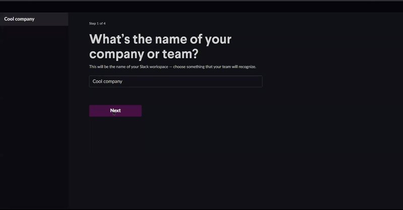
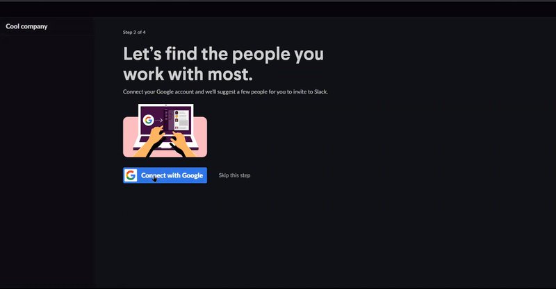
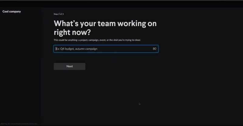
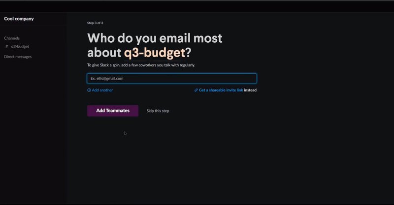
Slack’s onboarding process is engaging and informative, guiding users through team setup, project naming, invites, and Google account integration. Playful messages, emojis, and tooltips make the experience enjoyable and supportive.
How Slack creates a good user onboarding experience
- Helpful microcopies. Slack’s onboarding features friendly, concise microcopies that guide users through each step. These brief, helpful messages provide clear next steps without overwhelming users.
- Uses progressive disclosure. Slack introduces features gradually through progressive disclosure, revealing tools only when relevant. This prevents overload, allowing users to learn step-by-step and focus on each task.
- Interactive guidance. Slack’s user onboarding uses interactive guidance with modals and tooltips to highlight features like creating channels, messaging, and adding integrations. These real-time prompts help users quickly build confidence and independence in navigating the platform.
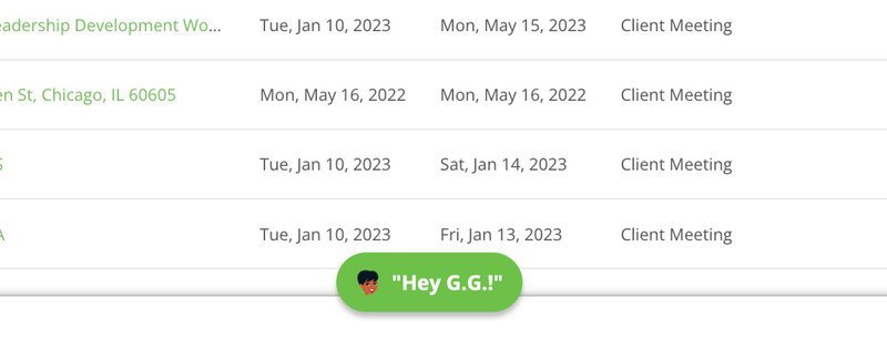
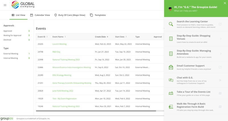
8. Groupize improves customer engagement with a gamified onboarding process
Groupize helps companies manage meetings, travel, and spending all in one place. It makes planning company events simple. Many new users found it difficult to start using the platform, which led to fewer people using all its features.
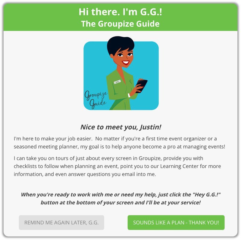
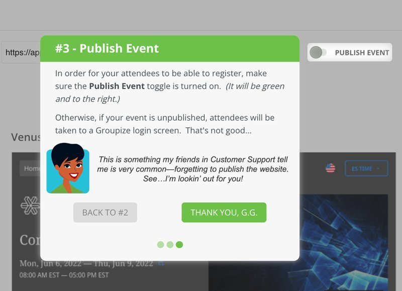
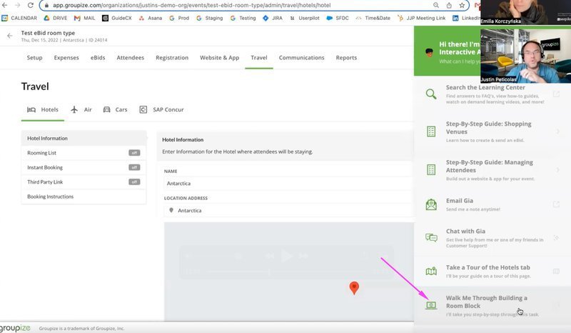
To solve this, they created G.G (Groupize Guide). This friendly guide uses fun tours and checklists to help new users. It makes learning about the platform more enjoyable.
Why Groupize creates a good user onboarding experience
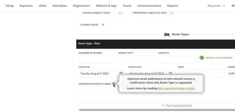
- Gamifies the onboarding experience with interactive elements. G.G. serves as a virtual guide, offering users step-by-step support via interactive elements. Onboarding tours are also triggered contextually to allow users to explore the app at their own pace.
- Provides step-by-step guidance with checklists. Users get a clear onboarding checklist of tasks to do. This makes learning easier and helps users feel successful.
- Personalizes onboarding with targeted feature education. Different users learn different features based on their roles – this helps them learn faster.
9. Grammarly incorporates a “learn-by-doing” approach for new users
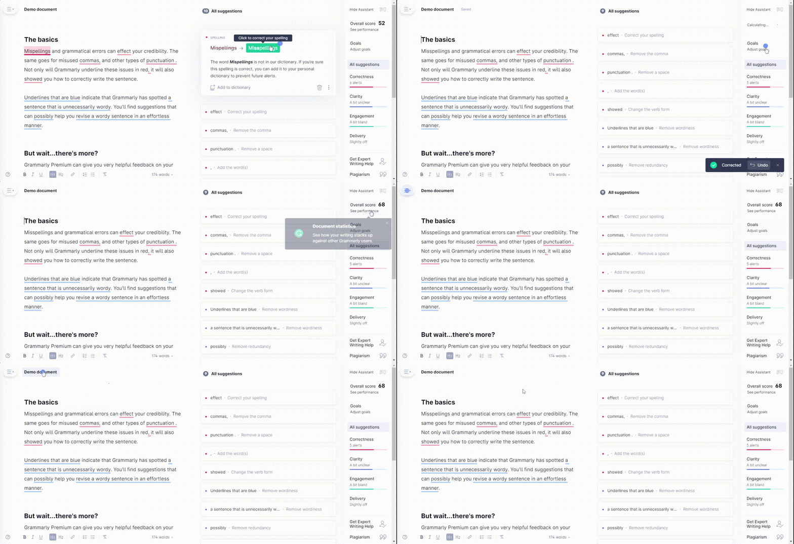
Grammarly helps people write better by checking grammar, punctuation, and style in real-time. They use a “learn-by-doing” approach where users start with a sample document that has some mistakes in it.
Hotspots and tooltips then guide users through features like grammar checks and word suggestions to make learning natural and fun.
How Grammarly creates a good user onboarding process
- Uses progressive disclosure. Users learn features one at a time with a sample document. They start with basic grammar fixes and move up to style tips. The sample document lets them practice at their own speed.
- Reduces barrier entry. Users can try features right away in the demo. They don’t need to set anything up first to see value quickly.
- Points out notable features with pulsing hotspots. Dynamic hotspots show users where important tools are. This helps them find and use key features easily
10. Kontentino improves user activation with a gamified onboarding process
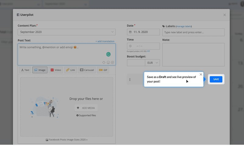
Kontentino helps teams to manage their social media content. It makes planning posts and getting approvals easier.
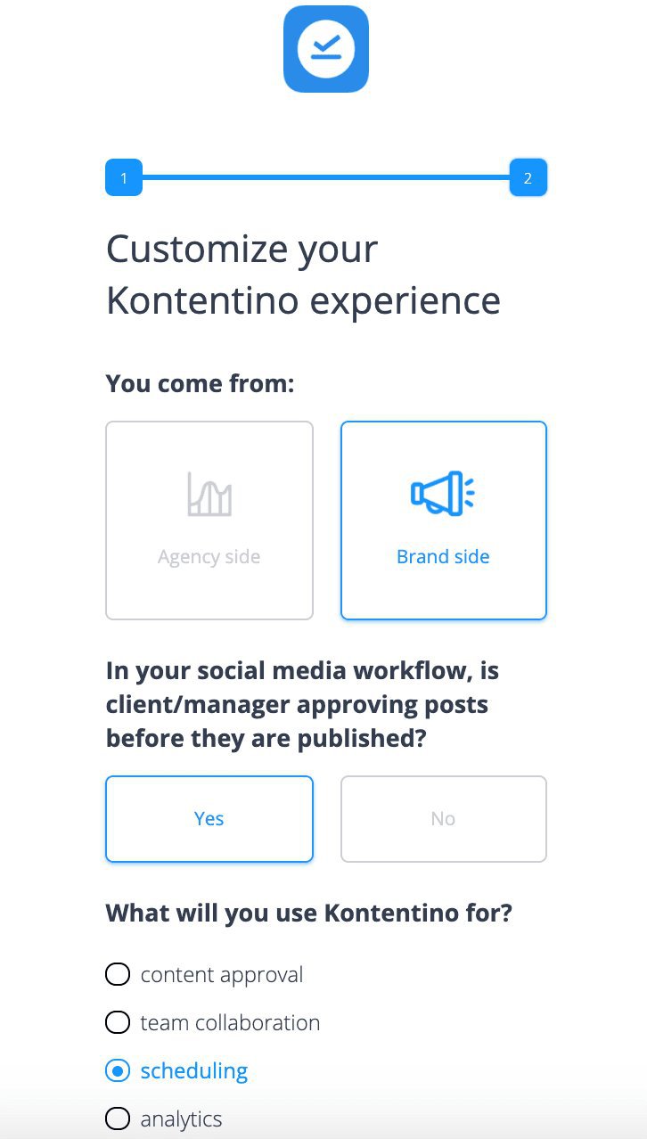
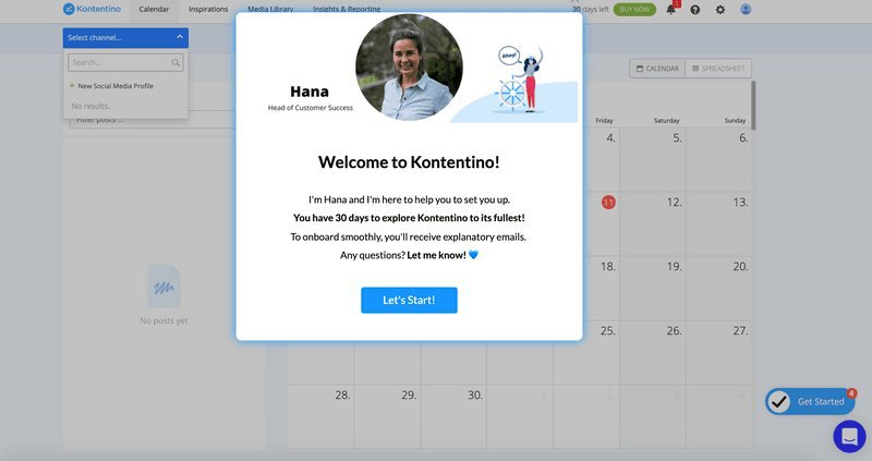
Their gamified onboarding starts with a friendly welcome. Users get an interactive checklist and positive messages. From there, they learn to connect accounts and schedule posts while having fun.
How Kontentino creates a good user onboarding flow
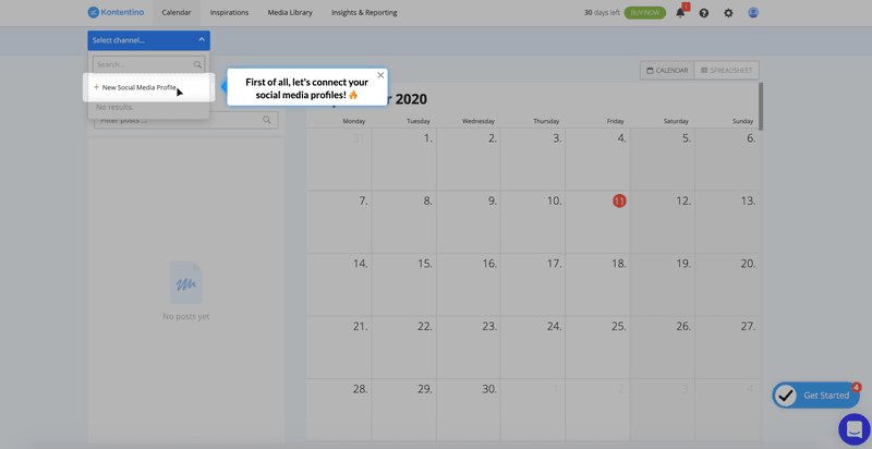
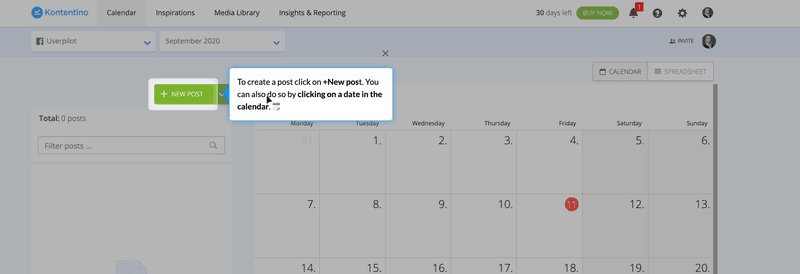
- The onboarding flow was connected with the main 2 activation points. Users learn to connect social accounts and schedule their first post right away. This helped 10% more users start using the platform regularly.
- Crafts well-thought-through elements with engaging and personable copy. The words they use are friendly and match their brand. This makes learning feel more natural.
- Engaging gamification elements. Users get a fun checklist and a GIF celebrating their success after connecting their profile. A series of tooltips then guide users through onboarding. These interactive elements encourage users to keep exploring and learning.
- White-glove onboarding. Users get personal help from dedicated teams. This works well for complex products and big clients.
- Self-serve onboarding. Users learn on their own through guides, tips, and checklists. This works well for simpler products with many users.
- Product-led onboarding. The product itself teaches users through demos and tips – users learn by doing.
- Interactive onboarding. Combines guides, pop-ups, and tips for better learning.
- Gamified onboarding. Uses progress bars, rewards, and challenges to make learning fun.
- Know your users. Learn what they need and what problems they face.
- Focus on milestones. Help them reach their “Aha! Moment.“
- Use interactive elements. Use user onboarding software to add tooltips and checklists.
- Personalize the journey. Design different onboarding paths for different users.
- Iterate. Keep testing and improving your approach where necessary.
Conclusion
Great user onboarding doesn’t just teach users how to navigate your product — it shows them why they need it and how to use it. The brands we’ve explored prove that personalized, engaging onboarding can create loyal customers who keep coming back.
Want to get started with user onboarding flows? Get a Userpilot Demo to create personalized, code-free onboarding flows that boost user activation and retention!
FAQ
What is user onboarding?
User onboarding helps new users learn about your product. It shows them key features and guides them toward achieving their goals. Good onboarding leads to more engaged users who stay longer and feel more satisfied.
Why is user onboarding important?
Good onboarding increases the activation rate and retention rate. It helps new users to trust your product and see its value quickly. Users learn features faster and stay loyal longer.

