What is a MAU? How (And Why) to Track Monthly Active Users


MAU is short for Monthly Active Users. Most product managers rightly use it as a north star metric for product growth. However, a rising MAU doesn’t always mean your product is thriving. Here’s why:
Most analytics tools count any interaction as “active,” even if a user logs in once and bounces immediately. To assess real user growth, product managers must define what “active” means for their product, filter out superficial activity, and pair MAU with engagement and retention metrics that reflect true product health.
In this guide, we’ll show you how to define and calculate MAU correctly. We also share which complementary metrics reveal whether users are genuinely engaged or just passing through.
What is Monthly Active Users (MAU)?
Monthly Active Users (MAU) is the number of unique users who interacted with your product in 30 days. It’s one of those key metrics that provides a quick read on whether your product is actually growing or quietly losing users.
We track MAU because it’s a health check and an early warning system. It tells us whether our product experience resonates and if our user acquisition efforts are attracting people who are most likely to engage. An increasing MAU trend indicates that users find value and return to your product. However, when it drops, it can signal a need to dig deeper into our customer experience strategy.
Why is MAU crucial for product growth?
Tracking Monthly Active Users gives us a clearer picture of whether our product is growing. If our MAU numbers are consistently rising, it tells me our product adoption and marketing strategies are effective and new users are finding value. When it drops, it’s a clear signal to investigate: perhaps a recent product update introduced friction, or a marketing campaign didn’t target the right audience.
MAU also plays a significant role in customer retention. A high MAU suggests that users are returning regularly, indicating the product is sticky and customers are experiencing their ‘Aha’ moments. User stickiness is especially vital for SaaS companies like ours, where recurring engagement drives revenue. It even influences how investors view our product, as a strong MAU signals a healthy, growing user base with potential revenue for long-term success.
When you think about “what is a MAU”, how do you define an ‘active’ user?
A rising MAU is a positive signal, but what’s the most significant blind spot it creates?
Which metric gives you the clearest insight into product stickiness?
You’re thinking beyond vanity metrics. The next step is turning MAU insights into action.
To truly understand what drives your MAU, you need to analyze user behavior, segment users effectively, and deliver personalized in-app experiences that drive activation and retention. What is a MAU if not a measure of the value you deliver?
How to track and calculate Monthly Active Users?
Measuring MAU sounds straightforward (just count unique users over 30 days), but if you want meaningful insights instead of vanity metrics, you need a clear process. Here’s how I typically break it down:
- Define what “active” actually means for your product: The word “active” isn’t a one-size-fits-all definition. For some product teams, an active user might simply log in. For others, it means performing a specific action, like creating a document, sending a message, or completing a transaction. To get meaningful insights, I recommend digging deeper than a login. Instead, define actions that show real engagement. For instance, at Userpilot, an active user creates or publishes an in-app flow, launches a survey, or analyzes a report. These actions demonstrate engagement with our platform.
- Select your timeframe: We stick to a rolling 30-day period. This approach provides a consistent view of activity, like day-to-day fluctuations and week-over-week comparisons. Some teams prefer calendar months for easier board reporting, but rolling windows are better for spotting trends early. Ensure that you count each user once, regardless of how many times they engage within that month. This provides a clean and unique user count.
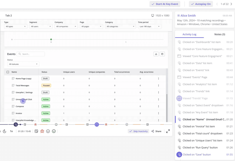
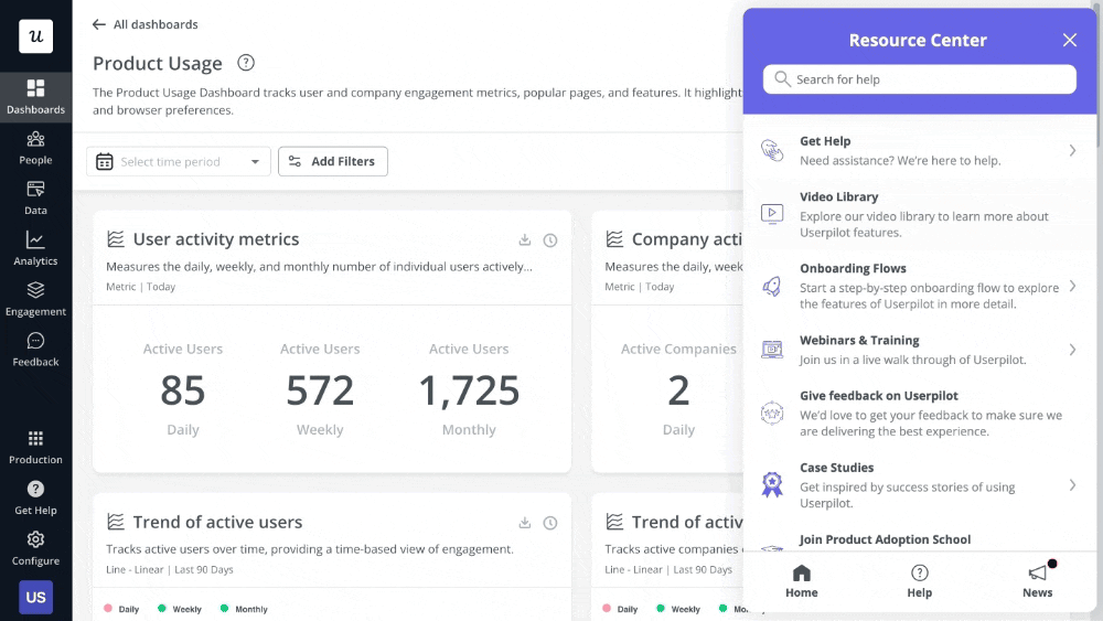
- Collect unique user data: This is where user analytics tools are handy. Userpilot enables us to track raw events, labeled events, and tracked events, allowing us to identify unique user interactions. It automatically captures clicks, text inputs, and form submissions, providing a great starting point for understanding user engagement. We can even create custom events by grouping related actions for more comprehensive insights.
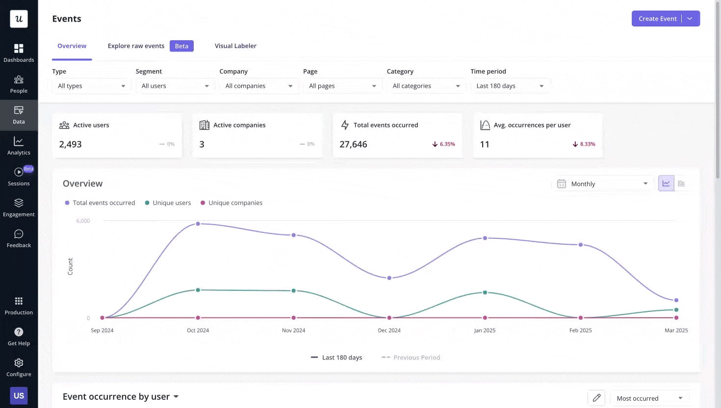
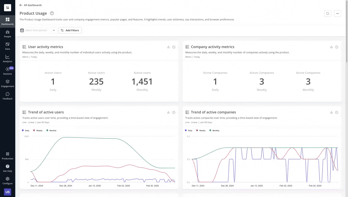
Once we’ve defined our events, we use Userpilot’s product usage dashboard to aggregate the data. Then, the Trends reports allow us to see MAU over time, segmented by user properties such as role, plan tier, or signup date.
What are the limitations of MAU (and how to overcome them)?
Relying on MAU alone can paint a misleading picture of your product’s health. Here are a few things it doesn’t tell us, and tips on how to fill in the gaps:
- It doesn’t highlight depth of engagement: MAU tells us only the quantity of users who are active, but not how active they are. Did they just log in and close the tab, or did they spend hours immersed in the product? This is where I turn to other metrics like sessions per user, retention rates, and session replays to understand the quality of interaction.
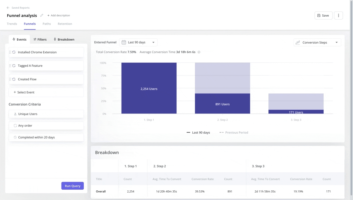
- It treats all users as equal: Not all active users are equally valuable. Some might be power users, others may only use the product occasionally. MAU doesn’t differentiate. We use user segmentation to gain a deeper understanding by analyzing how different groups of users interact with our platform. This way helps us track specific events and properties to define segments and then analyze their MAU separately, using funnel analysis or path analysis to see their journey.
- It inflates during launches and campaigns: For new products, initial MAU numbers can be inflated by launch campaigns. It takes time for organic usage patterns to emerge. In these cases, I focus on activation metrics and qualitative feedback to ensure users are getting genuine value.
Here’s a fix that addresses multiple limitations: split your MAU into new customers (those first active this month) and returning users (those active in previous months). This breakdown reveals whether growth comes from acquisition or user retention.
Rising MAU with mostly new users? That signals high churn and should be mitigated, even with a high acquisition rate. Rising MAU with growing returning users? That’s sustainable growth driven by a sticky product.
MAU vs WAU (Weekly Active Users) vs DAU (Daily Active Users)
Monthly Active Users isn’t the only way to measure engagement. Depending on your product’s natural usage cadence, you should track Weekly Active Users (WAU), Daily Active Users (DAU), or combine MAU with the other two to measure active users effectively.
WAU counts unique users who engage with your product within seven days. DAU counts the unique users who are active on a single day. The measurement process is identical to MAU; you simply change the time window.
Forcing any of these metrics as your north star can be misleading. Here’s how to choose:
Track DAU when your product is designed for daily use:
- Social media apps (Instagram, LinkedIn).
- Communication tools (Slack, messaging apps).
- Habit-tracking or fitness apps.
- News and content platforms.
These products lose value if users don’t engage frequently. For them, DAU is an important metric, and a strong DAU/MAU ratio signals genuine stickiness.
Track WAU for products with weekly rhythms:
- Project management tools (weekly standups, sprint planning).
- B2B analytics platforms (weekly report reviews).
- Email marketing tools (campaign scheduling and review).
- CRM systems (weekly pipeline updates).
Many B2B SaaS products fall into this category. Users don’t need to log in daily, but weekly engagement shows they’re getting consistent value.
Track MAU for lower-frequency products:
- Tax software (used during filing season).
- Expense management tools (monthly reconciliation).
- HR platforms (periodic reviews, benefits updates).
- Financial planning apps (monthly budget reviews).
For these products, daily or even weekly tracking creates noise. MAU smooths out the natural gaps in usage and gives you a clearer growth signal.
Why track multiple timeframes? Most product teams track all three (DAU, WAU, and MAU) because each reveals different insights. Measuring active users across daily, weekly, and monthly windows helps you spot patterns:
- Sudden DAU drops might indicate a critical bug.
- Declining WAU with stable MAU suggests users are engaging less frequently.
- Growing MAU with flat DAU means you’re adding users, but they’re not highly engaged.
The relationship between these useful metrics matters as much as the raw numbers, which is why the DAU/MAU ratio has become a standard measure of product stickiness.
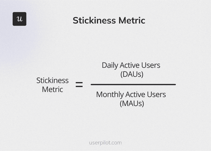
The DAU/MAU ratio: How to calculate stickiness metric
The DAU/MAU ratio indicates the percentage of your Monthly Active Users who return daily. It helps gauge how sticky your product is.
How to calculate the DAU/MAU ratio:
- Select a specific day and count how many users are active that day.
- Calculate MAU for 30 days ending on the same day.
- Divide DAU by MAU and multiply by 100 to get your percentage.
- Track it consistently, using the same day each week (such as every Monday), to spot trends.
Let’s say your product has 10,000 MAU. That sounds healthy, but if only 500 of those users log in daily, your DAU/MAU ratio is just 5%. This means 95% of your users engage less than once a day, signaling your product isn’t sticky enough to become part of their daily routine.
A high DAU/MAU ratio indicates that users consistently find value and return. Consequently, a low ratio suggests your product solves occasional problems but hasn’t become essential to users. The DAU/MAU ratio helps you quantify trends in user engagement over time and spot when stickiness is improving or declining.
The benchmark for a good DAU/MAU ratio depends heavily on your product category and expected usage cadence. Facebook famously maintains a DAU/MAU ratio above 50%, meaning more than half of its monthly users log in every single day. That’s exceptional, but it’s also a social network designed for constant engagement.
More acceptable benchmarks include:
- B2B SaaS products: Around 40% is solid (accounting for weekends and holidays when many users don’t work)
- General SaaS average: 13%
- E-commerce platforms: 9.8%
- Finance products: 10.5%
Before you panic about being below 40%, remember that usage patterns vary. A project management tool used mainly during business hours will naturally have lower engagement on weekends. An invoicing platform used monthly won’t match a messaging app’s daily cadence.
The key is tracking your ratio over time and comparing it to similar products in your category, not chasing Facebook’s numbers when your product serves an entirely different need.
How we drive MAU at Userpilot (and how you can too)
Increasing Monthly Active Users isn’t about growth hacks or tricks. It’s about consistently delivering value and making it easy for users to engage with your product. Here’s how we approach it, with tactics you can use in your product strategy.
1. Master user onboarding and activation
Your first impression sets the tone for everything that follows. If your net new users don’t hit their Aha moment quickly, they are less likely to become part of your active user base.
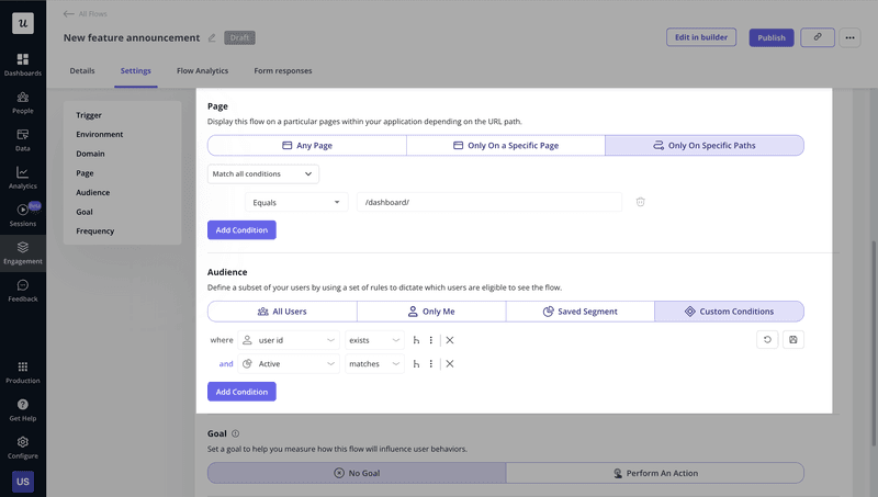
In addition to a transparent, goal-oriented onboarding process, we use Userpilot to create product tours and interactive user guides that walk users through setup step-by-step. Instead of front-loading everything in one overwhelming tour, we display contextual tooltips as users naturally encounter features. This progressive disclosure enables users to move forward without cognitive overload.
For example, a series of tooltips can highlight crucial features as a user encounters them, rather than overwhelming them with a single, long product tour.
We can even build these experiences quickly using our UI pattern templates while maintaining consistency across different user journeys. This reduces time to value and ensures users see the benefit before they lose interest.
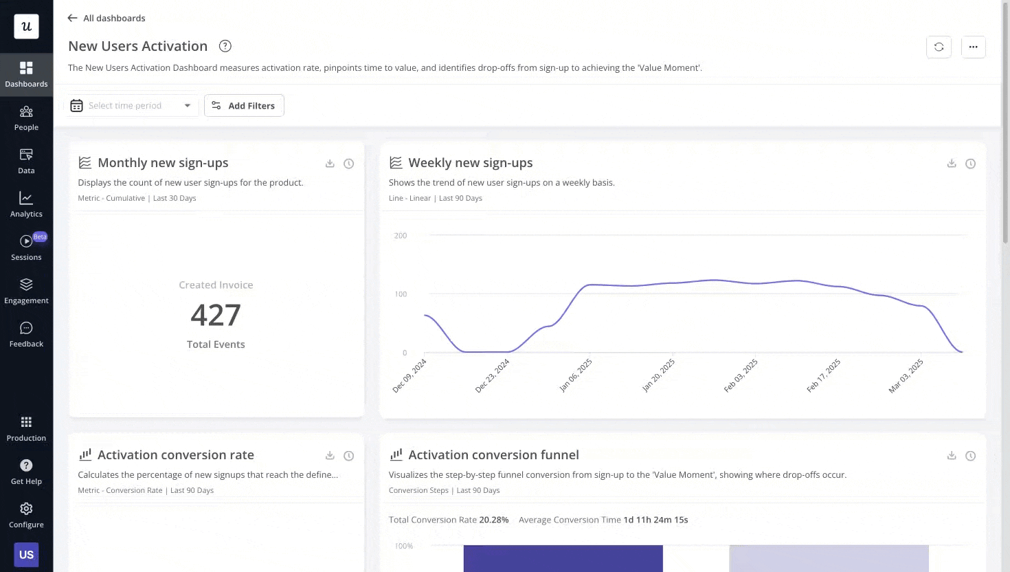
Our New User Activation Dashboard helps us track whether these efforts lead to higher activation rates, measuring drop-offs from sign-up to when users realize the value of our product.
2. Personalize the user experience
Generic experiences rarely drive customer satisfaction. A growth marketer and a UX designer have different goals, different workflows, and different definitions of value. Treating them the same guarantees that at least one will walk away confused.
We segment our users based on their roles, plans, or past behaviors and then deliver personalized experiences. For instance, a product manager might focus on onboarding centered on analytics and reporting, while a customer success manager emphasizes flows that prioritize surveys and feedback collection.
Our content personalization feature enables us to dynamically insert user data, such as their name, into messages, making interactions feel more human and relevant. We pass custom user properties to Userpilot during the SDK installation, and they flow through every touchpoint.
3. Drive continuous engagement with in-app messages
Onboarding gets users started, but sustained engagement keeps them active. We use in-app messages like spotlights, banners, and mobile slideouts to keep users engaged and informed.
The key is making these messages hyper-relevant to both the user’s job-to-be-done and their lifecycle stage. A new user needs help discovering core features. A power user needs to know about advanced capabilities and new releases. A dormant user needs a compelling reason to return.
For example, when someone’s in our analytics section, a banner might highlight a newly launched funnel report. Our checklists are also excellent for guiding users through complex tasks. They encourage feature adoption and push users to explore more of our product’s capabilities. We design these messages to be non-intrusive, allowing users to exit, dismiss, or skip steps easily.
Lifecycle emails play a supporting role here. While in-app messages catch active users, emails re-engage people who haven’t logged in recently. A well-timed email reminding someone about an incomplete setup task or a new feature they’d find useful can bring dormant users back into your MAU count. The combination of in-app and email touchpoints creates multiple pathways for users to return.
4. Collect and act on user feedback
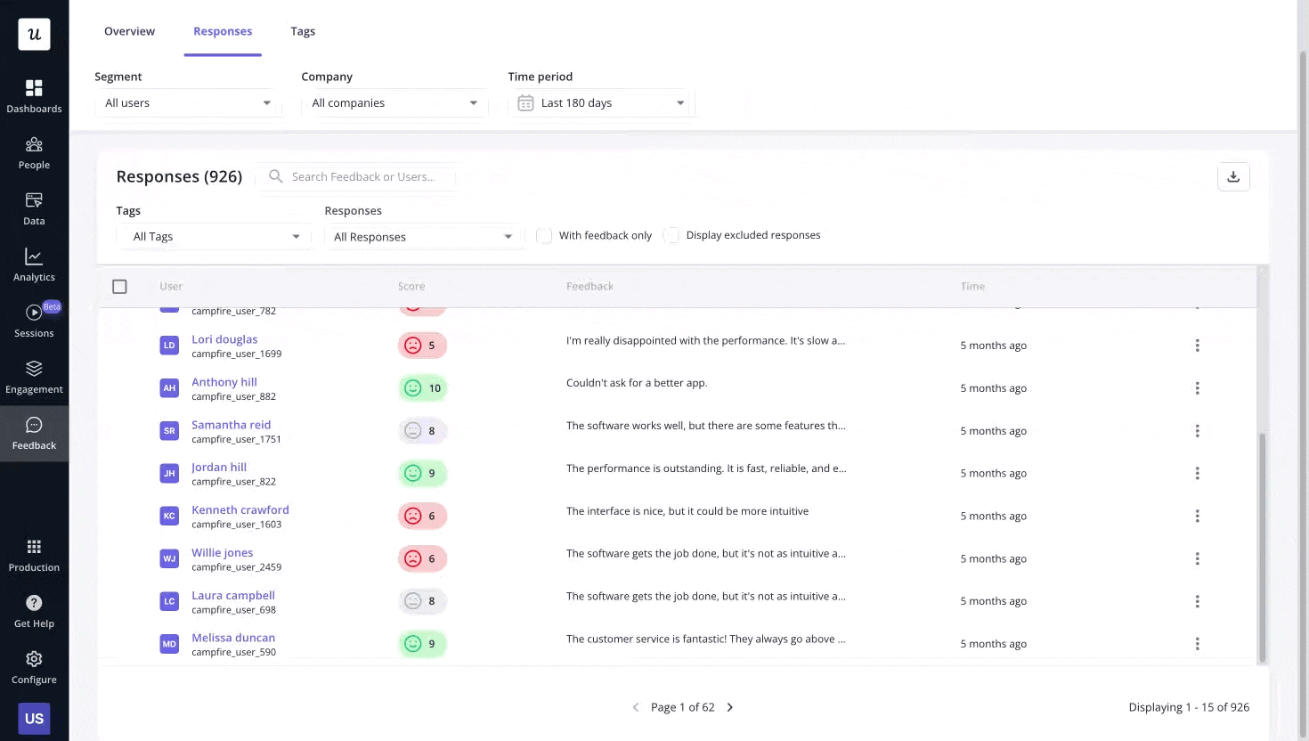
Listening to our users is paramount because we can’t improve what we don’t understand. We regularly use in-app surveys, including NPS surveys and feature-specific surveys, to understand sentiment and gather actionable feedback.
The magic happens when you actually act on that feedback. Our analytics dashboards make it easy to spot patterns. We tag NPS responses to identify recurring complaints, feature requests, or praise for specific capabilities. If ten users mention the same friction point, that’s not a coincidence; it’s a roadmap item.
This approach enables us to identify user friction points and implement data-backed improvements. We also sync survey responses with our CRM, like HubSpot or Salesforce, to close the feedback loop, which drives loyalty and repeat engagement.
5. Offer robust self-serve support
Empowering users to find answers themselves also boosts engagement. Our in-app Resource Center is a central hub where users can access help articles, video tutorials, and even replay past guides. It integrates with our knowledge base tools like Zendesk, making support readily available and reducing the load on our support team.

The Resource Center allows teams to include flows, checklists, surveys, videos, and custom JavaScript modules to provide comprehensive self-service options. But self-serve doesn’t mean leaving users stranded. We include a direct contact button and chatbot integration in the Resource Center.
If someone can’t find what they need, they can reach our support team instantly. This hybrid approach (self-serve first, human support as backup) keeps users moving forward rather than getting stuck and churning.
Increase monthly active users with Userpilot
Monthly Active Users might seem like a simple count, but tracking it properly (and pairing it with the right complementary metrics) gives you a real read on whether your product is growing or stagnating.
Growing your MAU means building a product people want to use repeatedly. That means:
- Nailing onboarding so users hit their aha moment fast.
- Personalizing customer experiences so that different user types find immediate relevance.
- Keeping users engaged through contextual messaging.
- Acting on feedback to remove friction.
- Offering support exactly when and where it’s needed.
Book a Userpilot demo to see how our platform helps you measure user engagement, identify drop-off points, and implement the strategies that drive sustained growth in Monthly Active Users.
FAQ
What are the pros and cons of tracking MAU?
Pros:
- MAU is simple to understand and communicate, as it provides a single number that anyone can grasp immediately.
- It smooths out daily fluctuations because, unlike DAU, MAU provides a stable view of your user base without day-to-day noise.
- MAU is easy to benchmark as it has industry standards across various product categories, making it straightforward to compare your performance against competitors.
Cons:
- You need to dig deeper to understand engagement depth. A user who logs in once for two minutes counts the same as a power user who spends hours daily in your product.
- MAU treats free and paid users equally, which makes it unclear who drives revenue.
- Launch campaigns, viral moments, or promotional signups can temporarily spike MAU without indicating sustainable growth or genuine product-market fit.
About the author