User Friction in SaaS: How to Identify and Reduce User Experience Friction to Win More Customers


User friction is anything that prevents users from getting things done and accomplishing their goals.
Too much friction kills your relationships with customers and eventually results in churn.
By reducing friction in your user experience, you will improve engagement, drive loyalty and retention, and ultimately boost conversions.
In this article, we’ll cover:
- What is user friction and how it can kill your relationship with customers?
- How to identify user experience friction.
- Examples of user friction and ways to overcome them.
- 9 actionable tips to reduce user friction in your product experience.
Let’s get started.
What is user friction?
In a nutshell, user friction is anything that prevents a user from completing the desired action.
Friction can be caused by bugs, unintuitive user interface, poor UX design, slow loading times, or by simply not understanding your users well enough and not meeting their expectations.
Obviously, such problems lead to frustration, decreased conversions, abandonment, and, ultimately, choosing a better app
What are the different types of user friction?
There are different types of user friction that can occur in SaaS. Those issues can be divided into three main categories: cognitive, emotional, and physical friction.
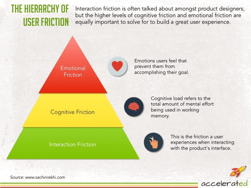
Emotional friction
The most complex type of user friction is emotional friction as it relates to the feelings of the users.
Emotional friction refers to the negative emotions the user feels as a result of not being able to effortlessly complete their desired action.
The goal of UX designers is to generate positive emotions and avoid making users feel bad when they use their product.
One excellent example of an app tackling emotional friction is Duolingo. The brand understands how challenging learning a new language is, so they make it fun with gamification elements like badges and certificates.
Interaction friction
Interaction friction occurs when the product’s interface is confusing or not easily navigable for users.
For example, when the user clicks on a button with the intention of landing on the pricing page of the product but instead is taken to the homepage, this type of friction happens.
Cognitive friction
Users experience cognitive friction when an interface does not function as they expect, and requires too much cognitive effort to complete a task.
One way to avoid this type of friction in your software is to have a dedicated team of UX designers to carry out in-depth user research on how users interact with similar products.
Examples of user friction and ways to overcome them
Let’s take a closer look at common user friction examples and how you can overcome them.
Too many steps in a process without accomplishing value
Including too many unnecessary steps in an action will increase the time to value and potentially harm the user experience. Users are more impatient than ever, so not experiencing an immediate value can frustrate them massively.
If users spend too much time trying to figure out your product without experiencing any value, they will churn. After all, they came because you promised a benefit, and if you fail to deliver, they will leave.
To help users discover value faster, remove unnecessary steps from all the processes. The faster and easier you can get them to the Aha moment, the better.
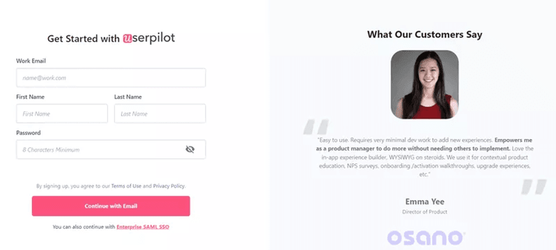
Take sign-up forms, for example. If you make them too complex or long, users will abandon them. Also, avoid asking users for upfront payment details before they try out your product.
You can improve your sign-up process by using single sign-on (SSO) to create a frictionless signup flow that will reduce the signup time.
Outdated and unattractive user interface design
Unattractive or outdated UI signals a poor product and leaves a negative impression of your product, which discourages users from trying it out.
UIs are for users, who ought to enjoy their experience when engaging with your product. But a bad design with too many colors, bad typography, or inconsistent style will leave them irritated.
Stay away from introducing too many design elements to your screen at once. And every once in a while, analyze the user’s needs to know if you need a product redesign.
Too much text
No one wants to read long chunks of text, that’s just too much cognitive load.
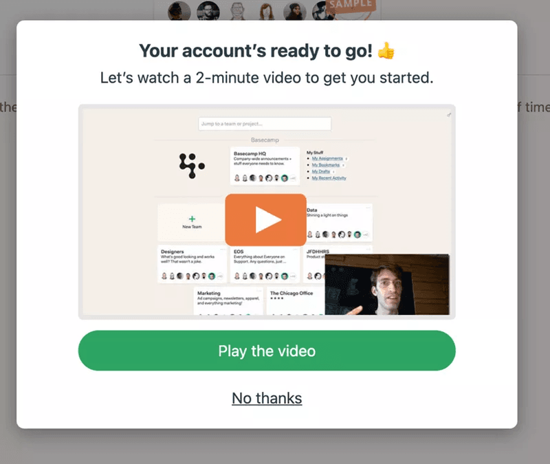
Spice up your design with visuals. For example, instead of writing 2000 words to explain how a feature works, create a short in-app video tutorial.
Not only would this make it easier for customers to understand your product in a shorter time, but it will also help them replicate the insights shared in your content.
Information overload and visual noise on the screen
Presenting users with lots of options at once can lead to cognitive impairment. Just imagine if you logged in to a new app and you are suddenly bombarded with multiple instructions.
You would be confused, right?
Reduce screen complexity by triggering one experience at a time. Don’t bombard users with multiple prompts, because giving users too many options just confuses them. Besides, users need time to absorb the information and act on it.
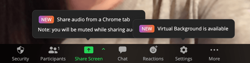
Here’s an example of visual noise from Zoom. Notice multiple tooltips popping up while the user is on a call. This single UX mistake would not only annoy the user but could also make them switch to other video tools.
9 Tips to reduce user friction in the product experience
As a user-centric business, eliminating user friction is vital for boosting customer retention KPIs. So, if you want to reduce user friction in your SaaS, start with these actionable strategies:
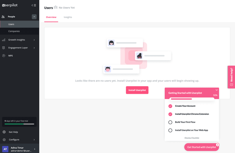
Fill empty states with engaging content to make it easier to get started
Simply put, “empty states” is the blank screen you encounter when there is no data to display on your product’s UI yet.
Leaving empty states empty is a huge UX design mistake. They make it difficult for new users to get started and require too much activation energy.
Utilize your empty states to their full potential by filling them up with educational information like in-app tutorial videos or placeholder data that can improve your onboarding process.
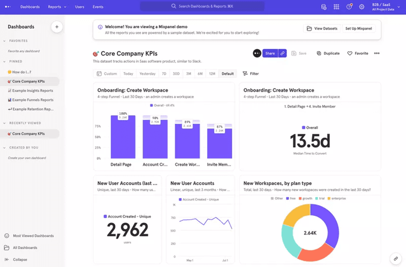
Mixapanel is an example of an app maximizing its empty state. Take a look at how the screen is filled with colorful placeholder data that is so exciting to just dive right in. Exciting, right?
Personalize the user experience based on needs to avoid user friction
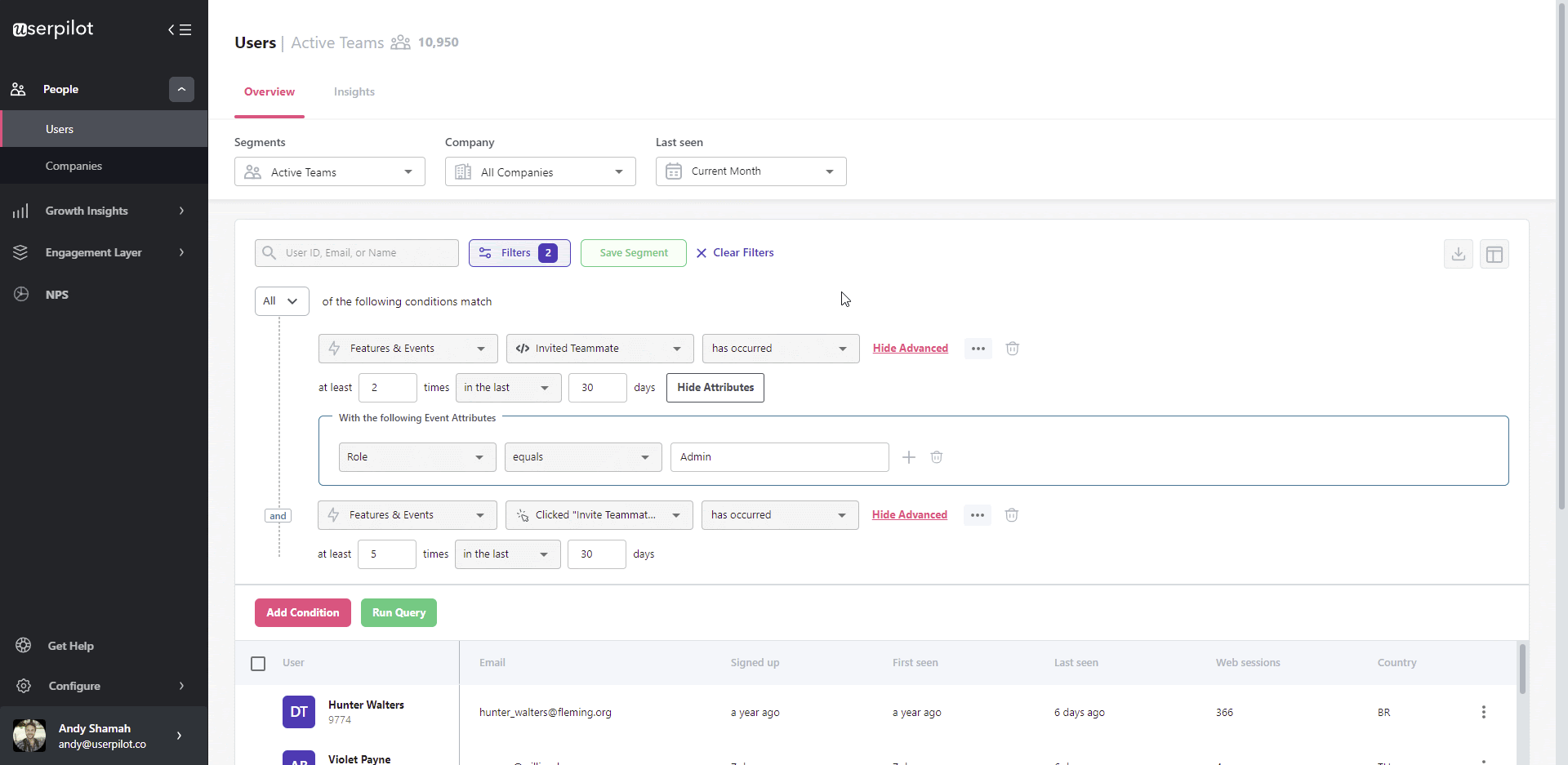
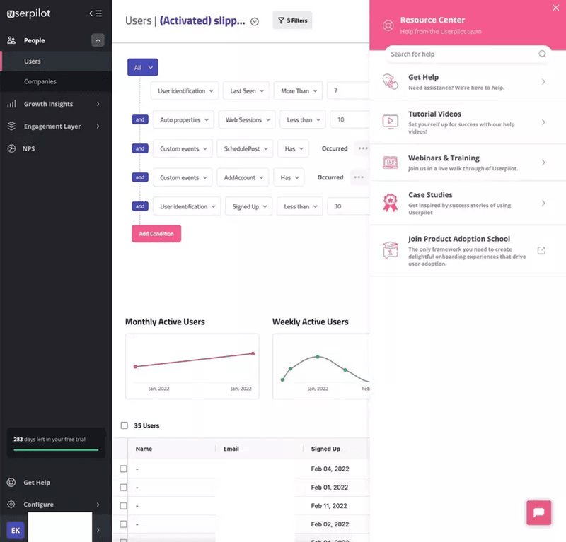
Use the data collected from in-app surveys and in-app usage to deliver personalized experiences that the particular user will find valuable.
Customize and launch in-app surveys of different types with Userpilot to gain insights into the mobile app experience.
With this data, segment users based on what they want to achieve with your app to craft flows for each user segment.
Trigger those experiences contextually. This way, the right user is getting the right information, at the right time without worrying about an information overload.
Use checklists and progress bars to keep users on the right track
The tiniest oversight can frustrate users and make them churn. That is why you need to map your journey and define the happy paths for your product.
Simply put, the happy path is the error-free path that users take to achieve the desired result.
Checklists help users to keep users in the right track and ensure they don’t end up taking the wrong paths. In the checklists, the key actions are outlined and your tasks are listed in chronological order, so there is very little chance to encounter roadblocks.
You can also add progress bars to motivate users to push through and complete tasks to decrease emotional friction. When users see they are already halfway through an action, they get excited and are more likely to complete it.
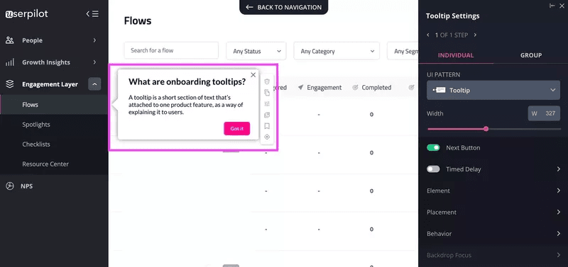
Help users overcome uncertainty and reduce user friction tooltips
You might have come across small pop-ups with details every time you hover over a UI element. These elements are called tooltips.
Tooltips keep the user interface clean without compromising the intuitiveness of the product. They provide contextual support when users need it and also help users to discover and get value from new features in a matter of seconds.
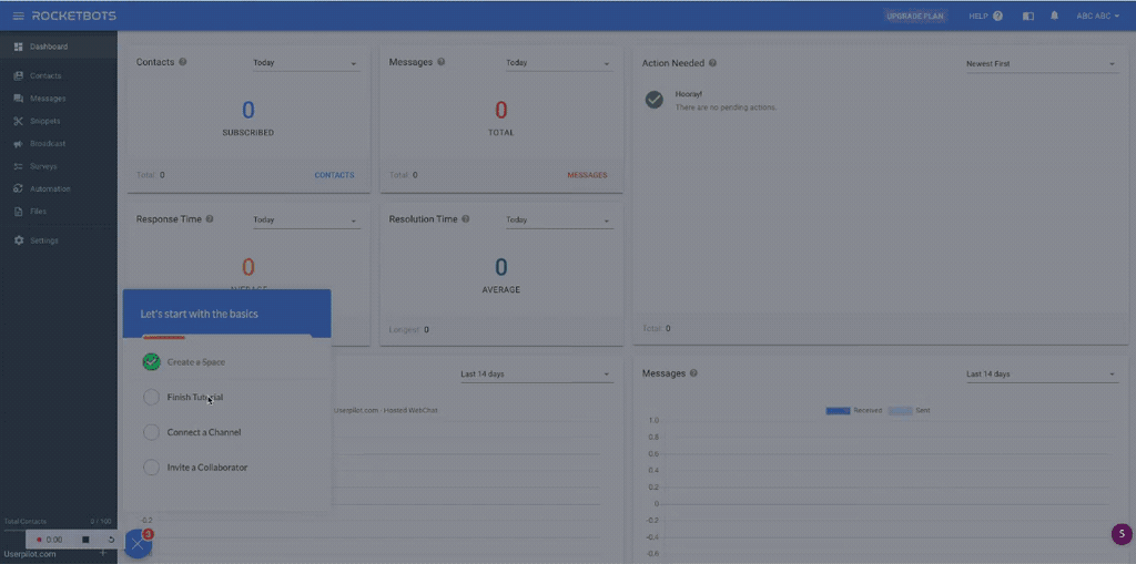
Use interactive walkthroughs to shorten the learning curve
Substitute long, generic product tours with interactive walkthroughs to improve your user experience.
With product tours, too many features are introduced too quickly. This overwhelms users and prevents them from establishing sufficient familiarity with one item before they’re ready to take on an additional layer of functionality.
Rather than overload customers, interactive walkthroughs take a better approach. Users are taken through engaging frictionless flows where each new step is triggered based on the user’s previous activity.
Keep the brand design consistent across the user journey
As we interact with familiar UI elements, we can draw on our previous experience. Learning how something new works, however, can create friction (too little knowledge can deteriorate the ease of use).
So it’s important to keep the UI design consistent throughout the user journey if you don’t want to overwhelm users.
Brand consistency starts with the tiniest details. For instance, using the same tone of voice and messaging throughout the user journey passes across a message of who you want to be.
Asana prioritizes brand consistency so much that when users come across their UI element, they immediately recognize that it’s them.
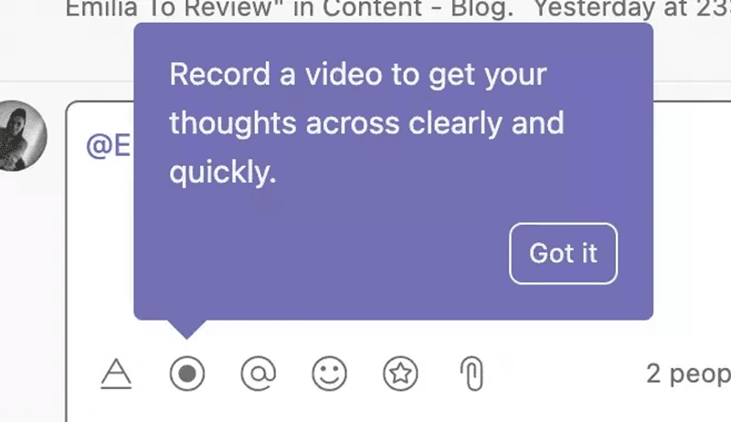
Plus, UI patterns are used for distinctive features so that users don’t mix them up. For example, the purple tooltips are reserved for product tips, while the white ones are used for notifications.
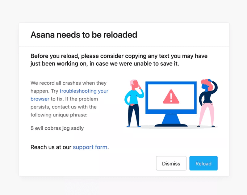
Set expectations and provide guidance through user interface feedback
Every time a user interacts with a product interface, a good UI feedback system informs the user what is happening.
The user interface can provide feedback in the form of error messages, form validation messages, loading pages or preloaders, button color changes when the user interacts with them, etc.
Get inspiration from Asana on how to provide good user interface feedback when users land on a broken page.
Reduce emotional user friction with gamification
Gamification infuses elements of gaming into UX design to encourage user engagement. Fun elements provoke positive emotions and make the experience memorable.
For example, you can add gamification elements to acknowledge and celebrate users each time they complete a task-just like in a game. Use celebratory modals, badges, points, or even certificates to drive users to the finish line.
By doing this, you make them happier and feel valued.
Enable on-demand self-service support
Sometimes, friction is inevitable. As much as you try to make your UI easy, users may always stumble upon something they don’t know how to navigate and solve.
However, there are still actions you can take to help users overcome the friction as painlessly as possible.
Create self-help resources for different parts of your product so that when users come across issues, they have the right resources to assist them.
For the best customer service experience, embed your self-help materials in an in-app knowledge base.
How to identify user experience friction
Now that you’ve seen the examples of user friction, let’s take a look at some ways of detecting user friction.
Conduct usability testing
Usability testing remains one of the most effective techniques for identifying and addressing friction in your product.
As you watch users use your product, you’ll undoubtedly find friction points that you hadn’t anticipated.
This technique must be leveraged not just once, but continually as you iterate a product.
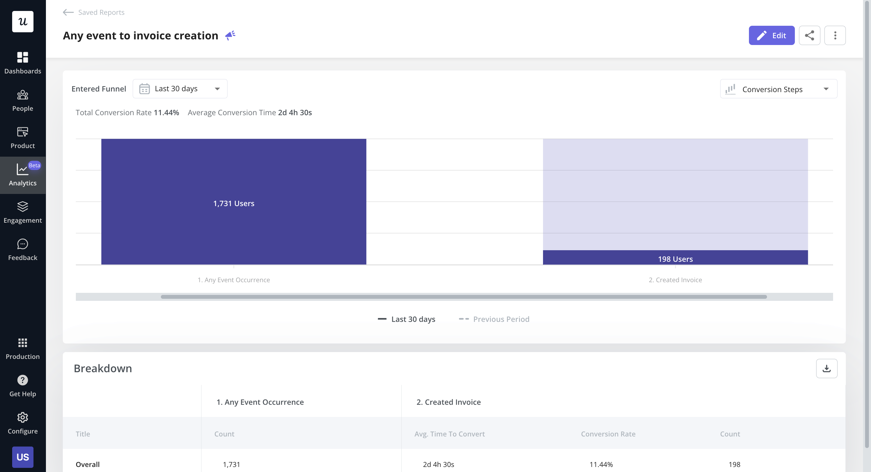
Perform funnel analysis
The funnel analysis technique identifies the steps in your app required to achieve a certain outcome (called a conversion or macro conversion) and more importantly, how many users progress through each of those steps.
The goal of funnel analysis is to identify the point where users drop off on their way to conversion and then design interventions to increase the chances of them reaching the next stage.
Tag features and analyze product usage
Tag features in your product to gain insight into how different user segments engage with each one.
Identifying underutilized features may help you identify friction points in your product.
Imagine that you have a feature that can help with a certain issue, but users are raising support tickets about it. Analyzing product usage may reveal that this feature isn’t used much.
When combined with usability testing, you may discover that the placement doesn’t work or that the feature has a bug. You can reposition the feature and fix the bug, then analyze the results after a while to see if this was the reason.
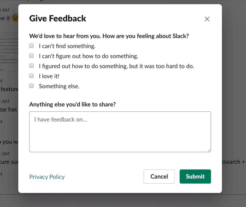
Collect user feedback at multiple touchpoints
Collecting user feedback at multiple touchpoints would help you uncover deeper insights into what’s happening in the user’s head at that moment.
However, your feedback survey is only as good as the questions you ask within it. Ensure you keep questions short, interesting and straightforward.
Ask open-ended questions to your customers about their emotions while using your product. This would help you identify which parts of your product are difficult to use and cause friction.
Mobile surveys are a quick way to measure customer satisfaction, gather real-time feedback, and boost engagement.
You can trigger those in-app surveys regularly. Or better, you can add an always-on feedback button to users can leave their feedback when they wish.
Conclusion
The success of every product is built on how easily users can understand and use your product. User friction makes this impossible to achieve. Not only does it mess up user experiences, but it also results in a high churn rate.
With the right product analytics tool, like Userpilot, you can spot user friction and tackle it head-on before this happens.
Book a demo with our team and get started!
About the author