Correlation vs. Causation in Product Analytics: A SaaS Guide to Growth
Imagine pouring resources into a feature upgrade based on a perceived correlation with churn, only to realize later that the real issue lies elsewhere. This is what happens when the distinction between correlation vs. causation is misunderstood.
And guess what? SaaS companies fall into this trap a lot. Our study of 181 companies found that only 24.5% of users adopt core features—let alone the entire feature set.
While adoption has several moving parts, understanding the true drivers of user behavior places you in a better position to deliver value and increase engagement.
To help you achieve that, today’s guide covers:
- Common examples of correlation and causation.
- 4 reliable ways to determine causal relationships.
- Best practices to help you make more data-driven decisions.
Correlation vs. causation: What’s the difference?
Let’s start by defining the key concepts:
What is correlation?
Correlation means there’s a pattern between two events or variables. They tend to happen together, but one doesn’t necessarily cause the other.
Statistical correlation is measured using data analysis tools like Excel, R, Python, or dedicated statistical software like SPSS or SAS. Basically, you want to determine the correlation coefficient, which ranges from -1 to 1. This coefficient helps you understand the strength and direction of the relationship between the variables.
Here’s how to interpret it:
- Positive value (e.g., 0.7): Indicates a positive correlation where the variables move in the same direction. An increase in one generally increases the other.
- Negative value (e.g., -0.5): Indicates a negative correlation where the variables move in opposite directions. As one increases, the other decreases.
- Zero correlation: Indicates no linear relationship between the variables.
What is causation?
Causation happens when there’s a clear and demonstrable link between an action and its outcome.
As you might have seen above, it’s easy to spot positive and negative correlations—what’s difficult is identifying if one variable is causally related to the other, and that’s the holy grail of product growth.
Once you’re able to observe user behavior patterns and find where the causation exists, you’ll be better positioned to improve customer satisfaction, boost adoption, and increase your bottom line.
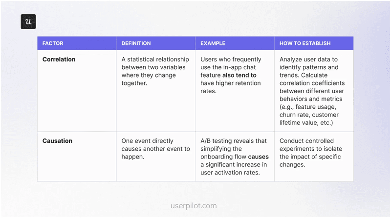
Correlation vs. Causation: What’s the difference?
You notice that users who rarely log in also have a high churn rate. What does this observation represent?
Why correlation does not imply causation
When two things happen together, it’s tempting to assume there must be an underlying causal relationship. But that’s not always the case.
Picture this: you’re checking the analytics report for your SaaS platform, then notice a positive correlation between users who rarely log in and those who churn. It’s easy to conclude that infrequent logins drive churn, but there might be a hidden third variable at play.
This third factor is called a confounding variable and it means any external factor that influences both the independent variable (infrequent logins, in this case) and the dependent variable (churn).
Going back to our example, it’s possible that users who don’t fully understand your product’s value are more likely to log in less frequently and eventually churn. Meaning, a lack of perceived value is the confounding variable driving both observed trends.
Why it’s important to distinguish between correlation vs. causation?
Mistaking a direct relationship for a causal relationship can lead to a series of unfortunate consequences, derailing your growth trajectory and hindering your ability to deliver true customer value.
Here’s what can go wrong:
- Ineffective solutions: When you misinterpret correlations, you might invest time and resources into features or improvements that don’t address the real drivers of customer behavior. This leads to ineffective solutions that fail to move the needle on key metrics like engagement, retention, or revenue.
- Wasted resources: Chasing correlations without understanding causation can lead to significant resource wastage. You might pour money into marketing campaigns, product development, or customer support initiatives that don’t yield the desired results.
- Missed opportunities: By focusing on the wrong variables, you might miss crucial opportunities to improve your product and enhance customer value. This can hinder your ability to innovate and stay ahead of the competition.
Example of why research is important: After identifying a correlation between community membership and user retention, Microsoft’s data analysis team decided to dig further and see if there was causal evidence before investing more resources in marketing the community feature. Their research confirmed the causal relationship indeed existed and also identified other factors affecting retention!
3 Examples of correlation vs. causation in product analytics
Let’s explore a few more examples to further illustrate the crucial difference between correlation and causation—and why it matters for your SaaS product.
1. Feature usage and customer lifetime value (CLTV)
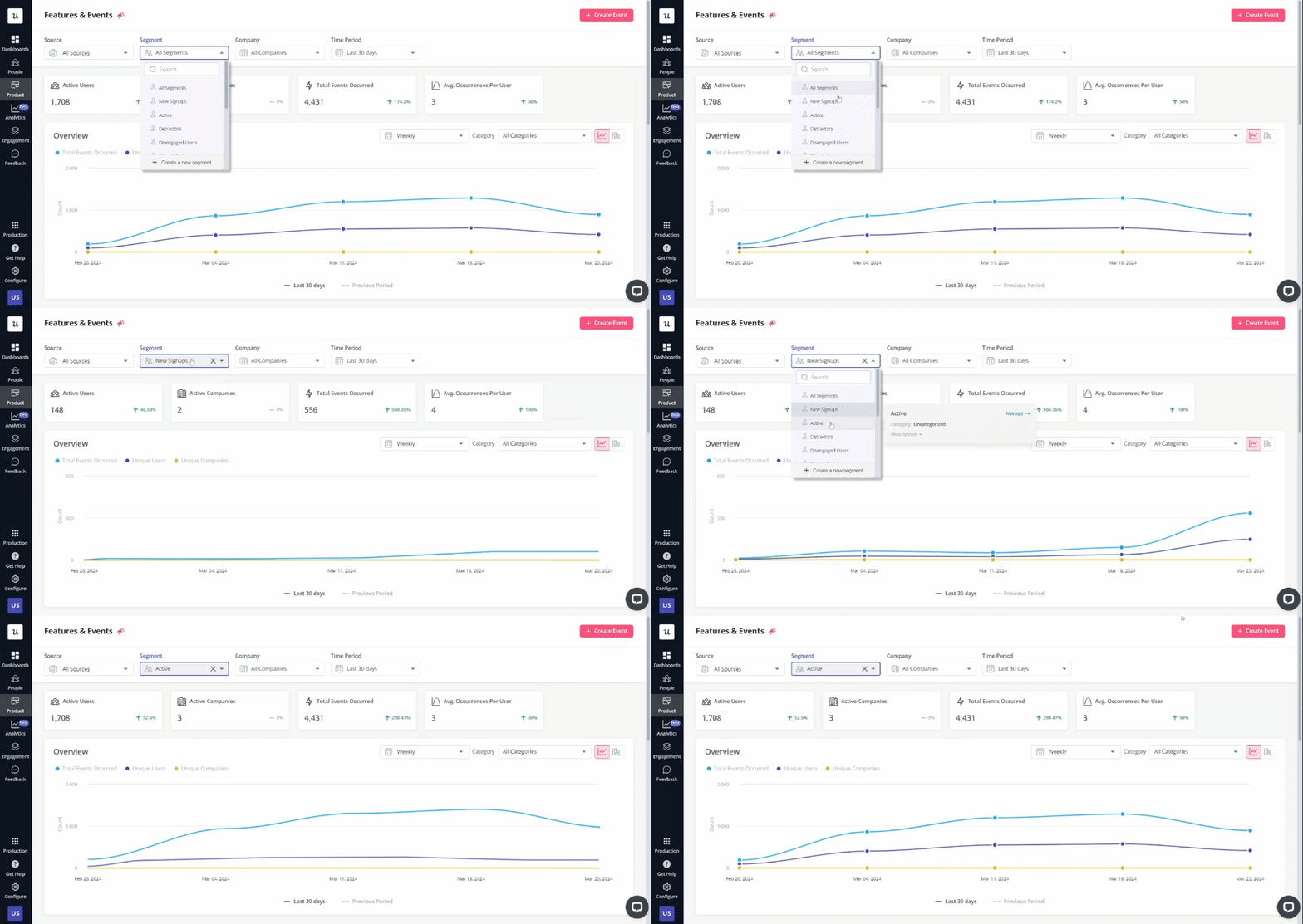
Imagine you’re analyzing data for your project management software and discover that users who frequently use Gantt charts tend to have a higher customer lifetime value.
While it might be easy to conclude that Gantt chart usage directly drives CLTV, it’s essential to consider other factors that might be at play.
Perhaps users who are more engaged with the platform overall or manage larger teams are more likely to use Gantt charts and stay subscribed longer.
To uncover the true causal relationship, you could use a tool like Userpilot to monitor feature usage patterns across different user segments and glean granular insights for a more solid conclusion.
2. Onboarding flow A/B test
Say your current user onboarding relies on a product demo. Activation rates are low, and you theorize that creating a new onboarding flow that provides interactive guides will improve activation.
Once the flow is ready, you deploy an A/B test to measure the impact of the new flow. By randomly assigning users to either group (control group vs. experimental group) and measuring the difference in user activation rates, you can determine if the new design causes an improvement.
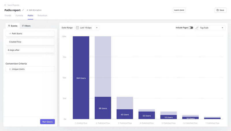
A product growth tool like Userpilot makes this process easy. In addition to deploying Userpilot for A/B testing, you can implement our path analysis feature to visualize and analyze user journeys through different onboarding flows.
3. Trial Length and conversion rate
For many SaaS companies, extended trial periods often correlate with higher conversion rates. At face value, it might seem like increasing your trial period from 7 to 14 days would directly lead to more paying customers.
However, this correlation doesn’t necessarily imply causation.
While longer trials might give users more time to explore your product’s features, it’s possible that users with higher purchase intent are simply more inclined to use a longer trial period. In other words, the desire to thoroughly evaluate the product before committing to a purchase could be the third variable influencing trial length and conversion rates.
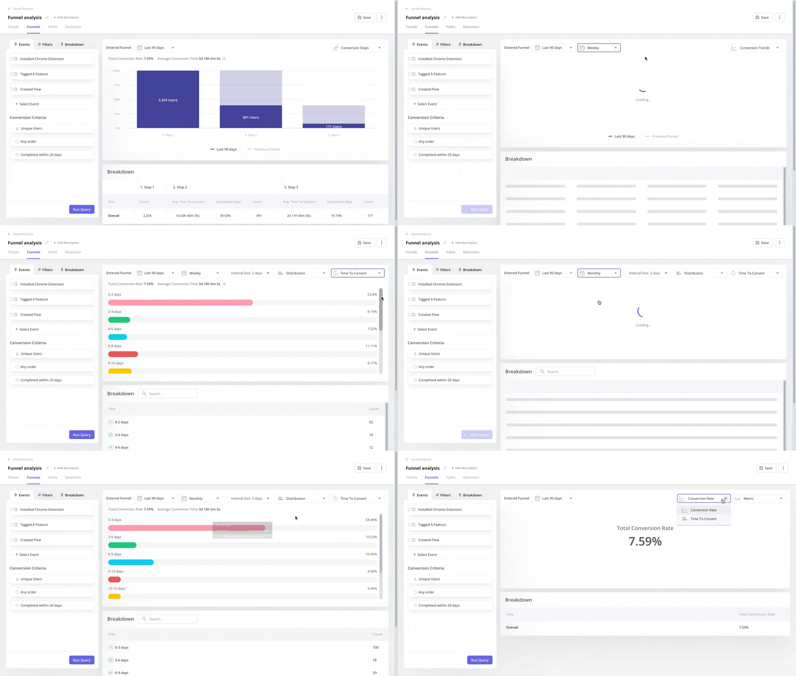
To understand the factors truly influencing conversion decisions, leverage the “time to convert” feature in Userpilot’s funnel analysis tool. This will allow you to analyze user behavior within the trial period and make data-driven decisions rather than relying on assumptions.
4 reliable ways to determine causal relationships for your SaaS
Now that you’ve understood the differences, this section will show you proven ways to distinguish correlation vs. causation.
1. Start with hypothesis testing
Hypothesis testing is a scientific research method that uses past data to help determine the type of relationship between two variables.
To begin, clearly define your independent and dependent variables.
- Independent variable: The variable you manipulate or change to observe its effect.
- Dependent variable: The variable you measure to see how it’s affected by changes in the independent variable.
For example, your hypothesis might be: “Increased usage of collaborative features (independent variable) leads to higher user retention rates (dependent variable).”
To test this hypothesis, you could use Userpilot to segment users based on their engagement with collaborative features (e.g., shared workspaces, co-editing tools, team communication channels, etc.).
After tracking the retention rates of those who actively use these features compared to those who don’t, you’ll gather evidence to support or refute your hypothesis.
2. Run controlled experiments (A/B testing)
A/B testing helps you establish causation by comparing two versions of something (e.g., a web page, an email campaign, or a feature) to see which performs better in achieving a specific goal.
While hypothesis testing analyzes existing data, A/B testing generates new data through controlled experimentation. This makes it an effective tool to validate findings from hypothesis testing and demonstrate a stronger causal link.
Follow these steps to conduct an effective A/B test and determine the cause-and-effect relationship between two variables:
- Define your hypothesis: Clearly state the expected impact of the change you’re testing. For example, “Changing the call-to-action button color on our pricing page from blue to green will increase the click-through rate.”
- Select the variables: Identify the independent variable (what you’re changing) and the dependent variable (what you’re measuring). In the example above, the independent variable is the button color, and the dependent variable is the click-through rate.
- Assign users to groups: Randomly assign users to either the control group (existing version) or the experimental group (modified version). In our example, users would be randomly shown either the blue or green button.
- Collect data on the chosen metric: Track each group’s performance based on the defined goal (e.g., conversion rate, click-through rate, engagement).
- Analyze results: Use statistical analysis to determine if the observed difference between the groups is statistically significant. If the green button has a significantly higher click-through rate than the blue button, you can conclude that the color change caused the improvement.
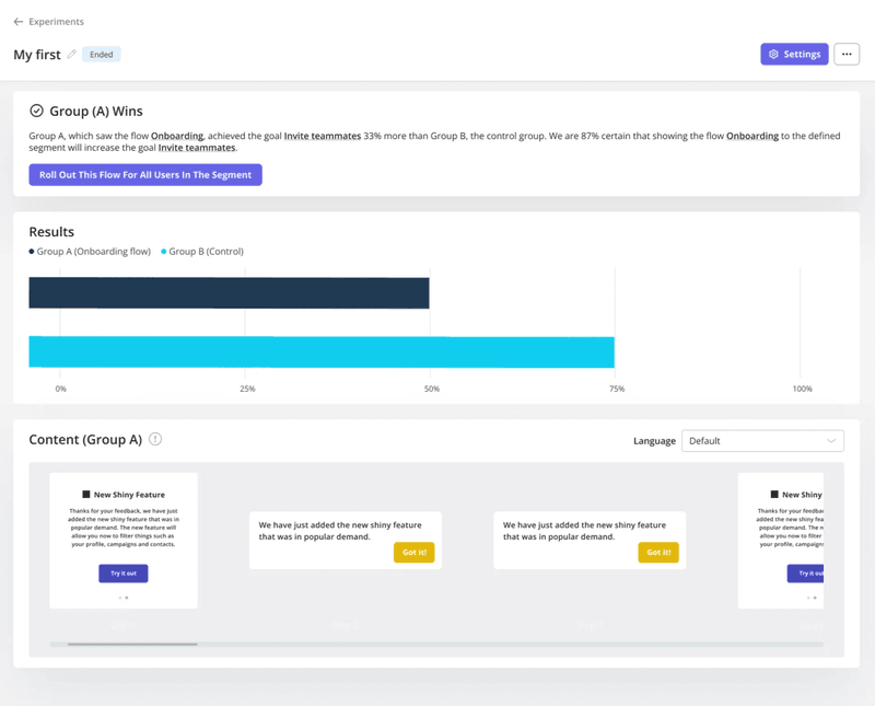
Userpilot makes it easy to run A/B tests and analyze the results in real time:
3. Analyze user paths and funnels
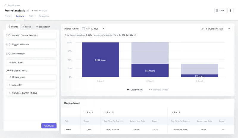
Path and funnel analyses help you visualize users’ steps, the pages they visit, and the features they interact with. This rich data empowers you to uncover patterns and spot potential causal relationships.
For example, when analyzing your onboarding funnel, you might discover that many users drop off after the initial signup stage. This could indicate a bottleneck in the process, such as an overwhelming UI or a confusing tooltip.
Tools like Userpilot provide powerful features for tracking user journeys and conducting funnel analysis. With Userpilot, you can:
- Define custom events and goals to track specific user activity.
- Visualize user flows and identify patterns across different segments.
- Analyze conversion rates at each stage of the funnel.
- Identify friction points and areas for improvement.
4. Conduct regression analysis
Regression analysis is a statistical method for examining the relationship between a dependent variable and one or more independent variables. Unlike hypothesis testing and A/B testing, which often focus on isolating the impact of a single variable, regression analysis allows you to consider the combined influence of multiple factors on an outcome.
For example, you could use regression analysis to analyze the impact of customer support interactions on churn rate. By controlling for other factors that might influence churn, such as pricing plan or feature usage, you can isolate the effect of support interactions and determine if they have a causal impact on customer retention.
Best practices for defining and analyzing causal relationships
Establishing causal relationships requires careful planning, rigorous analysis, and a thoughtful approach to data interpretation. Here are some best practices to guide your efforts:
1. Replicate and validate your experiments
A single experiment is often not enough to prove causation definitively. To strengthen your findings, replicate your experiments across different data sets and time periods.
As Kevin explains below, it’s important to start small and scale from there. Don’t try to track multiple metrics at once, as that can confuse you and extend the time it will take to arrive at solid conclusions.
It also helps to use an all-in-one tool like Userpilot, which allows you to track quantitative and qualitative data on a single platform and implement changes easily.
2. Collect and analyze data rigorously
Choose the proper statistical methods for your data and research question. Different techniques are suited for various data and analysis goals, so you may have to consult a data analyst or statistician if needed to ensure you’re using the most appropriate techniques.
During the research, carefully document your methodology and assumptions to ensure reproducibility.
3. Control for confounding variables
Confounding variables influence both the independent and dependent variables, potentially masking the true causal relationship. When analyzing data, consider factors such as user psychographics, prior experience with similar products, external events, or even the time of day.
While it’s not always possible to completely eliminate confounding variables, acknowledge their potential impact and consider further research later.
Conclusion
The fact that correlation exists doesn’t mean one variable is causally related to the other.
Assume everything is correlational unless proven otherwise through rigorous experimentation. This mindset will help you avoid misinterpreting data, allocate resources effectively, and prioritize product development efforts that deliver real value to your users.
If you’re looking for a tool to help you regularly differentiate correlation vs causation, Userpilot can help. Book a demo today to get started!

