Customer analytics helps SaaS teams understand what users do, why they do it, and where their experience can improve. By examining real behavior across the product journey, you can surface friction, uncover growth opportunities, and make smarter decisions that boost activation, retention, and revenue.
With clear visibility into how users interact with your product, you can move faster, resolve issues before they escalate, and create experiences that drive long-term customer loyalty. Customer analytics becomes the engine behind better decisions and sustainable SaaS growth.
What is customer analytics?
Customer analytics is the process of turning data from user touchpoints into insights that improve product decisions, revenue outcomes, and customer experience. Instead of simply reporting metrics, it combines three key data types:
- Behavioral data such as events, website activity, and feature usage
- Transactional data like plan details, billing history, and purchases
- Attitudinal data from surveys, feedback, and sentiment
Together, these data sources help identify patterns in user behavior, explain why they happen, and forecast what users are likely to do next across the entire customer journey.
We use customer analytics to:
- Improve retention: With churn signals and customer segments (e.g., users who haven’t hit activation KPIs) to trigger outreach or in-app tips before they leave. Over 50% of customers will switch after a single poor experience, so closing friction fast helps us maintain customer retention.
- Enhance customer experience: Personalization is no longer a “nice to have.” In 2024, the share of customers who feel brands treat them as unique individuals jumped to 73% from 39% in 2023. This shows that data-driven customer experience drives growth as more brands are implementing it.
- Building a predictive analytics strategy: Strong customer data collection enables us to act proactively by forecasting risks (such as customer churn) and opportunities (like upsell and customer lifetime value). The predictive analytics market was $18.89 billion in 2024 and is on a steep growth trajectory (CAGR of 28.3% from 2025 to 2030), proving that teams are operationalizing prediction, not just reporting.
Types of customer analytics
Customer analytics isn’t just a single method. It combines multiple approaches that help you understand what happened, why it happened, and what to do next. The four core types of customer analytics are:
Descriptive analytics
This explains what happened by looking at historical trends. You can use it to understand feature usage, traffic patterns, high-activity segments, and common user paths across your product.
Diagnostic analytics
This uncovers why something happened. When you see drop-offs or unusual behavior, diagnostic tools help pinpoint the root cause through path analysis, segmentation, and behavioral breakdowns.
Predictive analytics
This helps forecast what will likely happen next. Predictive analytics identifies churn-risk users, highlights high-value accounts likely to upgrade, and surfaces the leading indicators behind customer health.
Prescriptive analytics
This shows what you should do about it. Prescriptive analytics uses data and predictions to recommend actions — like triggering an in-app message, sending a proactive outreach, or adjusting onboarding flows for struggling segments.
Why is customer analytics important for SaaS companies?
In SaaS, you don’t win with a one-time sale: you win by keeping users engaged across multiple touchpoints. Customer analytics tells you what to fix, where to increase effort, and who needs help now.
- Create personalized experiences: It helps us make sense of our users’ actions. We can see patterns in their purchase histories, how they answer surveys, and how they navigate through our product. This means we can create personalized experiences that truly resonate, which is key to improving the overall customer experience. If survey responses indicate that “team collaboration” is a top priority, consider automating an onboarding checklist to guide them through adding team members.
- Improve product adoption: By understanding what drives users to engage, we can guide new users to their “Aha!” moment faster and make sure they stick around. Let’s say funnel analysis reveals activation jumps when new users import a CSV within their first session. Trigger a one-click “Import your data” modal on first login.
- Boost customer retention: Knowing why users leave allows us to fix those issues. When we know why they stay, we can double what works. For example, path analysis reveals users who are likely to churn due to errors on the billing settings page. Automate a contextual help panel there and send a follow-up “we fixed it” nudge to the segment once the bug is patched.
- Improve marketing campaigns: We can spot high-value segments and tailor our messages directly to them. This means less wasted ad spend and more effective campaigns. For instance, build a segment of power users and sync it to ads and email. Show them a comparison ad focused on session replays, cap frequency, and send a product-led email with a short case study and a 14-day upgrade trial.
How to get started with customer analytics process?
For me, the process of turning raw data into vital insights is a clear, five-step journey. It’s a loop that feeds continuous improvement.
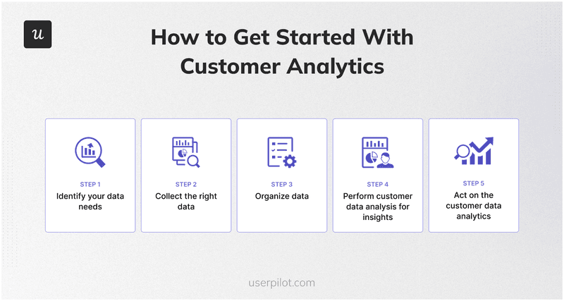
How to get started with customer analytics.
Step 1: Identify your data needs
Before we collect anything, I sit down and ask: What do we actually need to know? What questions are we trying to answer about our users? This step defines our focus.
- Are we trying to understand where our customers live or what industry they’re in? That’s demographic data.
- Do we care about their values, hobbies, or lifestyle? That’s psychographic information. This helps us build detailed user personas.
- Do we need to know which features they use, how often, and the steps they take to reach value? That’s behavioral data. It enables us to map real journeys.
This forms a significant part of understanding customer behavior analysis.
Step 2: Collect the right data
Once we know what we’re looking for, we set up the systems to capture the relevant data. We use a mix of direct and indirect methods to get a full picture.
- Quantitative data: For in-app activity, we use powerful user behavior analytics tools. Our Userpilot platform, for instance, offers raw event autocapture, so we start collecting clicks, text inputs, and form submissions from the moment our SDK is installed, without needing any custom code. We can then label these events visually to make sense of specific user actions, which is a huge time-saver. These event tracking tools give us incredible insight into behavioral data.
- Qualitative data: To understand user sentiment and opinions, we deploy in-app surveys. These include everything from NPS surveys to measure loyalty, CSAT surveys for satisfaction, and CES surveys to gauge ease of use. We dig even deeper with follow-up questions based on their responses.
- Visual data: Sometimes, seeing is believing. We use session replay to watch how users interact with our product literally. This helps us spot friction points and understand the “why” behind their actions, not just the “what.”
We also collect data from other systems. Our integrations with CRMs like HubSpot and Salesforce allow us to sync user properties and events, giving our sales and customer success teams a complete picture right within their familiar tools.
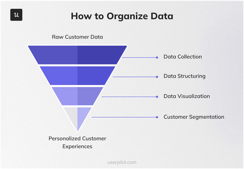
Step 3: Organize data
Collecting data is one thing; making it usable is another. This step is about structuring and preparing our data.
A customer data platform (CDP) is essential for this. Userpilot’s Data Sync feature, for example, allows us to export event data directly to our data infrastructure. This breaks down data silos and lets us combine Userpilot insights with other business data for a complete view of the customer journey.
We visualize these insights using custom analytics dashboards. I can build reports for funnel analysis to see conversion rates, retention reports to track stickiness over time, and a user activation dashboard to monitor new user success.
Customer segmentation is also key. We group users based on shared traits like behavior, plan type, or signup date. It allows us to personalize experiences and focus our marketing efforts on specific user segments.
Step 4: Perform customer data analysis for insights
Once your data is organized, the next step is analyzing it to uncover patterns, friction points, and opportunities for improvement. At this stage, the goal is to turn raw information into practical insights that tell you what’s working, where users struggle, and which behaviors drive retention or churn.
This analysis helps you validate assumptions, identify gaps in the user journey, and spot the moments that matter most for activation, adoption, and long-term engagement.
Step 5: Act on the customer data analytics
Insights only matter when we use them to improve user experience, and the impact of solid customer analytics is undeniable. It’s transformed how we approach everything.
- Better user onboarding: By understanding new user behavior from signup, we’ve optimized our user onboarding flows. It’s enabled us to translate early behaviour into personalized onboarding experiences that help new customers understand our product value much faster. That’s how GetCraft used Userpilot to simplify onboarding with interactive no-code flows, which more than doubled profile completion rates
- Reduced churn: Customer analytics is one of our lines of defense against churn. We use it to predict customer needs and identify at-risk customers before they leave. With Userpilot, Cuvama used behavior analysis to flag error-prone journeys, guided users back to value, and reduce churn rate.
- Increased feature adoption: Implementing customer analytics helps us identify underutilized features and use in-app guidance to drive feature adoption. For example, ClearCalcs uses Userpilot to combine cohort analysis with contextual guidance to steer engineers to the right calculators and improve activation.
- Smarter support: Turning customer interaction data and replays into fixes and self-serve help reduces repetitive tickets and speeds resolutions. A great case study here is GrowthMentor, which used Userpilot to automate role-based onboarding checklists, cutting support tickets by 83% and increasing mentee bookings by 50%.
Best practices to analyze customer data
These practices help me to make smarter business decisions by turning customer analytics into actionable insights.
Invest in the right customer analytics tools
Setting up a comprehensive analytics stack can seem daunting. However, modern tools, including no-code analytics platforms like Userpilot, make it far more accessible. Such tools have machine learning functionalities that help you identify patterns in large amounts of customer data faster.
They reduce the need for heavy engineering lift, allowing product managers like me to label events visually and build experiences without writing a line of code. Customer analytics tools also enable me to autocapture events, watch session replays, and launch in-app surveys to get insights easily.
Here are some of the best customer analytics platforms:
| Key features | Best for | |
|---|---|---|
| Zendesk | Explore analytics for support: prebuilt dashboards, custom queries, and insights into tickets, response times, and customer satisfaction. Useful signal for churn and experience analysis. | Feeding product analytics with support trends, spotting recurring issues, and prioritizing fixes that reduce tickets and improve customer experience. |
| Mixpanel | Event analytics with funnels, retention, flows; visual cohorting; shareable boards and public boards for stakeholder visibility. | Tracking activation and retention, comparing customer segments, and aligning executives on key metrics via live dashboards. |
| Pendo | Retroactive tagging (analyze usage without pre-instrumenting every element), funnels and paths, cohorts, and native session replay; in-app guidance to test improvements. | Combining analytics with guided experiences to reduce friction in onboarding and drive feature adoption. |
| Userpilot | Autocapture of clicks, text inputs, and form submissions; custom and prebuilt analytics dashboards; funnels and cohorts; session replay; in-app NPS/CSAT/CES surveys you can trigger contextually. | Product teams that want to analyze behavior and immediately act with in-app guidance, surveys, and experiments, without coding. |
| FullStory | Session replay plus funnels; frustration signals like Rage Clicks; diagnose where users drop off and why, then validate fixes. | Visualizing real user journeys to uncover hidden friction, confirm hypotheses, and improve conversion flows. |
Collect qualitative, quantitative and visual data to better understand customer behavior
We get the full picture only by combining all three. Each one answers a different question.
- Quantitative data (what happened): Event streams, funnels, retention, and cohort reports show scale and trends, e.g., “40% drop between upload and map fields.” Use it to size problems, track key performance indicators, and spot customer segments that behave differently.
- Qualitative data (why it happened): In-app customer feedback, NPS, CSAT, CES, and short follow-ups reveal intent, expectations, and customer sentiment. It explains whether the drop is due to confusing copy, missing integrations, or pricing friction.
- Visual data (how it happened): Session replay shows the exact journey: cursor hesitations, dead-ends, and rage clicks. It pinpoints UX debt you can fix today.
Userpilot covers all these views to enable us to collect customer data, understand the reason, and implement the most critical fixes without juggling multiple tools.
Focus on user needs
To get the best out of customer analytics, we start with needs, not dashboards. By mapping the users’ core jobs to be done, we can get the data collection requirements. That is, which events, properties, and customer feedback surveys we need to analyze to understand customers’ preferences.
Smart analysis requires purpose. I ask questions like: What decision will this chart change? If the answer isn’t clear, I refine the question until insights become actionable.
We make use of such insights by making informed business decisions in the form of targeted in-app guidance, copy tweaks, or workflow fixes. This approach helps us to build products that not only work well but truly delight our users and drive sustained growth.
If you’re looking for tools to put these customer analytics practices into action, explore our in-depth guide to the best customer analytics platforms. It breaks down the top solutions, key features, and how to choose the right tool for your SaaS use case.
Use customer analytics to make the right decisions
Customer analytics turns behavior, feedback, and transactions into action that improves engagement, adoption, and retention. With the right insights to make personalized experiences and smarter marketing, our customers enjoy a meaningful experience that makes them brand advocates.
Book a demo to see how Userpilot helps you collect customer data, analyze it, and act on such insights in one platform.
FAQ
What are the 4 types of analytics?
The four types of analytics we use are:
- Descriptive: explains what happened (usage, revenue).
- Diagnostic: explains why it happened (root causes, segments).
- Predictive: forecasts what will happen next (churn risk, conversion).
- Prescriptive: recommends what to do (offers, messaging, UX changes).
Using them together helps us move from reporting to action.
What are the three stages of customer analytics?
The three stages of customer analytics include:
- Collect and organize customer data (events, feedback, customer relationship management), ensuring quality and governance.
- Analyze and model the data (descriptive, diagnostic, predictive, prescriptive) to find patterns and drivers.
- Act and measure (personalize, run experiments, automate outreach) to make changes that improve customer experience.
We recommend iterating these stages as a continuous loop over time to capture new signals, validate insights, and prioritize the next best actions that drive product growth.
What are the different types of customer data?
The key types of customer data are:
- Demographic (role, industry, company size).
- Behavioral (events, clicks, feature use, website visits).
- Transactional (purchase history, plan, MRR).
- Attitudinal (NPS, CSAT, qualitative comments).
- Technographic/contextual (device, OS, channel, location).
- Interaction data (support tickets, live chat).
Combining all these types helps us understand customers and act with confidence, fast.

