What is the Happy Path in UX and How to Design It?

What is the happy path in software development?
The happy path refers to a user’s ideal journey to achieve their goals within your product. Sometimes known as the “happy flow,” it is the default, error-free flow where everything works as expected.
For example, the happy path for a user logging into your website will be to open the website, enter their credentials, get authenticated, and access the platform without errors.

Happy path vs. golden path vs. sad paths
Although all three terms describe different aspects of the user journey, they have distinct meanings.
The happy path is the ideal, error-free journey the user takes to achieve their goal. It involves completing specific tasks without errors.
The golden path, however, is the most engaging, rewarding, and efficient user flow. It is the path of most satisfaction, where the user doesn’t just complete tasks but also enjoys a delightful experience.
Finally, the sad path is a path where a user encounters errors, obstacles, and confusion. For example, a user tries to purchase an item online but receives a payment error message multiple times.
All three paths are important for understanding and designing a comprehensive user experience. The happy path prioritizes efficiency, the golden path, user delight, and the sad path, recovery.
What is happy path testing?
Happy path testing is one of the earliest tests run on a product. It tests the product’s performance under perfect conditions (using carefully scripted inputs).
The happy path test, thus, determines if the product delivers the expected output, assuming the user does everything as expected. Until it does, there’s no point in testing more complex scenarios.
What is unhappy path testing?
The opposite of happy path testing is sad or unhappy path testing. It involves testing what happens when things go wrong.
Although you simply can’t envisage all the ways a user can misuse your product, the goal of the test is to try as many wrong inputs and usage methods as possible and discover all the ways things can go wrong.
How to design a happy path user flow
To identify and design the happy path user flow, businesses must analyze their users and processes, and determine the best path for users to follow within your product.
Define your user personas
Which type of person is most likely to use your product? What goals will they hope to achieve with it? The answer to these questions will be key to your design process.
To answer these questions, you’ll need to define your user personas. Each persona should identify the user’s background, goals, needs, motivations, and behavior.
If you already have users, you can segment them based on their demographics and user behavior. Try to understand what each user group wants to achieve and the challenges that stand in their way.

Define the key user flows to focus on
Now that you know your users and their varying needs, it’s time to identify the flows that matter most to them. To do this, you need to identify the most common and important tasks users must complete.
For each task, visualize the different steps users go through within your product to achieve their objectives. This will enable you to see the already existing user flows within your product and how they’re interconnected.

For example, a typical SaaS product has a signup flow that leads to the primary onboarding flow and activation flow before culminating in a feature flow.
To complete this step successfully, therefore, you need to identify the most used flows that impact the user experience the greatest and contribute to your stated business goals.
Map the happy path for each user flow
Now it’s time to finally define the happy paths for the user flows you identified above. Your goal here is simple – of all the paths a user can follow to complete a task, what is the most likely positive alternative?
Create a flowchart outlining each step in the journey. Then, minimize friction by eliminating unnecessary steps and potential exception paths or error points.

Consider all the ways you can turn the path into an intuitive user flow. For example, could you simplify the navigation to make it more intuitive? How about including helpful messages and offering suggestions?
By the end of this step, you should have a pathway that users can follow to satisfactorily complete their task without confusion or errors.
Analyze the user behavior of different segments
Once you’ve created the happy flow, it’s time to begin testing. Use analytics tools like Userpilot to track user interactions and understand how users navigate the happy path.
Go deeper to analyze interaction/behavior patterns and pain points for different user groups. Does the flow work for every group? For each group, measure the time spent on tasks, task completion rates, etc.
Identify drop-off points where users abandon the flow and investigate why it happens. Dig deep to determine what each segment needs and how to improve their experience.

Pair your analysis with user feedback
Gather qualitative feedback to back up the quantitative data collected in the previous step. Conduct user interviews and surveys to encourage users to share their thoughts, feelings, and frustrations.
Compare both the analytics data and qualitative feedback to gain deeper insights and validate your findings. Identify the most impactful changes needed based on user needs and pain points.

The goal here is to constantly refine your happy path based on the feedback you collect and your analysis. Always experiment with different design variations to see what works for different segments.
How to steer users on the happy paths with Userpilot
It’s not enough to just create a happy path, you must also steer users away from unhappy paths. A complete product adoption solution, Userpilot helps you to achieve this goal in three key ways:
Identify drop-offs in the user journey and fix them
Userpilot’s funnel analysis feature enables you to discover how many customers complete pre-defined events leading up to a conversion point and identify where customers drop off.
It tracks everything from the conversion rates to the time taken to convert. You can also visualize conversion trends and break them down by different properties or features.
Ultimately, your goal is to identify drop-off points, determine the cause, and fix them. For example, if users regularly skip a step in the onboarding flow, removing that step or making it less confusing can improve the onboarding completion rate.

Determine top conversion paths and optimize them further
Whether you’re A/B testing different pathways or you’ve identified some valid alternatives that users take to complete a conversion event, Userpilot’s Paths feature helps you assess these different paths.
The feature creates a visual representation of each path, letting you analyze which is most successful and which experiences the most drop-offs.

You can also zoom into each path to identify the drop-off point and how to further optimize the path. For example, by tweaking a copy or simplifying it, you can make a step (and the journey) easier to complete.
Implement in-app guidance to keep users on the happy flow
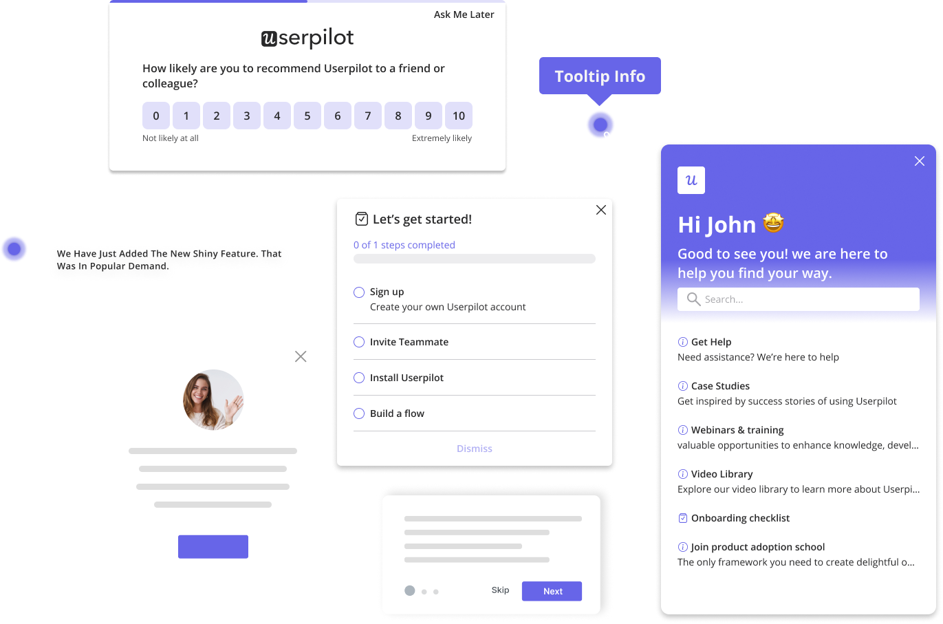
Userpilot also enables you to guide users to the happy path using a variety of in-app engagement tools.
For example, you can create bespoke checklists to drive new user activation. You can insert your checklist into appropriate parts of your product, complete them with dummy tasks, and include a progress bar.

You can also explain how a feature works using standalone tooltips or combine tooltips to create an interactive walkthrough that targets a specific segment of users.

Conclusion
Keeping your customers on the happy or golden paths will ensure they derive value quickly from your product. To do that, though, requires conscious effort on your part.
Ready to get started? Get a Userpilot demo to learn how Userpilot helps you steer users to the happy path and keep them from getting lost in your tool.


