Modal UX Design for SaaS in 2026 – Best Practices & Examples


Getting your modal UX right is a more important design issue than many product marketers believe.
It’s easy to focus on the flashiest parts of your product. But if it’s not clear from your UX modals how to use it, or you don’t interrupt your user with important messages when necessary, even the best-looking product only goes so far.
Rather than trying to design your modals from scratch, it’s more efficient to emulate the best practices already established by leading SaaS companies.
Let’s see what we can learn from their example.
What is a modal?
A modal is a large, rectangular UI element created by SaaS companies to grab users’ attention.
A modal window appears not as a separate page, but rather as an overlay on the parent page where users were before the modal pops up.
Due to the size of a modal, as well as the fact that modals often contain images, they are ideal for interrupting the user flow.
This makes them useful in urgent situations that require user interaction, such as when a customer needs to renew their subscription but also means that overusing modals rapidly becomes annoying for users.
Modal vs popup in UX: What is the difference?
Both modals and pop-ups have similar functionality, i.e., they display over the parent screen and require users to interact with them before continuing. However, the main difference lies in their purpose and usage.
Modal dialogs are more action-oriented and disruptive than popups. They usually prompt the user to take some kind of action, like adding information or confirming the previous step they took. Conversely, pop-ups are subtle and offer additional information without disrupting the user’s flow too much.
Should SaaS companies use modals in their user interface?
Similar to other design elements, UX modals have their pros and cons that should be carefully considered before implementing them. Whether you decide to incorporate them in your UX design or not depends on how much value you believe they will bring to your SaaS product.
Pros of using modals:
- Modal windows bring good friction to the workflow. They help to draw the user’s attention towards an important task i.e. alert users whether a data deletion was intentional and not a user error.
- Since modals are used to convey important information, they ultimately add to a positive customer experience and can help you achieve your desired goal, e.g., improving activation.
- Modals correctly used don’t clutter the user interface. They deliver crucial information in a concise, visually-attractive way.
Cons of using modals:
- Good friction is friction after all and some users might find disruption caused by modals to be annoying.
- Modals can further add to the customer’s frustration if there’s no way to dismiss the dialog box.
- Excessive usage of modal windows just slows users down from what they’re trying to achieve from your product. The last thing you want is to lose them to a competitor because of this.
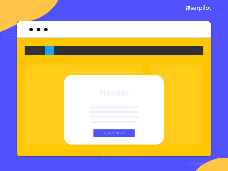
What elements should be part of your modal design?
When planning out your modal UX, make sure that you design modal windows that include the following elements:
- Header text
- Body text
- Graphics
- Call to Action
- X button
- Translucent background
Let me explain the value of each of these elements in a bit more detail.
Header
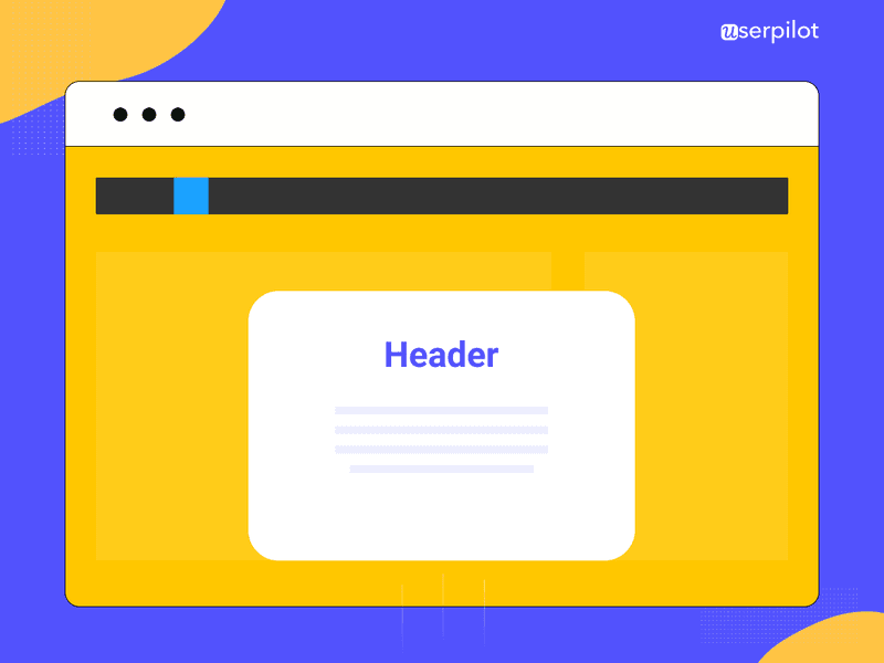
Your header is the first bit of text that your customer will see. As such, it needs to immediately explain the purpose of the modal.
If it’s too confusing, your user will click away without a second thought.
Ideally, you want to refer explicitly to the desired action that you want your user to take.
For example, a modal upselling a new SEO audit feature might be titled “Audit your users.”
Body
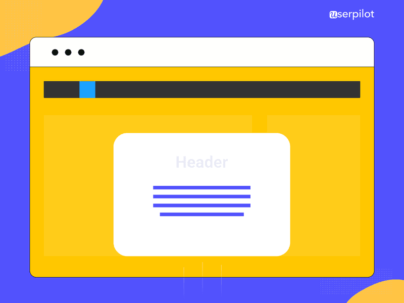
The body (or “modal dialog” if you want to get fancy) is the main section of text that customers see on your modal.
Keep it as brief as possible, using bullet points wherever you can.
Your goal should be to help users understand the value of the modal to them in 2-3 seconds.
Graphics
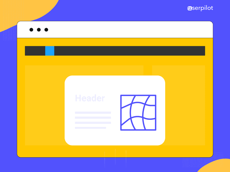
This is the eye-catching part of a modal. It can be an image, a gif, a meme, or even a micro video.
Bonus points if you use a little humor, or gamify the visuals in some way.
CTA
The Call to Action, or CTA for short, is where you drive your users to do whatever it is that your modal is set up to lead them towards.
It’s normally in the form of a button that the user needs to click on.
Make sure that your copy is as action-orientated as possible, using words like “today” or “now.”
X button
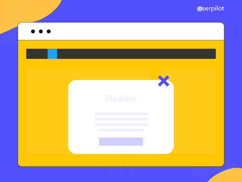
If the user doesn’t click on the CTA button, they need some other way to exit the modal.
Otherwise, they’re just going to get annoyed with you, especially if whatever they were doing before your modal interrupted them was important.
Ensure that your X is as visible as possible by maintaining a good color contrast between the X and the color of the modal itself.
Put another way: a light blue X on a turquoise modal probably won’t be visible enough.
Translucent background
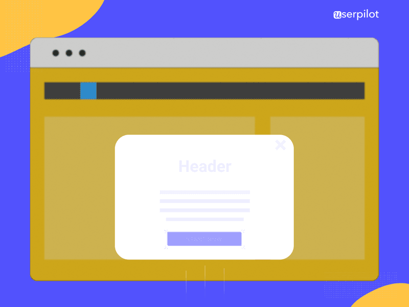
Finally, remember that your modal is just an overlay to whatever screen the user was on before, not a new window in itself.
You can emphasize this by blurring out the user’s previous screen with a translucent background.
That way, the user knows they can return to it after they click the CTA or the X button.
Modal UX best practices for optimizing user interface
Now that you know what goes into a modal, let’s explore how your SaaS company can get the most out of them.
To modal or not to modal?
The most fundamental modal design question is whether a modal is the best choice to achieve your desired goal, or whether a different UI pattern would work better.
We’ve seen modals work well for:
- User onboarding and customer education
- Welcome screens that log user data when they first sign up
- Upselling new features
- Subscription expiry notifications
- Server downtime notifications
By contrast, modals are not the best choice for error messages, because they block the user’s screen, potentially making the error message confusing. A small banner or lightbox might be a better choice.
They’re also not the best choice to let the user know that something is loading. Again, this is because they block the screen. It would be smarter to use a small “loading” icon and let the user continue to use your app while waiting.
Don’t overuse modals
Because modals are so disruptive to the user’s workflow, you’ll annoy your customers if you bombard them with modals all the time.
Most of the time, you should never use more than one modal consecutively.
If you’re building a product tour, it’s better to allow the user to click through multiple screens on one modal carousel-style, as opposed to creating multiple modals.
This particular rule of modal design is especially applicable to modals that are initiated automatically by your system.
Such modals are more disruptive than a modal that appears because a user explicitly interacts with your app to initiate it. They’re more surprising to users.
You should therefore use system-initiated modals sparingly. The only situations that might warrant something like this are urgent things like the customer’s subscription being about to expire.
Don’t make your modals too big
The larger your modals are, the more your customers will feel the sense of disruption that we’ve referred to numerous times in this article.
By restricting the size of your modals to 20-25% of the overall user interface, and by keeping what the user was doing previously behind a translucent background, you can keep the disruption to a minimum.
If you have more information to impart than fits on one modal, I would recommend creating a dedicated landing page instead.
Be careful using modals on mobile
Notwithstanding the magic of responsive design, most of the time, the modal dialog appears to be clunky on mobile devices.
They’re so large that the X button and CTA sometimes get lost, despite the best intentions of developers.
So from a user perspective, you’re stuck with a modal that you can’t get rid of. This normally leads to quitting the app at best or churning at worst.
A small tooltip is normally a better choice. Ultimately, you want to encourage user participation in your app, not block their entire screen.
Keep your modals accessible
Not all users browse apps in the same way that you do.
For this reason, you should ensure that users who are dependent on screen readers or keyboards are just as able to access your modals as any other type of user.
One of my favorite ways of doing this is to enable the use of the tab key to navigate through modal elements one by one and then use the enter key to select the CTA, the X button, or anything else.
💡For more discussion of this important subject, please consider reading this post.
Don’t code your modals manually
Coding modals from scratch is time-consuming. And that doesn’t include the time and money you’d have to spend tweaking the colors and design after they’re built.
A better solution is to use onboarding software so that product managers can build and iterate on modals without having to code.
This will free up your developers to work on engineering your product, which is why they were hired in the first place, right?
💡 For further exploration of user onboarding software options on the market, check out this article.
Choose the appropriate placement for modals
Choosing the right placement for UX modals is crucial to ensure they are effective and don’t interfere with the user’s experience.
A modal window with an important message, like confirmation for a user action, should be centered. This is to ensure you grab the user’s immediate attention. Conversely, modals related to feature announcements or surveys can be positioned towards the side.
You can also base the placement depending on the modal content, size, and the user’s workflow.
Ensure the option to dismiss the modal is visible
It’s important to create modals that have a clear and easy way to dismiss them.
Imagine a user is working on a critical workflow and they’re suddenly disrupted by a modal asking them to complete a survey. With no option out, they’d have to unwillingly fill out the survey hastily and get back to what they were doing. This will just result in a frustrated user.
Make sure there is a visible cross button on the modal. You can also give users a keyboard alternative, like the escape key, to dismiss the modal if needed.
Best modal UX examples from SaaS companies
Having gone through what makes a modal and how to use them, let’s apply our new knowledge to several modals currently being used by SaaS companies and see how good they are.
Kontentino: welcome screen modal
Social media scheduling app Kontentino built this modal as a way to welcome new customers to their platform.
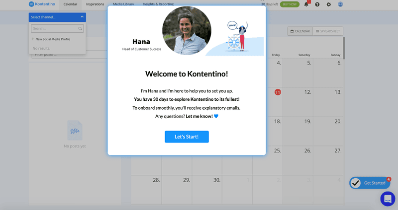
What we like about this modal:
- The imagery is simple, friendly, and welcoming. Including a smiley picture of one of your team is a great move on a welcome screen.
- There’s one clear CTA, which is worded in a way that implies both action and being taken by the hand.
What could be done better:
- There’s no X button for users who don’t want to start the product tour right then and there.
- The body text is inviting, but could perhaps be more concise or broken up into less of a wall of text.
Sked Social: onboarding modal
Sked Social, a social media management platform, used a modal created to onboard its new users.
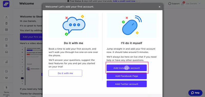
What we like about this modal:
- The two-column modal shares necessary information without appearing too crowded.
- The color palette of this modal is appealing to the eye and is consistent with Sked Social‘s branding.
What could be done better:
- The multiple call-to-action buttons are fighting for the user’s attention. A better approach would be to break this modal into two screens on one carousel-style modal.
Asana: new feature modal
This is a modal used by the project management software Asana to inform customers about a new, more advanced reporting feature.
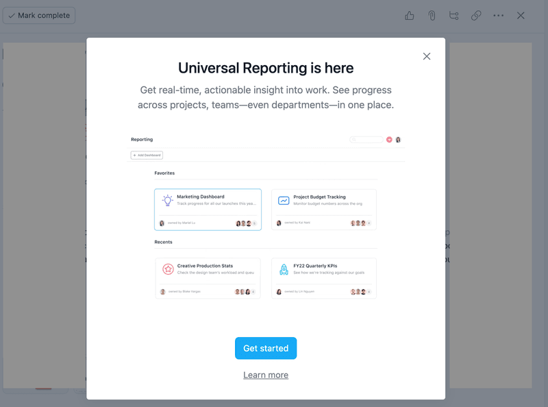
What we like about this modal:
- The value proposition is fairly clear from the header and the body.
- The X button is extremely visible, giving users a way out of the modal if they want it.
What could be done better:
- It’s generally advisable to have one CTA only. The presence of the “Learn more” link gives customers another option to think about.
- There are quite a lot of graphics. I wonder if the same value could have been communicated with one graphic, instead of four.
Dropbox: upsell modal
The next modal example is from Dropbox which uses it whenever users run out of space. It’s designed to get them to upgrade to a higher plan level with more storage space.
And it’s a work of art!
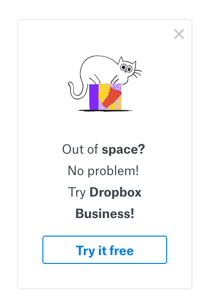
What we like about this modal:
- The imagery is brilliant. It’s playful, alludes to cat memes on the internet, and still expresses the pain point that the user is feeling at that moment.
- The copy is about as short as you could imagine. It’s the very definition of concise, and it’s easy to understand the purpose of the modal.
- There’s one CTA, and the fact that taking action is free initially reduces the friction from the customer’s perspective.
- There’s a clearly apparent X button that allows users to exit the modal if they’re not interested in the offer.
What could be done better:
- Nothing! This modal gets a 10/10 from me for creativity, execution, and providing value.
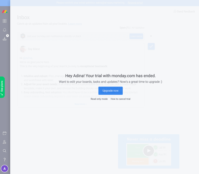
Monday: churn defense modal
Here’s a modal used by Monday to encourage users to freeze their accounts as opposed to deleting them. The purpose of this system-initiated modal is to reduce the likelihood of churn.
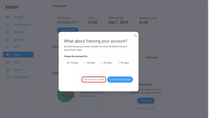
What we like about this modal:
- The purpose of the modal is very clear from the header and reinforced by the conciseness of the body text. There are no superfluous words used here.
- The modal doesn’t take up more than 20-25% of the screen.
What could be done better:
- This modal is missing graphical elements. Maybe Monday could introduce a sense of play to the idea of freezing an account by adding a snowman.
- Again, there are lots of different options here to choose from. I can see that Monday is trying to appeal to users with diverse sets of needs here, but it would be more straightforward to just have one CTA.
FAQ
What is a modal web design?
A modal is a web page element that appears on top of the main content, temporarily blocking interaction with the underlying page until the user interacts with it or closes it.
What is multimodal UX design?
Multimodal design focuses on using multiple modes of interaction, such as voice, touch, gestures, or haptics, to create a more natural and intuitive user experience.
What are modal sizes in UX design?
Modal sizes refer to the dimensions (width and height) of the modal window, which can vary depending on the content and context. Common sizes include small, medium, and large.
What is a module in UI/UX design?
A module is a reusable, self-contained component or block of content within a user interface, designed to perform a specific function or display a particular type of information.
About the author