19 Onboarding UX Examples to Improve User Experience
Building awesome user onboarding experiences requires great effort when starting from scratch. So we’ve collected onboarding UX examples from other companies to inspire you!
We have combined 19 user onboarding UX patterns and examples to help you create great user onboarding flows.
Before jumping to the examples, we will cover the following:
- Onboarding UX is the design choices and the layout of the onboarding experience to help produce an excellent onboarding experience.
- Onboarding UX is important as it can help increase user activation, user retention, and increase customer lifetime value.
- A good user onboarding experience is interactive, intuitive, action-oriented, and educational.
- Checklists, progress bars, help centers, tooltips, and welcome screens are onboarding UX patterns that help create an engaging user onboarding experience.
- Userpilot helps create the best user onboarding experiences by customizable UI/UX patterns, triggering personalized user onboarding experiences, and segmenting users based on their jobs to be done.
- Learn how Userpilot can improve your user onboarding experience by booking a free demo.
What makes a good user onboarding experience?
To make a good user onboarding experience, you need to exceed user expectations. To do this, you need to focus on the most important thing about your product: your user.
You can achieve this by crafting a user onboarding experience that is contextual, engaging, and educational to your users. Focus on being user-centric, doing everything possible to help your users succeed.
Moreover, you need to create a user onboarding flow that prompts users to take action (like using an interactive walkthrough that educates users).
Your app onboarding experience must educate and inform your user on how to gain value from your product.
A good onboarding experience doesn’t overwhelm the user by providing too much information upfront – ideally, users can be onboarded to different areas of the product as they become more comfortable overtime or the onboarding experiences can be re-triggered so that the user can return to learn more about their desired area when they’re ready. In Userpilot, we have all of onboarding flows accessible through our Resource Centre so that our users can return to them whenever they like.
– Lisa Ballantyne (UX Researcher at Userpilot)
6 Onboarding UX examples to create an engaging onboarding process
Thankfully, you can utilize a series of onboarding UX patterns in your product to create an engaging user onboarding. Some of the most useful ones are:
1. Welcome screens
Best customer onboarding experiences start with welcoming your customer to your product. It’s a common practice in SaaS companies.
You can use welcome screens to gather information to later segment your customers and let them know what to expect next in your product.
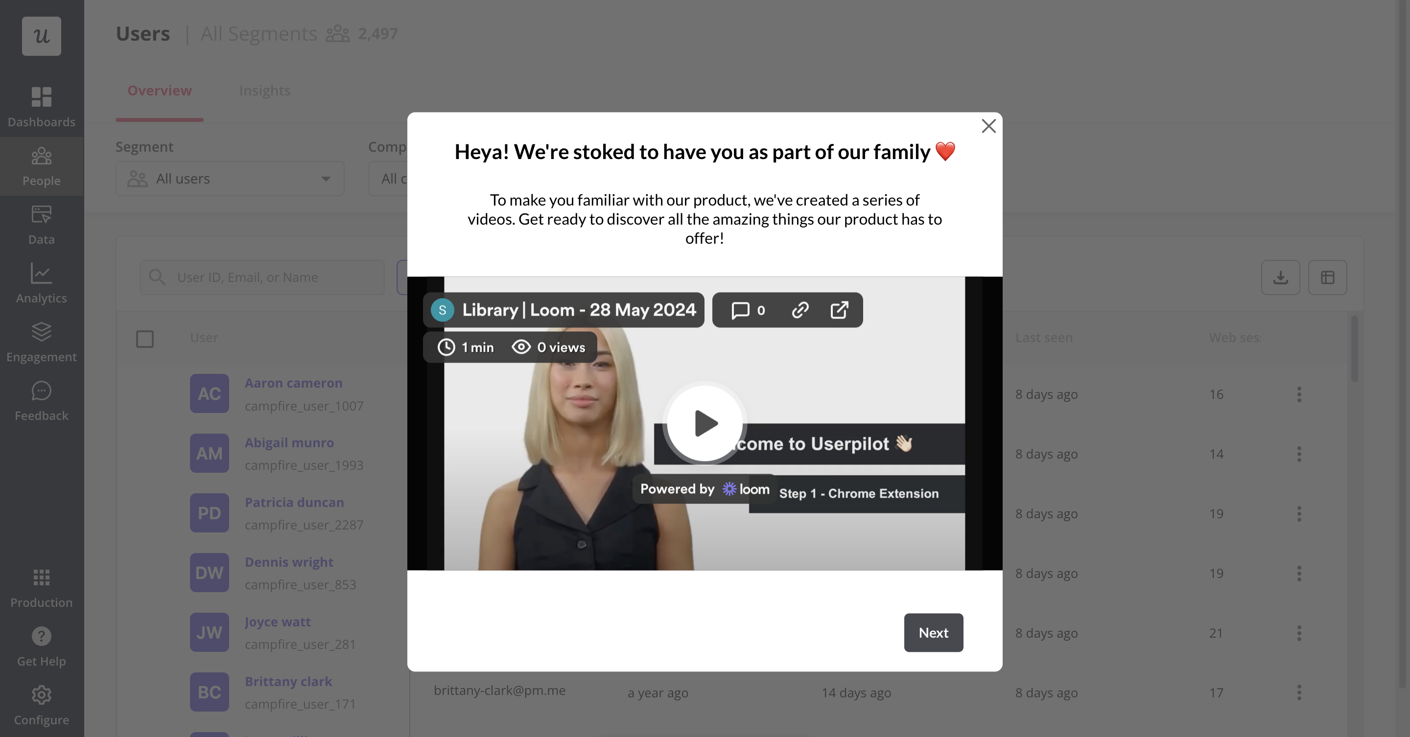
Welcome screen is the first impression you make with the client so it’s a useful element in building a successful onboarding experience. Here are some ways to use this UX pattern in an onboarding experience:
- Communicate your brand identity with a clean design and brief tagline.
- Provide a clear, simple call to action like “Get Started” or “Take a Tour.”
- Show users a preview of the main features to familiarize them with your product value.
- Tailor the welcome screen based on user details like name or role to personalize the user experience.
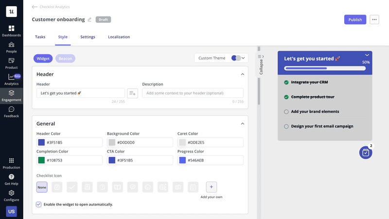
2. User onboarding checklists
You can use onboarding checklists to guide users through your product while maintaining a frictionless experience.
They usually contain around 3 to 5 core actions that users need to perform to achieve the Aha moment demonstrating your product’s value.
As a tip, adding a progress bar to your checklist will give users the psychological kick to keep going.
3. In-app resource center
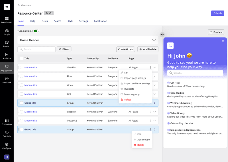
Resource centers are a great way to drive self-service customer support and help users resolve any issues by learning more about your product by themselves. To improve the onboarding experience, you can add a search feature within the Resource Center to help users quickly find relevant information from your knowledge base.
4. Customer onboarding tooltips
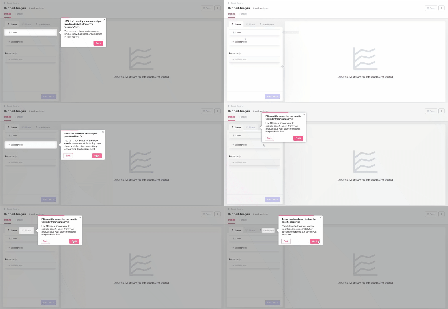
Tooltips are effective UX examples for drawing attention to what a user needs to do next.
They help to create a contextual onboarding experience as the user moves through your product.
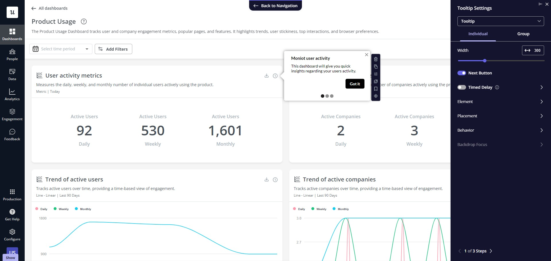
This is a great way to increase engagement and provide supplemental explanations by adding on-demand contextual help to your end-users, without requiring any additional coding or engineering resources.
5. Pop-ups and slideouts
If you need to make an announcement or want to collect user feedback, pop-ups, and slide-outs are great onboarding UX patterns that can help you as they are great for grabbing a user’s attention in-app.
6. Interactive walkthroughs
If you want to get your user’s attention on something specific and help them adopt it before moving on to the next feature then interactive walkthroughs are your go-to UX pattern.
Compared to product tours which dump huge amounts of info on customers without any end results, walkthroughs guide users through a feature and help them complete the tutorial and get immediate value from the feature.
Onboarding UX best practices
Now that we have learned about user onboarding UX patterns, let’s quickly go over some UX best practices that will help you create a great user onboarding experience:
- Use progressive disclosure to avoid overwhelming users and introduce information in small steps as the user interacts with the product.
- Keep the content on your UX patterns brief and offer additional help if needed.
- Design empty states on your user interface that guide users on what to do next, giving users a sense of direction (e.g., “Add your first contact” or “Create your first project”).
- Use subtle animations on your tooltips when introducing a new feature to engage existing users with gamification.
- After users complete your onboarding checklist, reward them to encourage engagement (e.g., showing a completion badge or offering an incentive).
- A/B test different onboarding UX patterns to make data-driven decisions.
How to create effective onboarding UX examples code-free with Userpilot
If you want to create a great user onboarding experience for your customers easily, then Userpilot can help.
Recreate some of the user onboarding examples above without writing a single line of code.
Userpilot helps you do this by using different UI/UX patterns that are fully customizable. It also lets you personalize the user’s journey by triggering events at the right time and enables you to segment your users so you can only show what matters to them.
Here is what our users have to say about us:
As a UX/UI designer, Userpilot has been a game-changer for creating smooth onboarding flows. The no-code visual builder makes it super easy to design in-app experiences without any hassle, which saves so much time. I also love how you can personalize user journeys with the segmentation feature—it helps us deliver the right content at the right time. If you’re a designer working on user flows, I highly recommend giving Userpilot a try!
— Alicia V. Small-Business (50 or fewer emp.) Computer Software Company
Customize different UI/UX patterns
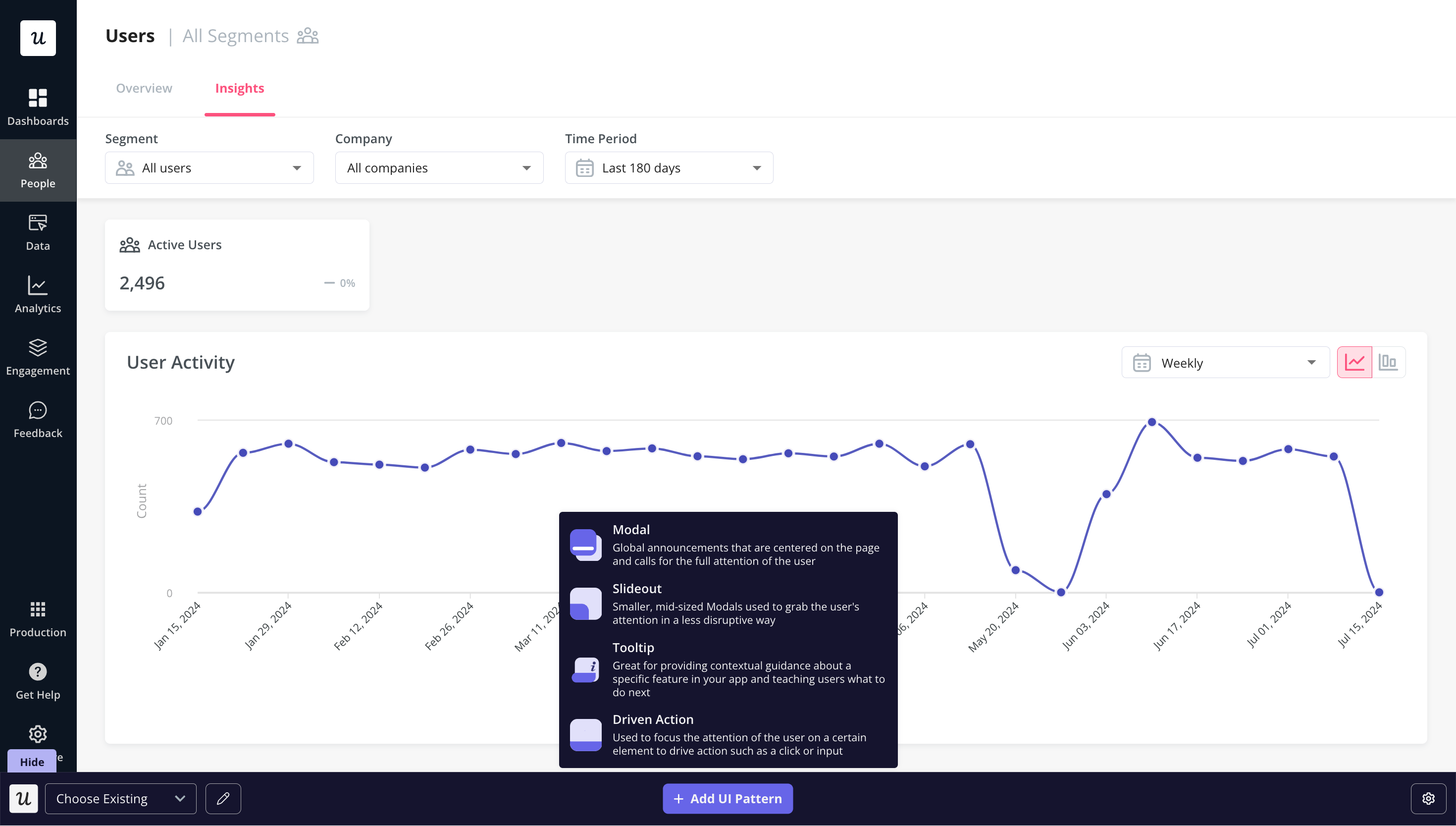
Userpilot has a range of different UI/UX patterns to customize your onboarding process. Some of these patterns are:
- Tooltips and hotspots: These let you present information to users based on a specific feature.
- Driven action: These are similar to tooltips but require a user to take action.
- Checklist and resource centers: Help to guide users through key activation points.
- Modals and slideouts: You can use modals and slideouts for your product welcome screens, as surveys to collect customer data, and for announcing new features.
- Banners: Banners are useful if you have any announcements you want your users to know about.
Personalize the user journey by triggering the right experiences at the right time
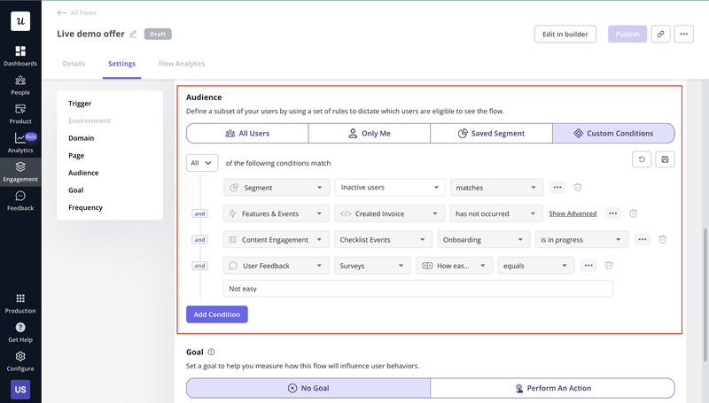
Userpilot can help you to personalize the user’s journey through the use of custom events. You can create custom events based on when certain conditions.
When a user meets these conditions, it triggers the event, which can be a personalized onboarding flow.
Make your onboarding process seamless with data from product analytics
An important step in user onboarding is the gathering of data. Through the use of in-app surveys, event tracking, etc. you can gather data from your users.
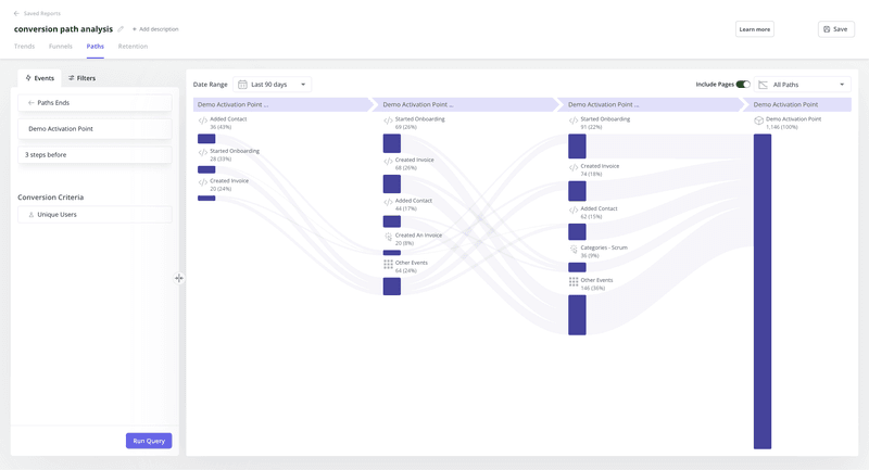
You can then use this information to perform analysis such as path, funnel, trend, etc. so you can further refine your onboarding strategies.
For example, you can monitor how your user base navigates toward activation and find the happy path. Then you can plan guidance for other users to lead them onto that happy path.
Onboarding UX examples: Summary
If you were stuck on what to do for your entire onboarding process, these onboarding UX examples should help get you inspired and on your way to creating a great onboarding experience. The key to success is to collect the right data and personalize the experience based on the findings.
Want to build a great code-free onboarding experience? Book a demo call with our team and get started! Click on the banner below to book a free demo.
FAQ
What is onboarding UX?
Onboarding UX is the design of the flow or multiple flows, used for a guided onboarding. Onboarding UX patterns introduce a user to your product, collect information from the first time users, for some initial product preferences, or highlight crucial UI elements in an interface.
Onboarding UX patterns include interactive walkthroughs, tooltips, pop-ups, and slide-outs. All of this helps to familiarize users with your tool.
Why is onboarding UX important?
Some of the most impactful reasons why you should prioritize UX in your guided onboarding are:
- Increased user activation rate: Best customer onboarding experiences help users perform key actions in your product to get immediate value and reach the activation point faster. Onboarding UX helps you with that.
- Higher user engagement rate: Onboarding UX helps to keep things simple with your product so users don’t get confused. It only adds elements that will engage users, and you can do this through gamification elements and personalization.
- Personalized user onboarding experiences: The best onboarding experience is personalized to customer needs. Onboarding UX helps showcase personalization elements. With the information collected based on welcome surveys, your UX can highlight only the features the user needs.
- Increased customer lifetime value: Onboarding UX can help to increase the customer lifetime value through engagement. You can show the right thing to the users at the right time, eliminating friction. The less confusing, the more likely users will continue using your product.
- Higher user retention rates: Offering a personalized experience through onboarding UX will help create happy customers and a satisfying customer experience, leading to higher user retention.
- Positive WoM: If you can wow your users with a world-class onboarding experience, it will make it hard for people not to talk about their experience.

