Pendo’s product tours – first impressions
When you first sign up for a Pendo trial account, the interface asks you whether you initially want to explore Guides, Behavior Analytics, or Dashboards.

Pendo can be a bit jargon-y at times, so it’s worth quickly noting what these options mean:
- Guides is what Pendo calls experience flows. In other words, by combining multiple guide elements together, you’ll be able to build a product tour.
- Behavior Analytics allows you to track actions taken by users before or after a specific event, see how many people completed a pre-determined funnel, and the percentage of users retained over time.
- Dashboards is set up similar to Google Analytics and shows you browsing data like weekly visitors and unique visitors per hour. The product insights and analytics from this part of Pendo are mostly vanity data.
As you may have guessed, this article will focus on the Guides feature first and foremost.
Pendo’s own product tour
Obviously, Pendo has built its own product tours in Pendo – so before we dive into creating product tours in Pendo, let’s look at its own creation.
Pendo’s own product tour is not especially interactive or engaging for new users.
They’re linear, which is the sort of product tour that we’ve advised readers of this blog to stay away from numerous times in the past. Users hate linear product tours:

Pendo’s own product tours really just consist of purple tooltip after purple tooltip.

Creating Product Tours in Pendo
If you select the “Guides” product tour, you might be a little confused by the fact that there are already some Guides that are up and running inside the Pendo app… despite the fact that you didn’t make any yourself.

These guides have been created by Pendo on the basis of dummy data. In other words, this is demo content devised to show you what sort of product tours you could build for your app, rather than based on real data. This is a smart move, one that reduces the learning curve associated with picking up onboarding software for the first time.
Creating your own Pendo product tours
If you want to create product tours that using actual user segments from your product, you’ll need to install Pendo to your website.
This is a straightforward process that involves using a JS snippet, in exactly the same way as you would install Userpilot.

Once the script is installed, you’ll be able to see the product tours that you create showing up on your app once you’ve tested them.
How easy is creating product tours in Pendo?
If you’re familiar with Divi, Elementor, or even WordPress’ own blocks system, the building blocks approach that Pendo uses for building Guides will be extremely intuitive.

You can drag and drop various elements, and match the colors and styling to your brand.
In terms of ease of use, this aspect of building Guides is similar to building Flows on Userpilot.
But there is one key difference: Userpilot lets you build product tours in its Chrome extension, which allows you to see what the tour will look like in your product instantly (What-You-See-Is-What-You-Get), whereas Pendo’s Guides are built in a dashboard:

Visual Design Studio vs Pendo Classic
Pendo used to operate a design tool that worked as a Chrome extension, much like how Userpilot works today. This tool is known today as “Classic.”
But in February 2019, Pendo released an internal tool called Visual Design Studio (VDS).

All of their current development efforts are focused on VDS, and new customers can’t download the extension from the Chrome Web Store anymore.
In other words, if you want to build a product tour using Pendo, you’ll need to build a Guide inside VDS.
This is a cumbersome process, especially since the Guides are previewed in-app.
Even Pendo users prefer the Chrome Extension…
Interestingly, there is a core group of customers who have been using Pendo since before 2019 who still use Pendo Classic.
This is evidenced by the fact that a large body of Pendo’s help articles are aimed at Classic users.

It suggests that, at least for some users, the old interface was better. Perhaps Pendo has to maintain it to keep up customer satisfaction levels.
Note that you don’t get this problem with Userpilot or other tools. Whenever there is an update to the Userpilot UI, or new features are released, all users adopt the most current interface.
What UX patterns do Pendo’s Guides include?
One thing Pendo has done pretty well is to create a comprehensive resource center to help people get the most out of its app.
Their resource page on creating a Guide includes a handy video that explains the main types of UX pattern that can be created as part of a product tour, as follows:
Lightbox
There’s a lightbox, which is a bit like Userpilot’s modals. It’s centered on the customer’s screen. You can use it to welcome new users, or collect customer feedback.

Banner
Next, there’s a banner, which comes down from the top of the screen. In many ways, this seems exactly the same as a lightbox, only positioned differently.

Tooltip
Like Userpilot, Pendo also allows you to create tooltips. In my personal view, this is the UX element that Pendo does best.

Tooltips trigger in response to so-called “Badges,” which are small icons placed next to an element on your page. When visitors click that element, the Guide for that tooltip will be displayed.
This is very similar to Userpilot’s tooltip feature, which can also be placed wherever the user desires and is often attached to elements that are not immediately intuitive.
Pre-made elements
The last type of pattern that the explainer video mentions are various instances where a team member has previously made a custom pattern from the previous options I outlined above.
These custom patterns are saved under Guides so that they can be re-used.
Examples given include:
- Success messages
- Polls (either quantitative or qualitative)
- A welcome screen with an introduction to a team member, in the style popularized on this blog by Kontentino (this one was actually built in Userpilot).

What’s missing
Here are some patterns that Userpilot includes but Pendo does not:
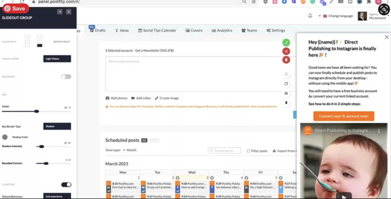
- Slideouts – smaller, mid-sized modals used to grab the user’s attention in a less disruptive way:
- Driven actions – used to focus the attention of the user on a given element to drive action such as a click or input
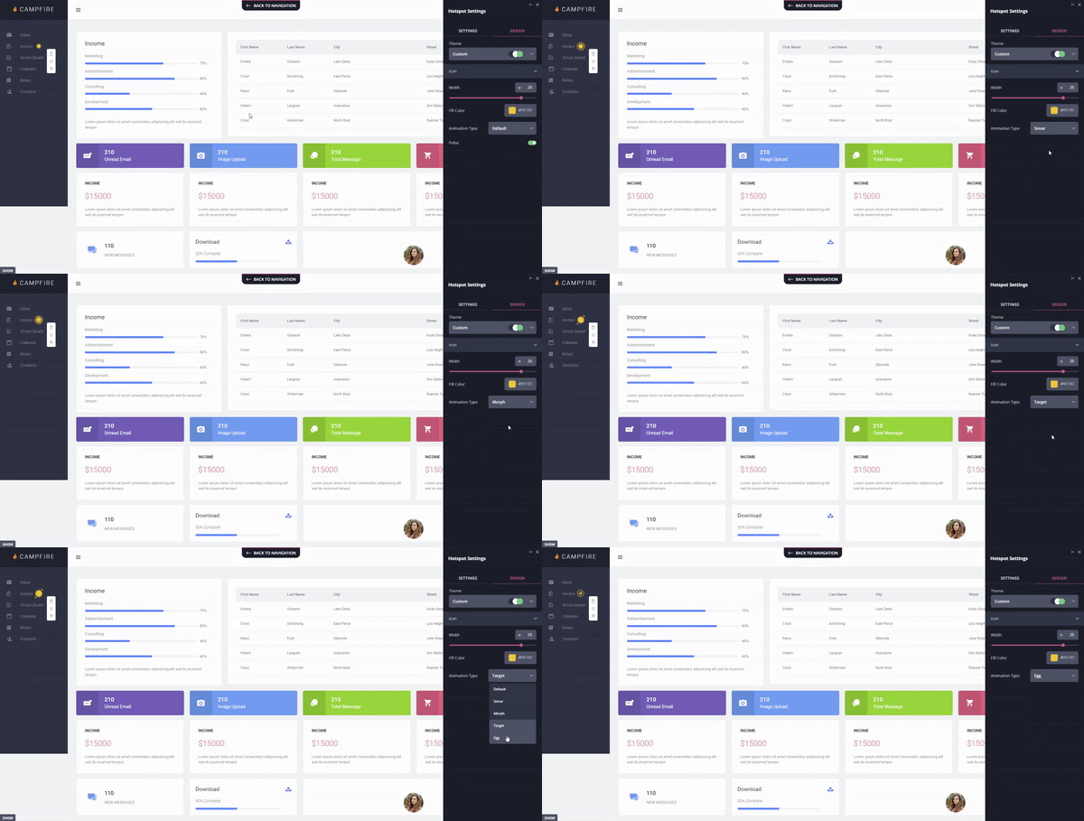
- Hotspots – small flashing beacons that encourage the user to focus in on a certain element:
The most egregious thing missing in the Guides part of Pendo compared to Userpilot is standalone checklists.
These are absolutely essential as a means of getting users in a particular segment to activate.
On Userpilot, this is as simple as serving a customized checklist to a given user cohort on the basis of their individual product needs.

Checklists do exist on Pendo, and they can even be customized according to user segments, but they’re built into the Resource Center feature.
This makes them much less visible for the end-user than they would be on Userpilot.
How easy is it to segment product tours on Pendo?
Segmentation also exists on Pendo, although one has to dig a little to find it.
The demo product tours on the Guide feature are segmented to “Everyone,” which is another way of saying they’re not segmented at all.

Since the demo isn’t very instructive, the best place to learn about Pendo’s segmentation options is by consulting their resource center article on the subject.
According to the article, Pendo allows you to segment by a very large range of factors, as this screenshot shows:

The obvious thing missing from Pendo’s segmentation options is segmenting by custom events. So, if you want to show your Pendo product tour to only those users that clicked on the “buy now” button 5 times in the last month, you can’t do that.
This is likely because of tech debt that doesn’t allow Pendo to trigger or target tours based on custom events.
More modern product adoption solutions like Userpilot or Appcues offer that option (and moreover – Userpilot offers segmentation by not only events, but also event attributes – e.g. bought a T-shirt ….for $50…and only include ‘green T-shirts by Addidas.’)
Are your customers humans or robots?
What strikes me reading this list is how incredibly tech-orientated most of these factors are.
It reminds me of Pendo’s analytics, which monitors user behavior in all sorts of technical ways, but doesn’t really give you a chance to speak directly to your customers in order to get feedback via NPS (unless you’re willing to pay).
I mean, I like automation as much as the next business person, but isn’t there a limit here somewhere?
Compare this to Userpilot, which offers a range of segmentation options under the following factors:
- Demographics
- In-app behavior (eg has the user completed a custom event, or gone through a particular flow)
- User attributes (eg plan type, language)
- NPS
- Account (eg power user vs. new user)

These factors seem much more human and tangible than Pendo’s do.
Segmentation as a means of feature testing
One thing that I do like about segmenting product tours on Pendo is how the software gives you the option to segment a Guide to yourself for testing purposes.
Simply set the Visitor ID as yourself, and then only you will be able to see the Guide you built.

This is a great way to avert embarrassment over faulty beta versions of new product tours. Userpilot has similar functionality for the same reason.
How interactive are Pendo’s product tours?
Of the 3 demo Guides that Pendo displays in their free trial, 2 of them only have one step.
All 3 of them display automatically, as opposed to only triggering after a user has completed a specific action.

This is a far cry from Userpilot, with its emphasis on multi-step experience flows that respond to prior user behavior.
In general, Pendo’s product tours seem very tooltip-driven. This is probably because as an older tool, Pendo was not able to overcome its tech debt to allow event-based triggering. This makes its product adoption experiences pretty un-interactive, and the analytics – not actionable. So what that you know a user segment has performed certain actions, if you can’t react to them with an in-app experience?
There’s a reason why they used all those purple tooltips as the product tour for their own app: those tooltips are actually a fairly good representation of the quality of their Guides overall.
Interactive microsurveys in a product tour?
One potential counter-argument to the idea that Pendo’s product tours lack interactivity is their microsurvey feature.
They don’t call this a microsurvey as such, but you can build quantitative or qualitative microsurveys onto lightboxes and banners, which are both part of Pendo’s product tours.

While the interactivity is appreciated, it’s confusing for the user to include microsurveys under Guides.
That’s because what a product tour really should be is an interactive walkthrough, where users follow along multiple breadcrumbs left by your product marketers until they reach an objective that’s significant to their use case.
A microsurvey is more of a one-off communication tool for sharing in-app messages than part of a longer, multi-step walkthrough like this.
In itself, a microsurvey doesn’t “guide” the user to do anything, apart from fill out the survey.
Conclusion
We hope that you’ve got something valuable out of this exploration of Pendo’s product tour system.
We would also like to hope you can see that Userpilot’s product tours are just better.
Compared to Pendo, Userpilot’s product tours:
- Are more interactive
- Are less linear
- Contain a greater variety of UI elements
- Have segmentation options that are more centered around customer needs than arbitrary technical data
- Use checklists that are easier for end-users to view
- And can be built in a Chrome app, rather than a cumbersome tool like VDS
And if that’s not enough of an argument for you to give Userpilot a spin, it also comes with a free trial.
So you literally have nothing to use by trying it today. Click here to get started!
[/vc_column_text][/vc_column][/vc_row][/vc_section]

