The Post-AI Role of Free Trial Landing Pages: It’s Not Just About Signups


Free trial landing pages are treated as a persuasive content for turning cold traffic into product signups.
But today, the visitor’s intent is different. According to G2’s 2026 buyer behavior research, 51% of B2B software buyers now begin their purchase research in an AI chatbot rather than a search engine. The person landing on your free trial landing page has often already read a synthesized comparison of you and your alternatives (with pricing, limitations, and complaints included). They arrive pre-briefed and sometimes pre-sold.
So for this post, I didn’t want to publish another gallery of ten out-of-date screenshots, so here’s what you’ll get instead:
- The role of a landing page in 2026.
- How the goal of a free trial page varies based on your trial model.
- What a good free trial landing page looks like now.
- Five current examples from top SaaS brands.

Free trial landing pages go beyond signups: Design for the whole buying journey
Many teams treat free trial landing pages as a means to generate as many signups as possible. But that mentality isn’t quite right. Think about how the signup looks in the whole journey. There is:
AI-assisted research and shortlisting -> the visit -> the signup -> the first session -> the first valuable action -> habit formation -> the upgrade.
A landing page does its job when its message matches the value that makes free trial users convert, which is a very different goal than just “signupmaxxing”. That’s why your landing page depends on your trial model. Each free trial model (opt-in, opt-out, reverse, usage-limited, or freemium) determines what the visitor should do next, how fast they need to reach their first AHA moment, and what “converted” even means for your funnel.
Kyle Poyar, who partnered with ChartMogul and ProductLed, analyzed conversion data from 200 B2B software products in January 2026. Across those products, the median free-to-paid conversion rate landed at 8%. But as the analysis suggests, that number is useless when you don’t account for different trial types and how each of them converts visitors into paying customers.
This is because focusing on either signups or conversions in isolation misses the point. So, per 1,000 website visitors, Poyar’s data showed the whole numbers for each model:
- Freemium products get 90 signups (9% landing page conversion) and 5 paying customers (5.5% free-to-paid conversion).
- No-card trials get 45 signups (4.5% landing page conversion) and 3.6 paying customers (8% landing page conversion).
- Ungated freemium experiences see 70 free signups (7% landing page conversion) and 5.6 paying customers (8% free-to-paid conversion).
- Card-required trials get 35 signups (3.5% landing page conversion) but 10.5 paying customers (30.5% free-to-paid conversion).
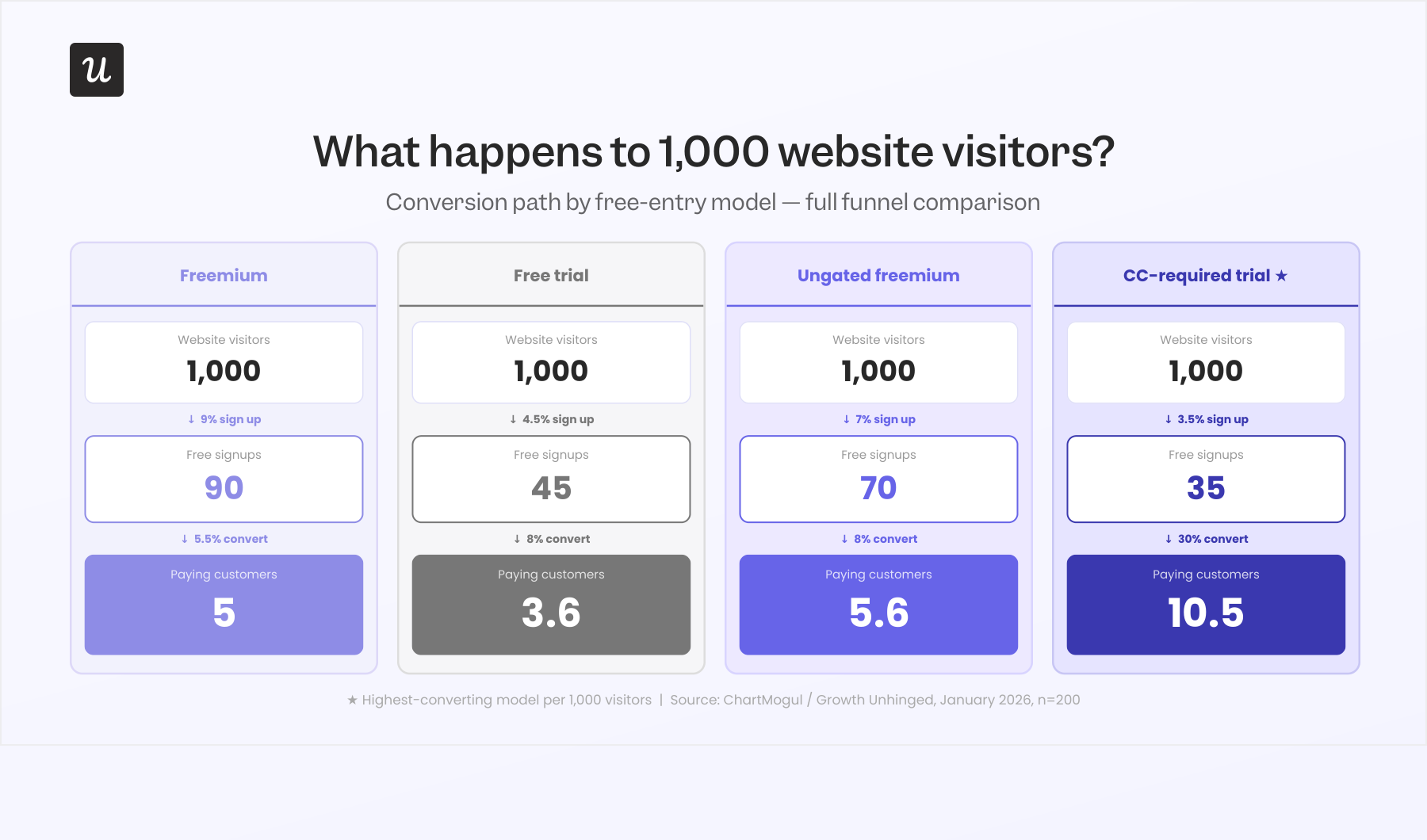
This puts your free trial landing page into perspective. If the conversion rate is just 3.5% but your product is in an opt-out trial, then it might be doing its job perfectly since its purpose is to filter users on intent and justify the upfront payment info.
Wes Bush, CEO and founder of ProductLed, has spent a decade watching teams copy each other’s free models without asking what those models optimize for. His advice in the 2026 report is:
“There is no single correct model. Instead of debating whether you should have a free trial vs. freemium model, focus on your user’s desired outcome and their challenges, then arm them with everything they need to succeed. Align your model with those solutions.”
The role of a free trial landing page in 2026
A free trial landing page still exists to convert visitors into trial users. What changed is what the visitors know when they arrive.
Forrester’s State of Business Buying 2026 research found that generative AI tools were the single most cited meaningful interaction for researching purchases, ahead of every traditional source. The same study found 36% of buyers felt more confident in their decision because of AI, while 20% felt less confident after hitting unreliable AI output.
Your page must appeal to both buyers. The confident buyer wants the page to match what the chatbot told them, since any mismatch (a hidden credit card requirement, a different trial length, a price that moved) reads as a warning sign. Skeptical buyers, meanwhile, come specifically to double-check the claims. Either way, the page’s first job is confirming what the AI assistants say to make a good first impression and make visitors more likely to sign up.
What a good free trial landing page looks like now
That said, creating a good landing page isn’t just a matter of verifying what the AI tells to people. Although the context of trials have changed, the fundamentals of a high-converting free trial haven’t.
Here’s what a good landing page should do today:
- Be mentionable by AIs: The page is a source document for AI-generated comparisons, so it has to stay legible to answer engines and keep its claims consistent with your pricing page and docs.
- Match the messaging of the top-funnel: Visitors arrive from ad campaigns, AI summaries, and review comparisons, each carrying a specific expectation, and the headline and first screen should stay consistent with their messaging.
- Reinforce the selling points: State trial length, what’s included, and who it’s for at the top, so the pre-briefed visitor can check the claims in the first few seconds. Also, the “no credit card required” and “cancel anytime” should be clearly disclosed, so put them next to the CTA button rather than in a footer.
- Show the product instead of describing it: A product screenshot or a short demo video communicates more than three paragraphs of copy. Pre-briefed visitors especially want visual confirmation that the interface matches what they were told, so an honest screenshot beats a polished description.
- Remove friction and handle objections: Including a short signup form (usually email plus password), one visible CTA button, and copy that addresses common objections (pricing jumps, cancellation policy, security posture, etc). If your trial model requires payment details, say so before the form does.
- Qualify leads: Adding disqualifying claims (e.g., mentioning the expected company size of your customers) help bad-fit visitors rule themselves out, which saves you from false-positive-signups and the cost of having new users churn in three weeks.
- Make promises the product can keep: The free trial inherits the expectations that the landing page sets. The value it promises should be visible within the first minutes of the product experience.
- Include social proof: Customer testimonials with real names and photos, customer logos, and security badges are better than your own words. AI assistants cross-reference your claims against review sites, so social proof that can’t be traced to a real customer is now worse than no social proof at all.
How AI agents read your free trial landing page
As I mentioned, landing pages now should be legible by AI assistants/ search engines so users can discover your product during research. The same G2 research cited earlier found 71% of software buyers rely on AI chatbots during research, which means the model’s summary of your trial is often the version buyers act on.
Those models get asked detailed questions (e.g., How long does the trial last? What happens when the trial ends? Can you cancel online?). When your page answers these in plain crawlable text, the chatbot works for you, mentioning what you want it to mention. But when it can’t find an answer, it improvises from review sites and three-year-old forum threads.
Four habits keep your free trial landing page legible:
- Put trial terms in text, not images: Trial length, payment details, and what happens after expiry should live in HTML that crawlers can parse, not inside a screenshot or a JavaScript accordion that never renders for a bot.
- Add an FAQ section and mark it up: A handful of question-shaped headings with direct answers (plus FAQPage schemas) gives answer engines exactly what they need.
- Keep claims consistent across pages: When the pricing page says 14 days and the landing page says 30, the model either picks one or flags the conflict, and neither outcome helps you.
- Address all free trial terms on purpose: Cancellation policy and billing behavior are the objections chatbots raise most readily, so treating them as selling points beats hiding them.
Free trial landing page examples that meet the 2026 standard
Here are four free trial landing page examples that demonstrate different good practices:
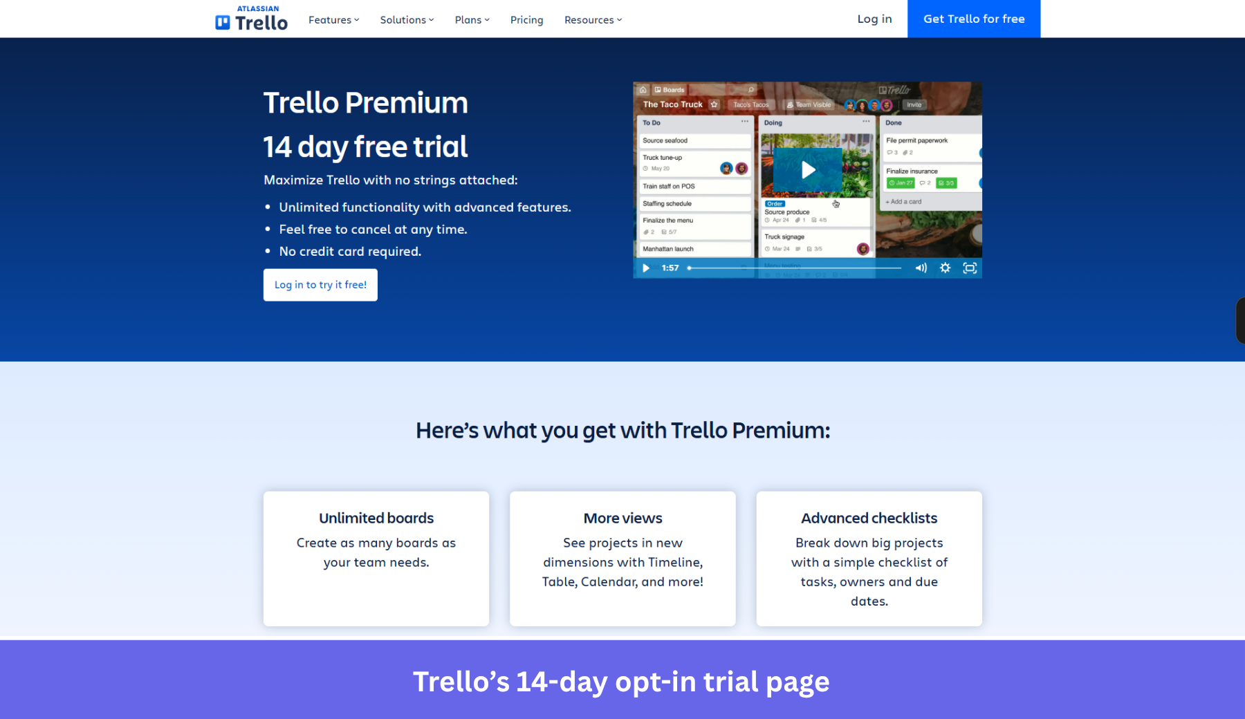
Trello: Opt-in clarity with zero ambiguity
The Trello Premium trial page leads with a “14 day free trial” headline and three bullets right under it: unlimited advanced features, “feel free to cancel at any time,” and “no credit card required.” A human and a crawler pull identical terms off that first screen. So the AI summary a buyer reads beforehand lines up with the page they actually land on.
The page then does the qualifying work, listing exactly what Premium adds (unlimited boards, more views, advanced checklists, custom fields, unlimited automation, stronger permissions) so a free-plan user can judge the upgrade before spending a day of the trial. The 20-minute webinar tour gives cautious buyers a way to preview that value without committing.
Where the page leaves money on the table is social proof and AEO depth. There are no named testimonials, customer logos, or security badges on the trial page, and no FAQ block for answer engines. A short cluster of question-shaped answers (“Does the trial auto-charge? What happens after 14 days?”) would let chatbots cite Trello directly instead of reconstructing the terms from forum threads.
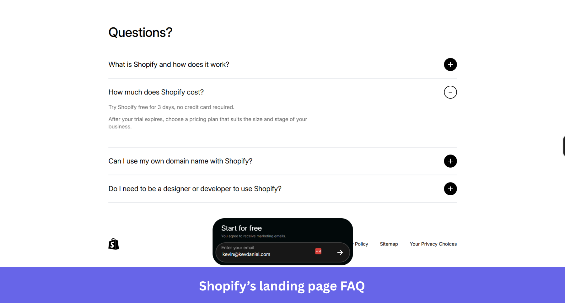
Shopify: Objection handling and AEO in one FAQ block
The Shopify free trial page pairs an aggressive offer (start free, then $1/month) with a single email field, which is about as little friction as a signup can carry. The hero repeats the offer twice and stacks recognizable customer logos (Allbirds, Gymshark, Brooklinen) underneath, so a pre-briefed buyer gets instant social proof without scrolling.
What earns Shopify its spot is the plain-text FAQ at the bottom. It answers “How much does Shopify cost?” verbatim, including the 3-day no-card trial terms, plus what the platform is and whether you need a developer. A model quoting that page can’t get the terms wrong, and a human skimming it gets the same reassurance without leaving the page.
Now, I can feel some offer congestion in this page. The headline promises “$1/month,” the FAQ describes a “3-day free trial,” and the page also dangles “up to $10,000 in credits,” so a careful buyer (or a careful chatbot) has to reconcile three numbers that aren’t obviously the same thing. Naming the trial length next to the email field, and letting the FAQ resolve the $1 and the credits explicitly, would remove this ambiguity.
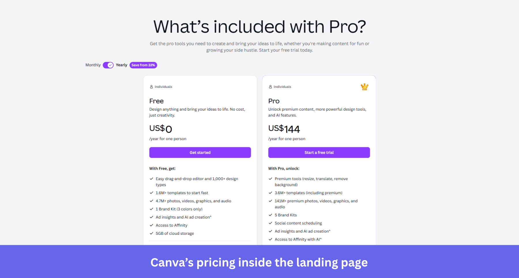
Canva Pro: A credit card requirement that de-risks itself
The Canva Pro page runs the opt-out model, a 30-day trial that asks for the card upfront and converts at the higher rates. The detail worth copying is the transparency around it, because Canva tells prospective trial users they’ll get a reminder email about a week before the trial ends.
That one line answers the biggest objection a card-required trial creates, the fear of forgetting to cancel. It addresses the cautious buyer who would otherwise have closed the tab, and it protects month-one retention from resentful accidental customers who only paid because they missed the deadline.
The weak spot is claim consistency across regions. Canva’s trial is 30 days in most countries but 14 in some, and a few regions skip the card entirely, so an AI assistant summarizing “the Canva trial” can confidently state terms that don’t match what a given visitor sees. Surfacing the trial length, the card requirement, and the reminder right next to the CTA (rather than leaving the specifics to billing pages) keeps the human and the chatbot reading the same numbers.
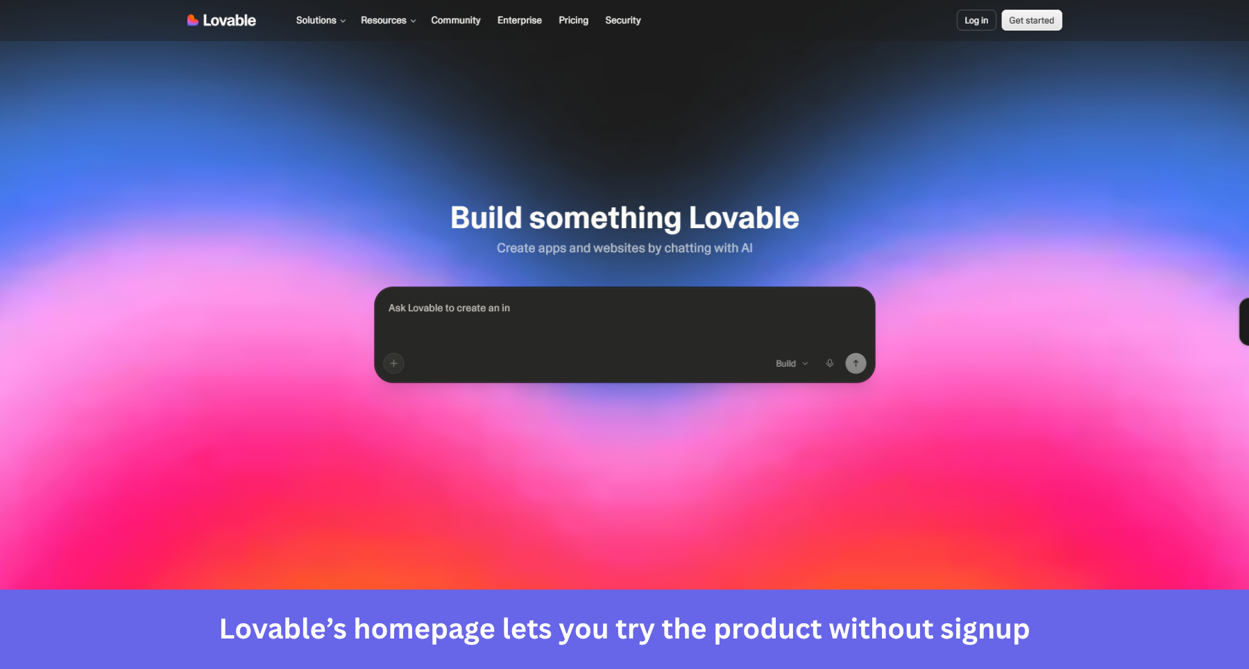
Lovable: The page is the product
On Lovable’s homepage, the hero is a prompt box under the line “Build something Lovable.” You describe the app you want and watch it get built before you’ve created an account, so the landing page and the AHA moment happen in the same breath. Signup only enters the picture when you want to save or deploy your work, which makes this the ungated freemium experience in its purest form.
This is the strongest page you can show to a pre-briefed visitor, because it shows value fast instead of describing it. It trades a little conversion tracking for a much wider top of funnel, and for an AI-building product, the demo is more persuasive than any screenshot.
My only gripe is the lack of FAQ. Almost none of the trial or pricing terms live on the homepage, they sit on a separate documentation page, adding a bit of friction to visitors who’re looking for committing to a plan. A compact FAQ on the homepage covering the free tier, credits, and plans would help address potential objections from visitors.
The free trial landing page doesn’t end with the signup
When creating a landing page, most teams forget to think about what happens after the signup. In Forrester’s buying research, more than 60% of buyers ran some form of trial before committing, and among trialing buyers 36% planned to buy from the same provider while 35% planned to buy from a different one.
That gap makes the first session more important than ever. Abrar Abutouq, a product manager here at Userpilot, hit a wall with our own email feature launch. The signup-to-activation funnel showed a sharp drop at the domain verification step. And instead of filing an engineering ticket, she fixed it in the product:
“Within a few hours, I just created a targeting tooltip and showed it to users and highlighted the correct steps for them to make it clear what to do next. That helped a lot on reducing friction and supporting users in real time without involving our dev team.”
The drop-off closed within days, and the lesson generalizes. The promise your landing page makes gets kept or broken in the first ten minutes in-app, so instrument those minutes as carefully as you instrument the page.
Personally, I recommend starting with a welcome screen that segments new trial users by use case. This data will help you create personalized onboarding experiences that help new users find the value of your product sooner.
Then, watch where trial users stall with funnel analysis, and pair it with session replay when you need the why behind a drop-off. Then hit the trial users who didn’t convert with two-question in-app survey asking why they didn’t convert, giving you actionable feedback in the process.
Turn your free trial landing page into a verified front door
Free trial landing pages are not just about making promises that make visitors signup, it must also be visible to answer engines and speak to visitors who are already pre-briefed on your product.
Since more than a third of trialing buyers still walk to a competitor, your landing page also needs to be coupled with a high-value product that activates users on the exact value it advertised. That first session experience is where your trial may leak customers too, no matter how good your landing page is.
That’s the part Userpilot is built for. If you want to see what a valuable onboarding experience looks like end to end, book a Userpilot demo and we’ll walk you through it.
About the author