The Top 12 Interaction Design Principles To Follow


The right interaction design principles can help you create intuitive, user-friendly product experiences that drive long-term retention.
Today’s article shows you some of these principles and how to apply them in your UX design.
Let’s get started!
What is interaction design?
Interaction design is the practice of creating interactive digital products, environments, systems, and services that focus on user behavior.
Interaction designers strive to create intuitive and meaningful relationships between users and products, ensuring that users can achieve their goals in the best way possible.
What are interaction design principles?
Interaction design principles are guidelines that help UX and visual designers create intuitive and engaging interfaces.
These principles are derived from various fields, such as psychology, human-computer interaction, and user research. Modern design principles are influenced by the works of experts like Don Norman, Alan Cooper, and Brenda Laurel.
For instance, in his seminal work, The Design of Everyday Things, Don Norman emphasizes that good design makes important information visible at the right time and provides immediate and informative feedback. Most digital products incorporate this design principle.
A common example is the login process: you’re clearly shown where to input your email and password and then receive UI feedback indicating either a successful sign-in or a prompt to retry your password.
12 Interaction design principles and best practices
Implement the following principles to help users enjoy your platform better:
1. Follow a user-centric design approach
A user-centric design approach places the user at the heart of the design process. It begins with thorough research to understand user needs, goals, and motivation, then tailoring design decisions to meet those needs.
There are various methods to gather valuable user insights, including:
- Surveys: Trigger in-app or email surveys to collect quantitative and qualitative data on user needs.
- Interviews: Have one-on-one interviews and ask open-ended questions that allow users to express themselves while you pay keen attention.
- Focus Groups: Facilitate discussions to uncover shared opinions and insights.

Design and trigger in-app surveys like this with Userpilot.
After researching users through any of the above methods, create user personas and empathy maps based on the information you gathered. These will allow you to visualize customer needs and create designs that follow the user’s mental model.
2. Create simple and intuitive user interfaces
Complex or confusing interfaces make users spend more time figuring out the product, often leading to frustration, errors, and abandonment.
Avoid user frustration by eliminating unnecessary elements—this can be anything from excessive features to cluttered layouts or confusing navigations.
Sometimes, interaction designers get in their heads and forget that the user isn’t as experienced as they are. So, it helps to conduct usability tests on your prototypes to ensure design intuitiveness before rolling out the final product.
3. Consider the context in the design process
Draw on customer data from the research process to ensure you’re building what aligns with the user’s context.
Here are some questions to help you create contextual designs:
- Who is the user? Understand their demographics, behaviors, and preferences.
- What are their goals? What tasks are they trying to accomplish?
- Where are they going to use the product? Tailor the design to the environment (e.g., optimize for mobile use if they’re on the go).
- What device are they likely to use? Ensure compatibility and responsiveness across different devices.
- What’s their emotional state when they use it? Design with empathy, understanding their mindset and potential frustrations.
- Possible disruptions? Consider external factors that might impact the user experience.
For example, if you’re designing a tool for project managers, you would want to prioritize clear and intuitive dashboards that provide a quick overview of project status and key metrics. You could also consider a mobile app since project managers are often on the go.
4. Follow usability guidelines to enhance engagement
Usability is the ease with which users can achieve specific goals with your product.
It’s deeply intertwined with user engagement: When your product is easy to use and understand, users are more likely to engage with it, spend more time on it, and return to it repeatedly. In contrast, poor usability can lead to frustration and disengagement.
Elements of usability to keep in mind:
- Learnability: The ease with which new users can accomplish tasks the first time they encounter the design.
- Efficiency: The speed at which experienced users can perform tasks.
- Memorability: How easily users can reestablish proficiency after a period of inactivity.
- Errors: The number and severity of errors users make and how easily they can recover from them.
- Satisfaction: How pleasant and fulfilling the user experience is.

5. Use progressive disclosure to avoid overwhelming users
Progressive disclosure involves gradually revealing information or features to users rather than all at once. This interactive design principle simplifies the initial interaction with a product, reducing cognitive load and preventing users from feeling overwhelmed.
Interactive walkthroughs are a prime example of progressive disclosure in action. They guide new users through a product’s essential features and functionalities, one step at a time, using tooltips, overlays, and other UI elements.

6. Provide meaningful UI feedback to drive positive user interactions
Clear feedback is one of the core interaction design principles that ensures users have a smooth and understandable experience. Without it, users might be left wondering whether their action was registered, a process is underway, or if they’ve made an error.
Incorporate feedback mechanisms into your product design to align with this principle. For example, this can mean offering instant visual, auditory, or haptic feedback when users perform actions like button clicks or form submission.
You can also use system status indicators, such as loading spinners, progress bars, and success/error messages, to inform users about the state of ongoing processes.

7. Keep your visual design consistent
Visual consistency reinforces your brand experience, enhances usability, and reduces cognitive load, as users don’t have to keep adapting to new styles.
When designing, ensure consistency with the color palette, fonts, icons, and layouts.
But keep in mind that consistency isn’t just about visual elements; it also applies to functionality. Users should expect similar behaviors and responses when interacting with different parts of your product.
For example, buttons should have consistent visual styles and interactive feedback, and navigation menus should function predictably across different pages.
8. Create a visual hierarchy in the user interface
Visual hierarchy concerns the arrangement and presentation of design elements to guide the viewer’s attention and create a clear order of importance.
A well-defined hierarchy helps users quickly identify the most important elements on a screen, understand the relationships between different components, and navigate the interface effortlessly.
Here’s an example of a good hierarchy.

Notice how the headline immediately grabs attention due to its large size, bold font, and central placement.
The UI design then guides the user’s eye in a natural flow from the headline to the call to action. The icons and labels for “In-app Engagement,” “Product Analytics,” and “User Feedback” are smaller and less prominent, indicating they are secondary to the main message.
9. Design for flexibility and efficiency of use
When crafting user interfaces, it’s crucial to recognize that your user base will encompass a wide range of skill levels and preferences.
Some users will be new to your product, while others will be seasoned veterans. Your design should accommodate both ends of the spectrum to create a truly inclusive and satisfying experience.
Guide new users through the essential features and functionalities with clear instructions and helpful prompts, but enable experienced users to bypass repetitive steps quickly.
For example, consider the modal below. Uninterested users can easily click the “x” icon to cancel it and proceed with their tasks.

Beyond accommodating different skill levels, offer customization and personalization options that empower users to tailor their experience. For instance, this can mean allowing users to rearrange elements or hide/show specific features.
10. Design with accessibility and inclusivity in mind
Build products and experiences that are usable by everyone, regardless of their abilities or disabilities. This includes people with visual, auditory, motor, or cognitive impairments, as well as those who use assistive technologies.
For instance, features like clear navigation, high-contrast color schemes, and keyboard navigation will assist users with disabilities while improving usability for your entire user base.
One of the most popular standards for inclusive design is the Web Content Accessibility Guidelines (WCAG). It has four key principles (POUR):
- Perceivable: All users must be able to perceive the content, whether through sight, hearing, or touch.
- Operable: Everyone should be able to navigate and interact with the content, regardless of their abilities.
- Understandable: Content should be presented in a clear and intuitive way that everyone can comprehend.
- Robust: Content must be compatible with a wide range of assistive technologies and web browsers.
11. Ensure clear and easy-to-understand product copy
As an interaction designer, it’s tempting to use technical jargon or industry-specific terminology in your product copy, but that will alienate many users. So keep your product copy simple.
You can use AI tools to simplify the process. For example, Userpilot’s AI writing assistant can help you write microcopy from scratch or rework your existing content:

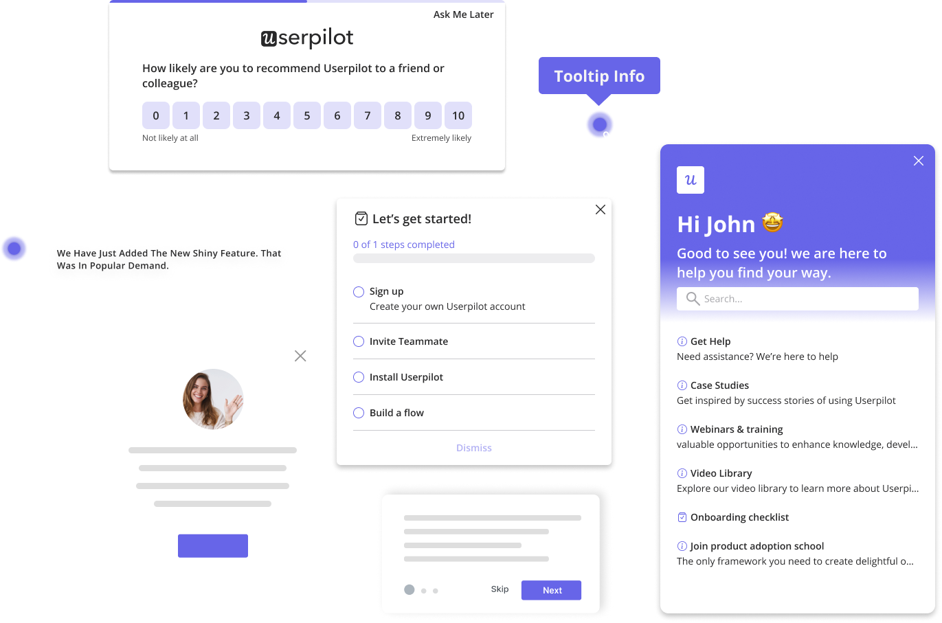
12. Make help easily accessible
When users encounter issues or have questions, they want quick and convenient access to assistance.
If they have to struggle to find help, they may become frustrated, abandon their task, or even lose trust in your product.
Eliminate friction in the user experience by integrating customer support widgets into your interface or having an in-app resource center, as in the example below.

Conclusion
Interaction design is just as important as product features. Customers consistently prefer products that offer a great user experience with good enough features over those with superior features but poor user experience. Don’t settle when you can strive for the best of both worlds!
Ready to implement the interaction design principles discussed in this article? Book a demo to learn how Userpilot can help you create intuitive and engaging user experiences.
Try Userpilot and Take Your User Experience to the Next Level
About the author