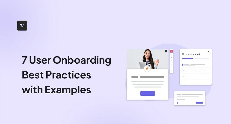
A great user onboarding experience can be the difference between a successful app and a dud.
Unfortunately, when it comes to onboarding, you’ve only got moments to charm your users and convince them they’re in the right place. But nailing that perfect onboarding experience can be tricky – signups, welcome messages, walkthroughs…
Where do you begin? Well, this article’s seven user onboarding best practices can help you transform your onboarding process and customer success teams into world-beaters that drive product growth.
Get The Insights!
The fastest way to learn about Product Growth, Management & Trends.
What is user onboarding and why is it important?
User onboarding is the process of helping new users become proficient with your app. It encompasses everything you do to help users get comfortable using your product.
Good user onboarding helps users recognize how your product will improve their lives. Essentially, it enables users to think, “Wow, I get why this product is awesome!” This is the activation point or the “Aha!” moment of product onboarding.
But onboarding doesn’t end with the basics. Secondary onboarding, for example, uses features like contextual in-app guidance to introduce more advanced or newly added features.
This form of continuous onboarding provides proactive guidance to users, helping them adopt new features and stay engaged with your product. It also creates a connection between the product and the user.
Unfortunately, about 40-60% of new users of SaaS products only visit a product during sign-up, never to return. Good onboarding, therefore, must get users to activate quickly, leading to better user retention.
So, how can you ensure your onboarding process achieves this purpose? Consider seven tried and tested user onboarding best practices that can turn new users into fully engaged customers.
1. Leave a lasting first impression
The user onboarding process lies at the start of your customer journey. Your goal should be to capture users’ attention and loyalty in those early moments by creating an excellent first impression.
Note that onboarding doesn’t just start when users log in – it begins the moment they spot your product in the wild, whether through an ad, a friend’s recommendation, or a Google search.
This initial meeting must be good enough to push them to sign up for your product. Still, you need to leave a lasting first impression after they sign up. How do you do this?

The first step, of course, is always to welcome users warmly.
Then, provide a personalized checklist to guide users to the 3-5 key actions they must complete to reach the ‘Aha’ moment. This should tell users what to do, help them do it, and show them how much they’ve done at each point (using a progress bar).

To help users complete each action, link interactive walkthroughs with checklist items, showing users how to complete the target action.

Sometimes, though, there’s so much to say that you can’t fit it all into an onboarding sequence. In that case, you can craft an onboarding email with useful resources, quick-start guides, and helpful tips to help users feel at ease.
What not to do…
- Don’t leave empty states: Empty states can leave users feeling lost and unsure of what to do next. So, fill them up with informative and actionable content.
- Avoid generic product tours: Product tours tend to be lengthy, unengaging, and overwhelming. Instead, interactive walkthroughs are more engaging and contextual, increasing the user’s chance of completing them and reaching the activation point.
- Don’t overexplain intuitive stuff: Trust your user’s intelligence. If something works just like every other app (like a save button or search bar), there’s no point explaining it.
- Never leave users hanging without a clear path to get help: Your user onboarding flow simply cannot cover every detail. So, empower users to get help when they need it. You can do this using a chat bubble, a help center link, or a friendly “Need help?” button.
Talana – an excellent user onboarding example
Talana’s onboarding example brings it all together.
This human resource solutions provider offers complex products for managing payroll, recruiting staff, managing workplace communities, etc.
Talana originally elected to provide the necessary training themselves. But, as the customer base grew, this became untenable. So, they found a way to automate the process while leaving a lasting first impression.
First, new users receive a checklist with four key action items needed for activation. Then, as users begin navigating the product, Talana keeps them engaged through contextual tooltips, modals, and banners offering helpful information.
Finally, they incorporated an in-app resource center for on-demand support to ensure continued user retention.
2. Tailor user experience to their needs and goals
Chances are, if you have a SaaS product, you’ve got a varied user base. These users visit your product with different goals in mind. To help them get the most out of your product, you must tailor their experiences to match these goals.
Think of this as a 3-step process:
Step 1: Understand your users
The first step to creating a great user onboarding experience is understanding why the user signed up for your product in the first place.
For this, you’ll need to craft user personas for different user segments. This part will require some work. First, you need to understand your product and its use case. Ask yourself…
- How complex is the product?
- Does the product have/support different use cases or jobs to be done (JTBD)?
- Does each use case need a different onboarding flow?
- What’s the quickest way for them to experience value?
For example, users can navigate a simple doc-to-pdf conversion tool without any instructions. But what if you have a complex analytics tool with different features and use cases?
Then, you’ll have to create user personas around those use cases. For each persona, highlight their background, need/problem, and how your product can help them.
Step 2: Create tailored flows
Next, consider the quickest way to help your users experience your product’s value. This will mean creating tailored onboarding flows for a complex product with multiple use cases for each persona.
The reason is simple – a good onboarding flow addresses a user’s immediate need.
For example, users downloading your tool for its analytics features will want to use the dashboard to track important metrics. So, what will they need to do to make the dashboard useful to them?
Do you have dummy data to show them how it works? Do they have to install a tracking script to start collecting their data? How does the dashboard work? What are the customization options, and how easy are they to find? How about data filtering?
These questions will help you lay out your onboarding steps and determine which steps (or screens) need extra guidance. You can then contemplate the best form of guidance for each step.
For instance, you can combine a checklist item with a tooltip to guide the user in installing the JS script. Likewise, you can use a tooltip to highlight the filter button or showcase the dashboard customization tab.
Step 3: Connect users to the right flows
Finally, identify each user’s persona and link them to the appropriate onboarding flows. The easiest way to do this is by using a welcome survey to determine their goals and JTBD.
Then, you can segment them using that information and trigger the appropriate flow.
For example, if your tool has analytics and engagement features, you can trigger an analytics-focused flow for product analysts and an engagement-focused flow for a UX designer.
This approach ensures you don’t overwhelm them with information they don’t need.
The eCommerce email marketing platform, Jilt, initially made that mistake. Their onboarding email flow discussed everything from newsletters to win-back emails, shipping notifications, abandoned cart reminders, etc.
The result was a conversion nightmare as users felt there was so much to learn. To fix this, they used a survey to determine user’s goals. Then, they split the flow to focus only on each user’s primary need.
Wistia, a video marketing tool, has a similar onboarding experience. As new customers sign up, they are welcomed with the question, “What’s your main goal with Wistia?” The company then tailors the onboarding flow to help the user achieve this goal.

3. Gamify user onboarding for higher engagement
Next on the list of user onboarding best practices is gamification – the practice of incorporating gaming elements into the product experience.
A lot of apps are unintuitive and boring to use. And apps that aren’t boring often struggle to help users find value in them. As a result, 25% of users abandon an app after using it once.
How can gamification help? Consider a few ways:
- Welcome screens: Can you make your welcome screen more interactive? You can include animations to make them more fun or include interactive elements like clickable buttons or videos that push users to engage.

- Onboarding checklist: Link your checklist items to a reward program to make them more engaging and rewarding. For example, free trial users can get access to more trial days as they complete more actions.
- Milestones and badges: As users complete key actions, trigger gamified celebrations to acknowledge their efforts. You can also issue them with badges for reaching major milestones.
4. Go beyond the primary user onboarding experience
Ultimately, you’ll only learn so much about your users and their needs as they use your product. So, onboarding has to be more than a one-time experience at the start of the user journey.
This is the magic of continuous onboarding – a process consisting of 3 stages: primary, secondary, and tertiary. Each stage has a distinct starting point, uses different onboarding elements, and applies to unique use cases.
Let’s consider them in a little more detail.
Primary Onboarding
This is the initial stage, which begins immediately after sign-up or account creation. Its goal is to help new users discover your product’s core features.
Primary onboarding involves the use of many of the touchpoints and elements we’ve discussed so far, such as:
- The sign-up flow.
- A welcome message/survey.
- An onboarding checklist.
- Interactive walkthroughs.
A successful primary onboarding process should guide the user to the activation point, setting them up for success with your product.
Secondary Onboarding
The secondary onboarding process starts after users reach the activation point. It typically involves using contextual tooltips to guide users to explore more advanced features of your product.
For example, primary onboarding for an analytics tool may focus on linking the tool to the target product or data source and working with the dashboard.
However, many other facets of the tool may remain unexplored (say, event tracking, heatmap analysis, etc.). Secondary onboarding, therefore, can involve releasing a tooltip or a mini-walkthrough when a user first interacts with this feature.
Tertiary Onboarding
Tertiary onboarding is far from the “final” onboarding phase. It is a never-ending process designed to strengthen user engagement and drive customer success.
Its goal is to help users continue using the product by addressing their more specific needs, offering swift support, rewarding loyal users, and seamlessly introducing users to product updates and feature releases.
For example, after releasing a new feature, analytics may show that some users have struggled to adopt it. You can then release an onboarding flow to help these users make sense of the new feature.
Tertiary onboarding can also come by way of industry-focused webinars, 1-on-1 support, etc.
5. Make proactive decisions based on customer feedback
Proper feedback management is key to the success of any product. As part of your user onboarding best practices, collecting and analyzing customer feedback helps you know how good your onboarding process is.
Note, however, that the best form of feedback collection is proactive in its approach. Rather than wait for customers to come to you with complaints, trigger in-app surveys at different touchpoints to get their opinions.
For example, you can trigger a survey right after the onboarding flow to see if users are satisfied with it. This will help you get their unfiltered opinion while it remains fresh.
There are other benefits of in-app surveys too:
- Users can respond in a few clicks, which increases the response rate.
- The feedback is more likely to be honest.
- It’s easier for users to report bugs.
Surveys are useless if you don’t act on them, though.
For example, imagine you launch a survey after onboarding, and some respond that a walkthrough wasn’t clear enough. You double-check the answers with session recordings and notice that users aren’t using the affected feature as they should.
So, you follow up with a modal telling them you’re aware of the issue and working on it. Then, you revise the walkthrough so it’s clearer for future new users.
For your now older users struggling with the feature, you provide them with another resource (a demo, webinar, or other in-app tutorials) to improve adoption.
Now, the feedback loop is closed and everyone is better for it.
6. Identify and fix friction points in the onboarding process
Even if you don’t notice them, friction points directly impact your onboarding process, slowing users down or deterring them altogether.
They’re not always bad, though. Indeed, sometimes, friction is necessary.
For example, you can use an added step that causes a slight delay to encourage users to double-check their decisions, ensuring they avoid mistakes or regrets.

However, you must also ensure there is no bad friction. So, carefully map out the user journey during onboarding to ensure it is designed for efficiency.
Then, employ user analytics to help you discover bugs, slow page loading times, and confusing processes. Some analytics features that could help you do this include:
- Autocapture: This feature lets you track key user interactions through different funnel stages. It enables you to identify rage clicks or other poor feature interactions.
- Session recordings: Watch recordings of users navigating your product to help you see exactly where friction happens and why.
- Funnel analysis: This analytical technique lets you track users’ progress through a sequence of steps leading up to a key conversion point. This way, you can spot touchpoints where users struggle or even drop off.
7. Re-engage and bring inactive customers back to your product
Let’s face it, no matter how captivating your user onboarding process might be, sometimes life gets in the way, and those who start the process (or even use your product for a while) abandon it halfway.
As a result, one of your user onboarding best practices should be a plan to re-engage and “woo” these users back. The best channel for this digital wooing is email.
But how can you ensure your mail actually gets through to them? Here are a few email re-engagement strategies to observe:
- Highlight interesting new features (if any) in your win-back email.
- Offer strategic discounts and promotions to former buyers to draw them back in.
- Leverage customer data to highlight elements and features that interest churned users.
- Showcase features the user is yet to interact with and tell them why they should care.

On the other hand, if the user directly informs you they’re leaving by unsubscribing or deleting their account, you can trigger an exit survey to understand why.
The responses you receive will help you improve your product and prevent future churn. But it’ll also give you an insight into how you can win back a customer after addressing their concern.

And when your re-engagement email succeeds, don’t forget to roll out the red carpet. You can send a “welcome back” email and post a modal in-app to celebrate their return.
How Userpilot can assist you with the user onboarding process
Implementing the user onboarding best practices above is easy if you’ve got the right tool – Userpilot. This no-code onboarding tool is packed with features that can greatly improve your onboarding experience.
Here’s how:
Onboarding elements
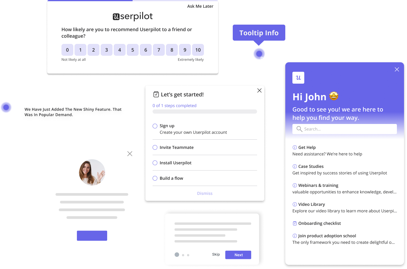
Userpilot’s engagement layer features various UI patterns, including:

- Tooltips: Used to describe specific elements of your product. You can chain multiple tooltips together to create an interactive walkthrough.
- Modals: Modals are large UI elements placed over the main application window. They can be used for major announcements, such as welcome messages, feature updates, etc.
- Banners: These unobtrusive elements often appear at the top of the web app and are used to communicate updates, promote new features, announce limited-time offers, etc.
- Onboarding checklists: Used to guide users to activation in a clear, structured manner.
Analytics
Userpilot features an analytics layer to help you better understand your users and provide proactive support. This layer includes features like:

- Dashboards: They enable you to track key product performance and user behavior metrics, without any technical setup.
- Paths: Useful for tracing how users navigate your product by tracking action sequences before or after an event.
- Funnels: They help you track user movements across key touchpoints on the way to a conversion event. They are useful for identifying frustration areas and drop-off zones.
- Event tracking: Track and analyze event data to understand user behavior better. You can sort through Userpilot’s auto-captured data for relevant features and view trend charts to identify behavior patterns.
Surveys

Userpilot’s feedback collection layer provides relevant tools for collecting and analyzing user feedback. It features several survey templates, including NPS, CSAT, and CES surveys.
You can customize their look, feel, and content, or build a survey from scratch using the no-code builder. You can even auto-translate these surveys for different audiences.
Userpilot also provides survey analytics features, enabling you to extract valuable insights from your surveys quickly.
Others
Userpilot also boasts other features that can improve your onboarding process. They include:
- A/B testing to determine what resonates with your audience.
- Session replay to track and identify causes of friction.
- Advanced segmentation features for addressing hyper-specific user needs.
- Extensive integration with third-party tools, etc.
Conclusion
And there you have it – seven user onboarding best practices to make your users feel more at home than a cat in a cattery.
But, let’s be real, no one gets it perfect right out of the gate. Thankfully, Userpilot doesn’t just help you create the initial onboarding flow – it provides the tools to help you refine your flow to perfection. Book a demo today!


