Emotional Design in 2026: The Human Signal AI Agents Still Can’t Fake


Emotional design used to be the thing you added after the product worked, but that has flipped over the past couple of years. I see this happen constantly in my work as a UX researcher. An AI copilot ships a functional screen in an afternoon, yet the screen still makes users feel nothing. AI agents don’t get a knot in their stomachs before launches or grin when a new interface gets positive user feedback. That’s why AI agents can’t design for the specific feeling a moment carries, only for the task underneath it. That gap is exactly where emotional design now lives.
The gap is growing fast as AI-generated sameness spreads. Once any team can prompt its way to an accessible interface, functionality stops being a differentiator. The products people will still choose despite that shift are the ones that feel good to use. Don Norman identified three levels of emotional design: visceral, behavioral, and reflective. AI can fake its way to one or two of those levels, but it doesn’t have the firsthand emotional reference point needed to nail all three.
This guide will go over emotional design in the AI era, the three levels of emotional design, and provide a curated collection of examples for you to learn from!

What emotional design actually means when AI can generate passable UI in seconds
Emotional design comes down to shaping a product to make users feel something positive while using it, not just creating something that works. It’s aimed at customer loyalty, tolerance for the occasional bug, and whether someone recommends your product without being asked. Any team can vibe code interfaces in an afternoon, but that screen can’t make someone feel like the product respects their time, intelligence, or mood. That’s still a design decision that AI agents skip and that humans need to make.
Emotional design compounds exactly because attention is the scarcest resource on a product team, and AI just made everyone’s roadmap longer.
I asked Yazan Sehwail, our CEO here at Userpilot, about the impact of AI in SaaS development and his answer matched what I’ve been seeing in my own research:
“As producing and building features becomes a lot cheaper, instead of every quarter you’re releasing one or two features, now you’re releasing seven, eight, nine. It becomes even harder for product teams to manually track each one and understand usage for each one.”
That’s the problem that compounds as feature velocity increases. Emotional design is what makes users forgive you for shipping fast and occasionally rough, because a product that feels intentionally designed and pleasant to use earns more patience than one that merely functions. It’s also what turns a first good impression into lasting product adoption that keeps users coming back habitually. The reverse is just as true. A product that’s technically correct but emotionally flat gets replaced the moment a competitor ships something that feels better.
Don Norman’s three levels of emotional design
Norman’s framework breaks the emotional connection into three sequential stages: visceral, behavioral, and reflective.
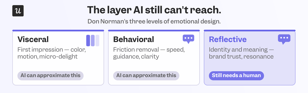
Here’s how they differ:
- Visceral is the gut reaction, the first-time user experience, what a user feels in the first second before they’ve formed any opinion.
- Behavioral is what happens while they’re using the product, such as how easily they complete a task.
- Reflective is the conscious verdict afterward as to whether they would use it again or tell others about it.
The sections below will give you examples for all three categories so you can see how each type of emotional design is already being utilized in SaaS UX design.
Visceral emotional design examples
Visceral reactions happen before a user has thought about anything. In SaaS, this shows up during the first ‘Aha’ moment that usually occurs between signup and the first real task. Waiting screens are still one of the easiest places to get this wrong. Rather than leaving someone staring at a generic spinner, show them what’s happening. I’ve watched session replays where a loading screen with a short message describing the ongoing process (e.g., “indexing your workspace now”) kept users engaged while waiting.

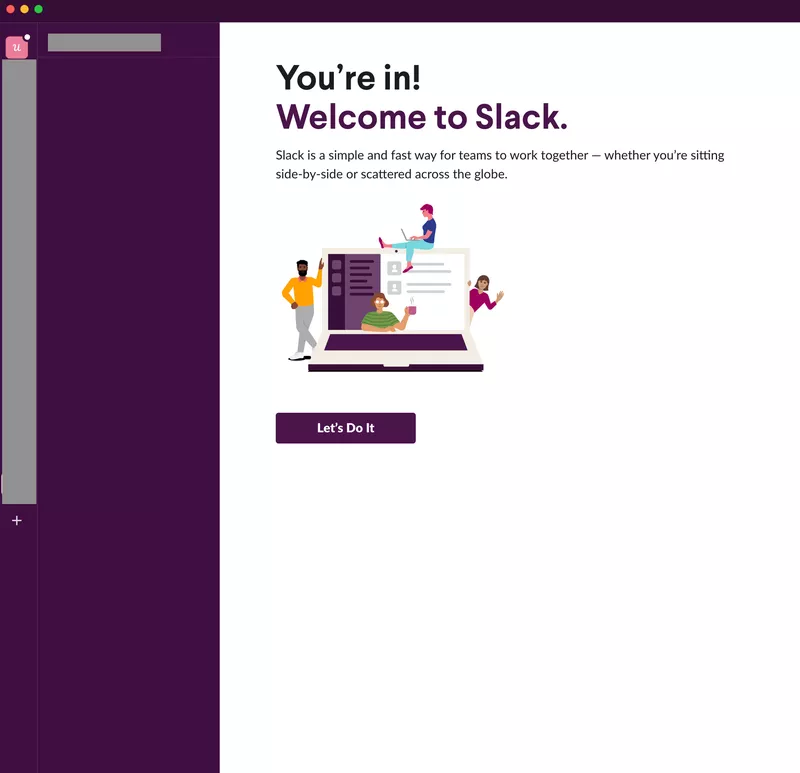
Loading pages have quietly become their own design discipline, and the products doing it well treat the waiting time as a part of the story rather than a workflow pause. Tone matters just as much as timing. Friendly microcopy line humanizes a product in the first few seconds, while a robotic system message does the opposite. Slack has leaned on this for years, and it’s still one of the clearer examples of visceral design done well with human phrasing in exactly the spot where a user might otherwise feel like they’re talking to a machine.
Behavioral emotional design examples
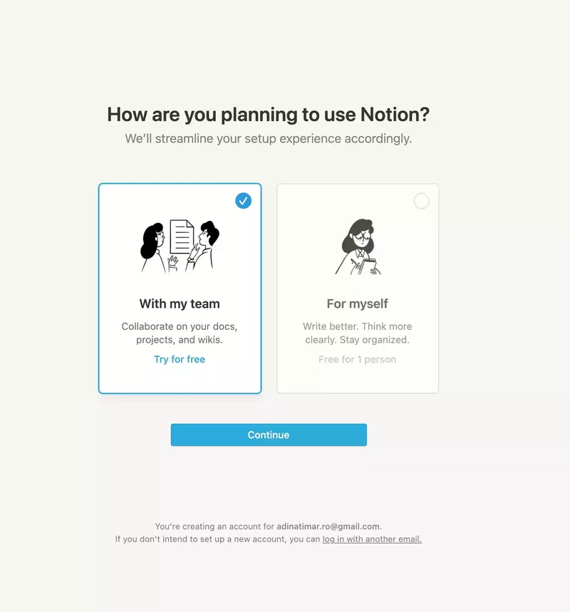
Behavioral design is about what happens while someone is actually using your SaaS product, such as how efficiently they get through a task or how much friction they encounter along the way. Contextual onboarding is table stakes now, with the bar moving to how specific that personalization is. Notion’s branched onboarding all shifts the entire flow based on the segment a user selects.
I’ve seen this play out directly on our own product. When Userpilot’s email feature first shipped, our conversion funnel analysis showed a sudden drop at the domain verification step. Instead of filing a ticket and waiting for engineers to fix it, our product manager Abrar Abutouq built a targeting tooltip that highlighted the exact next step. Drop-off closed within days of the tooltip being added, with no development resources being used up in the process.
Reflective emotional design examples
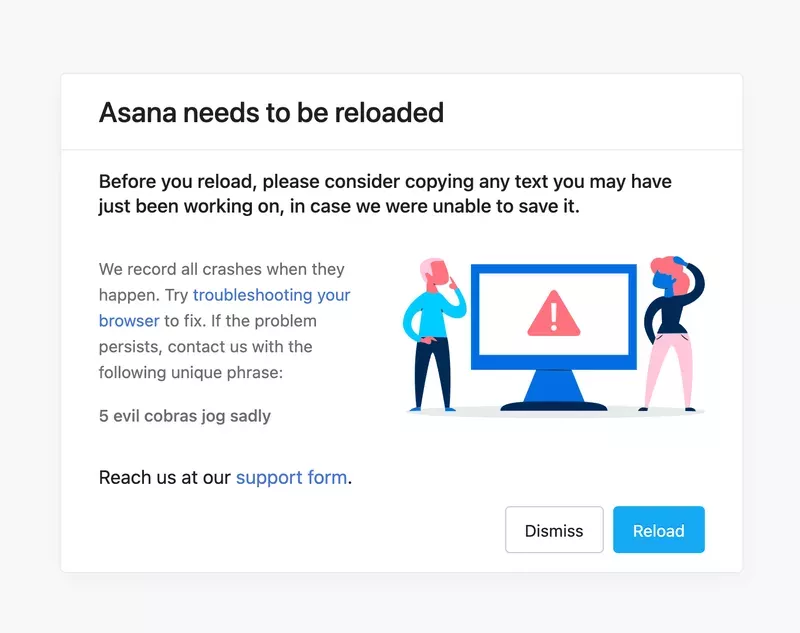
Reflective design is the final verdict a user reaches (whether consciously or unconsciously) after they’ve used your product. Did it solve their problem, will they use it again, and is it worth telling colleagues about? These are the questions that a user instinctively answers after using a product, and it’s where loyalty actually gets decided. Humor still works here when paired with the right dose of restraint. Asana’s “evil cobra” error messages are microcopy UX at its best, turning an annoying moment into a memorable punchline without pretending the underlying problem doesn’t matter.
We at Userpilot had a stats card tracking average time on page, but session replays showed us that only about 10% of users were interacting with it meaningfully. My first instinct was to cut it entirely. My manager pushed back on that instinct because 10% of an entire user base is still a sizable customer population. Sunsetting a feature they rely on can feel worse than leaving it alone. We compromised on a collapsible version that let the majority hide it while the minority could continue using it.
That’s the nuance of reflective design, respecting that a decision that cleans things up for one segment might feel like you’re taking something away from another user group.
Is your AI agent supporting emotional design or ignoring it
Adding an AI agent to a product isn’t the same as adding emotional intelligence. A chatbot that answers questions correctly but writes in a flat voice can actively undermine the reflective layer you’ve worked to build everywhere else. I asked myself whether I’d want to be interviewed by an AI agent instead of a person, and the honest answer is no. Even a well-built agent still sits in an uncanny valley of being technically capable but not someone I’d want to share my curiosities or frustrations with.
That’s not a knock on the (rapid-advancing) technology, just a reminder that some moments are reflective by nature because there’s a person on the other end. The teams getting this right treat AI as an intermediate layer that removes friction from the visceral and behavioral work, freeing up time for the reflective aspects that still need humans. That’s the design goal behind Userpilot’s own AI agent. Lia was developed to bridge the gap between user feedback, session replays, and product analytics so that researchers like me can refocus our time towards high-value human tasks.
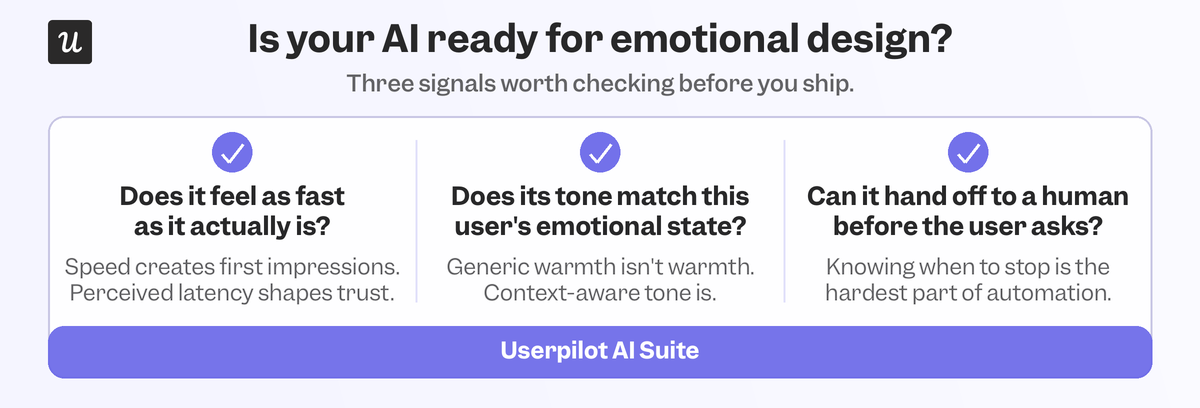
Before you delegate any part of the product experience to an AI agent, ask yourself three questions:
- Does the moment call for a fast answer or a felt one.
- Does the agent’s tone match the emotional weight of the task.
- Is there a clear handoff to humans when AI doesn’t know the answer.
If you can’t answer all three, that workflow isn’t ready to be delegated to an AI agent.
Design for the feelings AI still can’t replicate
Functional is the baseline now, not the differentiator it used to be. Emotional design is all that’s left to actually compete on because it’s harder to fake memorable moments than it is to generate a clean interface. Tools like session replays, in-app surveys, and AI agents can surface insights a lot faster than ever before, but humans still need to interpret what the feeling means and how to build products or features with that feeling in mind.
Book a demo to see how Userpilot helps teams close the gap between what users say and what they do, so you can base your emotional design on behavioral product data instead of guesses!
About the author