Funnel Tracking for SaaS Products: How to Spot Drop-Offs and Fix Them Fast


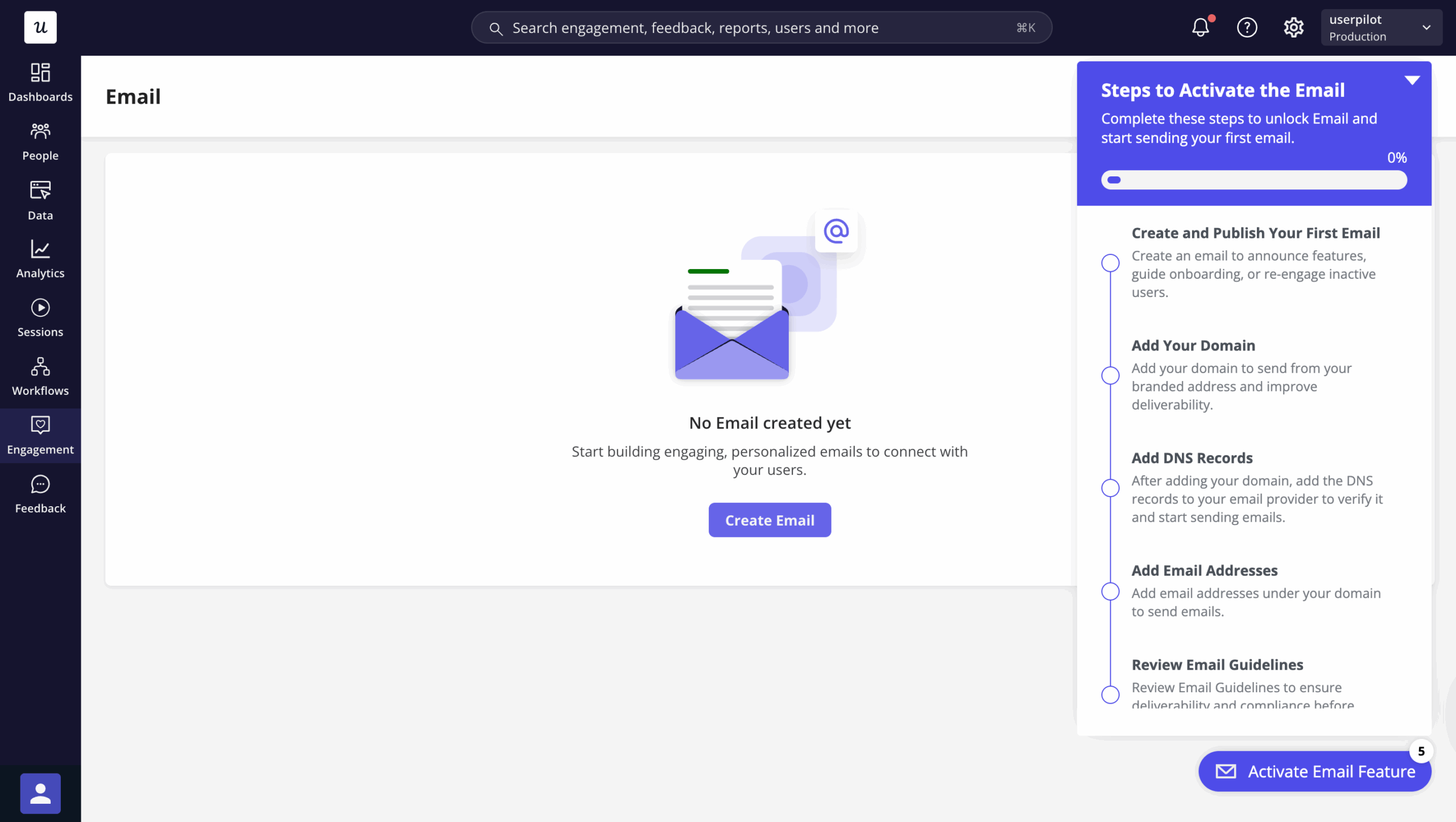
Funnel tracking showed me exactly where Userpilot’s email feature was failing within 48 hours of launch. The product analytics data showed a sharp drop-off at the domain verification step, with most users exiting before they ever activated the feature. Within a few hours of spotting it, I had a targeting tooltip and a user onboarding checklist live inside the product, and the drop-off started closing before the week was out.
Most SaaS teams don’t move that fast. Median free-to-paid conversion dropped from 50% to 34% between 2023 and 2025, according to Artisan Strategies’ benchmark of 1,200+ companies, and every leaked step in a funnel is more expensive than it used to be. The teams losing the most ground aren’t failing to find their drop-offs; they’re taking weeks to act on them.
I’m a PM at Userpilot, and the gap between seeing a funnel problem and fixing it is the one I think about most. Observation without intervention is just expensive anxiety: you know the funnel is leaking, you’ve logged it somewhere, and users are still leaving while the ticket sits in the backlog.

What is a product funnel?
A product funnel is a sequence of steps a user must complete to reach a defined outcome: activation, a feature milestone, conversion to paid, or renewal. The term gets used loosely enough that it’s worth drawing a clear line from the start.
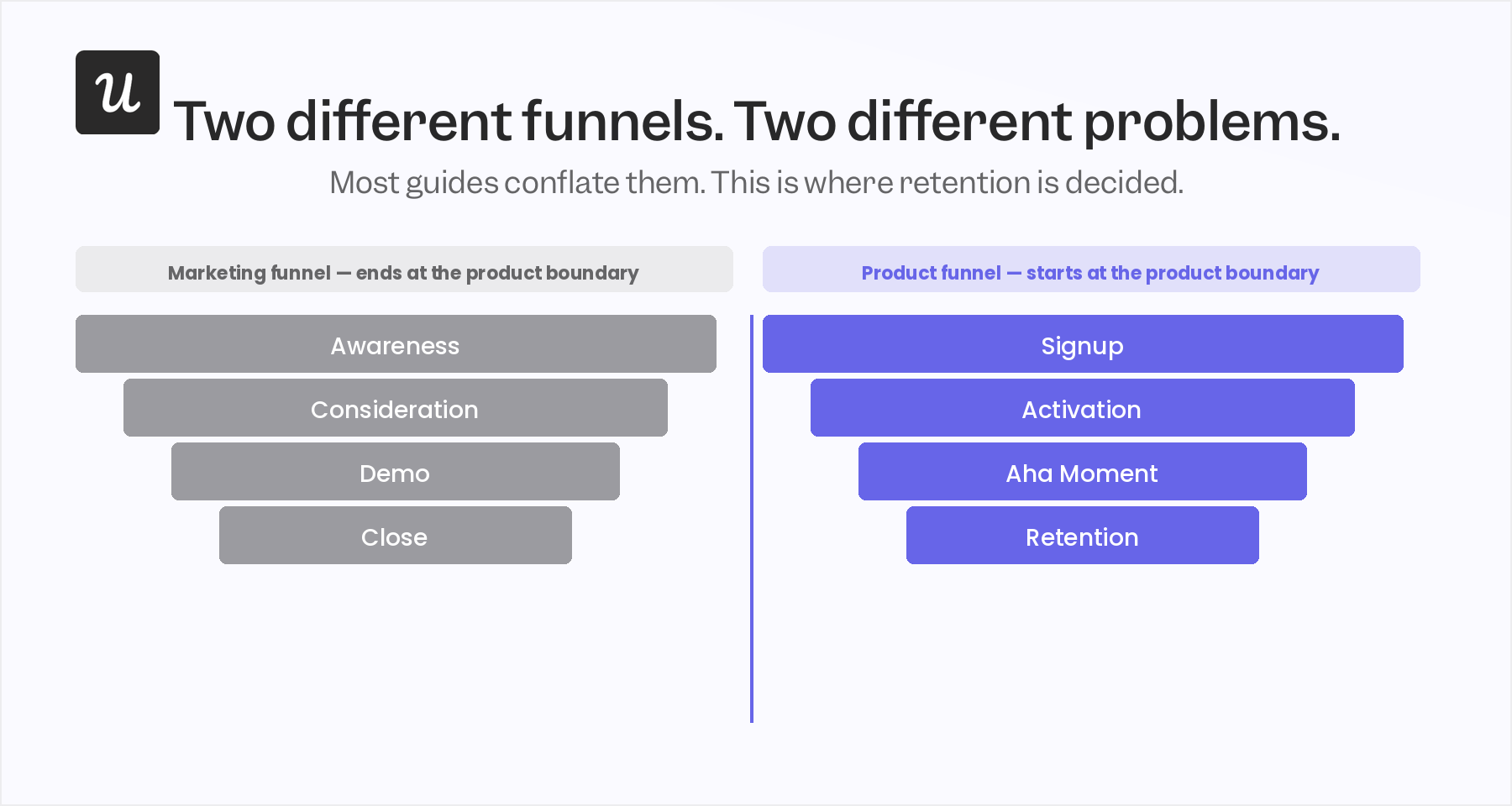
A marketing funnel tracks how strangers become leads: MQL, SQL, demo, close. A product funnel tracks what happens after they sign up: whether they reach their first value moment, whether they adopt the features that make them stay, whether they convert from free to paid. These are different problems with different fixes, and conflating them is one of the fastest ways to read your data wrong.
Product funnels are where retention is decided. A user who never reaches their aha moment inside your product won’t be retained by any amount of marketing spend; they haven’t found a reason to stay, and the funnel is the place where that reason either shows up or doesn’t.
The main funnel types for SaaS are four: the onboarding funnel (signup to first meaningful action), the activation funnel (active user to someone who has reached product value), the feature adoption funnel (access to repeated use of a specific capability), and the trial-to-paid funnel (free to paying). Each tracks a different question, and they’re worth building as separate funnels rather than trying to roll them all into one.
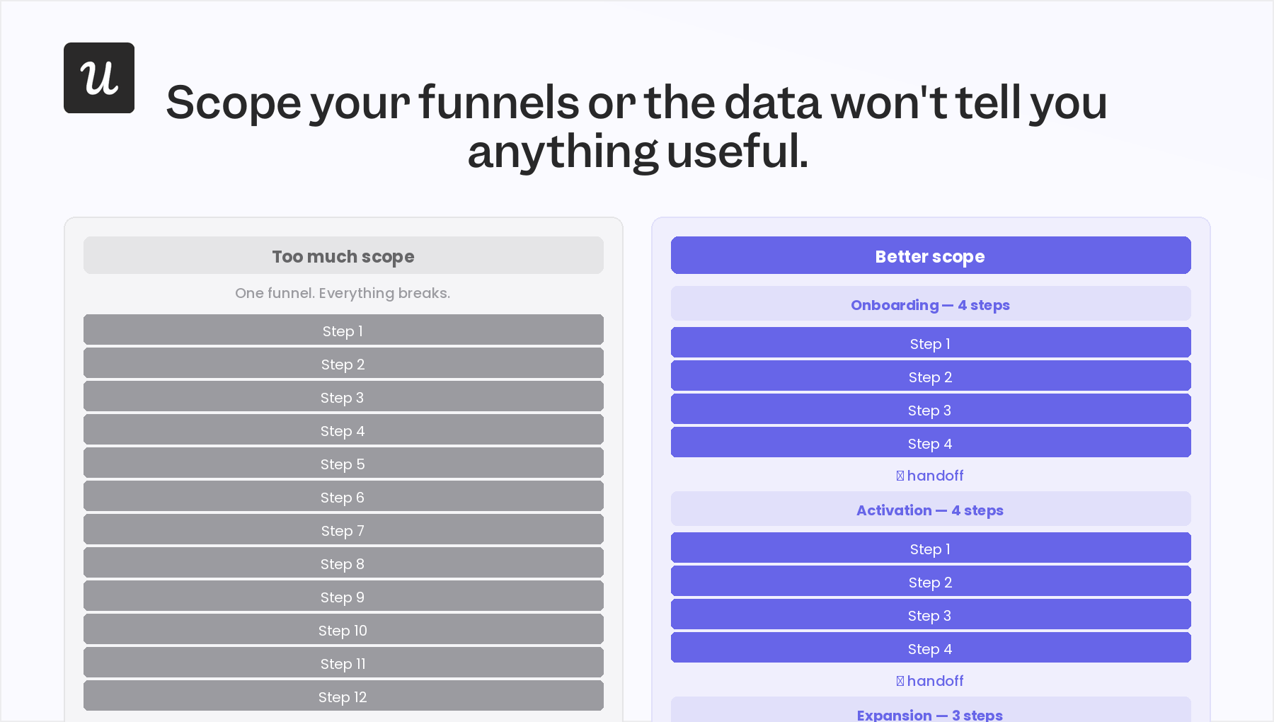
One rule I’ve adopted that most guides don’t mention: a funnel should have no more than 5 to 7 steps. More than that and you’re describing a process rather than measuring a conversion. If your user journey is 12 steps long, split it into two focused funnels with a clear handoff between them: one for onboarding, one for activation, rather than one unwieldy chain that mixes both.
Why funnel tracking matters for SaaS teams in 2026
The conversion environment has shifted meaningfully in the last two years. Above 5% free-to-paid puts you above the global median for SaaS; above 10% puts you in the top quartile, according to ChartMogul’s 2026 SaaS Conversion Report. Those benchmarks are useful context, but they don’t capture how much harder it’s gotten to reach them: the median itself dropped 16 points since 2023.
Poor onboarding is the proximate cause of most of that movement. 75% of users abandon SaaS products within the first week due to onboarding that fails to show value fast enough, and users who reach their first value moment within 5 to 15 minutes are three times more likely to retain than those who wait 30 minutes or more. The funnel is where you see that problem while there’s still time to act on it.
The deeper value of funnel tracking is that it tests assumptions. Your team built the feature based on a model of how users would interact with it; the funnel shows what users do. The gap between those two things is where most onboarding fails.
One example from our own data: when we launched when we launched Userpilot mobile support, the initial funnel showed only 10%, of our customers using the mobile feature. Once I filtered to only customers who had mobile apps, that number jumped to 25%. The raw figure was misleading because I was measuring the wrong population; the funnel forced me to reframe how I was reading the data, not just what the data said.
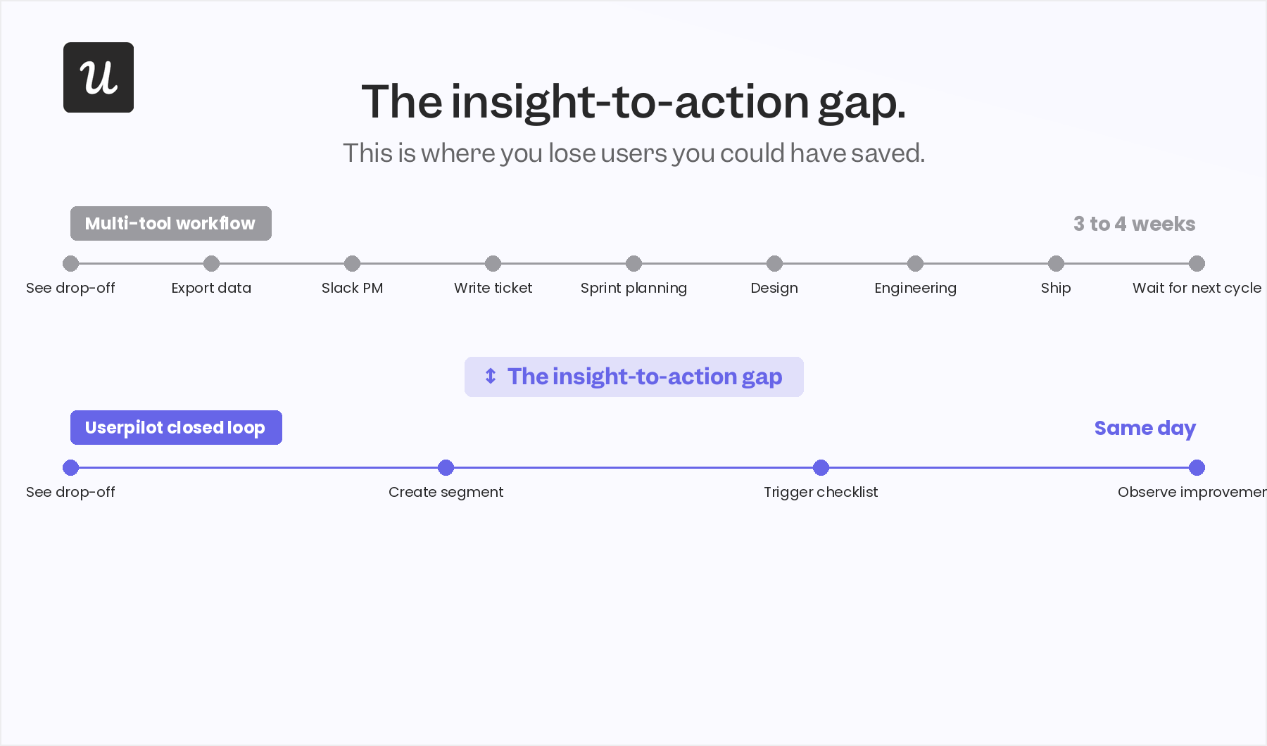
The piece of this that doesn’t get enough attention is the insight-to-action gap: the time between identifying a drop-off and shipping a fix. Most product teams have solved the visibility problem; any decent product launch analytics setup will surface a drop-off within days of a feature launch. The delay is in the intervention, and that’s where you lose the users you could have saved.
Four use cases for funnel tracking
Funnel analysis is valuable because it tells you where users leave, but what makes it actionable is knowing what to do about each type of exit. The four use cases below each end with a specific in-product response, not just an observation. For real data examples across different SaaS teams, these funnel analysis examples are worth reading alongside this.
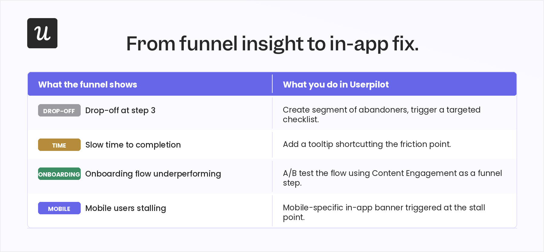
Identify drop-off points
A drop-off is a step in the funnel where a statistically meaningful share of users exit without completing the next action. Spotting the step is only the first move; the more important question is whether it’s a friction problem or a value problem, because those two causes have different fixes.
A 2026 UXCam study of 3.9 million sign-up sessions across 480 SaaS products found that reducing a sign-up form from 7 fields to 3 cut funnel abandonment by 44.7%. Adding a progress bar reduced Stage 1-to-2 drop-off from 38.4% to 24.1%. Those are large gains from single-step changes, which shows how much a focused fix can move a conversion rate.
Friction problems typically respond to in-app intervention: a tooltip that explains the step, a checklist item that breaks it into smaller actions, a shortcut that routes around the complexity. Value problems typically respond to messaging: a modal that reframes why this step gets the user closer to the outcome they want. The distinction matters because deploying the wrong fix wastes both user attention and your iteration budget.
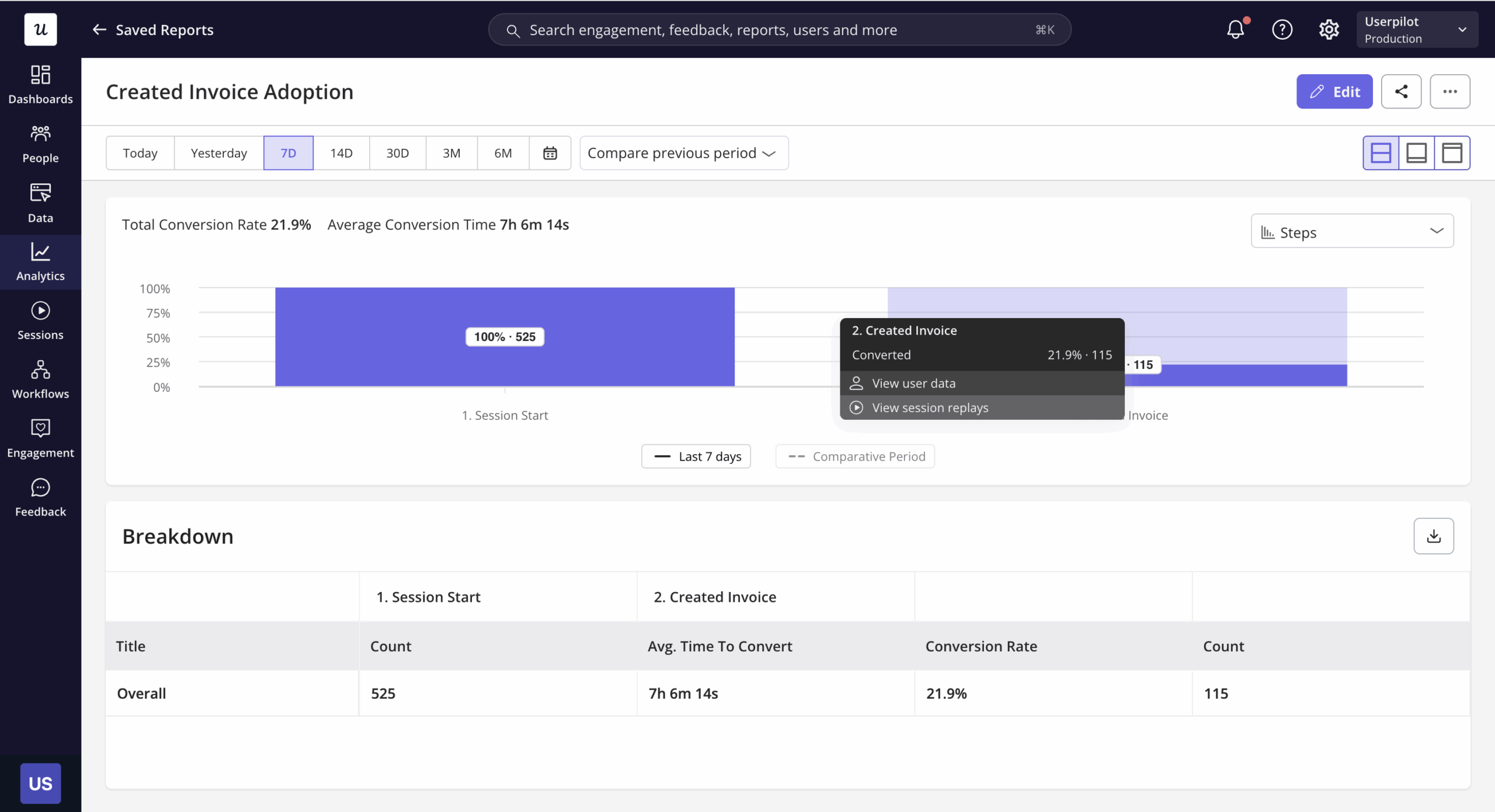
In Userpilot’s Funnels report, you can click into any drop-off step and see the specific users who abandoned. From there, you can create a user segment of those users and trigger an in-app experience immediately, without switching tools or writing a ticket. The loop from observation to intervention closes in the same environment where you found the problem.
Measure time to completion
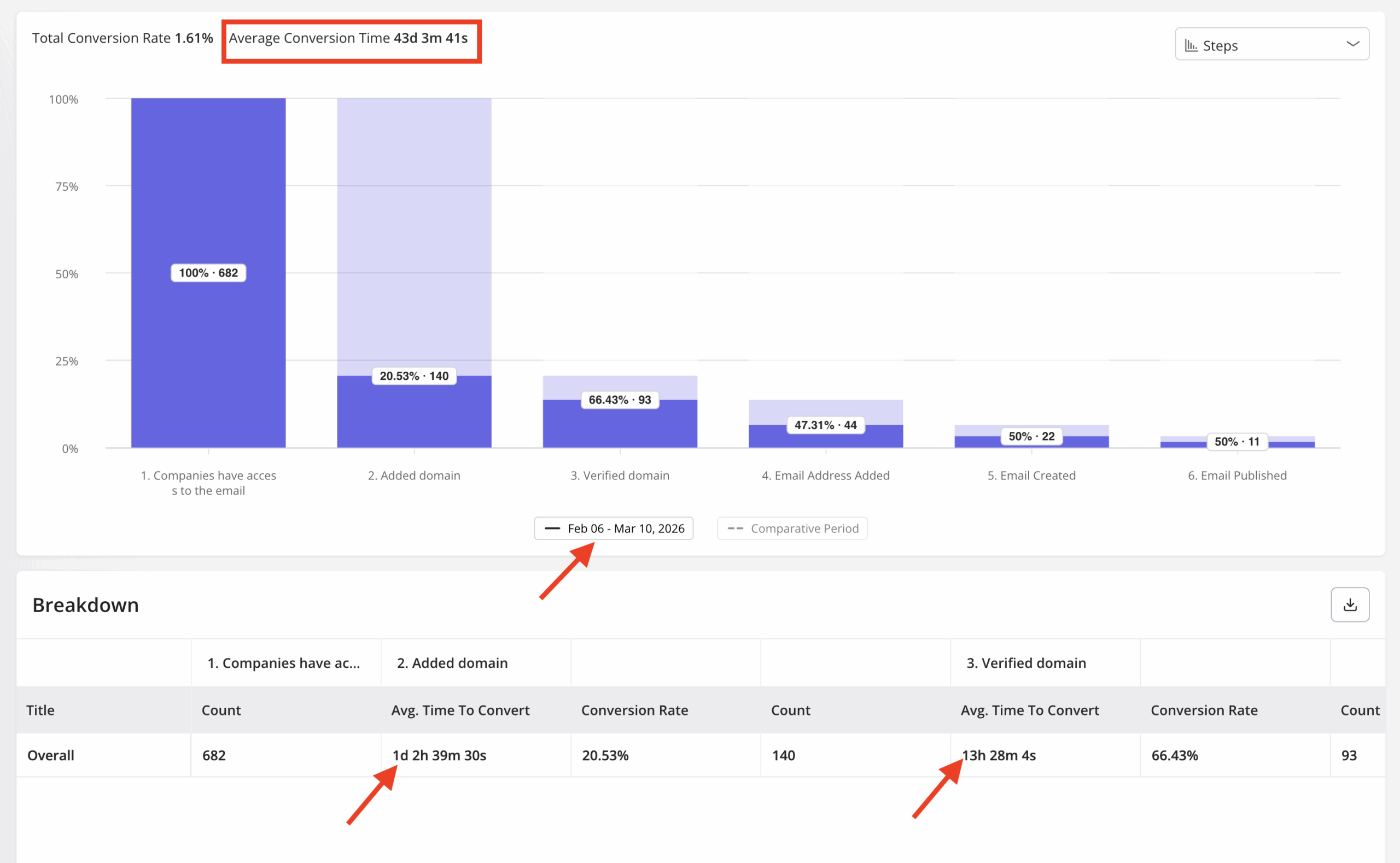
Drop-off rate is the most common funnel metric, and also the most incomplete one on its own. A funnel with 80% completion but a 14-day average time-to-complete is a retention risk: users who take two weeks to activate are often churning before they get there, regardless of whether they technically finished the sequence.
Time-to-first-value under 5 minutes correlates with trial conversion above 25%, according to Klickflow’s benchmarks. Every minute of friction between signup and first value is a conversion you’re losing to impatience, context switching, or a competitor who delivered faster.
Userpilot’s Funnels report surfaces time-to-completion data per step, so you can see not just who drops off but how long each step takes for users who complete it. That’s where you find the slow steps that look fine on the completion chart but are quietly killing activation speed, and where fixing completion time is often faster than fixing a leaky step.
Evaluate in-app experiences
This is the use case that sets Userpilot’s Funnels report apart from a standard analytics tool. You can include “Content Engagement” as a funnel step, which means you can directly measure whether users who interacted with a specific flow, checklist, or guided tour had a higher step-completion rate than users who didn’t. That gives you a real answer to the question every onboarding team eventually faces: is this content earning its place, or is it noise?
My standard process after launching a new feature: set up event-based analytics, track the meaningful events, watch where drop-offs cluster, then check whether users who engaged with the onboarding content we built for that feature are converting through the funnel at a different rate than users who didn’t. If the content isn’t moving the needle, I iterate on it before assuming the feature itself is the issue. Checklist engagement is the first thing I look at when activation numbers aren’t where they should be.
The email feature I mentioned in the intro is the clearest example of this loop working. The funnel showed users accessing the feature but dropping off at domain verification, and a session replay confirmed the step was confusing for most users. Within a few hours, I built a targeting modal that highlighted the correct steps and a checklist that walked users through the setup, and the drop-off closed within days without any engineering involvement.
Detect journey friction
Not all funnel problems show up as drop-offs. Some of the most expensive friction is invisible in a standard completion-rate view: the user who finishes step two but goes idle for three days before step three, the mobile user who completes the setup sequence but never takes a first action, the new signup who activates quickly on desktop but stalls on the same flow in mobile. None of these look like drop-offs until you segment the data deliberately.
Userpilot’s breakdown and segmentation features let you slice funnel data by segment, device, plan type, or cohort. Mobile users frequently stall at different steps than desktop users; users on a free plan may hit friction points that paying users never encounter because the feature set differs. A global completion rate hides all of this, and the patterns only surface when you break the data down rather than reading it as an aggregate.
The fix for invisible friction is contextual: a triggered email at day 3 of inactivity, specific to the step where the user stalled, or an in-app messaging banner targeting mobile users who completed setup but haven’t taken a first action. These responses require knowing exactly where the user is in the funnel, which is why segmented breakdown data matters as much as the headline completion rate.
How to get started with funnel tracking in Userpilot
The Funnels report is available on Growth and Enterprise plans. What follows is a setup walkthrough with the editorial decisions that most documentation skips. For full feature documentation, the Userpilot docs cover every option in detail.
Step 1: Choose your analysis level
Userpilot funnels can be tracked at the user level or the company level. User-level tracking follows individual journeys, which is the right choice for onboarding and user activation funnels where each person has their own path. Company-level tracking measures whether an account as a whole has completed a sequence, which matters in B2B when the purchasing decision is collective and one user finishing the onboarding doesn’t mean the account has activated.
Most teams default to user-level and miss the account-level view entirely. If you sell to teams, run both. A user might complete your customer onboarding process while the account has only sent one of eight seats through it, which is a different problem from an individual drop-off and requires a different response.
.png?fit=max&auto=format&n=j6BdSiRiF3SCgUJf&q=85&s=c9d3281eb293944f1e62f6bcf00395ca)
Step 2: Define your steps
Steps can be built from three types of data: events (labeled interactions, tracked events, custom events, and feature tags), pages (specific page views, useful when the onboarding sequence follows a defined page flow), and content engagement (interactions with Userpilot flows and checklists). That third type is what enables the “Evaluate in-app experiences” use case described above, and it’s the one most teams don’t configure.
Keep it to 5 to 7 steps if you can; the report allows up to 10. More than 7 steps usually means you’re trying to track a process rather than measure a conversion. If the journey is long, split it into two focused funnels with a clean handoff between them.
Step 3: Set your conversion criteria
Two options: “in this order” (steps must be completed sequentially) and “in any order” (steps can be completed in any sequence). Sequential ordering is right for onboarding flows where the path is defined: signup, verify email, set up workspace, take first action. Any-order is better for feature adoption where users discover value through different routes, and the sequence doesn’t reflect a meaningful distinction in behavior.
Set the time window deliberately. If your trial is 14 days, a 30-day conversion window means your funnel data is always lagging your decisions by two weeks. Match the window to the actual journey length so the data reflects what’s happening during the period when intervention still matters.
Step 4: Filter and segment your data
Inline filters apply to a single step: filter step 3 to show only mobile users, for example, to isolate where mobile-specific friction appears. Global filters apply to the entire funnel: show only users on the Growth plan, or only signups from the past 30 days. Breakdown by user property, company property, or segment moves you from “how many drop off” to “who drops off at which step,” which is where the actionable insight lives.
.png?fit=max&auto=format&n=j6BdSiRiF3SCgUJf&q=85&s=0438c70d97528a368cb69c995fc4945e)
Step 5: Read the results
Set your chart period, compare to the previous period to check direction, and filter by platform (web vs. mobile). Mobile users frequently show different drop-off patterns at the same funnel steps as desktop users, worth checking on every funnel, not just the ones where you already suspect a mobile issue. Period-over-period comparison is what tells you whether changes you’ve already shipped are moving the funnel or not.
.png?fit=max&auto=format&n=j6BdSiRiF3SCgUJf&q=85&s=079631b1a4b58d10759dbc910a773321)
Funnel tracking tools for each stage
Every one of the product analytics tools in this category will show you where users drop off; the question that separates them is what happens next. Analytics-only platforms end at the insight: you see the drop-off, export the data, write a ticket, wait. Closed-loop platforms let you act on what you find in the same environment, and which you need depends on whether your bottleneck is observation or intervention.
| Tool | Best for | Funnel data types | Retroactive analysis | In-app intervention | Pricing |
|---|---|---|---|---|---|
| Userpilot | Onboarding, activation, and feature adoption funnels with in-app fixes in the same session | Events, page views, content engagement (flows, checklists) | No | Yes — trigger flows, checklists, banners, and emails directly from a drop-off segment | Growth, Enterprise |
| Mixpanel | Complex event analytics and multi-path funnels built retroactively from historical data | Events, multi-path journeys spanning marketing and product | Yes | No — insight hands off to a separate tool | Free tier + paid |
| Amplitude | Enterprise behavioral analytics with A/B experimentation tied directly to funnel steps | Events, behavioral cohorts, experiment variants | Yes | No — in-app content requires a separate platform; pricing scales steeply above 10M monthly events | Custom/enterprise |
| Hotjar | Qualitative diagnosis of specific drop-off steps via session replay and heatmaps | Page-level only (not event-level) | No | No — best used as a “why” layer alongside a quantitative funnel tool | Free tier + paid |
The gap is the problem
Most SaaS teams have solved the visibility half of this. Mixpanel, Amplitude, Hotjar, and Userpilot will all show you where users leave. The teams converting at above-median rates aren’t doing so because they have better dashboards; they’re doing so because they move faster from the insight to the intervention.
Funnel tracking is the diagnostic, and in-app flows, checklists, triggered emails, and behavioral segmentation are the treatment. The question is whether your tooling forces you to separate those two things or lets you do them in the same place, and in 2026, that separation is a strategic cost, not just a workflow inconvenience.
See how Userpilot connects funnel analysis to in-app intervention.
About the author