In-Depth Guide to GA4 Path Exploration (+Better Alternative)

What are path exploration reports in Google Analytics 4?
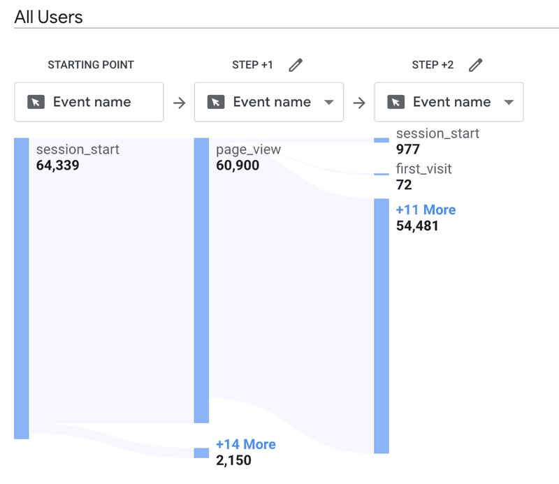
The path exploration report is a tool for visualizing user actions before or after they complete an event while navigating a website or app.
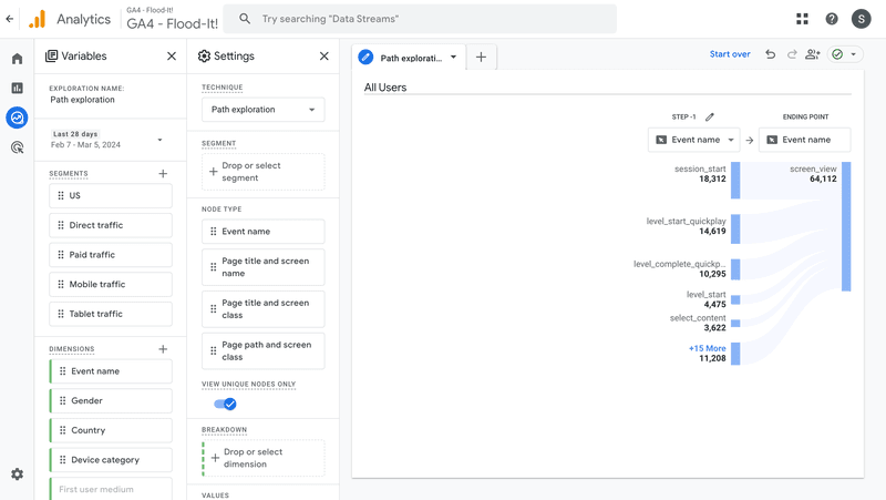
The path exploration graph consists of bars representing different events or pages, as well as arrow-like bands representing the number of users who complete an action, like in any other Sankey diagram.
What are the use cases of the GA4 path exploration report?
How can you leverage the insights that path exploration offers?
Here are 5 common use cases.
Understand how users navigate your website/app
The GA4 path exploration report is invaluable for gaining insights into how users navigate through your website or application.
By analyzing the sequence of pages or events users engage with, you can understand the typical pathways, including what content captures interest or what features they interact with the most.
This knowledge helps you optimize the user experience by making navigation more intuitive and highlighting the most relevant and valuable content or features.
Identify top pages users explore after visiting the homepage
Determining which pages users visit immediately after landing on the homepage is crucial for understanding their first impressions and interests.
The path exploration report can reveal these trends. This allows you to assess the effectiveness of your homepage layout, the visibility of your navigation elements, and the initial appeal of your content.
This information can be used to guide adjustments to ensure users find value and continue to engage with your site or product.
Find friction points in the user journey
Path exploration helps teams identify and address friction points within the user journey, which is essential for improving user satisfaction and conversion rates.
How so?
From the report, you can find out where users commonly drop off, as well as their actions before this happens. This allows you to make targeted improvements to streamline the user experience and reduce barriers to conversion.
Discover the top-performing pages
Understanding which pages are most effective in engaging users can inform content and design strategies.
The path exploration report allows you to identify pages that consistently attract and retain user interest.
These insights can be used to replicate successful elements across your site, enhance underperforming pages, and guide content development efforts to align with user preferences.
Analyze the page path that leads to conversions
Analyzing the paths users take before converting is key to understanding what drives successful outcomes.
The path exploration report provides detailed visibility into the sequence of interactions leading up to conversions, be it purchases, sign-ups, or other key actions.
By examining these pathways, you can identify which content, features, or user experiences are most effective at driving conversions and focus on optimizing these conversion paths for better performance.
Key elements of Google Analytics path exploration report
Now that you know what the path exploration report is and how you can use it to guide your decisions, let’s explore the elements of the report.
When you first look at the report, there are 3 main elements:
- Path exploration visualization – the diagram illustrating user flow between pages and events.
- Variables panel – listing the segments, dimensions, and metrics you can use to customize the visualization.
- Settings panel – that’s where you select the segments, dimensions for breakdowns, metrics for values, and set filters.
Starting or ending point
As mentioned, path exploration allows you to view actions users take before or after an event or page view.
The default path exploration template that GA uses to create the report focuses on actions that happened afterward, but you can generate a reverse report illustrating previous actions.
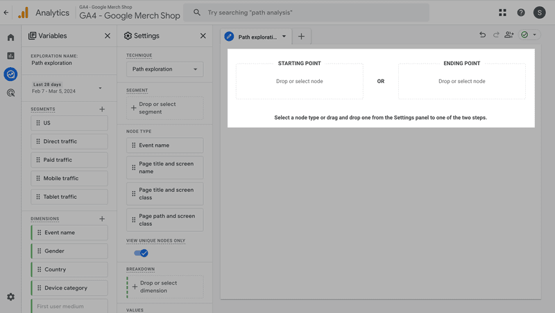
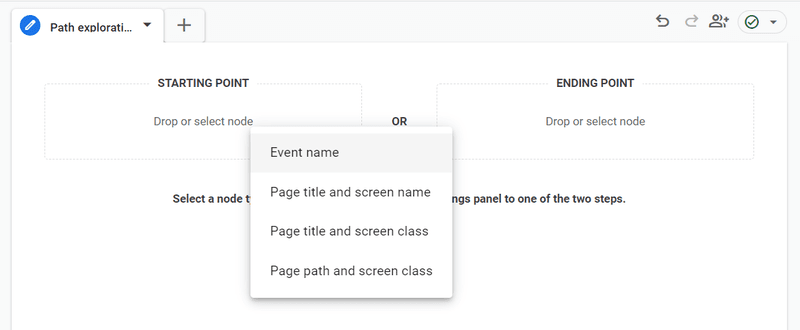
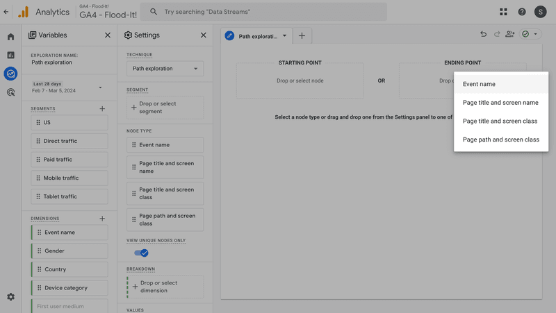
When creating a new path exploration report, a window like the one below appears.
That’s where you have to choose, either the Starting point or the Ending point for the diagram.
Path steps
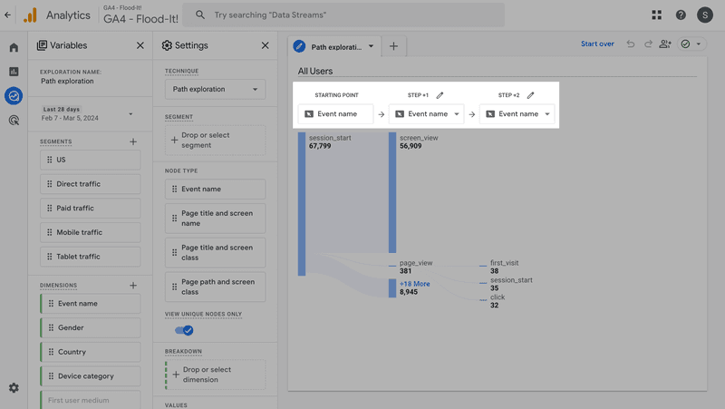
At the top of the graph, you have the details of the path steps.
That’s where you can edit the Starting/Ending point, and change node settings.
Segments
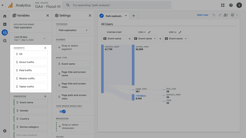
You can define the Segments by dragging them from the Variables panel on the left-hand side to the Segment section in the Settings column.
That’s how you narrow down the user group that you want to analyze.
For example, this could be users from a particular geographical location, using a particular device type (tablet, mobile, etc.), or any other user segments you’ve previously created.
Dimensions and metrics
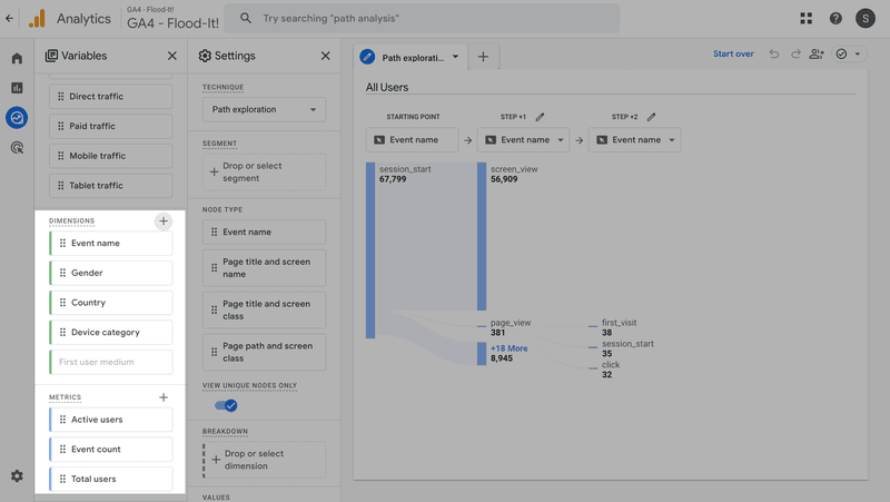
A dimension in GA is a characteristic or attribute of your data that you can use to organize, segment, and measure user behavior. They provide context to your data, allowing you to understand how and why certain metrics change over time.
In the report, they are listed in the left-hand side column and you can use them to create breakdowns.
Apart from the 4 dimensions listed by default (Event name, Gender, Country, Device category), you can add others from various categories by clicking on the plus button. There are multiple dimension options, and you can use them in any exploration technique.
Below the Dimensions, you can find a list of metrics to track in your report.
The report supports 3 metrics:
- The Event count metric counts the number of events users triggered for each node.
- The Active users metric shows how many users have engaged with the website or app.
- The Total users metric represents the total number of unique users who have logged an event.
Nodes
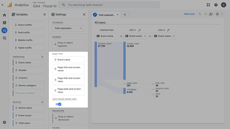
A node refers to a specific data point within the step. It represents user actions or events on your website or inside the app, such as page views, button clicks, or any custom events.
In the report, there are 4 possible node kinds:
- Event name – when you want to analyze the sequence of events that users trigger on your website or app.
- Page title and screen name – when you want to analyze page and screen view data.
- Page title and screen class – similar but instead of individual screens in apps, you analyze their categories.
- Page path and screen class – when you want to focus on specific URLs (and screen categories).
In the Settings panel, you can also decide to View unique nodes only. If you decide to do so, you won’t be able to see the multiple events tracked on each page or screen.
You can also exclude nodes from the path by right-clicking on it and selecting Exclude node.
Breakdown
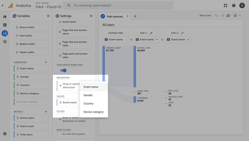
Google Analytics allows you to break down the paths by a dimension for side-to-side comparisons.
For example, you could compare the paths of website visitors using different operating systems or device types to identify friction points that slow them down.
To do so, drag and drop one of the dimensions from the Variables section. You can also choose them from the dropdown once you click on the button.
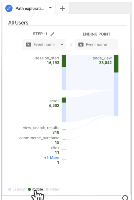
Hovering over the category shows you the number of users from the category in each node.
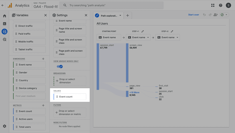
Values
Values is one of the Settings sections where you can select the metric to track in your report.
For instance, you could track the event count or unique users.
To define the value, drag and drop one of the 3 metrics on the left or select it from the drop-down.
Filters
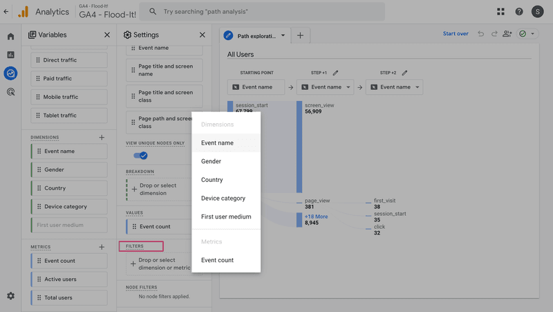
At the bottom of the Settings column, you can also set the filters to further narrow down the data points.
What can you filter the data by?
Dimensions and Values.
For example, you could filter users by age or country.
How to create a sample path exploration report in GA4?
As a Universal Analytics user, I must admit that generating a conversion paths report is more intuitive in GA4.
Here’s how you create path exploration visualization:
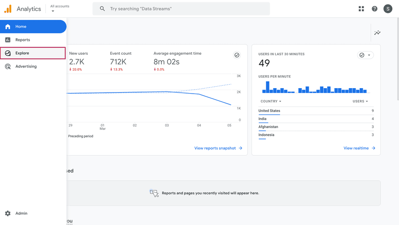
1. In the sidebar menu, click Explore.
2. In the Explorations section, select Path exploration or Blank. The latter allows you to create a custom report from scratch.
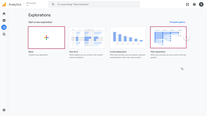
3. When you choose Path exploration, Google Analytics generates a default report.
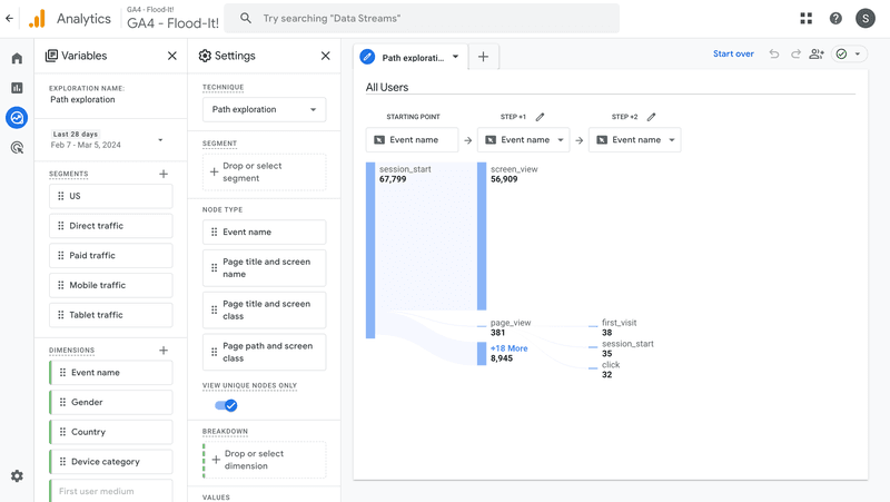
You can either customize it or start from scratch by clicking on Start over at the top of the page.
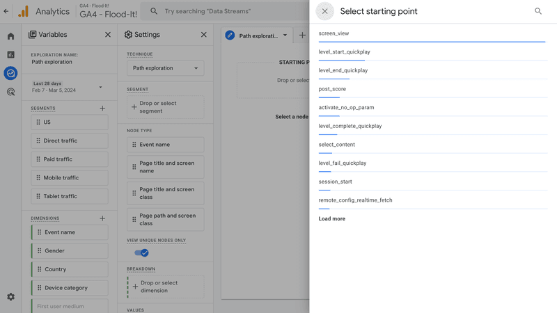
4. If you decide to create a new report, define the Starting point by selecting one of the 4 node types and the event, page, screen class, or page path.
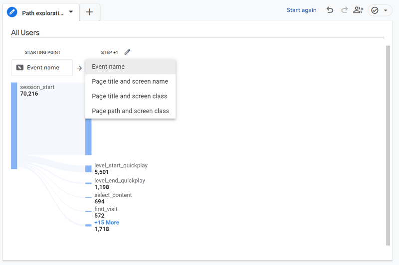
5. When the report is ready, define the node type for all consecutive steps and choose the event name, page title, screen class, or page path. The report shows the top 5 in each step and you can view the remaining ones by clicking on More.
6. Work your way down the Variables and Settings panel to customize your report:
- Specify the date range.
- Define user segments.
- Choose the Dimension for data Breakdown.
- Select the metric.
- Set up the filter.
How to create a reverse path exploration report in GA4?
The reverse path exploration report isn’t very different from the regular one.
The only difference is that it outlines the pages or events triggered by users before completing the key event or viewing the key page, not subsequent events or pages.
To create the report, follow the same process.
1. In the default report, Start over and click on Ending point.
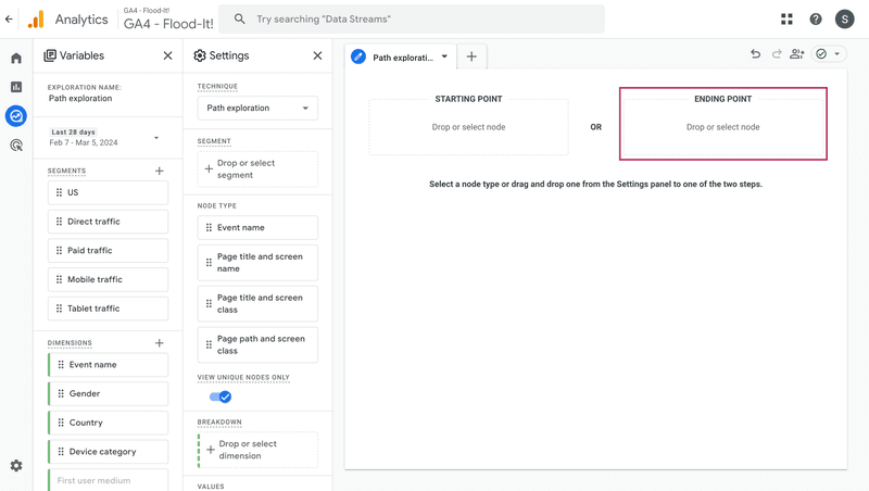
2. Choose the node type.
3. Pick the ending event, page, screen class, or path.
4. Tweak the segmentation, breakdown, value, and filter settings.
Userpilot Paths: A better alternative to GA4 path explorations
Userpilot is a product growth platform that has massively developed its analytics functionality in the last year or so.
Currently, it offers features that no other DAP supports, including:
- Code-free feature and event tagging.
- Retention analysis.
- Funnel analysis.
- Trends analysis.
- Flow analytics.
And user path analysis.
Overview of Userpilot’s path analysis feature
Just like path exploration in Google Analytics 4, Userpilot Paths enables teams to identify all users’ actions leading up to or following an in-app event.
Thanks to that, teams can:
- Track user behavior after sign-up to streamline the onboarding process and drive product activation.
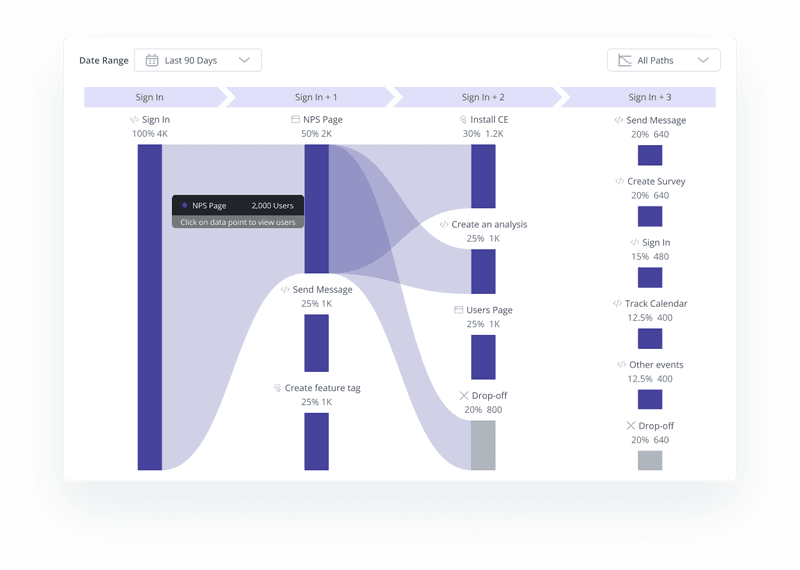
- Identify drop-off points in the user journey and understand why this happens. For example, if you can see a looped behavior, with users going back and forth between two screens without progress, they must be experiencing friction you need to address.
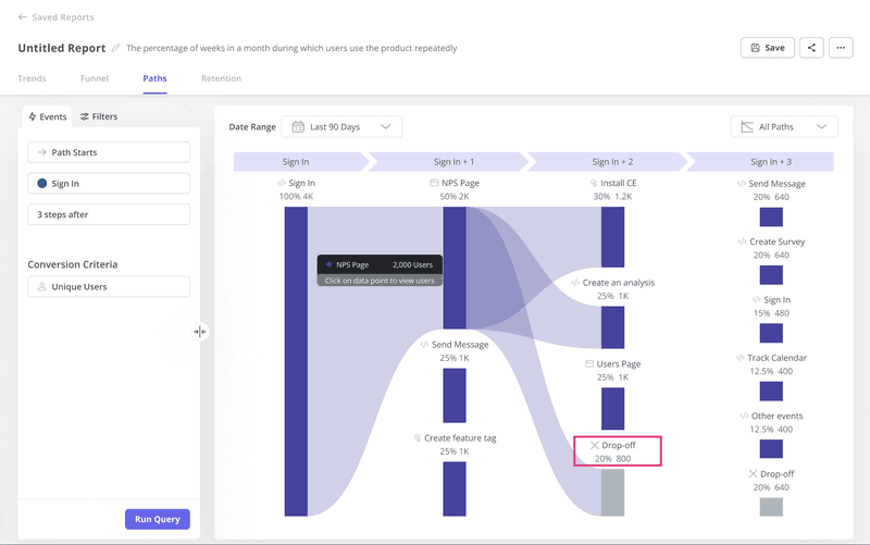
- Apart from the traditional tree graph showing all user actions, Userpilot allows you to display only the most common path. When you combine it with user segmentation, you can use it to identify the happy path for your users.
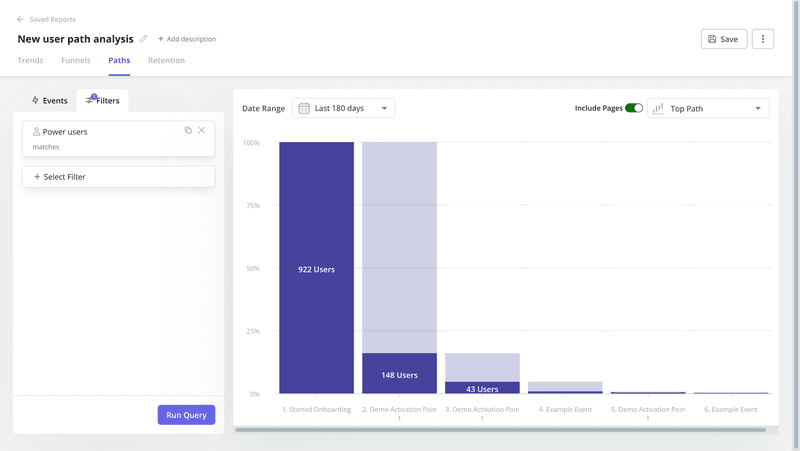
- Filtering the data by specific user segments enables in-depth analysis of user journeys for different user personas. You can use the feature to map them out, for example, for funnel analysis, or to design personalized onboarding experiences.
How is Userpilot Paths a better alternative?
Userpilot and Google Analytics 4 are two tools serving different use cases. Whether you consider Userpilot Paths a better alternative to GA path exploration depends on the problems you’re trying to solve.
For starters, Userpilot doesn’t allow you to track user behavior on websites or mobile apps, so if that’s what you’re after, GA is a better solution.
GA also offers more customization options. For example, with Userpilot you can track only one metric: event count.
However, if you’re looking for a platform for tracking user behavior inside web apps, Userpilot is the software for you.
Creating path reports in Userpilot is more intuitive thanks to its simple UI. It also has the Top path visualization, which you can’t find in GA.
However, the main advantage of Userpilot over GA is that it allows you to gather a complete picture of user behavior, needs, and pain points thanks to its feedback functionality.
For example, you can target the users who dropped off with an in-app survey (or an email one – thanks to integrations with HubSpot and Salesforce).
Once you have all the data, you can act on the insights: Userpilot’s engagement layer allows you to design interactive onboarding experiences and engage users at different touchpoints with in-app UI patterns.
One common use case is driving account expansion by contextually prompting users to upgrade to a higher plan once they reach a certain stage in the user journey.
Conclusion
GA4 path exploration is a powerful tool for tracking user actions at different stages of the funnel. This is possible for web and mobile apps, as well as websites.
As a digital adoption platform, Userpilot allows you to generate similar reports for web apps, collect customer feedback, and act on insights by engaging users in-app.
If you’d like to learn more about Userpilot Paths and its other analytics features, book the demo!


