How to Create a Customer Journey Mapping Template


Sales funnels track transactions, but they can hide the operational friction points that cause churn. To fix revenue leaks, you must map the user reality, not your internal assumptions. A customer journey mapping template gives you the structure to do this consistently.
Most product teams start mapping on a blank canvas, which leads to shallow analysis. The result? A pretty diagram that can’t explain churn or guide prioritization.
This guide provides four proven customer journey mapping template options. You’ll learn which template fits your specific goal, how to populate it with real data, and how to turn those insights into product improvements using tools like Userpilot.
What is a customer journey map?
A customer journey map is a visual representation of every interaction a customer has with your brand. It tracks their path from the first interaction to the moment they become a loyal advocate (or churn).
Unlike a sales funnel, which is linear and company-centric, a user journey map is often non-linear and customer-centric. It focuses on their emotions, their goals, and their friction points. It tells the story of their experience, not your sales process.
If you execute this correctly, you stop viewing your product as a collection of features and start seeing it as a vehicle for value. This shift is critical for any PLG strategy.
In a PLG motion, the product must do the selling. If you only look at the funnel, you see that a user didn’t convert. If you use a comprehensive customer journey mapping template, you see why. Adopting this broader view is essential for growth, as businesses that adopt omnichannel strategies achieve 91% higher year-over-year customer retention rates than those that remain siloed.
Use this quick diagnostic to determine which tool your team needs right now:
- Use a funnel if: You need to forecast revenue, track conversion rates across defined stages (e.g., Trial to Paid), or measure the efficiency of your sales team’s outreach.
- Use a journey map if: You have high churn but don’t know why, your customer satisfaction metrics (CSAT) are dropping, users are ignoring key features despite them being “obvious,” or you are planning a major UI overhaul.
Core elements of a successful customer journey map template
Regardless of which template style you choose, every effective map needs these five elements:
- The persona: Whose journey are you mapping? A journey map for a generic user is useless. You need specific user persona examples to ground your insights. The customer persona of a technical CTO is vastly different from that of a non-technical marketing manager.
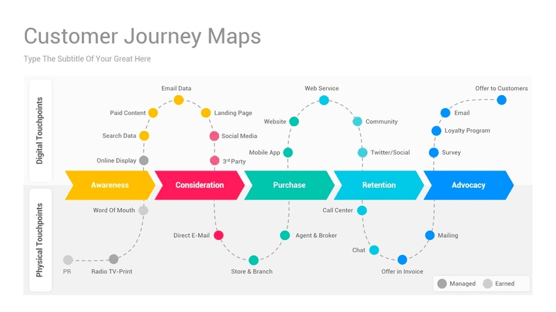
- The stages: These typically follow the customer lifecycle: awareness, consideration, decision, retention, and advocacy.
- Touchpoints: Are specific interactions that could be reading a blog post, clicking a PPC ad, talking to sales, experiencing an in-app tooltip, or contacting customer support. Identifying customer journey touchpoints is vital because each is an opportunity to delight or disappoint.
- Customer sentiment: How does the user feel at this stage? Are they confused during onboarding? Excited after the demo? Frustrated by the pricing page? You can gather this via sentiment analysis. You may want to cross-reference this with an empathy map to better understand user frustrations
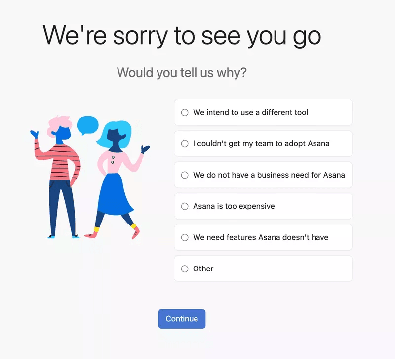
- Opportunities: This is the “so what?” section. Once you identify customer pain points, you list the actionable steps to fix them.
![]()
Eliminate User Friction Fast by Using a Customer Journey Mapping Template with Userpilot

4 Essential customer journey mapping templates
Not all journeys are the same. Depending on your goal (whether you’re addressing a churn problem or designing a new feature), you will need a different type of map. While you can build one from scratch, using a free customer journey map can significantly speed up your initial workshop. Here are the four most practical templates I recommend for SaaS teams.
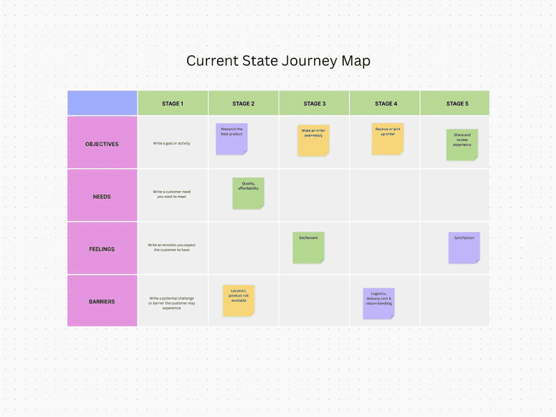
1. The current state template
This user journey map highlights the gap between your intended design and the user’s reality. It visualizes what your customers are experiencing right now. I use it as a diagnostic tool.
When to use it:
Use this to identify friction points. If you notice a drop-off in your activation metrics, a current state map helps you zoom in on the specific steps causing the leak. It highlights the gap between your intended design and the user’s reality.
How to fill it:
Focus heavily on the “Barriers” and “Feelings” rows. Use data from customer feedback collection methods, such as support tickets and session recordings, to validate the negative emotions.
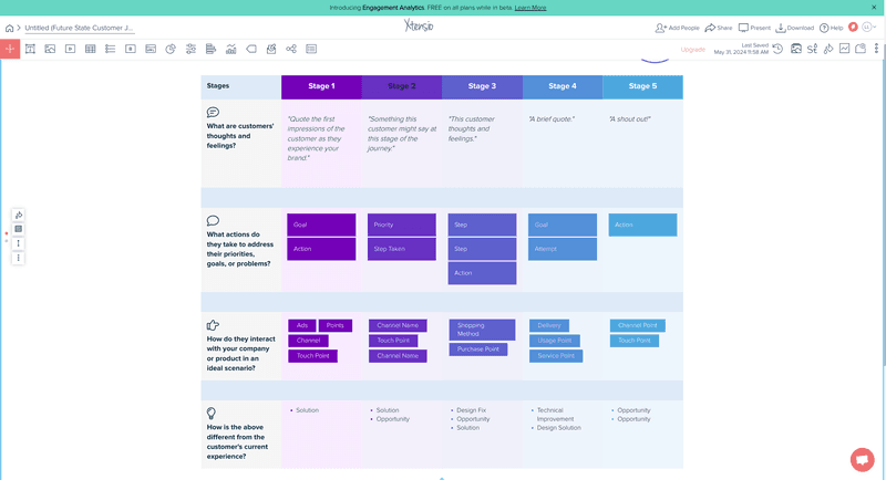
2. The future state template
This map helps you visualize how potential customers will ideally navigate your product. It is aspirational. Here, we strip away the current technical limitations and process bottlenecks to imagine what the perfect experience looks like.
When to use it:
Use this during product planning or before launching a new product line. It helps align the product, marketing, and sales teams on a shared vision. It answers the question: “If we built this from scratch today, how would it work?”
How to fill it:
Focus on the rows for how they interact with your product and the steps they take to address their needs. Since these don’t exist yet, you need to assign clear responsibility for building each touchpoint.
3. The “day in the life” template
This template zooms out to provide more context about the entire customer journey. It looks at the user’s entire day, not just the moments they spend in your app. For instance, let’s say my software is a product management tool. This map may indicate that my user spends their morning in meetings and their afternoon responding to emails.
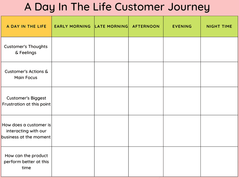
When to use it:
Use this for product strategy and messaging. If you understand your target audience and their daily context, you can time your messages better. You realize that sending an in-app notification at 9:00 AM on a Monday might be a bad idea because they are swamped with stand-up meetings.
How to fill it:
Relies heavily on qualitative research. You need in-depth Voice of the Customer (VoC) data, typically from interviews, to understand their daily routines outside your tool.
4. The service blueprint
This service blueprint is a map of your internal processes. While a standard customer experience map focuses on the user, the blueprint looks behind the scenes. It connects the customer experience (front stage) with the internal operations (back stage) that support it.
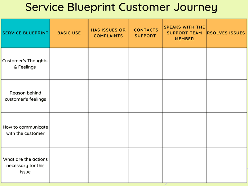
If the customer chats with support (front stage), the service blueprint shows the ticket routing system and the engineering escalation process (back stage).
When to use it:
Use this to fix operational inefficiencies. If your customer experience analysis indicates slow support response times, a service blueprint reveals whether the bottleneck lies in software, staffing, or processes.
How to fill it:
You need stakeholders from every department. This approach is not a marketing exercise; it is an operations exercise. You list every tool, database, and employee action required to deliver the customer journey.
How to populate your template with real data
A template filled with assumptions is a fictional representation of the user experience. To make your map actionable, fuel it with real data. I recommend this practical workflow to gather the insights you need.
Step 1: Define your goal and scope
Pick one persona, one lifecycle stage, and one business objective.
For financial institutions, the security audit might be the most critical touchpoint. Are you mapping the user onboarding process for enterprise clients? Or the renewal path for freemium users?
For example, map the first 7 days for self-serve trial users who signed up via a PPC ad. This practice provides specific digital touchpoints for analysis: the welcome email, the first login, the feature discovery moment, and the upgrade prompt. This approach enables you to pull exact data on drop-off rates and sentiment at each stage.
Step 2: Gather quantitative data
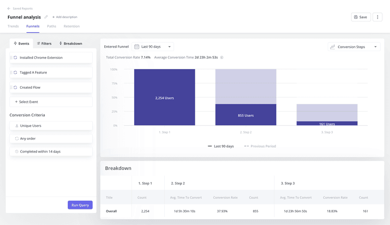
Let’s start by identifying your conversion benchmarks for each stage you defined in step 1. Look at your product analytics. If you’re mapping trial-to-paid conversion, note where the most significant drop-offs occur. If you are using a tool like Userpilot, look at your Paths report.
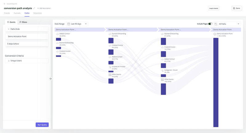
This type of customer data gives you the what. Let’s say you see 55% of users complete account setup, but only 18% connect an integration. That’s your friction point. Use user flow analysis to map the exact steps users take inside your product.
Next, segment the data by user attributes. Compare power users who hit activation in 24 hours versus those who take 7 days. What did the fast-activating group do differently? Did they watch the tutorial video? Skip certain steps?
This comparison reveals which touchpoints actually drive value versus which ones just add friction. Export this data into a spreadsheet. You’ll need it when you draft the customer journey map in step 4.
Step 3: Gather qualitative data
Now you need the why. Quantitative data shows that users dropped off at the integration step, but qualitative data tells you they couldn’t find their API key or that the instructions were confusing.
Launch in-app surveys at critical customer touchpoints. If a user spends three minutes on a setup screen without clicking anything, trigger a microsurvey asking if they need help. This gives you real-time context while the friction is fresh in their mind.
Run NPS surveys to gauge overall sentiment, but don’t stop there. Conduct customer churn analysis by interviewing users who left. I recommend scheduling 15-minute calls with churned users within two weeks of their cancellation.
Customer feedback is often the most honest data you’ll get regarding the friction points in your journey. Ask specific questions like: “What made you consider leaving?” “Which feature did you expect that we didn’t have?” “What almost convinced you to stay?”
Step 4: Draft the map
Bring your cross-functional team together. You need different perspectives because each team sees different parts of the buyer journey. Marketing knows how they acquired the user. Sales knows what promises they made. Product knows how the features work. Customer success knows where the complaints come from.
This collaborative stage is the heart of the customer journey mapping process. Map out the stages horizontally and the components (touchpoints, feelings, actions) vertically. Use the qualitative and quantitative data from our previous steps to fill in each cell.
For example, under the decision stage, your data might show:
- Touchpoint: Pricing page visit.
- Action: User compares plans for 4 minutes.
- Emotion: Confused (from exit survey customer feedback).
- Pain point: Can’t tell which plan includes API access.
If you identify a stage where you lack data, mark it as a knowledge gap. That’s an insight in itself. It tells you where to focus your next round of research or where to add tracking.
Step 5: Identify moments of truth
In every journey, there are “Moments of Truth”: critical interactions that determine if a user stays or goes. In SaaS, this is often the ‘Aha!’ moment during activation when users first experience the core value.
Use your map to pinpoint these moments. Look for stages where feelings shift dramatically or where drop-off rates spike. For example, let’s say our map shows that users who complete a specific integration within 48 hours have an 80% higher retention rate. That integration step is a Moment of Truth.
Now ask: are you supporting it enough? If your map reveals high user friction (such as confusing documentation or an invisible CTA) at this critical moment, that’s your priority fix. These moments deserve attention because minor improvements here can significantly impact customer retention and conversion rates.
How to turn your customer journey map into product growth
A customer journey map is useless if it sits in a Google Drive folder. You need to act on it. Here is how I turn map insights into product growth.
Fix onboarding friction
Let’s say your map reveals that users feel overwhelmed when they first enter the dashboard. They don’t know where to click. This is a common awareness-to-activation gap.
I build an interactive walkthrough. Instead of dumping users in an empty state, I guide them to the first key action. I segment this flow based on the persona I have identified to show different flows to different roles. This approach directly improves feature adoption.
Contextually upsell your power users
Your map might show that power users hit usage limits but don’t upgrade because they don’t realize the value of the higher tier. They feel frustrated rather than incentivized.
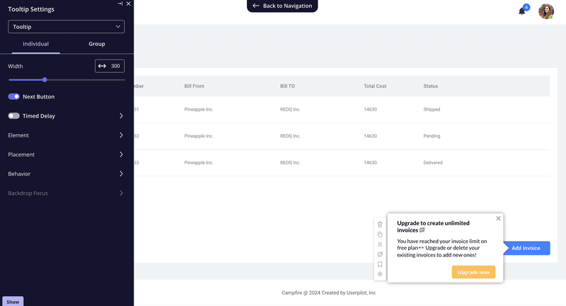
Create a tooltip that triggers exactly when they hit that limit. But instead of a generic “Upgrade Now” button, use the context from your map to craft a specific message. For example: “You’ve sent 500 emails this month: Our Pro plan gives you unlimited sends plus A/B testing to improve your open rates.”
This is a customer segmentation strategy in action. You’re targeting users who’ve already proven they get value from your product, and you’re showing them exactly what they’ll gain.
Provide proactive support
If your map highlights a stage where users frequently contact support, like a complex integration step, you can intervene before they open a ticket.
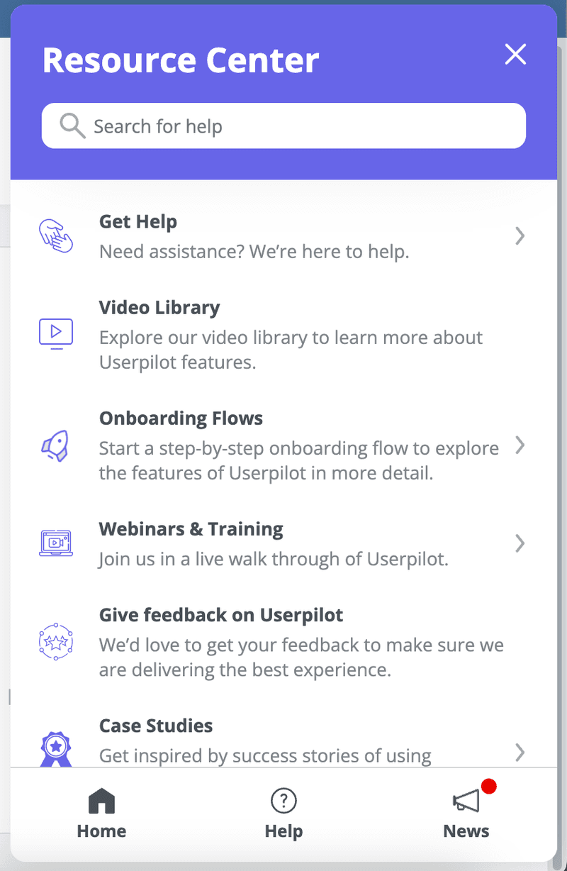
Embed a resource center or a checklist right inside the app at that specific touchpoint. For instance, if your map shows that 35% of support tickets come from users stuck on the OAuth setup, trigger a help widget the moment they land on that configuration page. Include a video walkthrough, troubleshooting steps, and a direct link to your API documentation.
By proactively providing help, you reduce friction and improve customer satisfaction metrics. Users are unblocked immediately, rather than waiting hours for a response from the support team. Your team spends less time answering repetitive questions and more time on high-value conversations.
Common pitfalls to avoid when creating customer journey maps
Even with the best customer journey mapping template, product teams fail when they commit these errors:
- Mapping for the average user: There is no average user. You need different maps for different customer segments (e.g., admins vs. viewers).
- Ignoring the off-app experience: Don’t only map what happens inside your software. If you do, you’ll miss the email touchpoints, the billing invoices, and the documentation searches that contribute to the overall sentiment.
- Setting it and forgetting it: Your product changes every sprint. You should update your map quarterly. Treat it as a living document, not a one-time artifact.
Start mapping the reality that drives revenue
A customer journey mapping template gives you a repeatable way to uncover what funnels miss: the friction, emotions, and barriers that drive churn. With the right template, you can move from a pretty map to clear priorities and specific product fixes that improve retention.
Ready to act on what your map reveals? Book a demo to see how Userpilot helps you turn insights into in-app experiences like interactive walkthroughs, contextual tooltips, and resource centers that remove friction and drive adoption.
![]()
Drive Higher Retention Rates Using a Customer Journey Mapping Template and Userpilot
About the author


![What are Release Notes? Definition, Best Practices & Examples [+ Release Note Template] cover](https://blog-static.userpilot.com/blog/wp-content/uploads/2026/02/what-are-release-notes-definition-best-practices-examples-release-note-template_1b727da8d60969c39acdb09f617eb616_2000-1024x670.png)