Pendo vs. WalkMe: Which Platform Wins on Features and Value?

The information in this comparison has been reviewed and is accurate as of August 2025.
If you’re on the hunt for the ideal
digital adoption solution,
you’ve likely come across the two heavyweights in the space: Pendo and
WalkMe. While both enable you to create and improve in-app onboarding
experiences, each serves a distinct use case.
So, Pendo vs WalkMe, which one is right for your business?
To save you time (and a few headaches), I’ve taken a deep dive into both tools, testing them
hands-on, reviewing extensive feedback from real users, and putting my insights into this blog.
I’ll give a very detailed head-to-head rundown, analyze their core features, explain where they
fall short, and where they excel.
What is Pendo, and who is it for?
Pendo is an
all-in-one product experience platform that helps teams build better digital products. With
powerful tools for analytics, session replays, on-screen guidance, and user feedback, it gives
you a 360° view of how people use your product and how to improve it.
Pendo has quite a large base of user personas, from UX designers to
product managers and
customer success teams. It empowers cross-functional teams to drive user engagement, uncover
friction points, and make data-driven decisions.
Pros of Pendo
-
Flexible dashboards: Pendo has plenty of widgets that you can add to your
dashboard, including
feature adoption,
net promoter score, poll results, guide engagement, product stickiness, and MAUs, so you
always have your most important user analytics metrics within reach. Additionally, it offers a
native Engagement Score dashboard that provides a quick snapshot of product health by
combining adoption, stickiness, and growth into a single score. -
Integrations: Pendo has over 50 different integrations to choose from,
including popular tools like Intercom, Jira, Okta, and HubSpot. It supports several
bi-directional syncs (e.g., HubSpot, Segment, Salesforce Discover feedback, Zendesk), plus
workflow automation via platforms like Workato. -
AI innovation: Pendo has incorporated AI into its different products,
enabling users to streamline workflows and optimize their productivity. For example, you can
use AI to analyze user behavior at a scale or automate in-app guide creation.
Cons of Pendo
-
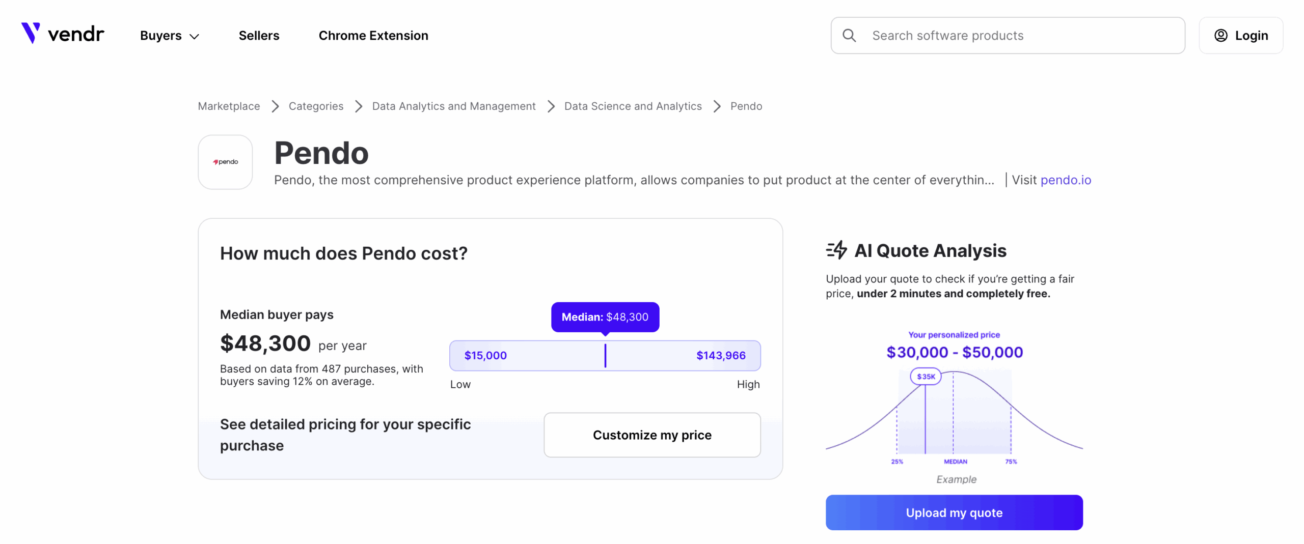
Expensive and complicated pricing: While
Pendo pricing isn’t public and
transparent, based on updated Vendr data, costs for Pendo typically range from
$15,900 to $140,091 annually, depending on plan, MAU volume, and add-ons. Neither
Pendo nor WalkMe publishes exact list prices, so these estimates can vary — you’ll still need
to connect with sales for a specific quote. -
Data lag:
Pendo’s analytics
dashboards only update once per hour. In some cases, this data lag could lead product teams to
make the wrong decisions or draw false conclusions from outdated insights.
However, this only affects reporting — in-app Guides and flows trigger on client-side events
in real time, so you can still fire contextual messages immediately based on user behavior.
-
Limited engagement features:
Pendo’s UI patterns aren’t the most
flexible. While you can add checklists to a Resource Center, you can also build standalone
checklists via the Guides module—though you must purchase the Guides Pro edition. Plus, Pendo
doesn’t include a built-in pulsing “hotspot” indicator on selected elements.
What is Walkme, and who is it for?
WalkMe has many of the same key
features as Pendo, but while it does offer tools for facilitating the customer onboarding
process, its larger focus is on employee onboarding.
It’s mostly used by Learning & Development (L&D) and HR teams for driving digital
transformation and improving employee adoption of internal software.
Although it has decent features for in-app step-by-step guidance, user onboarding is a secondary
use case for most companies.
Let’s put it this way: Customer success teams can take advantage of this tool, which is bought
by other cross-functional teams, and provide in-app support for users.
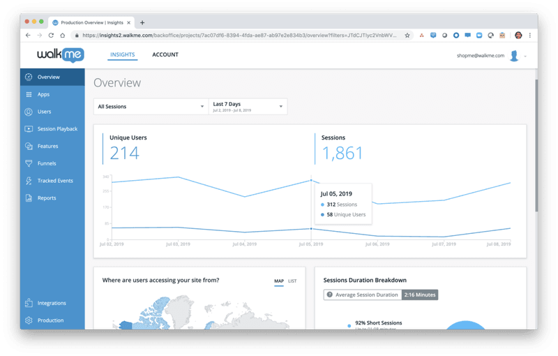
Pros of WalkMe
-
Workflow automation: Workflow automation features, like onboarding
automation, stand out as they enable you to automate a series of steps and processes, like
clicking buttons, to save your time. -
Community: WalkMe offers a strong community of experts and partners who can
help you whenever you get stuck.
Cons of WalkMe
-
Initially complex setup: WalkMe’s platform is designed to be used with
minimal coding. It includes a drag-and-drop Visual Editor that lets non-technical team members
create walkthroughs and tips without writing code. However, the initial setup and learning
curve can be significant, and achieving deep customizations or complex automations may require
technical expertise or assistance from WalkMe’s experts. -
Limited analytics: While WalkMe excels in user guidance and onboarding, its
user behavior analytics capabilities are not as robust as those of more analytics-oriented
platforms. While it has basic guide analytics and standard reports like funnels, it lacks
cohort analytics, which is a huge drawback if you are a SaaS company that prioritizes
retention optimization.
Pendo vs WalkMe for user onboarding
Pendo and WalkMe have a bit of overlap in terms of their core features when it comes to this use
case.
To start with, both will let you create effective user
onboarding experiences
that guide users across the user journey toward activation.
However, the different use cases of each tool mean there are key differences in the features
they offer.
Pendo for user onboarding
There are a few ways you can use
Pendo to improve your new user onboarding
flows:
-
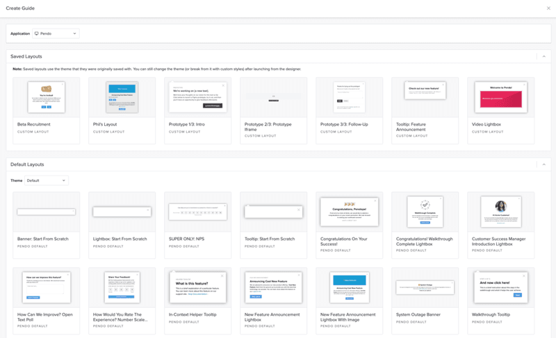
Guide layouts: Pendo has layout templates for lightboxes, banners, and
tooltips that you can use to build onboarding flows for new users.
-
Flow triggers: Pendo lets you trigger personalized guidance based on
customer data. For example, like when new users land on a particular URL, use a specific
device type, interact with a tagged element, or match the target segment. -
Localization settings: With Pendo’s AI Translation capabilities, guides can
be translated automatically, eliminating the need for manual CSV uploads for localization.
WalkMe for user onboarding
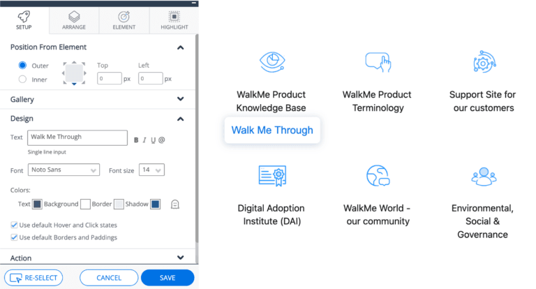
WalkMe has a bunch of features for user onboarding:
-
Onboarding checklist:
It’s possible to set different goals inside your checklist so users can keep checking them as
they complete them. The Onboarding Tasks can include Smart Walk-Thrus, videos, and articles to
guide your new users. -
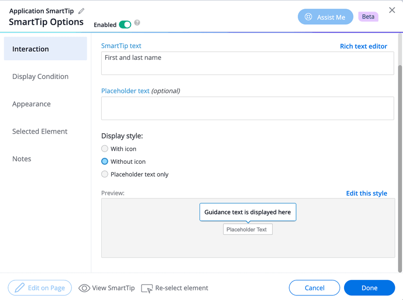
WalkMe’s SmartTips: These serve as
on-screen guidance and help
reduce the learning curve for new users. Clicking on a SmartTip opens a pop-up that gives more
information on the element.
-
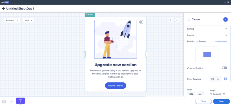
ShoutOuts: Draw your new user’s attention to
specific announcements.
They’re essentially banners that you can use to show users what they need to know when getting
started. You can also get them to take action through ShoutOuts.
-
Launchers for self-service: When users click on Launchers, a new action,
like a Smart Walk-Thru, will get triggered. Users can click on each Launcher you create to
learn more about your platform.
Pendo vs WalkMe for product usage analytics
Both Pendo and WalkMe give you access to product usage and onboarding analytics, but not to
quite the same extent.
Pendo for product analytics
Pendo has no shortage of
product analytics capabilities,
including both native features and third-party integrations. You’ll even be able to access the
most important metrics like MAUs and feature use from the home dashboard itself.
Here’s a closer look at Pendo’s analytics features:
-
Native analytics: Because Pendo is a product adoption platform, most of its
adoption and engagement analytics are native to the solution. This means you’ll be able to
track the number of views, clicks, and interactions that specific in-app guides or product
areas get. -
Paths: The Paths section of your Pendo account shows you which
paths users take when coming from a
specific page or which path they took to get to a particular page. You’ll also be able to sort
this data by segment, date, or see the paths taken by individual visitor IDs. -
Retention: Pendo’s
retention analytics
dashboard lets you see cohort retention data from month to month. You’ll also be able to
toggle between visitors versus accounts, switch between weekly or monthly views, and measure
retention for specific segments. -
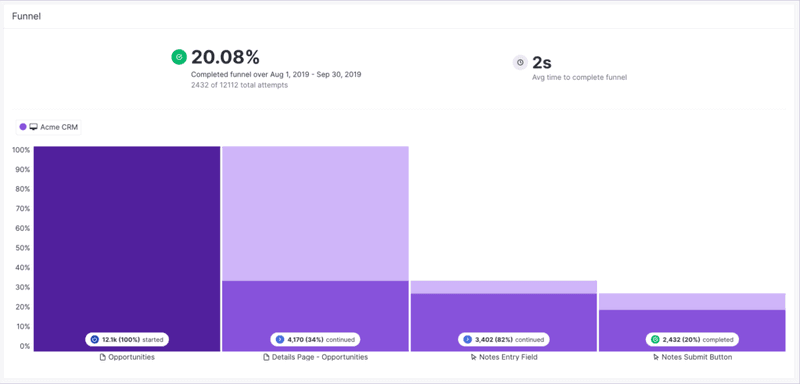
Funnels: Pendo’s
funnel analytics can tell
you how many unique visitors have seen your funnels, how many attempts have been made to get
through the funnel, and the average time it takes to complete the funnel. You’ll also be able
to see completion rates and sort by date or segment.
WalkMe for product analytics
WalkMe offers some advanced features for product analytics:
-
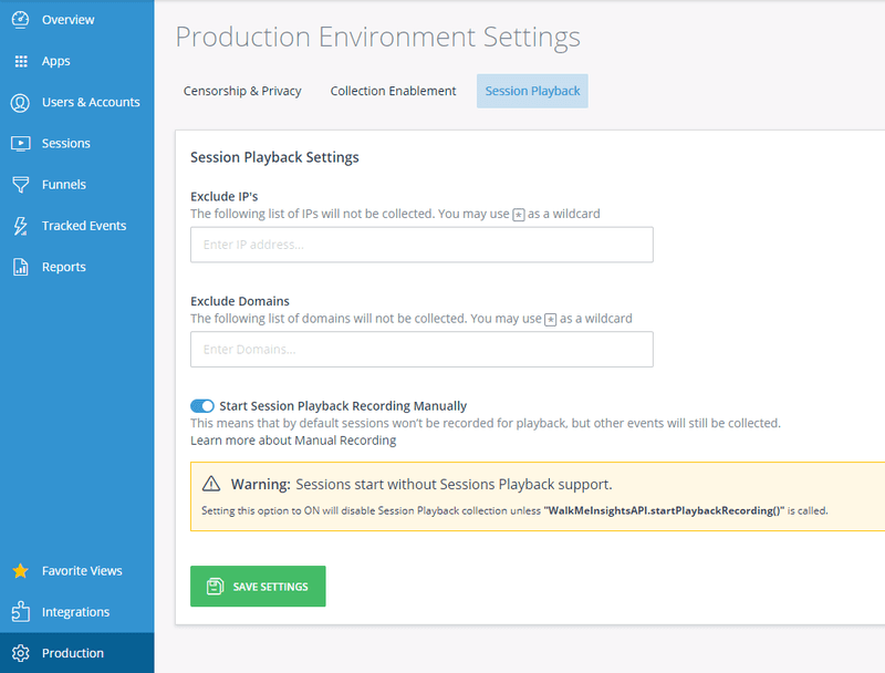
The session playback feature can help you look into user sessions from the past year. By
default, up to 1,000 session playbacks will be visible in your account at any given time. You
can use them to analyze past
user sessions and even
ones happening in real time.
-
You also get user funnel tracking capabilities on WalkMe. It enables you to create a custom
funnel to track various events. You
can then monitor various metrics like funnel completion rates and drop-off rates to see how
users interact with your platform. WalkMe also lets you filter the data based on browser, date
ranges, and more. -
It’s also possible to get analytics on your in-app experiences to determine which features are
being used the most by your users.
WalkMe vs Pendo ease of use comparison
Now, before diving into this section, it’s worthwhile to point out that the question we’ll
answer isn’t really “Which is easier to use?” Neither tool is that user-friendly.
Rather, it’s more like, “Which is less difficult?”
We’ve already touched on this a bit, so let’s start with setup.
Setup and implementation
WalkMe is a cloud-based digital adoption platform (with an optional self-hosted mode for those
who need it). While implementing large-scale WalkMe solutions can require planning and some
technical work, recent updates have made setup much simpler. WalkMe now offers pre-built
workflow templates and a Solutions Gallery to accelerate implementation, plus an improved Content
Manager and Builder Assistant that help teams configure and maintain walkthroughs with far less
effort.
This means you no longer need extensive time or coding just to get started with WalkMe’s in-app
guidance.
If you need technical help, WalkMe’s certified technicians can help you with this. Pendo is
simpler and faster to set up than WalkMe, but still requires some technical ability.
Using the product
WalkMe offers highly customizable and sophisticated product walkthroughs – that is, provided you
have the coding and technical skills necessary to get them working.
You can also pay for a certified expert to help with the technical aspects, but this just makes
an already pricey product even more expensive.
Pendo, on the other hand, offers its Visual Design Studio as a way to reduce the need for
coding.
The Visual Design Studio is a fully in-app, no-code WYSIWYG builder for creating guides. After a
one-time installation of the Pendo snippet, you can immediately author, test, and publish Guides
without any additional API. For pixel-perfect branding or custom behaviors, you can optionally
inject CSS or HTML snippets directly within the studio.
Pendo vs WalkMe pricing comparison
Comparing prices between Pendo and WalkMe is tricky since neither makes its pricing information
publicly available.
What we can say, though, is that both options are rather expensive.
Pendo pricing
Based on
user reviews,
costs for Pendo can potentially range from $16k to $140k annually.
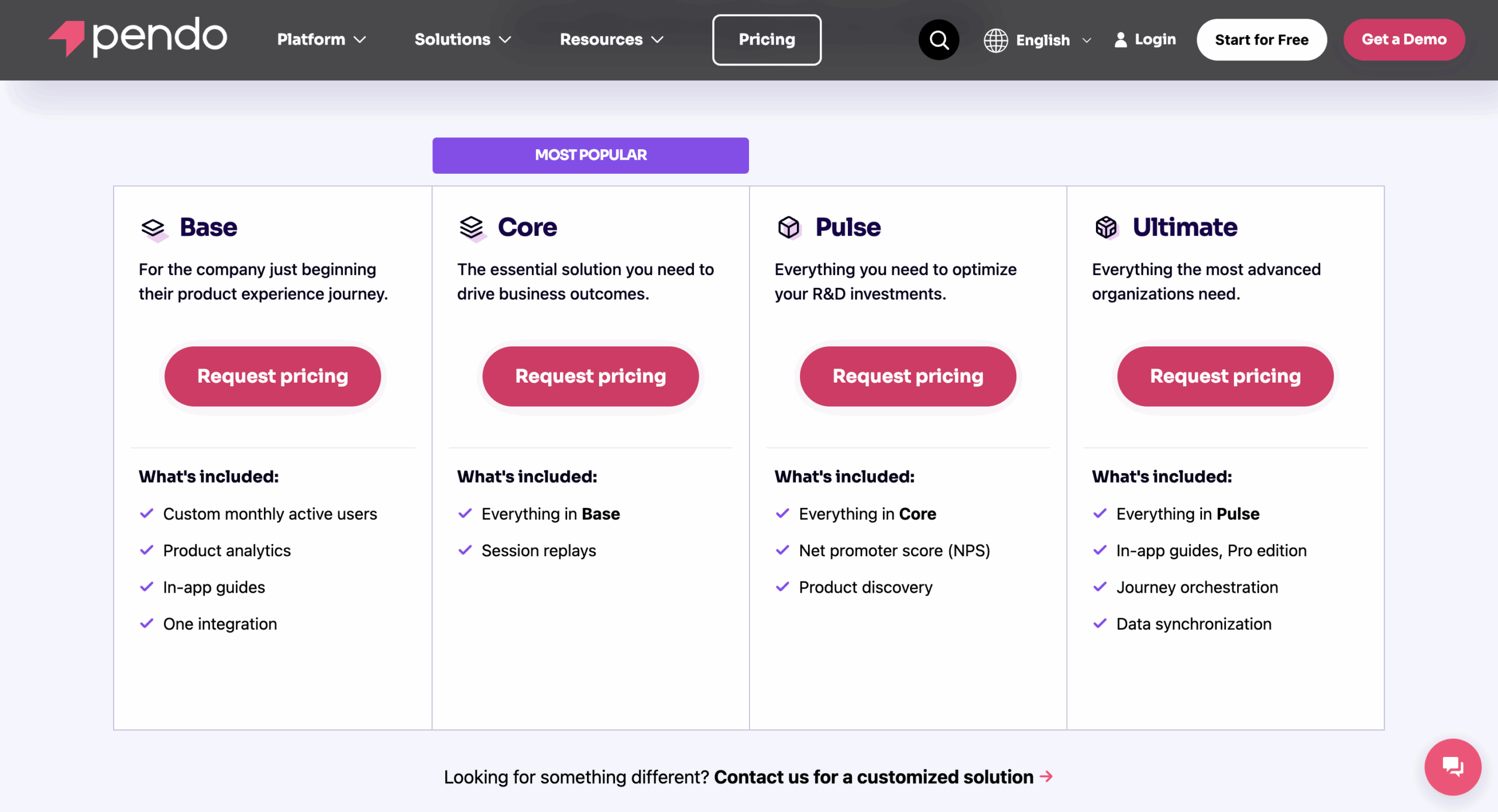
Here’s an overview of Pendo pricing plans:
-
Free: Limited functionality for up to 500 monthly active users (MAUs).
Includes basic product analytics, in-app guides,
NPS surveys, and roadmaps. -
Base: This plan targets companies starting with product experience
management. It includes custom MAU limits, product analytics, in-app guides, and one
integration. -
Core: The core solution for driving business results, it includes everything
in Base, plus session replay functionality. -
Pulse: Focuses on optimizing product investments, including everything in
Core, plus NPS surveys to collect user feedback and
product discovery
functionalities. -
Ultimate: Most comprehensive plan, it includes everything in Pulse, plus
advanced in-app guides (Pro
edition) and data sync capabilities.
WalkMe pricing
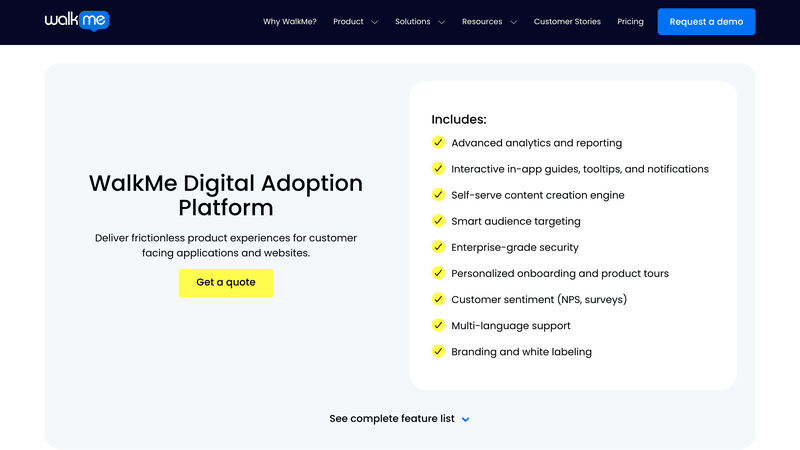
WalkMe uses a custom quote-based pricing model, with smaller implementations reportedly starting
around ~$9K/year, but costs scale up with enterprise needs. Mid-sized teams might pay tens of
thousands annually, while large enterprise deployments can run well above $50K/year – many of
WalkMe’s enterprise customers invest six figures per year, and the largest deployments can even
approach seven-figure yearly contracts.
You need to get in touch with their team to find pricing details for both the customer and
employee versions. Considering the platform is specifically built for enterprises, you can expect
the cost to be on the higher end.
Is Pendo better than WalkMe? The final verdict
If you’ve been keeping score, it’s pretty clear by now that Pendo has won in most categories.
To summarize, Pendo comes out ahead because of:
- Offers more advanced analytics features.
- It is simpler to implement.
At this point, you might be thinking that these products seem useful, but don’t quite meet the
needs of your SaaS business or customer
success goals.
If only there were a third option that’s easier to use, more focused on SaaS growth goals, and
less expensive.
Fortunately, such an option does exist! Allow me to introduce a third contender: our very own
software, Userpilot.
Before we dive deeper into details, here’s a quick summary of how Walkme compares to Pendo
alongside Userpilot.
| Feature | Pendo | WalkMe | Userpilot |
|---|---|---|---|
| Primary Focus | Product analytics | Digital adoption | Product growth |
| Implementation Time | Fast setup | Long setup | Quick setup |
| Ease of Use | Visual Design Studio; some technical skills needed | Complex, may require technical expertise | Intuitive, non-technical user interface |
| Customization | Limited without CSS; Visual Design Studio can be clunky | Highly customizable; may require coding skills | High level of customization with no coding required |
| Analytics | Robust analytics | Less customizable analytics; lacks powerful data sets | Robust analytics |
| Resource Center | In-app resource center | Simple Launcher widget | In-app resource center |
| Retention Reports | Includes retention | Lacks retention reports | Advanced user retention analytics, cohort analysis |
| Pricing | Custom pricing | Custom enterprise pricing | Customized Growth plan pricing |
Userpilot: A better alternative to Pendo and WalkMe for product teams
If you’re a mid-market or enterprise SaaS company with a product team, Userpilot might be just
the digital adoption platform you need. It unifies multiple tools into one: session replays,
product analytics, user feedback, and in-app messaging at the price of one. You’ll enjoy all the
perks of Walkme and Pendo without having to pay a large sum!
Let’s run through some of
Userpilot’s key features and see
how they compare.
Userpilot for user onboarding
Here are some features you can use when
onboarding new users:
-
No-code builder: Creating flows is simple. You just need to install the
Chrome extension, select the
UI patterns you’d like to
use, and then customize them with a visual editor. You can also use templates to create
modals, slideouts, tooltips, and drive actions to enhance your in-app messaging and user
experience strategy. -
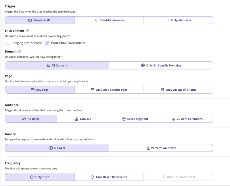
Advanced flow settings: With advanced condition settings, you can decide
when, where, and who you’ll be triggering your onboarding flows. This helps you
create contextual onboarding experiences
that drive engagement and adoption.
-
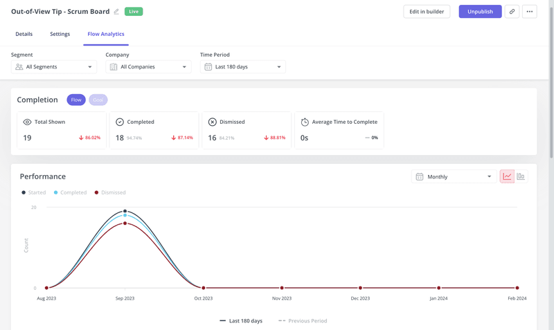
Onboarding engagement analytics: You can easily
assess the impact of your onboarding flows,
guidance, etc. by analyzing the completion rate of specific steps.
Userpilot for product analytics
Here are the top product analytics features:
-
Autocapture: The platform automatically records everything your users do, like
clicks and form inputs, so you don’t need to tag events or involve developers. -
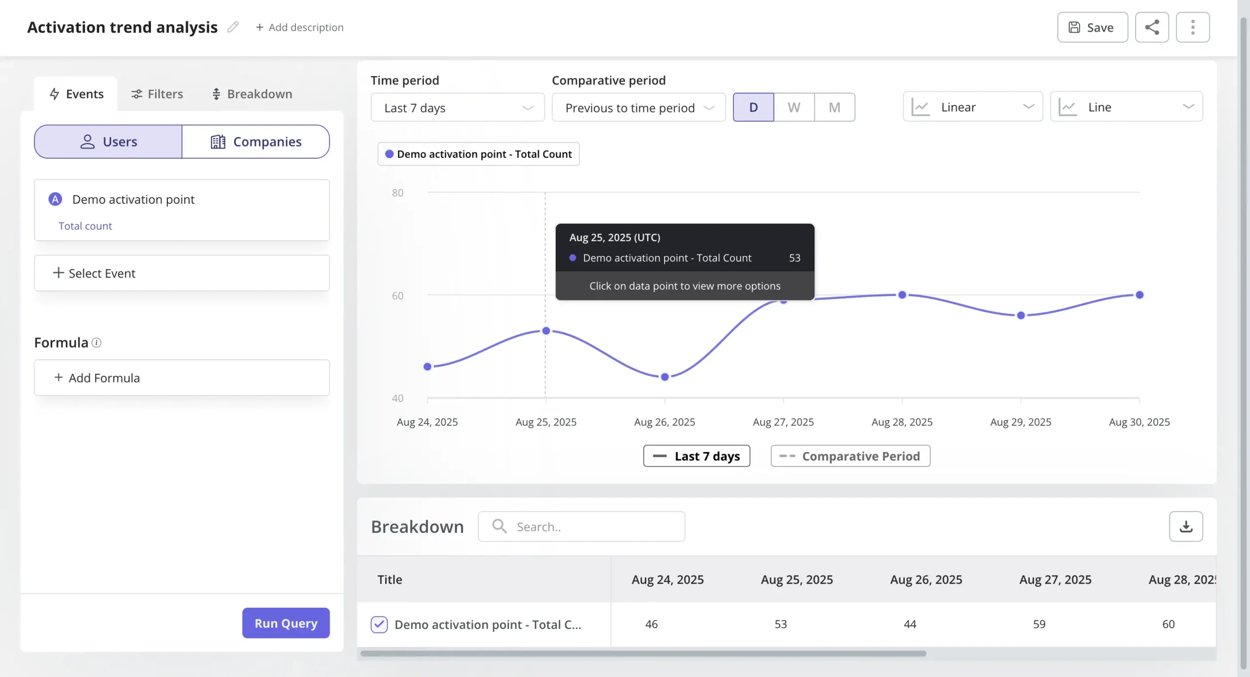
Trends and funnels: Trends and funnels report lets you identify trends and
extract actionable insights from big data. You’ll be able to see which stage of an onboarding/
conversion funnel most
users drop out of and create trend reports with detailed breakdowns by user or period.
-
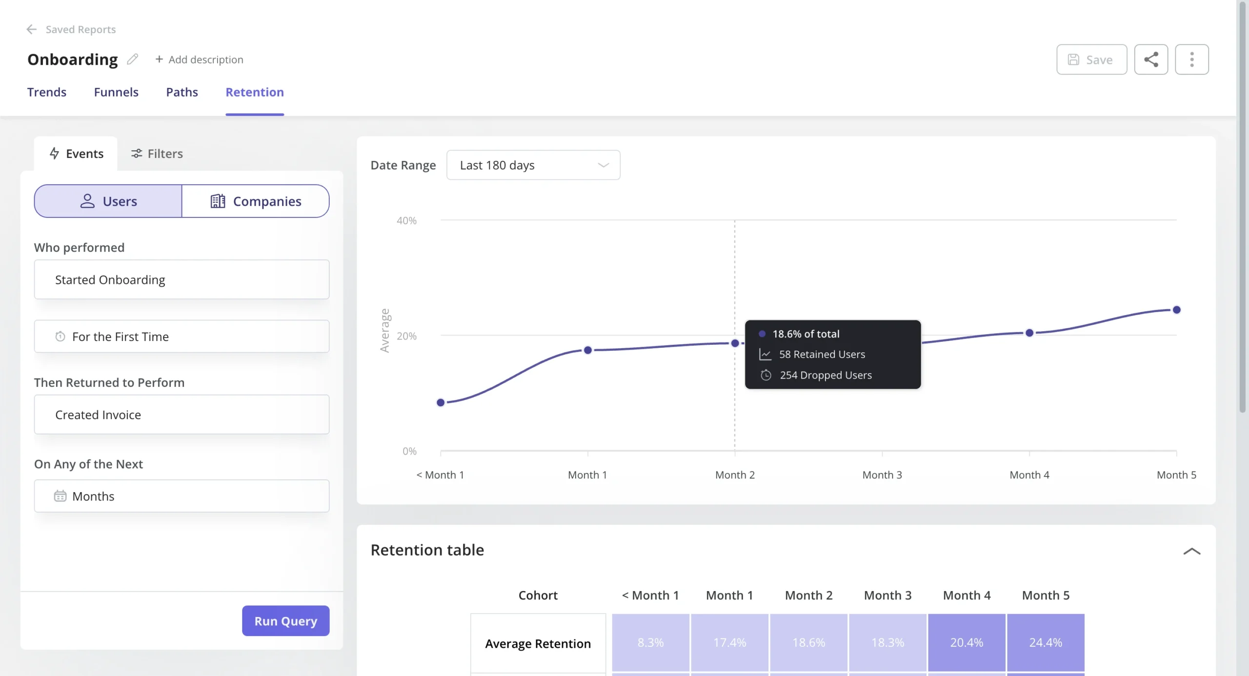
Retention tables: This lets you gauge product performance to see how
effective your product is at retaining users using
cohort tables and retention curves.
-
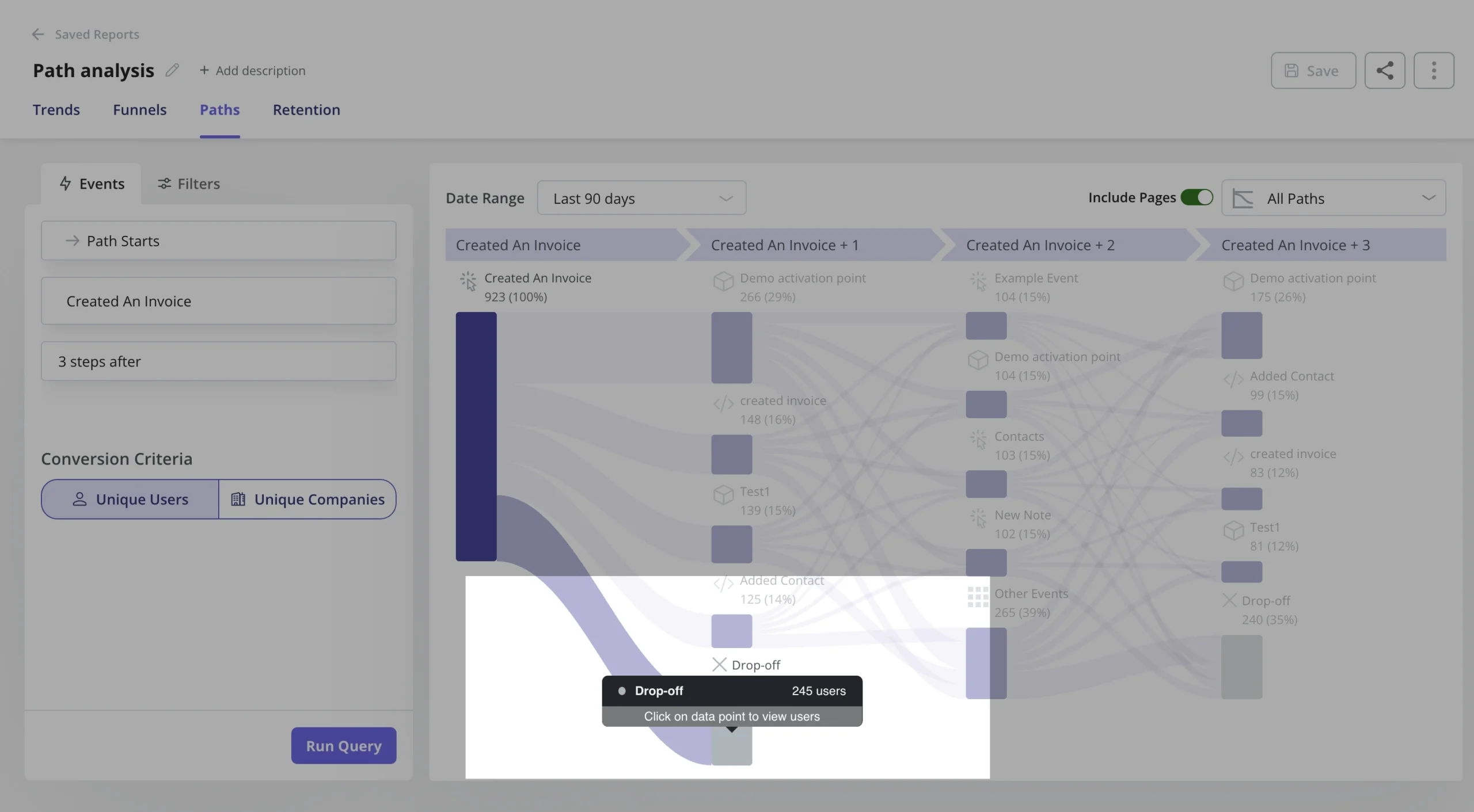
Paths: You can generate and access path reports directly within the reporting
builder, alongside funnels, trends, and retention reports. With Paths report, you can have an
overview of how users navigate your product features – offering invaluable insights into their
interactions with your products.
-
Session replays:
You can watch real-time recordings of how users interact with your product and see exactly what
they experience. For example, you can combine them with funnel analytics and watch the sessions
of dropped users to uncover the friction. -
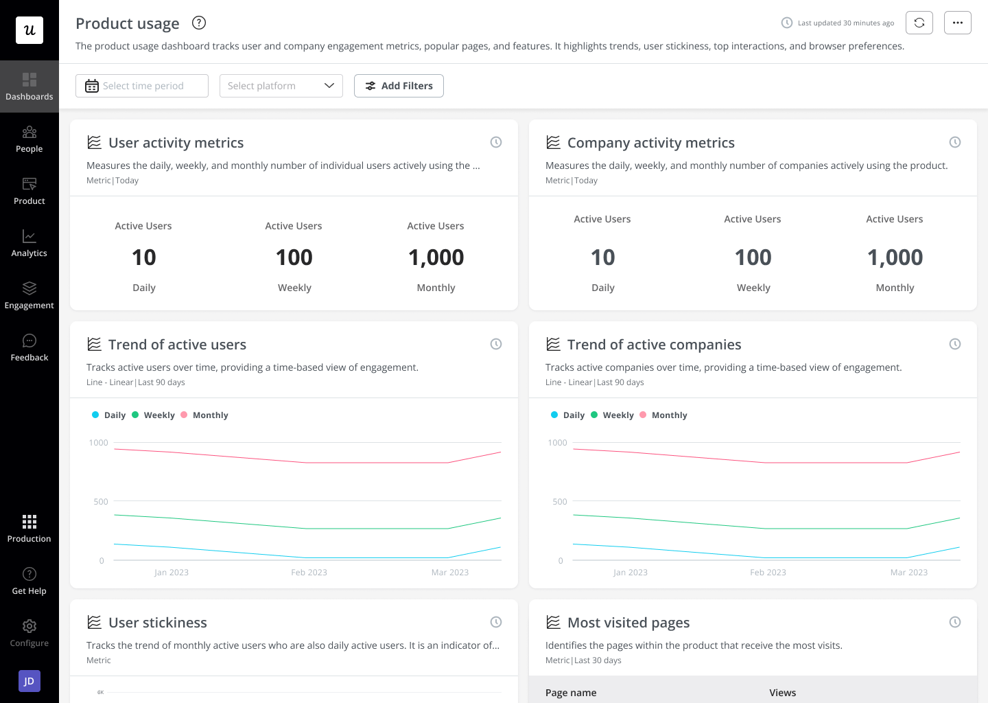
Analytics dashboards: These dashboards enable you to keep track of your key
product performance and user behavior metrics at a glance, without any technical setup
required. You can either choose one of the popular dashboard templates or create
customized dashboards
with metrics that matter to your business.
Userpilot’s pricing
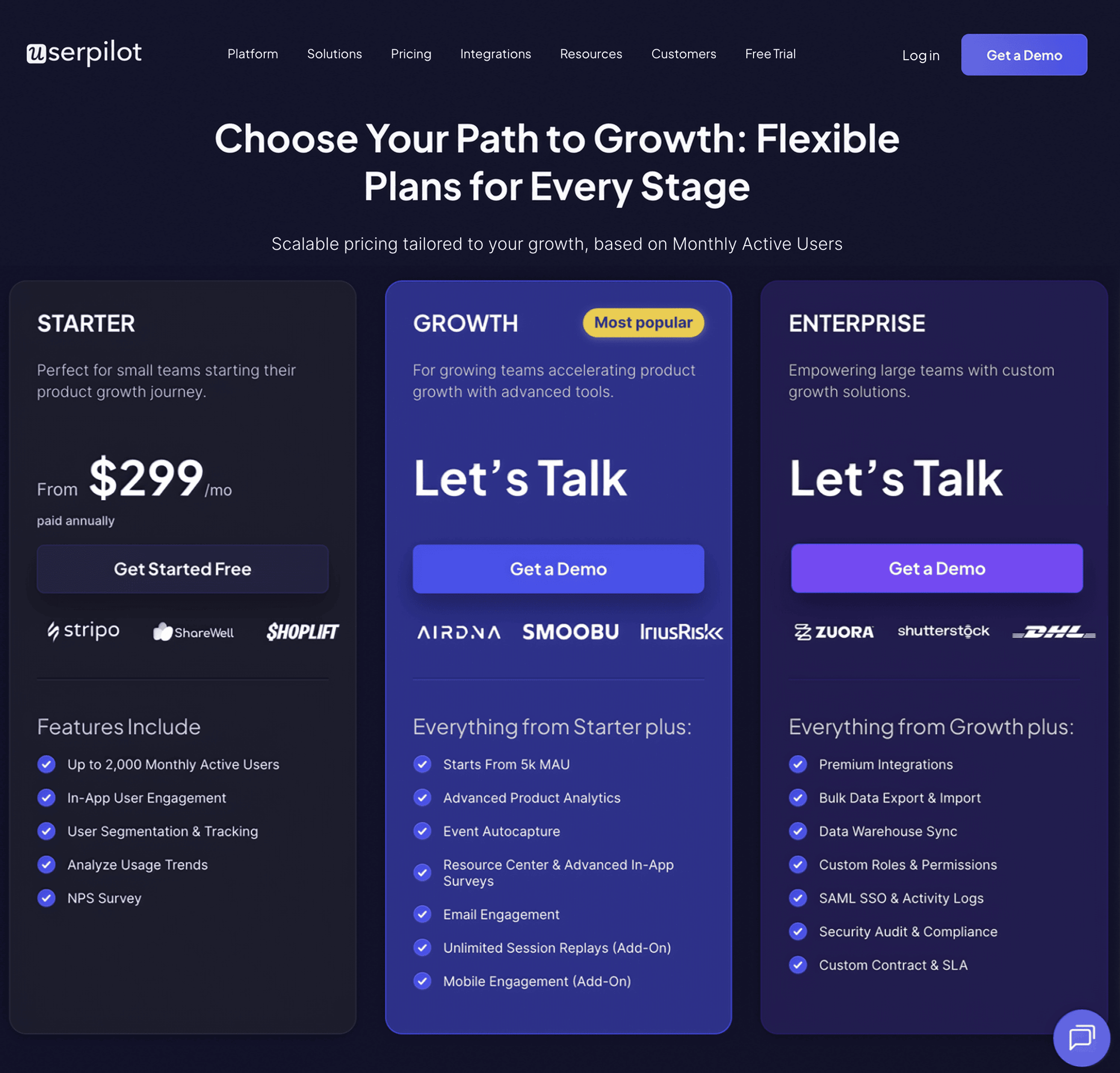
The transparent pricing ranges from $299/month on
the entry-level end to an Enterprise tier for larger companies.
Here is a more detailed breakdown of its plans:
-
Starter: To access the entry-level plan, customers can subscribe annually at a
rate of $299 per month. It includes features like segmentation, product analytics, reporting,
user engagement, NPS feedback,
and customization. -
Growth: The Growth plan uses custom pricing and includes features like
resource centers,
advanced event-based triggers, unlimited feature tagging, AI-powered content localization, EU
hosting options, and a dedicated customer success manager. -
Enterprise: The Enterprise plan uses custom pricing and includes all the
features from Starter + Growth, plus custom roles/permissions, access to
premium integrations, priority
support, custom contract, SLA, SAML SSO, activity logs, security audit, and compliance (SOC
2/GDPR).
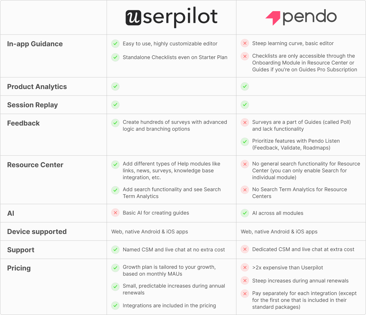
Userpilot vs Pendo
Here’s a quick side-by-side comparison:
Cuvama, one of our clients, switched from Pendo for this exact reason: they were paying tons of
money and not getting its value. After switching to Userpilot, Cuvama was able to streamline
onboarding and get better value for their money, as Leyre, their CX lead, mentions.
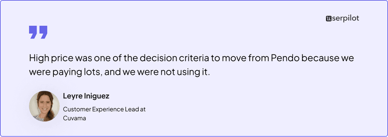
Read how an ex-Pendo customer found better value for money with Userpilot.
Userpilot vs Walkme
Here’s a detailed feature comparison between the two platforms.
| Feature | Userpilot | Walkme |
|---|---|---|
| Primary Use Case | User onboarding & product adoption of your core product | Employee onboarding & adoption of internal tools |
| Target Audience | Mid-sized and large companies | Large enterprises |
| Ease of Use | ✅ Easy to use, no dependency on developers | ❌ Steep learning curve, dev help needed |
| Time to Value | ✅ Quick setup and fast time to value | ❌ Long implementation time |
| In-app Engagement | ✅ Flows, Checklists, Tooltips | ✅ Guides, Checklists, Tooltips |
| Product Analytics | ✅ Trends, Funnels, Retention, Path analysis | ❌ No Retention analysis |
| Surveys | ✅ 15+ in-app survey templates for measuring user satisfaction | ❌ Basic templates |
| Devices Supported | Web Apps & native mobile | Web apps, native mobile & desktop apps |
| Pricing | Affordable, the Growth Plan is customized to suit your needs. | Typically starts around $10,000/year, and can exceed six figures for enterprises. |
Again, we have real people to back our words up: Rachel, the Co-Founder of TouchRight software,
switched to Userpilot from Walkme and saw firsthand how intuitive Userpilot is. It enables even
non-technical team members at TouchRight to create in-app experiences within minutes, saving them
valuable developer time.

Case Study: How Touchright Software saved hours of dev time after switching from Walkme to Userpilot
Where should you put your money?
While at first glance it seems like both Pendo and Walkme are digital adoption platforms and thus
direct competitors, upon closer introspection, it’s clear they have different main use cases.
If you need a tool mainly for employee training, choose Walkme. If you need a main user
onboarding or analytics tool, pick Pendo.
Or better yet, invest in Userpilot. It has all the features Pendo offers (analytics reports,
surveys, in-app guides, and session replays) at a fraction of the latter’s price, is much easier
to use, and offers additional engagement features.
Userpilot strives to provide accurate information to help businesses determine the best solution
for their particular needs. Due to the dynamic nature of the industry, the features offered by
Userpilot and others often change over time. The statements made in this article are accurate
to the best of Userpilot’s knowledge as of its publication/most recent update on August 9,
2025.




![Best User Onboarding Tools for SaaS [Categorized by Use Case]](https://blog-static.userpilot.com/blog/wp-content/uploads/2025/06/Best-User-Onboarding-Tools-for-SaaS-1024x670.png)