SaaS UX Design: 18 Best Practices

A good SaaS UX design is critical to a successful SaaS product in today’s constantly evolving and competitive market. An efficient and effective design with users’ needs at the center stage encourages product engagement and reduces churn.
In this article, we will examine what an effective SaaS UX design is, why it’s important, and the best practices to produce a well-crafted design that works.
SaaS UX design summary
- SaaS UX design is a process of creating a smooth and pleasant user experience for SaaS products.
- A well-crafted UX design increases customer satisfaction, improves user engagement, minimizes friction and churn, and improves customer retention.
- To create an effective design for SaaS apps, perform user research, define clear objectives, create and visualize the information architecture, and build your prototypes using device-specific features.
- To effectively attract users, you need to simplify the registration process by requesting only essential information. You can also use social proof to reassure users.
- In addition to creating an intuitive interface with mental models, you’ll also need to create a carefully crafted onboarding process to guide users.
- Use progressive disclosure to simplify complex SaaS products and simplify the experience for your users.
- Communicate your product’s value with clear instructions and use webinars to improve customer engagement.
- Provide self-serve resources to give users a feeling of ownership while using your SaaS products and use gamification to improve engagement.
- Collect user feedback and conduct regular user interviews to understand users’ challenges and generate feature ideas.
- To learn more about how you can craft an impactful and efficient SaaS UX design, book a demo today!
What is SaaS UX design?
SaaS UX design focuses on creating an intuitive, user-friendly, and efficient interface that allows users to easily accomplish their tasks and goals within the software.
It covers every user touchpoint from registration and onboarding to adoption.
Why is UX design important in SaaS?
Since the software as a service business involves delivering digital products, following design best practices is crucial to the creation of a successful SaaS product. Some benefits include:
- Increased customer satisfaction: A simplified registration and onboarding process creates a great first impression. Similarly, simple and intuitive designs reduce confusion and boost satisfaction.
- Simplified and improved customer experience: A good SaaS UX design eliminates unnecessary features and uses familiar design patterns. This makes the product easier to navigate.
- Improved user engagement: Users who are presented with an intuitive user interface are more likely to spend more time on your product.
- Minimize friction and churn: An intuitive, friction-free SaaS UX design drives user adoption and validates their reasons for purchase.
- Improve customer retention: If users consistently experience great quality while using your SaaS products, they are likelier to continue using them. Ultimately, retaining users will generate more revenue and minimize user acquisition costs.
What is the process of creating an effective design for SaaS apps?
A good SaaS UX design can spell the difference between the long-term success or failure of a SaaS product.
Here’s a quick guide to creating a design that works for your SaaS applications:
1. Perform user research
To create truly useful products, you must understand your target users and their needs. UX research helps you identify your users’ needs, preferences, and motivations.
You can perform this research by conducting surveys, observational studies, and other forms of research to learn what your competitors are doing right.
2. Define clear objectives
A great UX designer thinks beyond mere pixels and towards the users and business goals. Creating S.M.A.R.T (Specific, Measurable, Actionable, Realistic, Time-based) goals during the design process can help designers manage expectations before they begin.
3. Give clear and concise instructions
Use clear and concise labels to guide users through the product. Avoid using ambiguous language or confusing technical jargon, and ensure your instructions align with your goals.
4. Create information architecture
In SaaS, information architecture is a term that describes the structure and organization of SaaS software. Intuitive content labels, simple and clear navigation systems, efficient search functions, and categorizing related information are elements of an information architecture done right.
5. Visualize your layout with wireframes
Use wireframes to map out each step your users must – from product launch to task completion. Wireframes help visualize the app’s structure without getting into design details.
6. Take advantage of device-specific key features
Design your products with specific devices in mind for easier, smoother navigation. For example, the wide screen of a desktop allows for a wider product layout which may appear messy on the small screen of a mobile device.
7. Build prototypes
Build interactive prototypes to visualize your product and test its real-world performance before launch. By designing a prototype, you can avoid the costly mistake of creating a SaaS UX design that does not resonate with your audience.
8. Perform usability testing
Usability tests can help you identify design issues and areas for improvement before a full product launch. Conduct usability tests with real users to gather relevant feedback before launch.
9. Continuously iterate
Finally, it’s important to note that development never stops. After each product or feature launch, collect user feedback and act on it to make iterative improvements to the app’s design and features.
Best practices for a good SaaS UX design
The SaaS ecosystem has been steadily growing in recent years, leading to a lot of competition. As a result, SaaS UX design is more important than ever.
Let’s now consider 18 best practices to enable you to create a well-crafted SaaS UX design.
Build user trust with social proof
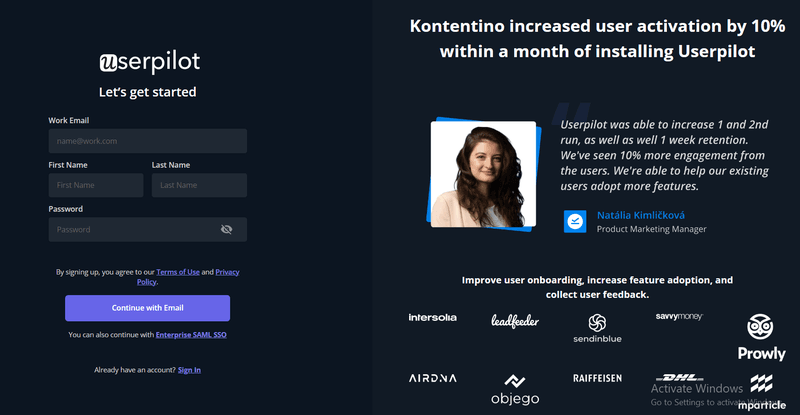
Building user trust with social proof is a great way to reassure users that others have had positive experiences while using your SaaS product. It adds a layer of credibility to your marketing and can influence customers’ decision-making process and drive conversions.
One way to build trust with social proof is by prominently displaying reviews, user ratings, and testimonials from satisfied customers on your landing and signup pages.
Simplify the registration process
A simple registration process makes it easy for users to get started with your SaaS application. It also minimizes the time it takes to offer value to users and reduces the number of customer support issues.
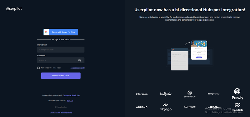
You can simplify the registration process by requesting only essential information, such as a username, email address, and password. You can even simplify this further by including SSO signup options.
Other simplification techniques include using a progress bar to show progress, enabling auto-fill for data fields, and featuring a simple but prominent CTA button.
Create a well-designed onboarding process for new users
A well-crafted onboarding process is critical to customer retention. It highlights the product’s value and sets the stage for user engagement with your products.
The first step to a successful onboarding process is a warm welcome message that puts new users at ease. This is also your chance to conduct a welcome survey and collect valuable user data.
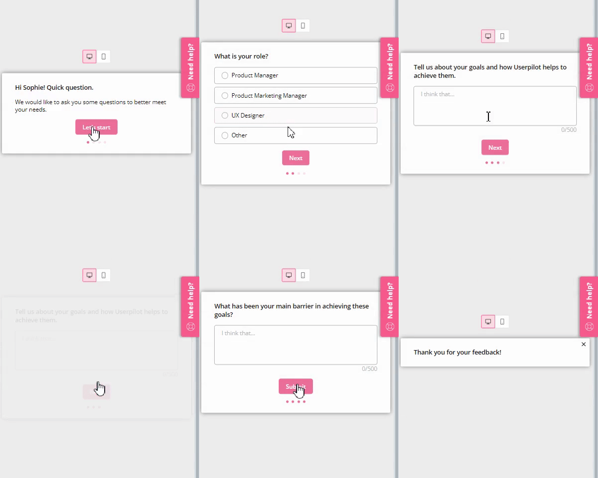
Next, you need to personalize the user’s onboarding experience according to their pain points and goals with your product.
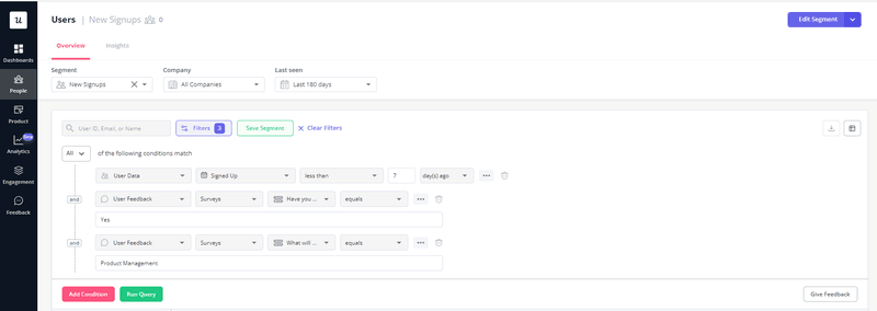
Replace your verification email with an in-app reminder
Forcing users to abandon your product in search of a verification email right after signing up can feel jarring and slow down progress. It directs attention away from your product at a time when a new user’s interest is highest.
Rather than send them away, use in-app messages to direct their attention to their verification. This gives them more time to verify without creating any friction in the already ongoing process.

Create an intuitive interface with mental models
Designing with mental models makes it easy for users to navigate your SaaS app because the design uses systems and frameworks that users already know. It, thus, allows users to effectively complete tasks as their subconscious UI expectations are met.
For example, users have come to associate the trash can icon with the “delete” function. Using a different icon for this feature can throw them off, causing unnecessary confusion.
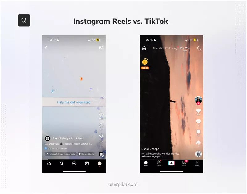
Simplify complex SaaS products with progressive disclosure
Progressive disclosure is a concept that involves breaking down information to gradually reveal information as users progress through the interface of a product. It reduces the learning curve of a SaaS app, simplifies the user interface, and improves the experience for new users.
You can implement it in your product by hand-holding users through getting started, increasingly releasing vital information as they progress rather than pushing out all of it upfront.
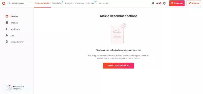
Communicate your product’s value with your UX design
Communicating the value of your product as soon as possible helps users easily discover the features they need and experience the product’s value in less time.
For example, Notion uses a simple to-do list to help users get started and use the platform immediately. Its “Get Started” page features simple instructions like “Give these things a try” to allow users to understand how the product works and learn by doing.
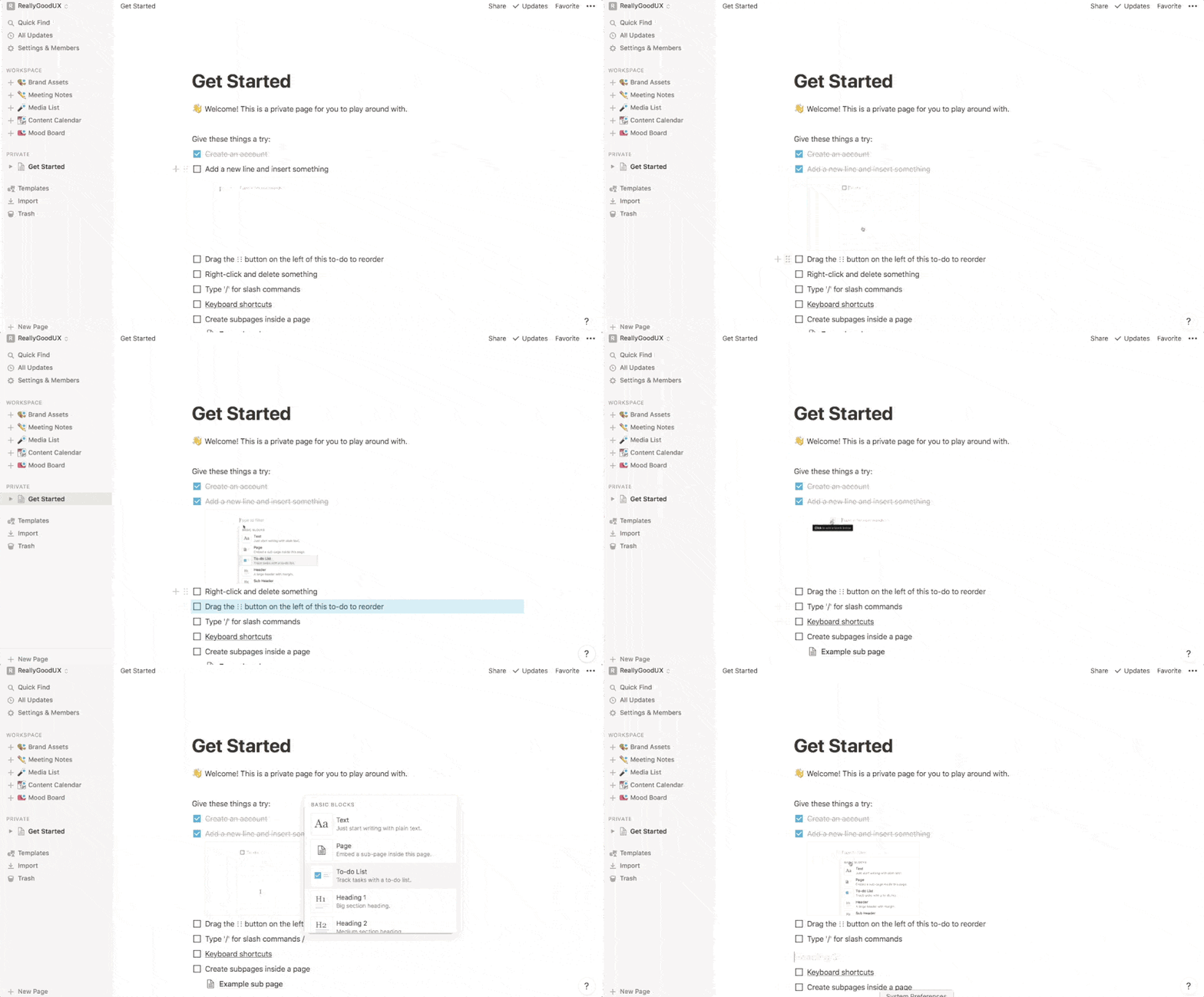
Create a simplified user journey with onboarding checklists
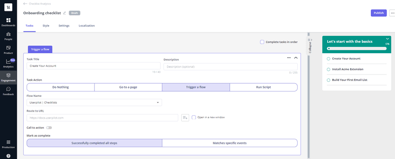
When crafted right, onboarding checklists give users a sense of accomplishment as they complete each task. It familiarizes them with the functionalities of your product and showcases its value.
A well-designed checklist should include key tasks users must complete to set up the product. It should also be tailored to the needs of the user, perhaps with relevant guided flows triggered when the user performs a certain action.
Streamline information architecture in your SaaS application with video resources
Use video resources to show users how to use different features of your SaaS application. Organizing the content of your SaaS products in a way users can relate to and navigate leads to increased user satisfaction.
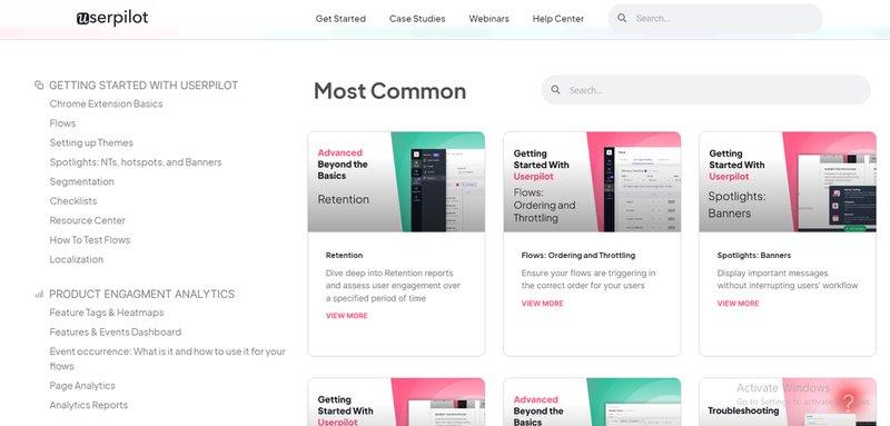
Provide available self-serve resources in your SaaS product
Self-service gives users control over their experience while using your product.
Rather than having to wait on customer success managers or a live chat system for support, customers can learn about your products and even troubleshoot their issues when they want and at their own pace.
Self-service resources, thus, increase user engagement, reduce customer support costs, and increase brand loyalty.
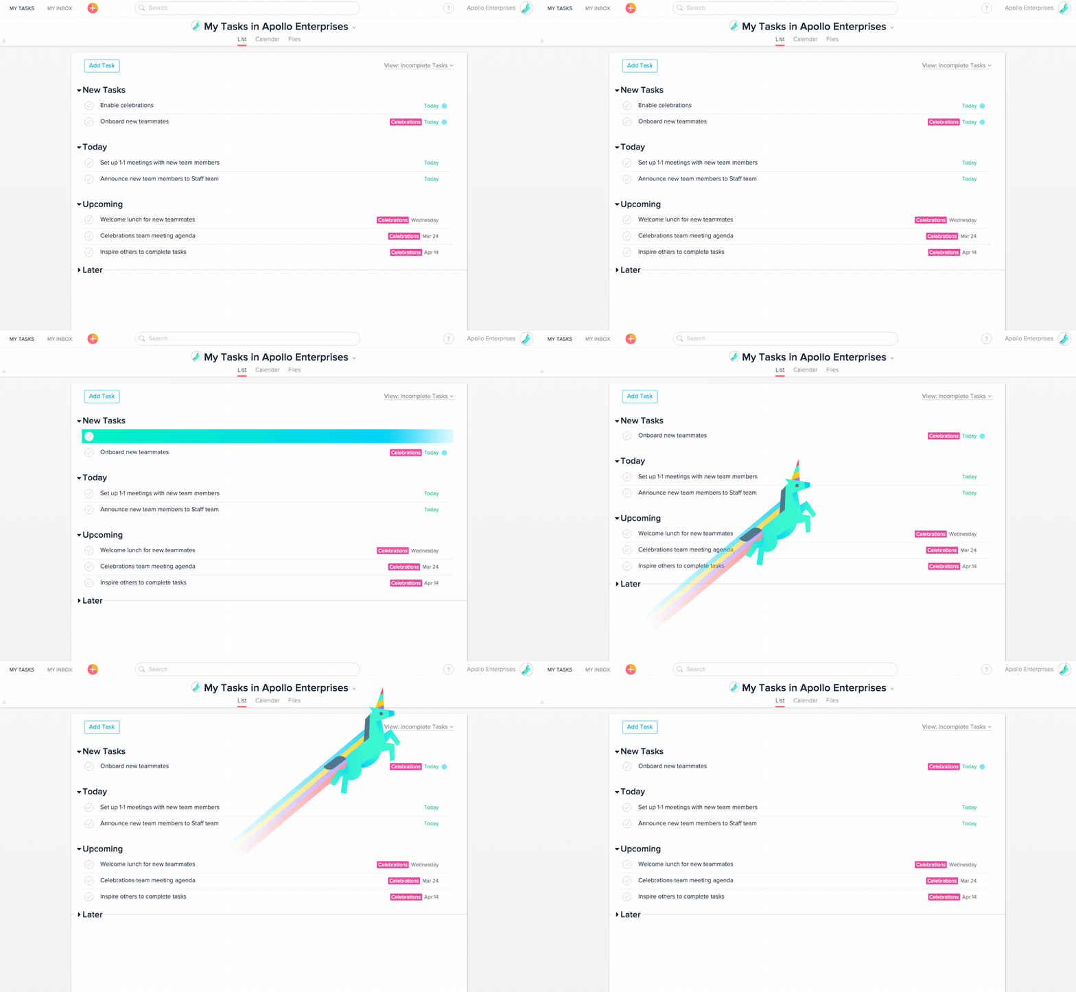
Engage users with a gamified customer experience
Gamification can help a business generate leads, increase engagement, and drive sales by using game-like models to incentivize people to engage with the SaaS platform.
One way you can gamify your customer experience is by using challenges to motivate users and implementing a point-reward system. You can also give badges to give users a sense of accomplishment, and progress bars can be integrated to show users how much progress they are making with a task.
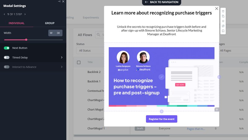
Improve customer engagement with webinars
Setting up chat spaces in a webinar creates an opportunity for businesses to engage with their customers. Providing valuable content to your users via a webinar also enhances your reputation, attracts new customers, and establishes your company as an industry leader.
Divide your customers into different segments and send contextual webinar invites. This way, you can personalize the journey of your prospects and expand your customer pool.
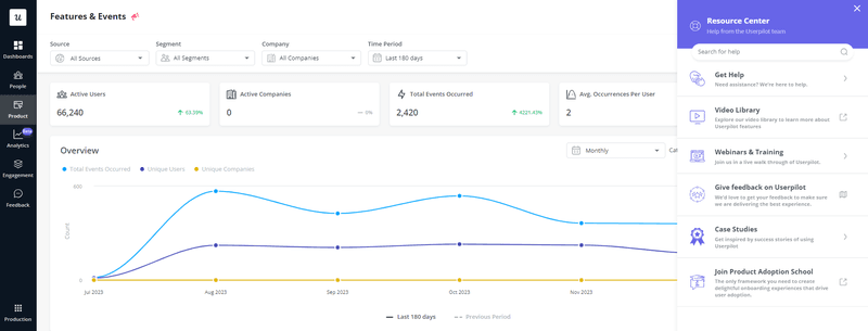
Use analytics dashboard to engage and inform users
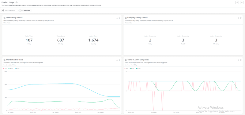
Analytics dashboards offer organizations insights into what customers desire. It can help them get an inside view of the minds of their customers and offer tailored experiences to satisfy their needs.
Customer funnel metrics are an example of dashboards. They track your funnel, revealing why customers drop off and what you can do to prevent that.
Collect user feedback regarding user interface and user experience
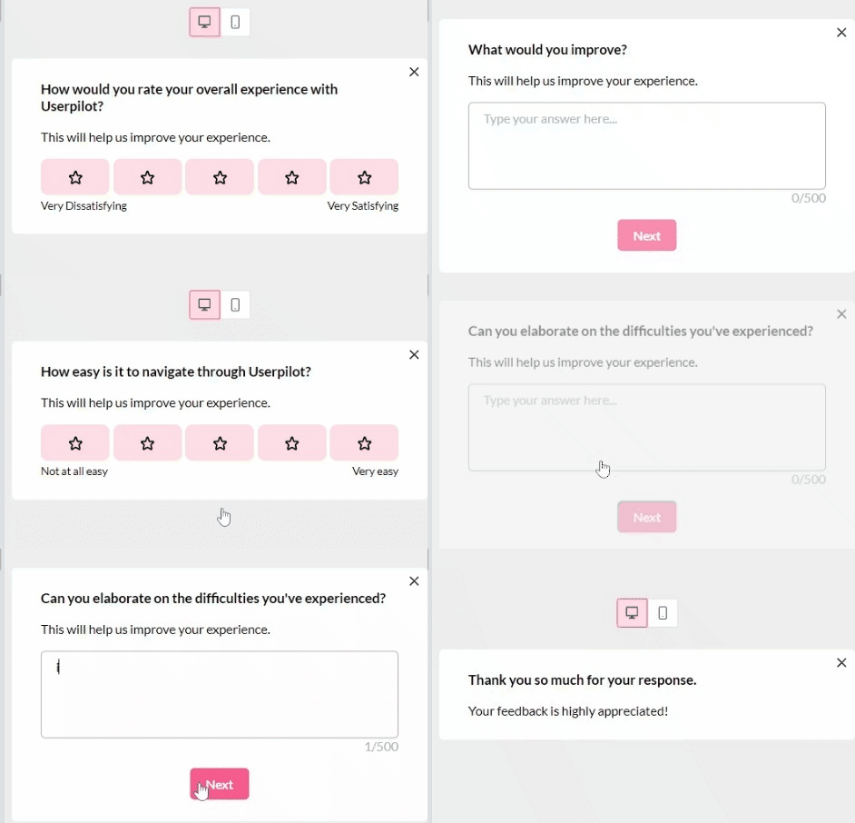
Collecting contextual feedback regarding the UI/UX design of your product lets you offer exactly what users expect and improve their experience. Feedback reduces friction, drives users to take action, and increases engagement.
UX design feedback such as preloaders, progress bars, and an empty state guide users through different tasks and challenges. This sets the tone for them to get the best value from your product.
Hold regular user interviews with your loyal customers
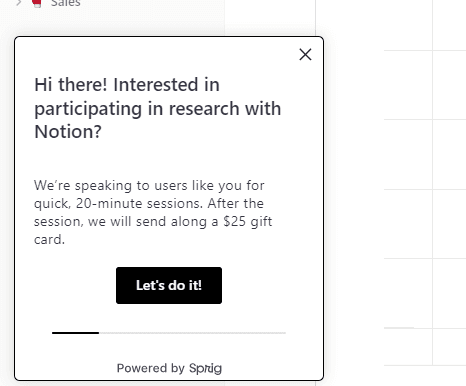
User interviews are a powerful way to generate ideas and uncover opportunities to offer users value while using your product. They are better than feedback because they foster empathy, showing your loyal customers that you care.
Define your research goals when conducting user interviews to find out what your customers want, their goals, and how your company’s efforts can satisfy these wants.
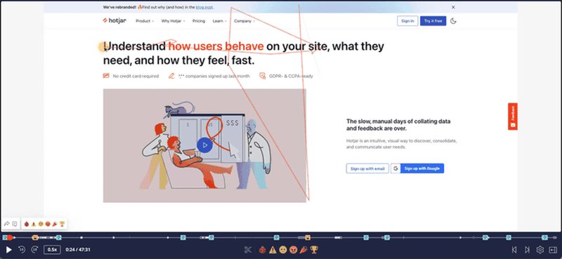
Monitor the effectiveness of your SaaS UI/UX design with screen recording
Screen recording helps to reveal the strengths and weaknesses of a SaaS UX design. They include rage clicks (areas of frustration), mouse movement, and scrolling across different portions of a SaaS app.
Insights from screen recording can help you understand how users interact with your platform, identify issues, and optimize your SaaS UX design to increase conversion.
Create an omnichannel user experience
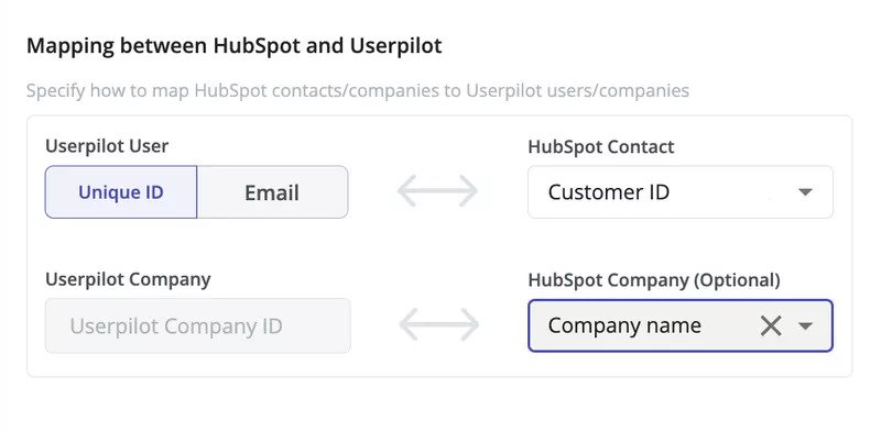
An omnichannel experience ensures users enjoy “moments of delight” across every possible channel. It offers users multiple touchpoints to engage with your brand, ensuring user satisfaction and retention.
To successfully offer an omnichannel experience, define your goals and map out the journey of your target users (trigger an email when the user performs a certain action in-app). Also, be sure to conduct data analytics to extract insights that can help you offer relevant services to your users across multiple channels.
Contextually onboard features
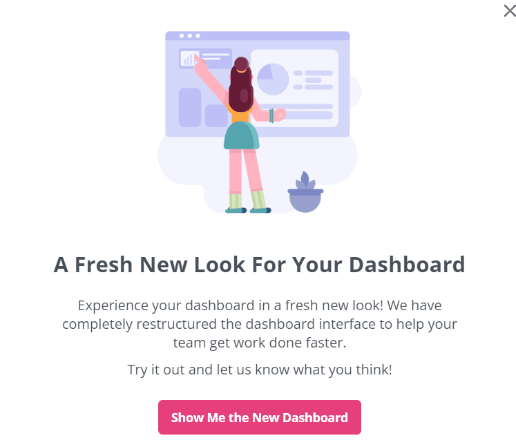
Introducing new features to users means showing them the right things about the features at the right time. This ensures that users are hand-held through the onboarding process, with a feeling that their needs are taken care of.
Segment users based on their goals and needs and create a new feature announcement alongside an interactive walkthrough that gives them a seamless path to follow. Encourage users to monitor the activity log for new features and request feedback to continuously improve SaaS UX.
Conclusion
Your company can ‘hit the big time’ by simply creating SaaS products that work for its audience. A good SaaS UX design makes it even easier to achieve this lofty goal.
If your SaaS application is struggling to attract and retain users, book a demo to find out how you can create a SaaS UX design that meets the needs of your audience.

