What is User Onboarding? Best Practices, Examples & Metrics
63% of customers believe user onboarding is key to deciding whether to subscribe to a product.
But getting the onboarding experience right is hard. You have to overcome communication barriers, account for knowledge gaps, and balance between too much and not enough information, all while making it personalized.
And what happens if even one element goes wrong?
Higher churn rates, lower user engagement, and more work for your customer support team, leading to increased support costs.
On the flip side, a well-crafted onboarding flow can boost user retention by up to 50%. Plus, it improves loyalty too, with 86% of users admitting that they’re more likely to stick with a product that offers educational onboarding content.
This article will help you design such seamless user onboarding, covering best practices and successful examples from which to take inspiration.
What is user onboarding?
User onboarding is the process of guiding new users to quickly unlock value from your product or service. The goal is to reduce the time to value, helping new users reach the “Aha moment” where they finally understand why they need your product.
But user onboarding doesn’t just end after the first value moment. Rather, it’s divided into 3 stages:
- Primary onboarding: The initial onboarding stage from sign-up to activation, also called minimum viable onboarding. Its goal is to guide new users through core features, making the experience as engaging as possible. Onboarding checklists, interactive tutorials, and step-by-step videos are great tools for this stage.
- Secondary onboarding: This stage introduces users to more advanced features, going deeper into the functionality. The goal is to improve user stickiness by helping existing users continue to realize value with your product. Onboarding tooltips are useful at this stage, nudging users to explore new features.
- Tertiary onboarding: This is the continuous phase of user onboarding that encourages ongoing engagement by offering specific support. Its goal is to retain happy customers and drive expansion revenue through upselling. In-app announcements are useful at this point, providing tailored training materials about new features and workflows.
This guide focuses on user onboarding strategy, best practices, and tools, covering how to help users reach value faster and stay engaged over time. If you’re specifically looking for real-world onboarding flow examples and patterns, see our guide to onboarding user flow examples.
What do new users expect from the onboarding journey?
81% of customers now prefer companies that offer a personalized experience. And 76% of them get frustrated at the lack of personalization. These changing needs affect the user onboarding process as well, with customers now expecting onboarding to be:
- Personalized: Tailored to their specific needs and goals. For example, an onboarding flow suggesting report templates based on your job role and industry.
- Intuitive: Easy to understand and navigate. This means an onboarding experience that isn’t too text-heavy, with step-by-step instructions, clearly labeled buttons, and minimal necessary steps.
- Engaging: Interactive and enjoyable. This can be achieved by adding interactive gamification elements to the flow, like progress bars and checklists.
- Value-driven: Clearly demonstrating the benefits of the product. Video tutorials make this easy since you can show users how to, for instance, create custom dashboards with actionable tips.
- Timely: Providing the right information at the right moment. For instance, suggesting helpful resources when the user is exploring new features during onboarding instead of later on.
8 Best practices to build a memorable user onboarding experience
How do you implement user onboarding that meets all the above expectations? With the help of these best practices for designing onboarding that’s engaging, easy to understand, and relevant.
To implement these ideas, you’ll need a clearly defined user onboarding flow that aligns with your product goals.
1. Segment users based on “jobs to be done”
New users who experience a personalized onboarding flow are 30% more engaged than those who undergo generic onboarding.
So, personalize onboarding, showing various user segments specific flows related to their job to be done.
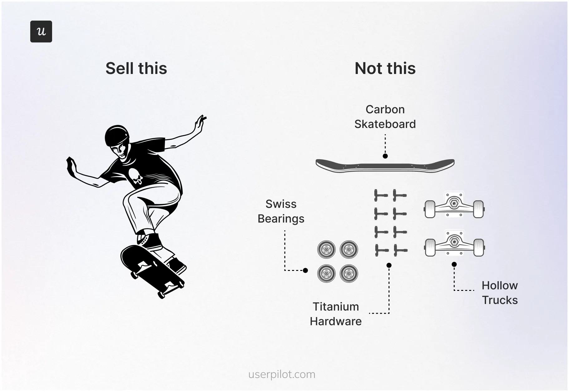
Start with welcome surveys to collect information on the new user’s role, industry, and primary “job” they’re hiring your product to do. Using this information, segment users and tailor the onboarding to help each segment achieve their specific outcomes.
For example, a marketing manager has the goal of tracking campaign performance. So the onboarding experience relevant to them should highlight features like campaign templates, analytics dashboards, and collaboration tools. Users focus on the outcome, a great onboarding experience, not the individual features that go into it.
To implement these ideas, you’ll need a clearly defined user onboarding flow that aligns with your product goals.
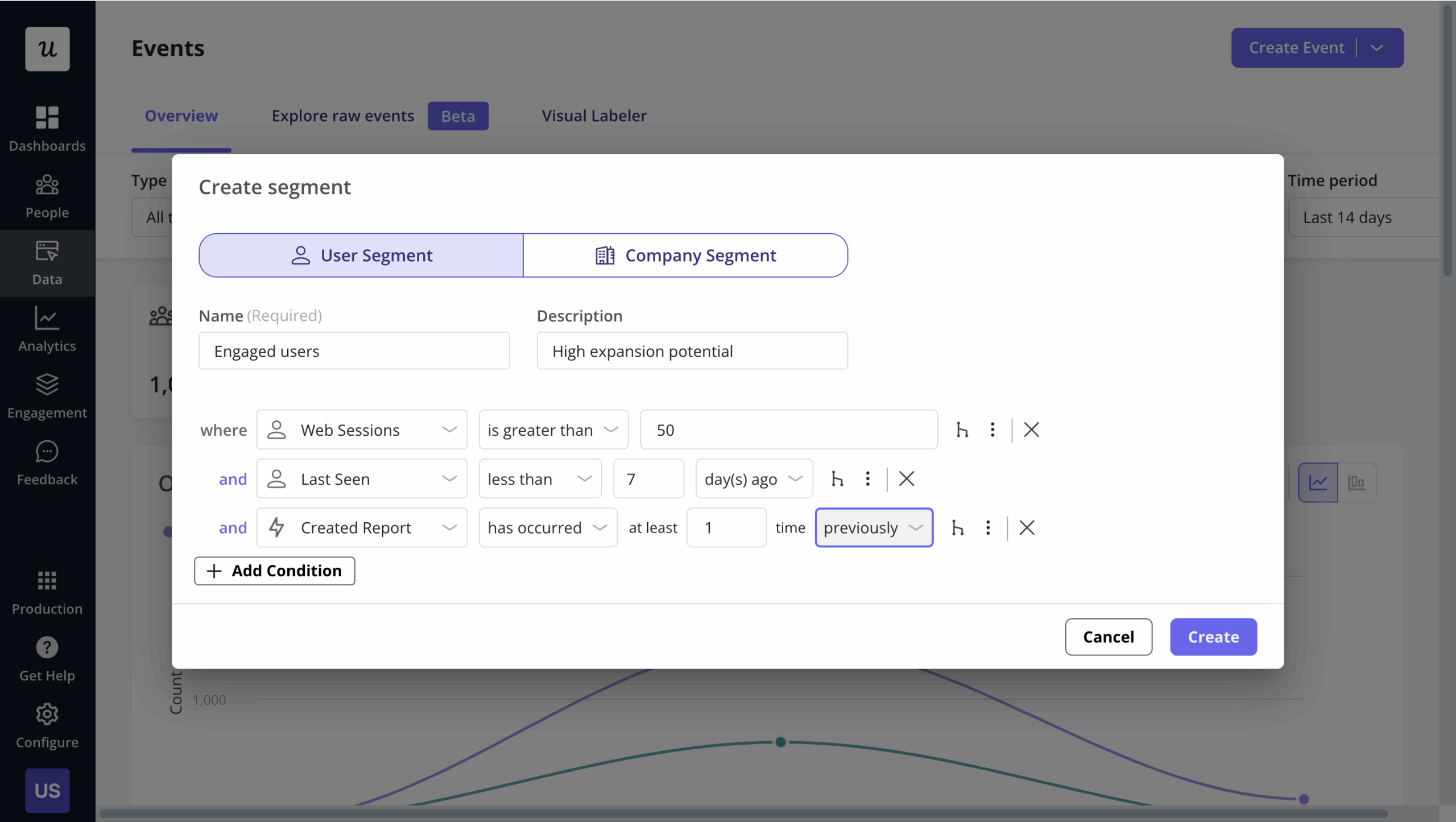
For hyper-personalization beyond user jobs, consider more advanced segmentation criteria that allow you to create user segments based on:
- User data (browser language, device type, last seen, number of web sessions, plan, or role).
- Company data (number of people, country, industry, plan, or stage).
- Events (e.g., users who have performed a specific action).
2. Empower users with a self-serve resource center
Zendesk research shows that 67% of users prefer self-service instead of waiting for customer support. And a staggering 91% would happily use an online resource center if it was available and tailored to their needs.
How does building a dedicated resource center tie in with creating a good user onboarding experience?
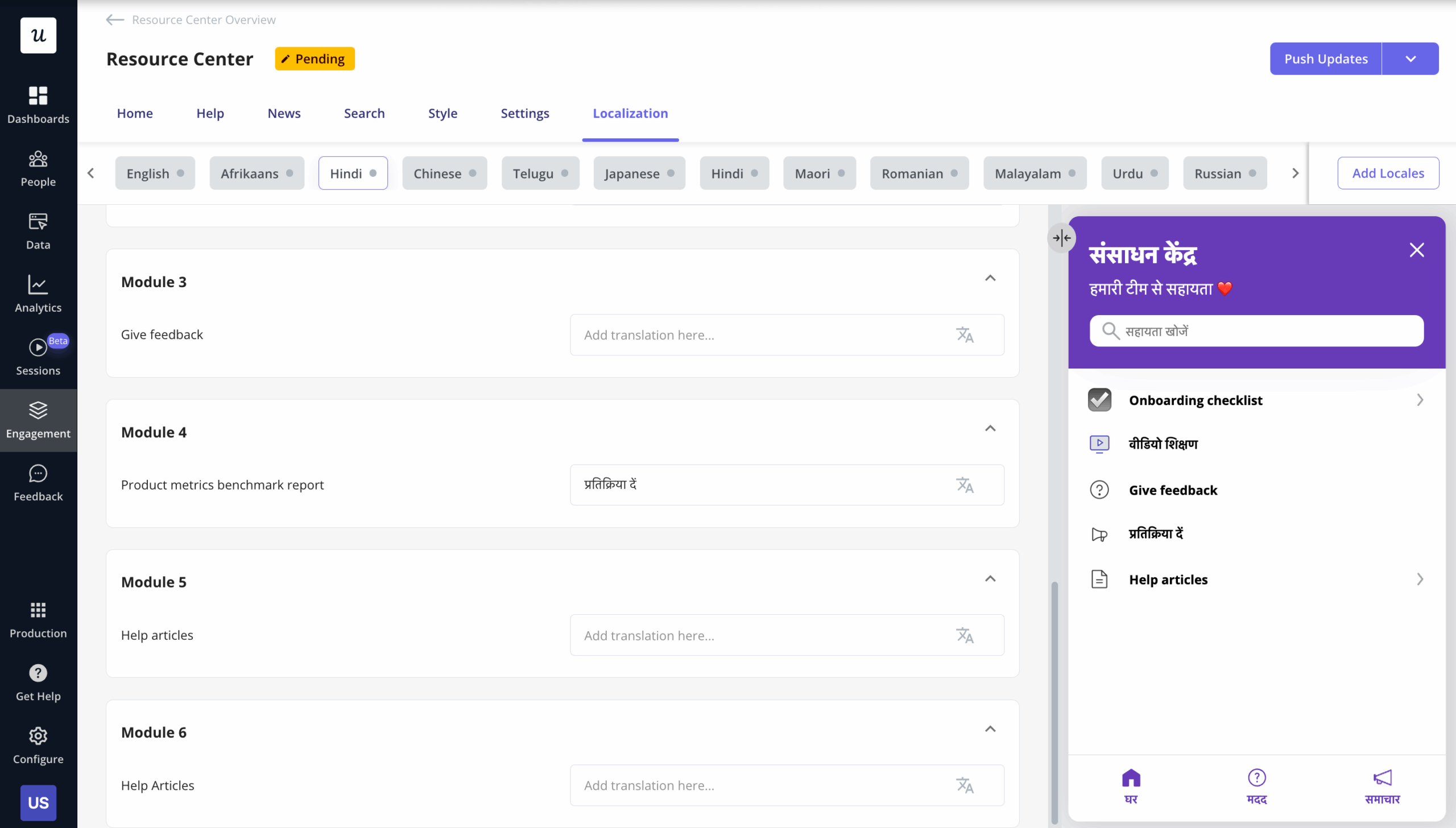
It complements a smooth onboarding since users can explore independently, reducing reliance on support and increasing adoption. Even better if your resource center is in-app so users can easily access information there and then.
Lastly, find tools that let you add several content formats in your resource center to cater to different learning styles, like video tutorials, support documentation, FAQs, walkthroughs, etc.
3. Use interactive elements to drive active learning
Interactive content results in 52% more user engagement than static content.
This means don’t just show new users what to do. Rather, encourage them to actively participate in the learning process through interactive elements like onboarding checklists, progress bars, in-app tooltips, etc.
A bit of advice, though: don’t over-rely on product tours. They’re more linear, just pointing out steps users need to take. The only “interactive” thing about them is frustrated users blindly clicking “Next” to end the tour.
Instead, try interactive walkthroughs. They actively engage users by allowing them to complete tasks and explore features at their own pace.
4. Provide “just-in-time” guidance, not just contextual assistance
Let’s compare two examples of in-app guidance.
First, a product tour launches immediately after login, explaining every feature, regardless of whether users need it.
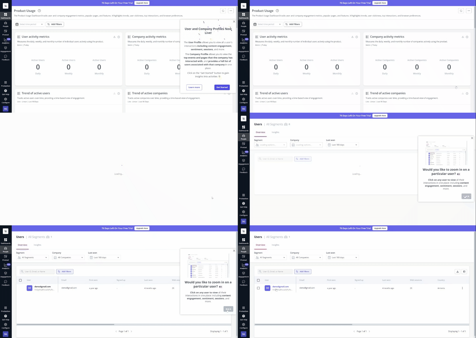
Second, tooltips or hints pop up only when new users click a specific feature for the first time.
Which one sounds more useful?
No surprise that the second example sounds better because it educates users when needed, without overwhelming them with unnecessary information.
This is known as “just-in-time” guidance, offered exactly when it is of value to users. To execute this successfully, you need to create fully customizable tooltips, slideouts, and modals for onboarding tasks.
5. Use multiple UI onboarding patterns
Suppose there’s a new user who needs structured, task-based guidance to onboard effectively. A checklist would be ideal for guiding them step-by-step and reducing the mental load of tracking key tasks.
But what happens if you don’t offer them a checklist? Maybe you show them a product tour instead.
Chances are, the user will feel overwhelmed by the lack of task management and all the passive information thrown their way. This will translate to greater confusion and slower adoption since your guidance doesn’t match the user’s learning style.
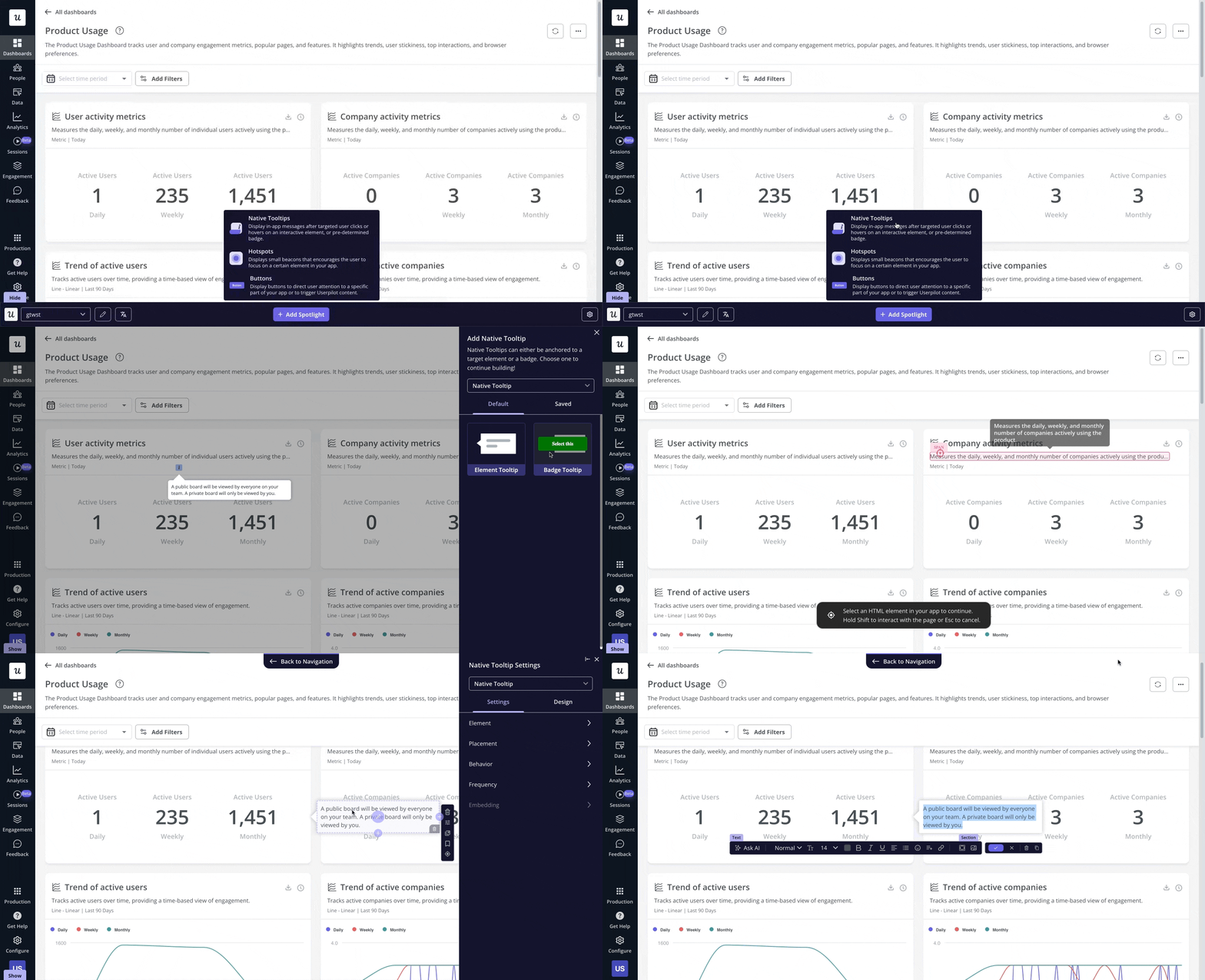
To avoid such scenarios and cater to various learning preferences, use a combination of different UI patterns during user onboarding. Some common UI patterns include:
- Progress bars: Visualize user progress to motivate them to complete the onboarding process.
- Checklists: Provide a clear list of tasks to be completed, helping users stay organized and focused.
- Tooltips: Offer bite-sized, context-specific tips without interrupting the user’s workflow.
- Hotspots: Highlight key areas to draw attention to important features, helping users navigate.
- Welcome screens: Greet users with a brief product introduction, setting expectations, and providing a clear starting point for their journey.
6. A/B test different in-app onboarding experiences
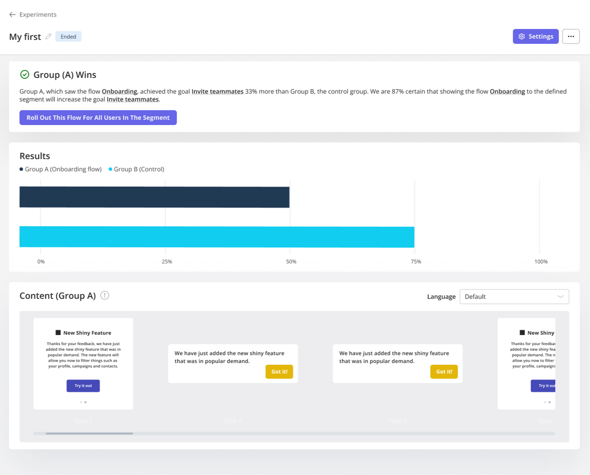
1 out of 8 A/B tests is successful at driving significant change. So, if you’re looking to refine your new user onboarding, A/B testing needs to be a regular occurrence, not just a one-time thing.
Here are some ways you can run A/B experiments as part of your onboarding strategy:
- Test different onboarding steps: Experiment with the order of tasks to see what leads to faster user activation.
- Vary the content: Play around with messaging or UI patterns to identify which resonates best with users.
- Timing experiments: Test when to show onboarding prompts, whether immediately after login or once users reach a specific point.
- Visual design changes: A/B test UI elements like buttons, colors, or progress bars to see what encourages user engagement.
7. Analyze user behavior to improve your onboarding process
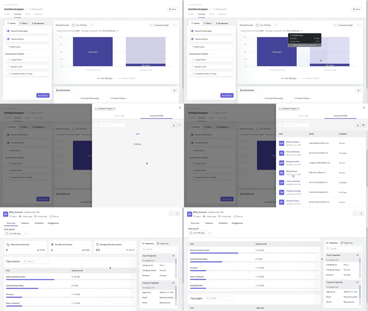
To better guide users, you first need to know where your user onboarding is lacking. That’s where tracking user behavior comes in, helping you uncover friction spots, drop-off points, and improvement areas within your product.
For example, you notice an increased drop-off rate after the first step in your onboarding flow.
So track user behavior with a funnel analysis and discover that many users struggle with the “Set Up Integrations” step. To further investigate why this is, capture session replays, which may highlight that the difficulty is due to unclear instructions.
Using this insight, refine the copy, add tooltips, or simplify the process, improving the overall onboarding experience and reducing drop-offs.
8. Collect feedback through continuous conversations
The easiest way to figure out what your user onboarding is missing? Talk to the users themselves.
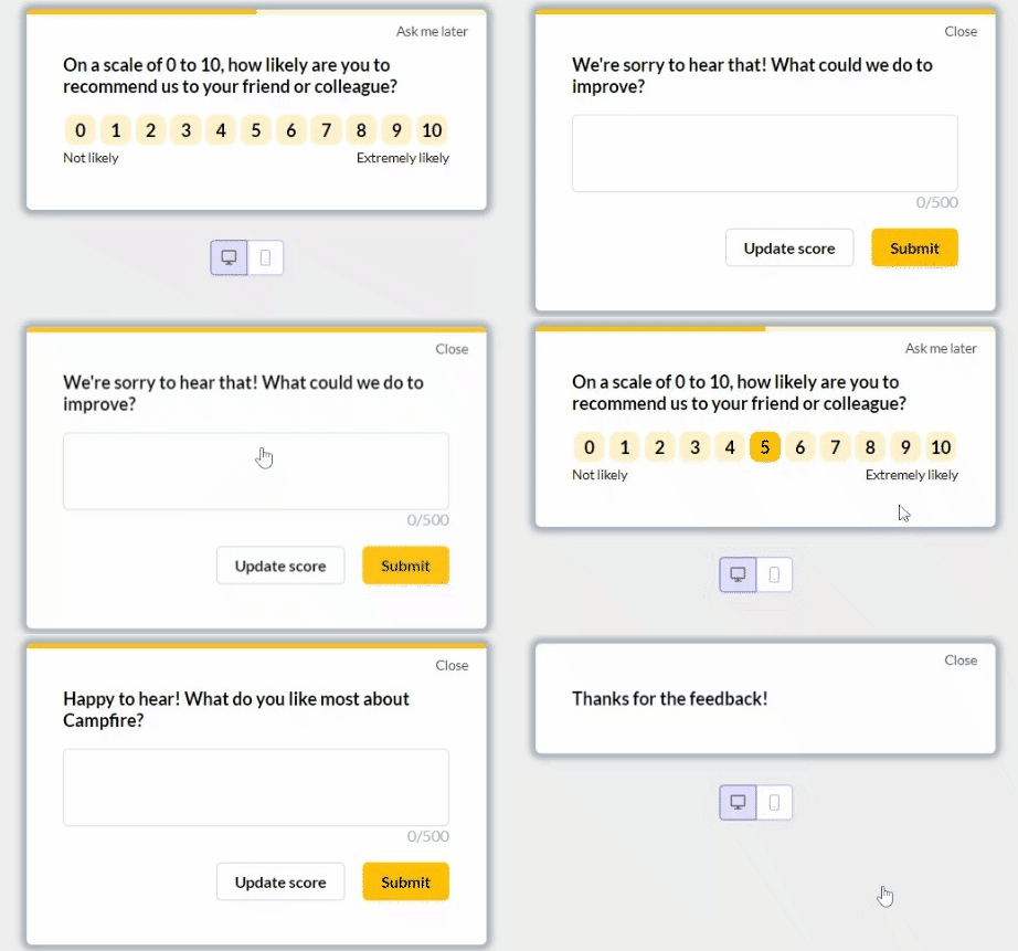
You can do this with contextual surveys, like a simple pop-up asking, “Was this step clear?” after users complete a key action.
Apart from these surveys, create opportunities for ongoing feedback collection throughout the user journey too. For example, trigger a chatbot to ask for feedback after users complete a task or spend a certain amount of time in-app.
Such continuous conversations help keep your onboarding aligned with changing user needs and pain points.
What does a great user onboarding flow look like?
Let’s look at successful user onboarding examples. These examples show how onboarding strategies are applied in practice, rather than breaking down full onboarding flow patterns.
Sked Social tripled its conversions
Sked Social had trouble onboarding new users efficiently while ensuring they completed key tasks that helped unlock value.
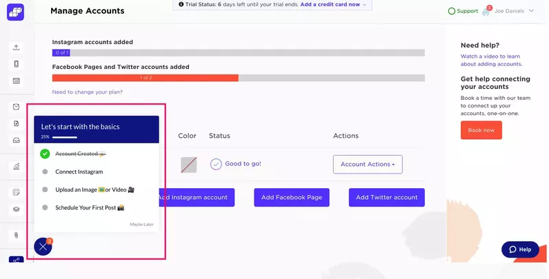
The solution? Implementing an onboarding checklist, which included:
- Four essential tasks to reduce the risk of overwhelming users.
- Elements like a progress bar so users could see how far they’ve come and stay motivated to continue.
- Checklist tasks linked to other onboarding elements, like product tours, to better educate users through each step.
As a result, users who completed the checklist were 3x more likely to convert into paying customers, demonstrating the effectiveness of a checklist.
The Room increased new user activation by 75%
The Room, a global talent platform, struggled with new users not uploading their CVs, a key activation point.
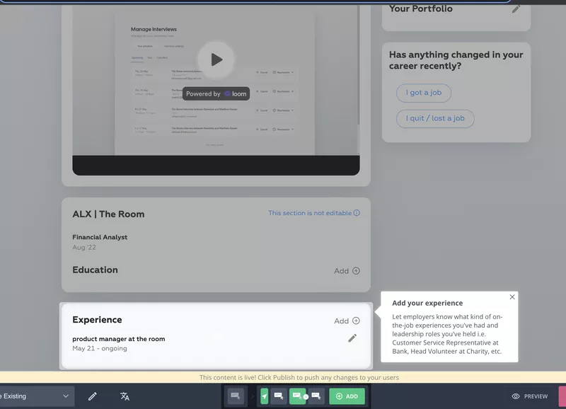
So, they created an in-app onboarding flow focused on driving CV uploads. Here’s everything the flow included:
- A “driven action” UI pattern that repeatedly prompts users to upload their CVs until completed.
- It provided job candidates with guidance on filling out the “experience” section.
- Engagement analytics to track the effectiveness of the user onboarding.
Because of these improvements, users engaged more, and CV uploads increased by 75% within 10 days.
Groupize gamified their user onboarding process
Groupize needed a new user onboarding solution within 6 days after their existing tool shut down before an upcoming launch.
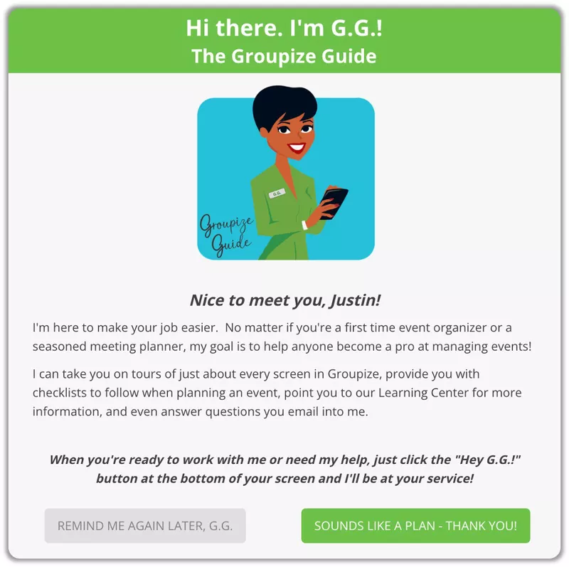
Groupize built an intuitive, gamified onboarding assistant, G.G, to guide users through interactive tours and checklists. Apart from G.G., Groupize also:
- Used a resource center to let users access G.G., trigger guided tours, and find help articles.
- Used native tooltips to update users about new functionalities in-app.
The implementation of G.G. led to improved user engagement and a significant reduction in support tickets. Plus, the innovative use of gamification also won Groupize a nomination for the Skift Idea Awards 2022, the travel industry’s top award for design and creativity.
FAQ
Why is user onboarding important?
The user onboarding process is important because it helps users:
- Understand your product’s value, encouraging long-term use.
- Experience early success and achieve their desired outcomes.
- Learn how to use your product effectively, minimizing frustration and churn.
- Build a positive relationship with your product and company.
What metrics can you track for measuring onboarding success?
To measure your onboarding flow’s performance, track these key metrics:
- Completion rates: Percentage of users finishing the onboarding process.
- Time to value: The time it takes for users to experience the product’s core value.
- Feature adoption: Usage rates of key features introduced during onboarding.
- Churn rate: Percentage of users who abandon the product early.
What are the 4 pillars of onboarding?
The 4 pillars of onboarding are:
- Compliance: Help new users understand duties, legal terms, policies, and security protocols.
- Clarification: Provide clear instructions on performance expectations and success criteria.
- Culture: Introduce the company’s values and mission to create a sense of trust and belonging.
- Connection: Build connections with team members and establish a support network.
These “4 Cs” are meant for employee onboarding. However, they can also apply to SaaS new users, helping them understand product policies and building a supportive user community.

