Interactive Walkthrough Guide: Examples, Best Practices, and Better Onboarding


Your users signed up. Then they disappeared.
Your onboarding failed them before your product had a chance to. A passive product tour that fires five tooltips and calls it done doesn’t teach anyone anything. It gives users enough rope to wander, get confused, and churn. By the time it shows up in your activation numbers, they’re already gone.
Interactive walkthroughs work differently. They make users do something inside your product, one step at a time, until they hit their first real success. That’s what drives feature adoption, reduces support costs, and keeps new users engaged past day one.
This guide covers how they work, how to build one without technical expertise, and nine real interactive walkthrough examples worth stealing.
What is an interactive walkthrough?
An interactive walkthrough is a step-by-step instruction that requires the user to take a specific action before showing the next step. The user must click a button, fill out a form, or navigate to a new page. The flow does not advance until they do.
That direct interaction is what makes walkthroughs work. Users learn by completing real tasks inside your product, so they leave each step with a practical understanding of the feature, not a vague memory of having read about it. In my experience, this is the difference between onboarding that activates users and onboarding that just checks a box.
What is the difference between an interactive walkthrough and a product tour?
The terms get used interchangeably, but they describe two very different things.
Product tours are passive: They fire a series of modals or tooltips that point out features across the screen. The user clicks “Next” five times, reads a wall of text, and clicks “Done.” Nothing was checked, nothing was confirmed. Most users click through without retaining anything, which is why passive tours correlate with low feature adoption rates.
Interactive walkthroughs require the user to perform a task before the flow advances: Users navigate through real actions inside your product, which means they achieve a specific goal before moving forward rather than just acknowledging that they saw a screen. That’s what keeps users engaged through the user onboarding process.
What are the different types of interactive walkthroughs?
The walkthrough you deploy depends on where a user is in the user journey. Different users need different guidance, and showing the wrong type to the wrong user segment does more harm than good.
| Category | Purpose | Best Time to Use |
|---|---|---|
| Welcome / Primary Onboarding | Guide brand-new users to their first major success in your app. | Immediately after a new user signs up and logs in for the first time. |
| Secondary Onboarding | Introduce advanced features to users who have already mastered the basics. | After the user completes their primary tasks and logs in for a subsequent session. |
| New Feature Announcements | Show existing users how a newly released tool works and why they should use it. | When launching a major product update or redesign. |
| Self-Service Support | Help users solve specific problems on demand without contacting support. | When a user clicks a help icon or searches within your SaaS knowledge base tools. |
How to build an interactive walkthrough step-by-step
Creating interactive walkthroughs no longer requires technical expertise or coding skills.
Step 1: Define your audience and trigger
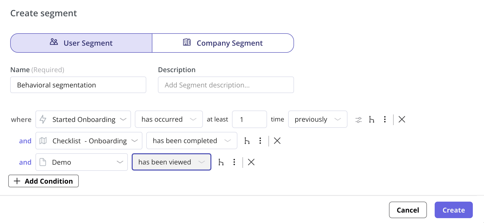
If you show your walkthrough to everyone, you will annoy most of your users. You need a clear path to your target users. Start by defining your user segmentation rules. Decide whether the flow should trigger for new users, power users, or users who just activated a specific integration.
Next, define the trigger. You can set the walkthrough to appear automatically when a user visits a specific URL, or you can trigger it manually when they click a specific element on the page.
Step 2: Select your elements
To guide users through your product, attach your steps to specific buttons or menus in your app. Using a visual labeler, click on the exact element you want the user to interact with so users navigate to the right place at the right moment. The system will automatically detect the CSS selector. If your application uses dynamic classes (like React or Angular often do), you can manually adjust the selector or use text-matching rules to ensure the element is always detected accurately.
Step 3: Add UI patterns
Choose how each step will look. You can use several step-by-step patterns:
- Modals: Use a large, central pop-up to welcome the user and explain the value of the workflow they are about to complete.
- Tooltips: Use small boxes attached to specific elements. Tooltips are perfect for pointing out exactly where the user needs to click.
- Driven actions: This is where the interaction happens. Tell the system to wait until the user clicks the element, hovers over it, or types text into a field before proceeding.
Step 4: Apply flow logic
A rigid sequence frustrates users. Apply flow logic to make the walkthrough adapt to their choices. For example, if a user clicks a “Skip” button, use logic to jump them to the final success screen. If they click “Tell me more,” direct them to an optional deep-dive step.
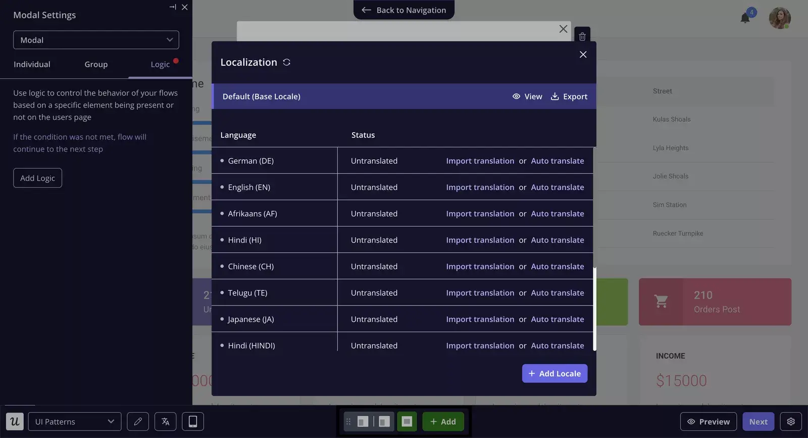
Step 5: Localize your content (optional)
If you have a global audience, forcing everyone to read English will hurt your completion rates. You can automatically translate your steps into the user’s native language based on their browser settings. Localization meaningfully improves completion rates in non-English markets.
What are the best practices for building interactive walkthroughs?
Building a walkthrough that moves activation numbers takes more than picking the right walkthrough software. Here is what I have learned from doing it wrong first.
- Get to the point quickly: Your first step should answer two questions: who is this for, and what will they achieve by the end? If the first three steps do not deliver clear value, most users will dismiss the flow before user engagement has a chance to build.
- Use progressive disclosure: Showing users everything your app can do on day one kills completion rates. Use progressive onboarding instead. Teach them the one feature they need to solve their immediate problem. Once they succeed, let them work. Later, when they navigate to a new section, trigger a short walkthrough for that specific area, including advanced features.
- Provide an escape route: Give users control. Always include a visible “Close” or “Dismiss” button. If a user feels trapped in a flow they do not want to complete, they will refresh the page or log out. Forcing users through a flow creates user friction. Let them skip it and offer a way to restart from a resource center later, encouraging users to return on their own terms.
- Test your assumptions: Create two versions of your walkthrough and pit them against each other. Use A/B testing to see which version drives higher completion rates based on real user behavior. Sometimes removing one step or changing a tooltip’s text is all it takes. Collect user feedback after each iteration and use continuous improvement to compound gains across your flows.
What metrics should you use to measure walkthrough success?
Walkthroughs that are not tracked are just assumptions. These user onboarding metrics tell you what is actually working.
| Metric | What it measures | What to look for |
|---|---|---|
| Completion rate | The percentage of users who start the walkthrough and reach the final step. | A rate below 30% usually means the flow is too long or triggering for the wrong user segment. |
| Time to value (TTV) | How long it takes a new user to achieve their first success. | A well-built walkthrough cuts this down by stopping users from wandering and surfacing valuable insights about where they get stuck. |
| Activation rate | The percentage of users who reach the milestones you define as activation. | Your clearest signal that users engaged with the flow and understood what to do next. |
| Feature adoption rate | How many users return to a specific feature the week after a walkthrough launches. | Strong numbers confirm the walkthrough translated into real user behavior change. |
| Monthly active users (MAU) | MAU trend after deploying new walkthroughs. | Sustained growth reflects the compounding effect of better digital adoption across your entire onboarding process: track at segment level, not just in aggregate. |
What tools and software can you use to create interactive walkthroughs?
The interactive walkthrough software you choose shapes what you can build, how fast you can build it, and whether your team needs technical expertise to maintain it. Here is how the top walkthrough creation tools compare.
| Tool | Best for | Coding skills required | Analytics capabilities | Ease of use | Pricing tier |
|---|---|---|---|---|---|
| Chameleon | Developer teams wanting deep UI customization | Some CSS knowledge | Basic | Medium, harder for non-technical users | Mid |
| Appcues | Teams wanting a polished no-code builder with strong mobile experience | None | Limited, often needs Mixpanel to supplement | High | Mid |
| WalkMe | Enterprise systems and internal employee digital adoption at scale | Significant | Robust | Low, steep learning curve | High |
| Userpilot | SaaS companies wanting behavior-driven walkthroughs with built-in analytics | None | Built-in, ties directly to engagement tools | High, no-code builder | Mid to high |
Examples of the best interactive walkthroughs for user onboarding
Length, tone, and timing all determine whether a walkthrough keeps users engaged or gets dismissed. The nine interactive walkthrough examples below show how real SaaS companies handled that balance and what you can take from each one.
Example 1: Attention Insight improved its user activation by 47%
Attention Insight had a solid product, a heatmap analysis tool with one-click trial signup. But there was one problem: users drop off before experiencing any value.
Instead of crossing fingers, they rebuilt onboarding.
So what changed? They launched a guided walkthrough, implementing interactive walkthroughs that used driven actions, requiring users to take action before the next step appeared.
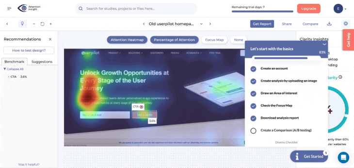
The flow walked new users through setting up their first heatmap, celebrated small wins, and helped motivate users toward the next step: defining Areas of Interest.
That small shift had a big impact. Activation rates jumped by 47%, and 69% of users now complete the key onboarding steps.
And it wasn’t just the walkthroughs. According to Darius Jokubaitis, CMO at Attention Insight
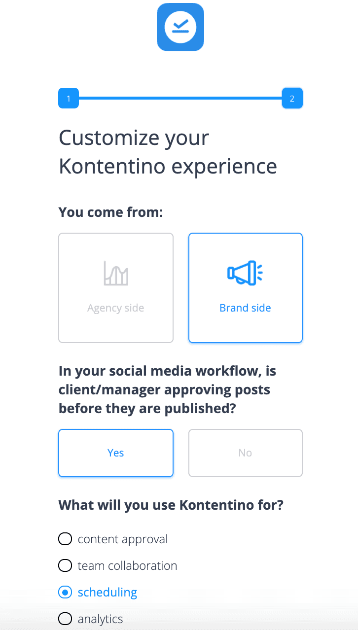
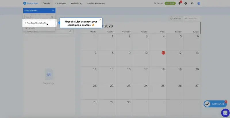
Example 2: Kontentino increased user activation by 10%
Kontentino, a social media management tool, increased user activation by 10% in the first month of installing a user onboarding tool. How, you ask? They created an interactive walkthrough instead of an ineffective product tour.
Kontentino first shows a welcome survey for user segmentation, allowing them to segment users into specific user segments and personalize their experience.
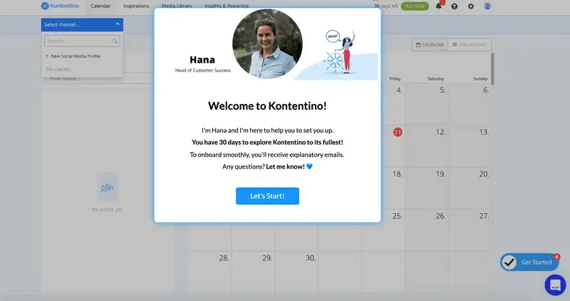
Then, there is a modal with a personal welcome from Hana:
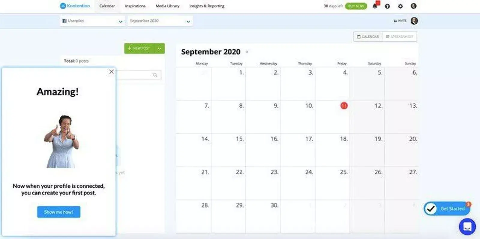
After that, Kontentino gently guides its users toward the two key activation points (linking the accounts and scheduling the first post) through a combination of tooltips and driven actions:
Once the first account is linked, a funny celebratory message pops up to gamify the experience:
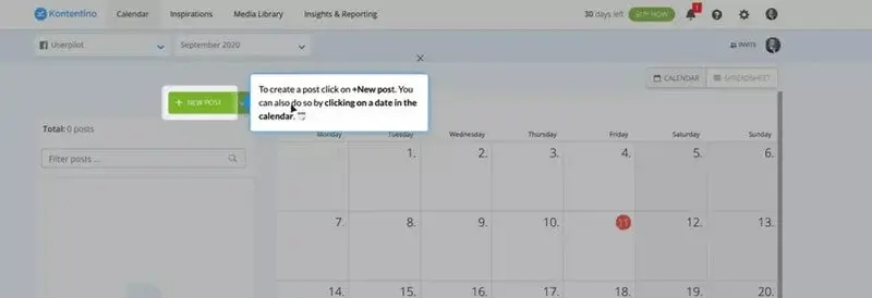
The next step, scheduling the first post, is made equally easy with an interactive walkthrough:
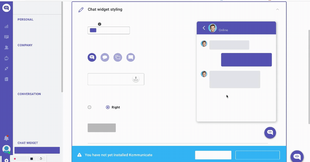
Example 3: Kommunicate.io increased feature usage by 3%
Kommunicate.io, a chat-based customer support tool, noticed something disturbing. Their customers kept asking for features that were already there. Users had no product knowledge of the platform’s capabilities or the tool’s features available to them. They decided to solve this problem by improving their onboarding.
Apart from adding a notification bar and an onboarding checklist, they created an interactive walkthrough to help and educate users on how to customize their chat widget.
Since its introduction, 86% of users have completed the chat widget customization step, which translates into a 3% increase in this feature’s usage.
“Since the introduction of feature adoption cues 86% of people have completed the chat widget customization goal.This translated into a 3% increase in the feature’s usage. It’s a substantial increase for us as well – even if it’s just 5% increase – it then translates into a 2-3% increase in revenue, which has a substantial impact on our MRR” – see how Kommunicate.io used onboarding to drive product-led growth in a data-driven way!
Example 4: RecruitNow saved thousands of training hours a year
RecruitNow, an applicant tracking system, experienced significant growth, which brought a host of new challenges across the entire process of onboarding new customers, and localizing its support resources for the other markets.
They created an interactive walkthrough, complemented by a resource center with video tutorials and automated localization.
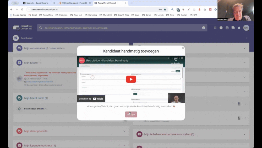
The result? Face-to-face training time went from hundreds of hours a month to only four, reining in support teams for high-touch work and boosting team productivity as part of a broader digital transformation effort.
Read this case study to learn how Userpilot helped RecruitNow scale its onboarding processes and facilitate its European expansion.
Example 5: Rocketbots saw a 300% increase in MRR
Rocketbots is a messaging platform that enables users to connect all of their inboxes in one app. Their challenge was that users didn’t experience the “Aha! moment” fast enough.
They built interactive product walkthroughs alongside a checklist, giving users a practical learning path to activation. When a user first signs up for Rocketbots, they are greeted with this screen:
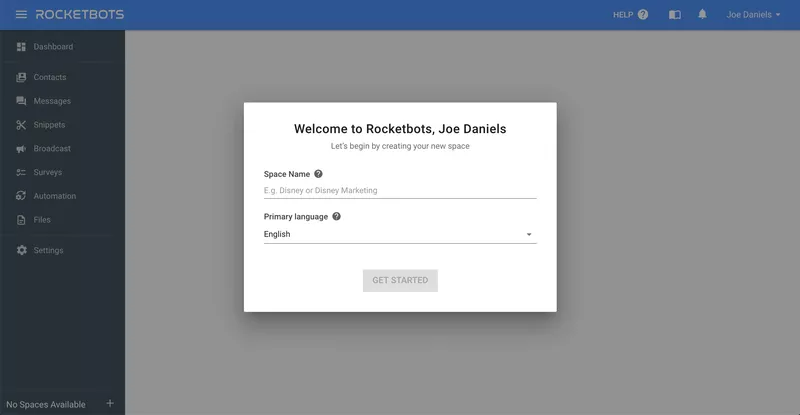
This welcome screen prompts them to take their first action. In this case, the first action is setting up a “space.” This is crucial to the running of the app, so Rocketbots makes sure you do this.
The user is taken to the dashboard. There’s quite a lot going on here, but fortunately, Rocketbots provides contextual guidance through a handy onboarding checklist:
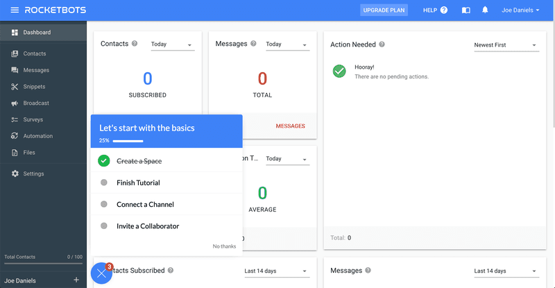
The new user onboarding checklist contains a couple of key events that Rocketbots wants new users to complete. First of all, they are shown a quick tutorial so that they know their way around messages.
The “Aha! moment” for Rocketbots, however, is realizing you can add practically any messaging service. The interactive walkthrough takes users to the relevant page and then points them to the button they need to press to add a service.
Rather than simply showing users the product, Rocketbots’ interactive walkthrough leads them to the “Aha! moment”.
Adding this interactive walkthrough doubled Rocketbots’ activation rate from 15% to 30%, with a 5% conversion rate and a 300% increase in MRR!
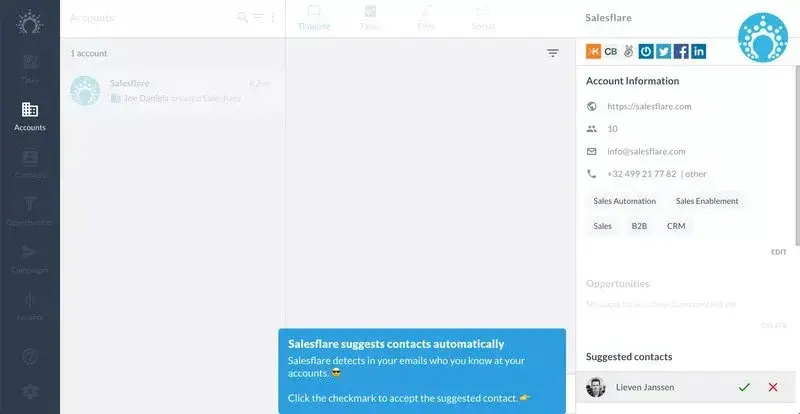
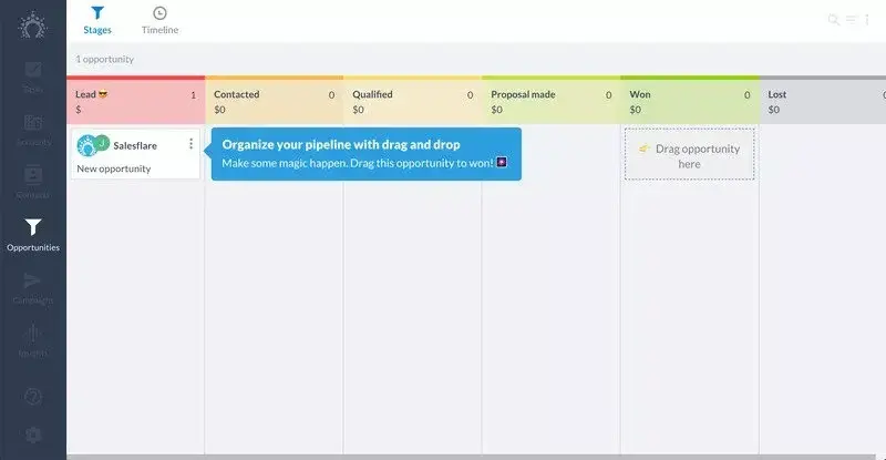
Example 6: Salesflare’s interactive walkthrough
Salesflare is one of the more intuitive CRM systems on the market that automates most of the work involved with keeping your contacts up to date.
CRMs can be complicated, but the strength of Salesflare is its simplicity. Its user-friendly interface is enhanced by its walkthrough, which keeps things simple and intuitive.
Their onboarding flow starts by acquainting users with the product, allowing users to choose whether to take the walkthrough.
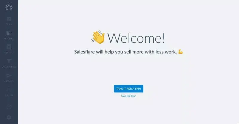
Giving users the choice works well, as it means those who prefer to find their own way around won’t have to sit through a tour and risk switching off.
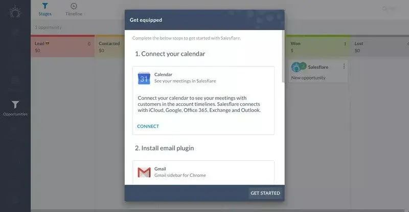
Once users start the tour, they are introduced to some of the key components of Salesflare:

As users progress through the app, an interactive walkthrough explains the benefits of Salesflare. But it also shows them how easy it is to use by pushing users to do it themselves.

Once users complete the interactive guide, they are prompted to connect different services and web apps.
Example 7: Demio’s product tour and interactive walkthrough
Demio is a webinar hosting service designed to make it even easier to share your webinars with the world.
When you first sign in to Demio, you receive one of the more creative interactive product tours on the market. Then, there is a webinar set up for you to join.
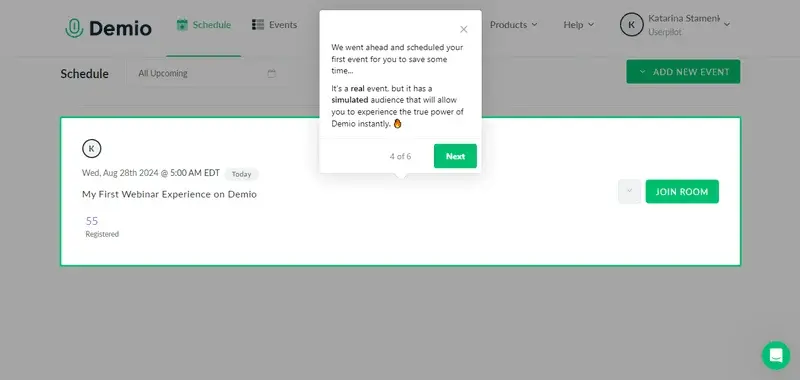
When you join the room, a Demio employee explains via a video that this is an example of the kind of webinar you can host.
After a brief introduction, she hands the reins over to you. You are now in charge of this fake webinar. You can share your webcam or even use the slides that Demio has added for you.
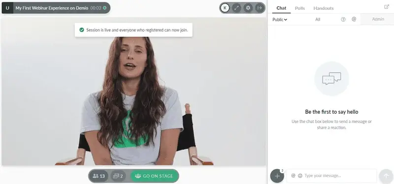
Demio’s “Aha! moment” is realizing just how simple it is to host a webinar with them. By letting you experience the product hands-on, Demio uses the walkthrough to enhance user experience from the first login.
Demio is a great example of how you can utilize walkthroughs and a product tour and create something entirely different from traditional training methods.
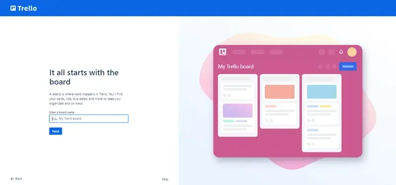
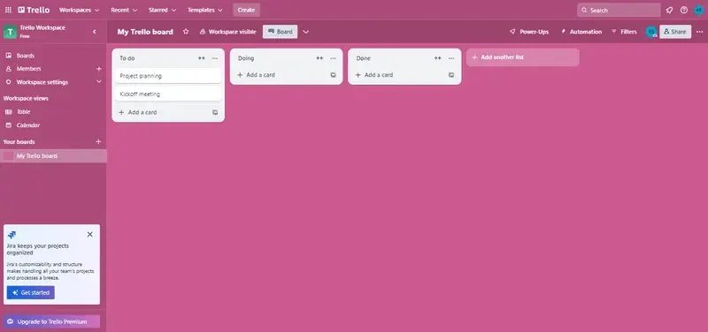
Example 8: Trello’s interactive walkthrough
Trello is a task management app that lets you organize your tasks and collaborate with other team members. With its app walkthroughs, Trello provides step-by-step guidance for setting up a first board so they can get started right away.
When users first sign up, Trello asks them to name their first board.
Next, it explains how Trello boards are structured in Lists. But of course, it doesn’t simply tell users, it empowers them to create some of their own.
It then explains Cards, prompting users to complete specific tasks and naturally introducing team communication features.
At this point, new users understand the hierarchy of a Trello board. They now know how it works. Not only that, but they have also been working to create their first board. After they’re asked to invite some team members, Trello takes users to the Trello board they just created:
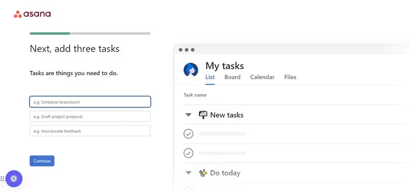
Example 9: Asana’s product walkthrough helps users create their own project
Project management tool Asana helps teams organize, track, and manage their workload. Similar to Trello, Asana’s interactive tutorial opens with detailed instructions for creating first tasks
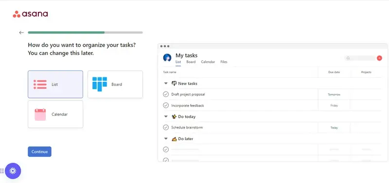
Then, it lets you choose from different visualization options, reassuring you that you can change this later:
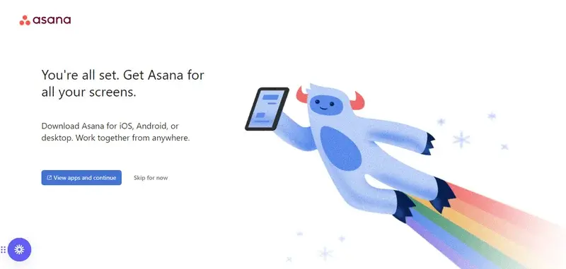
The product walkthrough ends with the option to invite teammates and download Asana for all your screens.
The flow works because it surfaces key features through action rather than explanation.
Start building walkthroughs that actually activate users
Onboarding is a product decision. The teams that treat it like one build walkthroughs that activate users. The ones that don’t lose them to confusion on day one.
If you want to build your first walkthrough or replace a passive tour that stopped converting, see how Userpilot helps you build interactive walkthroughs that drive activation, no coding required.
About the author