How to Create a Resource Center That Actually Deflects Tickets


Resource centers are one of the most common elements in a SaaS, and most of them don’t work the way they should in 2026. The typical one gets built during an onboarding sprint, filled with the same articles already sitting in the external help center, published with a tooltip pointing at it, and left untouched while the support tickets keep piling up. Users open the resource center, can’t find what they need, and file a ticket right away.
There’s a subtle difference at the fundamental level between help centers and resource centers. A help center helps users find answers, while a resource center helps users complete tasks inside the product.
Gartner found that 43% of customers can’t find content relevant to their issues in self-service, and in most of those cases, the content does exist; what’s broken is the structure and search. Most SaaS teams already have lots of help content, but users still contact support because they can’t find the right answer quickly enough.
I’ve built and rebuilt Userpilot’s resource center enough times to know where teams lose to an overwhelming number of support tickets. This guide covers what to include, how to organize it for both humans and AI, how to build one without filing a dev ticket, and the step most teams skip, which is almost always the reason the whole thing fails in the first place.

Why most resource centers fail to deflect tickets
The most common resource center failure is that it’s poorly organized and hard to navigate. Every help article, every recorded webinar, every PDF guide goes in, and the result looks thorough on a content audit spreadsheet. But when users arrive for help and when they can’t find what they need in under 30 seconds, they head straight for the support chat widget.
Gartner pegs self-service support at $0.10 per contact versus $8.01 for phone, live chat, or email. When the resource center exists but users can’t find what they need, you’ve absorbed the build cost and still paid the per-ticket cost.
The three most common culprits are:
- Bad search: If users can’t type a question and get a relevant result within seconds, they close the widget and don’t come back.
- Content organized by format rather than by job-to-be-done: It forces users to guess whether their answer lives in “documentation” or “video tutorials” rather than just finding it.
- Outdated content: Content that hasn’t been updated since your last major release misleads the users navigating it, and now it also misleads the AI assistant drawing answers from it. Unlike a confused human user who closes the widget, an AI will confidently serve the outdated information, that too at scale.
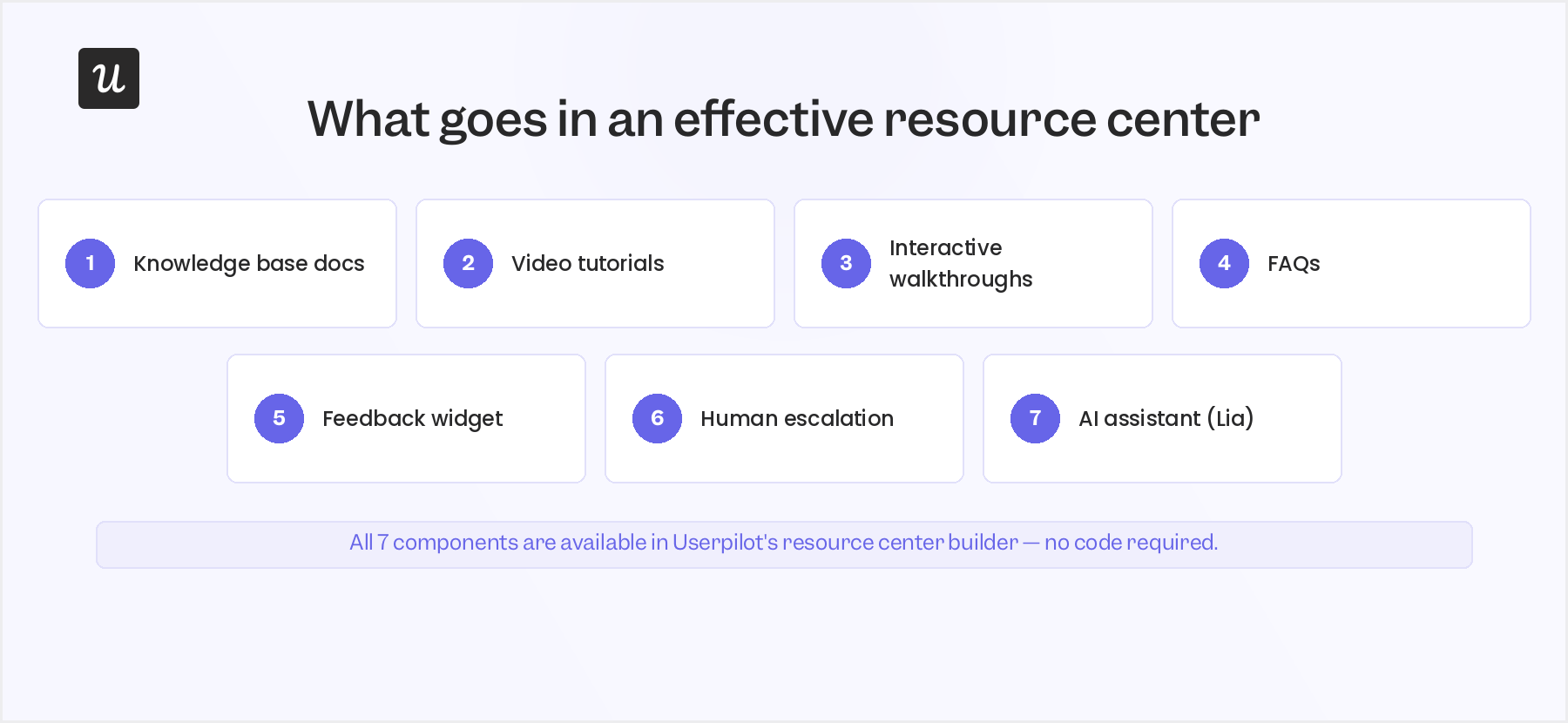
What to put in your resource center?
Before picking a tool or deciding on a structure, get clear on what an effective resource center actually contains. Most of the valuable resources you need are things you already have; they’re just scattered across different places and need pulling together.
Building the resource center around the customer service team’s ticket categories can help come up with helpful content that serves both the users looking for answers and the agents who need to send a quick reference link based on the relevant question the user had asked.
The foundation is user documentation, a set of step-by-step articles covering how to complete specific tasks. Write them by job-to-be-done rather than by feature name. For example, “How to set up a new onboarding flow” is more findable than “Onboarding flows documentation” because that’s how your end users will search when they need help with creating a new onboarding flow.
Video tutorials handle features that are easier to show than to explain in text, so always keep them short. A 90-second walkthrough showing a specific task performs better than a 15-minute “getting started” overview because it can be found and consumed in the context of the exact problem your users are trying to solve right now.
Interactive walkthroughs are the most underused content type in resource centers and often the highest-performing. Unlike static articles, interactive guides run inside the product itself and walk users through a task step by step. That’s the format most likely to produce actual task completion rather than just a generic walkthrough of an entire workflow.
While walkthroughs will definitely help your end users, there will still be something they’d feel missing, and that’s where an in-app feedback widget and a clear path to human escalation become essential. Because they lose patience fast, and a buried “contact support” link guarantees they’ll be frustrated when they finally reach a human support agent.
Two things that belong in every resource center in 2026 that weren’t standard practice two years ago are product updates (so users stay informed about new features without hunting for a changelog) and an AI assistant.
For example, our own AI agent, Lia, answers questions directly inside the product rather than making users navigate the content library themselves, which is the difference between a resource center that catches users before they file a ticket and one that doesn’t.
How to build a resource center that users don’t abandon after one search?
Most guides on creating a resource center start with user personas, and I think that’s the wrong starting point. Because when users reach out to your resource center, they don’t have the traits you have defined in a generic buyer persona. Their needs are totally different at that moment, and that friction was produced because of confusion caused by your product and not demographic differences.
Here’s how you can produce a resource center that works on day one and keeps working as your product changes.
1. Start with your support tickets, not user personas
Your support inbox is the most valuable brief you’d have. Analyze the last 90 days of tickets, sort them by category, and look at the top 10 to 15 recurring issues. Those are your content brief. They tell you exactly what users can’t figure out on their own, in the language they use to describe the problem.
Personas come after this, not before. Understanding who is asking the questions helps with personalization later, but knowing what questions are being asked is what determines whether your resource center deflects anything at all.
2. Segment your audience before you write a single article
Segmenting your target audience into distinct groups based on role, lifecycle stage, or behavior lets you create tailored content that speaks directly to each group’s unique requirements. New users who signed up yesterday need getting-started guides. Power users in month six need advanced feature documentation, and admins need configuration and team-management content.
Showing all three groups the same unsorted list guarantees nobody finds anything. Good segmentation also tells you where to invest content production time first. If 60% of your user base is in the activation phase, getting-started content should be your highest priority, regardless of what any persona framework says.
Understanding your audience goes deeper than grouping by role. Short surveys or onboarding interviews that surface the actual pain points, questions, and interests users bring to the product give you the language to write articles in and the topics that reflect genuine user needs rather than assumptions about what they could be asking. One built on real user questions delivers relevant information from day one; one built on product documentation assumptions mostly serves the team that wrote it.
3. Create content in multiple formats
Users absorb information differently, and the same user often wants different formats for different types of tasks. Someone troubleshooting an error message wants a text article they can scan in 15 seconds. A user learning a complex workflow for the first time wants a video or an interactive walkthrough, not a 2,000-word article.
Using multiple content types also increases the chance that at least one format lands on any given search query. For an in-app resource center, articles, short video tutorials, and interactive walkthroughs do most of the heavy lifting. External-facing content hubs oriented toward lead generation also include white papers, case studies, and industry reports, but the in-app support job is different and lighter, and usually better. If you think about it, a good in-app support/resource center helps retain users indirectly.
Adding visual elements and engaging multimedia formats beyond basic screenshots meaningfully improves how well users absorb complex multi-step processes. In terms of convenience, creating a screen recording of a workflow is much easier than annotating screenshots.
Furthermore, infographics, annotated UI diagrams, and recorded webinars covering common workflows give users a wide array of ways to consume the same information across different learning styles. For an external resource hub designed to drive traffic to your website, thought leadership content and industry insights are good assets to work upon. For in-app support, the job is practical and specific to the user’s current task. They shouldn’t be optimized for mass reach or user acquisition.
4. Organize by job-to-be-done, not by content format
I have shared this idea earlier, but let me cover this in detail here. The most common structural mistake in resource centers is organizing content by type, “Articles,” “Videos,” “Webinars.”
Users who need to complete a specific task don’t know which format contains the answer, so they have to check each section. A well-organized content hub groups resources by theme, challenge, audience, or persona, using metadata and tagging so users can filter across all formats at once. Think in terms of clear categories that mirror the questions users actually ask, like “Getting started,” “Managing your team,” “Reporting and analytics,” “Troubleshooting.”
If a user’s question is “how do I set up reporting,” they should see the article, the video, and the interactive walkthrough in the same place rather than hunting across three separate sections.
Adding brief summaries, visual thumbnails, and curated learning paths to your content library makes it scannable and lets users progress from beginner to advanced without hunting for what comes next. Users shouldn’t have to open a resource to know whether it answers their question. A one-line description of what an article covers, or a thumbnail that signals “90-second video, not a 3,000-word guide,” saves time and improves engagement with the resource center overall.
Good user navigation turns a collection of pages into an experience people can move through without friction. Using clear language in every category label, consistent formatting across every content piece, and a structure that lets users find relevant content quickly are what separate a well-organized resource center from a content dump. Even a short summary or piece of descriptive text beneath each article title makes sense for the same reason. It tells users whether to click without making them open the resource to find out.
5. Add search and filtering from day one
The Gartner finding that 43% of self-service failures come from users not finding relevant content is fundamentally a search and organization problem, and better structure alone doesn’t fully solve it.
A powerful search tool that interprets natural-language queries, supports filtering by topic, format, audience, or industry, and returns results across all content types lets users locate specific content quickly and is the single best structural investment in an effective resource center.
- Autocomplete suggestions help users who aren’t sure how to phrase their question.
- Advanced filtering lets users narrow results by category or content type without needing to know where anything lives.
- Monitoring what users search for and don’t find is also how you catch content gaps before they generate tickets, and it’s faster than any content audit.
6. Promote it so users actually know it exists
Publishing a resource center and waiting for users to find it is how you end up with high volumes of support tickets from day one. Promoting your resource hub means wiring it into the moments where users are most likely to need it. Use a tooltip to surface the resource center button during onboarding, and trigger a prompt when a user spends more than 60 seconds on a complex feature without completing the core action.
Other than in-app, add the resource center link to your welcome email sequence and product newsletters, feature it on your website’s landing pages and homepage, and share updates via social media so users outside the product can find their way in. These effective strategies bring more visitors to your resource center from channels your in-app tooltips can’t reach. Including social sharing options inside the resource center extends that reach further, where users who find a useful article can share a direct link through their own networks.
Furthermore, adding CTAs for related resources at the end of each article encourages visitors to keep exploring rather than leaving after their first answer. A user who came in with a billing question might find a walkthrough for a feature they didn’t know existed, and that kind of organic discovery can drive feature adoption without requiring additional outreach. Link directly from product changelog entries and new feature announcements to specific articles, so new content gets visitors from day one rather than waiting to be found.
7. Measure what works and update what doesn’t
A resource center engagement that doesn’t get measured doesn’t improve. The metrics that matter most are articles viewed per session, search queries that returned no results, and ticket deflection rate (the share of users who opened the resource center and didn’t file a ticket in the same session). Having said that, you can track the engagement in the Userpilot resource center, like clicks, article views, and last-click dates. This gives you valuable insights into which content is being used and which hasn’t been touched in months.
This is why I believe that regularly updating your content is vital to keep resources fresh, encourage repeat visits from users looking for new information, and keep search engines treating your resource center pages as credible sources rather than outdated filler.
To achieve that, you can set a quarterly review and check every article describing a UI or workflow that needs to be verified against the current product, because users who find an article about a feature that no longer behaves the way they remember will distrust everything else too.
If your resource center includes pages that search engines can index and/or dynamic pages that update regularly, it signals active maintenance and gets treated more favorably than static ones, which brings more visitors from organic search over time.
Basic SEO practices compound that advantage with descriptive page titles, meta descriptions, headers with relevant keywords, alt tags on images, and clean descriptive URLs for each resource page, all of which help surface your content to users still deciding whether to sign up or not. The same structural habits make your quality content easier for AI to parse.
Resource center examples worth copying
The useful thing about studying real resource centers isn’t the visual design. What’s worth copying is the specific structural decision each one makes that solves a distinct piece of the “users can’t find what they need” problem.
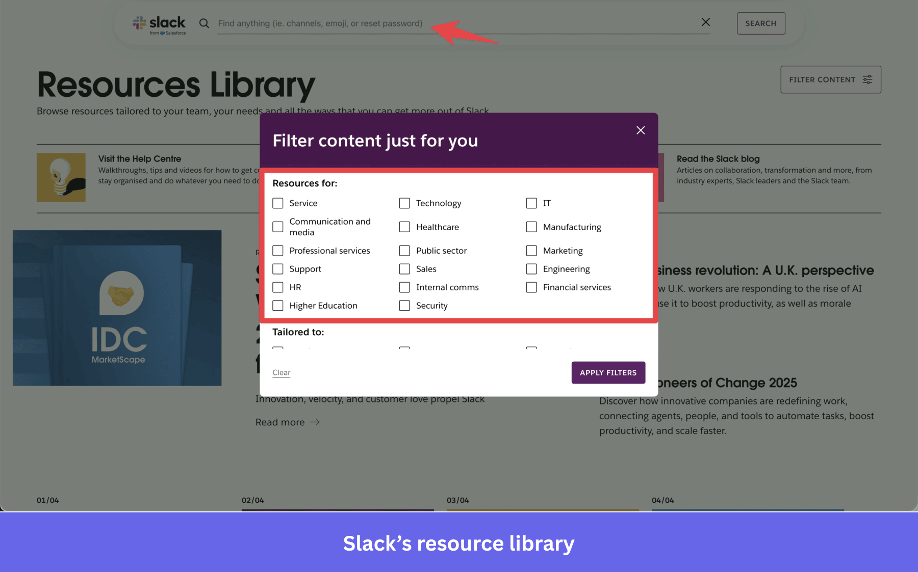
Slack is a great example of designing for users who already know what they want. The search bar is the dominant UI element, categories are minimal, and results surface across all content types at once. If your user base is experienced and task-driven, this is the architecture to model. It assumes users arrive with a clear question, and the resource center’s job is to answer it in one query.
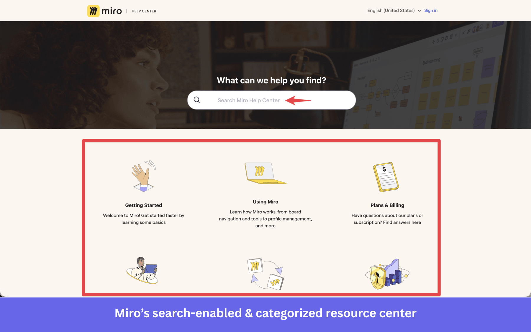
Miro leads with interactive walkthroughs in the “Getting started” section, each addressing a specific feature or task and launching directly inside the product. The product’s unique features are visual and spatial, so reading about how to use the canvas is dramatically less useful than being walked through it step by step inside the actual interface.
The most instructive example from Userpilot’s own customer base is Groupize, which built its resource center using Userpilot and layered G.G., its interactive assistant, on top to gamify the experience. Users earn points for accessing educational content, completing walkthroughs, and participating in polls. Support tickets dropped steeply as users turned to the resource center for answers they’d previously emailed in.
Gamification didn’t change the content at all; what it changed was users’ relationship with finding help for themselves. You can read the full Groupize story here.
Build your resource center once, maintain continuously
The steps for creating a resource center haven’t fundamentally changed. But what has changed is the bar for what “good enough” means. A resource center built during an onboarding sprint, filled with articles that roughly describe your product, and left alone, is no longer just a missed deflection opportunity.
In 2026, it’s also producing wrong answers through the AI layer sitting on top of it. The teams getting real user engagement from their resource centers treat it as a product, not a content project: regular reviews, usage data driving updates, and new features documented before they ship. A well-designed resource hub enhances user experience beyond simple deflection; it improves user satisfaction and builds the credibility and authority that come from a product where people can consistently find what they need.
Teams that invest time in a real content strategy, routinely updating quality content as the product changes, are the ones whose AI layers give accurate answers rather than fielding complaints about wrong self-service information. Userpilot makes the build fast and code-free, and Lia turns the whole structure into an always-on support layer that answers questions without your team in the loop.
Consider booking a demo to see how the Userpilot resource center builder and Lia work together.
About the author