Your Guide to In-App Communication: Types, Tips, and Examples
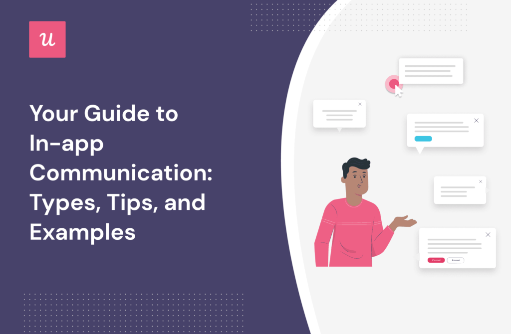
In-app communication is one of the most effective ways to engage with your users since it allows you to send contextual messages at the perfect moment. This also makes in-app messaging the ideal vehicle for guidance and upsells.
In this article, we’re going to dive deep into the types of in-app messaging, five best practices, and four real-world examples from successful SaaS brands. Let’s get right into it!
What is in-app communication?
In-app communication describes messages that are delivered to users while they are actively using an app (whether mobile, desktop, or browser). In-app communication is also often referred to as in-app messaging or mobile messaging which usually includes in-app notifications.
What is the use of in-app messaging?
In-app messaging helps you engage with users while they’re using your app. This customer communication makes it possible to prompt users to accomplish specific actions like clicking a button, testing a feature, filling in the information, or upgrading their subscription.
With the right use of in-app messaging, brands are able to create a positive customer experience within their product, boost customer success, and increase conversion rates.
What is the difference between push notifications and in-app messages?
While in-app messages and push notifications are often used interchangeably, they actually have very different purposes. Both are used for sending app messages to users but the main difference is where the users are.
Unlike push notifications, in-app messaging is used to communicate with users that are actively using the product. These could consist of in-app notifications about any ongoing activity or UI elements that guide users through their product adoption journey.
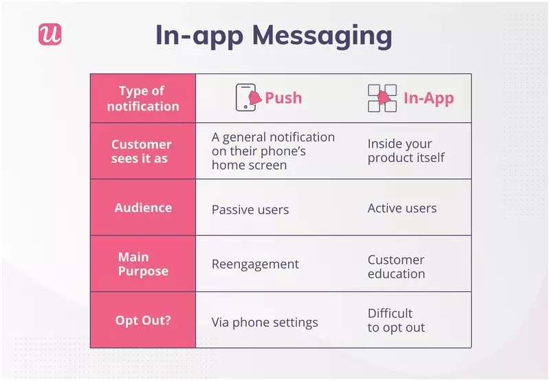
In contrast, push notifications are used to message users that aren’t using the product (either to alert them about a recent activity or get them to use the app again). In short, in-app messages are usually used for education, while push notifications are used for re-engagement.
Here’s a handy table that can help you identify push notifications vs in-app notifications:
Types of in-app messaging
There are six main types of in-app messaging that can play a role in your SaaS product marketing strategy. Let’s take a look at each type and how product marketers leverage in-app messaging to further growth efforts.
Modals
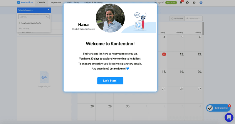
Modals appear as pop-ups on user screens while they’re actually using your app. Modals are great at attracting attention but, because they take up so much space, it’s best to use them scarcely to avoid being too intrusive.
A few examples of when you could use modals include feature announcements, limited-time promotions, product update notes, and welcome screens to activate new users. Here’s an example of how Kontentino uses modals to engage with its users:
Tooltips
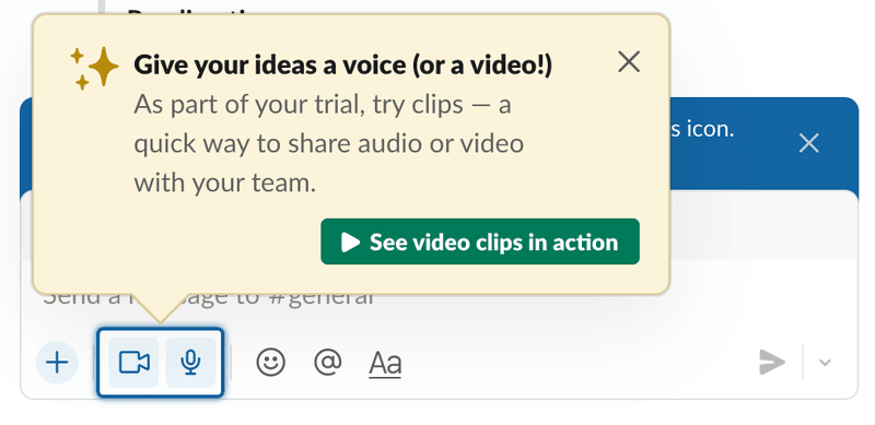
Tooltips are essentially the opposite of modals since they’re small, subtle, and don’t disrupt the user experience in any way. In most cases, tooltips appear after a user hovers over a specific UI element to give them more information about the selected element.
These contextual tooltips can be used to drive feature discovery, secondary feature adoption, and streamline the overall onboarding process for new customers. Here’s how Slack uses tooltips to promote its video clips feature to trial users:
Checklists
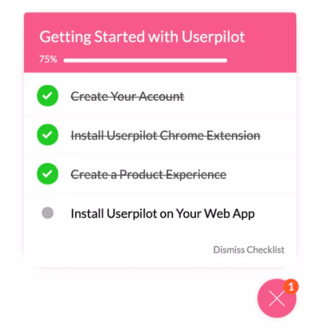
Checklists are a common form of in-app guidance that help move users through the customer activation funnel by showing them the next step in the onboarding process.
This is a prime example of how you can use in-app messaging to keep users motivated by giving them a visual way to track their progress (whether during account creation or onboarding flows).
Product walkthroughs
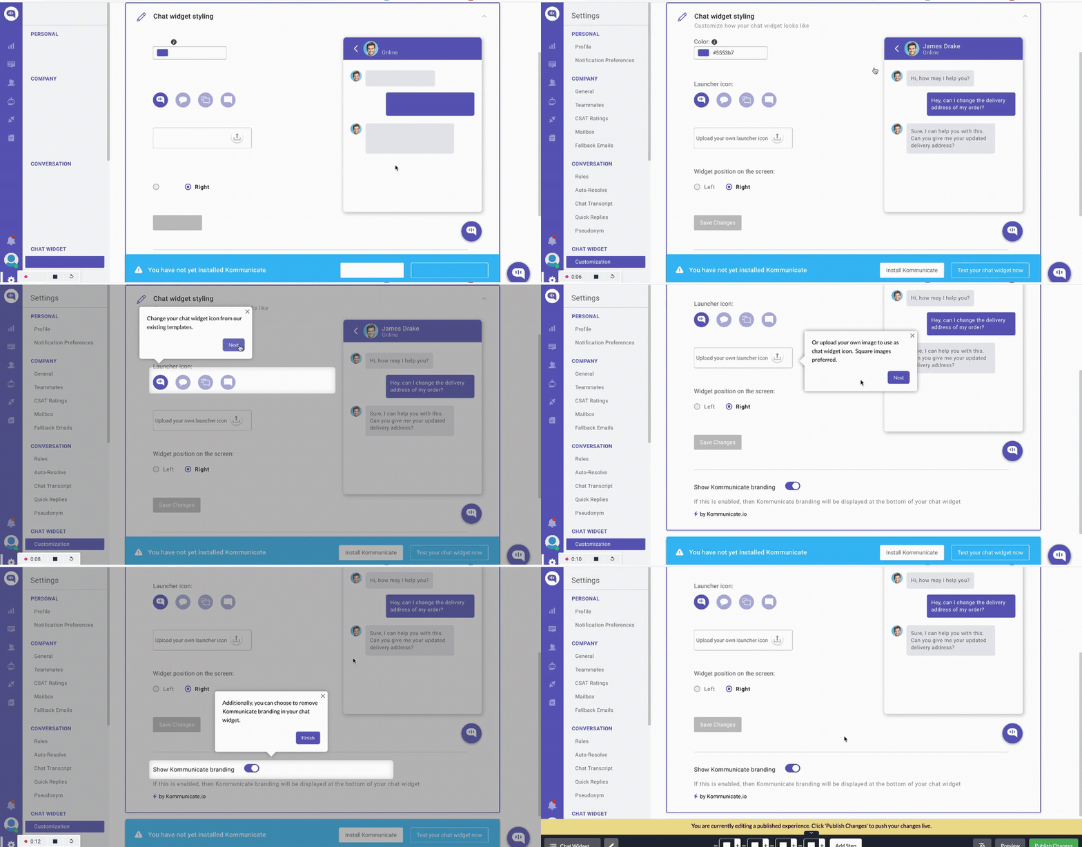
Interactive product walkthroughs are more effective than linear product tours since they have users learn by doing instead of dumping a ton of information on them all at once. Product walkthroughs are often made up of the UI elements described above to make them as contextual as possible.
Surveys
In-app surveys are an efficient way to capture customer insights right as they’re using the product. This real-time feedback will provide a more accurate representation of how users feel while they’re using the product rather than after using it.
In addition to getting insights on the overall app experience and user feedback on specific features, surveys are also a great way to learn more about the job-to-be-done (JTBD) of your users.
Bear in mind that in-app messages in the form of surveys should be short and to the point. So it’s best to stick to microsurveys when targeting users in real-time. More extensive surveys are better sent through other channels like email newsletters.
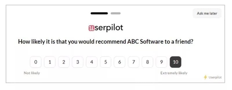
Net promoter score (NPS) surveys are one of the most popular ways to engage users with in-app messaging since they accurately gauge customer satisfaction by asking customers how likely they would be to refer other people to the product.
Chats
Last but not least, an effective in-app messaging campaign should include live chats. People using the app expect to get quick answers to their questions, and real-time in-app messages are the best way to meet those expectations.
Knowledge bases are a great place to store customer education resources, but real-time in-app messages (whether in the form of live chat support or AI chatbots) can be a far quicker way to relay information to users.
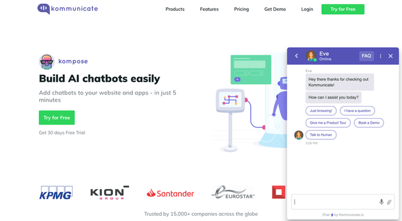
Product marketers often use in-app messages to reduce the time-to-value for new users and increase the retention rate for existing users. You can also use chatbots to announce new features or make a call to action like upgrading to a paid plan after a free trial.
Here’s how Kommunicate uses real-time in-app messages to help move users through the customer activation funnel:
Best practices for effective communication in-app
If you want to get started with in-app messaging, there are five best practices that all your in-app messages should follow. These best practices will serve as force multipliers that increase the efficacy of your in-app messages.
1. Derive messages from goals
In-app messaging is most effective when it’s purposeful. Instead of spamming your users with in-app messages, make sure there’s a clear goal behind every in-app message that you send.
Additionally, in-app messages should be structured as an interconnected web of elements that all serve a common purpose. Treating in-app messages as isolated elements will make your entire in-app messaging strategy feel disjointed to users.
The best way to target your in-app messaging strategy is to consider your top product goals and consider how various forms of in-app messaging could further those goals.
You should also think about the personal goals of your app users and how in-app messages could help them achieve those goals. One example would be using in-app messages to announce new features to the user segment that needs it most (based on user behavior).
2. Know your audience
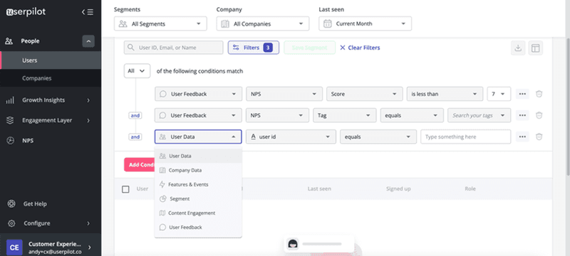
Knowing and segmenting your audience is the first step toward increasing the efficiency of your in-app messaging through personalized messages. There are various ways to segment users — by their demographics, psychographics, in-app behavior, lifecycle stage, and job-to-be-done.
Have a look at Userpilot’s user segmentation dashboard to get a feel for some of the data points you can use to create and track segments:
3. Speak their language
There’s a reason why SaaS localization has risen in popularity over the past decade.
Translating in-app messages to your user’s native language or adjusting the tone of your in-app messaging to suit different regions can be a great way to make in-app messages feel more relevant.
Irrelevant in-app messages are one of the fastest ways to annoy your user base. So make sure your in-app messaging strategy uses the right language, considers regional cultural differences, and creates an inclusive experience for all your customers.
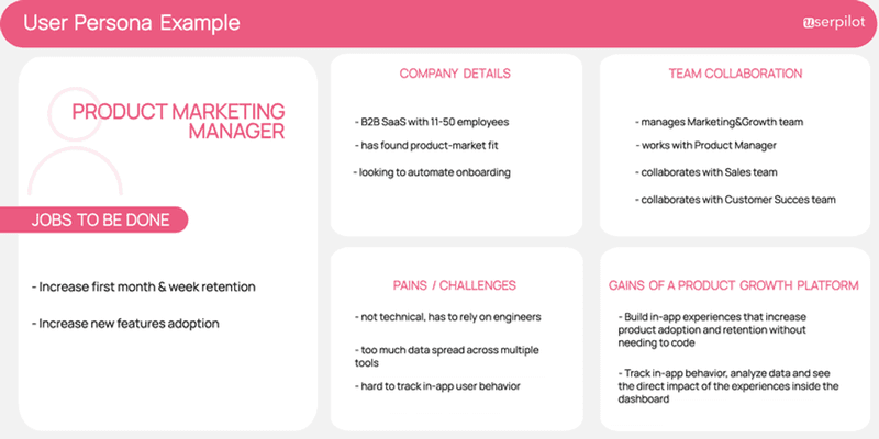
Creating user personas is a great way to create a picture of who your in-app messages are meant to target. By having multiple avatars to base your in-app messaging on, you’ll increase the odds of sounding more personalized.
Here’s an example template of what your user persona could look like:
4. Keep it light
In-app messages need to be clear, concise, and visually attractive. To keep the copywriting on your in-app messages as short as possible, be sure to omit any superfluous words or phrases. You can also use symbols like brackets or em dashes to make text boxes more compact.
Making in-app messages visually attractive, on the other hand, will come down to using multimedia, icons, white space, and other UI design elements that catch the user’s eye. You should also tailor these design elements to specific use cases.
If your in-app messages are meant to be call-to-actions then you may want to keep the pop-up white or gray while having the CTA button in red or other high-contrast colors. This ensures that the in-app message doesn’t only catch the eye of the user but draws it to the correct spot.
5. Test and improve
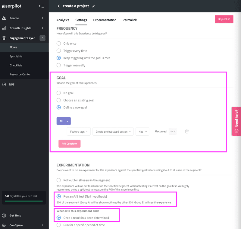
Testing the efficacy of your in-app messaging through product experiments, beta tests, and A/B testing are all proven ways to optimize the performance of your in-app messages. Continual split testing also gives you more data to work with.
By gathering performance analytics on your in-app messaging, you’ll be able to make decisions based on data instead of assumptions. Make sure that all your tests have a clear goal and plan to ensure you get actionable data on your in-app messaging efforts.
In-app messaging examples and use cases
Now that you’re familiar with the best practices and benefits of in-app messaging, it’s time to get a closer look at examples of in-app messages in real-world scenarios.
These in-app messaging examples will demonstrate how in-app communication and in-app messaging work to engage users.
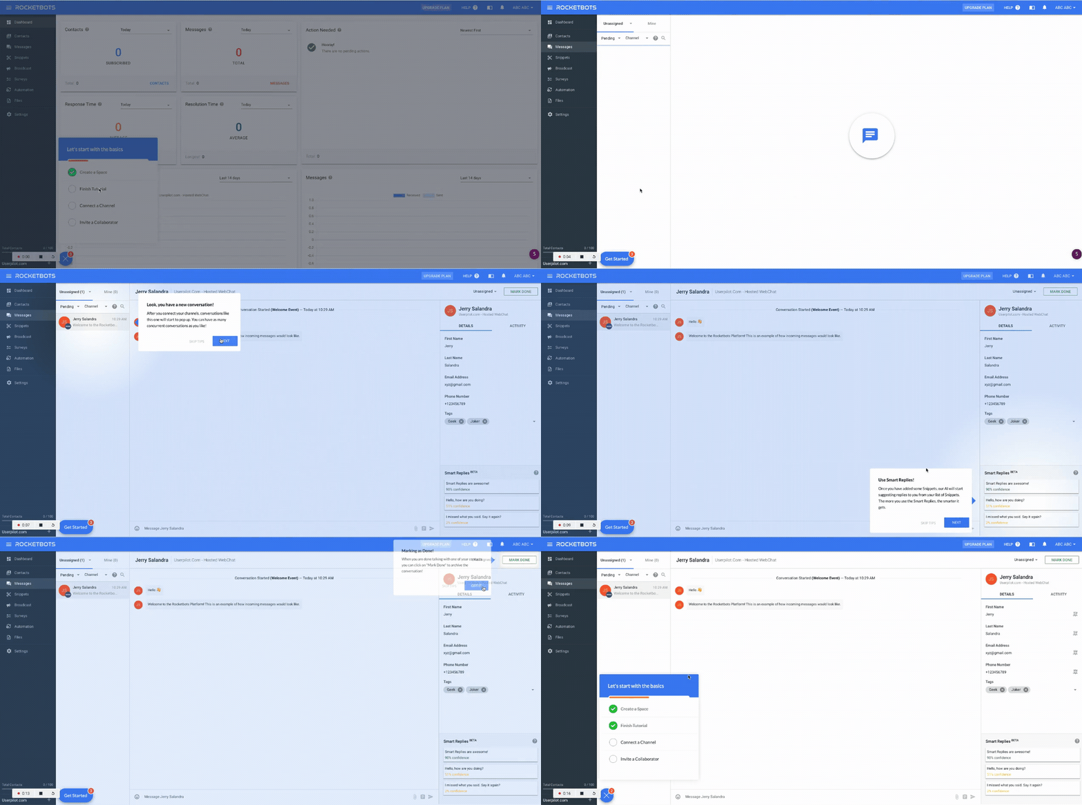
1. Rocketbots — User onboarding
Rocketbots uses in-app messages to move new users through the onboarding process. You’ll find multiple UI elements like tooltips being used to make the onboarding phase feel more digestible and streamlined for customers who are new to the Rocketbots interface.
Rocketbots also uses in-app messages to prompt their users with CTAs which speeds up the entire customer journey. The interactive walkthrough for new Rocketbots users is a prime example of how the brand uses in-app messages to move customers through flows.
2. Figma — Feature announcement
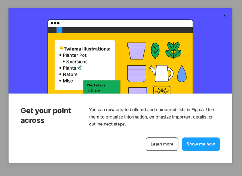
Figma’s graphic design and product marketing teams have been known to collaborate closely whenever they use in-app messaging to announce a new feature or drive adoption for existing features.
Figma also abides by the best practice of conciseness by keeping their in-app message short and clear. In fact, both the copy and the headline itself are shorter than the average in-app message which ensures that it won’t overstay its welcome with users.
Here’s an example of how the Figma team uses in-app messages to promote their bulleted/numbered lists feature:
3. HubSpot — Feedback collection
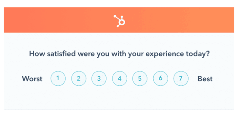
HubSpot has always been focused on measuring and optimizing the user experience (to great success), so users aren’t really shocked when they receive in-app messages from the company asking about their satisfaction.
HubSpot’s CSAT surveys are also well-designed with simple colors, easy-to-understand copy, and lots of white space to keep users comfortable. The look and feel may not impact the quality of the feedback collected, but it can increase the number of responses HubSpot gets.
Here’s how HubSpot uses an in-app message (in the form of a CSAT microsurvey) to gather user feedback from its customers:
4. Spotify — Account expansion
Spotify puts a lot of effort into creating a personalized app experience. Everything from its song-suggesting algorithm, annual “Spotify Wrapped” recaps, and new user onboarding flows are all a testament to that.
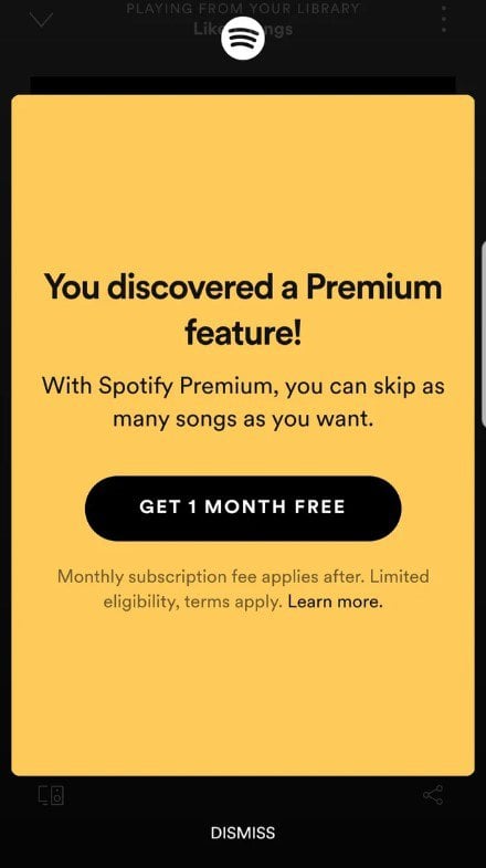
What Spotify app users may not know is that the company also uses in-app messaging to upsell users and drive account expansion. This is especially important for a company like Spotify which has millions of freemium users to convert.
This specific message is triggered by a contextual user action. It manages to provide a higher conversion rate while coming off as trying to help users rather than pitch them:
Conclusion
As you can see, nailing in-app messaging is a crucial part of onboarding, activation, retention, and expansion. If you procrastinate on creating an in-app messaging strategy, you could be leaving expansion revenue and customer loyalty on the table.
If you’re ready to build an effective in-app messaging campaign, get started with a free Userpilot demo today!

