Is In-App Messaging Still Working in 2026? A PMM Guide with Frameworks


I’ve always found it strange how confidently SaaS teams talk about in-app messaging compared to how users react to it.
Because if you spend enough time talking to customers or even just using software yourself, you’d be one of those people who close in-app messages instantly.
Users have been developing this behavior for years, but most conversations around in-app messaging still focus on what to ship — onboarding tours, feature announcements, upgrade prompts, empty-state nudges — instead of asking the more uncomfortable question underneath it all:
Do users actually pay attention to any of this anymore?
I think that question matters a lot more in 2026 than it used to because the conditions around user attention changed. People are navigating more products at once, shorter attention windows, more notifications, more tabs, more interruptions, and increasingly, AI-assisted workflows that reduce how often they interact with the interface directly in the first place.
Average screen attention dropped to 47 seconds in 2026, down from two and a half minutes in 2004. Knowledge workers now face 275 interruptions every workday and need 23 minutes and 15 seconds to fully regain focus, according to research from Microsoft and UC Irvine.
Meanwhile, most in-app messaging strategies still rely on interruption as the default mechanism for getting attention.
That disconnect is probably why so many teams are seeing the same pattern: launch the modal, ship the tooltip, add the onboarding step, and watch users close it reflexively. But I also don’t think the conclusion is “in-app messaging is dead.” Some messages still work extremely well, and of course, under specific conditions that I will discuss later in this article.
A second pressure most playbooks aren’t accounting for yet is the agent share of users. Gartner projects that roughly 40% of enterprise applications will embed task-specific AI agents by 2026, and those agents don’t open modals, scroll past banners, or hover for tooltips. They call MCP servers and APIs, finish the task, and leave.
So this article is my attempt to address when in-app messaging works and how AI changes the speed at which teams can figure that out.
How does in-app messaging work in 2026?
App messages are the messages displayed inside a web or mobile app while a user is actively interacting with it. Their job is to prompt users toward an action, give contextual guidance, announce a change, or collect feedback. They live entirely inside the product surface, which is the part that matters most when you’re trying to understand why they work or don’t.
In-app messaging is also frequently confused with push notifications, so it’s worth being precise. A push notification is sent from a server to a device and shows up on the user’s screen, whether or not the app is open. Users can opt out of receiving push notifications at the operating-system level, and many do.
In-app notifications appear only when the user is already inside the app. They can’t be opted out of in the same way, because they’re part of the product experience itself.
For top-tier mobile apps, in-app messaging still posts a 44% engagement rate according to Airship’s most recent benchmark. Medium-performing apps average around 26% when in-app is combined with push. Those numbers are real, and they’re also a survivorship bias trap; they describe the apps that have figured out timing and relevance.
Why are most in-app messages not working?
The collapse isn’t anecdotal anymore. Nielsen Norman Group’s 2026 update to its banner-blindness research found that users now skip over banners reflexively on both desktop and mobile, with detection rates dropping below what they were a decade ago. Users have trained themselves not to see entire categories of UI, which means the pattern is habit-based now, not attention-based.
Tooltip dismissal follows the same arc. The fastest-growing user behavior in any in-app messaging tool’s dataset is the “instant dismiss,” where a user closes a message in under two seconds without engaging with the content.
One of my favorite analogies is this one:
“Our team joked that users treat every banner like a mosquito… swat first, read later. Honestly, tooltips stopped working for us too. People just click the X like it’s a reflex at this point.”
r/SaaS thread on in-app education.
From the user’s side, the result is a wall of disconnected nudges that didn’t show up in response to anything they did. So they stop reading, then they stop seeing, then dismissal becomes a reflex.
Add to all of this the fact that almost no one tests their messages after shipping them. Teams ship a single guess as if it were a strategy, check engagement once, decide it’s “fine,” and move on. The signal back about what’s landing never gets generated, so next quarter’s playbook is built on the same assumptions that didn’t work last quarter.
How do you make in-app messages work?
If users are already conditioned to ignore most in-app messages, then the obvious follow-up question is: what still works?
I don’t think the answer is “better copy” or “more personalization” in the generic SaaS sense. Most users aren’t evaluating your modal closely enough for incremental improvements like that to matter. The bigger difference comes from whether the message respects the user’s momentum in the first place.
Here are two frameworks that help you build more effective in-app messages.
Framework 1: The earned-vs-interruptive lens
The most useful lens I’ve found for deciding whether a given in-app message is going to land or not has two questions. Did the user earn this moment? Is the message embedded in their workflow, or interrupting it?
The first is why the message appeared in the first place. Did it show up simply because the user opened the app or did it appear because the user actually did something that created a natural opening for the message?
The second is where the message appears relative to the workflow itself. Is it stopping the user mid-task to ask for attention, or does it feel embedded into the next step they were already about to take anyway?
For example, imagine opening a product for the first time and immediately getting hit with a modal announcing five “exciting new AI features” before you’ve even completed the task you came for. Most users close it automatically because they haven’t earned the context for that message yet.
Now compare that to a user who just finished creating their first dashboard and sees a small nudge explaining how to automate weekly reports. Now it’s more likely that they care because the message appears at the exact moment the next step becomes relevant.
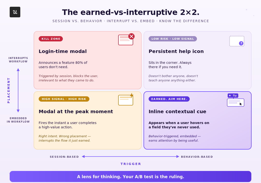
This lens is a thinking tool, nothing more. It can help you generate better hypotheses about which version of a message to ship, but it cannot tell you which version will win for your specific users. That answer comes from running the test in your product.
Framework 2: One message, one ask
Each in-app message should ask the user for one thing. The most common failure mode I see is the welcome modal that tries to introduce the product, announce new features, prompt an action, offer to upgrade, and invite feedback in the same breath.
Single-purpose means the message format, the copy, and the call-to-action all serve one job. If you catch yourself adding “also…” or “while you’re here…” to a draft, that’s a sign the message is doing two jobs and one of them needs to move somewhere else, or wait for a later trigger.
The reason I’d argue for this is cognitive cost. A single-purpose message lets the user decide in two seconds whether to engage. A stacked message asks them to parse what’s being communicated before they can decide, and inside a 47-second attention window, that gap is fatal.
Why should you always test your in-app messages?
Frameworks help you generate better hypotheses about which version of a message will land. They cannot tell you which version wins for your specific users in your specific product. The only way to know is to ship variants of the same message and watch what users do.
Sometimes, the difference between a message performing well or getting ignored comes down to surprisingly small changes. I’ve seen teams replace generic onboarding tooltips with tiny “Did you know?” cues embedded directly into the workflow, which later had better engagement rates.
Even our own customers, Smoobu, a short-term rental management platform acquired by HomeToGo, found success with A/B testing. Their team A/B tested an onboarding walkthrough in the French market: one group of new users got the walkthrough at signup, the other got nothing. Walkthrough users converted to channel connections at a 17% higher rate.
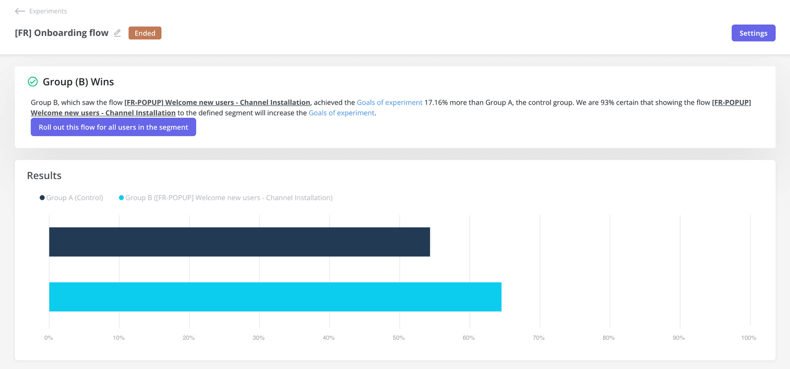 Dasha Frantz, the product designer who ran the test, put it this way:
“It allows us the flexibility to move fast, experiment, and really understand what users need.”
Dasha Frantz, Product Designer at Smoobu.
Three years ago, such A/B testing loop on in-app messaging would take weeks to get results: design pass, engineering ticket, two sprints of build, two weeks of measurement. Most teams I worked with ran one or two experiments a quarter and called it done.
This is where I think AI is genuinely useful in a product. We don’t think AI replaces product judgment, but it collapses how long the build-to-test-to-learn loop takes; the decisions about what to test and what to ship are still yours, the cycle time is what drops.
I can prompt Lia, our AI agent, to build three variants of the same flow in an afternoon. Each variant ships as a behavior-triggered A/B test, the data comes back in a week, and the winner ships. The cost of being wrong on any single variant dropped from a sprint to an afternoon.
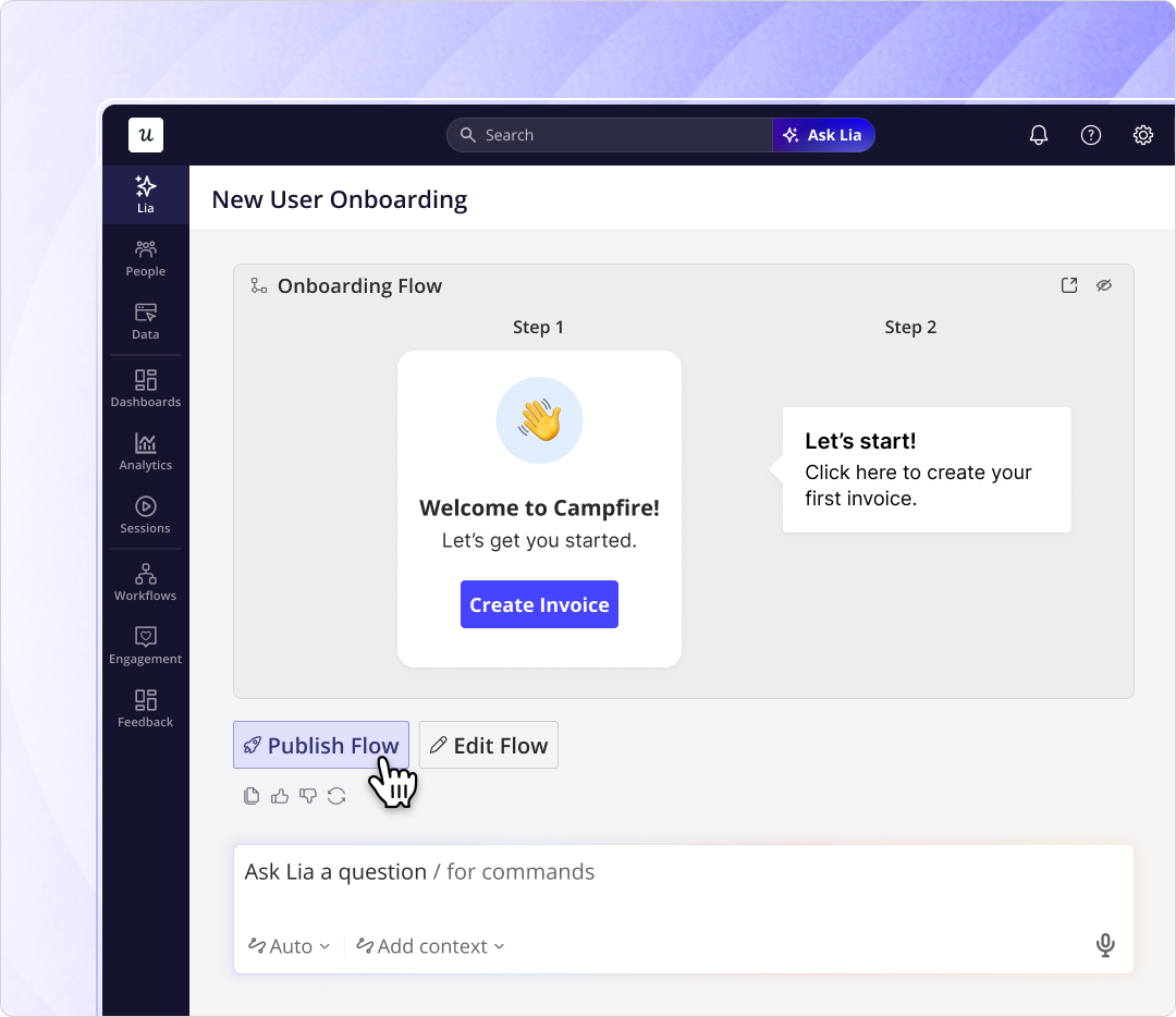
Userpilot’s built-in A/B testing feature handles the variant assignment, the segmentation, and the result analysis. The decisions about what hypothesis to test and what message to write are still on the team, but the build cost stopped being the bottleneck.
What does the future look like for in-app messages? Will they still work?
Everything above assumes the user reading your in-app message is a human. That assumption is getting weaker every quarter, and the Gartner number that 40% of enterprise apps will embed task-specific AI agents by 2026 is only one signal pointing in that direction.
Some of these agent users are explicit, set up by the customer to automate workflows; others are Cursor, Claude, or ChatGPT acting through MCP servers connected to your product. None of them open modals or read banners. They call the API, complete the task, and leave.
Userpilot’s MCP Server is one of the ways we’re starting to think about messaging to that share of users, but the bigger shift is conceptual. Yazan Sehwail, our CEO at Userpilot, framed it this way:
“People don’t wanna do any of this. That’s the truth. What it’s gonna be is that you literally do not need to do anything. You’re no longer operating. The AI is operating. You’re just basically evaluating and monitoring the agent workflow.”
Yazan Sehwail, CEO, Userpilot.
If a real share of your active accounts is operated by an agent that monitors rather than a human that clicks, every modal you ship is invisible to that share. I don’t have a clean answer for what in-app messaging looks like in that world, and I’d be suspicious of anyone who claims to. It’s a question worth carrying into your next planning conversation.
So is it worth investing in in-app messages right now?
Yes, when it respects the user’s momentum, when it matches a real user need rather than the team’s calendar, and when it asks for one thing at a time. No, the way most teams are still shipping it. The only way to know which side your product is on is to A/B test what you’re shipping, which is now a job that fits inside a week rather than a quarter.
If you want to start running that loop on your own users, book a demo.
FAQ
What is an in-app message?
An in-app message is any message displayed inside a web or mobile app while a user is actively interacting with it: modals, banners, tooltips, slideouts, checklists, surveys, and, on mobile, carousels. Its job is to prompt users to take action, provide contextual guidance, announce a change, or collect feedback. Because in-app messages live entirely inside the product surface, they only reach users who are already engaging with the app, which means they don’t compete with the rest of a user’s inbox or notification stack.
What is the difference between push notifications and in-app messaging?
Push notifications are sent from a server to a device and appear on the user’s screen whether the app is open or not, and users can opt out at the operating-system level. In-app messages appear only when the user is already inside the app, are part of the product experience itself, and can’t be opted out of in the same way. The practical difference: push is for reaching users outside the product, in-app messaging is for users already inside it.
What are the common types of in-app messages?
The most common formats are modals (center-screen, blocking interaction), banners (top or bottom, persistent), tooltips (inline labels tied to a specific UI element), checklists (ordered task lists for new users), slideouts (side panels sliding in from an edge), and in-app surveys (inline feedback collection). On mobile, you’ll typically see carousels (multi-slide swipeable sequences) and mobile slideouts as well. The right format depends on how much attention you can ask for and how embedded the message needs to be in the user’s workflow.
About the author