Pendo for Onboarding Automation: Features, Pricing, and Review21 min read
Get The Insights!
The fastest way to learn about Product Growth, Management & Trends.
Is Pendo a good choice for onboarding automation?
- Pendo is a good choice for onboarding automation and it comes with features such as user segmentation, onboarding checklist, self service support, and user journey mapping.
- There are a few obvious instances where you’ll likely need an alternative solution to Pendo — such as these use cases:
- Over 500 MAUs: If your product has more than 500 MAUs then you’ll need to subscribe to a premium Pendo plan (which tends to be significantly more expensive than other competitors on the market).
- Real-Time Analytics Needs: Companies that operate in fast-paced work sprints will likely opt for product adoption solutions with real-time analytics since Pendo’s one-hour data lag can data-driven decision-making difficult.
- Expensive Pricing Model: Pendo is more expensive than most solutions on the market and the subscription cost rises rapidly as your MAUs grow. Even if you’re on the Starter plan, you could be paying $35,000 annually once you reach 10,000 MAUs — which makes it harder to scale.
- If you’re looking for a better option for onboarding automation, Userpilot exceeds both functionality and value for money compared to Pendo.
- Ready to see Userpilot in action? Schedule a demo today to explore its powerful onboarding automation capabilities firsthand.
What is Pendo?
Pendo is a product adoption platform that lets teams monitor product usage, analyze user behavior, and publish in-app guides. The no-code solution focuses on increasing user engagement and driving feature discovery.
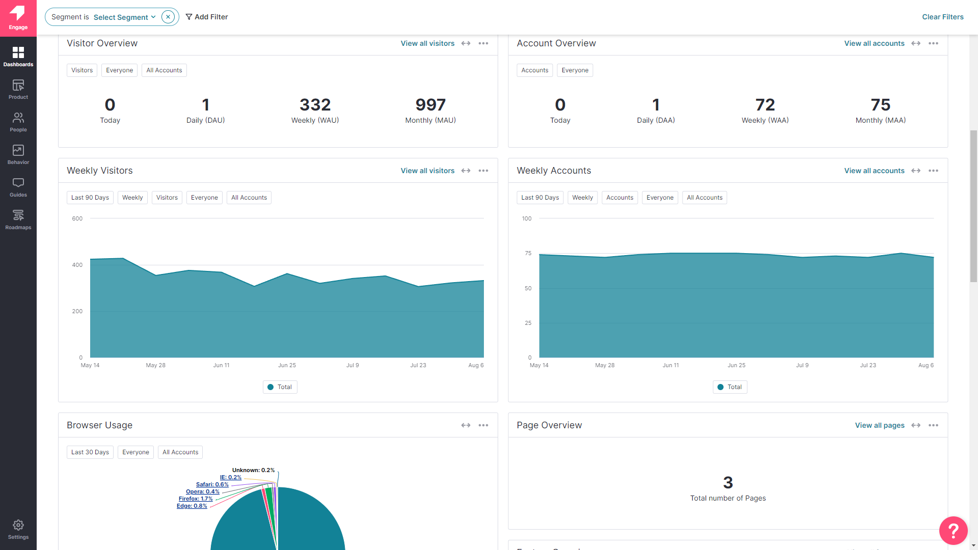
Additionally, Pendo also lets you survey users, segment customers, and see how many site visitors or MAUs your web app is getting. Certain features like product areas, data explorer, product engagement score, and resource centers are locked to the Starter plan or higher.
Must have features of onboarding automation tools
There are many onboarding automation tools available, so you may be confused about which one to choose.
Though the right tool will depend on your business goals and needs, here are the must-have features for any onboarding automation tool.
- Make sure the tool you choose isn’t limited to just product tours. Pick a tool that provides various UI patterns (modals, slideouts, banners, checklists, hotspots) to create beautiful welcome screens, and interactive walkthroughs to guide new customers and delight them from the very beginning.
- Look into getting decent segmentation capabilities based on in-app behavior and in-app experience engagement so you can trigger onboarding flows properly.
- An in-app help center is another feature that you should be looking for in an onboarding automation tool. With this, you can collect all your documentation files, tutorials, and videos in one place and offer on-demand support.
- Integration with 3rd party apps and tools so you can gain more insights and collect them in one place.
There you have it. These are the basic features that any solid onboarding automation tool should cover. Do your own research before buying a tool and make sure it’s aligned with your business goals.
Pendo features for onboarding automation
Pendo is a product adoption platform that has the usual onboarding features that are commonly included with similar solutions. However, those using Pendo Free will need to note that they’ll need to find a new onboarding solution once they cross 500 MAUs or upgrade to the paid version.
There are a few ways you can use Pendo to improve your new user onboarding flows:
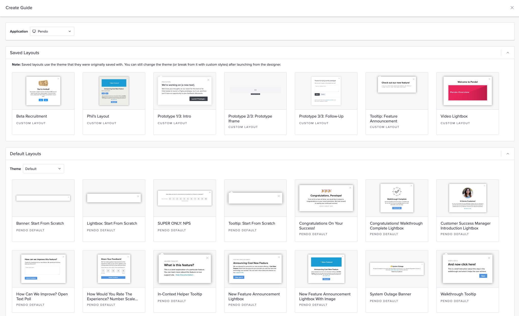
- Guide Layouts: Pendo has layout templates for lightboxes, banners, and tooltips that you can use to build onboarding flows for new users.
- Flow Triggers: Pendo’s guide activation options let you trigger an onboarding flow when new users land on a particular URL, use a specific device type, interact with a tagged element, or match the target segment.
- Localization Settings: Localization settings can stop an onboarding flow from triggering if it hasn’t been translated into the user’s chosen language. Because Pendo has no AI-powered localization features, you’ll need to upload language CSVs manually for this to work.
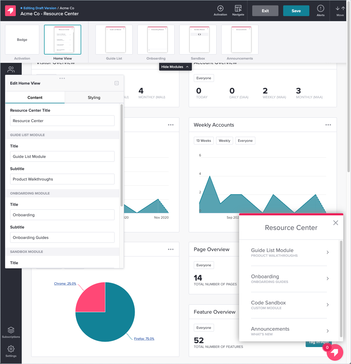
- Onboarding Module: You can add the onboarding module to your in-app resource center in two clicks then change the color, text style, and progress icon to align it with your product’s brand palette.
Pendo’s user segmentation
Pendo’s analytics-heavy focus has led to extensive segmentation capabilities within the solution.
Here are a few segmentation rules you can use when configuring in-app guides, filtering analytics, or collecting feedback from users:
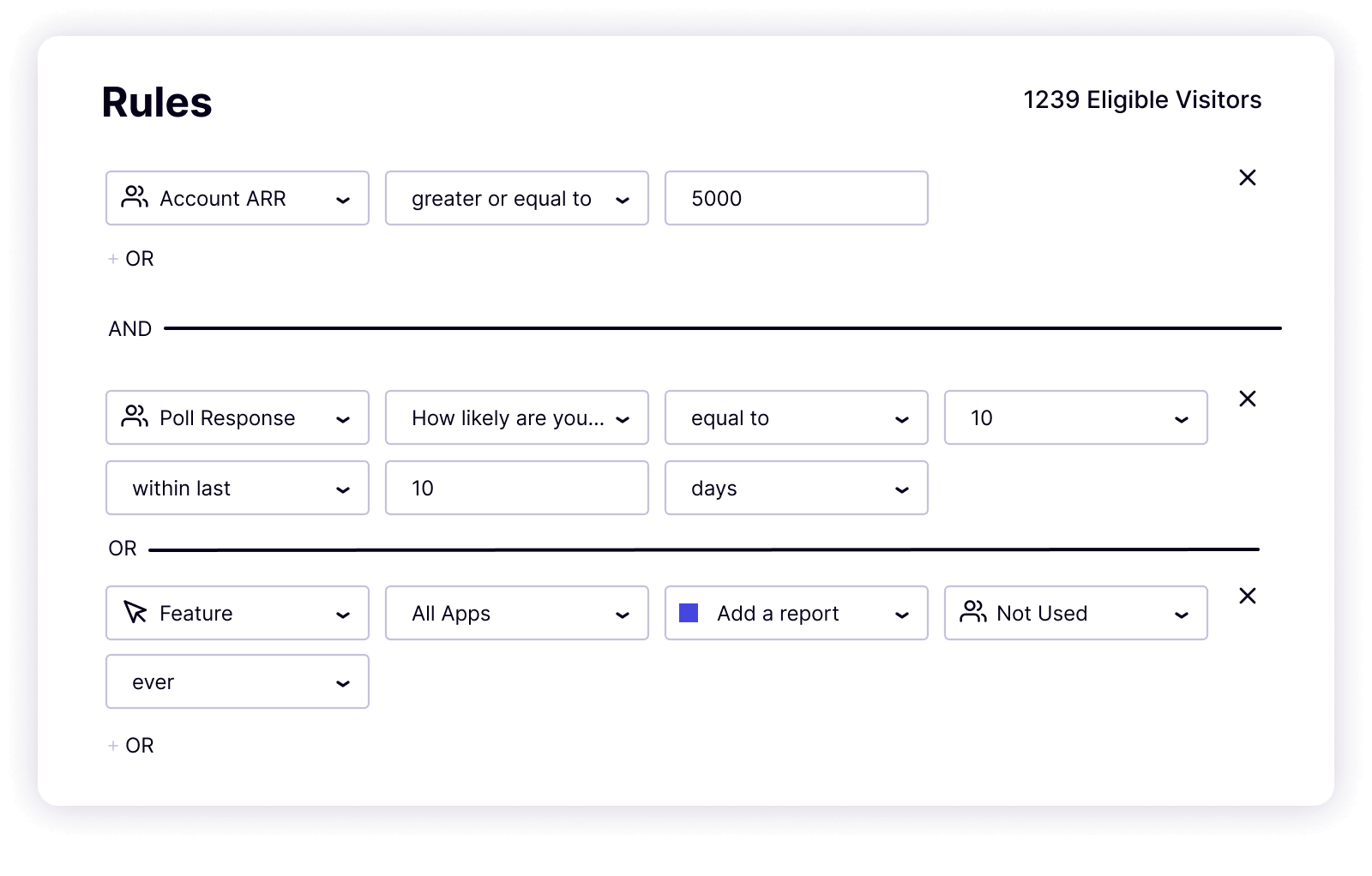
- Guide Targeting: Pendo lets you use segmentation rules as triggers for in-app guides. These rules include the type of device a user is on, what their chosen language is, which URL they’re currently on, whether or not they’ve interacted with an element, and which segment they’re in.
- Survey Segmentation: You can use Pendo segmentation rules to segment users based on their responses to recent polls. You could then target that segment with personalized in-app flows (e.g. showing upsell popups to customers who left positive poll responses).
- Segmented Feedback: If you get the separate Pendo Feedback product (charged on a per-seat basis) then you’ll be able to filter feedback based on which segment respondents are in, how much they spend on your product, and other user tags on their account.
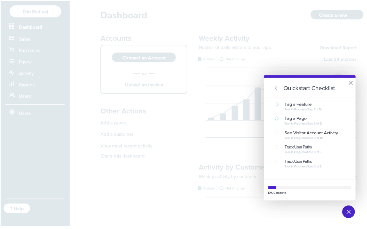
Pendo’s onboarding checklist
Pendo’s checklists can only be created through an in-app resource center (which is locked to the Growth plan). This means that you’ll need to upgrade to a five-figure annual subscription — and even then you won’t be able to create a standalone checklist outside the resource center.
Here are a few Pendo settings you can use to optimize your onboarding checklists:
- Segmentation: Pendo recommends that onboarding checklists be segmented so that users only see them within the first 30 days of their initial product interaction. This ensures that it won’t clutter the UI of proficient users who no longer need onboarding assistance.
- Analytics: All interaction data for your onboarding checklist can be found under the resource center metrics tab of your Pendo account. You’ll be able to see the total number of views, visitors, and clicks — along with which segment the checklist is visible for.
- Triggers: Because onboarding checklists need to be created within the resource center, this rules out any ability to use event-based triggering or have the checklist pop up in response to a specific user action.
Pendo’s self service support
Self-service support is a must-have for any SaaS company.
Here are the best Pendo features to use for self-service support:
- Resource Center: Pendo’s in-app resource center can serve as a self-service portal with different modules for each stage of the user journey. Create a dedicated section for onboarding resources or segment the visible modules so users only see the most relevant guides.
- Tooltips: In addition to educating new users, tooltips can also be used to link to product documentation, onboarding resources, and tutorial videos that will help your customers solve their own problems.
- Live Chat Integrations: When you integrate your Pendo account with either Drift or Intercom, you’ll be able to embed a live chat widget within the in-app resource center. This is very helpful for customers who try to solve a problem themselves but realize they need real-time assistance.
Note: You’ll need to upgrade to the Complete plan or higher to use Pendo integrations and resource centers.
Pendo’s user journey mapping
A journey map is a document that visualizes the steps users (or user personas) take to reach a certain goal, such as completing onboarding or upgrading to a paid plan. Pendo’s “Funnels” feature is the primary journey mapping function available on the platform.
Here are the benefits of using Pendo’s journey mapping capabilities:
- Navigational Patterns: Pendo’s funnel analytics can show you the paths that most of your users take so you can plan your in-app guidance flows accordingly or identify any neglected product areas.
- Behavioral Insights: The ability to see areas where users stop, start, or fail to complete specific tasks can help you spot areas that need improvement. These insights are especially helpful when trying to reduce friction or improve your customer effort score (CES).
- Cross-App Journeys: Tracking how users navigate your product portfolio can uncover upsell or cross-sell opportunities that you had not previously considered. Do note that this feature is only available on the Pendo Portfolio plan, which is more expensive than the Growth plan.
What are the pros and cons of Pendo?
Pendo’s pros
Let’s take a look at some of the benefits of using Pendo:
- No-Code: Pendo lets you create surveys, in-app guides, and track metrics without needing to write your own code which saves a lot of time (while making product experiments or split-testing a lot easier).
- Custom Themes: Pendo’s themes let you create multiple palettes and ensure that any in-app materials published align with your existing brand palette (however you can only create/customize themes after you’ve installed the Pendo snippet).
- Flexible Dashboards: Pendo has plenty of widgets that you can add to your dashboard including feature adoption, net promoter score, poll results, guide engagement, product stickiness, and MAUs — so you always have your most important metrics within reach.
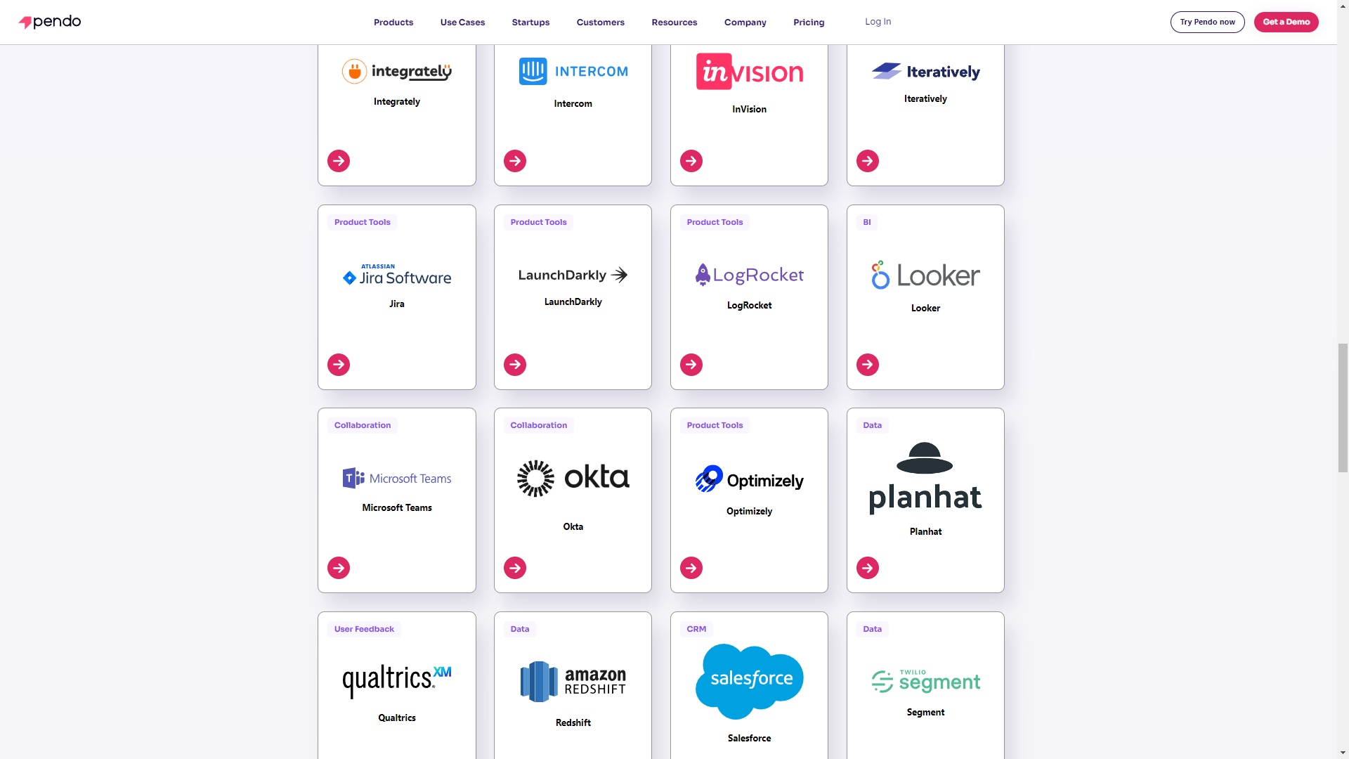
- Integrations: Pendo has 50 different integrations to choose from including popular tools like Intercom, Jira, Okta, and HubSpot. Unfortunately, only four of these — Salesforce, Segment, Workato, and Zendesk — are two-way integrations that can share data both ways.
- Multi-Platform Analytics: Because Pendo is compatible with mobile applications, you’ll be able to track product analytics for both web apps and mobile apps. This gives you a more holistic view of how users (or specific segments) use your product on different platforms. Note: You’ll need to upgrade to Pendo Portfolio to add more than one product to your account.
Pendo’s cons
While Pendo certainly has quite a few benefits that make it an appealing solution, there are also a few notable drawbacks that you should be aware of before you choose the platform as your product adoption tool:
- Pricing Jumps: While Pendo does offer a free version, it has a limit of 500 MAUs. Upon reaching the MAU limit, you’ll need to upgrade to continue using most of Pendo’s features (and paid plans tend to cost thousands of dollars per month).
- Locked Features: Key features like the data explorer, resource center, and product engagement score are locked behind the Growth or Portfolio plan.
- Data Lag: Pendo’s analytics dashboards only update once per hour. In some cases, this data lag could lead product teams to make the wrong decisions or draw false conclusions from outdated insights.
What do users say about Pendo?
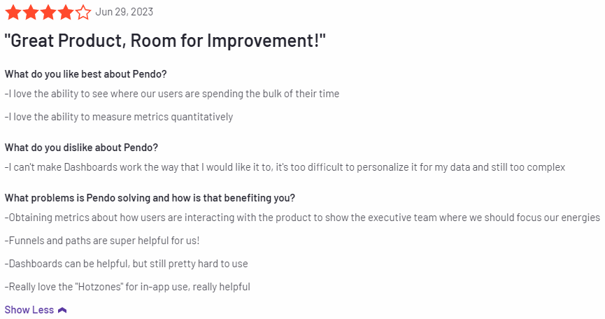
Most Pendo users seem to be quite happy with the solution despite a few personalization roadblocks and usability challenges:
I love the ability to see where our users are spending the bulk of their time. I love the ability to measure metrics quantitatively.
Other users were less satisfied with Pendo as a product adoption solution due to the amount of effort it takes to actually use the tool on a regular basis:
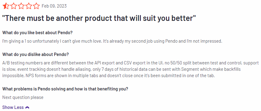
I’m giving a 1 so unfortunately I can’t give much love. It’s already my second job using Pendo and I’m not impressed. A/B testing numbers are different between the API export and CSV export in the UI, no 50/50 split between test and control, support is slow, event tracking doesn’t handle aliasing, only 7 days of historical data can be sent with Segment which make backfills impossible, NPS forms are shown in multiple tabs and doesn’t close once it’s been submitted in one of the tab.
Pendo’s pricing
Pricing for most paid Pendo plans (except Starter) is only provided on a quote basis and there are no listed price ranges on the solution’s website. That said, certain reviews have stated that prices start at upwards of $20,000 per year for a single product and more than twice that for higher plans.
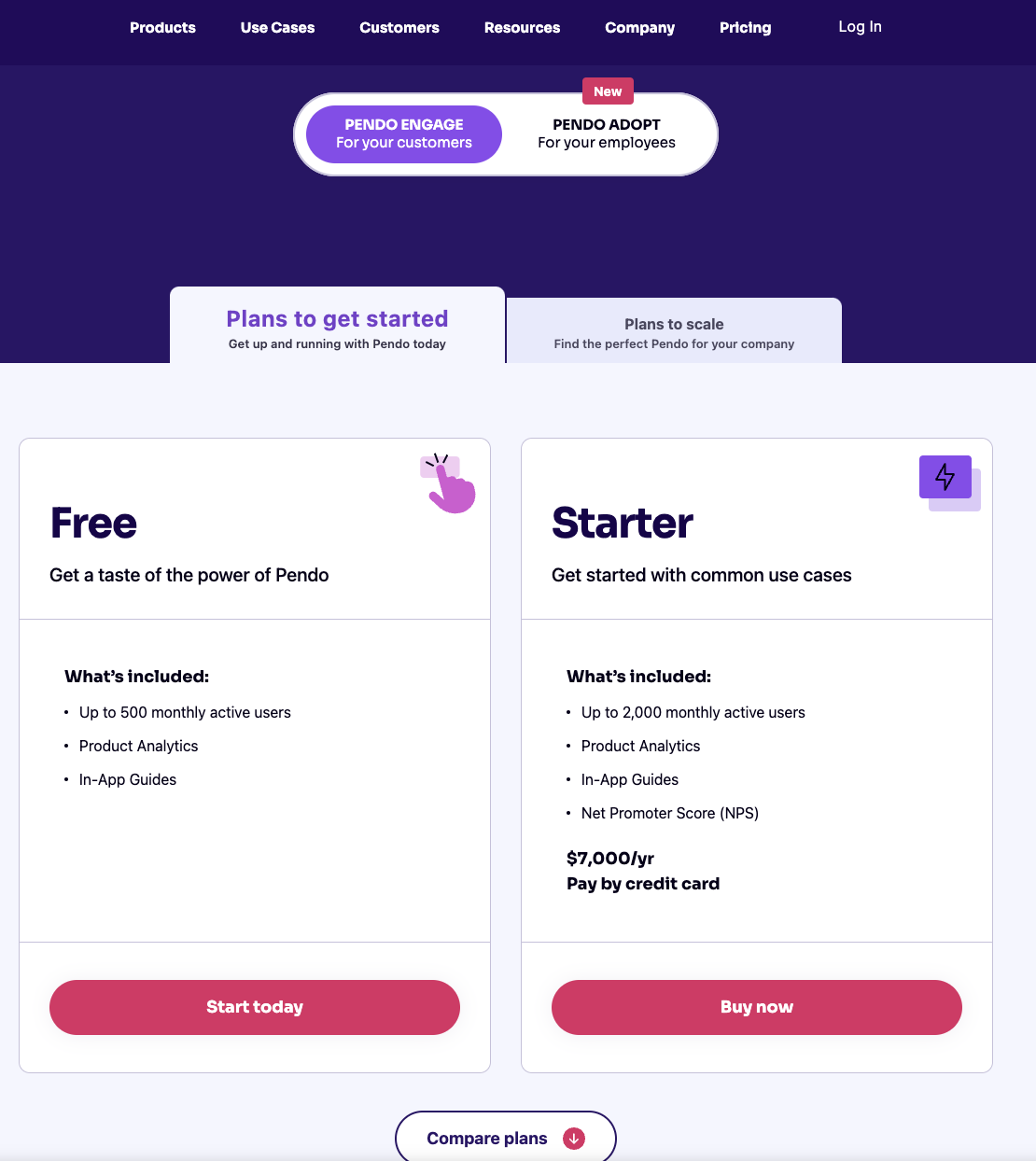
Pendo has three paid plans and one free version that is limited to 500 MAUs which makes it accessible to startups but difficult to scale in the long run.
Here are the differences between each Pendo plan:
- Pendo Free: The free version of Pendo can accommodate 500 MAUs and has features like native analytics dashboards, feature tagging, event tracking, segmentation, NPS surveys (with Pendo branding), analytics reports, and in-app guides.
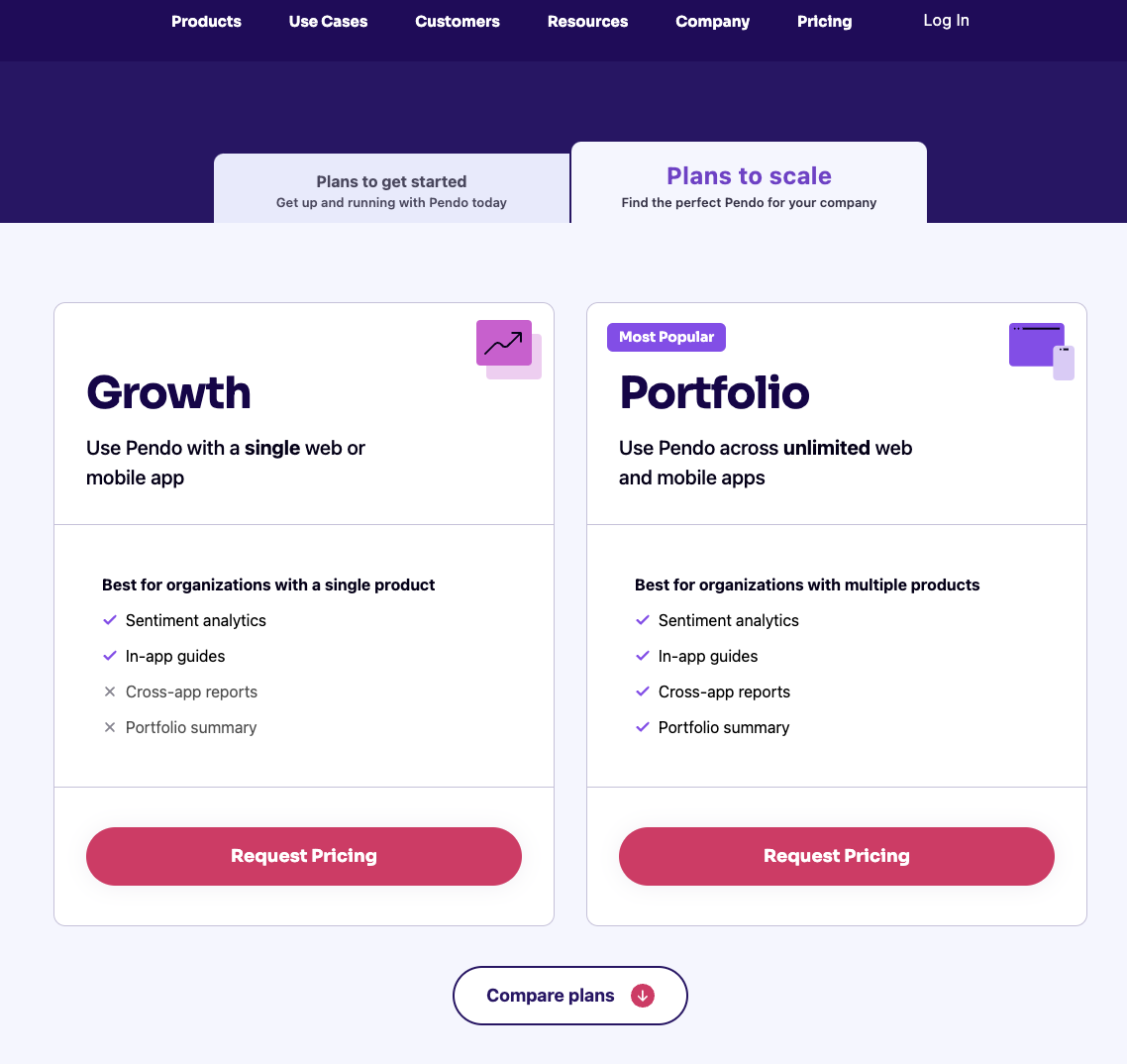
- Growth: Pendo’s Growth plan is designed to be used for a single web or mobile app but can accommodate a custom number of MAUs. It includes features like native analytics dashboards., in-app guides, NPS surveys and response tracking, and customer support.
- Starter: The Starter plan starts at $7,000 per year (or $2,000 per quarter) for 2,000 MAUs and is the cheapest upgrade option available for freemium users. Starter includes features like Product Areas, NPS surveys without Pendo branding, and (limited) NPS analytics. Note: You’ll need to upgrade to the Growth or Portfolio plan to get full NPS analytics.
- Portfolio: Pendo’s Portfolio plan is targeted towards customers who want to use the tool for multiple web and/or mobile apps. Features include guide experiment capabilities, cross-app executive dashboards, cross-app journey reporting, and access to product engagement scores.
3 Reasons why you might need a Pendo alternative
There are a few obvious instances where you’ll likely need an alternative solution to Pendo — such as these use cases:
- Over 500 MAUs: If your product has more than 500 MAUs then you’ll need to subscribe to a premium Pendo plan (which tends to be significantly more expensive than other competitors on the market).
- Real-Time Analytics Needs: Companies that operate in fast-paced work sprints will likely opt for product adoption solutions with real-time analytics since Pendo’s one-hour data lag can data-driven decision-making difficult.
- Expensive Pricing Model: Pendo is more expensive than most solutions on the market and the subscription cost rises rapidly as your MAUs grow. Even if you’re on the Starter plan, you could be paying $35,000 annually once you reach 10,000 MAUs — which makes it harder to scale.
Userpilot – A better alternative for onboarding automation
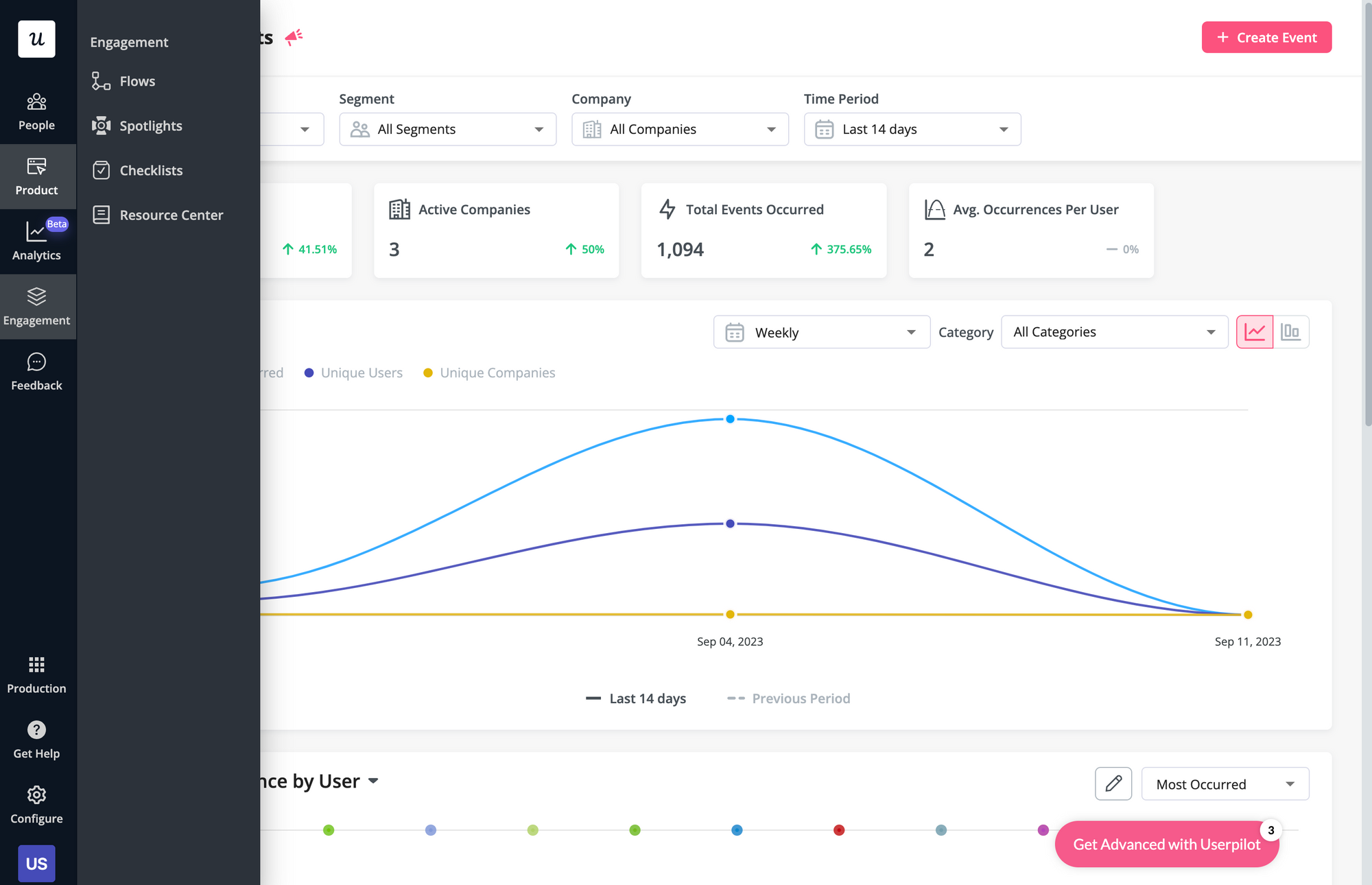
Here are some Userpilot features you can use when onboarding new users:
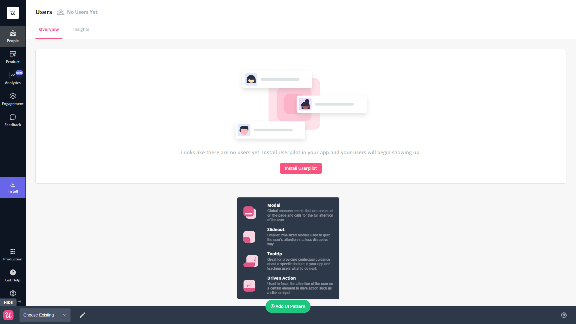
- No-code builder: Creating flows with Userpilot is as simple as installing the Chrome extension, selecting the UI patterns you’d like to use, and then editing the content/settings to suit your use case. You can also use templates to create modals, slideouts, tooltips, and driven actions.
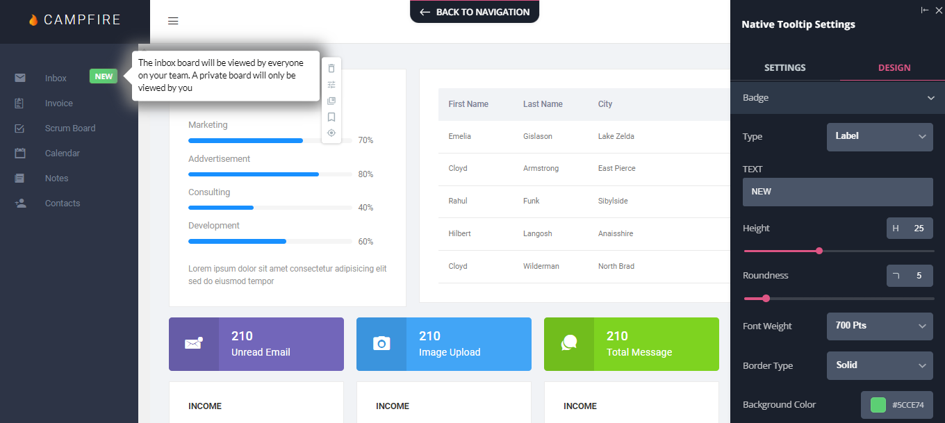
- Native tooltips: Userpilot lets you create native tooltips that show up when users hover over an element or click on an information badge. Since these native tooltips attach to the element itself, they aren’t page-dependent and will show up on any screen where that element is visible.
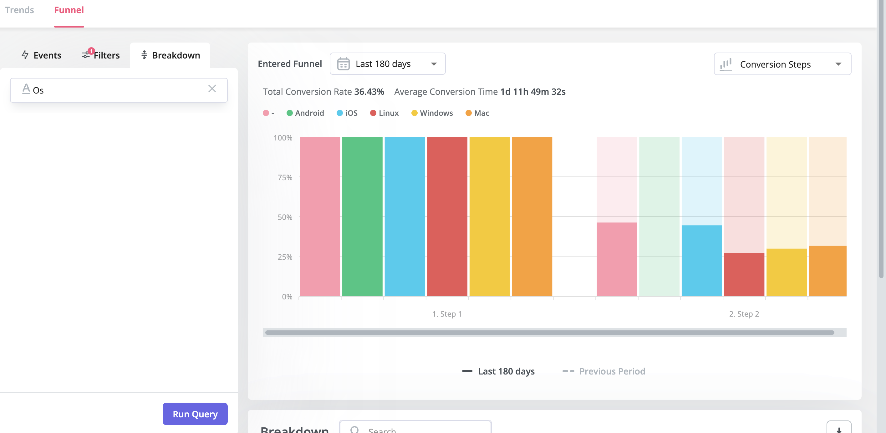
- Funnel analytics: Userpilot’s advanced analytics lets you create funnel reports that track the onboarding journey. You can also add filters (like name, user ID, signup date, operating system, country, etc.) and monitor the total conversion rate from the first step of the funnel to the last.
- User segmentation: Userpilot lets you segment users based on the device they’re using, where they’re located, their engagement data, or which NPS rating they selected on the latest survey. You can then filter your analytics dashboards to see which segments struggle with onboarding.
Userpilot’s user segmentation
User segmentation is essential for creating a personalized and contextual onboarding experience. Userpilot can segment users based on demographics, product usage data, NPS scores, and more. You can then trigger flows or filter analytics based on segments.
Here’s an overview of Userpilot’s customer segmentation capabilities:
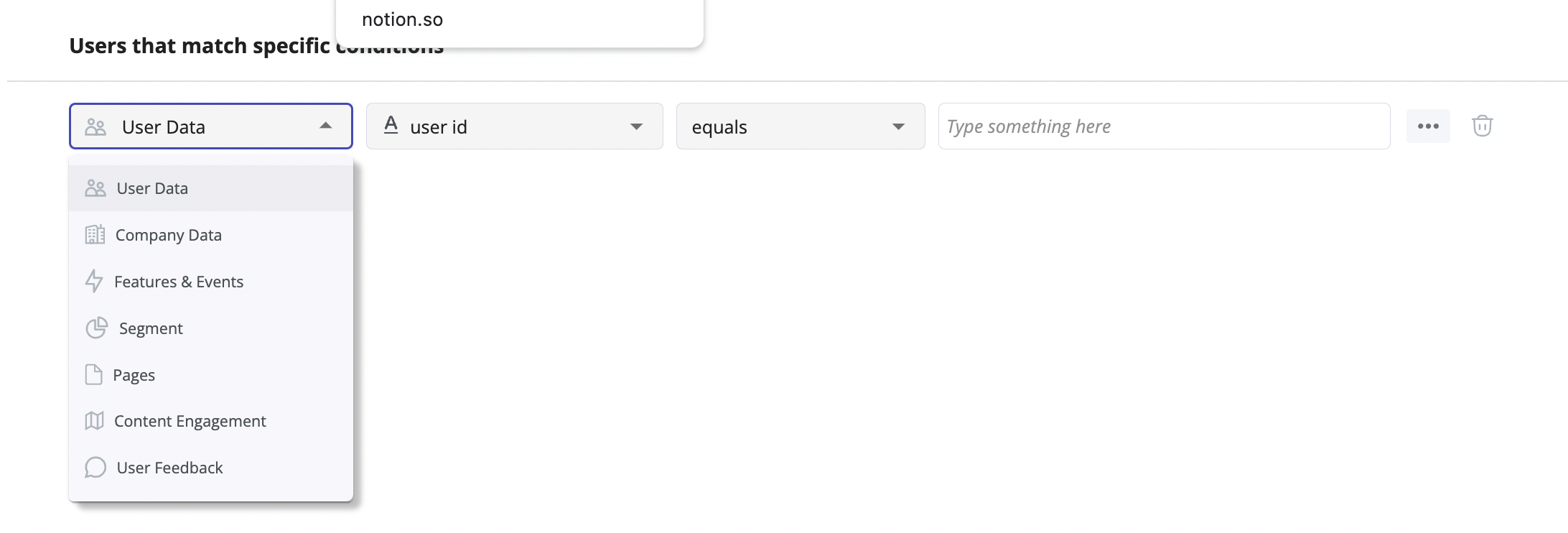
- Segment conditions: Userpilot lets you form segments by adding different conditions like user data, company data, features and events, etc. You can then use these segments as analytics filters or flow triggers later on.
- Analytics filters: Userpilot’s product analytics and user insights dashboards can be filtered to only display data from specific segments (or companies). This will help you extract insights from certain cohorts and compare how adoption or activation varies from one segment to the next.
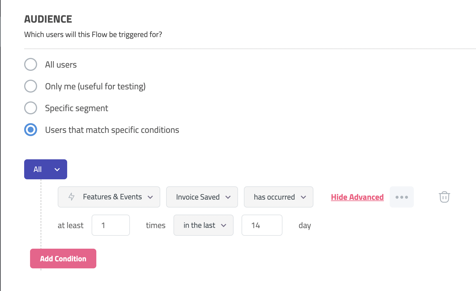
- Flow triggers: Userpilot’s audience settings let you trigger flows for specific segments or target users that meet certain conditions. You can combine this with page-specific or event-occurrence triggers to show relevant flows to the right users at the most contextual moments.
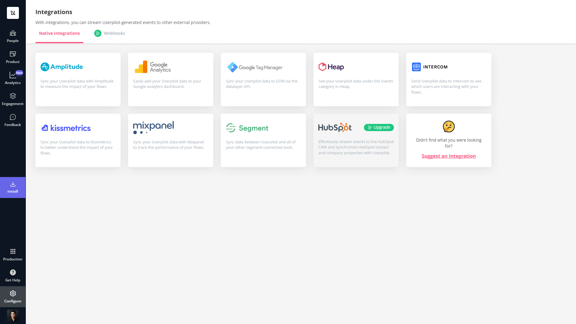
- External data: Userpilot integrates with tools like Amplitude, Google Analytics, Mixpanel, and Segment using a one-way integration. This means you can use the data inside Userpilot to build advanced segmentation and trigger contextual experiences. For more advanced use cases, the two-way integration with Hubspot lets you send and receive data, unlocking a full set of use cases.
Userpilot’s onboarding checklist
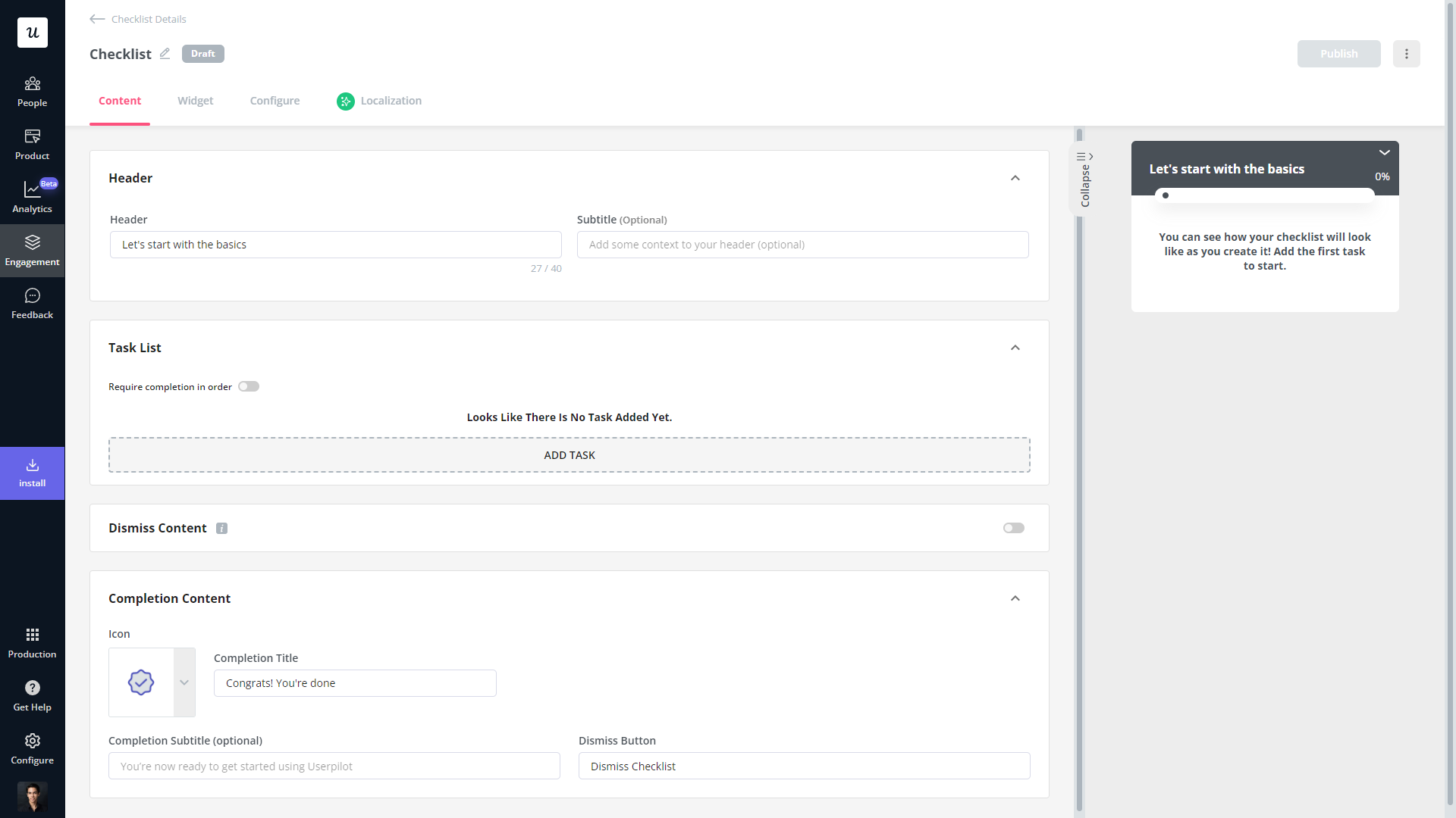
Onboarding checklists help new users learn about a product and reduce their time-to-value (TTV). Userpilot checklists can be created using the no-code builder, used to trigger specific actions, and tracked using the analytics dashboard to gauge overall engagement.
Here’s how you can use Userpilot to create an advanced onboarding checklist:
- No-code builder: Userpilot’s checklist creator lets you edit the content of checklists, add tasks, style icons, and configure the triggers for when your checklist should appear. You’ll also be able to choose from five widget icons (or upload your own) and recolor the widget to match your UI.
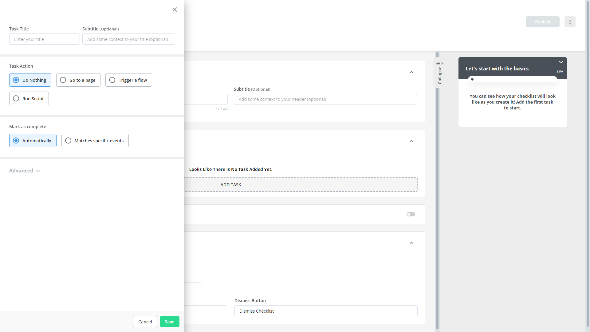
- Smart tasks: Checklist tasks can be set to trigger specific actions upon being completed, such as redirecting a user to a different page, launching an in-app flow, or running a custom JavaScript function. You can also set the conditions for when a task and action will be marked as complete.
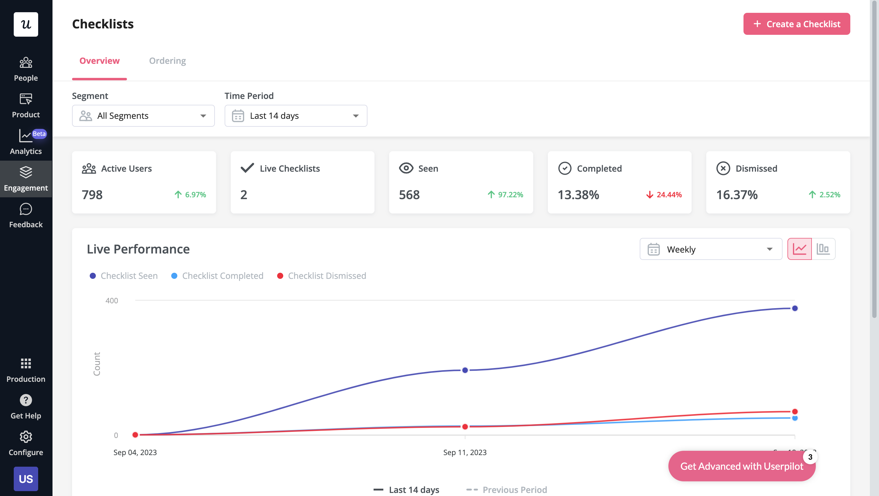
- Checklist analytics: The Checklists dashboard shows you all relevant metrics. These include the number of live checklists you have, how many views they’ve gotten, and how many have been completed. You can also sort these analytics by segment or time period to identify trends.
Userpilot’s self service support
Self-service support helps users solve problems themselves instead of having to reach out to a representative. Userpilot’s no-code resource center makes onboarding guides and product documentation easily accessible to users from within your product.
Here’s how you can use Userpilot to create a self-service customer experience:
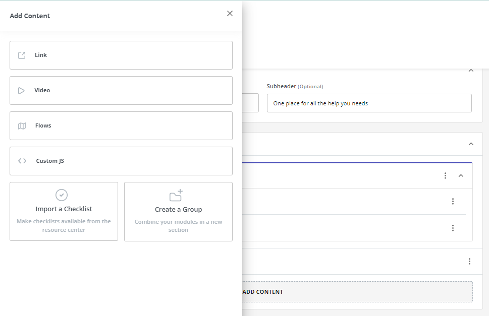
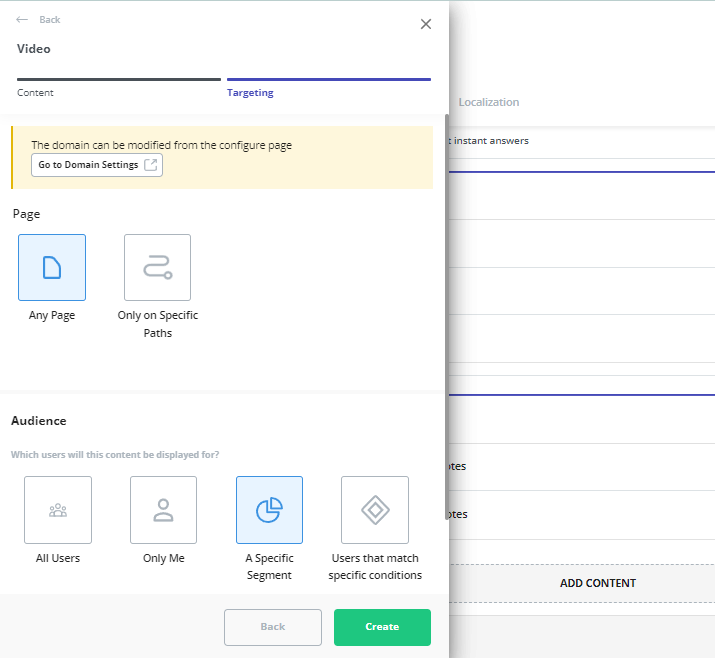
- No-code builder: Userpilot’s no-code resource center lets you add modules without writing a single line of code. Module options include links, videos, flows, custom JavaScript functions, and checklists. You can also group modules into sections to help users navigate the resource center.
- Module segmentation: Userpilot’s segmentation settings let you hide or show specific modules within your resource center based on audience settings. This makes it possible to create modules for different user segments and hide resources that aren’t relevant to other users.
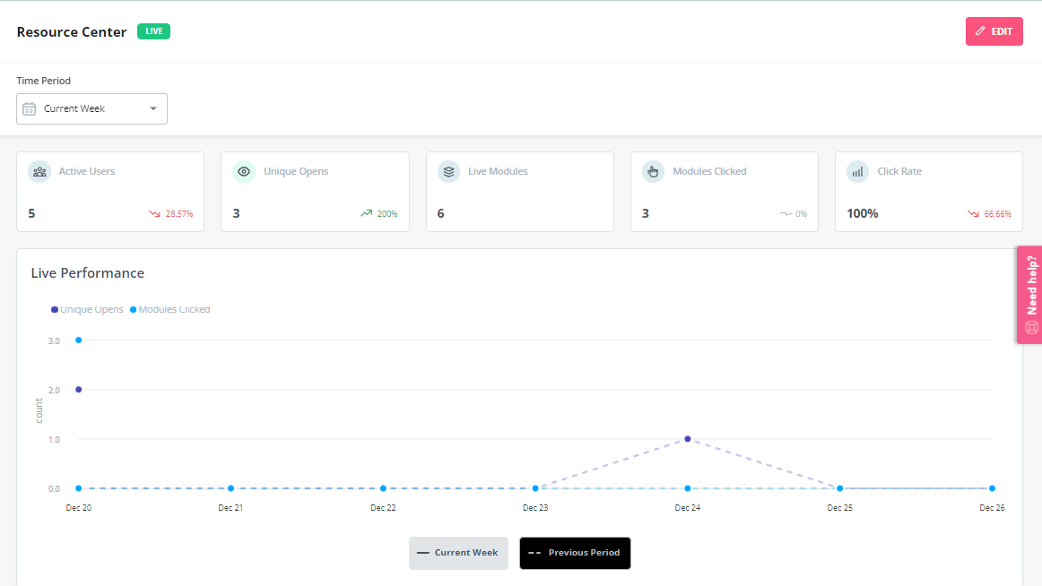
- Analytics dashboard: The dedicated analytics dashboard helps you see how many unique visitors your resource center gets, how many modules have been clicked, and the overall click rate across your user base. This will make it easier to gauge resource center performance.
Userpilot’s user journey mapping
User journey mapping helps you visualize all the interactions between users and your product as they try to achieve a particular goal. Userpilot’s detailed user analytics and funnel/trend reports help you track customers as they progress through different stages of their journey.
Here are the Userpilot features you can use for user journey mapping:
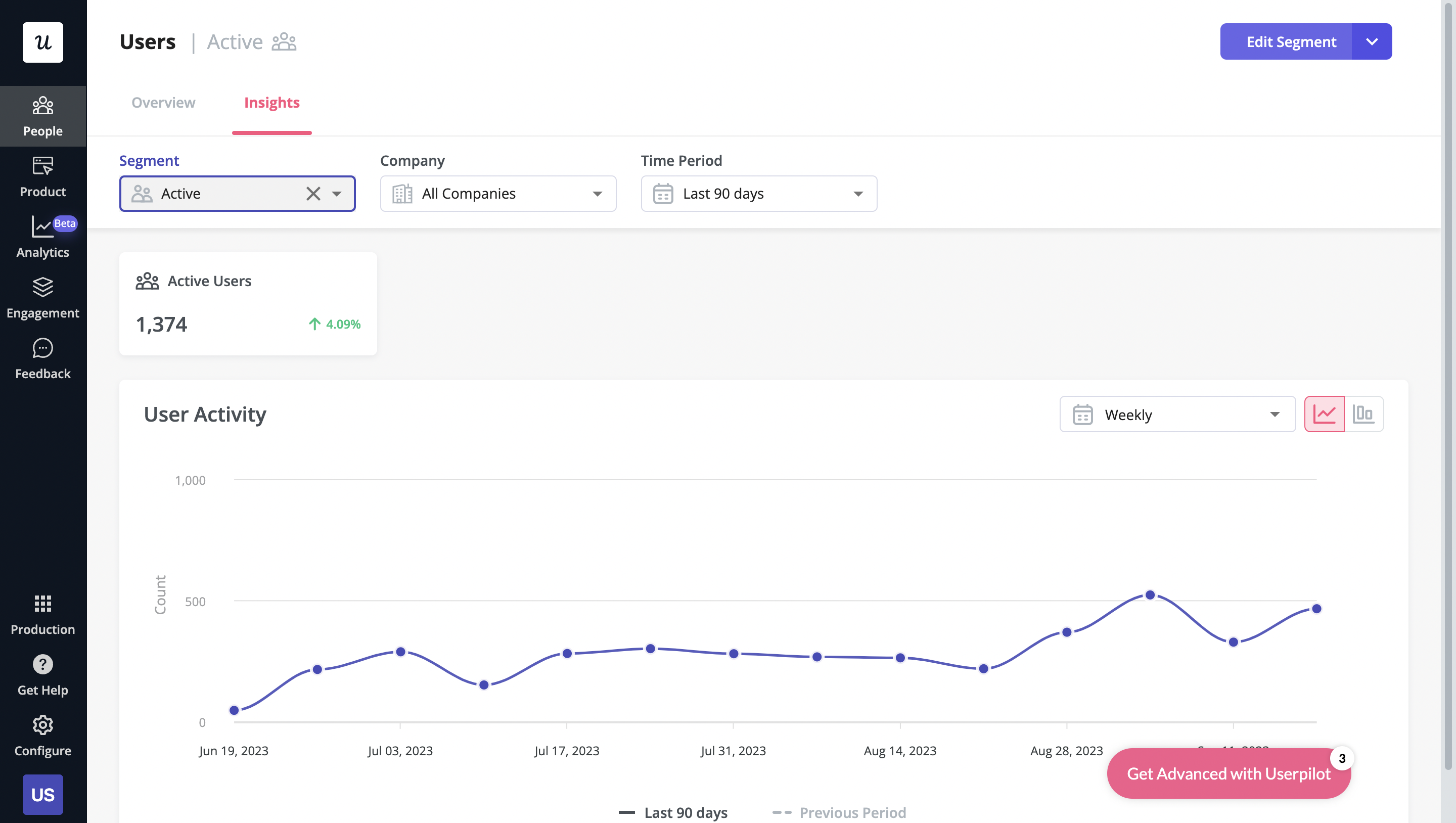
- User analytics: The Users dashboard provides detailed analytics of your entire customer base. You’ll be able to sort by segment, company, or time period and add multiple filters to help you narrow results. You can also perform bulk actions and export user data in a CSV format.
- Funnel reports: These reports help you visualize the user journey map by showing which stage, page, or action most users get stuck on. You’ll also be able to view breakdowns so you can see how the user journey changes depending on which OS, browser, or device type a user is on.
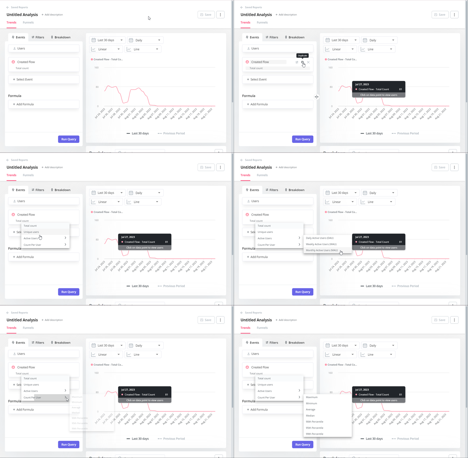
- Trend reports: Userpilot’s trend reports offer behavioral insights such as how often users perform a specific action, the number of unique users who take that action, and where in the user journey these actions occur. You can also create custom metrics and build your own charts.
What are the pros and cons of Userpilot?
Userpilot pros
As a full-suite digital adoption platform, Userpilot has all the features you need to onboard users, track analytics, and gather feedback from customers without writing a single line of code. Here are a few pros of using Userpilot as your product growth solution:
- No-code builder: Userpilot’s Chrome extension lets you build flows, add UI elements, and tag features without writing a single line of code.
- UI patterns: There are plenty of UI patterns to choose from when using Userpilot such as hotspots, tooltips, banners, slideouts, modals, and more!
- Startup-friendly: Userpilot’s entry-level plan gives you access to all available UI patterns so you can hit the ground running.
- Walkthroughs and flows: Build engaging interactive walkthroughs and personalized onboarding flows that target specific segments of your user base.
- Self-service support: Build an in-app resource center to help users solve problems, customize its appearance to align it with your brand, and insert various types of content (videos, flows, or chatbots) to keep your customers satisfied.
- A/B testing: Userpilot’s built-in A/B testing capabilities will help you split-test flows, iterate on the best-performing variants, and continually optimize based on user behavior.
- Feedback collection: Userpilot has built-in NPS surveys with its own unified analytics dashboard and response tagging to help you retarget users. There are other survey types to choose from and you can even create your own custom survey.
- Survey templates: There are 14 survey templates to choose from so you can gather feedback on specific features or run customer satisfaction benchmarking surveys like CSAT and CES.
- Advanced analytics: Userpilot lets you analyze product usage data, monitor engagement on all in-app flows, and use the data to create user segments that are based on behaviors instead of demographics.
- Event tracking: Userpilot’s no-code event tracking lets you tag UI interactions (hovers, clicks, or form fills) and group them into a custom event that reflects feature usage.
- Third-party integrations: Userpilot has built-in integrations with tools like Amplitude, Mixpanel, Kissmetrics, Segment, Heap, HubSpot, Intercom, Google Analytics, and Google Tag Manager so you can share data between all the solutions in your tech stack.
Userpilot’s cons
Of course, no tool is perfect and there are a few cons to consider before choosing Userpilot as your user onboarding or product growth solution:
- Employee onboarding: Currently, Userpilot only supports in-app customer onboarding.
- Mobile apps: Userpilot doesn’t have any mobile compatibility which could make it difficult for developers with cross-platform applications to create a consistent user experience for both versions of their product.
- Freemium plan: There’s no freemium Userpilot plan so those bootstrapping their startup and need sub-$100 solutions should consider more affordable onboarding platforms like UserGuiding or Product Fruits.
What do users say about Userpilot?
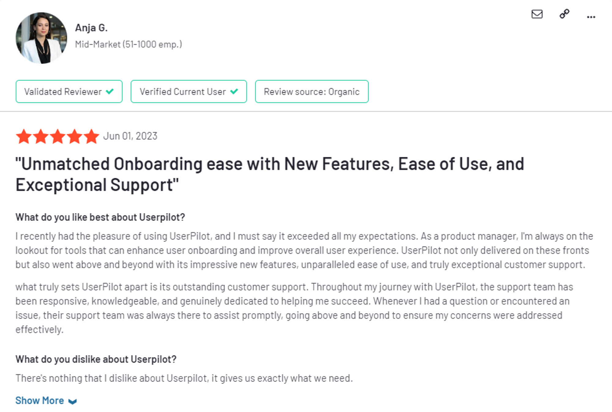
Most users laud Userpilot for its versatile feature set, ease of use, and responsive support team:
I recently had the pleasure of using Userpilot, and I must say it exceeded all my expectations. As a product manager, I’m always on the lookout for tools that can enhance user onboarding and improve overall user experience. Userpilot not only delivered on these fronts but also went above and beyond with its impressive new features, unparalleled ease of use, and truly exceptional customer support.
What truly sets Userpilot apart is its outstanding customer support. Throughout my journey with Userpilot, the support team has been responsive, knowledgeable, and genuinely dedicated to helping me succeed. Whenever I had a question or encountered an issue, their support team was always there to assist promptly, going above and beyond to ensure my concerns were addressed effectively.
Source: G2.
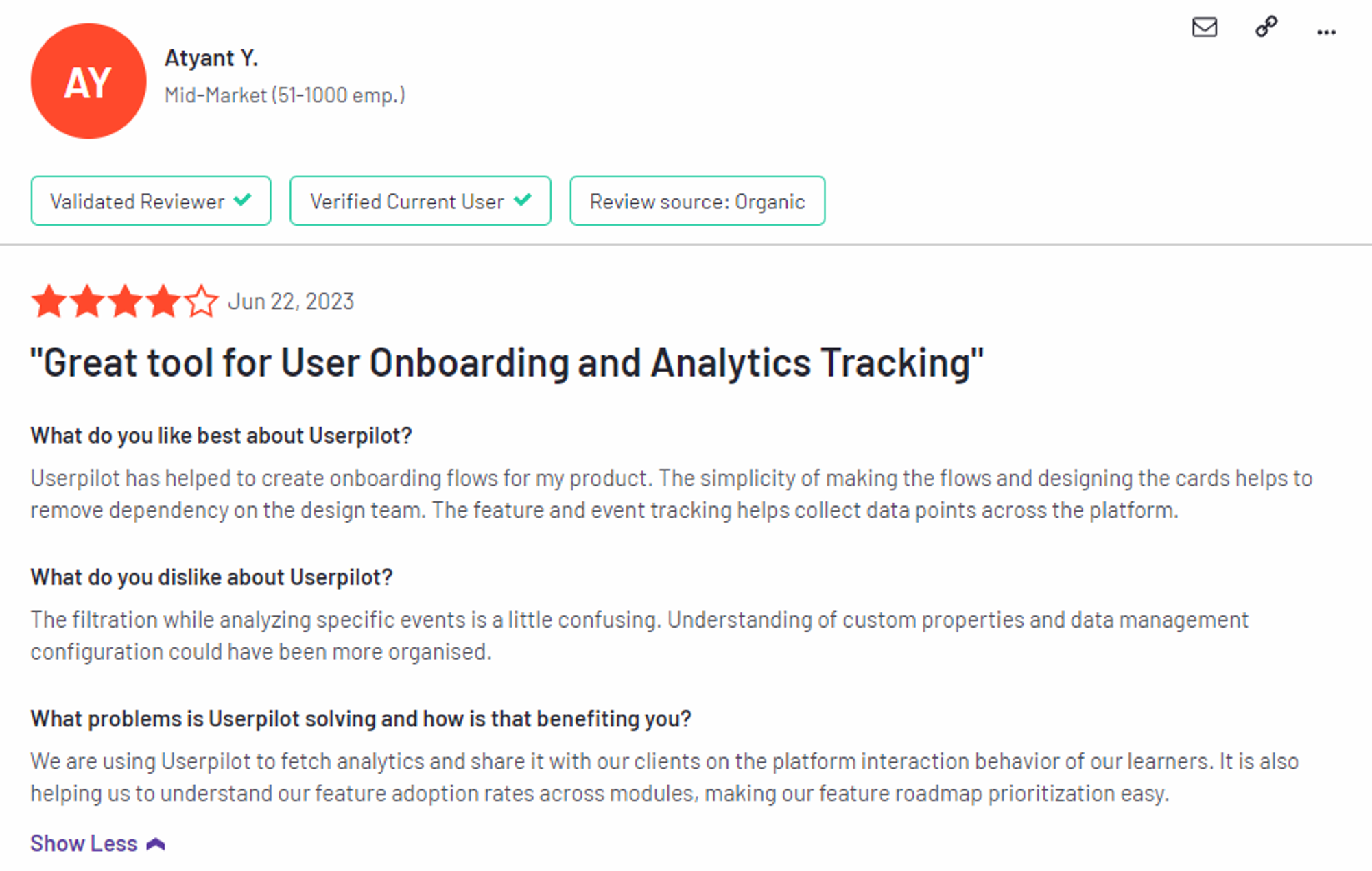
Of course, other users are also kind enough to share constructive criticism regarding specific features like event tracking filters:
“The filtration while analyzing specific events is a little confusing. Understanding of custom properties and data management configuration could have been more organised.”
Source: G2.
Userpilot’s pricing
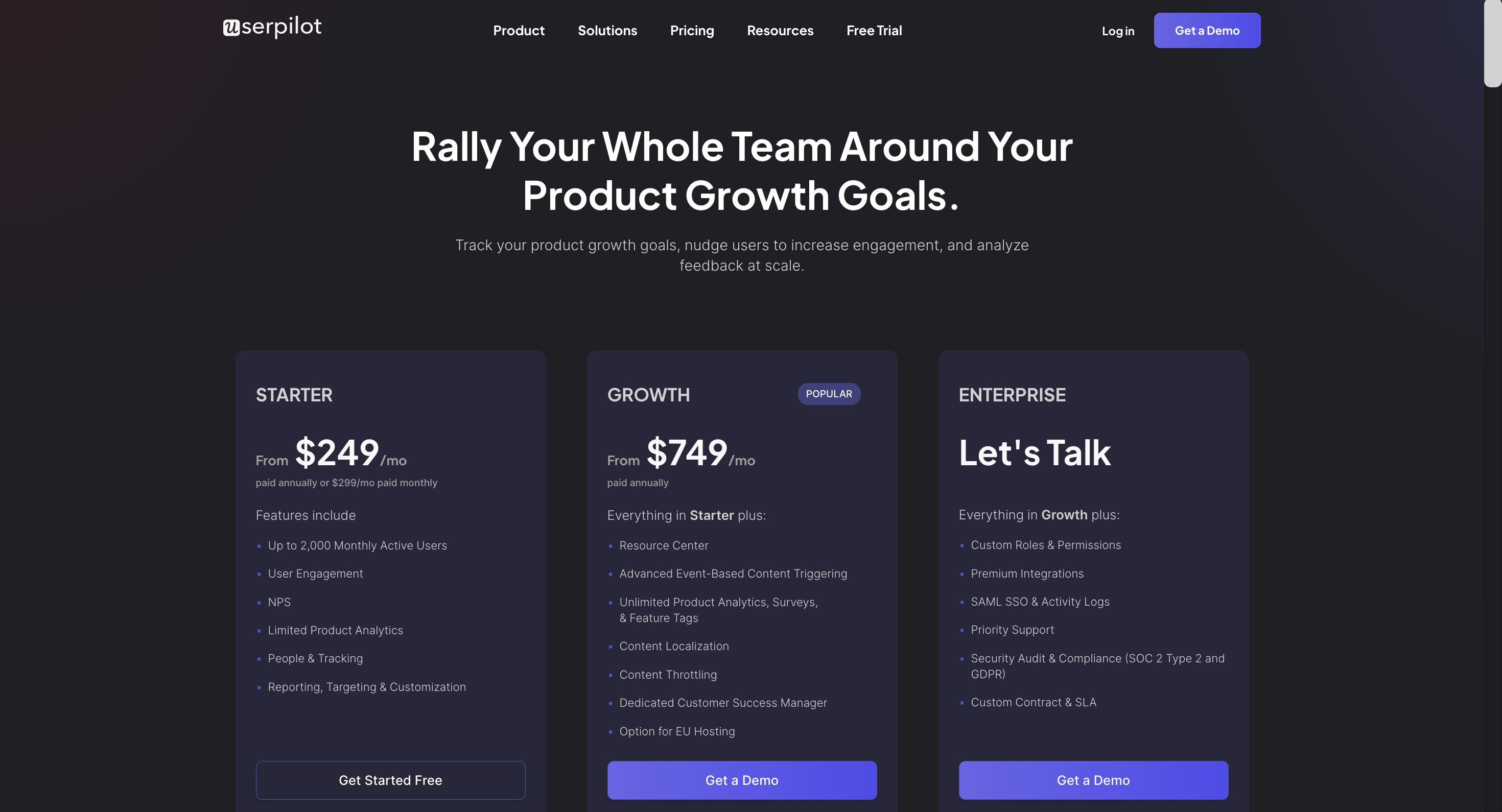
Userpilot’s transparent pricing ranges from $249/month on the entry-level end to an Enterprise tier for larger companies.
Furthermore, Userpilot’s entry-level plan includes access to all UI patterns and should include everything that most mid-market SaaS businesses need to get started.
Userpilot has three paid plans to choose from:
- Starter: The entry-level Starter plan starts at $249/month and includes features like segmentation, product analytics, reporting, user engagement, NPS feedback, and customization.
- Growth: The Growth plan starts at $749/month and includes features like resource centers, advanced event-based triggers, unlimited feature tagging, AI-powered content localization, EU hosting options, and a dedicated customer success manager.
- Enterprise: The Enterprise plan uses custom pricing and includes all the features from Starter + Growth plus custom roles/permissions, access to premium integrations, priority support, custom contract, SLA, SAML SSO, activity logs, security audit, and compliance (SOC 2/GDPR).
Conclusion
There you have it.
It should be easier now to make an informed decision whether Pendo is your go-to option for onboarding automation. Ultimately, the best choice will depend on your product and current needs.
If you’re looking for a better alternative to Pendo for onboarding automation, book a Userpilot demo today to experience firsthand how it can enhance your user experience and drive product growth!
Looking for A Better Alternative for onboarding automation? Try Userpilot
