SaaS Feature Release Examples That Drive Product Adoption in 2026


Shipping the feature is the easy part. Turning a feature release into real product adoption that drives retention is where most SaaS teams fall short.
Luckily, you can learn from the best before starting on your own launch journey. Below, I compiled nine real feature release examples from SaaS companies, split across in-app and external channels, with a breakdown of what makes each one work.

Feature release examples with in-app messaging
The most effective way to announce a new feature release is right inside the app. Let’s take a look at companies that do in-app engagement right.
1. Figma: In-app feature announcement using modals
Figma introduced its UI3 redesign with a modal that appears the moment users open the app. Instead of burying the update in release notes, Figma puts the announcement directly in front of users and invites them to explore the new experience through a guided tour.
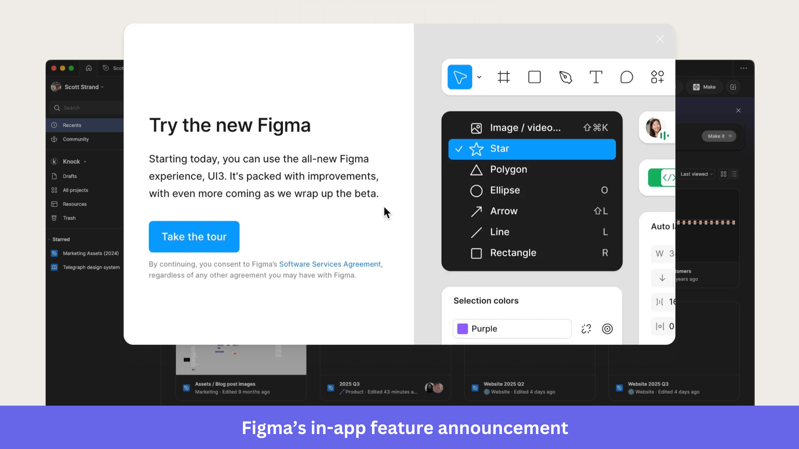
What makes it work:
- The headline immediately communicates the change. Users know they’re looking at a new Figma experience before they read the supporting copy.
- The message stays focused on the update. Rather than listing every UI improvement, Figma gives a high-level overview and lets users discover the details during the tour.
- There’s a single call to action. The “Take the tour” button provides users with a clear next step and reduces decision fatigue.
- Visibility and simplicity stay balanced, with important information front and center, while secondary details stay unobtrusive.
When to use it: Reach for a modal when you’re launching a major update that affects a large part of your user base, like a redesign, a new workflow, or a flagship feature release. Because modals interrupt the experience, save them for high-impact announcements that warrant immediate attention.
2. Postify: In-app feature announcements using slideouts
Postify announced its direct Instagram publishing feature with a slideout that appears alongside the post composer. Users can read the announcement, watch a short demo, and act on it without leaving their current workflow.
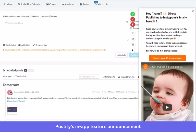
What makes it work:
- Users get the benefit right away. The copy explains what’s new and why direct Instagram publishing matters, with no extra context required.
- Its CTA points to the next step, so instead of a generic button label, Postify nudges users toward the specific action that unlocks the feature.
- A short product demo adds context. Interested users see the feature in action before deciding whether to turn it on.
- Because the slideout doesn’t disrupt the workflow, the announcement stays visible while users keep working in the product.
When to use it: Use a slideout when you need more room than a tooltip, but don’t want to interrupt people with a modal. It fits feature launches that need a bit more context than a one-line in-app message before users act.
3. HubSpot: In-app feature announcement using tooltips
HubSpot introduces new users to its CRM with a tooltip-driven product tour on the Contacts page. Each tooltip attaches to a specific UI element and walks users through key actions, so they learn the platform without leaving the interface.
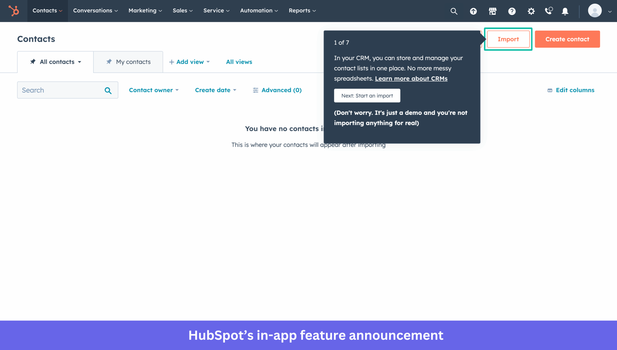
What makes it work:
- Context is built into the experience. By attaching the tooltip to the Import button, HubSpot shows users exactly where to act.
- A visible progress indicator sets expectations. Users can see how many steps remain and decide whether to keep going.
- The copy explains why importing contacts matters and how it helps users manage customer data, instead of jumping straight to instructions.
- An extra layer of reassurance lowers hesitation. HubSpot makes it clear that users are exploring a demo, which reduces the perceived risk of clicking unfamiliar elements.
When to use it: Choose tooltips when users need contextual guidance inside an existing workflow. They work well for feature discovery, onboarding flows, and small product updates tied to a specific part of the interface. For longer walkthroughs, keep the step count manageable so users don’t drop off before the end.
4. Userpilot: Feature release announcements using webinars
At Userpilot, we promote some new features through webinar invitations shown inside the product. Rather than explaining every detail in the announcement itself, the modal invites users to a live session to see the feature in action and ask questions.
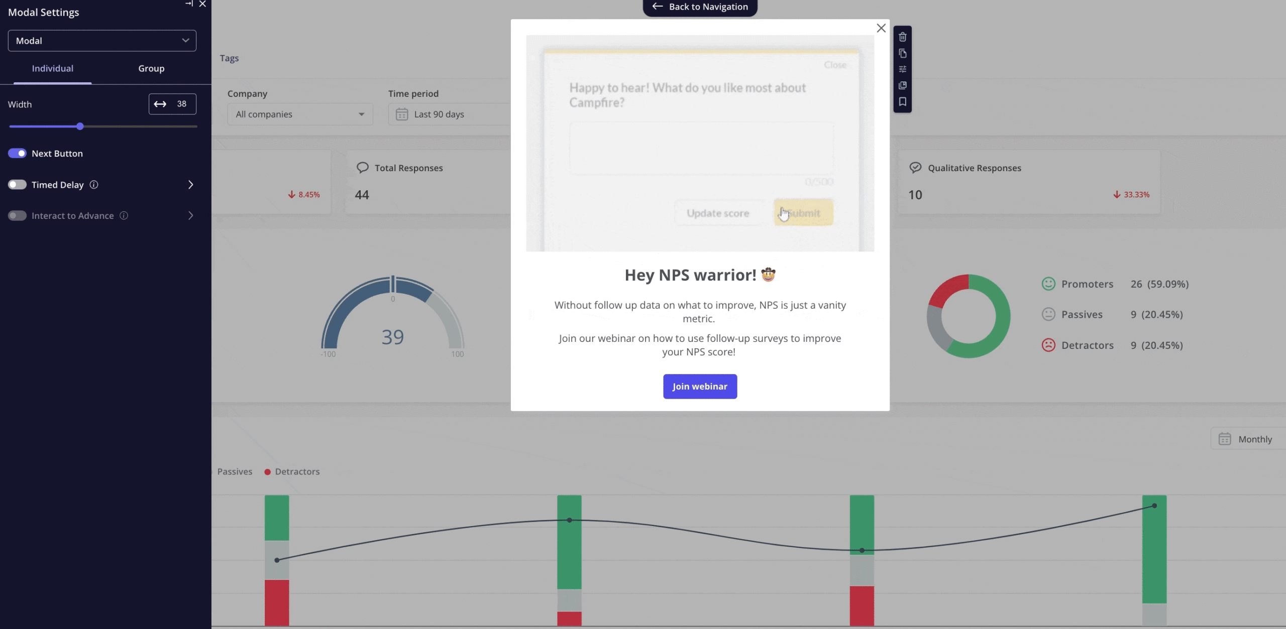
What makes it work:
- Personalized messaging makes the invite feel relevant. Tailoring the copy to a specific user segment makes it more likely to resonate.
- The value of attending is clear. Instead of feature details, the modal highlights the problem users can solve by joining.
- One primary CTA keeps things focused. Users register for the webinar without having to sort through competing actions.
- Live demonstrations shorten the learning curve. Attendees see the feature in practice, which makes adoption easier afterward.
When to use it: In-app launch messages, like webinar invites, work best for releases that need more explanation than a tooltip, a modal, or a changelog can provide. They suit advanced workflows, analytics features, and capabilities that benefit from a live walkthrough. To boost attendance, pair the in-app invite with email reminders and a post-webinar recording.
5. Notion: In-app feature release notes
Notion shares product updates through concise release notes that explain new features without interrupting the experience. Each update pairs a short description with a visual demo, so users grasp what changed and how to start using it.
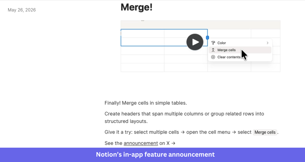
What makes it work:
- A quick visual demo shows the feature in action. Users understand the update in seconds instead of reading a long explanation.
- Practical use cases add context. The note explains how the feature can be used and connects the update to users’ workflows.
- Clear instructions reduce friction. Readers get enough guidance to try the feature immediately, without digging through documentation.
- The format stays consistent across updates. Regular users know where to find announcements and what to expect from each note.
When to use it: release notes are ideal for incremental improvements, quality-of-life updates, bug fixes, and smaller releases that don’t need a modal or guided walkthrough. They give users a self-serve way to stay informed and build a permanent, centralized changelog of product changes for later reference.
Feature release examples with external channels
One of the goals of a new feature release is to drive disengaged users back to the product. Maybe you just released a functionality whose lack made them pull away? For such users, in-app announcements won’t work, so it’s best to use different channels: email, website, social media.
6. Flourish: New feature announcement using email
Flourish introduced its “Draw the Line” template through a product update email that pairs visual previews with a clear explanation of the feature’s value. The email gives recipients enough context to understand the update and explore it, without drowning them in detail.
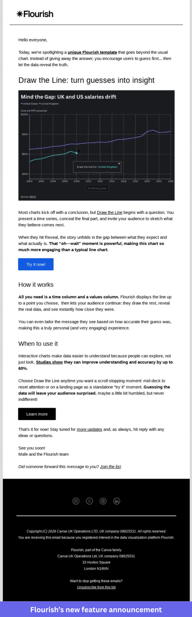
What makes it work:
- Visuals show the feature immediately. A preview of the chart template helps recipients get it before they read the copy.
- The email focuses on outcomes. It explains how the template helps users uncover insights from their data.
- A simple structure improves readability. Breaking the content into sections makes it easy to see how the template works and when to use it.
- There are multiple paths to engagement. Recipients can learn more or jump straight in and try it themselves.
When to use it: Email works for launches that should reach both active and inactive users, and it’s one of the better ways to re-engage churned users by telling them about a feature they once wished you had. It’s especially useful when a visual helps explain the update or when you want to pull users back into the product. For best results, focus each email on a single feature with one clear next step.
7. Dovetail: New feature announcement on the blog
Dovetail announced its Fall 2025 launch with a dedicated blog post covering multiple updates, including AI agents, dashboards, docs, and integrations. Instead of publishing a separate announcement for each release, Dovetail grouped them into a single launch story that provides users with a complete overview of what’s new.
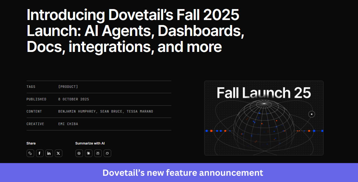
What makes it work:
- A single launch post brings related updates together. Readers explore every new feature in one place instead of hopping between announcements.
- The seasonal launch theme creates a narrative. Packaging the release as a Fall launch makes it feel cohesive rather than a pile of unrelated features.
- Visuals break up the content. Screenshots, illustrations, and product previews help readers quickly see what’s being introduced.
- Each feature gets enough context to stand on its own. Users learn what it does, who it’s for, and how it fits their workflow.
When to use it: A launch blog is ideal when you’re shipping several related features within a short window. It gives customers, prospects, and internal teams a single resource to reference, and it doubles as the anchor you can promote through email, social, and in-app product updates.
8. Later: Feature release on social media
Later, AI Creator Match was introduced through a LinkedIn post that pairs a benefit-led message with supporting data and a branded launch visual. The post quickly explains the problem the feature solves and gives users a reason to learn more.
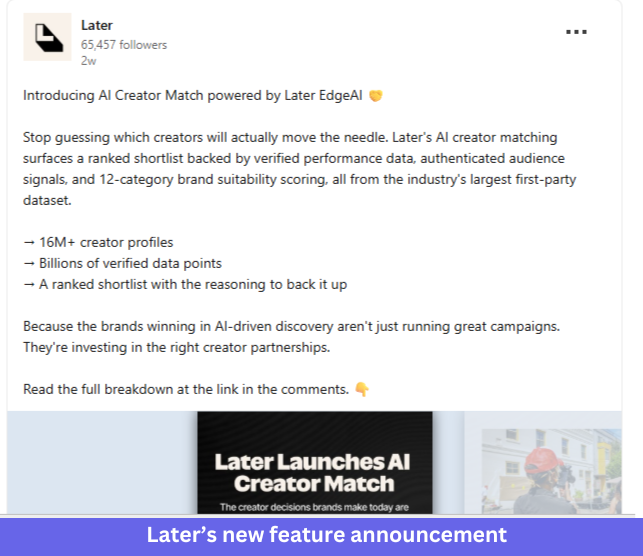
What makes it work:
- The opening line leads with a familiar challenge. Instead of the feature name, Later starts with the problem marketers face when choosing creators.
- Supporting data adds credibility. A few key metrics explain what powers the feature and why the results are worth trusting.
- Branded visuals reinforce the message, so even users who only skim the post can tell a new capability shipped.
- The CTA invites further exploration. Interested readers move from the post to a fuller explanation of the feature.
When to use it: Social media suits releases with a clear audience and an easy-to-grasp value proposition. It’s useful for building awareness among existing followers while reaching potential customers who have never subscribed to your emails or product updates.
9. Honestly: Feature release announcement using Product Hunt
Honestly introduced its platform on Product Hunt with a launch page built around helping teams discover real customer opinions from Reddit and TikTok. The page pairs a clear product description with social proof, making it easy for visitors to understand the product and weigh its value.
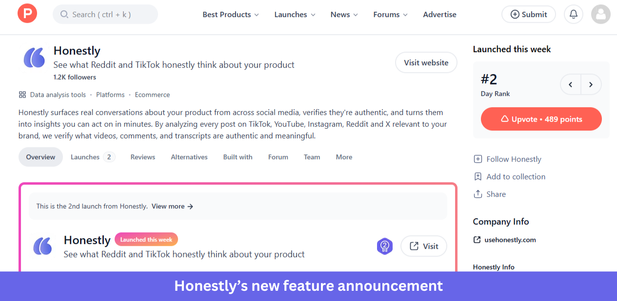
What makes it work:
- The positioning is easy to grasp. Visitors quickly understand what the product does and where the insights come from.
- A timely problem gives the launch context. The messaging leans on the growing challenge of finding authentic customer feedback online.
- Product Hunt brings built-in visibility. Rankings, upvotes, and comments build momentum during launch week.
- Community interaction supports discovery. Prospective users read discussions, ask questions, and see feedback from early adopters.
When to use it: Product Hunt is best for new products, major platform launches, and large expansions. If you’re announcing a small feature update, in-app messages, release notes, email, or social will usually serve you better.
How to choose the right format for your announcement
Most guides list the patterns and stop there. The harder question is which one to use, so here’s how I’d match the format to the feature announcement.
- Modal: Major launches, complete redesigns, and breaking changes. Use sparingly to avoid modal fatigue.
- Slideout: Secondary feature announcements, follow-up reminders, and richer messages that need more room than a tooltip.
- Tooltip: Small enhancements, contextual reminders, and feature discovery anchored to a specific UI element.
- Banner: System-wide, non-blocking notices like maintenance windows, ongoing promotions, and trial reminders.
- Hotspot: Passive feature discovery in complex UIs.
Two rules cut across all five. Lead with the user benefit rather than the technical detail, and give one clear next step, such as “Try it now” or “Learn more.” Time the message to the workflow too, since a lightweight tooltip or banner shown while someone is in the relevant part of the product beats a modal that interrupts unrelated work.
Whatever the format, segment before you send. Targeting the announcement by role, plan tier, or in-app behavior keeps it relevant and stops you from nagging users who already adopted the feature. It also helps to show rather than tell, the way Nudge Security embeds interactive demos in its changelogs so users see a feature in action instead of only reading about it.
Userpilot supports all five of these in-app patterns through a no-code builder, so product teams can ship any of them without engineering help.
How to measure whether your feature announcement landed
A feature release example isn’t finished when the announcement goes out. The real question is whether usage moved, and in 2026, that question is getting harder to answer. As Yazan Sehwail, Userpilot’s CEO, points out, teams are shipping far more than they used to:
“As producing and building features become a lot cheaper, instead of every quarter, you’re releasing one or two features, now you’re releasing 7, 8, 9. It becomes even harder for product teams to manually have to track each one and understand usage for each one.”
More releases mean more announcements, and more announcements mean more chances for a feature to ship and quietly go unused. That’s why the feature adoption rate is the number I’d watch first. Across 181 SaaS products in Userpilot’s benchmark, the average core feature adoption rate is 24.5%, so a flat curve after a launch is common rather than a fluke.
A low number isn’t a verdict so much as a starting point for finding where users got stuck. When Userpilot shipped its own email feature, Abrar Abutouq, one of our product managers, observed a drop-off in the funnel at domain verification and fixed it without an engineering ticket. She treated that drop-off as a diagnostic signal, the same approach she lays out in her guide to feature adoption metrics.
Her fix took a few hours, not a sprint:
“Within a few hours, I just created a targeting tooltip and showed it to users and highlighted the correct steps for them to make it clear what to do next. That helped a lot on reducing friction and supporting users in real time without involving our dev team.”
The takeaway for measuring any release is to instrument the announcement as part of the feature. With Userpilot Analytics, you can track adoption rate, funnel drop-off, and stickiness after a launch, then trigger a follow-up nudge to the users who saw the announcement but didn’t act.
One 2026 wrinkle is that if AI agents use your product, they adopt its features as well, and Userpilot’s Agent Analytics tracks whether those agents complete the action your announcement was meant to drive.
Turn your next feature release into real adoption
The best feature release examples all do the same thing: they meet users where they are and give them one clear reason to try what’s new. Pick the format that matches your launch, then measure whether it actually moved adoption.
Want to build in-app modals, slideouts, tooltips, and banners for your next release without writing code? Get a Userpilot demo and see how to ship and measure your next feature announcement.
About the author