ProductFruits vs Stonly vs Userpilot – Which is Best For Your SaaS?15 min read
Deciding between ProductFruits, Stonly and Userpilot?
We know that choosing the best product adoption platform for your SaaS is difficult. So we decided to write a more in-depth comparison of the three tools – going into more detail about the tools’ features, use cases, pros and cons – than what you’ll find on review sites.
Whether you’re looking mainly to improve your user onboarding or product analytics, collect user feedback or NPS – you’ll find out how ProductFruits performs vs Stonly vs Userpilot – and which one is the best choice for you!
Let’s dig in!
Get The Insights!
The fastest way to learn about Product Growth, Management & Trends.
Overview of ProductFruits vs Stonly vs Userpilot
- Product Fruits stands out as one of the most affordable user onboarding tools available in the market. It can be an ideal choice for small startups operating on a budget of less than $100.
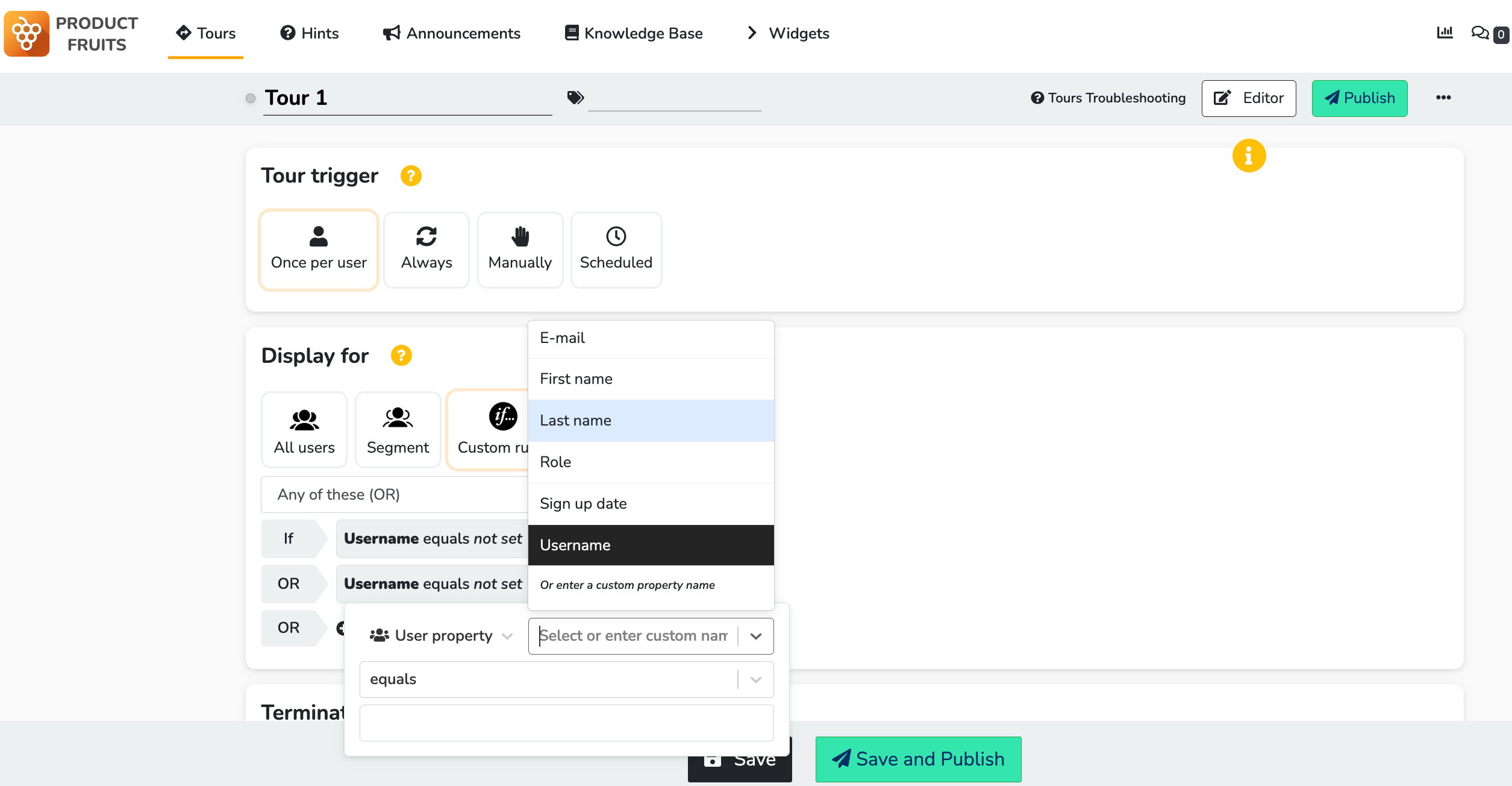
- Although Product Fruits offers some functionalities that are also found in more advanced tools, it lacks sophisticated analytics, has limited segmentation options, lacks A/B testing capabilities, exhibits unreliable element detection algorithms, and does not support real-time event-based triggering.
- Stonly positions itself as a budget-friendly alternative to its more expensive competitors, but in fact – it’s more of a CS tool for building knowledge bases than a product adoption tool for onboarding. Similarly, as with Intercom Product Tours, Stonly’s tour builder feels like a makeshift add-on to the Knowledge Bases rather than a fully-fledged product (compared to its competitors like Userpilot or Appcues).
- However, Stonly has a confusing builder and an even more confusing installation.
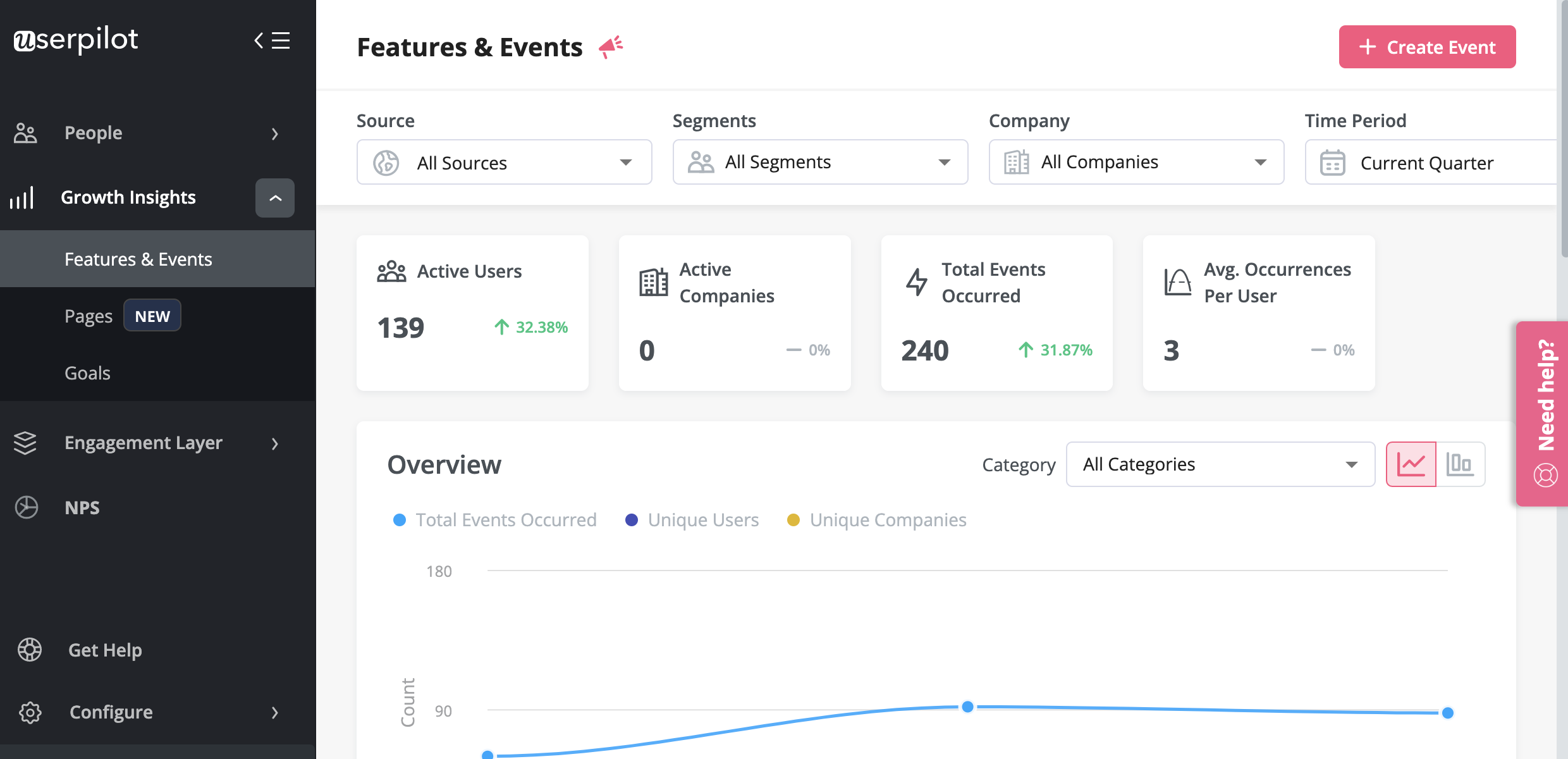
- Userpilot is a comprehensive product growth platform with powerful analytics and user feedback functionality too. It enables product teams to track product usage and user behavior to guide product development and optimize the user experience. In addition, it allows them to gather user feedback with various survey templates and design personalized onboarding experiences to drive product adoption. All of this is possible without coding. Book a demo to learn more.
What is ProductFruits?
What is ProductFruits best for?
Typically, SaaS Product Managers consider ProductFruits for the following reasons: they want to improve their user onboarding, they need product adoption, and would also be able to measure their user feedback.
How does ProductFruits perform when it comes to these top-three use cases? Let’s examine it all, and then compare it to the other tools we’re discussing in this post.
ProductFruits for user onboarding
While Product Fruits may not be the most advanced tool on the market, it does offer some useful features for user onboarding. With options for:
- Product tours.
- Checklists.
- Hints.
- In-app announcements.
- Feedback and NPS surveys.
- A help center button.
This platform covers the basics of what you need for a successful onboarding experience. Plus, it’s an affordable option for small startups on a budget. However, it’s worth noting that Product Fruits has its downsides, such as only offering basic linear tours, clunky UX, and limited reporting for the help center widget. Nonetheless, if you’re looking for a cost-effective solution for user adoption, Product Fruits may be worth considering.
ProductFruits for product adoption
Product Fruits as a user adoption tool offers basic features to help you create a simple onboarding experience for your users. Its core features include product tours, checklists, hints, in-app announcements, feedback and NPS surveys, and a help center button.
However, the platform has its limitations, such as only offering basic linear tours and having a clunky UX that can be hard to use (esp the element selection). T
he lack of certain UI patterns (hotspots, spotlights) can make product adoption via secondary onboarding more challenging. Moreover, the segmentation options are limited to user attributes only, so unlike with tools like e.g. Userpilot, you cannot display product adoption experiences based on what the user has actually done inside your app (= tracked events).
ProductFruits for user feedback
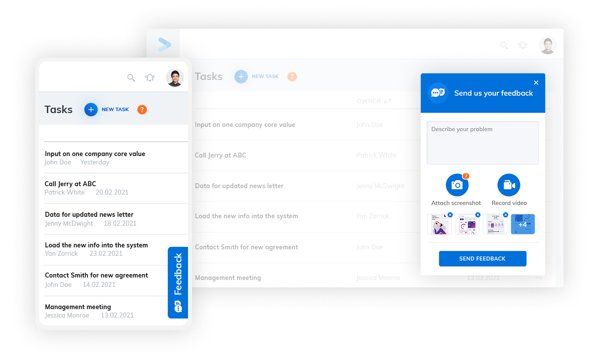
Product Fruits surveys are simple but easy to implement:
- In-product feedback and surveys without any coding required.
- Adoption Meter to track user moods and understand how users feel about your product or feature.
- Targeting as granular as you need with advanced segmentation and behavioral triggers.
- Easy setup with hassle-free deployment and no impact on app loading or response times.
- Very limited analytics.
- No AI-based user sentiment analytics.
There is a better tool for your SaaS than ProductFruits!
What is Stonly?
Stonly positions itself as a budget-friendly alternative to its more expensive competitors, but in fact – it’s more of a CS tool for building knowledge bases than a product adoption tool for onboarding.
Similarly, as with Intercom Product Tours, Stonly’s tour builder feels like a makeshift add-on to the Knowledge Bases rather than a fully-fledged product (compared to its competitors like Userpilot or Appcues).
So it may be good for startups and small businesses with few users and a per-view pricing model (which may become super-expensive once you have more users!) and that want a tool primarily for the Knowledge Base use case.
What is Stonly best for?
Similar to ProductFruits, Stonly is typically considered for user onboarding, product adoption, and user feedback. Let’s examine Stonly for these use cases before we compare it to Userpilot.
Stonly for user onboarding
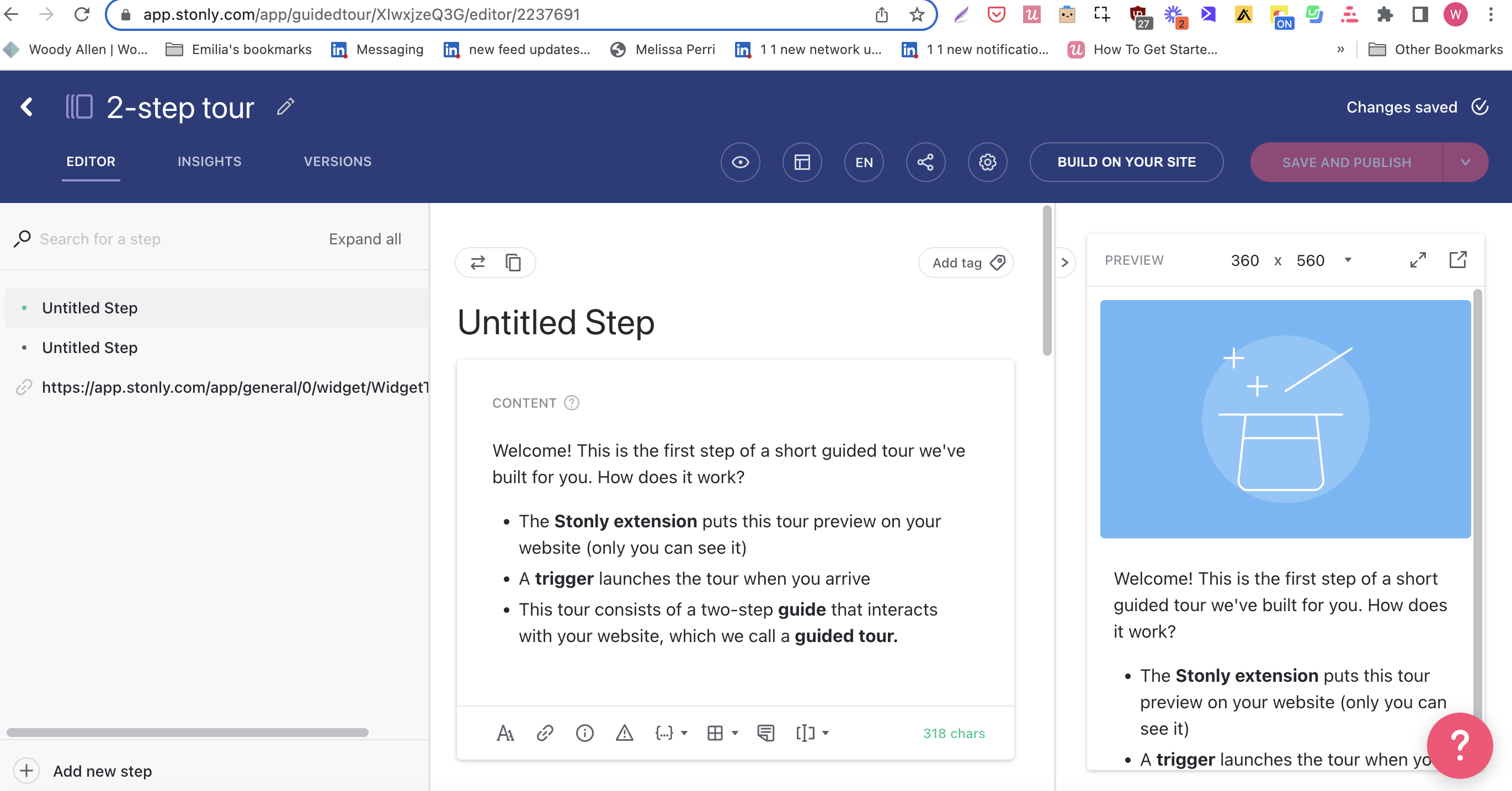
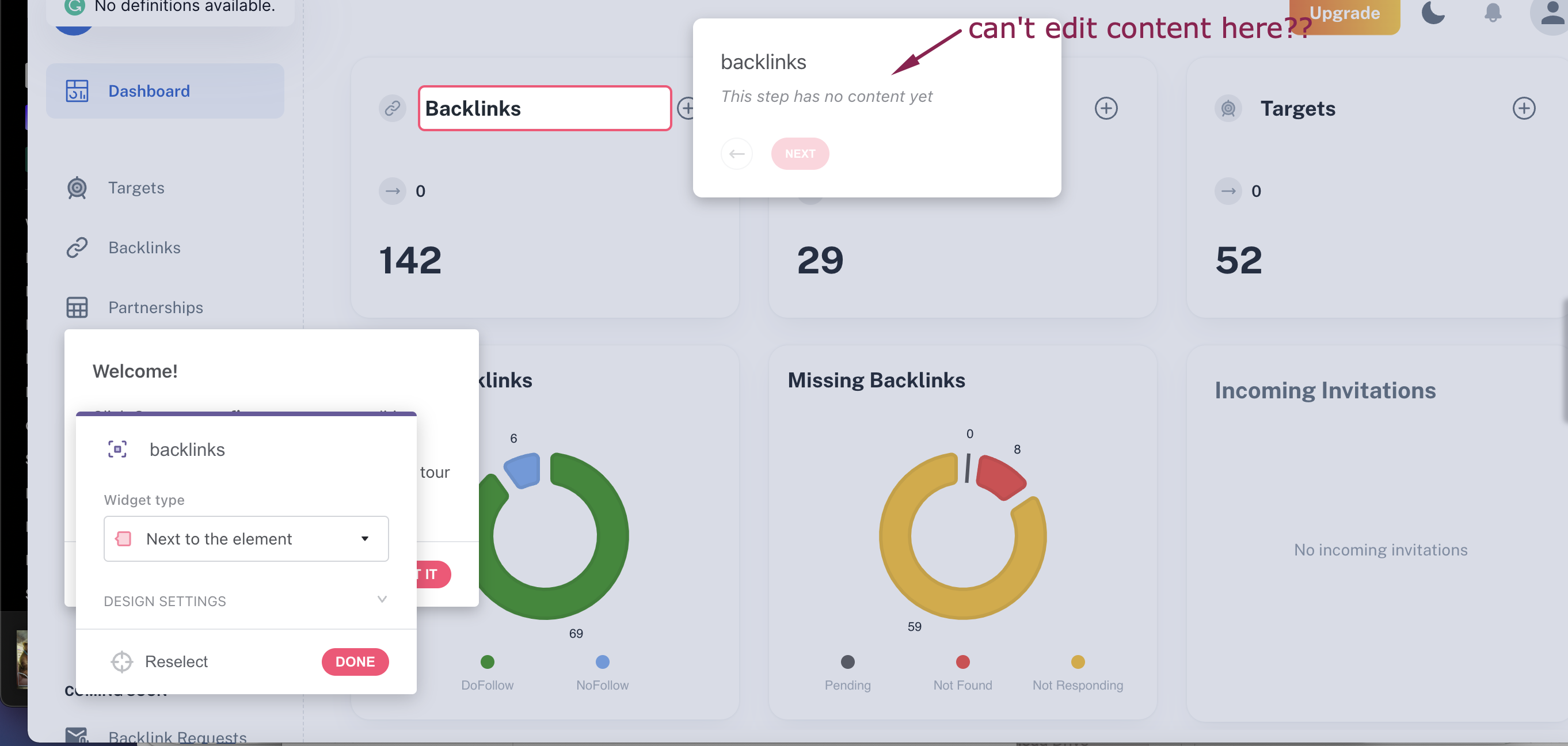
Stonly’s product tours are not the most intuitive (and require quite a bit of coding), and they come with limited integrations. In fact – its setup and builder are extremely confusing: you can build the tours both in the Stonly dashboard and on top of your app, but then you need to go back to the dashboard to edit the content of the steps you’ve just built in the Chrome Extension. 🤔 This doesn’t make much sense…
Try a better tool for your SaaS than Stonly!

What is Userpilot?
Userpilot is a comprehensive digital adoption platform (DAP). It enables product teams to track product usage and user behavior to guide product development and optimize the user experience.
In addition, it allows them to gather user feedback and design personalized onboarding experiences to drive product adoption. All of this is possible without coding.
What is Userpilot best for?
Userpilot is used for similar use cases as Stonly and ProductFruits. Let’s see how Userpilot compares to the tools we discussed before it comes to user onboarding, product adoption, and user feedback.
Userpilot for user onboarding
Userpilot was built specifically for SaaS product teams that want to improve their user onboarding experience and boost user activation.
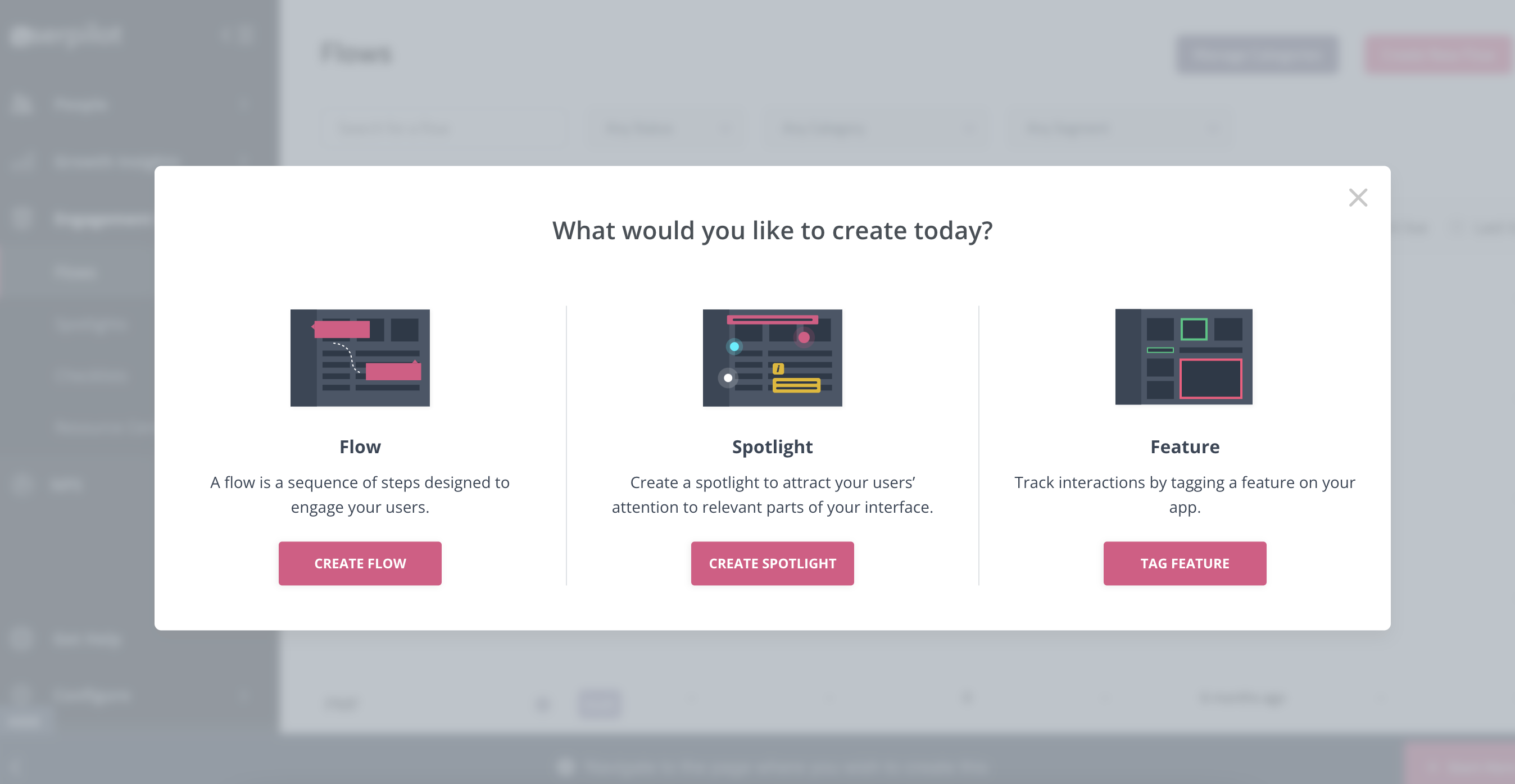
You can build a huge variety of user onboarding experiences and in-app guidance flows without needing to code.
Here’s what you’ll get when you start using Userpilot:
- Forget about coding in-app experiences: Userpilot is a no-code solution and only requires your dev to install a line of javascript inside your app and for you to download a Chrome extension that opens up the visual builder.
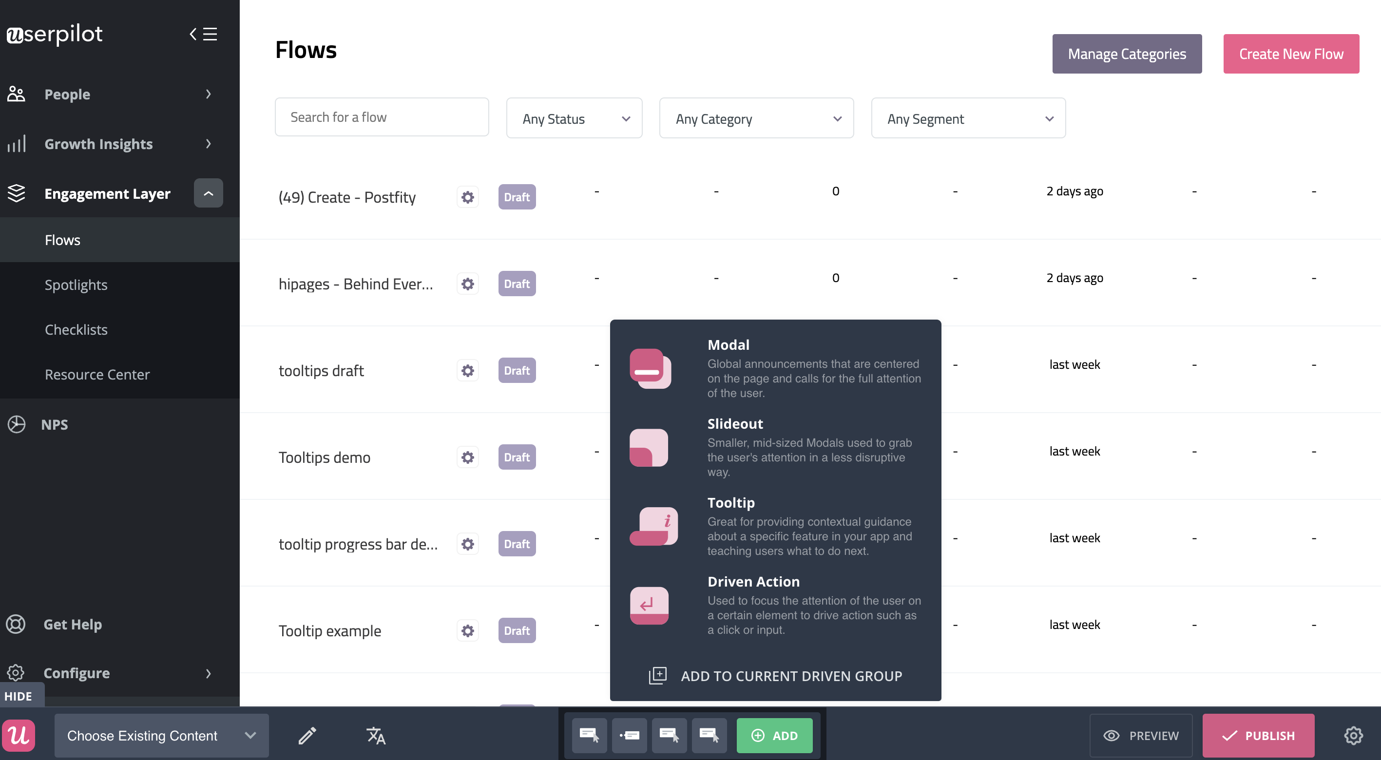
- Build in-app flows using the largest range of UI patterns (modals, slideouts, tooltips, hotspots, banners) and in-app onboarding experiences (checklists, micro surveys, NPS surveys, in-app resource center).
- Get access to a built-in NPS tool for collecting and analyzing user sentiment so you can improve your onboarding process based on real data.
- Create and track combinations of in-app events like clicks, hovers, and form fills, and then analyze all these interactions under your own custom events, which can be built without code or API calls.
- Use advanced product analytics and in-app flows analytics to identify where users need help and create granular user segments to trigger in-app experiences contextually (segment based on user identification data, in-app engagement, custom events, clicks, hovers, form fills, user feedback responses, NPS scores and more).
- Enhance the onboarding experience with in-app help by launching a Resource Center directly inside your app. Add in-app guides, and video tutorials, and give users access to search the knowledge base or reach out to support. Self-service has never been easier.
The best user onboarding is contextual and it happens right where the users need it, inside your app. There isn’t a better user onboarding tool out there that offers more value for the money than Userpilot.
Schedule a demo with our team and get ready to build the best onboarding experiences your users have seen.
Userpilot for product adoption
Product adoption describes the process of getting users to the point where they are experiencing value from your product.
Userpilot is a powerful product adoption platform that enables you to quickly build personalized and contextual in-app experiences targeted to different user experiences – all without writing a line of code.
It’s a great option for enterprise users too since it’s SOC 2 Type II certified and offers robust features for large-scale usage.
Here are some of Userpilot’s product adoption features that you may find helpful:
- A broad range of UI patterns to build fully customizable, contextual, and interactive in-app flows: modals, slideouts, tooltips, hotspots, driven actions, banners, and more. And – most importantly – you are not limited by plan when it comes to how many UI patterns or designs you can build.
- Advanced in-app checklists with built-in gamification elements like progress bars or ”automatically marked complete” tasks: checklists also come with analytics so you can track who is interacting with them and how.
- Fully interactive walkthroughs walk users through engaging and adopting specific features of your app.
- The self-service in-app resource center lets users search your knowledge base directly inside the app, access chat, and support but also launch guides and tutorials when they get stuck.
- User feedback tools allow you to collect insights to improve the product and the user experience, thus leading to a higher product adoption rate. You can also collect NPS data and tag responses to uncover patterns into what makes users stick, or build micro surveys for more granular data. Then you can use all the feedback collected to build user segments based on the answers and personalize the path to higher product adoption for each segment.
Want to see Userpilot in action? Get a demo and improve product adoption with contextual and personalized in-app flows that actually help users.
Userpilot for user feedback
There are two types of feedback you should be focusing on collecting to better understand the health of your product and users.
First, you have user sentiment which looks at user satisfaction and effort scores or loyalty (using NPS surveys). Then you may also want to collect feedback on the functionality of the product or specific features.
You can do all these with Userpilot. In short, you can:
- Collect and track (NPS) in-app with a built-in NPS widget that allows you to fully customize the survey look and feel, and set the trigger frequency and specific targeting.
- Analyze NPS scores, tag responses, and use the data to create specific user segments.
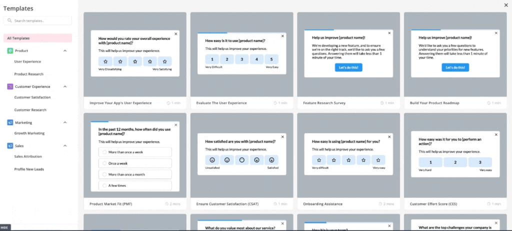
- Build and trigger in-app micro surveys like the classic PMF survey, or similar ones and mix multi-choice and open-ended types of questions to collect specific insights.
- Be in charge of who gets which survey type and when with advanced segmentation capabilities, and of course, you can use the answers to segment your audience.
The advantage of using Userpilot for collecting feedback over other survey tools is that you can better control who sees the surveys but also you can instantly use the data collected to segment your user base and trigger the right experience for them.
For instance, if your users give you a low NPS score because they think you’re missing a critical feature (that you actually have already), you can push an interactive walkthrough guiding them to find and explore this feature.
Tired of bad Digital Adoption tools? Try Userpilot for your SaaS for free!

So Which tool should you choose? ProductFruits vs Stonly vs Userpilot – final thoughts
As you can see, both ProductFruits, Stonly and Userpilot cater to most of the use cases Product Managers typically look for for their SaaS companies. There are some differences between the tools when it comes to how those use cases are executed in each, of course.
So if you’re still on the fence – there are two more factors that can make a difference for you – the tools’ pricing, its reviews, and the final pros and cons. Let’s have a look at both below!
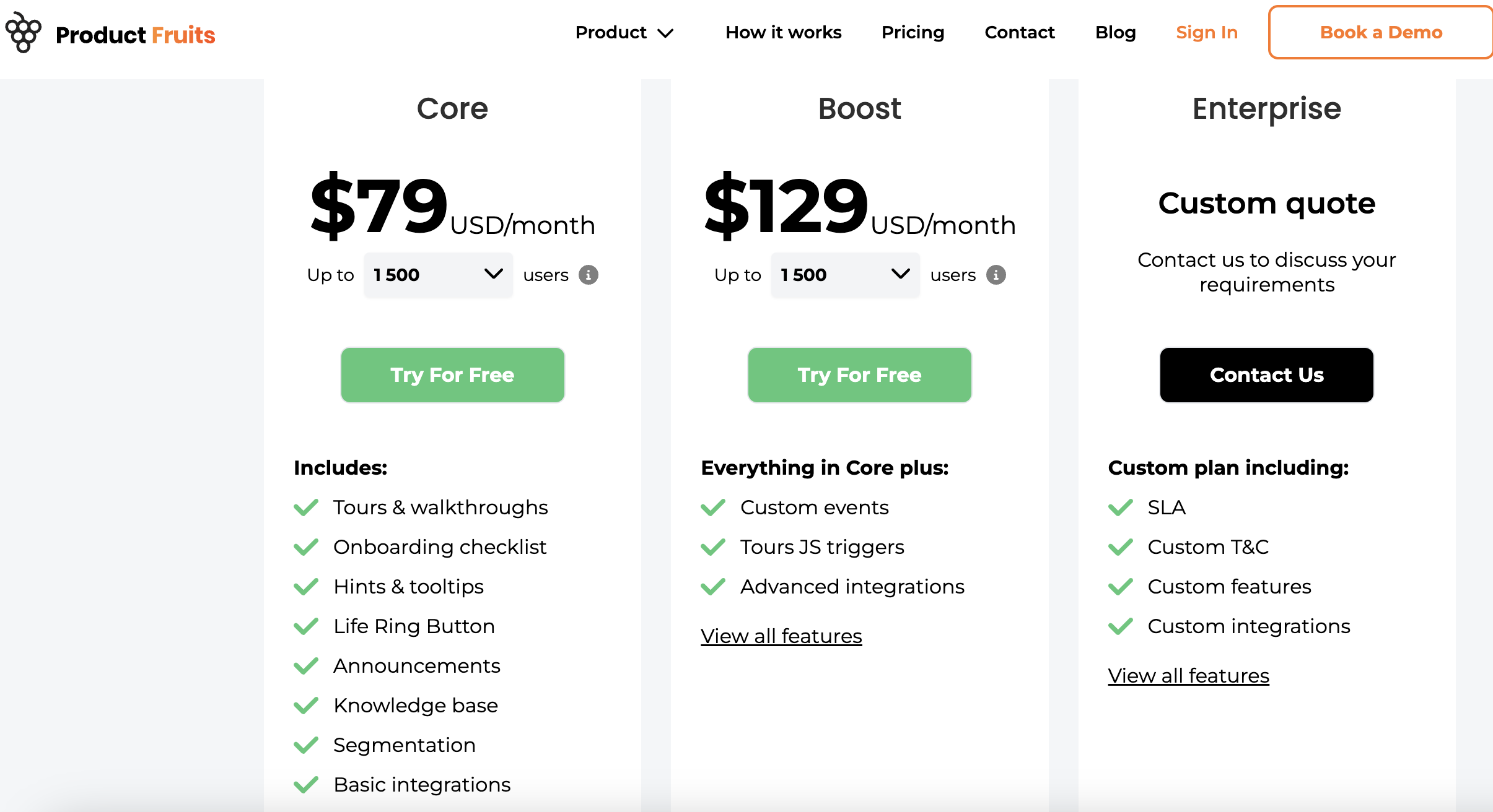
ProductFruits pricing
Product Fruits is one of the absolutely cheapest solutions on the market, with plans:
- Core: From $79 for 1,500 users.
- Boost: $129 for 1,500 users and then $249 for up to 5000 MAUs.
- Enterprise: Custom quote only.
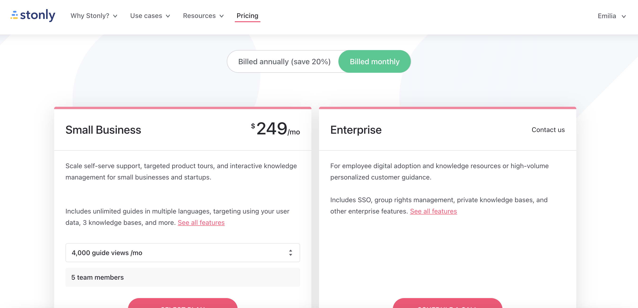
Stonly pricing
Stonly offers two main pricing plans for its customers, catering to different business sizes and needs. The pricing details are as follows:
- Small Business: Billed at $199/mo, this plan is designed for small businesses and startups looking to scale self-serve support, targeted product tours, and interactive knowledge management. Features include:
- Unlimited guides in multiple languages.
- Targeting using your user data.
- 3 knowledge bases.
- 4,000 guide views per month.
- 5 team members.
- Enterprise: Pricing available upon contacting Stonly, this plan is geared towards employee digital adoption and knowledge resources or high-volume personalized customer guidance. Features include:
- SSO (Single Sign-On).
- Group rights management.
- Private knowledge bases.
- Other enterprise features.
Customers can save 20% on both plans when billed annually.
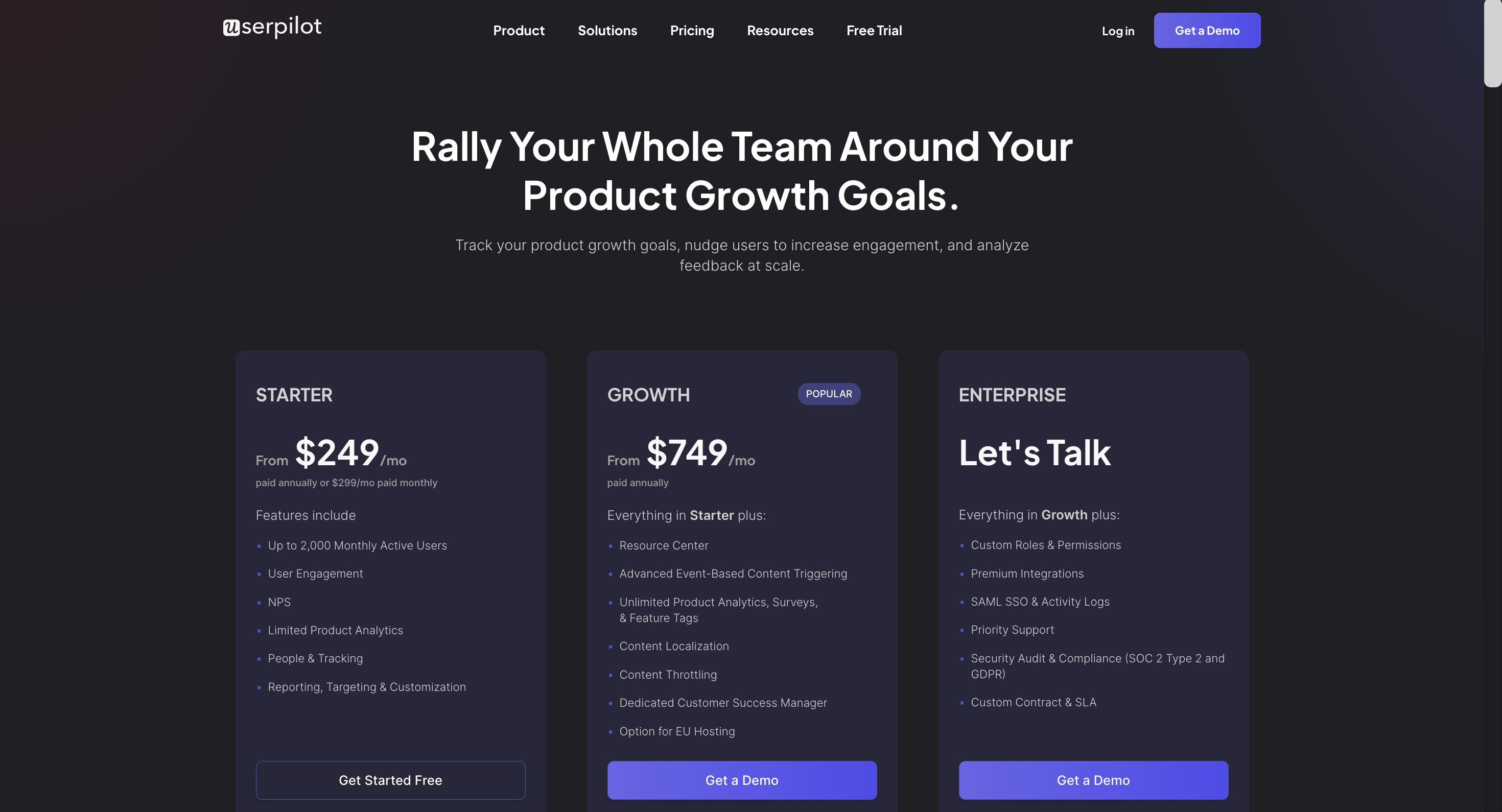
Userpilot pricing
Userpilot’s transparent pricing ranges from $249/month on the entry-level end to an Enterprise tier for larger companies.
Furthermore, Userpilot’s entry-level plan includes access to all UI patterns and should include everything that most mid-market SaaS businesses need to get started.
Userpilot has three paid plans to choose from:
- Starter: The entry-level Starter plan starts at $249/month and includes features like segmentation, product analytics, reporting, user engagement, NPS feedback, and customization.
- Growth: The Growth plan starts at $749/month and includes features like resource centers, advanced event-based triggers, unlimited feature tagging, AI-powered content localization, EU hosting options, and a dedicated customer success manager.
- Enterprise: The Enterprise plan uses custom pricing and includes all the features from Starter + Growth plus custom roles/permissions, access to premium integrations, priority support, custom contract, SLA, SAML SSO, activity logs, security audit, and compliance (SOC 2/GDPR).
What do users say about ProductFruits vs Stonly vs Userpilot?
ProductFruits reviews
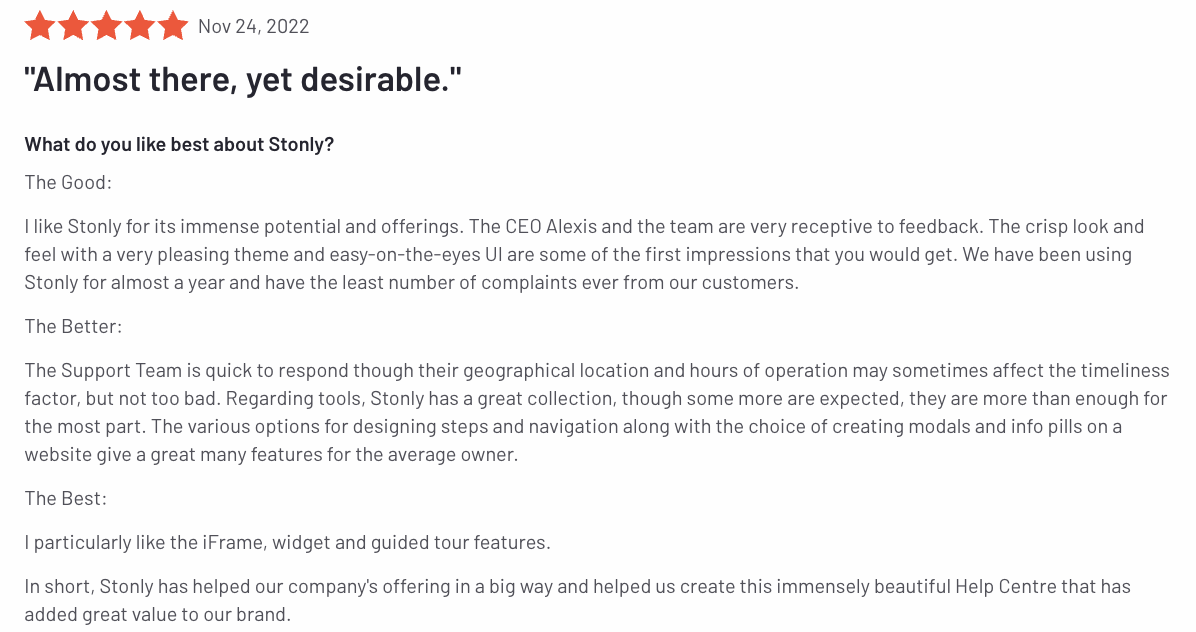
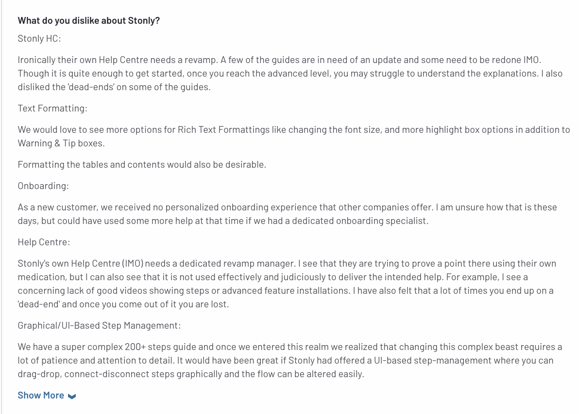
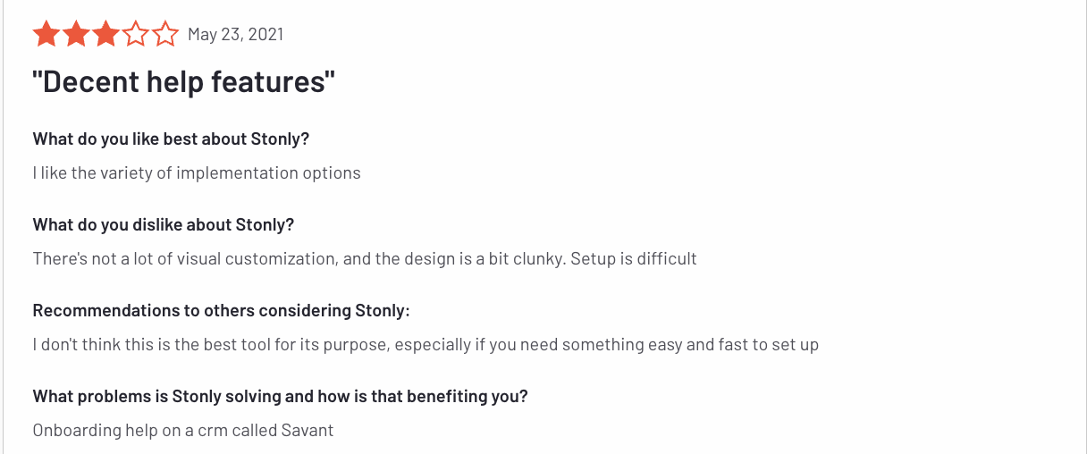
Stonly reviews
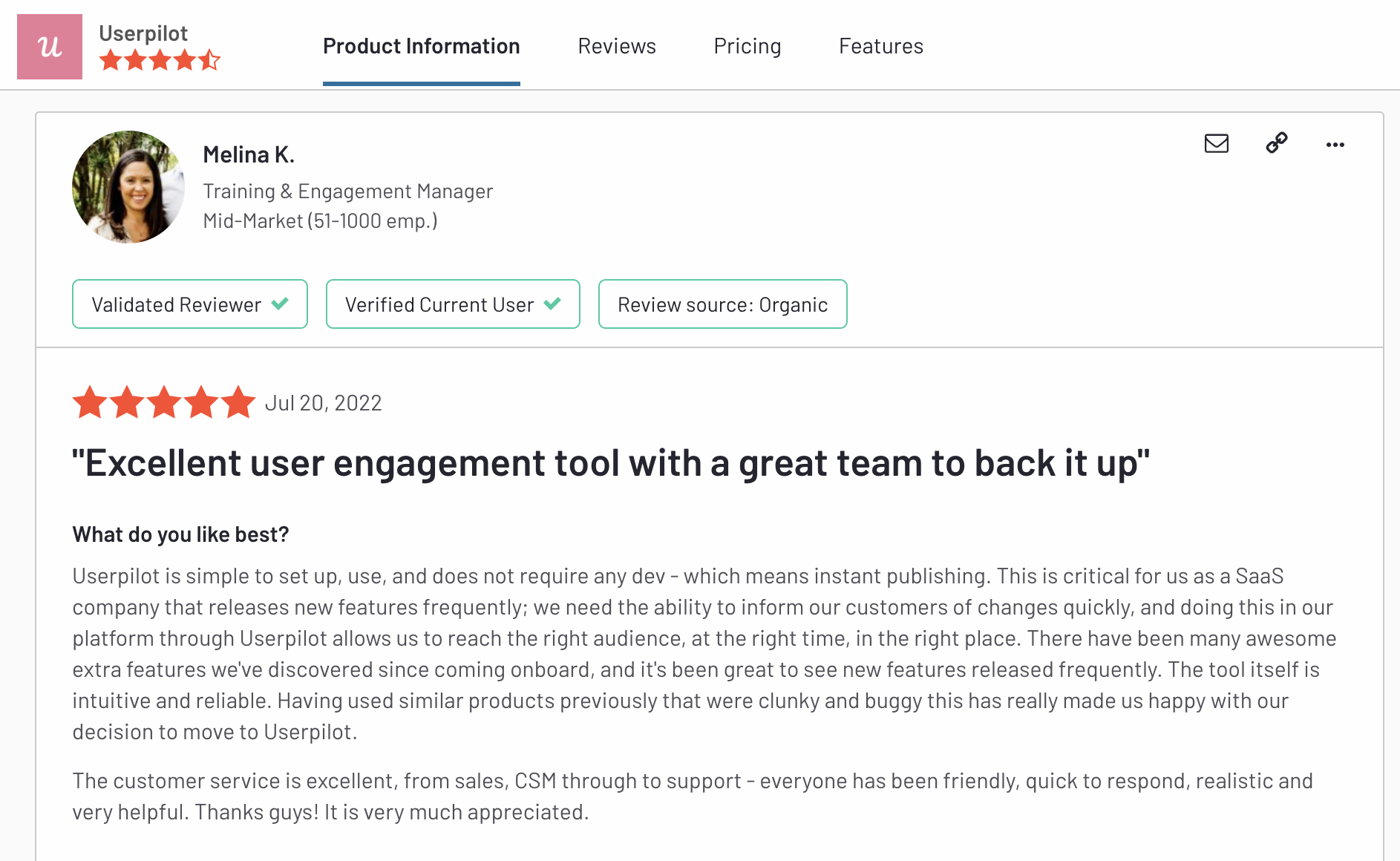
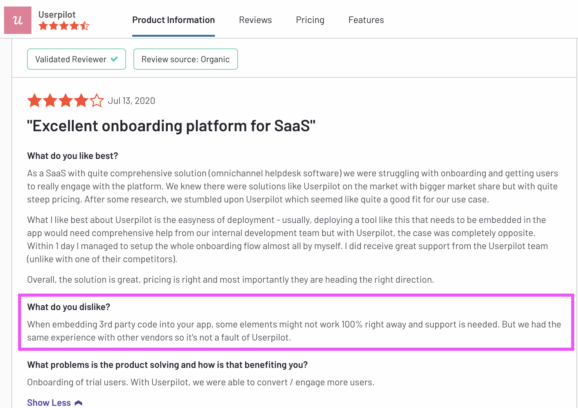
Userpilot reviews
The final countdown: Pros & Cons of ProductFruits, Stonly and Userpilot
ProductFruits pros
ProductFruit’s most commonly quoted pros include:
- The responsiveness of the CS team.
- Easy setup.
- Easy to build product tours with a Chrome Extension directly on top of your product.
ProductFruits cons
There are several downsides to ProductFruits though:
- Only basic, linear product tours.
- Clunky UX – making it quite difficult to use.
- Only basic form of a resource center and checklists.
- No NPS.
- No native surveys.
- No reporting for the Resource Center (“life ring widget”).
- The product tour triggering can be quite buggy.
Stonly pros
Stonly has a number of advantages:
-
The ability to support multiple languages
-
Small companies with fewer initial views will benefit from this pricing model
-
Integrated analytics
-
Front, Zendesk, Freshdesk, and Segment integrations
-
Knowledge base functionality included
Stonly cons
There are also several considerable downsides to using Stonly though:
-
-
Extremely confusing builder
-
-
-
Pretty code-heavy product tour setup for a “no-code tool”
-
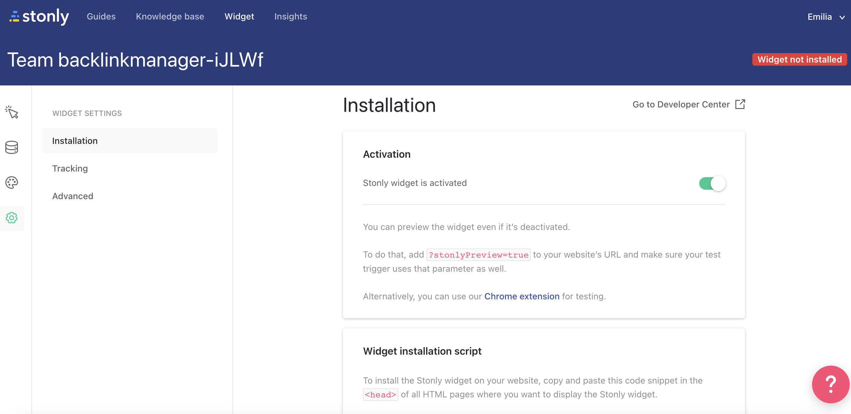
- Confusing installation: it’s impossible to install it for a non-technical user:
-
Requires some knowledge of CSS to customize – the customization options are worse than the market standard
- Doesn’t allow you to add content to your product guides (text) directly in the Chrome Extension:
-
There is a lack of certain popular product tour features, such as progress bars and checklists
Userpilot pros
Userpilot has a number of advantages, especially for mid-market SaaS companies looking for a robust but at the same time very easy-to-use, no-code tool for user onboarding, product adoption, and simplified product analytics. Let’s have a look at the pros of using Userpilot:
- No-code builder – Userpilot comes with an easy-to-use Chrome Extension builder.
- Multiple UI patterns – choose from a range of options to build customized flows: modals, slideouts, banners, tooltips, hotspots, and checklists are all at your disposal
- UI patterns are not limited by plan – you get access to all of them on every single plan, meaning you get value even with the Traction plan (this is the entry-level one).
- Engaging walkthroughs and onboarding flows- build interactive walkthroughs targeted to distinct user segments.
- In-app help – build a resource center offering self-service support to your users, customize it with your branding, and select from a range of help options to boost user satisfaction (i.e. videos, in-app flows, chat, and more).
- Experimentation – built-in A/B testing for flows lets you explore and quickly iterate based on direct user behavior.
- Powerful feedback options- integrated NPS surveys with analytics and response tagging unlock insight into how your users feel.
- Advanced analytics and segmentation- analyze product usage and in-app flow engagement and build user segments using the data.
- Event tracking and feature tags- tag UI engagement (clicks, form fills, hovers) and group them into one custom event to track what really matters.
- More value with integrations- unlock value faster with built-in integrations with popular tools like Segment, Amplitude, Mixpanel, Kissmetrics, Intercom, Heap, and more.
Userpilot cons
There are, however, some downsides to Userpilot as well:
- Browser/web app only – Userpilot won’t run on mobile devices/applications.
- Doesn’t support employee onboarding- The tool is better suited for customer onboarding than for employee onboarding as you can’t build in-app guides on third-party tools.
- Missing integrations – doesn’t have built-in integrations with some tools, but it has webhooks, and Hubspot and Zapier are coming soon.
- Not appropriate for small startups on a shoestring budget (<$100)- Userpilot is a powerful, mid-market to enterprise-level tool. So $249 a month might be too expensive for really small startups.
Try the best tool for user onboarding for FREE!

Conclusion
In this post, we’ve discussed how ProductFruits, Stonly and Userpilot compare when it comes to user onboarding, product adoption, and user feedback. We’ve discussed their features for each use case, pricing, and reviews, as well as the pros and cons.
Obviously, we’re a little biased, but we think that Userpilot offers the best value for money, and is unrivaled especially when it comes to user onboarding. Get a Userpilot demo to see it in action.


